The Shake Shack Logo History, Colors, Font, and Meaning
Icons. They’re not just symbols; they’re storytellers. And in the tale of Shake Shack, its logo wears the crown—unveiling a saga where fast food meets flair. It’s a stroke of genius, a masterclass in visual branding.
A mere glance at it, and you’re engrossed in memories of sizzling burgers and blissful shakes.
This emblem, it’s more than a mere graphic. It echoes the ethos of a New York-based chain that transformed how we perceive a quick bite.
As someone entrenched in the nuances of web design, I delve into the makings of a symbol that transcends mere marketing and burgeons into an entity of its own.
Within these lines, discover the powerhouse of a dynamic logo and its seismic impact on customer loyalty and corporate identity.
Unwrap the secrets behind Shake Shack’s visual identity—from its conception in picturesque Madison Square Park to its recognizably green touch gracing global avenues. We won’t just explore; we’ll experience the transformative power of a burger icon.
The Meaning Behind the Shake Shack Logo
![]()
Crack open the secret sauce of the Shake Shack logo, and what do you find? A spicy blend of nostalgia, playfulness, and a dash of modernism. It’s not just about the burgers, folks! This logo is a real, substantial conversation starter.
Nostalgic Elements
Step back into the past, when things were simpler. The Shake Shack logo echoes the aesthetics of classic American roadside diners and ice cream parlors. This vintage vibe gives a nod to the traditional, inviting you in for a burger and a shake, just like the good old days.
A Modern Twist
But wait, there’s a fresh spin on the retro feel. The logo embraces clean lines and minimalistic design elements. It’s a smooth blend of the old and the new, the vintage and the contemporary. It tells you, “Yeah, we’re fun, but we’re also slick and modern.”
The History of the Shake Shack Logo
![]()
Travel with me, folks. Let’s dip into the story of this logo, a journey of evolution and change.
In The Beginning
Our starting point is 2004, the birth of Shake Shack in New York City’s Madison Square Park. The logo back then? As fresh and new as the brand itself, designed by Paula Scher of Pentagram. It was intended to reflect the brand’s fun, friendly, and fresh identity.
The Evolution
Fast forward a bit, and you see the logo growing with the brand. Minor tweaks here and there to keep up with the times, but the core elements remain. It’s a testament to the strength of the original design.
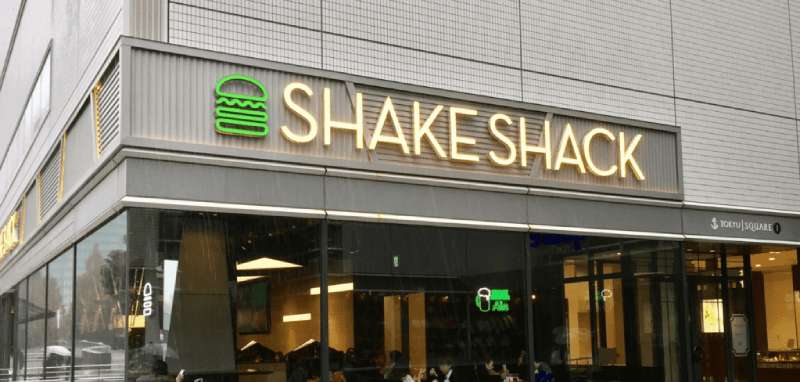
The Colors of the Shake Shack Logo
![]()
Now, let’s talk about the hues that make up the Shake Shack logo. It’s not just about looking pretty. Each color choice carries a meaning.
The Green
It’s bold, it’s vibrant. The green symbolizes growth, freshness, and prosperity. It’s a nod to the brand’s commitment to quality and their growth journey.
The Black
Contrasting with the green, the black text gives a sense of balance and sophistication. It adds depth, solidity, and seriousness to the otherwise playful logo.
The Font Used in the Shake Shack Logo
Typography, my friends, is a big deal in design. The typeface of the Shake Shack logo? It’s as carefully chosen as the rest of the elements.
Neutraface Typeface
The logo uses the Neutraface typeface, a modern sans-serif font that embodies simplicity and clarity. It’s legible and friendly, yet sophisticated, perfectly aligning with the brand’s persona.
The Architecture Influence
This logo doesn’t exist in a vacuum, folks. It’s deeply influenced by the architecture of their eateries.
Mid-Century Modern Aesthetics
The logo mirrors the mid-century modern design of their outlets. Clean lines, organic curves, and a blend of indoor and outdoor elements. The logo is a reflection of the space where the burgers are served, and the experience they aim to provide.
Cultural Impact of the Shake Shack Logo
Finally, let’s chat about how the Shake Shack logo has influenced popular culture.
Branding and Pop Culture
From its humble beginnings, Shake Shack has grown into a globally recognized brand.
The logo has become a cultural icon, a symbol of good times and great food. It’s been featured in films, TV shows, and has garnered a loyal following on social media.
FAQ On The Shake Shack Logo
Who designed the Shake Shack logo?
Well, the green and black magic was spun by none other than Pentagram, the design wizards. They crafted a logo that’s bold yet playful, reflecting Shake Shack’s fun and straightforward approach to fast-casual dining.
Picture this: a masterstroke meshing modern with classic, making that burger icon unforgettable.
What does the Shake Shack logo represent?
At first glance, the Shake Shack logo might just be a burger and shake. But dig deeper, it’s a narrative. A tale of quality, community, and modern-day roadside eats.
It stands for a straightforward promise—good food, good times, and an ambiance that’s as inviting as your backyard BBQ.
Has the Shake Shack logo changed over time?
Evolution’s part of any great brand. Shake Shack’s logo, though? It’s stood its ground since day one. Minor tweaks, sure, to keep it fresh. But the essence? Unchanged.
That timeless quality speaks volumes, echoing the brand’s commitment to keeping those core values consistent as they scale global heights.
What colors are used in the Shake Shack logo?
Imagine a leafy park. Fresh, natural. That’s the green in their logo. Paired with a bold, deep black, it’s like they’ve captured the essence of Madison Square Park, where it all began.
An emblem born of a place, almost an SEO entity in its own right—synonymous with the brand’s roots.
How has the Shake Shack logo influenced brand identity?
This isn’t merely about a logo slapped on merch; it’s the heartbeat of Shake Shack’s brand identity. Memorable, isn’t it? It’s front and center—menus, uniforms, app.
Think of it as an invitation, one that wraps modern sophistication and roadside charm into a tidy, irresistible package.
Why is the logo important to Shake Shack’s marketing strategy?
In the rough and tumble of the food industry, that logo’s a beacon. It’s part of a sophisticated marketing strategy, threading through every Shake Shack venue or ad campaign.
It’s steadfast. It signals a brand you can align with, no matter where you are, turning visual identity into a promise.
How does the Shake Shack logo enhance customer experience?
Ever walked by a Shake Shack and felt a smile creep up? The logo’s a cue, designed to spark joy and drum up nostalgia for crispy crinkle-cut fries. It’s the visuals, a sensory experience setting the tone before the first bite—a subconscious nod to customer loyalty at its finest.
Can you describe the design elements of the Shake Shack logo?
The design elements—oh, they’re a masterclass. Bold typography, clean lines, that spirited burger and shake—simplicity that resonates.
It doesn’t just say “fast food,” it whispers a promise of quality—an anchoring design that keeps you coming back to that modern but classic resto-chain emblem.
How is the Shake Shack logo perceived internationally?
Go global, yet the green and black logo remains an embodiment of New York cool. Internationally, it’s a symbol, one that imports a slice of Big Apple hospitality worldwide.
It’s a mix of cosmopolitan sophistication and homegrown comfort. Totally recognizable—spreading the Shake Shack essence across continents.
What challenges come with designing a logo for a brand like Shake Shack?
Honestly, it’s balancing act. Gotta hit that graphic sweet spot—nostalgic yet contemporary, inviting yet bold.
For a brand like Shake Shack, it’s about creating an emblem that scales from Madison Square to Tokyo—while keeping that hometown vibe. Not just creating a graphic, but a legacy.
Conclusion
So, here we are, the final twist of the lid on this jar of stories and strategies swirled together with dashes of color and a whole lot of soul: the Shake Shack logo. We’ve dived deep past that green and black emblem, straight into the heart of a brand that echoes the hum of New York and the sizzle of griddles.
- It’s about a visual promise that spans continents but always nods home.
- It’s about a modern roadside stand growing into a global icon, with not a single beat missed.
- It’s the art of being unmistakably recognizable, of sparking cravings and fond memories alike.
Let’s wrap it up then, shall we? Take it from me—good design tells a story. And Shake Shack’s logo? It’s a novel worth savoring. A standing ovation to those early sketches that have become synonymous with quality and a textbook example of leveraging design as the bedrock of brand identity. Cheers to that—every burger, shake, and fry aligned under one deliciously iconic banner.
If you liked this article about the Shake Shack logo, you should check out this article about the Subway logo.
There are also similar articles discussing the Pizza Hut logo, the Arby’s logo, the Little Caesars logo, and the Dairy Queen logo.
And let’s not forget about articles on the Panda Express logo, the McDonald’s logo, the Domino’s Pizza logo, and the Chick-fil-A logo.
Bogdan Sandu, a seasoned designer with 15 years of diverse experience, has been designing websites since 2008.
Renowned for his expertise in logo design and visual branding, Bogdan has developed a multitude of logos for various clients.
His skills extend to creating posters, vector illustrations, business cards, and brochures. Additionally, Bogdan's UI kits were featured on marketplaces like Visual Hierarchy and UI8.
Latest posts by Bogdan Sandu (see all)
- Rainbow Color Palettes for Joyful Designs - 29 April 2024
- The Bethesda Logo History, Colors, Font, And Meaning - 28 April 2024
- Out of This World: Space Color Palettes for Cosmic Designs - 28 April 2024