The Domino’s Pizza logo stands as one of the most recognized symbols in the quick-service restaurant industry. It combines a domino tile graphic with bold wordmark typography to create instant brand recognition.
Within the crowded fast food logo landscape, this design has carved out distinctive territory. The current version launched in 2012, though the brand itself dates back to 1960.
Over six decades, Domino’s has cycled through several logo iterations. Each version reflected shifting design trends and business strategy changes. The three-dot domino tile remains the consistent thread connecting all versions.
What Is the Domino’s Pizza Logo?
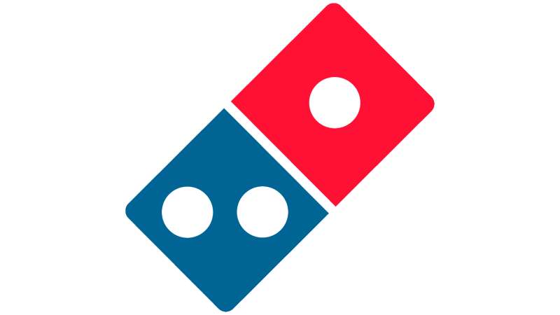
The Domino’s Pizza logo is a combination mark featuring a red and blue domino tile with three white dots positioned next to the company wordmark. Introduced in its current form in 2012, this design was created by the brand’s internal team to represent the original three Domino’s locations while projecting a modern, digital-friendly image.
Design Type: Combination mark (icon plus wordmark)
Primary Elements:
- Two-square domino tile at an angle
- Three white dots (one on top square, two on bottom)
- Bold sans-serif wordmark reading “Domino’s”
Official Introduction Date: 2012 (current version)
Designer/Agency: In-house Domino’s design team with consultation from Crispin Porter + Bogusky
Trademark Status: Registered trademark with the United States Patent and Trademark Office
Color Palette:
- Domino’s Red: #006491
- Domino’s Blue: #E31837
- White: #FFFFFF
Usage Context: Pizza boxes, store signage, delivery vehicles, mobile app, website, uniforms, and all marketing materials worldwide
How Has the Domino’s Pizza Logo Evolved Over Time?
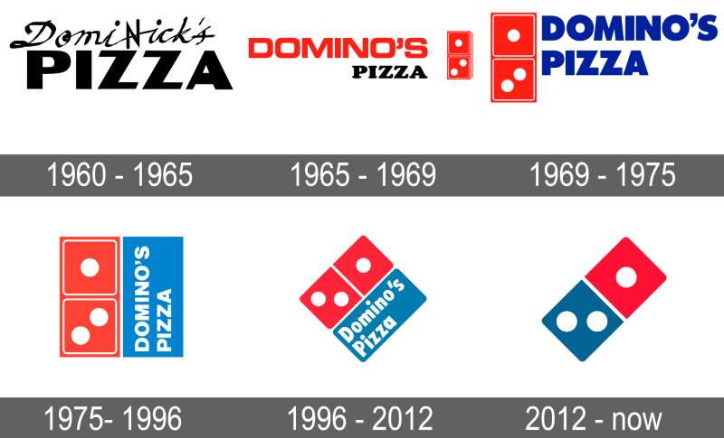
The Domino’s logo has gone through four major redesigns since the company’s founding.
Each change brought the brand closer to its current streamlined look.
The domino tile has stayed constant, but everything around it shifted dramatically over the years.
Original Domino’s Logo (1960-1965)
Years Active: 1960-1965
Design Description: When Tom Monaghan bought the small pizza shop called DomiNick’s in Ypsilanti, Michigan, the original branding was basic. A simple text-based logo with minimal graphic elements.
Color Scheme: Red and white
Designer: Unknown local designer
Context: The business was still finding its footing. The name changed from DomiNick’s to Domino’s Pizza in 1965 after the previous owner forbade use of his name.
Cultural Significance: This era represented humble beginnings. Nothing fancy, just a small Michigan pizza operation trying to survive.
First Domino Tile Logo (1965-1996)
Years Active: 1965-1996
Design Description: The iconic domino tile made its debut here. Two connected squares with dots appeared alongside a rounded, playful wordmark. The whole thing had a hand-drawn quality.
Color Scheme: Red, white, and blue introduced
Designer: Company founder Tom Monaghan reportedly sketched the initial concept
Context: The three dots represented the three original stores. Monaghan planned to add a dot for each new location but quickly abandoned that idea as the chain exploded in popularity.
Key Changes from Previous: Added the domino game piece as the central symbol. Established the red, white, and blue palette that continues today.
Cultural Significance: This version built the foundation for all brand recognition going forward. People started associating the tilted domino with pizza delivery.
Refined Domino’s Logo (1996-2012)
Years Active: 1996-2012
Design Description: Sharper edges replaced the softer curves. The domino tile got a slight 3D treatment with shadow effects. Typography became bolder and more corporate.
Color Scheme: Same red, white, and blue but with deeper, richer tones
Designer: Professional design consultants (specific agency undisclosed)
Context: The brand was going global. They needed something that translated across cultures and looked professional on everything from billboards to early websites.
Key Changes from Previous: More dimensional appearance. Cleaner lines. The playfulness was toned down for a more serious corporate image.
Cultural Significance: Represented Domino’s transformation from regional chain to international powerhouse.
Current Domino’s Logo (2012-Present)
Years Active: 2012-present
Design Description: Flat design took over. The 3D effects disappeared. What remained was a clean, simple domino tile and streamlined wordmark. Everything got optimized for digital screens.
Color Scheme: Consistent red, white, and blue
Designer: Internal team with Crispin Porter + Bogusky agency involvement
Context: Mobile ordering was becoming huge. The old logo looked cluttered on smartphone screens. This redesign prioritized digital clarity.
Key Changes from Previous: Removed dimensional effects. Simplified everything. Made the tile work as a standalone app icon.
Cultural Significance: Marked Domino’s pivot from pizza company to tech-forward delivery operation.
What Do the Design Elements of the Domino’s Pizza Logo Mean?
Every piece of the Domino’s logo carries meaning.
The domino tile references the company name while connecting to American game culture.
Those three dots tell the founding story. And the color choices tap into deep psychological associations with food and trust.
Why Did Domino’s Choose These Specific Colors?
The red in the logo does heavy lifting. It stimulates appetite and creates urgency.
Fast food brands love red for a reason. It grabs attention and makes people hungry.
According to color psychology research, red increases heart rate and creates excitement.
Domino’s Red
- Hex: #E31837
- Symbolism: Energy, appetite, passion
- Psychological impact: Creates urgency, stimulates hunger
The blue provides balance. It communicates trust and reliability.
When you order delivery, you need to trust the company will actually show up. Blue handles that job.
Domino’s Blue
- Hex: #006491
- Symbolism: Trust, dependability, professionalism
- Psychological impact: Calming, builds confidence
White dots and text create breathing room. They prevent the design from feeling heavy or cluttered.
What Typography Style Is Used in the Domino’s Pizza Logo?

The current wordmark uses a custom sans-serif font.
It looks similar to Futura Bold but has been modified for the brand.
The letters are thick and rounded at certain points. This gives them a friendly, approachable feel without looking childish.
Readability was clearly a priority. You can spot that wordmark from across a parking lot.
Earlier versions used more decorative typography elements. The current approach strips all that away for maximum clarity.
What Are the Hidden Meanings in the Domino’s Pizza Logo?
Those three dots are the big story. Tom Monaghan placed them to represent the first three Domino’s locations.
The plan was to add more dots as the chain grew. Good thing they scrapped that idea. Imagine a domino with 19,000 dots.
The tilted angle creates movement. It suggests speed and forward motion.
For a delivery company, that visual momentum matters. Static logos feel slow. This one feels like it is going somewhere.
How Does the Domino’s Pizza Logo Compare to Competitor Logos?
Pizza chain logos tend to fall into predictable patterns.
Red shows up almost everywhere. Circular shapes dominate. Domino’s stands apart by going geometric instead.
The Pizza Hut logo uses a roof-shaped icon. Very literal. It is a hut where you get pizza.
Little Caesars went with a cartoon mascot. Fun and playful, aimed at families.
Papa John’s keeps things text-focused. The shield shape suggests tradition and quality.
Domino’s sits in unique territory. The game piece reference makes it memorable without being cartoonish. It works for both kids ordering with parents and adults ordering after midnight.
The contrast with competitors actually helps. When everything looks similar, being different becomes an advantage.
What Are the Technical Specifications of the Domino’s Pizza Logo?
Official Color Codes:
Primary Red
Primary Blue
- Hex: #006491
- RGB: (0, 100, 145)
- CMYK: (100, 43, 12, 43)
- Pantone: 7692 C
White
- Hex: #FFFFFF
- RGB: (255, 255, 255)
- CMYK: (0, 0, 0, 0)
Dimensions and Proportions:
- The domino tile sits at approximately 45-degree angle
- Tile width to wordmark length ratio: roughly 1:3
- Minimum size: 0.75 inches for print, 50 pixels for digital
- Clear space requirement: Height of one domino dot on all sides
What Cultural Impact Has the Domino’s Pizza Logo Had?
The Domino’s logo achieved something rare. It made a game piece synonymous with pizza.
That mental connection did not exist before. Now it is automatic for millions of people worldwide.
The logo appears in pop culture regularly. Movies, TV shows, video games. It has become shorthand for pizza delivery itself.
During the company’s 2009 “Pizza Turnaround” campaign, keeping the logo unchanged actually helped. Customers recognized they were getting something new from a brand they already knew.
How Does the Domino’s Pizza Logo Fit Into the Overall Brand Identity?
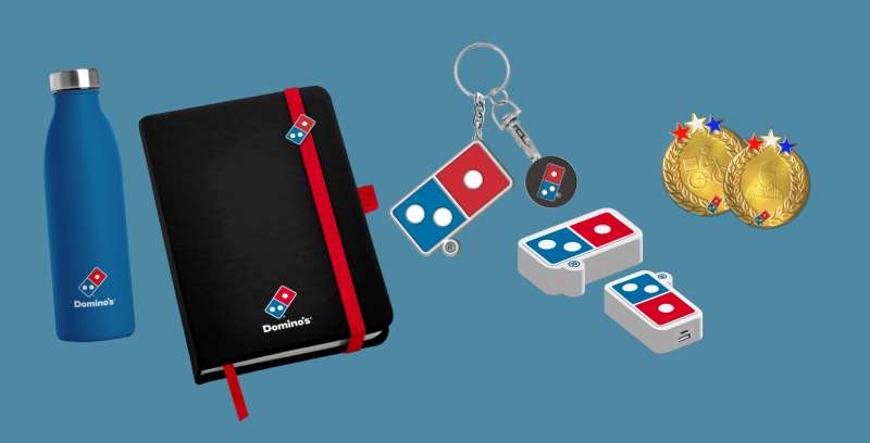
The logo anchors everything else. Store design, packaging, uniforms, app interface. All flow from those core visual elements.
Domino’s brand guidelines specify exactly how the logo should appear in every context.
The red and blue palette extends throughout all touchpoints. You see it on delivery cars, pizza boxes, employee shirts.
Even the pizza tracker in the app uses the same colors. That consistency builds recognition over time.
The domino tile works as a standalone symbol too. On app icons and social media profiles, just the tile appears. No wordmark needed. That level of recognition took decades to build.
How Should the Domino’s Pizza Logo Be Used?
Official Usage Guidelines:
Do:
- Use official logo files from Domino’s brand portal
- Maintain required clear space around the logo
- Use approved color variations only
- Scale proportionally without distortion
Do Not:
- Alter colors outside approved palette
- Stretch or compress the logo
- Add effects like shadows or gradients
- Place on busy backgrounds that reduce visibility
- Separate the tile from wordmark without approval
Accessing Official Logos: Franchisees access approved assets through Domino’s internal brand portal. Media requests go through corporate communications.
Trademark Protection: The Domino’s logo is federally registered. Unauthorized commercial use will trigger legal action. The company actively monitors and enforces its trademark rights globally.
FAQ on The Domino’s Pizza Logo
What Do the Three Dots on the Domino’s Logo Mean?
The three dots represent the original three Domino’s locations. Tom Monaghan placed them there in 1965.
He planned to add a dot for each new store. That idea died fast once franchises started multiplying across Michigan and beyond.
Why Is the Domino’s Logo Red and Blue?
Red stimulates appetite and grabs attention. Blue builds trust and reliability. Together they create balance.
This color palette works perfectly for a pizza delivery company. You get hungry looking at it, and you trust your order will arrive.
Who Designed the Current Domino’s Pizza Logo?
The 2012 redesign came from Domino’s internal team working with Crispin Porter + Bogusky agency. The original 1965 domino tile concept came from founder Tom Monaghan himself.
He sketched the first version on paper.
When Was the First Domino’s Logo Created?
The domino tile first appeared in 1965. That year marked the name change from DomiNick’s to Domino’s Pizza.
The Ypsilanti, Michigan shop needed fresh branding to match its new identity. The game piece concept stuck immediately.
Has the Domino’s Logo Changed Over Time?
Four major versions exist. The brand evolved from simple text (1960) to domino tile introduction (1965) to refined corporate look (1996) to current minimalist design (2012).
Each version reflected current design trends and business needs.
What Font Does Domino’s Use in Their Logo?
Domino’s uses a custom typeface similar to Futura Bold. The letters feature rounded edges and thick strokes.
Good kerning keeps the wordmark readable from distance. Earlier versions used more decorative fonts.
Why Is the Domino Tile Tilted at an Angle?
The 45-degree angle creates asymmetry and visual energy. Static logos feel slow. Tilted ones suggest speed and forward motion.
For a delivery brand, that sense of momentum matters. It says your pizza is on its way.
What Are the Official Domino’s Logo Color Codes?
The red is #E31837. The blue is #006491. White fills the dots and wordmark.
These codes appear in corporate brand style guide documents. Franchisees must match these exact values on all packaging design materials.
Can I Use the Domino’s Logo for My Project?
Not without permission. The logo carries federal trademark registration through the USPTO.
Unauthorized commercial use triggers legal action. Media requests go through corporate communications. Franchisees access official vector graphics through internal brand portals only.
Why Did Domino’s Remove “Pizza” from Their Logo?
The 2012 rebrand dropped “Pizza” to reflect menu expansion. Domino’s now sells chicken wings, pasta, sandwiches, and desserts.
Keeping “Pizza” felt limiting. The visual hierarchy shifted to emphasize the domino tile as the primary focal point.
Conclusion
The Domino’s Pizza logo proves that simple ideas stick. A tilted domino tile with three dots became one of the most recognized symbols in the QSR industry.
Good logo design principles drove every decision. The red and blue palette, the clean wordmark, the angled positioning. Nothing accidental here.
Six decades of brand evolution refined the concept without losing its core identity. The domino game piece still connects customers to that first Michigan pizza shop.
Few graphic design principles matter more than memorability. Domino’s nailed it.

Renowned for his expertise in logo design and visual branding, Bogdan has developed a multitude of logos for various clients.
His skills extend to creating posters, vector illustrations, business cards, and brochures. Additionally, Bogdan's UI kits were featured on marketplaces like Visual Hierarchy and UI8.
He also wrote in the past years on sites like Design Your Way, WebDesignerDepot, WPDean, Designmodo, Speckyboy, Slider Revolution, and more.
- The Cursor Logo History, Colors, Font, And Meaning - 24 September 2026
- Top 7 Web Design Subscription Services That Replace Full-Time Hires - 24 September 2026
- Canva vs PowerPoint: Which Is Better for Presentations? - 22 September 2026

Bogdan Sandu is a seasoned designer who has been designing websites since 2008. Renowned for his expertise in logo design and visual branding, Bogdan has developed a multitude of logos for various clients. His skills extend to creating posters, vector illustrations, business cards, and brochures. Additionally, Bogdan's UI kits were featured on marketplaces like Visual Hierarchy and UI8. He also wrote in the past years on sites like Design Your Way, WebDesignerDepot, WPDean, Designmodo, Speckyboy, Slider Revolution, and more.
You Might Also Like