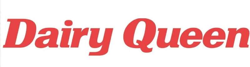
The Dairy Queen logo stands as one of the most recognizable marks in the American fast food industry. It represents a brand that has served soft serve ice cream since 1940.
Within fast food logos, the DQ emblem holds a unique position. The current version dates back to 2001, though the brand has gone through roughly six major design changes.
International Dairy Queen, Inc. (now owned by Berkshire Hathaway) first opened in Joliet, Illinois. The logo has always tried to capture that friendly, treat-focused identity the founders wanted.
What is the Dairy Queen Logo?
The Dairy Queen logo is a combination mark featuring the letters “DQ” styled with curved, lip-like shapes in red and white, officially introduced in 2001 by Tesser, a San Francisco branding agency. It symbolizes smiling lips and the joy of eating frozen treats.
Design Type: Combination mark (abstract symbol with wordmark)
Primary Elements: Stylized “DQ” letterforms resembling smiling lips, elliptical frame
Official Introduction Date: 2001
Designer/Agency: Tesser (San Francisco)
Trademark Status: Registered trademark of International Dairy Queen, Inc.
Color Palette:
- DQ Red: #ED1C24
- White: #FFFFFF
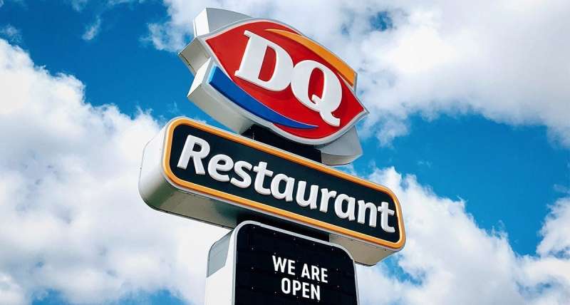
Usage Context: Restaurant signage, cups, packaging, uniforms, digital platforms, marketing materials, and franchise documentation
How Has the Dairy Queen Logo Evolved Over Time?
The Dairy Queen logo has undergone six major redesigns since the company’s founding in 1940.
Each version reflected changing design trends and business expansion goals.
The brand moved from simple text-based marks to the abstract, lips-inspired symbol we see today.
Original Dairy Queen Logo (1940-1960)
Years Active: 1940-1960
Design Description: Simple wordmark reading “Dairy Queen” in a classic script style. Nothing fancy. Just the name.
Color Scheme: Black and white primarily, though some locations used red
Designer: Unknown (likely in-house or local signage company)
Context: The first Dairy Queen opened in Joliet, Illinois. The logo needed to be simple and affordable to reproduce across early franchise locations.
Key Changes from Previous: N/A (original version)
Cultural Significance: Represented post-war American optimism and the birth of soft serve culture
Mid-Century Dairy Queen Logo (1960-1970)
Years Active: 1960-1970
Design Description: Introduced a more stylized script with a swooping underline. The text gained personality.
Color Scheme: Red became more prominent alongside white
Designer: Unknown
Context: Franchise expansion required stronger brand recognition. The red color helped locations stand out on American highways.
Key Changes from Previous: Added decorative elements, shifted toward red as primary brand color
Cultural Significance: Aligned with 1960s commercial design trends and roadside advertising aesthetics
Ellipse Era Logo (1970-2001)
Years Active: 1970-2001
Design Description: Featured “Dairy Queen” text inside an elliptical shape. Some versions included a cone illustration.
Color Scheme: Red, white, and occasional blue accents
Designer: Unknown
Context: The brand needed a contained mark that worked across growing media channels. TV advertising was becoming more important.
Key Changes from Previous: Enclosed the wordmark, standardized proportions
Cultural Significance: This version saw the introduction of the Blizzard in 1985, making it the logo most Baby Boomers and Gen X remember
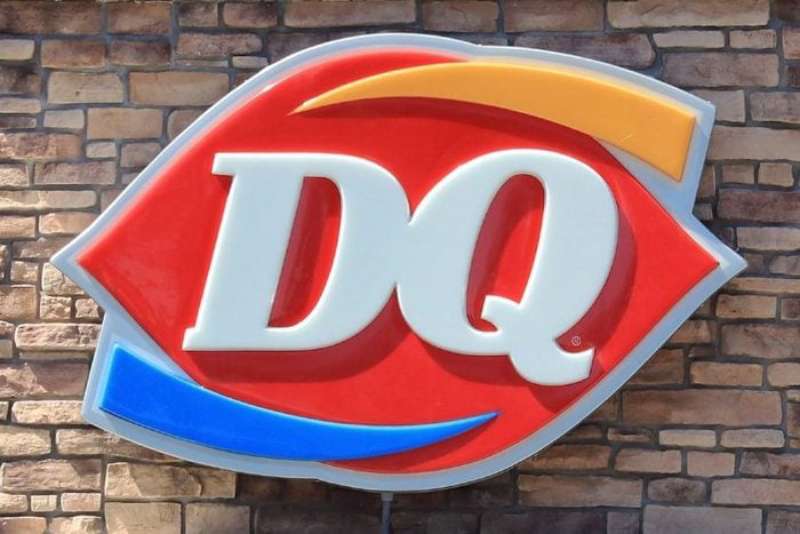
Current DQ Logo (2001-Present)
Years Active: 2001-present
Design Description: Abstract “DQ” letterforms designed to look like smiling red lips. The ellipse shape remains but with a modern twist.
Color Scheme: DQ Red (#ED1C24) and white
Designer: Tesser (San Francisco branding agency)
Context: Berkshire Hathaway’s 1998 acquisition led to brand modernization. The company wanted something that felt fresh but still familiar.
Key Changes from Previous: Dropped the full “Dairy Queen” wordmark in favor of abbreviation, introduced lips concept
Cultural Significance: Reflects modern minimalist design trends while maintaining brand warmth
What Do the Design Elements of the Dairy Queen Logo Mean?
The DQ logo’s primary visual element, the stylized lips, represents the smile customers get when enjoying Dairy Queen treats.
It’s clever. The letters “D” and “Q” form the shape naturally.
This dual meaning creates instant brand recognition while conveying positive emotions.
Why Did Dairy Queen Choose These Specific Colors?
DQ Red
- Hex: #ED1C24
- Symbolic meaning: Energy, appetite stimulation, excitement
- Psychological impact: Red triggers hunger responses and creates urgency
- Brand connection: Consistent with red logos across the fast food industry
White
- Hex: #FFFFFF
- Symbolic meaning: Cleanliness, dairy products, freshness
- Psychological impact: Creates trust and suggests purity
- Brand connection: References the soft serve ice cream product itself
The color psychology here is straightforward. Red gets attention and makes people hungry. White says “clean” and “dairy.”
What Typography Style Is Used in the Dairy Queen Logo?
The current logo uses custom letterforms rather than a standard font.
The “DQ” is hand-drawn to create the lips effect.
When the full “Dairy Queen” name appears in marketing, it typically uses clean sans-serif fonts for readability.
The typography evolution moved from decorative scripts to modern simplicity.
What Are the Hidden Meanings in the Dairy Queen Logo?
The most obvious “hidden” element is the lips shape formed by the D and Q.
But look closer. The curved lines also suggest a soft serve swirl.
Some people see a crown shape in the negative space, nodding to the “Queen” name. Whether intentional or not, it works.
The designers at Tesser have confirmed the smile interpretation was deliberate. They wanted joy baked into the mark.
How Does the Dairy Queen Logo Compare to Competitor Logos?
Among ice cream and fast food competitors, Dairy Queen takes a unique approach.
While Baskin Robbins hides the number 31 in its mark, DQ goes for emotional connection.
The McDonald’s logo uses golden arches. Wendy’s features a mascot.
DQ sits somewhere between abstract and figurative. It doesn’t show food directly. Instead, it shows the reaction to eating the food.
Competitors like Subway and Arby’s use more literal approaches.
The DQ lips concept feels more sophisticated, honestly. It trusts customers to get it.
What Are the Technical Specifications of the Dairy Queen Logo?
Official Color Codes:
Primary Color: DQ Red
Secondary Color: White
- Hex: #FFFFFF
- RGB: (255, 255, 255)
- CMYK: (0, 0, 0, 0)
Dimensions and Proportions:
- Aspect ratio: Approximately 1:1 for the primary mark
- Minimum size requirements: 0.5 inches for print, 50 pixels for digital
- Clear space: Equal to the height of the “D” on all sides
- The logo should never be stretched, rotated, or recolored outside approved variations
What Cultural Impact Has the Dairy Queen Logo Had?
The DQ logo has become synonymous with small-town America.
There’s something about seeing that red sign in a rural community. It signals normalcy, summer treats, Little League celebrations.
The brand appears in countless movies and TV shows as shorthand for “regular American life.”
The lips design specifically has influenced how other brands think about dual-meaning logos. It proved you could be clever without being confusing.
How Does the Dairy Queen Logo Fit Into the Overall Brand Identity?
The logo anchors a broader brand guidelines system that includes store design, packaging, uniforms, and advertising.
Everything connects back to that red-and-white palette.
The “Fan Food Not Fast Food” tagline complements the logo’s friendly vibe. DQ positions itself as a treat destination rather than just another burger joint.
Store interiors use the same colors. Cups feature the lips prominently. Even the Blizzard cup turned upside-down has become a brand ritual.
How Should the Dairy Queen Logo Be Used?
Official Usage Guidelines:
Do:
- Use official logo files from DQ corporate resources
- Maintain proper clear space around the mark
- Use approved color variations only (full color, white, black)
- Follow minimum size requirements
Don’t:
- Alter the proportions or colors
- Add effects like shadows or gradients
- Place the logo on busy backgrounds that reduce visibility
- Use outdated versions of the logo
Where to Access Official Logos: Franchisees receive brand assets through the DQ corporate portal. Media inquiries can contact Dairy Queen’s communications team.
Licensing Information: The DQ logo is a registered trademark. Unauthorized commercial use is prohibited. Fan art and editorial use typically fall under fair use, but commercial reproduction requires licensing.
Trademark Protection: International Dairy Queen, Inc. actively protects its marks. The USPTO registration covers the stylized DQ design and various brand elements.
FAQ on The Dairy Queen Logo
What does the Dairy Queen logo represent?
The DQ logo represents smiling lips formed by the letters D and Q. This design symbolizes customer happiness when enjoying soft serve ice cream and other frozen treats.
The red and white logo connects to the brand’s focus on joy and quality desserts.
When was the current Dairy Queen logo introduced?
The current logo debuted in 2001. Tesser, a San Francisco branding agency, created the design.
It replaced the previous ellipse-style wordmark that had been used since the 1970s. The redesign marked a shift toward modern brand recognition strategies.
Why are the Dairy Queen logo colors red and white?
Red stimulates appetite and grabs attention. White suggests cleanliness and references dairy products.
This color palette follows color theory principles common in restaurant logo design. Most ice cream chain identity marks use similar approaches.
Who designed the Dairy Queen logo?
Tesser designed the current lips logo in 2001. The San Francisco agency specializes in brand identity design for food and retail companies.
Earlier versions had unknown designers, likely local signage companies or in-house teams at International Dairy Queen Inc.
What font does Dairy Queen use?
The main DQ symbol uses custom letterforms, not a standard typeface. The D and Q were hand-drawn to create the lips effect.
Supporting text in marketing materials typically uses clean, modern fonts for readability across signage and digital platforms.
Has the Dairy Queen logo changed over time?
Yes. The logo has gone through roughly six major versions since 1940.
The logo evolution moved from simple script wordmarks to the abstract lips design. Each version reflected changing design trends and franchise expansion needs.
What is the hidden meaning in the Dairy Queen logo?
The D and Q form smiling lips. Look closer and you might see a soft serve swirl shape.
Some people spot a crown in the negative space, referencing “Queen.” The psychology of shapes plays a role in how viewers interpret the mark.
Who owns the Dairy Queen trademark?
Berkshire Hathaway owns Dairy Queen through International Dairy Queen Inc. Warren Buffett’s company acquired the brand in 1998.
The trademark covers the stylized DQ design and is actively protected. Unauthorized commercial use is prohibited.
Where can I download the official Dairy Queen logo?
Franchisees access official logo files through DQ corporate portals. Media professionals can contact the communications team directly.
The corporate identity system includes specific usage rules. You cannot legally use the franchise logo for commercial purposes without licensing.
How does the Dairy Queen logo compare to other fast food logos?
DQ uses an abstract approach rather than showing food directly. The Chick-fil-A logo features a chicken. Domino’s Pizza shows a domino.
The lips concept stands out among competitors by representing emotion instead of product.
Conclusion
The Dairy Queen logo proves that smart design choices last. Those red lips formed by the DQ letters do exactly what a trademark should do: stick in your memory.
From Joliet, Illinois to thousands of franchise locations worldwide, the visual identity has grown alongside the Blizzard, Dilly Bar, and the entire treat menu.
The mark works on drive-thru signage. It works on cups. It works digitally.
Good logo design principles guided every version. The result is a quick service restaurant brand that feels both familiar and fresh after 80-plus years.
Renowned for his expertise in logo design and visual branding, Bogdan has developed a multitude of logos for various clients.
His skills extend to creating posters, vector illustrations, business cards, and brochures. Additionally, Bogdan's UI kits were featured on marketplaces like Visual Hierarchy and UI8.
He also wrote in the past years on sites like Design Your Way, WebDesignerDepot, WPDean, Designmodo, Speckyboy, Slider Revolution, and more.
- The Airtable Logo History, Colors, Font, And Meaning - 12 July 2026
- How to Blur Background in Canva: A Quick Tutorial - 11 July 2026
- Typography Trends - 10 July 2026
Bogdan Sandu is a seasoned designer who has been designing websites since 2008. Renowned for his expertise in logo design and visual branding, Bogdan has developed a multitude of logos for various clients. His skills extend to creating posters, vector illustrations, business cards, and brochures. Additionally, Bogdan's UI kits were featured on marketplaces like Visual Hierarchy and UI8. He also wrote in the past years on sites like Design Your Way, WebDesignerDepot, WPDean, Designmodo, Speckyboy, Slider Revolution, and more.
You Might Also Like