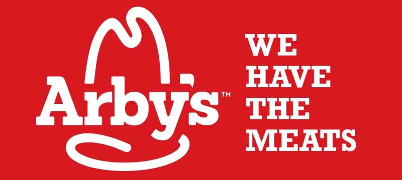
The Arby’s Logo History, Colors, Font, and Meaning
Ever gazed at the Arby’s logo and felt a nudge of nostalgia? That cowboy hat isn’t just a quirky cap—it’s the insignia of a brand that’s sizzled its way into America’s culinary psyche.
We’re all saturated with logos, right? But there’s a dance of design and symbolism where some just…stick.
You see them, you remember them—boom, you’re craving a roast beef sandwich. It’s no accident; it’s savvy visual branding at its best.
Dive in here, and we unravel the threads of this icon—a hat, sure, but also a beacon to fast food connoisseurs.
From graphic elements to marketing strategies, this isn’t merely about the emblem. It’s a peek behind the curtain of brand identity and corporate image that makes a trademark outshine its peers.
You’re in for the full reveal: the evolution, strategy, and why Arby’s cowboy hat is more than just part of the quick-service restaurant’s signage; it’s a lesson in holding the reins of brand recognition.
The Meaning Behind the Arby’s Logo
Reading Between the Lines
Let’s dive deep into the world of Arby’s logo, shall we?
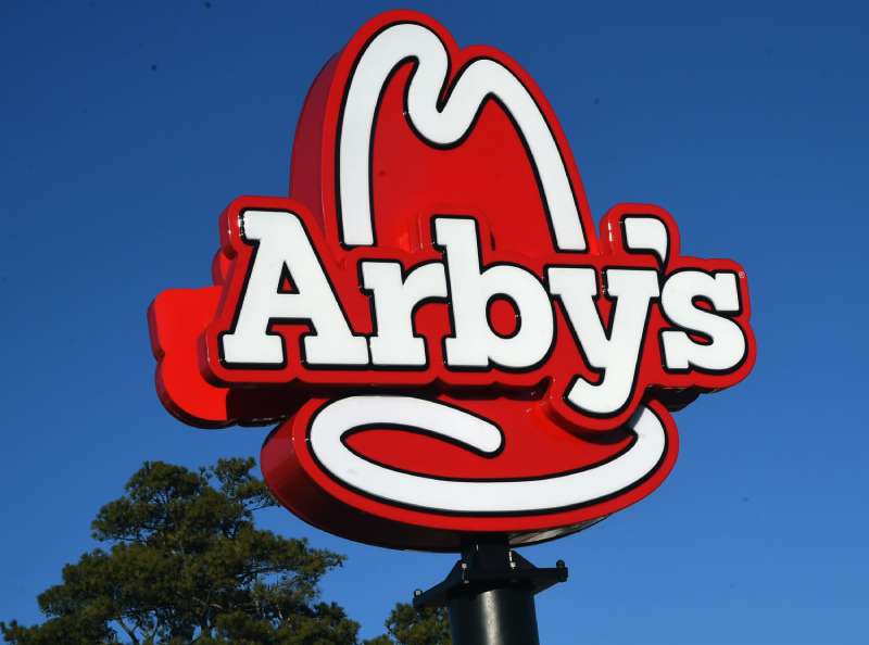
The logo, it’s more than just a fancy hat! The ten-gallon hat, my friends, is an iconic symbol of the American West. It screams freedom, adventure, and big open skies. So what’s Arby’s doing with it?
It’s all about that cowboy spirit, a homage to the roasts and sandwiches that are as hearty and adventurous as a cowboy riding the prairie. Now, that’s a meaning we can all sink our teeth into!
A Hidden Message?
Hold onto your seats, ’cause there’s more. Ever noticed how the hat’s brim and crown form the letter ‘A’? Yup, it’s an ‘A’ for Arby’s! A clever bit of design, wouldn’t you say?
The History of the Arby’s Logo
The Humble Beginnings
Once upon a time in 1964, the Arby’s logo was born. It started with a simple and bold sketch of a cowboy hat. Back then, it was all about standing out, showing that Arby’s was different, daring, a place for those who wanted something more than usual.
The Evolution
But as the world changed, so did the logo. In the 70s and 80s, the cowboy hat got a slick upgrade, with smoother lines and a more stylized look. And then in the 90s, the Arby’s name was added underneath in a bold, friendly font.
Fast forward to 2012, and the Arby’s logo underwent a major makeover. The hat got even sleeker, the Arby’s name got a new font, and a little slice of meat was added underneath. A neat little nod to their roast beef specialties!
The Colors of the Arby’s Logo
The Powerful Red
Let’s talk color. The logo is all about that bold red. Red, the color of passion, energy, and, of course, appetite. Nothing screams ‘delicious’ more than a fiery red, am I right?
The Calming White
And then there’s the white. Pure, clean, and fresh. It’s the perfect balance to the red, creating a design that’s both exciting and comfortable.
The Font Used in the Arby’s Logo
The Bold and the Beautiful
The font in the logo is bold, rounded, and friendly, just like their sandwiches! It’s all about making a statement while still feeling warm and inviting.
The Evolution of the Arby’s Logo
Adapting to the Times
With every decade, the Arby’s logo adapted. It kept its roots, but it wasn’t afraid to change with the times. It went from a simple cowboy hat to a stylized icon with a trendy font. A journey of growth and adaptation, just like Arby’s itself.
The 21st-Century Upgrade
The most recent changes in the Arby’s logo reflect the company’s dedication to innovation. The streamlined look and the slice of meat underline their focus on quality food and their commitment to the future.
The Impact of the Arby’s Logo
A Brand Identity
The Arby’s logo has played a huge role in creating the brand’s identity. It’s not just about a tasty sandwich, it’s about a feeling. A feeling of freedom, boldness, and fun. And that’s what the Arby’s logo brings to the table.
The Memorability Factor
Logos are all about being remembered, and the Arby’s logo does just that. Who could forget that big, bold cowboy hat or that fiery red color? It sticks in your mind, making you think of Arby’s every time you see a cowboy hat or the color red.
The Arby’s Logo in Popular Culture
Arby’s in Movies and TV
Have you ever noticed the Arby’s logo in a movie or TV show? It’s there, a quiet but strong presence. It’s become a part of our cultural landscape, a symbol of fast food and American lifestyle.
Arby’s in Social Media and Advertising
And let’s not forget social media and advertising! Arby’s has made clever use of their logo in online campaigns, using it to create a sense of familiarity and comfort. You see that logo, and you instantly know what you’re getting.
The Influence of the Arby’s Logo on Other Brands
Setting a Trend
The Arby’s logo has been a trendsetter in the world of fast-food branding. The use of a simple, bold symbol paired with vibrant colors has influenced many other brands to follow suit.
Creating a Template for Success
With its strong brand identity and its adaptability over the years, the logo has become a template for success. It’s a shining example of how a well-designed logo can help a brand stand out and evolve with the times.
FAQ On The Arby’s Logo
What’s the history behind the Arby’s logo?
The tale goes way back—1964 to be precise. The Raffel Brothers—that’s RBs, hence Arby’s—wanted a distinct mark. Enter the ten-gallon hat logo, a nod to the Wild West and big, bold flavors.
Over time, it’s been tweaked for a modern look. Yet, that hat remains the visual anchor. A slice of Americana served with a side of fries.
Has Arby’s logo always included a cowboy hat?
Sure as the day is long, the cowboy hat has been there since the get-go. It was their beacon of quick service restaurant nostalgia. They’ve played with the design, but at its core, the hat is the hero. It’s as iconic as the Cowboys in Dallas. Sometimes simplified, but never shelved.
Why did Arby’s choose a cowboy hat as their logo?
It was a stroke of genius. Cowboys? Symbolize frontier, open spaces, freedom. Meats swinging over an open flame? It’s a gastronomic rodeo, my friend.
The hat? It’s a bold promise—a fast-food joint not about burgers but roast beef sandwiches. And it clicked. A branding collateral masterpiece.
What does the Arby’s logo symbolize?
The cowboy hat? That business means more than just fast food—it’s an experience. A tip of the hat to quality and tradition in the fast food symbols noisy crowd. It’s Arby’s saying, “Pull over, friend. Get your fill of warmth and good old-fashioned hospitality.”
How often has the Arby’s logo changed?
Change is good, right? The logo has morphed a handful of times. Subtle tweaks mostly. They revamped in 2012, making it more graphic design friendly, 3D if you will. But they kept the trusty hat, because why mess with a classic?
Do people recognize the Arby’s brand just by the logo?
Oh, absolutely! The logo is burnt into the cultural identity of yesteryears and today. It’s not just about recognition; it’s brand loyalty. People see that hat, and they think “Arby’s”—now that’s staying power.
What importance does the Arby’s logo have in marketing?
In the circus of advertising campaigns, that hat is the ringmaster. It’s more than a mere sign; it’s a visual identity system—a silent salesman working 24/7. It carries the whole branding shebang on its brim. People see it; their mouths water. Marketing gold, my friend.
Can you explain the redesign of the Arby’s logo?
They said it was time for a new coat of polish. Kept the soul—the hat. But they infused modern branding vibes. Flatter, streamlined, ready for the digital age. A throwback yet forward-looking—a tricky balance, but hey, they nailed it.
How does the Arby’s logo affect customer perception?
Like a trusty lighthouse, the logo guides folks to safe harbor, or in this case, tasty eats. It speaks of a promise to deliver, not just fast food, but an authentic Arby’s encounter. It affects perception big time—signals quality and a brand that’s stood the test of time.
What’s the significance of red and white in the Arby’s logo?
Colors talk, ya know? Red screams passion and energy. Add white, and you get simplicity and purity. They’re like visual umami for the senses. In the realm of iconic brand images, red and white are like ketchup and mayo—classics that deliver every time.
Conclusion
So, we’re winding down our jaunt through the storied plains of the Arby’s logo. The hat that rode across billboards and right into our mealtime musings, huh? There’s the rub—a symbol pulling more than its weight, etching a brand into the landscape of fast food lore.
- It’s been a journey.
- One through trademark design, brand identity, and the cogs of marketing strategy that spin behind a successful logo.
We’ve seen how a simple graphic element manages to lasso customer loyalty, ensuring the Arby’s experience isn’t just a fleeting craving but a lasting impression.
In the dance of red and white, of tradition and modern flair, this logo goes beyond the realm of roast beef and curly fries. It’s an alchemy of sorts—brand recognition forged in the crucible of visual branding.
Remember, folks—it’s the stories that stick, and Arby’s cowboy hat has got yarns to spare. Keep your eyes peeled—the next time you spot that hat, you’ll be seeing a whole lot more than just a logo.
If you liked this article about the Arby’s logo, you should check out this article about the Subway logo.
There are also similar articles discussing the Pizza Hut logo, the Little Caesars logo, the Dairy Queen logo, and the Panda Express logo.
And let’s not forget about articles on the McDonald’s logo, the Shake Shack logo, the Domino’s Pizza logo, and the Chick-fil-A logo.
Bogdan Sandu, a seasoned designer with 15 years of diverse experience, has been designing websites since 2008.
Renowned for his expertise in logo design and visual branding, Bogdan has developed a multitude of logos for various clients.
His skills extend to creating posters, vector illustrations, business cards, and brochures. Additionally, Bogdan's UI kits were featured on marketplaces like Visual Hierarchy and UI8.
Latest posts by Bogdan Sandu (see all)
- Rainbow Color Palettes for Joyful Designs - 29 April 2024
- The Bethesda Logo History, Colors, Font, And Meaning - 28 April 2024
- Out of This World: Space Color Palettes for Cosmic Designs - 28 April 2024