Lora’s calligraphic elegance demands a partner that either complements its curves or provides sharp contrast. Get this wrong, and your design feels off. Get it right, and you create typography that actually works.
Lora font pairing isn’t about following generic rules. It’s about understanding how serif fonts interact with sans-serifs, how weight distribution affects readability, and which combinations actually hold up across screens and print.
This guide covers 30 proven pairings with Lora. You’ll see exactly which fonts work for headers versus body text, how to balance contrast without creating chaos, and real applications where these combinations excel.
Each pairing includes specific weight recommendations, readability considerations for web and print, and actual use cases. No theory without practice.
Lora Font Pairing
| Font Pairing | Best Use Case | Visual Contrast | Overall Character |
|---|---|---|---|
| Lora + Merriweather | Long-form reading, editorial content | Low (both serif) | Traditional, literary |
| Lora + Source Sans Pro | Professional websites, SaaS platforms | High (serif/sans) | Clean, modern, versatile |
| Lora + Roboto | Tech blogs, mobile-first designs | High (serif/sans) | Contemporary, approachable |
| Lora + Ubuntu | Open-source projects, community sites | High (serif/sans) | Friendly, humanist |
| Lora + Alegreya | Literary magazines, book reviews | Low (both serif) | Scholarly, elegant |
| Lora + Nunito | Children’s content, educational sites | High (serif/sans) | Playful, rounded, warm |
| Lora + Montserrat | Fashion blogs, lifestyle brands | High (serif/sans) | Geometric, sophisticated |
| Lora + Open Sans | Corporate websites, documentation | High (serif/sans) | Neutral, highly legible |
| Lora + Poppins | Startups, creative portfolios | High (serif/sans) | Modern, geometric, bold |
| Lora + Cinzel | Luxury brands, historical content | Medium (both serif) | Classical, prestigious |
| Lora + Open Sans Condensed | News sites, data-heavy layouts | High (serif/sans) | Compact, efficient |
| Lora + Fjalla One | Sports blogs, bold headlines | Very High (serif/sans) | Strong, condensed, impactful |
| Lora + Istok Web | Technical documentation, wikis | High (serif/sans) | Simple, straightforward |
| Lora + Nunito Sans | UI design, mobile apps | High (serif/sans) | Balanced, friendly |
| Lora + Lustria | Poetry sites, fine print publications | Low (both serif) | Delicate, refined |
| Lora + Raleway | Design agencies, portfolios | High (serif/sans) | Elegant, thin, stylish |
| Lora + Work Sans | Professional blogs, agencies | High (serif/sans) | Professional, optimized |
| Lora + Mulish | Modern interfaces, web apps | High (serif/sans) | Contemporary, minimalist |
| Lora + Plus Jakarta Sans | Indonesian market, global brands | High (serif/sans) | International, versatile |
| Lora + Proxima Nova | Premium brands, marketing sites | High (serif/sans) | Polished, professional |
| Lora + Söhne | German brands, European content | High (serif/sans) | Precise, systematic |
| Lora + FK Screamer | Music sites, event promotions | Very High (serif/display) | Expressive, loud, bold |
| Lora + Mariposa Sans | Art galleries, cultural sites | High (serif/sans) | Artistic, organic |
| Lora + Archivo Black | Editorial headlines, magazines | Very High (serif/sans) | Heavy, dramatic, strong |
| Lora + Oswald | News headers, landing pages | Very High (serif/sans) | Condensed, authoritative |
| Lora + Dancing Script | Wedding sites, invitations | Very High (serif/script) | Casual, handwritten, personal |
| Lora + Playfair Display | High-end editorial, fashion | Medium (both serif) | Transitional, luxurious |
| Lora + Quattrocento | Academic journals, books | Low (both serif) | Classic, bookish |
| Lora + Cardo | Philosophy blogs, theology sites | Low (both serif) | Scholarly, old-style |
| Lora + Sacramento | Creative projects, personal blogs | Very High (serif/script) | Flowing, decorative, artistic |
Lora + Merriweather
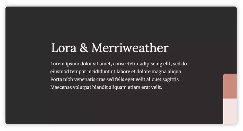
Two serif fonts from the calligraphic family create unexpected harmony. Both were designed specifically for screen readability, making this combination particularly effective for digital publishing.
Pairing Characteristics
The brushed curves of Lora complement Merriweather’s slightly condensed letterforms. Both share similar x-heights and moderate contrast, creating visual consistency while maintaining distinct personalities through their serif treatments.
Best Use Cases
Long-form editorial content where both fonts work as body text alternatives. Literary blogs and online magazines benefit from switching between these two for different article sections. Digital publications that need traditional aesthetics with modern legibility.
Weight & Style Combinations
Lora Regular paired with Merriweather Bold creates effective headers. Merriweather Black works for attention-grabbing headlines while Lora Italic adds emphasis within paragraphs without disrupting reading rhythm.
Readability Considerations
Both fonts maintain readability at smaller sizes (14px and up). Leading should be generous, around 1.6-1.8 line height. The similar stroke weights prevent jarring transitions when alternating between fonts in complex layouts.
Design Examples
News websites featuring opinion pieces alongside reporting. Academic journals that need professional appearance with comfortable reading experience. Recipe blogs where ingredients and instructions require different typographic voices.
Lora + Source Sans Pro

A classic serif meets Adobe’s first open-source typeface. Source Sans Pro’s humanist qualities soften Lora’s formality, creating approachable yet sophisticated designs.
Pairing Characteristics
Lora’s calligraphic serifs contrast beautifully with Source Sans Pro’s neutral geometric forms. The weight distribution differs enough to establish clear visual hierarchy while sharing similar x-heights for smooth reading flow.
Best Use Cases
User interface design where headers need elegance but body text requires maximum clarity. Corporate websites balancing professionalism with accessibility. Educational platforms combining authority with approachability.
Weight & Style Combinations
Lora Bold for section headers pairs with Source Sans Pro Regular for body text. Source Sans Pro Semibold works for subheadings. Lora Italic provides emphasis without requiring font weight changes.
Readability Considerations
Source Sans Pro’s larger apertures improve on-screen legibility at any size. Pair with Lora at slightly larger sizes (16px minimum) for body text. Generous font spacing prevents crowding in dense content layouts.
Design Examples
SaaS product documentation and help centers. Professional portfolios for consultants and agencies. Educational course materials requiring sustained reading across multiple screen sizes.
Lora + Roboto

Google’s system font meets Cyreal’s calligraphic serif. This pairing brings together two of the web’s most optimized typefaces for digital reading experiences.
Pairing Characteristics
Roboto’s mechanical skeleton contrasts with Lora’s organic curves. The geometric sans-serif font provides stability while the serif adds warmth. Both fonts share excellent hinting for crisp rendering across devices.
Best Use Cases
Android applications needing both functionality and personality. Blog templates requiring maximum versatility. Web platforms with heavy text content where performance matters as much as aesthetics.
Weight & Style Combinations
Roboto Medium or Bold for headlines with Lora Regular for paragraphs. Roboto Light works for captions when paired with Lora Italic for quotes. The extensive weight options in both families offer flexibility.
Readability Considerations
Both fonts render exceptionally well on mobile screens. Roboto’s wider letterforms complement Lora’s slightly condensed design. Line length should stay under 75 characters for Lora body text to maintain readability.
Design Examples
Technology blogs and product reviews. Mobile-first news applications. Cross-platform design systems requiring consistent typography across web and native apps.
Lora + Ubuntu

Canonical’s signature font paired with calligraphic elegance. Ubuntu’s technical precision balances Lora’s artistic qualities for designs that feel both modern and considered.
Pairing Characteristics
Ubuntu’s humanist approach softens its technical roots while Lora adds sophistication. Both fonts feature generous x-heights but different character widths, creating natural contrast without conflict.
Best Use Cases
Tech company blogs and documentation. Open-source project websites. Developer portfolios combining technical credibility with design sensibility.
Weight & Style Combinations
Ubuntu Medium for navigation and headers pairs with Lora Regular for content. Ubuntu Bold creates strong calls-to-action. Lora Italic works for technical terminology or quotes without switching font families entirely.
Readability Considerations
Ubuntu’s distinct letterforms prevent confusion between similar characters (Il1, O0). Lora complements this clarity in longer passages. Both work well with generous tracking for improved legibility.
Design Examples
Software company marketing sites. Technical writing platforms. Design tool documentation combining instructions with expressive content.
Lora + Alegreya

Two typefaces from the same design philosophy create harmonious combinations. Both feature calligraphic roots but serve different purposes in layout hierarchy.
Pairing Characteristics
Alegreya’s dynamic italic contrasts with Lora’s more reserved design. Both share Renaissance-era calligraphic influences but Alegreya brings higher contrast and more dramatic strokes. The pairing feels cohesive while offering clear distinction.
Best Use Cases
Literary magazines and book design. Cultural institution websites. Art gallery online exhibitions where typography carries significant aesthetic weight.
Weight & Style Combinations
Alegreya Black for dramatic headlines with Lora Regular for body text. Alegreya Italic provides expressive subheadings. Lora Bold works for pull quotes maintaining readability at larger sizes.
Readability Considerations
Both fonts benefit from generous line height (1.7-2.0) due to their tall ascenders. Alegreya’s small caps variant pairs beautifully with Lora for sophisticated typographic detailing. Consider larger base sizes (17-18px) for extended reading.
Design Examples
Literary journals and poetry publications. Museum exhibition catalogs. Premium branding materials for cultural organizations.
Lora + Nunito
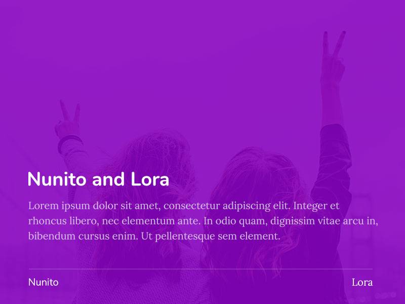
Rounded terminals meet calligraphic serifs. This pairing combines approachability with elegance, perfect for designs needing both warmth and authority.
Pairing Characteristics
Nunito’s soft geometry contrasts with Lora’s traditional structure. Where curves meet, they complement rather than compete. Nunito’s rounded terminals echo Lora’s brushed curves, creating subtle visual connections.
Best Use Cases
Healthcare and wellness websites. Educational platforms for younger audiences. Lifestyle brands balancing professionalism with personality.
Weight & Style Combinations
Nunito Bold or ExtraBold for headers with Lora Regular for body. Nunito Light works for captions. Nunito Sans variant offers tighter spacing options for compact layouts paired with Lora.
Readability Considerations
Nunito’s rounded forms work at smaller sizes while Lora needs 15px minimum. Both fonts handle generous letter spacing well. The combination remains friendly at any scale without becoming childish.
Design Examples
Parenting blogs and family-focused content. Mental health resources and wellness apps. Children’s book publishers and educational toy companies.
Lora + Montserrat

Urban geometry meets Old World elegance. Montserrat’s geometric precision balances Lora’s organic qualities for designs that feel both modern and timeless.
Pairing Characteristics
Montserrat’s wide letterforms provide stark contrast to Lora’s more condensed design. The geometric sans-serif offers clarity while the serif adds refinement. Different stroke patterns create visual interest without chaos.
Best Use Cases
Fashion and lifestyle blogs. Creative agency portfolios. Boutique e-commerce sites requiring both style and substance.
Weight & Style Combinations
Montserrat Light or ExtraLight for minimal headers with Lora Regular for content. Montserrat Bold creates impact for calls-to-action. Alternates include Montserrat Subrayada for unique display needs.
Readability Considerations
Montserrat requires careful kerning at display sizes. Lora’s moderate contrast complements Montserrat’s uniform stroke weight. Both fonts scale well but serve different size ranges effectively.
Design Examples
Online magazines covering design and culture. Minimalist design portfolios. Premium product pages for fashion and accessories.
Lora + Open Sans

Two of the web’s most popular fonts create surprisingly fresh combinations. Open Sans’s neutral personality lets Lora’s character shine without competition.
Pairing Characteristics
Open Sans lives up to its name with open apertures and excellent screen optimization. Lora adds personality without overwhelming. The neutral versus expressive dynamic creates effective hierarchy naturally.
Best Use Cases
Corporate blogs and company news sections. Government and nonprofit websites. Any project requiring broad accessibility combined with visual interest.
Weight & Style Combinations
Open Sans Semibold for headers with Lora Regular for articles. Open Sans Light works for metadata and captions. Lora Bold creates section headers within long-form content.
Readability Considerations
Both fonts were designed for optimal screen rendering. Open Sans works at any size while Lora shines at 16px and above. This pairing handles poor rendering conditions better than more delicate combinations.
Design Examples
University websites and academic publications. Professional services brochures and annual reports. Accessible government portals requiring WCAG compliance.
Lora + Poppins
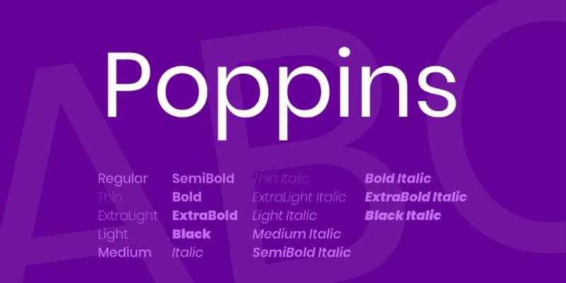
Geometric modernity meets calligraphic tradition. This pairing works especially well for international audiences thanks to Poppins’s Devanagari support and Lora’s Latin/Cyrillic coverage.
Pairing Characteristics
Poppins’s pure geometric forms contrast dramatically with Lora’s organic serifs. The circular forms in Poppins echo Lora’s curved strokes, creating visual harmony despite structural differences. Both fonts feature consistent rhythm across weights.
Best Use Cases
Startup landing pages and tech products. Modern editorial designs. International brands requiring multi-script typography.
Weight & Style Combinations
Poppins Bold or SemiBold for headers with Lora Regular for body. Poppins Light creates airy navigation elements. Lora Italic adds emphasis without requiring weight changes.
Readability Considerations
Poppins’s wide letterforms require more horizontal space. Lora’s condensed design works well in constrained layouts. Together they create balanced pages without feeling cramped or wasteful of space.
Design Examples
Mobile applications with mixed content types. Design tool interfaces. Social media management platforms balancing data and storytelling.
Lora + Cinzel
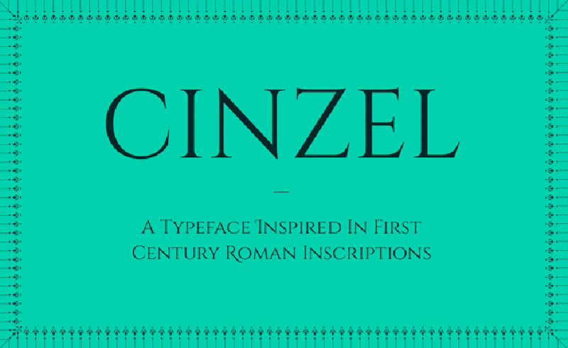
Roman classical design meets contemporary calligraphy. This all-caps display font brings gravitas when paired with Lora’s refined body text capabilities.
Pairing Characteristics
Cinzel’s Roman inscriptional capitals provide monumental headers while Lora handles readable text. The classical proportions in both fonts create unexpected synchronicity despite their different purposes.
Best Use Cases
Luxury brand websites. Event invitations and formal announcements. Architecture and design studio portfolios.
Weight & Style Combinations
Cinzel Bold or Black for titles with Lora Regular for descriptions. Use Cinzel sparingly (headers only) while Lora carries content load. Cinzel Decorative variant offers even more impact for special occasions.
Readability Considerations
Cinzel works only at display sizes (36px+). Lora must handle all body text. The strong contrast in purpose prevents confusion. Generous white space is essential for this dramatic pairing.
Design Examples
Wine and spirits brands. Luxury real estate marketing. Museum exhibition materials and gallery invitations.
Lora + Open Sans Condensed
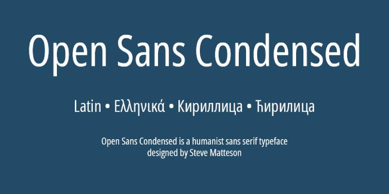
The condensed variant adds urgency to Open Sans’s neutral personality. Paired with Lora, this combination works for space-constrained designs requiring both impact and readability.
Pairing Characteristics
Open Sans Condensed’s narrow letterforms create vertical emphasis while Lora provides comfortable reading width. The condensed variant feels more urgent than the regular Open Sans, adding energy to layouts.
Best Use Cases
News websites with dense information. Magazine layouts with tight column grids. Data-heavy dashboards needing both charts and article content.
Weight & Style Combinations
Open Sans Condensed Bold for headlines with Lora Regular for articles. The condensed variant provides maximum impact per horizontal inch. Lora Italic breaks up dense text blocks.
Readability Considerations
The condensed font requires larger sizes for comfortable reading (16px minimum). Lora’s standard width provides relief from visual tension. Alignment must be precise to prevent ragged edges.
Design Examples
Sports news websites. Financial publications with data visualizations. Magazine-style blogs with sidebar content competing for attention.
Lora + Fjalla One
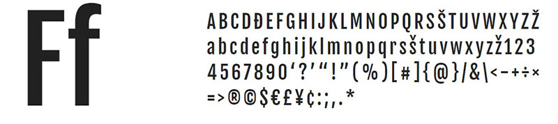
Scandinavian display strength meets calligraphic refinement. This pairing brings Nordic design sensibility to traditional serif typography.
Pairing Characteristics
Fjalla One’s condensed sans-serif creates powerful headers while Lora provides elegant body text. The extreme contrast in personality works because both fonts maintain excellent legibility in their respective roles.
Best Use Cases
Fitness and sports brands. Architectural project presentations. Product packaging design requiring bold shelf presence.
Weight & Style Combinations
Fjalla One (single weight) for all display needs with Lora Regular for descriptions. Lora Bold works for subheadings when Fjalla One proves too strong. The pairing requires no additional weights.
Readability Considerations
Fjalla One’s condensed forms demand large sizes (48px+). Lora handles everything smaller gracefully. The stark weight difference creates instant hierarchy without requiring careful size calculations.
Design Examples
Athletic wear brands. Construction and development firms. Energy drink and performance supplement packaging.
Lora + Istok Web
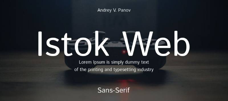
Russian design meets calligraphic elegance. This underutilized pairing brings fresh perspective to web typography.
Pairing Characteristics
Istok Web’s geometric structure with subtle humanist touches complements Lora’s warmth. Both fonts share development history focused on screen optimization, making them natural technical partners despite stylistic differences.
Best Use Cases
International tech companies. Multilingual publications. Projects requiring Cyrillic and Latin script support.
Weight & Style Combinations
Istok Web Bold for headers with Lora Regular for content. Both fonts offer extensive language support. Lora Italic provides emphasis while maintaining consistent character throughout texts.
Readability Considerations
Istok Web’s loose tracking suits wide layouts. Lora’s tighter spacing works in narrow columns. Together they adapt to various layout constraints without requiring constant adjustment.
Design Examples
Eastern European company websites. International news platforms. Technology documentation requiring multiple language support.
Lora + Nunito Sans
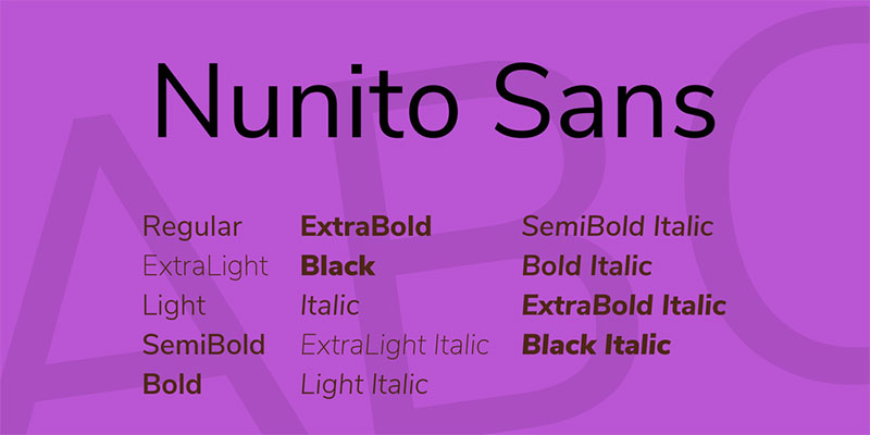
The sans-serif sibling offers different personality than rounded Nunito. This pairing provides cleaner, more modern feel while maintaining approachability.
Pairing Characteristics
Nunito Sans’s straighter letterforms contrast more sharply with Lora than rounded Nunito does. The resulting combination feels more professional while retaining friendliness through shared proportions.
Best Use Cases
Corporate internal communications. HR and recruitment websites. Professional services requiring approachable yet authoritative presence.
Weight & Style Combinations
Nunito Sans SemiBold for headers with Lora Regular for body. The extensive weight range (ExtraLight through Black) offers flexibility for complex information hierarchies.
Readability Considerations
Nunito Sans’s wider letterforms pair better with generous line length. Lora works in tighter spaces. Both handle small sizes well (14px+) making them suitable for compact layouts.
Design Examples
Employee handbooks and training materials. Professional networking platforms. Business coaching and consulting websites.
Lora + Lustria
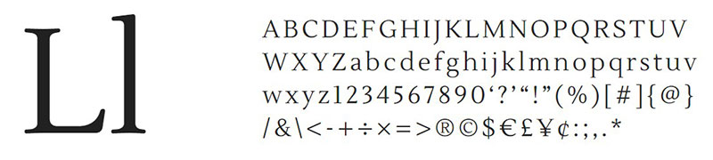
Two display-oriented serifs create sophisticated combinations when used strategically. Both fonts demand space and attention.
Pairing Characteristics
Lustria’s rounded serifs soften its geometric foundation while Lora brings calligraphic movement. Despite both being serifs, their different approaches to letterforms prevent redundancy.
Best Use Cases
Editorial designs with multiple hierarchy levels. Restaurant menus and hospitality branding. Craft and artisan product packaging.
Weight & Style Combinations
Lustria (single weight) for main headlines with Lora Regular for body and Lora Bold for subheadings. Lora’s weight variations compensate for Lustria’s single weight offering.
Readability Considerations
Both fonts prefer larger sizes. Lustria works at 18px minimum while Lora handles standard body sizes. Line height should be generous (1.7+) to prevent descenders from crowding ascenders.
Design Examples
Farm-to-table restaurant branding. Craft brewery websites. Artisan marketplace platforms and boutique hotel marketing.
Lora + Raleway
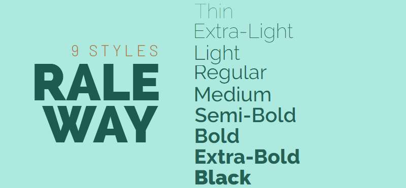
Elegant thin weights meet calligraphic detail. This pairing works beautifully for minimalist designs requiring subtle sophistication.
Pairing Characteristics
Raleway’s geometric elegance provides clean headers while Lora adds warmth to body text. The contrast between Raleway Thin/ExtraLight and Lora Regular creates visual interest without requiring bold weights.
Best Use Cases
Fashion editorial and lookbooks. Minimalist design portfolios. Spa and wellness center branding.
Weight & Style Combinations
Raleway Thin or ExtraLight for large display text with Lora Regular for content. Raleway Medium works for navigation. The wide weight range allows precise hierarchy control.
Readability Considerations
Raleway’s thin weights require large sizes (48px+) and careful color choices. Lora handles smaller text comfortably. High contrast between text and background essential for the delicate Raleway weights.
Design Examples
High-end fashion brand campaigns. Photography portfolio websites. Meditation and mindfulness app interfaces.
Lora + Work Sans
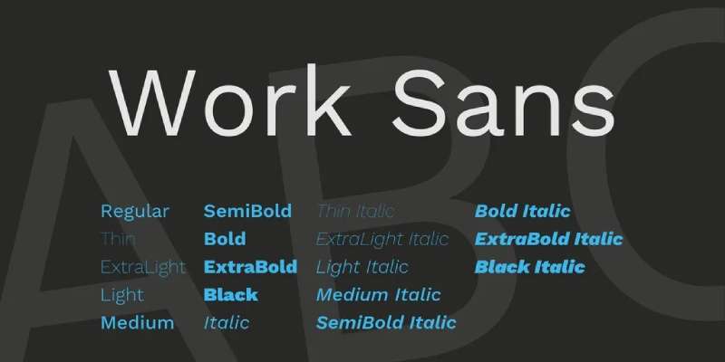
Grotesque revival meets calligraphic tradition. Work Sans brings early 1900s advertising energy to contemporary digital designs.
Pairing Characteristics
Work Sans’s slightly quirky personality balances Lora’s refinement. The semi-geometric structure provides clear contrast while shared humanist qualities create cohesion.
Best Use Cases
Creative agency websites. Independent publisher branding. Arts and culture organization materials.
Weight & Style Combinations
Work Sans Medium or SemiBold for headers with Lora Regular for body. Work Sans Black creates dramatic display type when needed. Lora Italic adds emphasis without switching families.
Readability Considerations
Work Sans works across all sizes but shines in headers. Lora prefers body text roles. Both fonts handle generous spacing well, allowing flexible layout adjustments.
Design Examples
Indie bookstore websites. Theater and performing arts marketing. Design conference materials and event branding.
Lora + Mulish
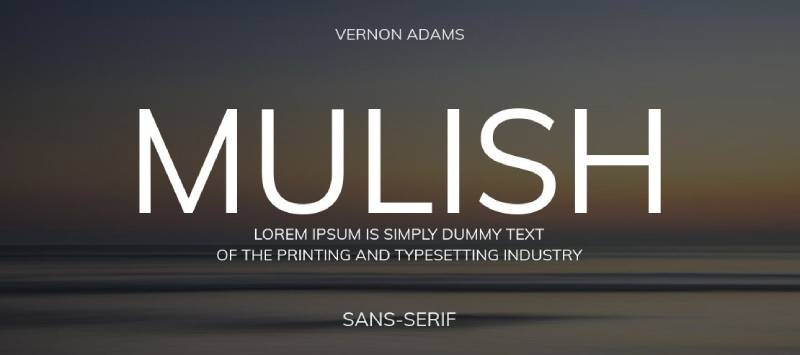
Contemporary minimalism meets traditional elegance. Mulish’s neutral geometry lets Lora’s personality define brand character.
Pairing Characteristics
Mulish’s subtle quirks in otherwise minimal design complement Lora’s more expressive serifs. The pairing feels modern without cold minimalism typical of purely geometric sans-serif fonts.
Best Use Cases
Startup branding and pitch decks. Modern editorial designs. Clean e-commerce interfaces.
Weight & Style Combinations
Mulish Bold for headers with Lora Regular for content. Mulish’s extensive weight range (ExtraLight through Black) offers flexibility. Lora Italic provides necessary emphasis.
Readability Considerations
Both fonts optimize for screen with excellent hinting. Mulish handles small UI text while Lora works for article content. The pairing scales across devices without requiring separate font stacks.
Design Examples
SaaS product interfaces. Tech startup marketing sites. Modern magazine platforms and content aggregators.
Lora + Plus Jakarta Sans
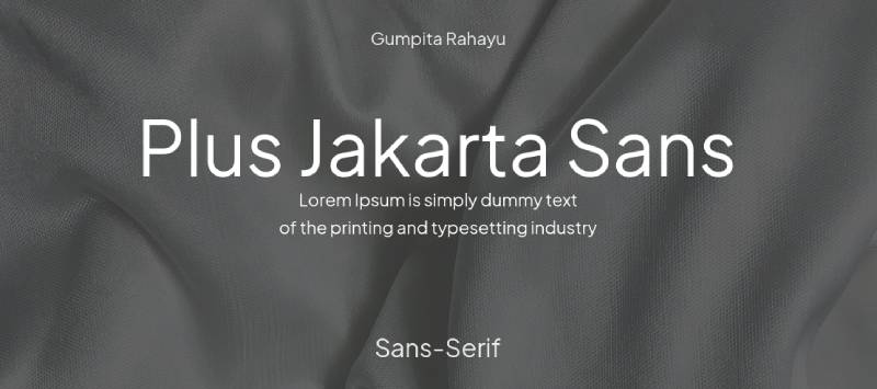
Indonesian-inspired geometry meets calligraphic serifs. This pairing brings international design sensibility to web projects.
Pairing Characteristics
Plus Jakarta Sans’s geometric foundation with humanist warmth balances Lora’s traditional elegance. The rounded terminals in Plus Jakarta echo Lora’s curved strokes, creating subtle visual harmony.
Best Use Cases
International brand websites. Modern editorial platforms. Projects requiring contemporary feel with readable body text.
Weight & Style Combinations
Plus Jakarta Sans Bold for headers with Lora Regular for articles. The extensive weight range (ExtraLight through ExtraBold) provides hierarchy flexibility.
Readability Considerations
Plus Jakarta Sans works at any size while Lora prefers 15px minimum for body text. Both fonts handle mixed language content well, making them suitable for international audiences.
Design Examples
Tech company blogs with global audiences. Modern news platforms. International nonprofit organization websites.
Lora + Proxima Nova
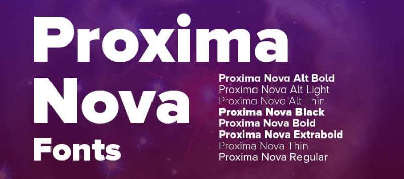
Mark Simonson’s modern classic meets Cyreal’s calligraphic serif. This commercial font pairing (Proxima Nova requires licensing) delivers premium results.
Pairing Characteristics
Proxima Nova’s refined geometry and multiple widths pair beautifully with Lora’s elegance. The commercial font’s superior spacing and optical corrections justify its cost when paired thoughtfully.
Best Use Cases
Corporate identity systems. Premium brand websites. Publication design requiring typographic sophistication.
Weight & Style Combinations
Proxima Nova Semibold for headers with Lora Regular for body. Proxima Nova Condensed variants offer space-saving options. The extensive family allows precise typographic control.
Readability Considerations
Both fonts represent best-in-class design for their categories. Proxima Nova’s exceptional kerning pairs with Lora’s careful spacing. Professional-level typography without extensive customization.
Design Examples
Fortune 500 company annual reports. High-end brand style guides. Premium publication redesigns requiring typographic excellence.
Lora + Söhne
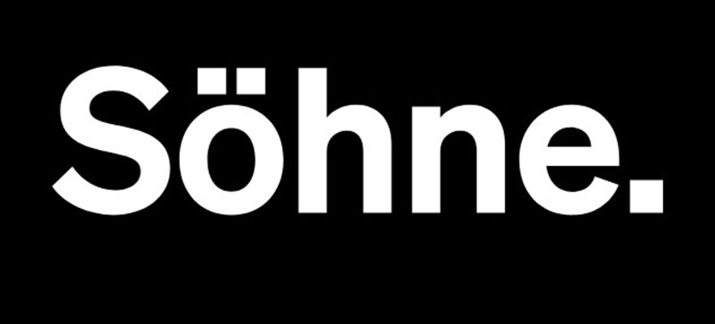
Minimalist sans-serif meets calligraphic detail. This pairing balances austere modernity with accessible warmth.
Pairing Characteristics
Söhne’s neutral geometry provides clean structure while Lora adds necessary personality. The contrast between mechanical precision and organic curves creates dynamic layouts.
Best Use Cases
Tech-forward editorial designs. Modern institutional websites. Projects balancing data presentation with storytelling.
Weight & Style Combinations
Söhne for all UI elements and headers with Lora for article content. The pairing creates clear distinction between interface and content.
Readability Considerations
Söhne’s tight spacing suits headers while Lora’s more generous spacing works for body text. Both fonts maintain clarity across devices despite different spacing philosophies.
Design Examples
Think tank and research institute websites. Modern news platforms. Digital-first publishing companies.
Lora + FK Screamer
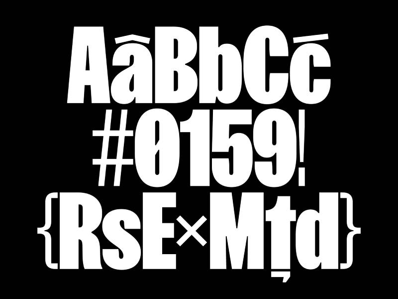
Bold display energy meets refined elegance. This unconventional pairing creates memorable designs for brave clients.
Pairing Characteristics
FK Screamer’s loud personality demands attention for headlines while Lora provides calming influence for body content. The extreme contrast in temperament works when hierarchy is crystal clear.
Best Use Cases
Music and entertainment industry websites. Youth-oriented brands. Creative projects demanding maximum personality.
Weight & Style Combinations
FK Screamer for major headlines only with Lora Regular handling all other text needs. No middle ground exists between these extremes, which simplifies rather than complicates hierarchy decisions.
Readability Considerations
FK Screamer works only at large sizes (60px+). Lora must carry entire content load. The pairing requires confident design choices and cannot hedge between personalities.
Design Examples
Music festival posters and websites. Alternative lifestyle brands. Podcast cover art and promotional materials.
Lora + Mariposa Sans
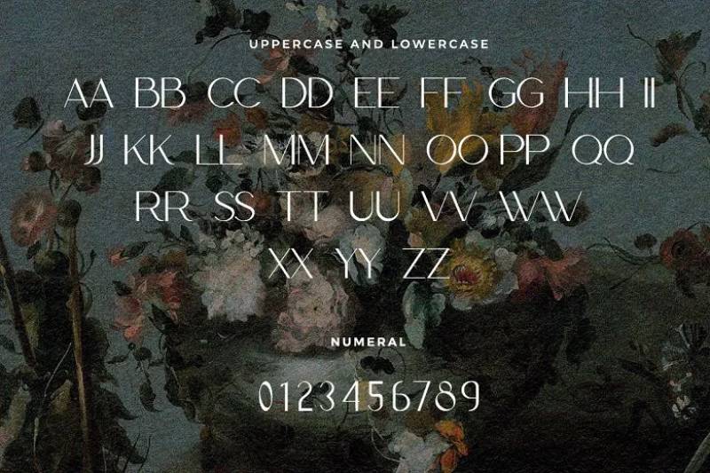
Contemporary sans-serif with personality meets established elegance. This pairing balances modern trends with proven readability.
Pairing Characteristics
Mariposa Sans brings contemporary design language while Lora anchors the pairing in tradition. The combination feels current without chasing trends.
Best Use Cases
Fashion and lifestyle brands. Design-conscious businesses. Modern editorial platforms requiring personality.
Weight & Style Combinations
Mariposa Sans for headers and UI elements with Lora for articles and descriptions. The pairing works across digital and print applications without requiring substitutions.
Readability Considerations
Both fonts optimize for screen but Lora brings print-proven reading comfort. The combination works equally well in web design and printed materials.
Design Examples
Contemporary fashion brand campaigns. Design agency portfolios. Lifestyle magazine websites and applications.
Lora + Archivo Black
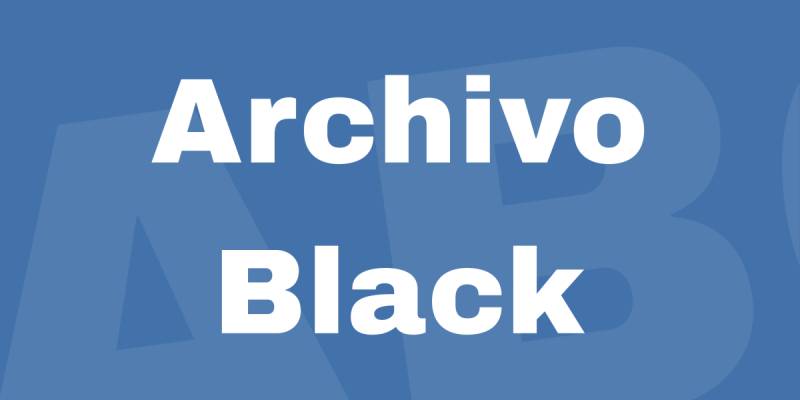
Maximum impact meets readable body text. This pairing brings advertising poster energy to digital designs.
Pairing Characteristics
Archivo Black’s heavy weight creates powerful headers while Lora provides elegant contrast. The extreme weight difference establishes instant hierarchy.
Best Use Cases
Sports and fitness brands. Bold marketing campaigns. Projects requiring immediate visual impact.
Weight & Style Combinations
Archivo Black for all headers with Lora Regular for body content. No intermediate weights needed as the contrast is the point. Lora Bold can work for subheadings when necessary.
Readability Considerations
Archivo Black demands large sizes and generous spacing. Lora handles everything else. The pairing prevents subtle hierarchy mistakes through obvious weight differences.
Design Examples
Athletic brand marketing. Event promotion materials. Campaign landing pages requiring maximum conversion focus.
Lora + Oswald
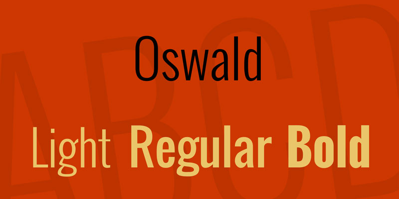
Condensed sans-serif power meets calligraphic refinement. This popular pairing balances strong headlines with comfortable body text.
Pairing Characteristics
Oswald’s tall, narrow letterforms create vertical emphasis while Lora’s standard proportions provide reading comfort. The condensed versus regular width contrast creates clear visual separation.
Best Use Cases
News websites and blogs. Magazine layouts with column grids. Content-heavy platforms requiring space efficiency.
Weight & Style Combinations
Oswald Medium or Bold for headlines with Lora Regular for articles. Oswald’s narrow width allows larger point sizes in constrained spaces paired with standard Lora body text.
Readability Considerations
Oswald requires careful size selection to prevent feeling cramped. Lora’s comfortable proportions balance Oswald’s tension. Line length limits more important with this pairing than most.
Design Examples
Sports journalism sites. News aggregation platforms. Political commentary blogs with frequent updates.
Lora + Dancing Script
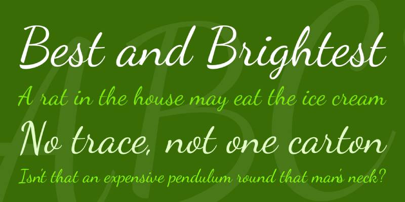
Formal script meets sophisticated serif. This pairing requires restraint but rewards careful use with elegant results.
Pairing Characteristics
Dancing Script’s casual energy contrasts with Lora’s refinement. The script provides personality for headers while serif maintains authority for content. Both share calligraphic roots from different traditions.
Best Use Cases
Wedding invitations and event materials. Personal brand websites. Projects where personality outweighs corporate neutrality.
Weight & Style Combinations
Dancing Script Bold for short headlines with Lora Regular for body text. Use script sparingly to prevent the design from feeling amateurish. Lora carries the sophistication load.
Readability Considerations
Dancing Script works only for short phrases (1-5 words). Lora must handle all actual reading. Color and size choices critical to prevent script from overwhelming.
Design Examples
Event invitation suites. Personal blog headers. Creative professional brand materials requiring distinctive personality.
Lora + Playfair Display

Two display serifs create luxurious combinations when handled carefully. Both fonts bring strong personalities requiring thoughtful application.
Pairing Characteristics
Playfair Display’s high contrast and strong vertical stress differ from Lora’s moderate contrast and calligraphic flow. The pairing works because each font occupies distinct size ranges.
Best Use Cases
Editorial design and publishing. Luxury brand marketing. Projects where typography itself becomes the design.
Weight & Style Combinations
Playfair Display Bold or Black for major headlines with Lora Regular for body content. Playfair Display Italic creates dramatic subheadings. Avoid using both fonts at similar sizes.
Readability Considerations
Playfair Display demands large sizes (36px+) where its high contrast shines. Lora handles body sizes comfortably. Clear size separation prevents competition between these strong personalities.
Design Examples
Magazine mastheads and feature articles. Luxury product catalogs. Premium brand style guides and marketing materials.
Lora + Quattrocento
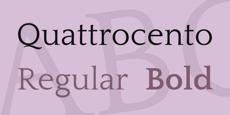
Renaissance-inspired serifs create sophisticated editorial combinations. Both fonts reference classical letterforms with contemporary clarity.
Pairing Characteristics
Quattrocento’s sturdy structure complements Lora’s more delicate calligraphic details. Both bring historical references but serve different functions in hierarchy.
Best Use Cases
Literary publications. Academic journals. Cultural institution materials.
Weight & Style Combinations
Quattrocento for headlines with Lora for body text, or vice versa depending on desired tone. Both fonts work in either role. Quattrocento Sans variant offers additional pairing flexibility.
Readability Considerations
Both fonts optimize for extended reading. Generous leading (1.7+) recommended. The similar baseline proportions allow switching fonts between sections without disrupting reading rhythm.
Design Examples
Literary magazine websites. University press publications. Museum exhibition catalogs and cultural organization materials.
Lora + Cardo
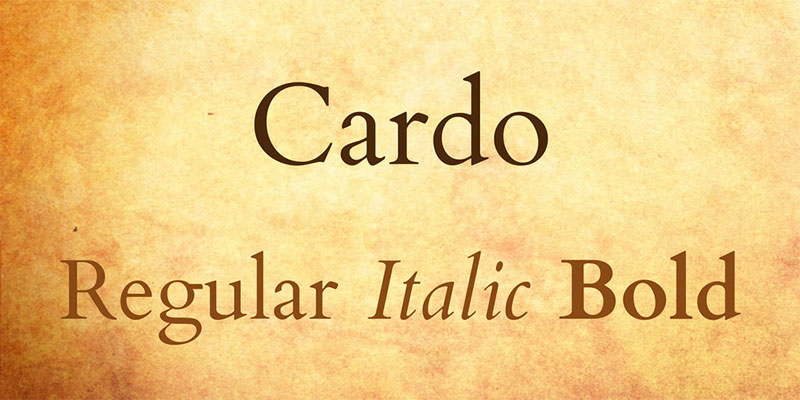
Scholarly serif meets contemporary calligraphy. This pairing brings academic credibility with modern accessibility.
Pairing Characteristics
Cardo’s classical design for academic texts pairs surprisingly well with Lora’s modern interpretation of calligraphic tradition. Both fonts handle extended reading while bringing distinct personalities.
Best Use Cases
Academic publications. Religious and classical texts. Literary analysis and criticism platforms.
Weight & Style Combinations
Cardo for body text with Lora Bold for section headers, or swap depending on primary content needs. Cardo Italic provides emphasis while maintaining scholarly tone.
Readability Considerations
Cardo designed specifically for scholarly texts with extensive diacritics. Lora complements with excellent language support. Both fonts prefer larger sizes (16px+) for comfortable sustained reading.
Design Examples
Digital editions of classical texts. Academic conference materials. Theological seminary publications and scholarly journals.
Lora + Sacramento
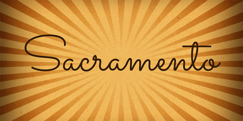
Monolinear script meets calligraphic serif. This feminine pairing requires delicate touch but creates distinctive results.
Pairing Characteristics
Sacramento’s flowing letterforms provide decorative energy while Lora maintains readability. The monoline script contrasts with Lora’s varying stroke widths, creating visual interest through structural difference.
Best Use Cases
Wedding and event materials. Personal branding for creative professionals. Projects targeting feminine aesthetic sensibility.
Weight & Style Combinations
Sacramento (single weight) for short display lines with Lora Regular for all content. Lora Bold can substitute for headers when script feels inappropriate. Keep script usage minimal.
Readability Considerations
Sacramento works only for brief phrases. Lora handles all sustained reading. The script requires careful color psychology and sizing to prevent appearing amateurish or dated.
Design Examples
Wedding stationery and websites. Feminine lifestyle blog headers. Artisan product packaging with personal touch.
FAQ on Lora Font Pairing
What fonts pair best with Lora?
Sans-serif fonts like Open Sans, Roboto, and Montserrat create classic contrast. Source Sans Pro works for user interfaces. Nunito adds warmth while Poppins brings geometric precision. The key is balancing Lora’s calligraphic elegance with cleaner heading fonts.
Can I use Lora for headings?
Yes. Lora works beautifully for headings, especially in Bold weight. Use it at 24px minimum for headers. Pair with geometric sans-serifs like Roboto or Montserrat for body text to maintain readability and establish clear visual hierarchy throughout your design.
Is Lora good for body text?
Absolutely. Lora was designed for extended reading on screens and print. Use 16px minimum with 1.6-1.8 line height. The brushed curves and moderate contrast maintain readability while adding personality. Works best with clean sans-serif headings.
What’s the best Lora pairing for websites?
Lora plus Open Sans delivers proven web performance. Both fonts optimize for screen rendering across devices. Open Sans handles UI elements and navigation while Lora manages article content. This combination appears on thousands of professional websites for good reason.
How do I pair Lora with display fonts?
Use restraint. Pair Lora with bold display fonts like Archivo Black or Fjalla One only for headers. Keep display fonts at 48px+ and limit to short phrases. Let Lora handle all body text and longer content where readability matters most.
Does Lora work with other serif fonts?
Yes, when done carefully. Merriweather, Playfair Display, or Quattrocento can pair with Lora if used at different sizes. One font handles display (36px+), the other manages body text (16px). Avoid similar sizes where serif fonts compete visually.
What weight combinations work best with Lora?
Pair Lora Regular with sans-serif Bold or Semibold for headers. Lora Bold works for subheadings. Lora Italic adds emphasis without weight changes. Most sans-serif partners need Medium or Bold weights to establish clear hierarchy against Lora’s moderate stroke weight.
Is Lora suitable for mobile designs?
Extremely suitable. Lora’s design includes excellent hinting for mobile screens. Use 15px minimum on mobile devices. Pair with mobile-optimized sans-serifs like Roboto or Open Sans. The slightly condensed letterforms work well in narrow mobile layouts without sacrificing legibility.
Can Lora work for print design?
Yes. While optimized for screens, Lora translates beautifully to print. Use larger sizes (12pt minimum) with generous leading for printed materials. Pair with typefaces like Montserrat or Raleway for print applications including brochures, magazines, and book design projects.
What’s the biggest mistake in Lora font pairing?
Using decorative partners that compete with Lora’s personality. Script fonts, ornate serifs, or quirky display types clash with Lora’s refined elegance. Stick with neutral sans-serifs or classical serifs. Let Lora provide the character while partners provide structure and balance.
Conclusion
Successful Lora font pairing requires understanding contrast, weight distribution, and context. The 30 combinations covered here work because they respect typographic hierarchy while maintaining readability across platforms.
Start with proven pairings like Lora plus Roboto or Open Sans. Experiment once you understand why these work.
Test your combinations at actual usage sizes. What looks good at 72px rarely translates to 16px body text. Check kerning at display sizes and leading in paragraphs.
Remember that font psychology matters. Lora brings sophistication and warmth. Your partner font should either amplify these qualities or provide necessary contrast without creating visual chaos.
The best pairing serves your content first, aesthetics second. Choose combinations that readers won’t notice because they’re too busy engaging with your message.

Renowned for his expertise in logo design and visual branding, Bogdan has developed a multitude of logos for various clients.
His skills extend to creating posters, vector illustrations, business cards, and brochures. Additionally, Bogdan's UI kits were featured on marketplaces like Visual Hierarchy and UI8.
He also wrote in the past years on sites like Design Your Way, WebDesignerDepot, WPDean, Designmodo, Speckyboy, Slider Revolution, and more.
- How to Install Fonts on Mac (Step-by-Step Guide) - 20 September 2026
- From Mockup to Code: How AI-Augmented Development Speeds Up the Design Handoff - 19 September 2026
- The Beehiiv Logo History, Colors, Font, And Meaning - 18 September 2026

Bogdan Sandu is a seasoned designer who has been designing websites since 2008. Renowned for his expertise in logo design and visual branding, Bogdan has developed a multitude of logos for various clients. His skills extend to creating posters, vector illustrations, business cards, and brochures. Additionally, Bogdan's UI kits were featured on marketplaces like Visual Hierarchy and UI8. He also wrote in the past years on sites like Design Your Way, WebDesignerDepot, WPDean, Designmodo, Speckyboy, Slider Revolution, and more.
You Might Also Like