Every typeface you read carries a history. Some were built from circles and rulers. Others were shaped by the human hand, and that difference changes how text feels on a page or screen.
So what is a humanist font, exactly? It’s a typeface rooted in Renaissance-era calligraphy, designed with organic stroke contrast, open letterforms, and proportions that mirror natural handwriting. Fonts like Gill Sans, Frutiger, and Open Sans all belong to this category.
This article breaks down where humanist typography came from, how to identify its key characteristics, how it compares to geometric and grotesque classifications, and which humanist typefaces work best for body text, signage, branding, and digital interfaces.
What Is a Humanist Font

A humanist font is a typeface modeled after the handwriting of Renaissance-era Italian scholars. These letterforms carry organic stroke contrast, open counters, and a calligraphic feel that separates them from more mechanical type classifications.
The name comes directly from the intellectual movement of humanism that spread across 15th-century Italy. Scholars in Florence and Venice rejected the heavy blackletter scripts of medieval Europe and started writing in a rounder, more readable hand inspired by ancient Roman inscriptions.
That handwritten quality carried over into metal type. And it stuck.
Humanist fonts exist in both serif and sans-serif forms. The serif versions (sometimes called Venetian oldstyle) trace back to the earliest printed books. The sans-serif versions showed up centuries later but kept the same DNA: slightly tilted stress in round characters, visible thick-to-thin stroke variation, and wide open apertures.
Monotype’s 2024 Global Font Use Survey found that 76% of designers prioritize readability and accessibility when selecting typefaces. Humanist fonts score well on both counts. Their letter shapes are distinct enough that the brain identifies them quickly, even at small sizes or from a distance.
An analysis of 1,000 websites shows that 85% use sans-serif fonts on the web (Toner Buzz, 2024). A large portion of those are humanist sans-serifs like Open Sans, Lato, and Frutiger.
Look, there’s a reason these fonts keep showing up in airports, hospital signage, and government documents. They’re built around how people actually read.
Origins of Humanist Typography
Humanist typography didn’t start in a type foundry. It started with ink on parchment.
In the mid-1400s, Italian scholars and scribes were deliberately moving away from the dense, angular blackletter scripts that dominated European writing. They wanted something cleaner, something that reflected the classical ideals they were rediscovering in Roman texts. The result was a rounder, more open handwriting style that pulled from both Roman capital inscriptions and Carolingian minuscule letterforms.
This wasn’t a small aesthetic preference. It was a cultural statement tied to the broader Renaissance movement.
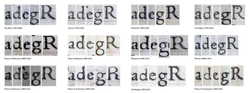
When printing arrived in Italy, type cutters adapted these handwritten forms into metal. Nicolas Jenson, a French engraver working in Venice, cut a roman typeface around 1470 that became the reference point. According to Britannica, Jenson’s letterforms marked the moment printed type stopped imitating handwriting and became its own thing.
Jenson published over 150 titles during his decade in Venice. His type was so well constructed that designers still base revivals on it today (Adobe Jenson, Centaur).
Shortly after, Aldus Manutius and his punch cutter Francesco Griffo pushed things further. Griffo’s roman types for the Aldine Press refined the proportions and spacing that Jenson had established, creating a template that lasted centuries.
From Venetian Oldstyle to Modern Humanist Sans-Serif
For about 400 years, “humanist” meant serif. That changed in the early 20th century.
Edward Johnston designed the typeface for the London Underground in 1916. It was sans-serif, but it carried the proportional variety and organic shapes of the humanist tradition instead of relying on uniform geometric construction.
Eric Gill, who had worked with Johnston, released Gill Sans through Monotype in 1928. Gill Sans kept the calligraphic roots visible, with capital letters based on Roman lettering and lowercase forms borrowed from oldstyle serif types. That was the bridge.
From there, the category grew. Adrian Frutiger, Hermann Zapf, Robert Slimbach, and others built on this foundation through the rest of the century, producing typefaces that millions of people now read daily without ever thinking about where they came from.
Key Characteristics of Humanist Fonts
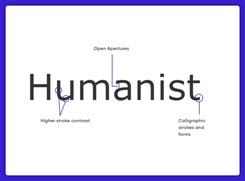
You can spot a humanist font by paying attention to a handful of specific features. Once you know what to look for, you’ll start seeing them everywhere.
Moderate stroke contrast: the thick and thin parts of each letter aren’t identical in width. There’s visible variation, like the kind you’d get naturally from a broad-nib pen held at an angle. This is one of the clearest differences between humanist and geometric type.
Calligraphic axis: round characters like “o” and “e” have a slightly tilted stress. If you drew a line through the thinnest parts of the letter, it wouldn’t be perfectly vertical. It leans a bit, echoing how a right-handed scribe would hold a pen.
Open apertures: the gaps in letters like “c,” “e,” and “s” are wide. This matters for legibility. Research from the Interdisciplinary Journal of Signage and Wayfinding found that Gill Sans and Avenir Medium (both humanist-influenced) ranked as the top two fonts for distance reading on simulated road signs.
Two-story letterforms: the lowercase “a” and “g” typically use their double-story versions. The single-story forms are more common in geometric fonts like Futura.
Generous x-height: the height of lowercase letters relative to capitals tends to be tall. This is a big deal for readability on screens and at small sizes. A 2025 study in the Journal of Vision confirmed that x-height directly affects reading speed across different font sizes.
The overall impression is warm. Not mechanical. The letters feel like they were shaped by a person, not assembled from circles and straight lines.
Humanist Serif vs. Humanist Sans-Serif
The word “humanist” gets applied to two groups of fonts that look pretty different at first glance. One has serifs. The other doesn’t. But they share the same underlying logic.
| Feature | Humanist Serif | Humanist Sans-Serif | |———|—————|——————-| | Serifs | Yes, often bracketed and organic | None | | Stroke contrast | Higher, more visible | Lower, but still present | | Historical root | 15th-century Venetian printing | 20th-century reinterpretation | | Common examples | Centaur, Adobe Jenson, Palatino | Gill Sans, Frutiger, Myriad Pro | | Typical use | Books, editorial, print design | Screens, signage, interfaces |
Humanist serif fonts are the older branch. Think Centaur, Adobe Jenson, Palatino. They carry more obvious calligraphic DNA: bracketed serifs, a slanted axis of stress, and moderate stroke contrast. These tend to work well in book design and long-form print.
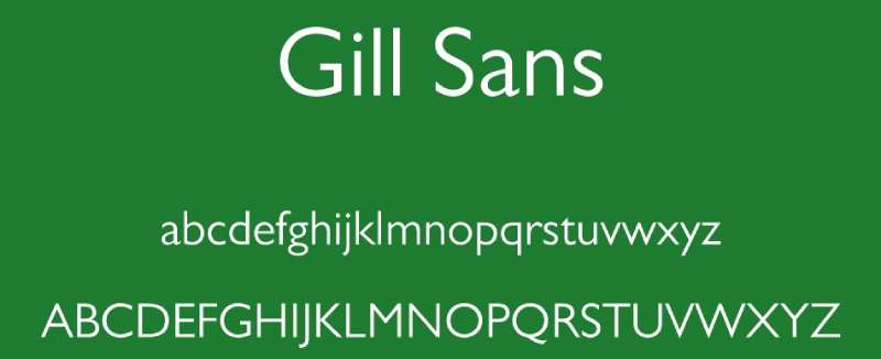
Humanist sans-serif fonts are the modern branch. Gill Sans (1928), Frutiger (1976), Myriad Pro. They dropped the serifs but kept the organic proportions and stroke variation. These are the go-to choices for web design, interface text, and wayfinding.
Monotype notes that humanist typefaces became the preferred choice for digital use because of their distinct character shapes and open letterforms, even as modern screens have improved enough to render serif fonts cleanly.
So which branch should you pick? It depends on context. Serif versions carry a more literary, established feel. Sans-serif versions read as contemporary and clean. Both are readable. Your mileage may vary based on the emotional tone you’re after.
Humanist Fonts vs. Geometric and Grotesque Fonts

This is where classification actually matters in practice. Three major categories live under the sans-serif umbrella, and they behave differently in real projects.
Humanist sans-serifs (Frutiger, Gill Sans, Myriad) are built on pen-drawn shapes. Stroke widths vary. Letters have individual character.
Geometric sans-serifs (Futura, Montserrat, geometric fonts in general) are built on circles, squares, and uniform stroke widths. The lowercase “o” is often a near-perfect circle.
Grotesque and neo-grotesque sans-serifs (Helvetica, Univers, grotesque fonts) sit somewhere in between. They prioritize neutrality. Less personality than humanist, less mathematical than geometric.
The easiest way to tell them apart? Check the lowercase “a.” Humanist fonts almost always use the two-story “a” with a bowl and stem. Geometric fonts often use a single-story “a” that looks like an upside-down “e.”
Three-quarters of Fortune 500 companies choose sans-serif fonts for their logos (Toner Buzz, 2024). But the specific sub-category matters. A tech startup picking Futura sends a very different signal than a healthcare company picking Frutiger.
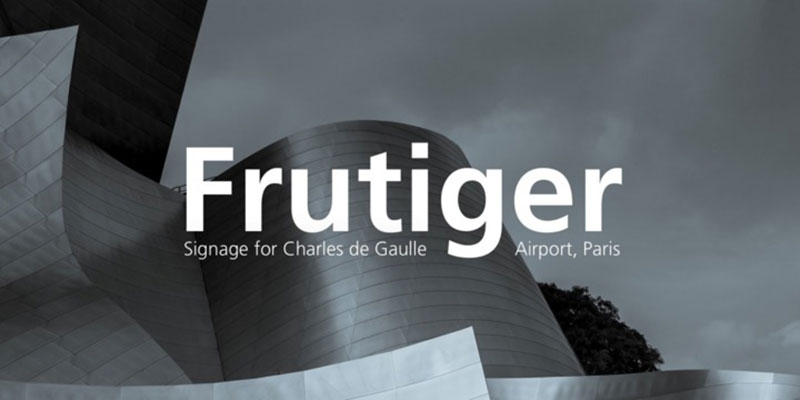
Frutiger himself recognized this distinction. When commissioned to design the signage system for Charles de Gaulle Airport, he rejected his own Univers (a neo-grotesque) because it felt too closed and round for quick recognition. He designed something new with open, humanist shapes instead. That typeface, originally called Roissy, became one of the most widely used sans-serifs in the world.
Practically speaking, humanist fonts win on legibility at small sizes and in wayfinding. Geometric fonts win on bold graphic impact. Grotesques win when you want something invisible and neutral. There’s no single “best” category, but if you’re designing for reading comfort, humanist is hard to beat.
Why Humanist Fonts Are Used for Body Text and Signage

Readability isn’t subjective. Well, it sort of is, but some fonts genuinely perform better than others in controlled tests. Humanist typefaces consistently come out ahead for body text and signage, and the reasons are structural.
Open letterforms reduce ambiguity. When the apertures on “c” and “e” are wide, your brain can distinguish them faster. Same with “a” and “o.” In humanist fonts, each letter looks distinct enough that you rarely confuse one for another. Monotype explains that this is because humanist typefaces have calligraphic roots hardwired into their shapes, creating subtle differences between characters that geometric fonts lack.
Adrian Frutiger designed his namesake typeface specifically for airport signage at Charles de Gaulle Airport, starting in 1968. He tested it for legibility at distances ranging from 10 to 100 meters and in low-light conditions. The typeface needed to work for travelers moving fast through unfamiliar spaces. Erik Spiekermann later described Frutiger as the best general typeface for legibility in almost any situation.
That’s not just airport talk. The NHS has used Frutiger as its primary font since 1999 for all branding and signage. The World Health Organization adopted Frutiger Bold Condensed for its logotype in 2006. Bay Area Rapid Transit uses it across every station.
Research confirms the pattern. DeveloperUX data from 2025 found that 52% of users leave a site when text is hard to read. Humanist fonts address this directly through their proportional letter spacing, tall x-height, and natural stroke variation, all features that reduce visual fatigue during extended reading.
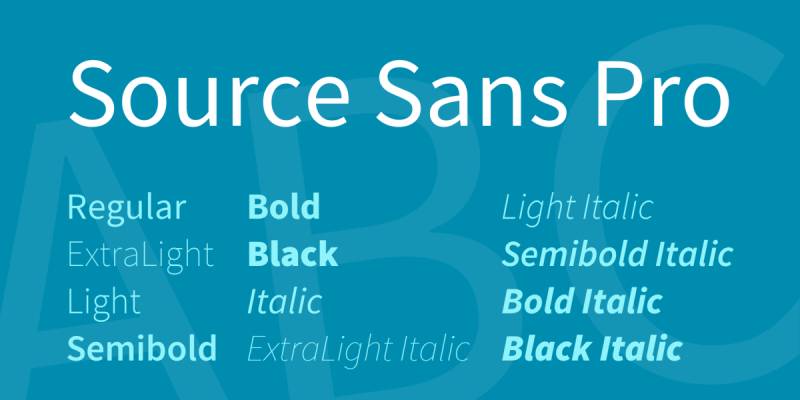
The U.S. Web Design System (USWDS) chose Source Sans Pro, a humanist sans-serif by Paul D. Hunt, as its default typeface. The system guidelines recommend a readable line length of 45 to 90 characters and a minimum body text size of 16px. Humanist fonts fit these specifications naturally because their proportions were designed around how people actually process text.
Took me a while to appreciate this, honestly. When you’re picking fonts for a project, you think about aesthetics first. But once you’ve tested a humanist sans-serif against a geometric one in a signage context or a long article, the readability gap becomes obvious.
Well-Known Humanist Fonts and Where They Appear
Humanist typefaces are everywhere. You’ve read them on billboards, in apps, on government websites, and across airport terminals. Most people just don’t realize it.
Here’s a quick look at some of the most recognized ones:
| Font | Designer | Notable usage |
|---|---|---|
| Gill Sans | Eric Gill (1928) | BBC Penguin Books British Railways |
| Frutiger | Adrian Frutiger (1976) | Charles de Gaulle Airport NHS WHO |
| Myriad Pro | Slimbach & Twombly | Apple (2002–2017) Adobe products |
| Optima | Hermann Zapf (1958) | Vietnam Veterans Memorial Estée Lauder |
| Calibri | Lucas de Groot (2004) | Microsoft Office default (2007–2023) |
| Verdana | Matthew Carter (1996) | IKEA (briefly) Early web standard |
Calibri served as the default Microsoft Office font for 16 years before Microsoft replaced it with Aptos in July 2023. Wikipedia notes that Calibri is classified as a humanist sans-serif, designed by Lucas de Groot specifically for Microsoft’s ClearType rendering system.
Apple used Myriad Pro across all its marketing and product packaging from 2002 until switching to San Francisco in 2017. That’s 15 years of one of the world’s most recognized brands using a humanist sans-serif as its typographic voice.
Gill Sans became so tied to British culture that it’s sometimes called “the national typeface of England.” Penguin Books has used it on their covers for decades. The BBC adopted it as a core part of their visual identity.
Free and Open-Source Humanist Fonts
Not every project has a budget for font licensing. Luckily, several high-quality humanist options cost nothing.
Source Sans Pro was designed by Paul D. Hunt for Adobe and released as open-source. It’s the default typeface in the U.S. Web Design System and has accumulated over 8 billion views on Google Fonts (UMA Technology, 2024).
Open Sans by Steve Matteson leads as one of the most-used Google Fonts overall, with roughly 17 billion total views. The 2025 Web Almanac by HTTP Archive reports it as one of the top five Google-hosted fonts, accounting for about 3.3% of all Google font requests on desktop.
Lato by Lukasz Dziedzic has over 15 billion views and sits comfortably in the top tier of Google Fonts. It balances warmth with professionalism, which is probably why it keeps showing up on corporate sites and legal platforms.
All three are available through Google Fonts and come with generous open-source licenses that cover both personal and commercial use.
How to Choose the Right Humanist Font for a Project
Picking a humanist font isn’t just about liking how it looks. The typeface you choose for your brand communicates something specific, whether you intend it to or not.
Monotype’s 2024 survey found that 75% of respondents view choosing a distinctive typeface as critical to shaping a brand’s identity. And 83% of designers say font selection ranks in the top three components of their creative decision-making process.
Here’s what to actually think about when narrowing your options:
Match the tone: Gill Sans reads as British and literary. Frutiger reads as clinical and trustworthy. Myriad reads as clean and tech-forward. Same category, totally different personalities.
Check the weight range: Some humanist fonts ship with only regular and bold. Others, like Source Sans Pro, offer a full spectrum from extra-light to black. If your project needs typographic hierarchy across multiple heading levels and body text, you need that range.
Test at target sizes: A humanist serif like Centaur looks gorgeous at 24px for headings but can get fussy at 12px body text on screen. A humanist sans-serif like Open Sans handles small sizes better because of its tall x-height and generous counters.
Confirm character set support: If you’re working on a multilingual project, verify the font covers the scripts you need. Noto Sans from Google was designed to support over 800 languages, making it one of the safest bets for global projects.
When pairing fonts, humanist sans-serifs tend to pair well with oldstyle serifs. Typewolf confirms this is one of the most reliable combinations. Frutiger with Palatino. Myriad with Minion. Open Sans with Merriweather. The shared calligraphic roots create a natural harmony between the two.
Humanist Fonts in Web Design and Digital Interfaces
The web runs on humanist type. That’s not an exaggeration. Several of the most-used typefaces online fall into this classification, and the numbers back it up.
Google Fonts powers over 50 million websites globally (Linearity, 2024). Among the most requested fonts on the platform, humanist sans-serifs like Open Sans, Lato, and Source Sans Pro consistently rank in the top ten.
The HTTP Archive’s 2024 Web Almanac reports that web font usage overall has reached 87% of all pages. That’s up from essentially 0% in 2010. Humanist faces have ridden that wave hard.
How Variable Fonts Are Changing the Game
Variable font technology lets a single file contain multiple weights, widths, and styles. For humanist typefaces, this is a big deal.
The HTTP Archive found that 33% of websites used variable fonts in 2024, up from 29% in 2023. Figma’s 2026 web design statistics report that 41.3% of mobile websites used variable fonts in 2025.
Open Sans is among the most popular variable fonts, found on 16% of all sites using variable font technology (HTTP Archive, 2024). Humanist typefaces like Source Sans Variable and Frutiger Neue also now ship in variable formats.
The practical benefit? Fewer HTTP requests, smaller total file sizes, and smoother responsive behavior across devices. You get an entire type family in one file instead of loading six or seven separate font files.
Rendering and Accessibility
Humanist fonts don’t look identical on every operating system. macOS applies its own font smoothing, which tends to make text appear slightly heavier. Windows uses ClearType, which prioritizes sharpness at the pixel level.
WebAIM’s 2025 report found that 79.1% of homepages still have low-contrast text issues, making font choice even more critical for accessibility. Humanist sans-serifs with tall x-heights and open letterforms help compensate for poor color contrast situations because their shapes remain distinguishable even when contrast drops.
WCAG 2.1 calls for a minimum contrast ratio of 4.5:1 for body text. If you pair that with a well-designed humanist typeface, you’re covering two of the biggest readability factors (font shape and color contrast) at once.
Common Misuses and Limitations of Humanist Fonts
Humanist fonts do a lot of things well. But they’re not the right answer for every project, and pretending otherwise is how you end up with design that feels off.
Too casual for some industries. A law firm or investment bank needs to project authority and precision. Humanist sans-serifs carry warmth and approachability. Frutiger on a legal brief just feels wrong. Firms that need gravitas typically lean toward transitional or slab serif fonts instead.
Personality can flatten at large sizes. Humanist typefaces are optimized for text sizes. When you blow them up to 72px or larger for a hero banner, the subtle stroke variation that makes them readable at 16px becomes almost invisible. For display-level type, a more expressive choice usually works better.
Weight coverage isn’t always complete. Some humanist fonts, especially older ones, only come in regular and bold. If you need a full range of weights for complex visual hierarchy (light, regular, medium, semibold, bold, black), check the font family before committing.
Doubling up on warmth causes problems. Pairing two humanist typefaces, say Gill Sans for headings and Frutiger for body, creates a situation where both fonts are fighting for the same personality. The contrast between heading and body text disappears. You get visual monotony instead of a clear hierarchy.
Wichita State University research found that sans-serif fonts don’t carry strong emotional characteristics on their own. They tend to be perceived as neutral. So while humanist sans-serifs are warmer than geometric ones, they still won’t communicate the formality of a serif or the playfulness of a script font. Know your limits.
The $965.4 million global font market (valued in 2021, projected to reach $1.33 billion by 2031 per Toner Buzz) keeps growing partly because designers increasingly understand that no single typeface classification works for everything. Humanist fonts are a strong default. But defaults shouldn’t be applied mindlessly.
FAQ on What Is A Humanist Font
What defines a humanist font?
A humanist font is a typeface with organic stroke contrast, open apertures, and calligraphic proportions rooted in Renaissance handwriting. The letterforms show visible thick-to-thin variation, a tilted axis of stress, and typically use two-story lowercase “a” and “g” shapes.
What is the difference between humanist and geometric fonts?
Geometric fonts like Futura are built from circles and uniform strokes. Humanist fonts like Frutiger are based on pen-drawn shapes with varied stroke widths. The result is that humanist typefaces feel warmer, while geometric ones feel more mechanical and mathematical.
Is Helvetica a humanist font?
No. Helvetica is a neo-grotesque sans-serif with uniform stroke widths and a neutral, closed design. Humanist sans-serifs like Gill Sans or Myriad Pro have more stroke variation and open letterforms that reflect calligraphic influence.
Why are humanist fonts considered more readable?
Their open apertures and distinct letter shapes make each character easier to identify quickly. This reduces ambiguity between similar-looking letters like “c” and “e,” which is why humanist typefaces are preferred for signage, body text, and interfaces.
Can humanist fonts be serif or sans-serif?
Yes, both. Humanist serif fonts like Centaur and Adobe Jenson trace directly back to 15th-century Venetian printing. Humanist sans-serif fonts like Frutiger and Open Sans appeared in the 20th century but carry the same organic proportions.
What are the best free humanist fonts?
Source Sans Pro, Open Sans, and Lato are the top free options, all available on Google Fonts. Each offers multiple weights, strong legibility at small sizes, and open-source licenses that cover both personal and commercial projects.
Is Calibri a humanist font?
Yes. Calibri is classified as a humanist sans-serif, designed by Lucas de Groot for Microsoft’s ClearType system. It served as the default Microsoft Office font from 2007 until Aptos replaced it in 2023.
What industries use humanist fonts the most?
Healthcare, government, transportation, and education rely heavily on humanist typefaces. The NHS uses Frutiger for all branding. The U.S. Web Design System uses Source Sans Pro. Airport signage worldwide favors humanist sans-serifs for quick legibility.
Are humanist fonts good for logos?
They can be, depending on the brand tone you want. Humanist fonts project approachability and clarity. Apple used Myriad Pro in its branding for 15 years. But brands needing stronger visual impact often pair them with a bolder display typeface.
How do I identify a humanist typeface?
Look at the lowercase “o” for a slightly oval shape instead of a perfect circle. Check for visible stroke contrast and open gaps in letters like “c” and “s.” If the letterforms feel organic rather than constructed, it’s likely humanist.
Conclusion
Understanding what is a humanist font gives you a real advantage when selecting typefaces for any project. These letterforms, shaped by centuries of calligraphic tradition, remain some of the most legible and versatile options in modern type design.
From Nicolas Jenson’s roman type in 1470 to Adrian Frutiger’s airport signage and today’s web fonts, the humanist classification has proven its staying power across print and digital contexts.
Whether you’re building a brand identity, designing an interface, or setting long-form body text, humanist typefaces offer readability without sacrificing personality.
Test a few options. Compare them at different sizes. And pick the one that actually serves your audience, not just the one that looks good in a mood board.

Renowned for his expertise in logo design and visual branding, Bogdan has developed a multitude of logos for various clients.
His skills extend to creating posters, vector illustrations, business cards, and brochures. Additionally, Bogdan's UI kits were featured on marketplaces like Visual Hierarchy and UI8.
He also wrote in the past years on sites like Design Your Way, WebDesignerDepot, WPDean, Designmodo, Speckyboy, Slider Revolution, and more.
- Canva vs PowerPoint: Which Is Better for Presentations? - 22 September 2026
- How to Install Fonts on Mac (Step-by-Step Guide) - 20 September 2026
- From Mockup to Code: How AI-Augmented Development Speeds Up the Design Handoff - 19 September 2026

Bogdan Sandu is a seasoned designer who has been designing websites since 2008. Renowned for his expertise in logo design and visual branding, Bogdan has developed a multitude of logos for various clients. His skills extend to creating posters, vector illustrations, business cards, and brochures. Additionally, Bogdan's UI kits were featured on marketplaces like Visual Hierarchy and UI8. He also wrote in the past years on sites like Design Your Way, WebDesignerDepot, WPDean, Designmodo, Speckyboy, Slider Revolution, and more.
You Might Also Like