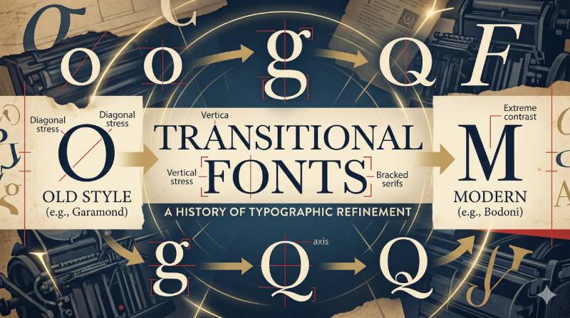
Every serif typeface you have ever read falls somewhere on a spectrum, and transitional fonts sit right at the center of it. So what is a transitional font, and why does it matter for your design work?
Transitional typefaces like Baskerville, Georgia, and Times New Roman bridge the gap between Old Style calligraphic serifs and the sharp, high-contrast Modern faces like Bodoni. They emerged during the Enlightenment, when type design shifted from handwritten tradition to rational construction.
This article covers how to identify transitional serif characteristics, where they fit in the typographic classification system, which fonts belong to the category, and when to use them in print and web design projects.
What Is a Transitional Font

A transitional font is a category of serif typeface that sits between Old Style and Modern (Didone) designs in the typographic classification system. The name “transitional” refers to the historical shift that happened in type design during the mid-18th century, when letterforms began moving away from calligraphic roots toward more rational, geometry-based construction.
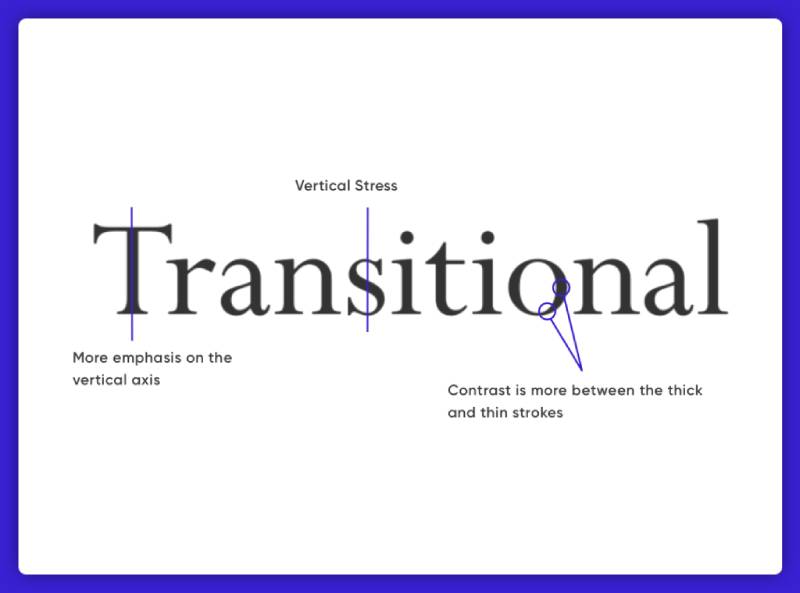
You can spot a transitional typeface by a few defining traits. The stroke contrast between thick and thin elements is more noticeable than in Old Style faces, but not as extreme as what you find in Bodoni or Didot.
The axis of stress on rounded letters like “o” and “e” shifts toward vertical. Serifs become sharper, more horizontal, and less wedge-shaped than their predecessors.
John Baskerville is the name most tied to transitional type. His typeface, designed in 1757 in Birmingham, England, is widely considered the peak of the transitional category. Baskerville increased stroke contrast, refined the serifs, and pushed the axis of rounded characters nearly upright, all while keeping a warmth that Modern faces later abandoned.
The Monotype 2024 Font Use & Forecasting Survey found that 83% of designers consider typography a critical part of brand identity and communication. Transitional serifs sit at the center of that conversation because they balance readability, formality, and adaptability better than most serif categories.
Errol Morris and David Dunning conducted a famous experiment through the New York Times in 2012. Approximately 45,000 readers read a passage set in different fonts and were asked whether they agreed with the statement. Baskerville outperformed Helvetica, Georgia, Comic Sans, Trebuchet, and Computer Modern by a statistically significant margin (p-value of .0083). Readers were roughly 1.5% more likely to believe a statement set in Baskerville than the average of the other five fonts.
That might sound small. But in uncontrolled conditions (different devices, screen sizes, environments), seeing any measurable effect is significant. It suggests that transitional serifs carry associations with institutional authority and formal publishing that quietly shape how people process text.
Transitional Fonts vs. Old Style and Modern Typefaces
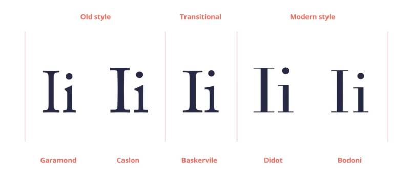
The three main serif categories, Old Style, transitional, and Modern, form a progression. Each one built on what came before, and each reflects the design thinking and printing technology of its time.
Old Style typefaces like Garamond and those by Nicolas Jenson show strong calligraphic influence. Stroke contrast is low. The stress axis tilts diagonally, mimicking the angle of a held pen. Serifs are heavily bracketed, with soft, rounded connections to the main strokes.
Transitional typefaces like Baskerville, Georgia, and Cambria push away from that handwritten feel. Stroke contrast increases. The stress axis straightens toward vertical. Serifs sharpen and flatten, though they still keep some bracketing. The overall impression is more refined, more intentional.
Modern typefaces like Bodoni and Didot take everything further. Stroke contrast becomes extreme, sometimes dramatically so. The stress axis goes fully vertical. Serifs become thin, unbracketed hairlines. The result is striking but can hurt readability at small sizes.
| Feature | Old style (Garamond) | Transitional (Baskerville) | Modern (Bodoni) |
|---|---|---|---|
| Stroke contrast | Low | Medium-high | Extreme |
| Stress axis | Diagonal | Nearly vertical | Fully vertical |
| Serif style | Bracketed, wedge-shaped | Sharper, still bracketed | Thin hairline, unbracketed |
| Calligraphic influence | Strong | Moderate | Minimal |
| Best readability | Body text |
Body text Screen |
Headlines Display sizes |
A Dribbble study of the top 1,000 websites found that roughly 85% of web fonts are sans-serif, with serif, monospaced, and other categories splitting the remaining 15%. But here is what’s interesting: serif fonts showed up more often in headers than body copy. The HTTP Archive’s 2022 data reported serif appearing in the font stack of 55% of mobile pages as a fallback or primary choice.
Transitional serifs occupy a sweet spot. They are readable enough for long body text (unlike many Moderns), and clean enough for digital screens (unlike most Old Styles, which can feel too soft at low resolutions).
Where Transitional Fonts Sit on the Vox-ATypI Classification
The Vox-ATypI system is the standard framework for classifying typeface families. It groups typefaces into categories based on historical period and visual characteristics.
Transitional fonts fall under the “Classicals” group, alongside Humanist (early Renaissance types) and Garalde (Old Style types like Garamond). The “Classicals” label covers serif designs rooted in the Roman tradition of letterforms.
Within that group, transitional types are sometimes called “Reales” or “Neoclassical.” The Romain du Roi, commissioned by Louis XIV in 1692, is often cited as the earliest example that moved type design toward the transitional model. Its grid-based construction and increased vertical stress influenced Pierre Simon Fournier and later Baskerville.
This classification matters for practical reasons. When you are browsing font libraries or writing a CSS font stack, understanding that a typeface is transitional tells you a lot about its behavior: moderate contrast, good readability across sizes, and a tone that reads as formal but not rigid.
Key Characteristics of Transitional Typefaces
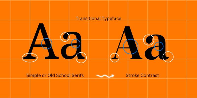
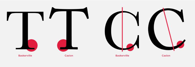
Vertical stress axis. Look at the lowercase “o” in Baskerville, then compare it to Garamond. In Garamond, the thinnest parts of the stroke sit at a diagonal angle. In Baskerville, those thin points sit nearly at the top and bottom, creating a vertical or near-vertical axis. This single trait is probably the fastest way to identify a transitional face.
Medium-to-high stroke contrast. The difference between thick and thin strokes is clear but not harsh. You can see it, but it does not overwhelm the letterform the way it does in Bodoni. This middle ground is what gives transitional fonts their readability at both text and display sizes.
Sharper, more horizontal serifs. Old Style serifs tend to slope or curve into the stroke. Transitional serifs flatten out. They connect to the main stroke with a bracket (a small curve), but the bracket is tighter, and the serif itself extends more horizontally. If the serifs look like clean, deliberate shelves rather than soft pen strokes, you are likely looking at a transitional design.
Ball terminals. Many transitional typefaces feature ball terminals on letters like “a,” “c,” “f,” and “r.” These are the round, teardrop-shaped endings where strokes taper off. Ball terminals are not exclusive to transitional fonts, but they show up consistently in the category.
Wider, more open letterforms. Transitional designs tend to have generous proportions. The counters (enclosed spaces within letters like “e” and “o”) are roomy compared to the tighter forms of Old Style. This openness directly improves legibility, especially on screen.
Three-quarters of Fortune 500 companies choose sans-serif fonts for their logos, according to Toner Buzz research. But for body copy in annual reports, legal documents, and formal communications, many of those same companies lean on transitional serifs. The category’s balance of authority and readability makes it a go-to for long-form professional text.
The History Behind Transitional Typography
Transitional type design did not appear overnight. It grew out of a slow shift in how people thought about letterforms, driven by Enlightenment thinking, better printing technology, and a handful of individuals who were unsatisfied with the status quo.
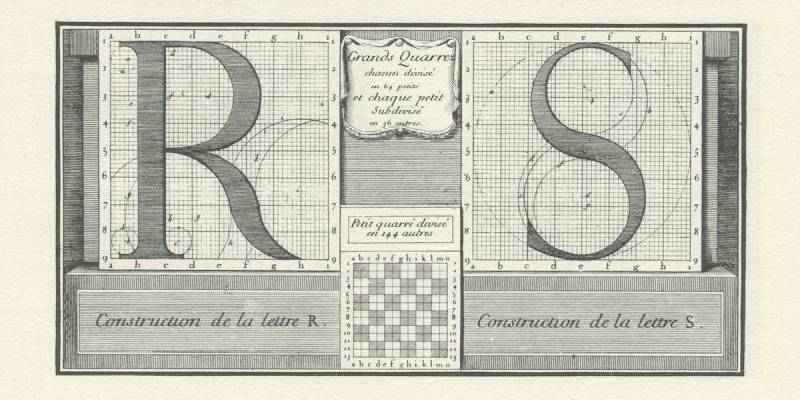
The starting point is usually set at 1692, when Louis XIV commissioned the Romain du Roi for the exclusive use of France’s Royal Print Office. A committee from the Academy of Sciences designed the letterforms on mathematical grids rather than following the freehand calligraphic tradition. Philippe Grandjean cut the punches, softening the rigid geometry just enough for legibility.
The Romain du Roi introduced features that would define the transitional category: increased contrast between thick and thin strokes, sharper horizontal serifs, and a vertical stress axis. It was reserved exclusively for royal use, and unauthorized reproduction was a serious offense.
Pierre Simon Fournier picked up where the Romain du Roi left off. Working in France during the mid-1700s, Fournier standardized type measurement (his “point” system became a foundation for modern typographic measurement) and designed typefaces that blended rationalist construction with commercial practicality.
Then came John Baskerville. He pulled the transitional style into its fullest expression in Birmingham during the 1750s.
John Baskerville’s Role in Transitional Type Design
Baskerville was not a lifelong printer. He started as a writing master and teacher of calligraphy, then made a fortune manufacturing japanned lacquerware before turning to type design in his 40s. That background matters. His sense of letterform beauty came from years of handwriting practice, and his wealth meant he could invest heavily without worrying about immediate profit.
He directed his punchcutter, John Handy, to create types with higher stroke contrast, more vertical stress, and crisper serifs than anything William Caslon (the dominant English type designer of the period) was producing. But Baskerville did not stop at the letters themselves. He developed his own ink formulation, darker and more consistent than standard inks. He worked with papermaker James Whatman to produce smoother wove paper that showed off the fine details of his type.
His first publication, an edition of Virgil in 1757, took three years to complete. It was beautiful. It was also controversial.
Competitors in England criticized his work. Some claimed the high contrast and bright pages were tiring to read. Benjamin Franklin, however, was a vocal admirer. He famously tested English critics by showing them a Caslon specimen while claiming it was Baskerville, and they still complained about eye strain, proving the objections were more about bias than actual readability.
Baskerville’s types found more appreciation in continental Europe. After his death in 1775, his widow sold the punches and matrices to Pierre-Augustin Caron de Beaumarchais in France. There, the designs influenced Giambattista Bodoni in Italy and Firmin Didot in France, who pushed the style even further into what we now call Modern type.
Since the 1920s, multiple revivals have brought Baskerville back into active use. Monotype, Linotype, and other foundries have released their own versions. In 1996, Zuzana Licko at Emigre designed Mrs Eaves, a popular contemporary interpretation named after Baskerville’s wife, Sarah Eaves.
Notable Transitional Fonts and Where They Are Used
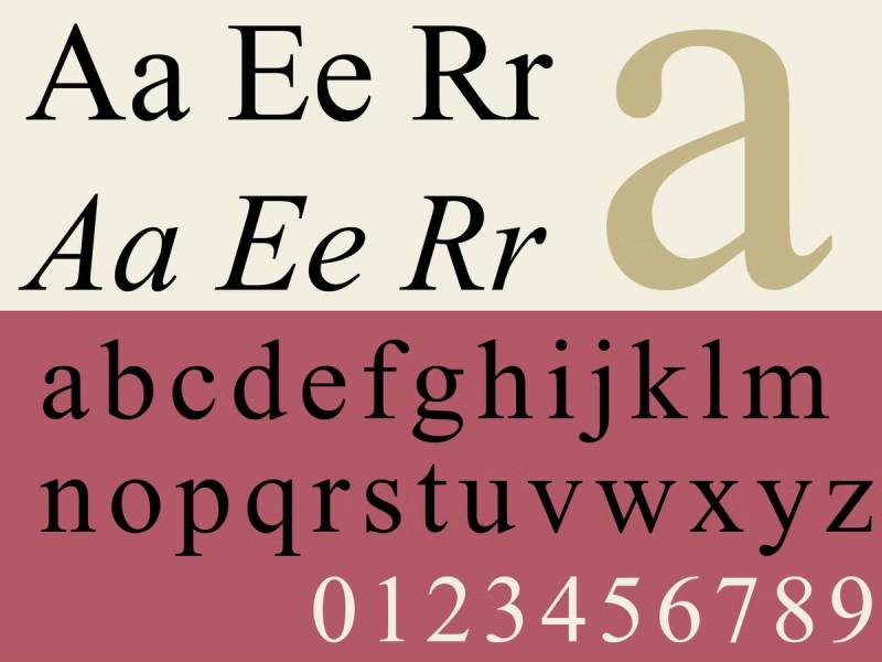
The transitional category includes some of the most widely used typefaces in print and digital publishing. A few of them are so common that most people have read thousands of words set in transitional serifs without ever thinking about the classification.
Baskerville remains the standard-bearer. It is popular in book design, academic publishing, and formal documents. The Canadian government uses a version of Baskerville for its official wordmark. Libre Baskerville, available on Google Fonts, is a free web-optimized version. And Mrs Eaves, Licko’s 1996 revival, shows up regularly in editorial layouts and luxury brand work.
Times New Roman was designed by Stanley Morison and Victor Lardent in 1931 for The Times of London, with the specific goal of improving newspaper readability at small sizes. It dominated word processors for decades as the default font in Microsoft Word. WhatFontIs reports that Times New Roman is still used by 13% of designers.
Georgia was designed by Matthew Carter in 1993, specifically for screen readability. It was one of the first serif typefaces built from the ground up for digital display, with generous x-height, open counters, and slightly heavier strokes that hold up at low resolutions. It remains one of the most widely used web-safe fonts.
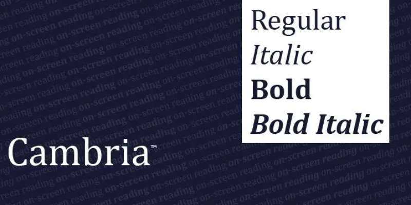
Cambria was created by Jelle Bosma for Microsoft’s ClearType font collection, optimized for on-screen reading. It ships with Microsoft Office and is a common choice for professional documents.
| Typeface | Designer | Year | Primary use |
|---|---|---|---|
| Baskerville | John Baskerville / John Handy | 1757 | Books Academic text Formal documents |
| Times New Roman | Stanley Morison / Victor Lardent | 1931 | Newspapers Word processing General print |
| Georgia | Matthew Carter | 1993 | Web body text Screen reading |
| Cambria | Jelle Bosma | 2004 | On-screen documents Microsoft Office |
| Mrs Eaves | Zuzana Licko | 1996 | Editorial Branding Display |
Times New Roman as a Transitional Font
Times New Roman gets more debate about its classification than almost any other typeface. Some typographers place it closer to Old Style because of its relatively moderate stroke contrast and slightly angled stress. Others call it transitional because of its sharper serifs and more regular proportions.
The truth is that it blends features from both categories, which is partly why it became so universal. Morison designed it for a specific problem: The Times of London needed a font that was highly readable at small sizes while being more space-efficient than the older typeface it replaced.
Its adoption as Microsoft Word’s default font in the 1990s cemented its place as the typeface most people associate with “formal” or “official” text. That perception persists even now, decades after Calibri replaced it as Microsoft’s default. If you have ever received a document set in Times New Roman, you probably assumed it was something serious. That is font psychology at work.
When to Use a Transitional Font in Design Projects
Transitional serifs work best in contexts where you need to communicate credibility without stiffness. They split the difference between the warmth of Old Style faces and the formality of Moderns.
Long-form body text. Books, reports, academic papers, editorial layouts. The moderate stroke contrast and open letterforms hold up well across long reading sessions. Baskerville and Georgia are especially strong here.
Professional and institutional branding. Law firms, universities, financial institutions, government agencies. Transitional serifs signal established authority without feeling stuffy. The Errol Morris experiment backs this up: people literally trust text set in Baskerville more than text set in other fonts.
Screen typography. Georgia and Cambria were purpose-built for digital rendering. If you are setting body text on the web and want a serif option, these two are safe bets. Libre Baskerville from Google Fonts is another solid choice for website typography.
Pairing fonts with sans-serifs. Transitional serifs pair naturally with clean sans-serif faces. Baskerville with Helvetica. Georgia with Arial. Cambria with Calibri. The moderate contrast of transitional designs creates a comfortable tension with the uniform strokes of sans-serifs, giving you a clear typographic hierarchy without visual clashing.
Monotype’s 2024 survey found that 76% of designers prioritize readability and accessibility when choosing fonts. Transitional serifs score well on both counts. Their stroke contrast aids character recognition, and their open counters improve legibility for readers with visual impairments.
Where transitional fonts are not the best pick: ultra-modern tech branding (where geometric or grotesque sans-serifs dominate), display work that needs extreme personality, or contexts where a casual, friendly tone matters more than authority. For those, look at humanist sans-serifs or script fonts instead.
Transitional Fonts in Web Design and Digital Typography
Web fonts now appear on roughly 87% of websites, according to HTTP Archive’s 2024 data. That is up from near zero in 2010. Transitional serifs have been part of that growth from the beginning, largely because Georgia was one of the first typefaces built specifically for screen use.
Matthew Carter designed Georgia in 1993 for Microsoft’s core web font project. It was engineered for low-resolution CRT monitors, with a tall x-height, generous counters, and slightly heavier strokes than a typical print serif. Before custom web fonts were even possible through CSS, Georgia was the go-to serif for anyone building websites. And honestly, it still holds up.
The situation changed when @font-face support and services like Google Fonts made it possible to load any typeface on the web. Google Fonts alone is now used on over 50 million websites, according to Linearity research. Among the serif options available there, several carry transitional characteristics.
Libre Baskerville is the standout. Designed by Pablo Impallari and based on the 1941 American Type Founders version of Baskerville, it is optimized for body text at 16px. It appears on over 3 million websites, making it one of the most popular serif choices on Google Fonts.
Lora blends transitional and calligraphic features. It works well for both body text and headings, and it shows up frequently in editorial and blog contexts.
Cambria ships with every copy of Microsoft Office and was designed for ClearType rendering on LCD screens. If you have ever opened a Word document on a Mac and seen a different serif than Times New Roman, it was probably Cambria.
| Web serif | Source | Optimized for | Best pairing |
|---|---|---|---|
| Georgia | System font (pre-installed) | Low-res screens | Arial Verdana |
| Libre Baskerville | Google Fonts | Body text at 16px | Open Sans Montserrat |
| Lora | Google Fonts | Editorial, blog layouts | Source Sans Pro Poppins |
| Cambria | Microsoft Office (bundled) | LCD / ClearType | Calibri Segoe UI |
Variable font technology is changing how transitional typefaces render across devices. HTTP Archive’s 2024 report shows that 34% of mobile pages now use variable fonts, up from just 1.8% in 2019. Variable fonts store multiple weights and styles in a single file, which means a transitional serif can adjust its stroke weight dynamically based on screen size and resolution.
For CSS font stacks that include transitional serifs, a common pattern looks something like this: Libre Baskerville as the primary, Georgia as the first fallback, and a generic “serif” declaration at the end. This gives you good coverage across browsers and operating systems without loading unnecessary files.
One thing worth knowing: the Dribbble study of the top 1,000 websites found that serif fonts appear in H1 headers on 42% of pages, even though sans-serif dominates paragraph text. If you are going to use a transitional serif on the web, headers and pull quotes are where it makes the strongest impression.
Common Misconceptions About Transitional Fonts
Classification in typography is not as clean as most textbooks make it sound. The boundaries between Old Style, transitional, and Modern are fuzzy, and people get confused about them all the time. Here are the mistakes that come up most often.
Confusing Transitional with Modern Typefaces
This is the most common one. Both transitional and Modern (Didone) typefaces look “refined” compared to Old Style, so people lump them together. But the differences matter.
Key distinction: transitional fonts have moderate stroke contrast with bracketed serifs. Bodoni and Didot have extreme contrast with hairline, unbracketed serifs. If the thin strokes look like they might disappear at small sizes, you are looking at a Modern, not a transitional.
This matters practically. Modern serifs can break down in body text below 10pt or on low-resolution screens. Transitional serifs stay legible because their thinnest strokes still have enough weight to render cleanly.
Assuming Every Medium-Contrast Serif Is Transitional
Moderate stroke contrast alone does not make a font transitional. You need to check the stress axis too.
- Diagonal stress + moderate contrast = probably Old Style (Garamond, Caslon)
- Vertical stress + moderate contrast = likely transitional (Baskerville, Georgia)
- Vertical stress + extreme contrast = Modern (Bodoni, Didot)
Humanist serif designs can also show moderate contrast while sitting firmly in the Old Style camp. The stress axis is the deciding factor.
Treating “Transitional” as a Quality Judgment
The word “transitional” sounds like it means “in between” or “not fully developed.” It does not. It is a classification term that refers to a specific historical period and set of visual characteristics.
Baskerville is considered the peak of transitional type design. There is nothing incomplete about it. The category name just describes where these typefaces fall in the historical progression from Renaissance type to Enlightenment-era rationalism.
The Times New Roman Classification Debate
Times New Roman blends features from multiple categories. Its working title during development was actually “Times Old Style,” according to historical records. The design was based on Plantin, a 16th-century Old Style face by Robert Granjon.
But Stanley Morison sharpened the serifs, increased the stroke contrast, and straightened the stress axis, pulling it toward transitional territory. The Wikipedia entry for Times New Roman notes that its features have been compared to Baskerville, while its origins sit with Granjon’s work. Most classification systems now list it as transitional, but the debate is real.
Typewolf labels it a transitional serif. Microsoft Design calls it a “transitional” serif explicitly when comparing it to Bodoni’s Modern classification. The Talk Paper Scissors typography podcast classifies it as “Mixed Transitional Old-Style.”
The honest answer? It sits right on the boundary. And that is fine. Classification systems describe tendencies, not hard walls.
How to Identify a Transitional Font
You do not need to memorize the entire Vox-ATypI system to spot a transitional typeface. Five checks will get you there most of the time.
Check the stress axis on the lowercase “o.” This is the fastest test. Find the thinnest parts of the curved stroke. If they sit at roughly 12 o’clock and 6 o’clock (vertical axis), it is probably transitional or Modern. If they sit at about 11 o’clock and 5 o’clock (diagonal axis), it is likely Old Style.
Measure the stroke contrast. Look at the difference between the thickest and thinnest parts of a letter like “O” or “D.” If the contrast is noticeable but not dramatic, you are in transitional territory. If it is so extreme that the thin strokes almost vanish, that is Modern.
Look at the serifs. Transitional serifs are sharper and more horizontal than Old Style, but they still have a small curve (bracket) where the serif meets the main stroke. If the serifs are perfectly flat with no bracket at all, you are looking at a slab serif or a Modern face.
Check for ball terminals. Letters like “a,” “c,” “f,” and “r” in many transitional designs end with a round, teardrop-shaped terminal. This is not exclusive to the category, but it shows up consistently enough to be a useful signal.
Compare against known examples. Put the unknown font next to Baskerville and Garamond. Then compare it to Bodoni. If it looks closer to Baskerville than to either of the other two, it is probably transitional.
| Identification check | What to look for | Transitional result |
|---|---|---|
| Stress axis (lowercase “o”) | Position of thinnest strokes | Vertical or near-vertical |
| Stroke contrast | Thick vs. thin difference | Moderate Not extreme |
| Serif shape | Connection to main stroke | Sharp Horizontal Bracketed |
| Terminals (c, a, f, r) | Endings on c, a, f, r | Ball shape Teardrop shape |
| Overall impression | Compared to Baskerville | Similar weight Similar structure |
Linearity’s font research shows that consistent font use can increase brand recognition by up to 80%. Knowing how to correctly identify a transitional serif matters because misclassifying your brand font can lead to pairing mistakes, inconsistent brand typography, and tone mismatches across your materials.
If you are still not sure, use a font identification tool to narrow down the typeface name, then look it up in a type specimen database. Most reputable foundries list the classification in the font’s metadata or product page.
At the end of the day, the ability to tell a transitional serif from an Old Style or Modern face gives you a real advantage when making design decisions. It means you are picking fonts based on their actual visual behavior, not just gut feeling. And your layouts will be better for it.
FAQ on Transitional Fonts
What defines a transitional font?
A transitional font is a serif typeface with near-vertical stress, moderate stroke contrast, and sharper horizontal serifs than Old Style designs. Baskerville, designed in 1757 by John Baskerville, is the most recognized example of this category.
What is the difference between transitional and Old Style fonts?
Old Style typefaces like Garamond have diagonal stress, low stroke contrast, and heavily bracketed serifs from calligraphic tradition. Transitional fonts straighten the stress axis, increase contrast between thick and thin strokes, and flatten the serifs for a more refined appearance.
Is Times New Roman a transitional font?
Most classification systems label Times New Roman as transitional, though it blends Old Style features from its Plantin origins. Its sharper serifs, increased stroke contrast, and near-vertical stress push it into transitional territory despite the ongoing debate.
What are examples of transitional typefaces?
The most well-known transitional typefaces include Baskerville, Times New Roman, Georgia, Cambria, Mrs Eaves, Charter, and Bookman. Libre Baskerville is a popular free option on Google Fonts, optimized for web body text.
When should I use a transitional serif font?
Transitional serifs work best for long-form body text, academic papers, institutional branding, and book design. Their balance of readability and formality makes them a strong choice for professional documents and editorial layouts.
Are transitional fonts good for web design?
Yes. Georgia and Libre Baskerville were specifically designed for screen readability. Georgia is a system font that loads instantly, while Libre Baskerville appears on over 3 million websites through Google Fonts.
How do transitional fonts compare to Modern typefaces?
Modern typefaces like Bodoni and Didot have extreme stroke contrast with unbracketed hairline serifs. Transitional fonts keep their contrast moderate and retain bracketed serifs, which gives them much better legibility at smaller text sizes.
What is the Vox-ATypI classification for transitional fonts?
Transitional fonts fall under the “Classicals” group in the Vox-ATypI system, alongside Humanist and Garalde categories. They are sometimes called “Reales” or Neoclassical typefaces, reflecting their Enlightenment-era origins.
Who created the first transitional typeface?
The Romain du Roi, commissioned by Louis XIV in 1692 and cut by Philippe Grandjean, is considered the earliest transitional design. John Baskerville later refined the style into its fullest expression during the 1750s in Birmingham, England.
What fonts pair well with transitional serifs?
Transitional serifs pair naturally with clean sans-serif typefaces. Common combinations include Baskerville with Helvetica, Georgia with Arial, and Libre Baskerville with Open Sans or Montserrat for web projects.
Conclusion
Understanding what is a transitional font gives you a practical edge when choosing typefaces for any project. These serif designs, from Baskerville to Georgia to Cambria, occupy a unique position in the typographic classification system that makes them unusually versatile.
Their moderate stroke contrast, vertical stress axis, and bracketed serifs deliver readability across both print and screen environments. That is not something every serif category can claim.
Whether you are setting body text for a magazine layout, building a CSS font stack, or selecting a branding typeface that signals trust, transitional serifs belong on your shortlist.
The next time you evaluate a font family, check the stress axis first. If it is vertical with moderate contrast and sharp but bracketed serifs, you have found a transitional. Now you know exactly what to do with it.

Renowned for his expertise in logo design and visual branding, Bogdan has developed a multitude of logos for various clients.
His skills extend to creating posters, vector illustrations, business cards, and brochures. Additionally, Bogdan's UI kits were featured on marketplaces like Visual Hierarchy and UI8.
He also wrote in the past years on sites like Design Your Way, WebDesignerDepot, WPDean, Designmodo, Speckyboy, Slider Revolution, and more.
- The Windsurf Logo History, Colors, Font, And Meaning - 10 October 2026
- How to Remove Background From Product Photos (No Photoshop) - 10 October 2026
- How Designers can Build a Stronger Online Creative Identity - 9 October 2026

Bogdan Sandu is a seasoned designer who has been designing websites since 2008. Renowned for his expertise in logo design and visual branding, Bogdan has developed a multitude of logos for various clients. His skills extend to creating posters, vector illustrations, business cards, and brochures. Additionally, Bogdan's UI kits were featured on marketplaces like Visual Hierarchy and UI8. He also wrote in the past years on sites like Design Your Way, WebDesignerDepot, WPDean, Designmodo, Speckyboy, Slider Revolution, and more.
You Might Also Like