


Academic Appeal: The 11 Best Fonts for Academic Papers

Imagine settling into the rhythm of crafting your academic magnum opus—the words flow, ideas chime, yet it all hinges on how your prose meets the reader’s eye. You’re well aware that the best fonts for academic papers don’t just whisper to the intellect; they shout to the discerning critic in each evaluator. Here unfolds a narrative, not merely of typography but your academic saga’s silent ambassador.
In forging this guide, I’ve honed focus on one pivotal, often underestimated player in the academic arena: font selection.
Navigate through this roadmap and emerge with a treasure trove of legible typefaces and format tips that ensure your paper stands hallmark to clarity and professionalism.
Absorb insights—from the revered Times New Roman to the understated elegance of Arial—paired with indispensable formatting nuggets that transcend mere compliance with university guidelines.
Dive deep, and by article’s end, unlock a dossier of sage advice, setting your documents a class apart in the scrutinous world of academic scrutiny. Here’s to typography serving not just as a vessel but as your ally in the scholarly discourse.
The Best Fonts for Academic Papers
| Font Name | Serif/Sans-serif | Legibility | Usage | Notes |
|---|---|---|---|---|
| Times New Roman | Serif | High | Formal papers, journals | Standard and widely accepted |
| Arial | Sans-serif | High | Presentations, less formal | Clean and modern appearance |
| Calibri | Sans-serif | High | General academic work | Default in Microsoft Word, well-balanced |
| Helvetica | Sans-serif | High | Professional papers | Classic and neutral, can be less formal |
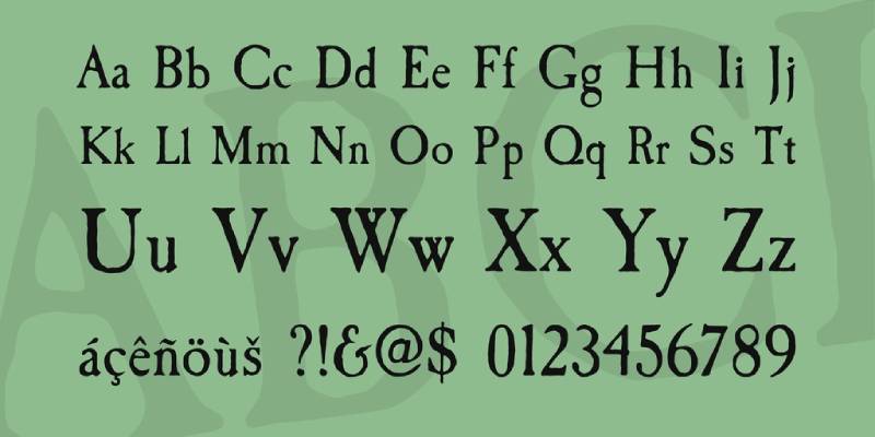
| Garamond | Serif | Moderate | Long texts, books | Old-style, gives a classic look |
| Palatino | Serif | High | Humanities papers | Elegant and easy-to-read |
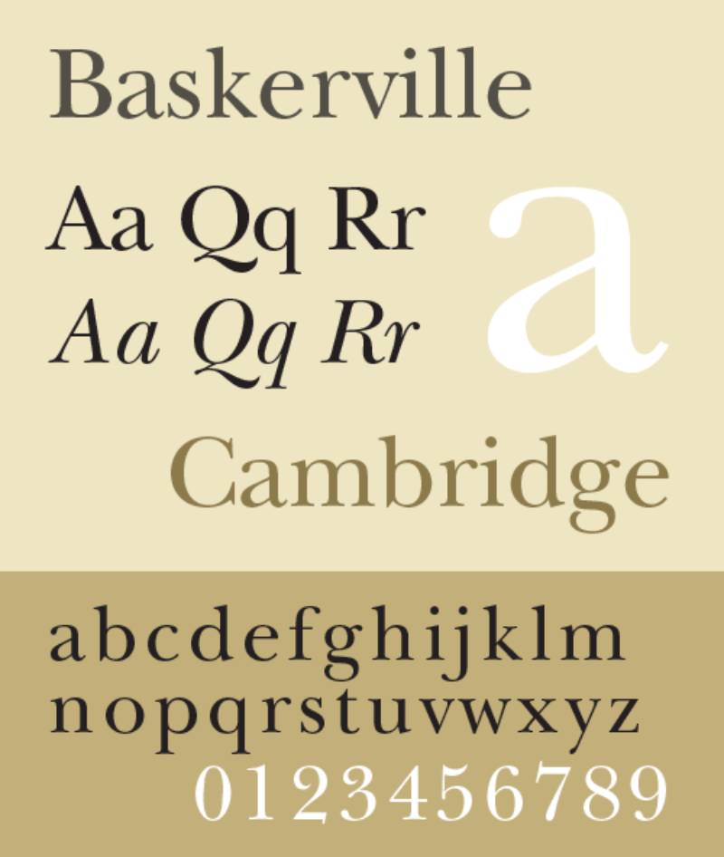
| Baskerville | Serif | Moderate | Formal and traditional works | Professional and authoritative |
| Caslon | Serif | High | Academic journals | Traditional and long-lasting readability |
| Georgia | Serif | High | Online and printed text | Specifically designed for screen readability |
| Cambria | Serif | High | Electronic and printed papers | Designed for on-screen readability and output |
Traditional Choices and Their Limitations
Times New Roman: Ubiquity and readability vs. overuse
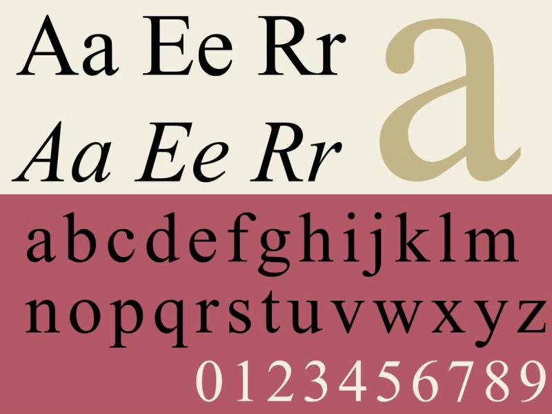
Ah, Times New Roman, the granddaddy of academic fonts. It’s like that reliable old friend, always there, always readable. But here’s the thing – it’s almost too familiar. It’s everywhere, right? Still, its readability can’t be denied, making it a solid choice for your papers.
Arial: Readability in various text blocks
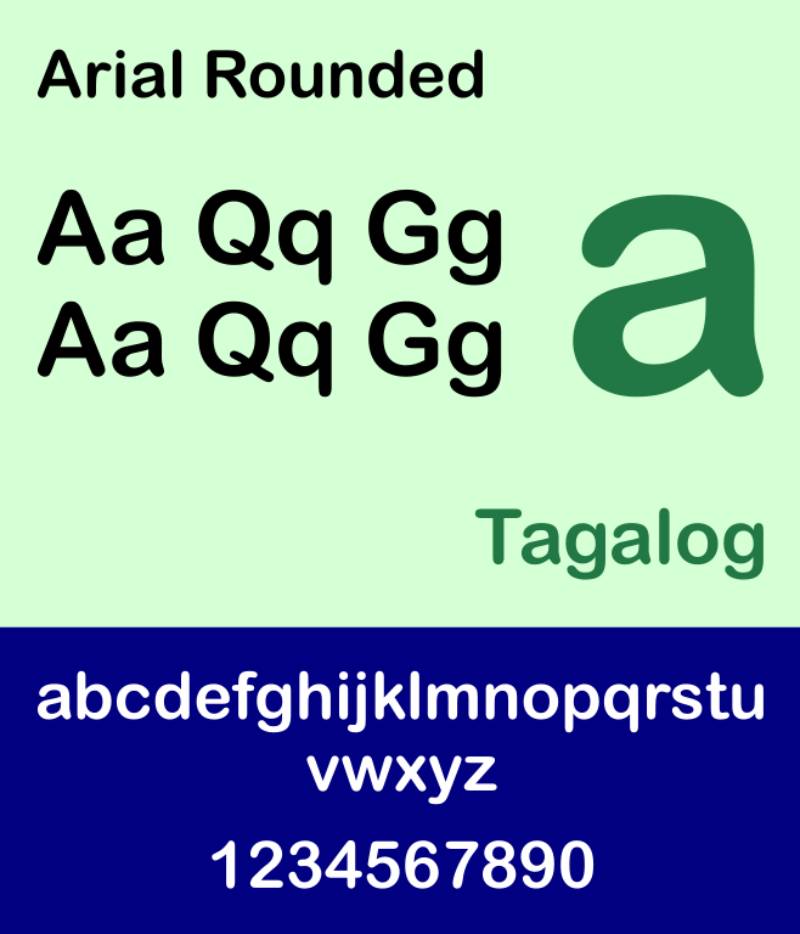
Moving on to Arial. Think of it as the breezy, modern cousin of Times New Roman. It’s straightforward, no-nonsense, and super legible in different text sizes. A safe bet for digital documents, especially if you’re aiming for that clean, contemporary look.
Calibri: Screen readability vs. printed text limitations
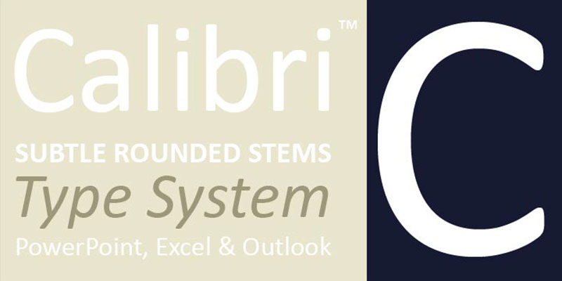
Calibri steps in as the new kid on the block. It’s a champ on screens, thanks to its clear and round characters. But beware, in print, it can lose some of that charm. It’s all about where your paper will be read.
Helvetica: Heavy use and easy readability, suitable for both print and screen
Helvetica is like the cool, versatile artist of fonts. It’s everywhere – from subway signs to tech brands. And for a good reason! It’s incredibly easy to read on any platform. A solid choice if you want your academic paper to be effortlessly readable.
Garamond: Historical significance and suitability for long prose
Garamond takes you back, way back. It’s got this old-school, refined vibe. Perfect for lengthy pieces thanks to its elegant and classic design. It’s like wearing a vintage jacket – stylish yet timeless.
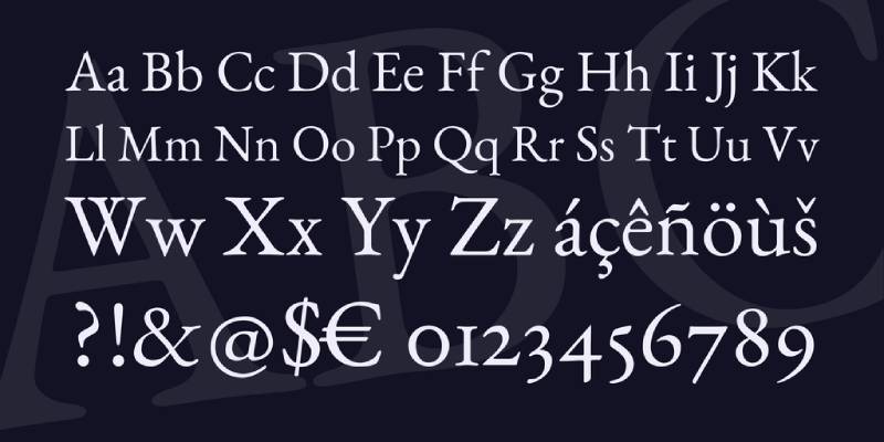
Palatino: Elegant and readable, good for formal academic papers
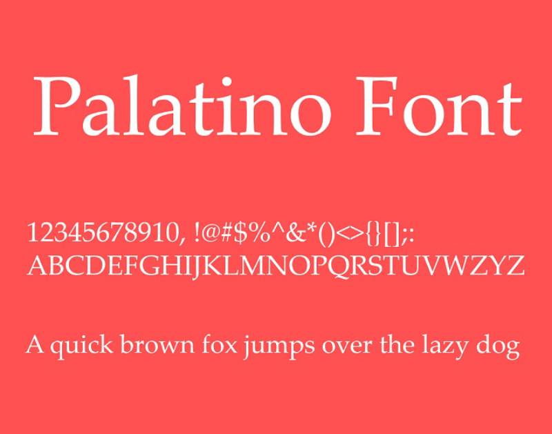
Lastly, Palatino. Picture a grand, old library – that’s Palatino. It brings a touch of elegance without sacrificing readability. Great for when you want to add a dash of formality to your work.
Serif vs. Sans Serif Fonts
Readability and formality considerations
Now, the eternal debate: Serif or Sans Serif? Serif fonts, like Times New Roman and Garamond, bring a formal, traditional vibe. They’re often easier on the eyes for long reads. Sans Serif fonts, like Arial and Helvetica, offer a cleaner, more modern look. Perfect for shorter texts or digital platforms.
Contextual appropriateness for academic documents
Context is king. A thesis? Maybe stick to the classics like Garamond. A quick presentation? Helvetica or Arial can be your best friends. It’s all about matching the font to the purpose.
Baskerville: Positive influence on readers, ideal for print
Baskerville is like a good cup of tea – comforting and reliable. It’s said to have a positive influence on readers. Ideal for print, it makes your text inviting and authoritative.
Caslon: Historical importance, suitable for blocks of text
Caslon is another historical champ. It’s like stepping into an old, wise professor’s office. Perfect for large blocks of text, it brings a touch of academia’s rich history to your paper.
Georgia: Clear and legible, good for online and printed texts

Georgia strikes a balance. It’s like the hybrid car of fonts – efficient and adaptable. Equally legible online and in print, making it a versatile option for various academic documents.
Cambria: Designed for readability on screen, good for electronic submissions
Finally, Cambria. It’s like the ergonomic chair of fonts – designed specifically for screen readability. If your paper is destined for digital eyes, Cambria’s a smart pick.
Font Size and Readability
Let’s dive into a crucial piece of the puzzle when talking about the best fonts for academic papers: Font Size and Readability. Because, let’s face it, nobody wants to squint or get lost in a sea of text.
Standard Font Sizes for Academic Papers
Recommended sizes for essays and theses
Rule of thumb: 12 or 14 points. Why? It’s like the Goldilocks zone – not too big, not too small. Just perfect for readability without eating up too much space. Whether you’re crafting an essay or wrestling with a thesis, sticking to this size range is a safe bet.
Importance of size for readability and eye strain prevention
It’s not just about looking good; it’s about comfort too. Imagine reading pages and pages of tiny text. Hello, eye strain! Bigger isn’t always better, though. Too large, and your paper looks like a children’s book. Balance is key.
Specific Font Recommendations
Wensley Modern Serif for sophistication
Meet Wensley Modern Serif. It’s like that sleek, stylish outfit you save for special occasions. Perfect for when you want your paper to dress to impress. Sophisticated yet readable, it’s a great choice for those formal papers where you need to shine.
Garamond and Palatino for long prose and formal occasions
Oldies but goodies. Garamond and Palatino are like fine wine – they never go out of style. Ideal for lengthy prose, these fonts offer a timeless look while keeping your text clear and easy on the eyes. They bring that classic academic vibe, perfect for dissertations where you want to blend tradition with readability.
Advanced Font Selection Criteria
Alright, let’s get a bit more in-depth with our journey into the best fonts for academic papers. We’re not just talking about what looks good; we’re diving into the nitty-gritty, the criteria that really make a font stand out in the academic world.
Choosing Fonts for Specific Academic Needs
Considerations for thesis writing and scientific research
When you’re knee-deep in thesis writing or scientific research, your font choice is like picking the right tool for a delicate job. It’s not just about looking pretty; it’s about clarity, readability, and making sure your groundbreaking research isn’t overshadowed by a poor font choice. Think about fonts like Georgia or Cambria; they’re like the reliable workhorses of academic fonts.
Balancing legibility and aesthetic appeal
Now, don’t get me wrong, aesthetics matter too. You want your paper to not only be easy to read but also pleasing to the eye. It’s like dressing up your words in their Sunday best. A font like Palatino might just strike that perfect balance between looking sharp and being crystal clear.
Combining Different Typefaces
Strategies for using serif body text with sans serif headings
Mixing it up can be fun! Using a serif font for your body text and a sans serif for headings is like having a well-coordinated outfit with a snazzy hat. It grabs attention where you want it and keeps the reader flowing through your paper. Imagine Garamond for your main text and Arial for your headings – classic, yet modern.
Recommended combinations for visual hierarchy and readability
This is where you play director and guide your reader’s eyes through your masterpiece. Pair a strong, bold sans serif like Helvetica for titles with a subtle, easy-on-the-eyes serif like Times New Roman for your main text. It’s like setting up signposts, making sure your reader doesn’t get lost in the sea of words.
Contemporary and Popular Font Choices
Alright, let’s jump into the present and look at what’s hot right now in the world of best fonts for academic papers. We’re talking fresh, modern, and yes, even trendy. But still, all about that readability and academic vibe.
Modern Fonts for Academic Writing
Constantia for screen and print readability
First up, Constantia. It’s like the chameleon of fonts, equally at home on screen and paper. It’s got this subtle elegance that makes your academic work look effortlessly chic yet totally approachable. Plus, your eyes will thank you after those long hours of reading and writing.
Helvetica and Baskerville for professional and positive influence
Now, Helvetica is the kind of font that walks into a room and everyone notices – in a good way. It’s clean, it’s professional, and let’s be honest, it just looks cool. Pair it with Baskerville, and you’ve got a combo that’s not only pleasing to the eye but also brings a positive vibe to your work.
The Rise of Digital-Optimized Fonts
Calibri’s popularity and suitability for digital platforms
Calibri is like the friendly neighbor of fonts – familiar, reliable, and perfect for digital papers. It’s become super popular for a reason. It’s like it was made for the screen, which, let’s face it, is where most of our work ends up these days.
Times New Roman’s historical significance and widespread use
And then there’s Times New Roman. The OG of academic fonts. It’s got history, it’s got style, and yes, it’s everywhere, but that’s because it works. It’s like the classic blue jeans of fonts – you just can’t go wrong with it.
FAQ On The Best Fonts For Academic Papers
What’s the best font for readability in academic papers?
Serif fonts rule the academic roost for legibility. Times New Roman stands out; it’s visually comfortable for long reads—your thesis panel will thank you. Serifs guide the reader’s eye along lines of text, a scholarly norm.
Can I use sans-serif fonts for my dissertation?
Most committees nod approval at sans-serif fonts for figures and tables. Think Arial or Calibri—crisp for data presentation. Main text? Stick to serifs. Sans-serifs are modern, sure, but tradition wins in dissertation style.
Is there an ideal font size for academic documents?
Size 12 strikes a balance—neither squint-inducing nor space-hogging. It’s the go-to for MLA and APA guidelines. Exceptions exist; footnotes and figure text often shrink to size 10 without side-eye from the scholarly crowd.
Does line spacing matter in academic papers?
Absolutely. Double-spacing is your friend here. It allows breathing room for annotations and comments—a courtesy to readers and graders. Plus, formatting guidelines generally mandate it for everything except block quotations, footnotes, and bibliographic entries.
Should I use different fonts for headings and subheadings?
Consistency is key but differentiate hierarchically. Use bold or italics for distinction, maintaining the same font family. This unifies the document while subtly navigating readers through your paper’s structure.
What’s the most accepted font for academic journal submissions?
Journals often have publisher requirements—Times New Roman, 12-point font frequently tops the list. When in doubt, consult the submission guidelines to avoid the faux pas of using a non-standard font.
What are some lesser-known fonts suitable for academic writing?
Branch out with Garamond—it’s elegant and legible. Book Antiqua also offers that classic vibe without being overused. Exploring beyond Microsoft Word’s default list can distinguish your work subtly yet effectively.
How crucial is font choice in peer-reviewed papers?
Font choice is your paper’s handshakes—first impressions matter. Legible typefaces support peer reviewers in engaging thoroughly with content. Underestimating font’s impact is akin to ignoring the dress code at a gala—noticeable and potentially distracting.
Do different academic fields prefer specific fonts?
Indeed, fields pivot on tradition. Humanities often herald Times New Roman; STEM fields lean into Arial’s clean lines for clarity in data-driven documents. Match your font to the field’s ethos.
Can I be creative with fonts in my academic paper?
Creativity in academics lives in content, less in formatting. Keep the font choice within the bounds of readability and academic institution guidelines. Let your research shout, not your typeface. Originality lands in your discoveries, not font escapades.
Conclusion
Stepping back, eyeing the canvas of our discourse on the best fonts for academic papers, it’s clear: Typography wields quiet power—shaping perception, ensuring clarity, the unsung hero in the story of academic success. Serif fonts—with Times New Roman at the helm—have held the baton in traditional scholarly compositions, swaying with the rhythm of legibility and convention.
Yet, amidst the staccato of intellectual exchange, the modern beats of Arial and Calibri press forth—bringing sleekness to tables and lucidity to data. Foreground this takeaway: your words, the intense research, the hypotheses—they’re the protagonists. Fonts, however, set the stage, inviting eyes to linger longer, to comprehend without strain.
So, equip your arsenal with the typographic titans treasured in these halls of learning. Their silent echo underscores your voice, bearing it aloft through the critical gaze of peers and mentors. With this map in hand, chart a course through the vast sea of academia—poised to make your indelible mark.
If you liked this article about the best fonts for academic papers, you should check out this article about the best fonts for accessibility.
There are also similar articles discussing the best fonts for children’s books, the best fonts for neon signs, the best fonts for vinyl lettering, and the best fonts for invitations.
And let’s not forget about articles on the best fonts for Google Slides, the best fonts for mobile apps, the best fonts for blogs, and the best fonts for magazines.
Bogdan Sandu, a seasoned designer with 15 years of diverse experience, has been designing websites since 2008.
Renowned for his expertise in logo design and visual branding, Bogdan has developed a multitude of logos for various clients.
His skills extend to creating posters, vector illustrations, business cards, and brochures. Additionally, Bogdan's UI kits were featured on marketplaces like Visual Hierarchy and UI8.
Latest posts by Bogdan Sandu (see all)
- Deep Dive: Sea Color Palettes for Tranquil Designs - 3 May 2024
- The Stella Artois Logo History, Colors, Font, And Meaning - 2 May 2024
- Sky Color Palettes for Fresh Designs: 40 Examples - 2 May 2024