
The Pittsburgh Penguins Logo History, Colors, Font, And Meaning
Imagine a symbol that encapsulates the spirit of a city and the tenacity of its people. That’s exactly what the Pittsburgh Penguins logo stands for.
Woven into the fabric of the National Hockey League, this emblem represents more than just a hockey team; it’s a beacon of athletic prowess and design elegance.
Within this article, we’ll dive into the logo’s influential journey – from sketched idea to an iconic sports emblem. Together, we’ll unfold the layers of its history, design elements, and the profound impact it has on fan gear and NHL brand marketing.
By the last period, you’ll grasp not only the aesthetic and emotional weight of the black and gold crest but also appreciate how this artistic masterpiece mirrors the ever-evolving story of the Penguins franchise.
Prepare to explore the chapters that shaped the Penguins Mascot as we know it – a timeless testament to logo design and hockey heritage.
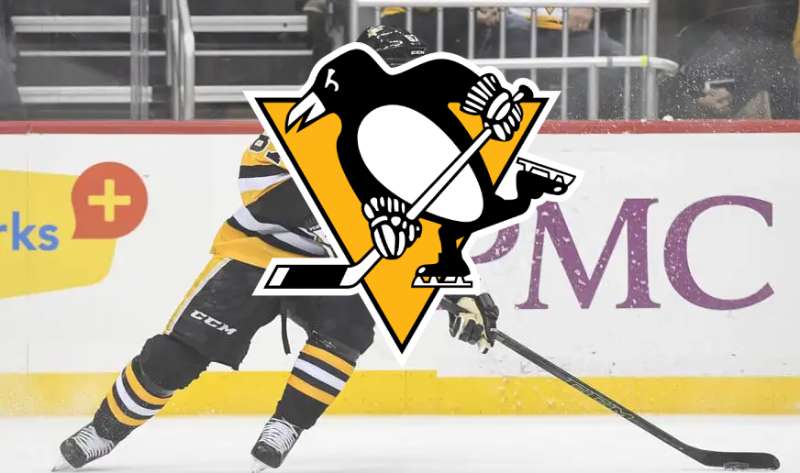
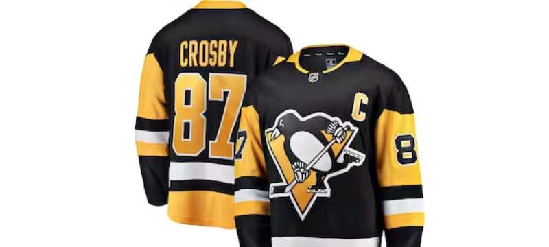
The Meaning Behind the Pittsburgh Penguins Logo
![]()
Oh man, you’d think it’s just a cute bird on skates, right? But dive deeper, and there’s so much more.
The Power of the Penguin
Why a penguin? Penguins are tough, resilient birds. Just like hockey players, they thrive in extreme conditions.
Penguins waddle, but on ice, they glide seamlessly – just like hockey players. The imagery here isn’t just about a bird; it’s about resilience, agility, and adaptability.
The Skating Stance
The way the penguin is poised on the logo? It’s not just skating. It’s attacking. It’s moving forward with purpose and determination, embodying the spirit of the team on the ice.
The History of the Pittsburgh Penguins Logo
![]()
Dude, logos evolve, and the Pittsburgh Penguins logo has had its own journey.
Humble Beginnings
The initial design? Simpler times. It had the penguin, sure, but over the years, the emblem has grown, refined, and become more dynamic.
Updates and Refinements
Every few decades, tweaks have been made. Whether it’s to make the penguin more modern, or to better align with the team’s vision, these changes have added depth and layers to the emblem’s story.
The Colors of the Pittsburgh Penguins Logo
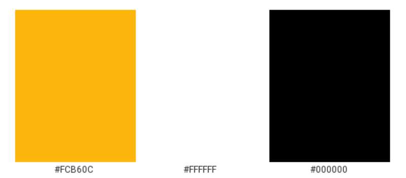
Colors, they’re not just pretty. They carry weight, emotion, and story.
Black and Gold, Baby!
In the world of sports, especially hockey, colors can say a lot. Black – for strength and determination. Gold – for excellence and victory. The combo? Unbeatable. It’s no accident that these are the colors of the team.
The Evolution of Shades
Over time, the gold has seen variations. From brighter yellows in earlier days to deeper, richer golds in modern times. It’s all about keeping it fresh but also connected to roots.
The Font Used in the Pittsburgh Penguins Logo
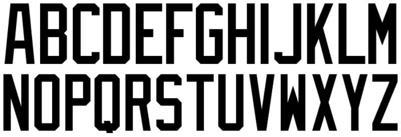
Let’s talk type. The font, it’s not just letters. It’s personality.
Bold and Sturdy
Look at that typography! Strong. Bold. Just like a team ready to take on the world. Fonts speak, and this one screams confidence.
The Modern Touch
Over the years, as with the logo, the type’s undergone tweaks. Keeping up with times, but without losing its essence.
Impact on Pop Culture
Man, logos aren’t just for teams. They’re symbols, and they seep into our culture.
Merch and Beyond
Caps, jerseys, mugs… you name it. The logo’s become an icon, not just for die-hard fans, but anyone who digs cool designs.
In the Heart of the City
Walk around Pittsburgh, and what do you see? That logo’s everywhere. It’s not just an emblem for a team; it’s part of the city’s heartbeat.
Influence on Other Team Designs
Let’s get real. When something’s good, it sets trends.
Leading the Pack
Over the years, many teams have looked at the Pittsburgh Penguins logo and thought, “We need something that powerful.” It’s set a standard in sports branding.
The Embrace of Mascots
The penguin wasn’t the first mascot in sports. But its popularity? It sure encouraged other teams to look into mascots for their brand identity.
FAQ On The Pittsburgh Penguins Logo
Why does the Pittsburgh Penguins logo have a penguin in it?
The logo embodies the team’s name, embracing the penguin for its associations with ice, harkening to hockey’s essence. This mascot choice adds character, creating a distinctive brand that fans and the NHL community easily recognize.
How has the Pittsburgh Penguins logo changed over the years?
Starting with a full-bodied penguin with a scarf, the logo evolved into a more streamlined, triangular emblem, focusing on the penguin’s head.
Modifications reflect modern tastes in sports branding, yet maintain the classic black and gold palette integral to Pittsburgh’s identity.
What is the significance of the colors in the Pittsburgh Penguins logo?
Black and gold resonate with Pittsburgh’s sporting heritage, shared with the Steelers and Pirates. This color scheme fosters unity across the city’s sports teams, symbolizing solidarity and a gritty, hard-working spirit in line with the city’s history.
When was the Pittsburgh Penguins logo first introduced?
The first official logo debuted in 1967 when the franchise joined the NHL. It featured a playful penguin with a hockey stick, instantly establishing a jovial yet competitive representation for the newly minted team.
Who designed the original Pittsburgh Penguins logo?
The original logo was the result of a contest held by the Penguins’ ownership. What a creative strategy! It garnered community involvement and distilled the city’s spirit into a visual form that kick-started the team’s visual branding journey.
Is the Pittsburgh Penguins logo one of the most recognizable in sports?
Absolutely. Its presence is strong, not just in hockey, but across the sports world. The design’s longevity and the team’s Stanley Cup victories have cemented its status as a globally recognized sports symbol.
How do the Pittsburgh Penguins use their logo in their marketing?
From merchandise to digital campaigns, the logo is front and center. It adorns jerseys, hats, and a myriad of fan gear, acting as the cornerstone of the franchise’s branding and advertising efforts.
Has the Pittsburgh Penguins logo ever been controversial?
Unlike some sports logos with contentious histories, the Penguins’ emblem steers clear of controversy. Its design focuses on a general concept rather than specific cultural references, which aids in its widespread acceptance.
What do fans think of the Pittsburgh Penguins logo?
The loyalty runs deep. Fans generally hold the logo in high esteem, often seen wearing the emblematic trademark with pride.
The design captures the essence of Pittsburgh’s vibrant sports culture, making it a fan-favorite.
How often do NHL teams like the Pittsburgh Penguins update their logos?
Updates and tweaks are infrequent compared to other industries. It’s about maintaining tradition within the dynamic of modern design. Only pivotal moments in a team’s timeline, like ownership changes or significant anniversaries, typically prompt a logo refresh.
Conclusion
Embarking on this exploration of the Pittsburgh Penguins logo, one truth has crystallized like ice beneath skate blades—logos are much more than mere graphics.
- They are histories woven into threads of jerseys.
- They are symbols uniting thousands under a banner of passion.
The impact of this particularly iconic emblem has extended beyond the borders of a hockey rink, leaping into the hearts of those who don the black and gold crest. It’s an identity shared by a city and immortalized through Stanley Cup victories.
As curtains draw on this narrative, one can’t help but admire the genius behind this scalene triangle housing a determined penguin, hockey stick in flipper—striking in its simplicity, enduring in its significance.
Its evolution, ever so subtle, mirrors the changing tides of time, yet steadfastly holds onto the legacy of the franchise. This logo isn’t merely viewed; it’s felt. It thrums with the anticipation of face-offs and the echoes of cheering crowds, forever etching the spirit of both the Penguins and Pittsburgh onto the icy canvas of hockey lore.
If you liked this article about the Pittsburgh Penguins logo, you should check out this article about the Ottawa Senators logo.
There are also similar articles discussing the Philadelphia Flyers logo, the San Jose Sharks logo, the St. Louis Blues logo, and the Tampa Bay Lightning logo.
And let’s not forget about articles on the Toronto Maple Leafs logo, the Vancouver Canucks logo, the Vegas Golden Knights logo, and the Washington Capitals logo.
Bogdan Sandu, a seasoned designer with 15 years of diverse experience, has been designing websites since 2008.
Renowned for his expertise in logo design and visual branding, Bogdan has developed a multitude of logos for various clients.
His skills extend to creating posters, vector illustrations, business cards, and brochures. Additionally, Bogdan's UI kits were featured on marketplaces like Visual Hierarchy and UI8.
Latest posts by Bogdan Sandu (see all)
- Tie the Knot: Romantic Wedding Color Palettes - 9 May 2024
- Game Show Typography: What Font Does Jeopardy Use? - 9 May 2024
- The Carlsberg Logo History, Colors, Font, And Meaning - 8 May 2024