


The San Jose Sharks Logo History, Colors, Font, And Meaning
Imagine a symbol that encapsulates the ferocity of the ocean’s apex predator with the finesse of ice gliding steel. The San Jose Sharks logo does just that, embodying the spirit of both the city it represents and the heart-pounding action of professional hockey.
As the emblem of an esteemed NHL team, it’s more than mere graphics; it’s a banner under which fans rally, and history is made.
In this voyage through design and legacy, you’ll unravel the story behind the shark that took a bite out of hockey’s visual culture.
Delve into the evolution of this iconic sports crest, its deep ties to the Silicon Valley locale, and its impact on merchandise far beyond the reaches of the SAP Center.
By the close, you’ll have a newfound appreciation for the artistry and symbology that render this emblem a beacon for both Sharks hockey enthusiasts and aficionados of logo design.
Prepare to explore the intricacies of branding that transcends the ice hockey arena, and discover how an insignia becomes synonymous with passion, pride, and the raw energy of sport.
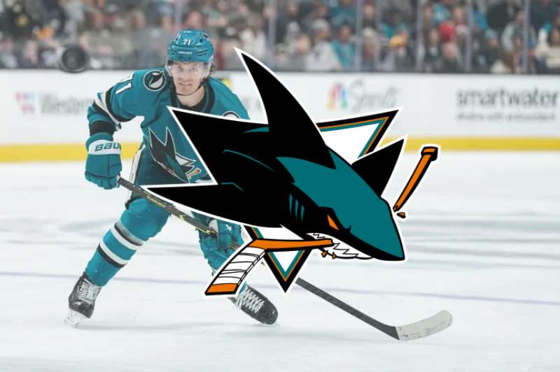
The Meaning Behind the San Jose Sharks Logo
![]()
Hey there, you ever wonder about logos? Especially the ones that stick out like, “Whoa, what’s the story there?” Today, let’s dive deep (see what I did there?) into the San Jose Sharks logo. It’s not just a picture, my friend; it’s a story!
A Fierce Representation
Alright, let’s get straight to it. A shark is not your everyday dolphin; it’s fierce, dominant, and represents power.
When you see that shark on the logo, it’s not just about representing the city’s ties with the marine world. It’s also about showcasing the team’s aggression, their drive, and their will to dominate in the game. That shark is more than a fish; it’s a statement.
A Connection to Home
San Jose has a rich marine heritage. So, what better way to represent the city and its team than with a shark? The choice is deeply rooted in the geography and identity of San Jose. It’s like, “Hey, we’re proud of our waters and the magnificent creatures in it.”
The History of the San Jose Sharks Logo
![]()
You might think that the San Jose Sharks logo has been the same since the dawn of time. But nah, there’s more to it!
The Original Bite
The very first logo? Oh, it had some bite! It was sleek, had that classic shark look, but over time, it evolved. As the team changed and grew, so did the identity they wanted to showcase.
Tweaks and Turns
Through the years, the logo underwent subtle changes. Adjustments in shading, positioning, and even the intensity of the shark. It’s like watching a kid grow up, but in logo form!
The Colors of the San Jose Sharks Logo
![]()
Colors, my friend, they aren’t just for looking pretty. They say something, they evoke emotions.
Deep Ocean Teal
That beautiful teal? Think deep oceans, mystery, and the depth of the team’s spirit. It’s calming but with an underlying intensity.
Accentuating Black
Black in the mix? Oh, it’s not just for contrast. It stands for the team’s strength, elegance, and timeless essence.
The Font Used in the San Jose Sharks Logo
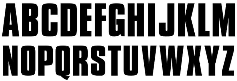
Typography geeks, gather around. The font, or should I say, the typography of a logo is like the unsung hero. It complements the visual.
The font used in the San Jose Sharks logo is NHL San Jose Regular. This font is also used for jersey lettering, player names, numbers, team logo, branding, and merchandise.
The wordmark logo introduced in 2020/21 features the entire name of the team presented in italics with a modified sans serif style font.
Bold and Direct
When you look at the text accompanying the shark, it’s bold, it’s direct. It resonates with the team’s clear-cut strategy and no-nonsense approach.
Contemporary Yet Timeless
It’s a delicate balance, but the font strikes it perfectly. Modern vibes? Check. Timeless aura? Double-check.
The Artistic Inspiration Behind the Logo
Let’s talk art! There’s always some inspo, right?
Minimalism
In an age where less is more, the San Jose Sharks logo embodies minimalistic brilliance. It’s straightforward yet profound.
Fluidity and Motion
Notice the curves, the dynamic movement of the shark? It’s all about capturing the essence of fluidity, the seamless glide through challenges, and the perpetual motion of the game.
How Fans Have Embraced the Logo
Tattoos and Merch
Dude, you won’t believe the number of fans flaunting shark tattoos or rocking some sick merch. It’s become more than a logo; it’s a symbol of their undying love for the team.
Memes and Social Media
In the digital age, what’s more approval than trending on social media? The logo, its variations, and the quirky memes fans create; it’s all a testament to its iconic status.
FAQ On The San Jose Sharks Logo
What inspired the design of the San Jose Sharks logo?
The logo captures the essence of the fierce predator of the oceans, blending it with the dynamic nature of the team. It’s inspired by the attributes of the shark, synergizing with the aggressive and swift characteristics required in NHL gameplay.
How has the San Jose Sharks logo evolved over the years?
From its inception, the emblem has seen subtle refinements rather than complete overhauls. Updates have focused on modernizing the visual while maintaining the original shark’s spirit and team colors—teal and black, preserving the San Jose sports crest’s identity.
Who designed the original San Jose Sharks logo?
The original logo, introduced with the team’s debut, was the brainchild of Terry Smith. Not just a graphical triumph, it’s an emblem woven into the Silicon Valley’s fabric, conceived to embody the region’s innovative and competitive edge.
Are there alternative versions of the San Jose Sharks logo?
Yes, indeed. The team has alternate logos, each with a unique twist on the standard shark fin emblem. They range from more abstract interpretations to the integration of local California motifs, expanding the team’s visual ice hockey logos portfolio.
What do the colors of the San Jose Sharks logo represent?
The teal, black, and white colors symbolize the depth and mystery of the sea while embodying a sleek, competitive vibe. Teal, the primary hue, represents the unique color of the Pacific Ocean, closely tied to the team’s San Jose home.
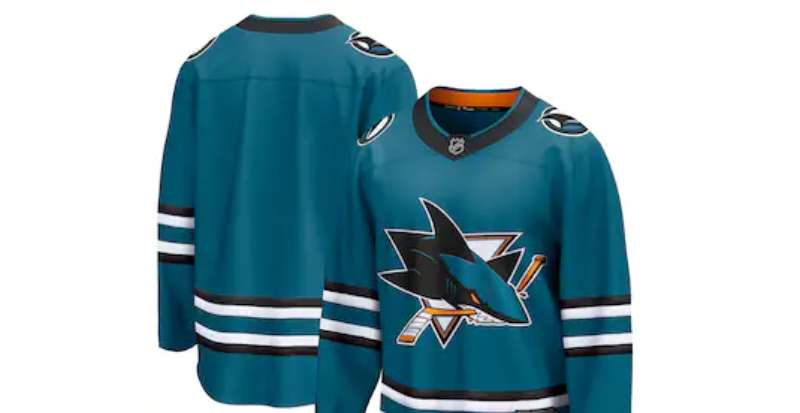
How often does the San Jose Sharks logo get used on merchandise?
Frequently, to say the least. The emblem adorns everything from jerseys and hats to pucks and memorabilia. It’s a core aspect of Sharks merchandise, symbolizing fan loyalty and regional pride.
Is the San Jose Sharks logo considered iconic in the sports world?
Absolutely. Its distinctive look and the team’s presence in the Stanley Cup Playoffs have carved out its iconic status. It stands as a representative of professional hockey insignia recognized well beyond the confines of the SAP Center.
How does the San Jose Sharks logo fit within the broader NHL branding?
Within the larger NHL branding context, it distinguishes itself through its unique maritime theme linked to an actual shark, making it one of the more memorable and distinctive NHL team emblems in the league.
What role does the San Jose Sharks logo play in local community engagement?
The logo, beyond representing the team, is a rallying symbol within the community. It’s integral to community events, youth programs, and local identity—the team’s commitment to the area reflected in the sports team identity.
How do copyright and trademark laws protect the San Jose Sharks logo?
They ensure exclusive rights for its use, reproduction, and distribution. Such laws guard the logo against unauthorized usage, ensuring it remains a legally protected asset of the San Jose Sharks franchise, reinforcing its status within sports franchise branding.
Conclusion
Navigating through the waters of design and team spirit, the journey behind the San Jose Sharks logo unfolds a narrative rich with identity, passion, and a fierce competitive nature. It stands as a beacon of professional hockey insignia, artfully combining the raw menace of the ocean’s top predator with the sleek agility inherent to NHL play.
Circling back to the cavernous depths from which this icon emerged, one can’t help but appreciate how deeply engrained it has become in the fabric of both local culture and the widespread merchandise it graces. From the teal and black logo that adorns jerseys to the energetic cheers within the SAP Center, its impact resounds.
- Embracing change, yet rooted in tradition
- Becoming an iconic emblem
- A touchstone for fan loyalty
With each thunderous slapshot and heart-stopping save, the logo endures—not just as a graphic but as a timeless emblem bringing together a community, echoing the unmatched spirit of the game, and honoring the city that’s named in its crest.
If you liked this article about the San Jose Sharks logo, you should check out this article about the Ottawa Senators logo.
There are also similar articles discussing the Philadelphia Flyers logo, the Pittsburgh Penguins logo, the St. Louis Blues logo, and the Tampa Bay Lightning logo.
And let’s not forget about articles on the Toronto Maple Leafs logo, the Vancouver Canucks logo, the Vegas Golden Knights logo, and the Washington Capitals logo.
Bogdan Sandu, a seasoned designer with 15 years of diverse experience, has been designing websites since 2008.
Renowned for his expertise in logo design and visual branding, Bogdan has developed a multitude of logos for various clients.
His skills extend to creating posters, vector illustrations, business cards, and brochures. Additionally, Bogdan's UI kits were featured on marketplaces like Visual Hierarchy and UI8.
Latest posts by Bogdan Sandu (see all)
- Tie the Knot: Romantic Wedding Color Palettes - 9 May 2024
- Game Show Typography: What Font Does Jeopardy Use? - 9 May 2024
- The Carlsberg Logo History, Colors, Font, And Meaning - 8 May 2024