The Vegas Golden Knights Logo History, Colors, Font, And Meaning

Imagine the pulsating energy of a packed T-Mobile Arena, where every gaze converges on one iconic emblem—the Vegas Golden Knights logo. It’s an insignia that transcends mere graphic artistry, embodying the spirit of a city synonymous with vibrancy and resilience.
The logo is not just stitched on the jerseys and fan merchandise, it’s etched in the heart of every enthusiast pulsing with the thrill of the game.
In this exploration, we delve into the essence of a symbol that has swiftly carved its niche in the National Hockey League’s storied tapestry.
You’ll unravel the threads of creativity and strategy interwoven into sports branding and discern the logo’s symbolism that echoes the lore of both knights and Nevada.
Discover how the Golden Knights’ emblem mirrors the audacious spirit of Las Vegas itself, and grasp the synergy between sports culture and graphic design principles that breathe life into this contemporary crest.
By journey’s end, you’ll be versed in the nuances that dictate the design choices shaping the identities gracing the NHL’s rinks, particularly that of the Vegas Golden Knights.
The Meaning Behind the Vegas Golden Knights Logo
Symbolism in Design
So, let’s break this down. A logo is like a visual story, right? And the Vegas Golden Knights logo? It’s a tale brimming with power, valor, and a hint of that Vegas charm.
The helmet central to the logo represents a knight, a symbol of strength and bravery. This isn’t just about a game on ice; it’s about a legacy.
Embracing Vegas
Then there’s the V-shaped opening on the helmet. Sneaky, right? Well, that’s a nod to “Vegas”. It’s like the design is whispering, “Yeah, we’re here, and we own this space.” A clever merge of identity and location.
The History of the Vegas Golden Knights Logo
The Beginning
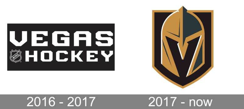
Way back when the idea of a Vegas hockey team was just a twinkle in the eye, who’d have thought the logo would become iconic? But then it happened. A marriage of sports, design, and desert land. The outcome? The Vegas Golden Knights logo.
Evolutions and Revamps
Surprisingly, this logo hasn’t gone through the typical rebrands many sports teams face. It hit the mark straight off the bat, solidifying its place in both the sporting and design world.
The Colors of the Vegas Golden Knights Logo
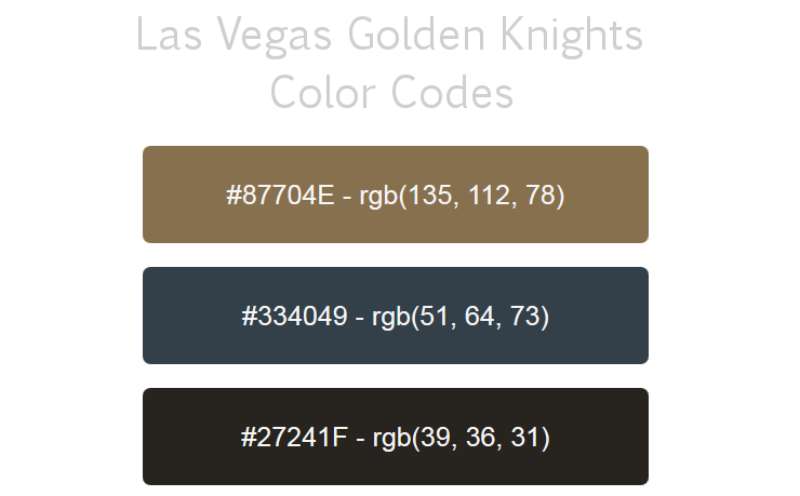
Gold: For Glory
Gold isn’t just about bling. In the Vegas Golden Knights logo, it stands for excellence, glory, and top-tier performance. The kind of stuff legends are made of.
Steel Grey: Strength and Resolve
Then comes the steel grey, channeling the strength of a knight’s armor. It’s more than just a shade; it’s an ethos.
The Font Used in the Vegas Golden Knights Logo
Modern yet Timeless
Dive into the textual part of the logo, and you’ll find a font that’s both modern and timeless.
It’s sleek, it’s bold and oh-so-readable. It compliments the emblem, ensuring the team’s name stands out, yet remains a part of the larger story.
Design Inspiration: Where it All Began
Knighthood and Valor
The whole knight vibe? It doesn’t just pop out of nowhere. The team wanted an emblem that oozed valor, strength, and courage. And what better than a knight’s helmet to bring that vision to life?
Vegas Vibes
Beyond the medieval bravery, there’s also the unmistakable glitz and glam of Vegas. The logo had to encompass both these worlds, and boy, did it deliver!
Impact on Merchandise and Branding
Jerseys and More
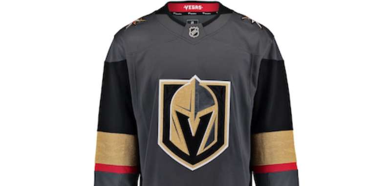
From jerseys to caps, the Vegas Golden Knights logo is everywhere. And let’s be honest, it’s not just about supporting the team. Wearing that logo? It’s like flaunting a piece of art.
A Brand Beyond Sports
The beauty of this design is how it’s transcended beyond the rink. Today, it’s a brand, an identity, a statement. Whether you’re a hockey fan or not, you can’t help but admire the sheer design genius of it.
FAQ On The Vegas Golden Knights Logo
What inspired the Vegas Golden Knights logo?
The inspiration springs from the team’s noble namesake, the knights, and a desire to encapsulate the enduring courage and valor these historical figures represent. Featuring a helmet with a visible “V” for Vegas, it’s a salute to both the city and warrior spirit.
How was the color scheme for the Vegas Golden Knights logo chosen?
Their color scheme mirrors the golden glint of a knight’s armor and the red rock hues native to Nevada. The steel grey represents strength and durability, while black adds a touch of power and intensity. Gold signifies a standard of excellence, and red adds a bold flair.
What does the Vegas Golden Knights logo symbolize?
The logo stands as a fortress of regional pride, reflecting Las Vegas’s dynamic sports culture and the team’s connection to its home. It’s a bastion of fan identity, symbolizing unity and the shared thrill of hockey as more than a game, but a community’s passion.
Who designed the Vegas Golden Knights logo?
The emblem was crafted by Adidas in collaboration with the NHL, culminating in a design that balances modernity with tradition.
It’s a testament to meticulous sports graphic design carved out of roundtable discussions, sketches, and the vision to create something iconic.
How has the Vegas Golden Knights logo evolved since the team was established?
Surprisingly, the logo has maintained its original integrity, a testament to its well-received inception. Even as sports branding thrives on evolution, the endurance of the Golden Knights’ logo speaks volumes about its instant classic status amidst NHL team emblems.
What is the significance of the secondary logos associated with the Vegas Golden Knights?
Secondary logos, like the crossed swords behind a star, deepen the team’s mythology, representing the fierce combat prowess of knights and a nod to the famous star-studded Las Vegas Strip. A balance between heritage and hometown homage.
Can you describe the different logo variations used on Vegas Golden Knights merchandise?
On merchandise, variations play with color contrasts and scale but retain the core identity graphics. There’s something for every enthusiast—from understated monochrome to full-color decals, all underscoring the team’s visual narrative.
In what way does the Vegas Golden Knights logo represent Las Vegas?
It encapsulates Las Vegas’ allure—bold, resilient, and sparkling with possibility. The inclusion of gold elements whispers of the city’s glamorous side, while the warrior’s helmet echoes its fighting spirit. It captures an essence unique to the team’s home.
How does the Vegas Golden Knights logo compare to other NHL team logos?
It’s a striking tapestry of tradition and modernity, standing out as one of the few NHL logos with a direct representation of its team’s namesake.
Its level of abstraction and fusion of city-specific elements set it apart (think: the “V” in the helmet not found in other logos).
What role does the Vegas Golden Knights logo play in fan engagement and team branding?
Logos are the heartbeat of team branding, and this one is no exception. It’s plastered on fan merchandise, igniting team spirit and serving as a brand identity cornerstone.
A rallying symbol, its sight alone sparks an electric connection among the Golden Knights’ fans.
Conclusion
In the electric expanse of design and sports enthusiasm, the Vegas Golden Knights logo stands as a shining beacon of identity. It’s more than an emblem; it’s a narrative woven in the heart of every play, every cheer, every moment of triumph that unfolds within the rink’s hallowed walls.
- It’s where boldness meets finesse,
- Where history greets modernity,
- Where the thrill of the game meets the art of design.
This isn’t just a logo; it’s a storytelling device, capturing imaginations and encapsulating the NHL team spirit within its contours. Like knights of old set against the backdrop of a vibrant city, the logo merges past with the pulsating present.
As the final whistle sounds, we skate away knowing that this symbol—a blend of chivalry and state-of-the-art creativity—has left its indelible mark both on sports branding and within the loyal hearts of its admirers. The journey through the logo’s artistry reveals the essence of what it means to be a Golden Knight under the luminous glow of Las Vegas.
If you liked this article about the Vegas Golden Knights logo, you should check out this article about the Ottawa Senators logo.
There are also similar articles discussing the Philadelphia Flyers logo, the Pittsburgh Penguins logo, the San Jose Sharks logo, and the St. Louis Blues logo.
And let’s not forget about articles on the Tampa Bay Lightning logo, the Toronto Maple Leafs logo, the Vancouver Canucks logo, and the Washington Capitals logo.
- The Bungie Logo History, Colors, Font, And Meaning - 27 April 2024
- After Dark: Night Color Palettes for Mysterious Designs - 27 April 2024
- The Capcom Logo History, Colors, Font, And Meaning - 26 April 2024


