The Los Angeles Kings Logo History, Colors, Font, And Meaning
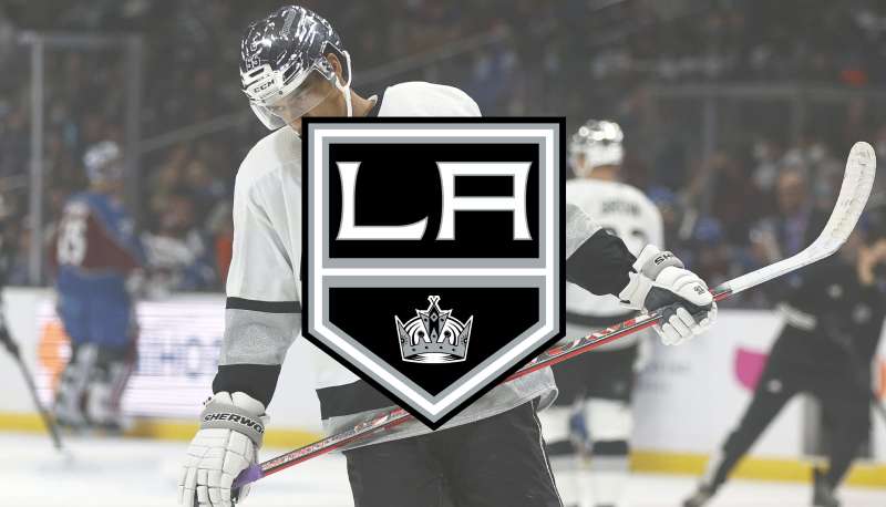
Every stroke of the brush, every hue selected, carries the essence of identity—and nowhere does this resonate more than with the celebrated emblem of the Los Angeles Kings logo.
This icon is not merely a splash of silver and black; it is a banner under which fans rally, a visual symphony striking the chord of kinship in the sprawling City of Angels.
Delve into the artistry of this storied insignia. From the sleek lines that contour the regal crown to the evolution that recounts the team’s victories and trials, the Kings’ logo is a testament to the power of sports branding.
Whether adorned on jerseys showcased beneath the bright lights of the Staples Center or emblazoned on fan apparel rippling in the Californian breeze, its impact is profound.
In unpacking the rich tapestry behind the Kings’ emblem, explore the hallmarks of graphic design in sports—a realm where passion meets precision.
This excursion is not just for die-hard devotees of the puck but for anyone fascinated by the confluence of identity, belonging, and the audacious spirit of competition.
The Meaning Behind the Los Angeles Kings Logo
![]()
Behind every logo is a world of symbolism and stories, and the Los Angeles Kings logo is no exception.
Team Spirit & Royalty
The crown, the predominant feature, is a nod to royalty. It subtly signifies the team’s ambition to rule the rink, to be the kings of the game.
They’re not just participants; they’re contenders for the throne. Every time the players hit the ice, they’re reminded of the regality, the responsibility, and the pride.
LA Vibes
The logo isn’t just about hockey; it’s about its home. Los Angeles – a city of dreams, stars, and endless summers. The emblem encapsulates that essence, blending LA’s vibrant energy with the ferocity of the game.
The History of the Los Angeles Kings Logo
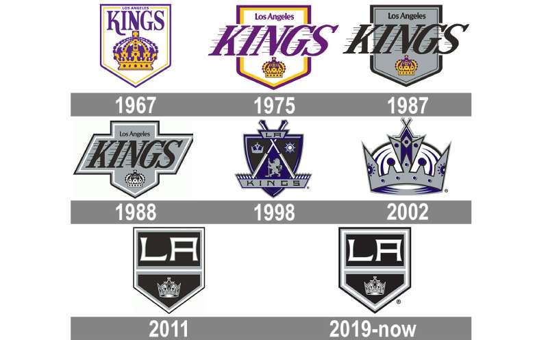
Dive into a timeline, and you’ll see the Los Angeles Kings logo evolving, almost mirroring the team’s journey.
Inception and Original Design
When the team debuted in the NHL in the late 1960s, the logo was a purple and gold crest, colors which spoke of royalty. The design was simple yet striking, setting the tone for the decades to come.
The ’90s Makeover
Fast forward to the ’90s, and you see a shift. The colors darkened, the crown became more detailed, echoing the team’s matured gameplay and fiercer strategies.
The Colors of the Los Angeles Kings Logo
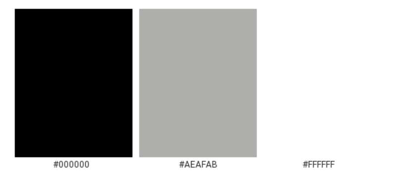
Colors are never just colors in design. They tell tales, evoke feelings.
Purple & Gold Era
Initially, the team sported purple (or “Forum Blue”) and gold, representing regality and prestige. It was a shoutout to the team’s royal name and the city’s sunny vibes.
Silver & Black Transition
The transition to silver and black was more than a fashion statement. It signified a new era, a tougher stance, and perhaps even a nod to LA’s glamorous nightlife.
The Font Used in the Los Angeles Kings Logo
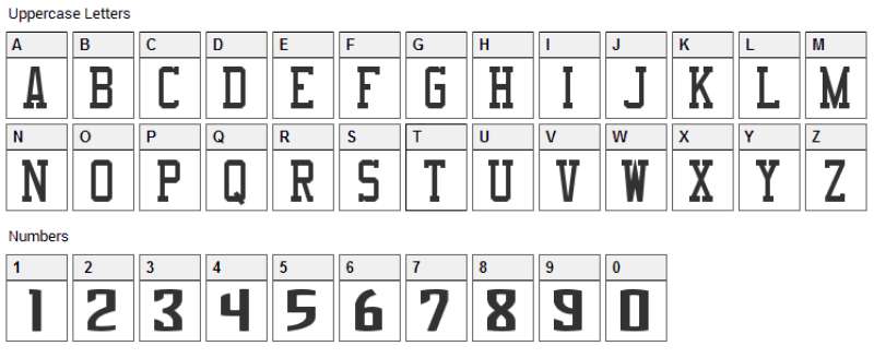
Typography often goes unnoticed, but it’s crucial in branding.
Bold & Assertive
The current font is bold, assertive, and undeniably modern. It stands out, much like the team itself, asserting its presence and ambition.
Legacy of Letters
Over the years, the typography has seen shifts, but it has always stayed impactful, ensuring the team’s name is instantly recognizable.
Evolution and Reception
Every change in design, especially something as iconic as a team logo, is bound to stir emotions.
Fans’ Adaptation
While initial changes often met resistance – fans grow attached, after all – each iteration has eventually been embraced, becoming a symbol of specific eras and memories.
Impact on Merchandise
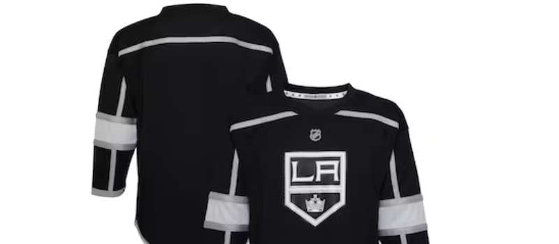
Every tweak, be it color or design, influences merchandise. Vintage jerseys become collector’s items, and new ones mark the beginning of chapters.
Cultural Impact
Beyond the rink, the Los Angeles Kings logo has found its place in broader culture.
Fashion Statements
Snapback hats, cool tees, and even high-fashion adaptations – the logo has become a fashion statement, sported by fans and celebrities alike.
LA’s Sports Landscape
In a city buzzing with sports legends – the Lakers, Dodgers, and more – the Kings and their emblem have carved out a distinct space, marking hockey’s significant imprint on LA’s diverse sports tapestry.
FAQ On The Los Angeles Kings Logo
What is the significance of the Los Angeles Kings logo?
The Kings’ logo embodies more than just a team; it represents a legacy of grit and triumph in the NHL. The crown symbolizes sovereignty in the realm of ice hockey, while the silver and black reflect a distinctive, bold identity intrinsic to the Los Angeles franchise.
How has the Los Angeles Kings logo evolved over time?
Beginning with a regal purple and gold palette, the logo has undergone several redesigns, mirroring the team’s evolution.
The current iteration boasts a more streamlined look, a crisp crown, emphasizing the Kings’ modern era, while honoring the franchise’s storied past with its enduring color scheme.
What do the colors of the Los Angeles Kings logo represent?
The deep black signifies power and authority. Silver injects a dash of sophistication—a nod to the glitz of Los Angeles. The white offers a stark, clean contrast. Together, they craft a visual identity as sharp and formidable as the players themselves.
Can you describe the design elements of the Kings’ logo?
Precision reigns in the logo’s design elements. A distinctive, bold crown sits at the heart of the insignia, punctuated by a hockey stick that signifies the sport. Typography complements the aesthetic, ensuring the team’s name is as memorable as the icon itself.
When was the current Los Angeles Kings logo adopted?
The current logo design was adopted in the 2011–2012 NHL season. It was a strategic move that brought back the cherished black and silver, reinforcing the brand with a visual tie to the Kings’ hockey identity and their prominent era of success during the early ’90s.
What role does the Los Angeles Kings logo play in fan engagement?
Memorabilia emblazoned with the logo—be it on jerseys, hats, or flags—is a beacon for fans. It’s a rallying symbol for the community, stimulating fan apparel sales and helping supporters feel a visceral part of the Kings’ team identity.
How is the Los Angeles Kings logo used in marketing?
Striking and memorable, the logo anchors the Kings’ branding. It stamps all marketing collateral, from digital adverts to physical merchandise, reinforcing the sports team identity in the competitive market of professional hockey and beyond.
Who designed the original Los Angeles Kings logo?
The original logo was designed for the Kings’ 1967 inaugural season. Though the designer’s name has faded into the annals of history, their work sparked a visual legacy that has endured for decades, becoming synonymous with Los Angeles sports.
Are there any legal restrictions for using the Los Angeles Kings logo?
As a trademarked emblem, the Kings’ logo is protected. Unauthorized use, especially in commercial contexts, violates trademark laws. Licensing is essential for any use outside personal, non-commercial activities.
How does the Los Angeles Kings logo compare to other NHL team logos?
While every NHL team emblem carries its distinct flare, the Kings’ logo stands out with its monochromatic boldness.
It eschews excess for impact—a design philosophy that, much like the Los Angeles Kings merchandise, proves timeless amid a league abundant with color and detail.
Conclusion
In the fabric of Los Angeles sports, one symbol stands indomitable: the Los Angeles Kings logo. It’s an insignia stitched with the threads of legacy, its colors—a stark palette of monochrome hues—invoke a sense of dauntless spirit within the bustling metropolis and the NHL’s icy battlefields. As we’ve journeyed through the emblem’s storied anthology, the immutable bond between design and the collective breath of fans has been unmistakably illuminated.
- An emblem evolves, echoing triumphs.
- Silver and black, an unyielding alliance.
- A monarch’s crown, the pride of Staples Center.
This exploration, a confluence of past and present, confirms that a logo can encapsulate more than just team identity; it can encapsulate aspiration, history, and the unrelenting heart of a city. As the Kings skate onward, so does their standard, unfurled high—symbolizing not only a franchise but an enduring chapter in the annals of Los Angeles and hockey history.
If you liked this article about the Los Angeles Kings logo, you should check out this article about the Detroit Red Wings logo.
There are also similar articles discussing the Edmonton Oilers logo, the Florida Panthers logo, the Minnesota Wild logo, and the Montreal Canadiens logo.
And let’s not forget about articles on the Nashville Predators logo, the New Jersey Devils logo, the New York Islanders logo, and the New York Rangers logo.
Bogdan Sandu, a seasoned designer with 15 years of diverse experience, has been designing websites since 2008.
Renowned for his expertise in logo design and visual branding, Bogdan has developed a multitude of logos for various clients.
His skills extend to creating posters, vector illustrations, business cards, and brochures. Additionally, Bogdan's UI kits were featured on marketplaces like Visual Hierarchy and UI8.
Latest posts by Bogdan Sandu (see all)
- Cinematic Fonts: What Font Does Wes Anderson Use? - 10 May 2024
- The Red Stripe Logo History, Colors, Font, And Meaning - 9 May 2024
- Tie the Knot: Romantic Wedding Color Palettes - 9 May 2024