The New York Islanders logo stands as one of the most recognizable marks in professional hockey. It represents a franchise born in 1972 on Long Island, carrying decades of championship history in its design.
This emblem sits firmly within the tradition of NHL logos that prioritize geographic identity. The current version debuted in 1997, following a controversial fisherman rebrand that lasted just two seasons.
Since their founding, the Islanders have used four distinct logo versions. The classic “NY” island design remains the most beloved among fans, connecting the team to its Long Island roots through simple yet effective imagery.
What is the New York Islanders Logo?
The New York Islanders logo features the letters “NY” placed over a geographic outline of Long Island, with a hockey stick crossing through the design. Introduced in 1997 as a return to tradition, the emblem was created by the team’s internal design department after fan backlash against the fisherman logo.
Design Type: Combination mark (wordmark with geographic symbol)
Primary Elements:
- Interlocking “NY” letterforms
- Simplified Long Island silhouette
- Hockey stick diagonal element
- Hockey puck at stick blade
Official Introduction Date: 1997
Designer: New York Islanders internal creative team
Trademark Status: Registered trademark of the New York Islanders Hockey Club, LP
Color Palette:
- Islander Blue (#00539B)
- Islander Orange (#F47D30)
- White (#FFFFFF)
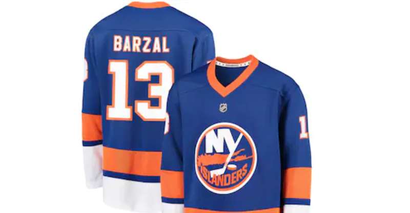
Usage Context: Center ice, jerseys, merchandise, digital platforms, arena signage, and all official team communications
How Has the New York Islanders Logo Evolved Over Time?
![]()
The Islanders have gone through four major logo iterations since 1972. Each version reflects the design trends and team circumstances of its era.
The original lasted 23 years. Then came the fisherman disaster. Now we’re back to basics.
Original New York Islanders Logo (1972-1995)
Years Active: 1972-1995
Design Description: The inaugural logo featured “NY” letters positioned over Long Island’s geographic shape. A hockey stick ran diagonally through the composition, with a puck resting at the blade.
Color Scheme: Royal blue and orange with white accents
Designer: Attributed to the team’s original ownership group
Context: Created for the 1972 NHL expansion. The design needed to establish Long Island as distinct from Manhattan and the Rangers.
Cultural Significance: This logo witnessed four consecutive Stanley Cup championships (1980-1983). It became synonymous with dynasty-era hockey and players like Mike Bossy and Denis Potvin.
Fisherman Logo (1995-1997)
Years Active: 1995-1997
Design Description: A dramatic departure featuring a bearded fisherman holding a hockey stick, with waves beneath and a triangular background shape.
Color Scheme: Navy blue, teal, orange, and gray
Designer: External design agency (specific attribution unavailable)
Context: Part of a complete rebrand attempting to modernize the franchise. Coincided with the mid-90s trend of aggressive, detailed sports logos.
Key Changes from Previous: Abandoned geographic identity entirely. Introduced a mascot figure. Added teal to match 1990s color trends.
Cultural Significance: Widely considered one of the worst rebrands in NHL history. Fan protests and poor merchandise sales led to its quick retirement. Honestly, it’s become a cult classic among logo collectors now.
Revised Classic Logo (1997-1998)
Years Active: 1997-1998
Design Description: Return to the “NY” and Long Island concept, but with updated proportions and slightly different coloring.
Color Scheme: Updated blue and orange tones
Key Changes from Previous: Complete reversal from fisherman design. Streamlined the original concept with cleaner lines.
Context: Emergency response to fisherman backlash. Represented the team listening to its fanbase.
Current New York Islanders Logo (1998-Present)
Years Active: 1998-present
Design Description: Refined version of the classic design with adjusted proportions and standardized colors.
Color Scheme: Islander Blue (#00539B), Islander Orange (#F47D30), White
Key Changes from Previous: Minor refinements to letter spacing and island shape. More precise color specifications for modern reproduction.
Cultural Significance: Represents stability and respect for franchise history. Has remained untouched through arena changes and ownership transitions.
What Do the Design Elements of the New York Islanders Logo Mean?
Every element serves a specific purpose. The “NY” establishes state identity while differentiating from the Rangers’ shield approach.
Long Island’s silhouette claims geographic territory. The hockey stick and puck? They just say “we play hockey here.”
Why Did the Islanders Choose These Specific Colors?
Orange and blue weren’t random picks. These colors connect to New York’s broader identity.
Islander Blue (#00539B):
- Reflects the waters surrounding Long Island
- Creates authority and tradition
- Stands apart from the Rangers’ lighter blue
Islander Orange (#F47D30):
- Ties to New York state’s Dutch heritage (matching the Knicks and Mets)
- Provides energy and visibility on ice
- Creates strong contrast against the blue
Understanding color psychology explains why this pairing works. Blue suggests reliability. Orange brings excitement.
What Typography Style Is Used in the New York Islanders Logo?
The “NY” uses a custom serif font with thick strokes and minimal flourishes.
It’s not based on any commercial typeface. The letters interlock in a way that requires custom drawing.
Readability works at any size because the forms are so simple. No thin strokes that disappear when the logo shrinks down for merchandise.
What Are the Hidden Meanings in the New York Islanders Logo?
The hockey stick positioning isn’t accidental. It runs from Nassau County (west) toward the eastern tip of Long Island.
Some fans see the stick as pointing toward Manhattan. A subtle competitive gesture toward the Rangers, maybe.
The puck placement at the stick’s blade suggests action. The team is always ready to shoot, always in motion.
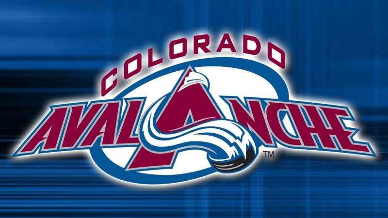
How Does the New York Islanders Logo Compare to Competitor Logos?
In the Metropolitan Division, the Islanders logo takes a quieter approach than most rivals.
The New York Rangers logo uses a shield shape with diagonal text. More traditional sports heraldry. The New Jersey Devils logo goes abstract with their “NJ” devil face.
Compare this to the Philadelphia Flyers logo and its aggressive winged “P,” or the Pittsburgh Penguins logo with its skating penguin mascot.
The Islanders stand out by not trying to stand out. Geographic identity over flash. That’s become increasingly rare in modern sports branding.
What Are the Technical Specifications of the New York Islanders Logo?
Official Color Codes:
Islander Blue (Primary):
Islander Orange (Secondary):
- Hex: #F47D30
- RGB: (244, 125, 48)
- CMYK: (0, 60, 90, 0)
- Pantone: 158 C
White (Accent):
- Hex: #FFFFFF
- RGB: (255, 255, 255)
- CMYK: (0, 0, 0, 0)
Dimensions and Proportions:
- Aspect ratio: Approximately 1:1 (square presentation)
- Minimum size: 0.5 inches for print applications
- Clear space: Minimum padding equal to height of “N” letter on all sides
- The logo exists in vector graphics format for unlimited scaling
What Cultural Impact Has the New York Islanders Logo Had?
Four Stanley Cups make any logo iconic. The 1980-83 dynasty cemented this design in hockey history.
Long Island identity runs deep here. The logo appears on everything from bumper stickers to tattoos across Nassau and Suffolk counties.
The fisherman disaster actually strengthened attachment to the original. Fans realized what they had only after losing it temporarily.
How Does the New York Islanders Logo Fit Into the Overall Brand Identity?
The logo anchors everything. Jersey designs, arena graphics, and marketing all flow from this central mark.
Team brand guidelines maintain strict consistency. The blue and orange appear across all touchpoints, from UBS Arena signage to social media templates.
Unlike teams that update regularly, the Islanders treat their logo as untouchable. That consistency builds recognition across generations of fans.
How Should the New York Islanders Logo Be Used?
Official Usage Guidelines:
- Never stretch or distort proportions
- Maintain minimum clear space around the mark
- Use only approved color variations (full color, single color, reversed)
- Don’t place on busy backgrounds that reduce legibility
Where to Access Official Logos:
- NHL media resources portal (credentialed media only)
- Official team press kit requests
- Licensed merchandise partners receive approved artwork directly
Licensing Information:
- All commercial use requires NHL licensing agreement
- Fan art exists in a gray area (personal use typically tolerated)
- Counterfeit merchandise actively pursued legally
Trademark Protection:
- Registered with USPTO
- Protected under NHL collective trademark agreements
- International protection in major hockey markets
FAQ on The New York Islanders Logo
When Was the Current New York Islanders Logo Introduced?
The current Islanders logo debuted in 1997 after the fisherman rebrand failed spectacularly.
Minor refinements came in 1998. The design has remained essentially unchanged since then, making it one of the more stable marks in the NHL.
What Does the NY Islanders Logo Represent?
The interlocking “NY” sits over a Long Island silhouette. This establishes geographic identity separate from Manhattan.
The hockey stick and puck complete the composition. Simple elements that say exactly what the team does and where they play.
Who Designed the Original Islanders Emblem?
The 1972 original came from the team’s founding ownership group. No single designer gets credited.
Internal team staff created the 1997 return-to-classic version. They responded directly to fan demands after the fisherman disaster at Nassau Coliseum.
Why Did the Islanders Change From the Fisherman Logo?
Fans hated it. Merchandise sales dropped. The team looked nothing like a four-time Stanley Cup champion.
That 1995-1997 rebrand tried following trends instead of honoring history. The backlash forced a quick reversal to the classic team identity.
What Are the Official New York Islanders Colors?
Islander Blue and Islander Orange form the primary color palette. White serves as an accent.
These connect to New York’s Dutch heritage. The hue choices mirror other NY teams like the Knicks and Mets.
Is the Islanders Logo Trademarked?
Yes. The NHL holds collective trademark protection for all team logos.
The Islanders organization maintains specific rights through league agreements. Commercial use without licensing will get you a cease-and-desist letter fast.
What Font Does the NY Islanders Logo Use?
The “NY” uses a custom typeface designed specifically for the team. You won’t find it in any font library.
Thick strokes and interlocking letters required hand-drawn typography. The custom approach gives them complete ownership over the visual identity.
How Does the Islanders Logo Compare to the Rangers?
Completely different approaches. The Rangers use a diagonal shield wordmark. Traditional sports heraldry stuff.
The Islanders chose geographic representation instead. Long Island’s outline claims territory. Both work, but the philosophies couldn’t be more opposite.
Can I Use the New York Islanders Logo for Personal Projects?
Personal, non-commercial use typically gets tolerated. Fan art exists everywhere.
Selling anything with the logo? That requires NHL licensing. The Metropolitan Division team protects its marks aggressively through legal channels.
What Made the Fisherman Logo So Unpopular?
It abandoned everything fans loved. Gone was the Long Island map. Gone were the classic colors.
The bearded fisherman mascot felt generic. Any coastal team could’ve used it. Nothing connected to the dynasty era or Denis Potvin and Mike Bossy legacy.
Conclusion
The New York Islanders logo tells a clear story. Four Stanley Cups. Long Island pride. A franchise that learned the hard way what happens when you abandon your roots.
That fisherman experiment proved something. Fans care about hockey team branding more than executives expected.
The current team emblem works because it respects the dynasty era while staying clean enough for modern web design and merchandise applications.
From UBS Arena to jersey patches, the NYI logo connects generations of Eastern Conference hockey fans to their Long Island identity. Simple beats trendy every time.
Renowned for his expertise in logo design and visual branding, Bogdan has developed a multitude of logos for various clients.
His skills extend to creating posters, vector illustrations, business cards, and brochures. Additionally, Bogdan's UI kits were featured on marketplaces like Visual Hierarchy and UI8.
He also wrote in the past years on sites like Design Your Way, WebDesignerDepot, WPDean, Designmodo, Speckyboy, Slider Revolution, and more.
- Canva for Teams Review: Is It Worth the Business Plan? - 24 July 2026
- 5 Brand Compliance Checkpoints Every Enterprise Should Automate - 23 July 2026
- Timeless Open Sans Font Pairing for Any Project - 22 July 2026
Bogdan Sandu is a seasoned designer who has been designing websites since 2008. Renowned for his expertise in logo design and visual branding, Bogdan has developed a multitude of logos for various clients. His skills extend to creating posters, vector illustrations, business cards, and brochures. Additionally, Bogdan's UI kits were featured on marketplaces like Visual Hierarchy and UI8. He also wrote in the past years on sites like Design Your Way, WebDesignerDepot, WPDean, Designmodo, Speckyboy, Slider Revolution, and more.
You Might Also Like