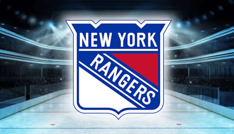
The New York Rangers logo stands as one of the most recognizable emblems in professional hockey. It’s a shield-shaped design featuring the word “RANGERS” written diagonally in bold capital letters.
Within the broader context of NHL logos, the Rangers mark holds a special place. The franchise was founded in 1926, making it one of the Original Six teams.
The current version of the logo was refined in 1999, though it maintains the classic diagonal wordmark that fans have recognized for decades. The team has used approximately four main logo variations throughout its history.
What is the New York Rangers Logo?

The New York Rangers logo is a shield-shaped emblem featuring the team name “RANGERS” displayed diagonally across a red, white, and blue background. Introduced in its modern form in 1999, this combination mark blends typography with a classic crest shape to symbolize New York pride and hockey tradition.
Design Specifications
- Design Type: Combination mark (shield emblem with integrated wordmark)
- Primary Elements: Diagonal “RANGERS” text, shield shape, patriotic color scheme
- Official Introduction Date: 1999 (current refined version)
- Designer/Agency: Not publicly credited
- Trademark Status: Registered trademark of Madison Square Garden Sports Corp.
- Color Palette: Rangers Blue (#0038A8), Rangers Red (#CE1126), White (#FFFFFF)
- Usage Context: Jerseys, merchandise, arena signage, digital platforms, broadcast graphics
How Has the New York Rangers Logo Evolved Over Time?

The Rangers logo has remained remarkably consistent since the team’s founding in 1926.
Unlike many NHL franchises that underwent dramatic rebrands, New York kept faith with the diagonal wordmark concept.
The evolution has been subtle. Refinements to proportions and colors rather than complete overhauls.
Original New York Rangers Logo (1926-1947)
- Years Active: 1926-1947
- Design Description: Simple diagonal “RANGERS” text without the shield background. The lettering appeared directly on jerseys.
- Color Scheme: Red and blue on white
- Designer: Unknown
- Context: Created when Tex Rickard founded the team. The diagonal orientation made the text readable from a distance on the ice.
- Cultural Significance: Established the iconic angled typography that would define the franchise for nearly a century
Shield Era Logo (1947-1952)
- Years Active: 1947-1952
- Design Description: The diagonal wordmark was placed inside a shield shape for the first time
- Color Scheme: Red, white, and blue
- Key Changes from Previous: Addition of the shield border created a more structured, formal appearance
- Context: Post-World War II era brought more polished sports branding across American leagues
Classic Shield Logo (1952-1999)
- Years Active: 1952-1999
- Design Description: Refined shield with bolder typography and cleaner lines
- Color Scheme: Darker blue, brighter red, crisp white
- Key Changes from Previous: Heavier letter weight, more defined shield edges
- Cultural Significance: This version saw the team win the 1994 Stanley Cup, cementing it in fan memory
Modern Logo (1999-Present)
- Years Active: 1999-present
- Design Description: Streamlined shield with updated proportions and contemporary color values
- Color Scheme: Rangers Blue (#0038A8), Rangers Red (#CE1126), White
- Key Changes from Previous: Subtle modernization of letter spacing and shield geometry
- Context: Updated for improved reproduction across digital media while honoring tradition
What Do the Design Elements of the New York Rangers Logo Mean?
The shield shape represents protection and strength. It’s a classic heraldic form that connects to European sporting traditions.
The diagonal text orientation creates movement and energy. Your eye travels across the emblem rather than sitting static.
Every element reinforces the team’s identity as tough, traditional, and proudly New York.
Why Did New York Rangers Choose These Specific Colors?
The red, white, and blue palette connects directly to American patriotism. New York City’s identity as a cultural capital made these colors a natural fit.
Rangers Blue (#0038A8) conveys trust and stability. It’s darker than typical sky blues, giving it weight and seriousness.
Rangers Red (#CE1126) adds intensity. Understanding color psychology explains why this shade evokes passion and competitive fire.
The white provides necessary contrast and breathing room between the bold primary colors.
What Typography Style Is Used in the New York Rangers Logo?

The Rangers use a custom sans-serif font with thick, block-style letters. The typeface features minimal variation in stroke width.
Letter tracking is tight but readable. The characters nearly touch, creating visual unity.
At its core, the typography prioritizes impact over elegance. You can read “RANGERS” from the nosebleed seats.
What Are the Hidden Meanings in the New York Rangers Logo?
The diagonal orientation isn’t random. It moves from lower left to upper right, suggesting upward momentum and progress.
The shield’s proportions follow classical design ratios. The width-to-height relationship creates natural balance.
Some fans see the letter arrangement as forming a subtle “NY” in the negative space. Whether intentional or not, it’s become part of Rangers lore.
How Does the New York Rangers Logo Compare to Competitor Logos?
Among Original Six teams, the Rangers logo is arguably the most text-focused. The Detroit Red Wings logo uses an iconic winged wheel. The Chicago Blackhawks logo features a detailed mascot head.
The Rangers went the other direction. Pure typography in a shield.
Compared to their local rival, the New York Islanders logo, the Rangers emblem feels more traditional. The Islanders use geographical imagery with their “NY” and hockey stick island design.
The New Jersey Devils logo takes yet another approach with its stylized “NJ” devil face. Three metro area teams, three completely different design philosophies.
Within the Metropolitan Division, the Philadelphia Flyers logo and Pittsburgh Penguins logo both use more illustrative elements than the Rangers’ text-heavy approach.
What Are the Technical Specifications of the New York Rangers Logo?
Official Color Codes
- Rangers Blue
- Hex: #0038A8
- RGB: (0, 56, 168)
- CMYK: (100, 67, 0, 34)
- Pantone: PMS 286
- Rangers Red
- Hex: #CE1126
- RGB: (206, 17, 38)
- CMYK: (0, 92, 82, 19)
- Pantone: PMS 186
- White
- Hex: #FFFFFF
- RGB: (255, 255, 255)
- CMYK: (0, 0, 0, 0)
Dimensions and Proportions
- Aspect Ratio: Approximately 1:1.2 (width to height)
- Minimum Size: 0.5 inches for print applications
- Clear Space: Minimum padding equal to the height of one letter in “RANGERS”
- File Formats: Available in vector graphics (AI, EPS, SVG) and raster formats (JPEG, PNG)
What Cultural Impact Has the New York Rangers Logo Had?
The Rangers shield has become shorthand for New York hockey. Walk through Manhattan and you’ll spot it on caps, jackets, and bumper stickers.
It transcends sports. The logo appears in films set in New York, worn by characters to signal local authenticity.
The 1994 Stanley Cup run burned this emblem into collective memory. That team ended a 54-year championship drought, and the logo became a symbol of perseverance.
Madison Square Garden, “The World’s Most Famous Arena,” amplifies the logo’s reach. Every concert and event puts it in front of millions.
How Does the New York Rangers Logo Fit Into the Overall Brand Identity?

The logo anchors everything. Jersey designs, arena graphics, digital content, and merchandise all flow from the primary shield mark.
The team’s brand guidelines maintain strict control over usage. The consistency builds recognition over decades.
An alternate logo featuring the Statue of Liberty’s head appeared in the 1990s. It connected the team to New York iconography but remained secondary to the classic shield.
The “Broadway Blueshirts” nickname ties into this identity. Everything points back to New York, tradition, and hockey excellence.
How Should the New York Rangers Logo Be Used?
Official Usage Guidelines
- Do: Maintain original proportions when scaling
- Do: Use official color codes for accurate reproduction
- Do: Provide adequate clear space around the logo
- Don’t: Stretch, rotate, or distort the emblem
- Don’t: Apply unapproved color variations
- Don’t: Place the logo on busy backgrounds that reduce legibility
Accessing Official Logos
Official logo files are available through NHL media resources for credentialed press and partners. Commercial use requires licensing through MSG Sports.
Trademark Information
The New York Rangers name and logo are registered trademarks. Unauthorized commercial use violates intellectual property law. Fan-created merchandise sold for profit faces legal action.
Personal, non-commercial use in fan content is generally tolerated but not explicitly licensed.
FAQ on The New York Rangers Logo
What Does the New York Rangers Logo Look Like?
The Rangers logo features a shield-shaped emblem with “RANGERS” written diagonally in bold capital letters.
The color palette consists of red, white, and blue. It’s a classic wordmark design that NHL fans recognize instantly from Madison Square Garden broadcasts.
When Was the Current Rangers Logo Introduced?
The modern version debuted in 1999. But here’s the thing. The basic diagonal lettering concept dates back to 1926.
The team has refined proportions over time while keeping the core logo identity intact. Original Six tradition matters to this franchise.
Why Is the Rangers Logo Tilted at an Angle?
The diagonal orientation creates visual hierarchy and energy. Your eye follows the text upward, suggesting momentum.
It also improved readability on vintage hockey jerseys. Players move fast. The angle helped fans identify teammates during Broadway Blueshirts games.
What Do the Rangers Logo Colors Represent?
Red, white, and blue reflect American patriotism and New York City pride. The Rangers blue (#0038A8) communicates trust and tradition.
Understanding color theory reveals why the red adds competitive intensity. These colors work together to create a powerful team identity.
Does the Rangers Logo Have a Statue of Liberty Version?
Yes. The alternate Liberty head logo appeared in 1996. It showed Lady Liberty wearing a Rangers jersey and holding a hockey stick.
This secondary mark connected the team to iconic New York sports imagery. The primary shield remains the official crest on home jerseys.
What Font Does the New York Rangers Logo Use?
The Rangers use a custom block-style font designed specifically for the team. It’s thick, bold, and built for visibility.
The letterforms prioritize impact over elegance. Understanding font psychology explains why this aggressive style fits hockey branding perfectly.
How Has the Rangers Logo Changed Over the Years?
Changes have been subtle. The 1926 original had no shield. The shield border appeared in 1947.
The 1952 version added bolder text weight. The 1999 update refined proportions for modern media. Each iteration honored the vintage Rangers crest while improving reproduction quality.
Can I Use the Rangers Logo for Personal Projects?
Personal, non-commercial fan use is generally tolerated. But the logo is a registered trademark of MSG Sports.
Commercial use requires licensing. Selling Rangers merchandise without permission violates intellectual property law. The team actively protects its brand identity.
What Makes the Rangers Logo Different from Other NHL Logos?
Most NHL team logos feature mascots or symbols. The Rangers went pure typography.
This text-focused approach follows classic logo design principles emphasizing simplicity. The diagonal wordmark stands apart from illustration-heavy hockey emblems across the league.
Where Can I Find Official Rangers Logo Files?
Official high-resolution files are available through NHL media resources. Credentialed press and partners access them directly.
For merchandise, the team store sells licensed products featuring the authentic shield emblem. Always verify you’re getting official Rangers team branding.
Conclusion
The New York Rangers logo represents nearly a century of hockey heritage. Few sports emblems have stayed this consistent while remaining relevant.
That diagonal wordmark tells a story. It speaks to the team’s founding by Tex Rickard, the Stanley Cup glory of 1994, and countless battles at Madison Square Garden.
The Rangers shield emblem proves that strong graphic design principles don’t require complexity. Sometimes a bold typeface and patriotic colors are enough.
This hockey team identity stands as proof that respecting tradition while refining details creates lasting brand power.

Renowned for his expertise in logo design and visual branding, Bogdan has developed a multitude of logos for various clients.
His skills extend to creating posters, vector illustrations, business cards, and brochures. Additionally, Bogdan's UI kits were featured on marketplaces like Visual Hierarchy and UI8.
He also wrote in the past years on sites like Design Your Way, WebDesignerDepot, WPDean, Designmodo, Speckyboy, Slider Revolution, and more.
- The Cursor Logo History, Colors, Font, And Meaning - 24 September 2026
- Top 7 Web Design Subscription Services That Replace Full-Time Hires - 24 September 2026
- Canva vs PowerPoint: Which Is Better for Presentations? - 22 September 2026

Bogdan Sandu is a seasoned designer who has been designing websites since 2008. Renowned for his expertise in logo design and visual branding, Bogdan has developed a multitude of logos for various clients. His skills extend to creating posters, vector illustrations, business cards, and brochures. Additionally, Bogdan's UI kits were featured on marketplaces like Visual Hierarchy and UI8. He also wrote in the past years on sites like Design Your Way, WebDesignerDepot, WPDean, Designmodo, Speckyboy, Slider Revolution, and more.
You Might Also Like