
The Detroit Red Wings Logo History, Colors, Font, And Meaning
Some logos capture the essence of a team with such finesse that they transcend simple graphics—they become symbols of heritage and heart.
The Detroit Red Wings logo, a timeless emblem of the city’s gritty determination woven deep within professional hockey’s tapestry, does just that.
Stamped with the iconic winged wheel, this logo not only captures the spirit of a legendary NHL franchise but also tells the story of a community’s unbreakable bond with the sport.
This article unveils the meticulous craft behind the Detroit Red Wings emblem, a beacon of hockey iconography. Journey through the emblem’s evolution, and capture its role in crafting a fan gear legacy.
From the colors that paint a picture of Motor City to the design that traces back to the Original Six, you’ll discover how a logo encapsulates decades of passion.
By the conclusion, not only will the layers of history behind the winged wheel graphic be revealed, but you’ll also comprehend its continued influence in shaping sports team branding.
Prepare to delve into an insignia that’s more than just a mark—it’s a storied chapter in the annals of the National Hockey League.
The Meaning Behind the Detroit Red Wings Logo
![]()
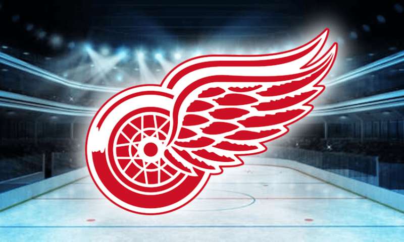
Ah, the iconic emblem of the Detroit Red Wings. A sight to behold, isn’t it? Not just a symbol for a sports team, but a symbol full of stories, tales, and emotions.
Deep Dive into the Wings
Ever noticed how mighty and stretched those wings look? It’s more than just for the aesthetics, guys. The wings symbolize speed, agility, and power. When those players zip across the ice, it’s like they’ve got wings on their feet.
The Wheel
Now, let’s talk about that wheel. Motor City’s pride, right? Detroit is the heartbeat of America’s auto industry. The wheel doesn’t just represent the car industry, but the tireless hard work and the revolutionary spirit of the city.
The History of the Detroit Red Wings Logo
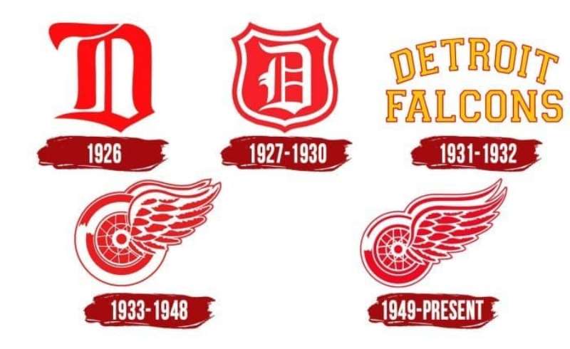
Time for a quick trip down memory lane.
Humble Beginnings
Our beloved logo didn’t pop out of nowhere. Back in the day, before all the swank and swag, the team was called the Detroit Cougars. Yeah, no wings, no wheel. But the evolution? Stellar!
The Big Shift
When they changed their name to the Red Wings, the logo underwent a metamorphosis too. Inspired by the Montreal Winged Wheelers, James E. Norris crafted the emblem we all know and adore today. A beautiful merge of the city’s identity with the team’s spirit.
The Colors of the Detroit Red Wings Logo
![]()
Color says a lot, and boy, does our logo speak volumes!
The Bold Red
Ever seen a red that’s this intense? It’s not just there to catch your eye. It embodies passion, determination, and the fiery spirit of the players and fans alike.
Crisp White
Clean, sharp, and undeniable. The white backdrop is no second fiddle. It stands for purity, precision, and the flawless game the Red Wings aim for every time they hit the ice.
The Font Used in the Detroit Red Wings Logo
Typography nerds, this one’s for you!
Classic Yet Fresh
The typeface of the logo is timeless, evoking nostalgia and yet staying relevant. Its curvy nature complements the boldness of the logo, creating a harmonious visual dance.
Why No Italics?
Ever wondered why the font isn’t slanted or super fancy? It’s all about stability and standing firm. No frills, just pure commitment and focus.
The Adaptations Over the Years
Change is the only constant, they say.
Minor Tweaks, Big Impact
While the essence of the logo has stayed true, there have been subtle changes in its design over the years. Be it a slight shift in the red shade or tiny alterations in the wing’s design, every change was made keeping in mind the contemporary appeal and retaining its core identity.
Digital Era and the Logo
In today’s digital age, the logo has been adapted for various platforms. From tiny app icons to huge billboards, it retains its charm and message across all sizes.
The Influence Beyond Hockey
The Red Wings logo has left its mark, and not just in the world of sports.
Fashion and Lifestyle
Caps, tees, jackets – you name it! The logo has become a fashion statement. It’s not just about supporting the team but flaunting a piece of iconic design.
Cultural Symbol
For many in Detroit, this logo isn’t just about hockey. It’s a symbol of community, unity, and a shared love for the city and the sport. It’s transcended beyond just a sports emblem, becoming a part of Detroit’s cultural fabric.
FAQ On The Detroit Red Wings Logo
What is the significance of the Detroit Red Wings logo?
The logo stands as a sentinel, embodying Detroit’s industrial might and the team’s dynamic nature. The winged wheel represents the city’s automotive history interlaced with the speed and agility of hockey.
It’s a fusion of heritage with the fervent energy of the sport – quite fitting for the Original Six stalwart.
How did the Detroit Red Wings logo originate?
Conceived in the ’30s, the logo was the brainchild of James E. Norris, who purchased the team and was inspired by the Montreal Amateur Athletic Association’s wheel logo.
He introduced the wing motif, creating a symbol that fuses Detroit’s automotive legacy with its burgeoning passion for hockey.
Has the Detroit Red Wings logo changed over the years?
Yes, though the core design – the storied winged wheel – has remained constant, subtle tweaks have refined its look.
The current iteration boasts a crisp, streamlined aesthetic, befitting a team steeped in NHL history yet moving briskly into the future. Evolution within iconic stability.
What do the colors of the Detroit Red Wings logo represent?
The red and white palette is brimming with significance. Red for heart and vigor, echoing energy and action. White stands for clarity and integrity, mirroring the team’s upright spirit.
Together, they’re a visual articulation of the Red Wings’ ethos, as intrinsic to Detroit as the steel that forged it.
Why is there a wheel in the Detroit Red Wings logo?
At the heart of the logo rests the wheel, an enduring nod to Detroit’s automotive prestige. It’s the city’s lifeblood, symbolizing the relentless drive and industrious rhythm that propels both the city and its cherished hockey team forward in the National Hockey League.
What type of wing is on the Detroit Red Wings logo?
The wing in the logo is styled after a bird’s, suggesting lift and speed inherent in hockey play. It’s crafted to echo movement—the swiftness and agility of the Red Wings gliding across ice in pursuit of yet another Stanley Cup victory.
Has the Detroit Red Wings logo ever been completely redesigned?
While the logo has seen refinements, the fundamental design—a celebrated winged wheel—has never undergone a complete overhaul.
Its storied legacy and the reverence with which fans hold it deter such drastic change, ensuring this hockey emblem remains unmistakably Red Wings.
Is the Detroit Red Wings logo one of the most famous in sports?
Absolutely. Its storied visage is recognized worldwide, not just among puck fans but across the sports sphere.
The simplicity, coupled with the deep-rooted meaning entrenched in the Detroit Red Wings emblem, ensures its place in the annals of sports team branding prominence.
What does the Detroit Red Wings logo mean to the fans?
To the faithful, it’s more than a logo—it’s a banner rallying Detroit’s spirit, an emblem that’s seen championship banners raised high.
Its iconic stature beckons to generations of fans who share a deep connection with the team’s legacy, symbolizing unity and pride in the Hockeytown community.
Can I use the Detroit Red Wings logo for personal projects?
Though fans proudly sport it, the logo is trademarked. Use for personal, non-commercial projects usually goes unchallenged, but it’s best to avoid using it in ways that could imply endorsement or official affiliation.
For broad use, seeking permission from the hockey franchise is the proper course.
Conclusion
In the swirling dance of red and white, the Detroit Red Wings logo stands as an enduring testament to a team’s identity stitched into Hockeytown‘s storied fabric. As a beacon within the National Hockey League, its unmistakable winged wheel serves not only as a brand but as a rallying cry, echoing through the halls of the Little Caesars Arena and the at-home shrines where fans congregate.
Infused with meaning, the logo transcends mere design, capturing the pulse of a city wedded to its wheels, to the ice beneath the skates, and to the legends who have hoisted the Stanley Cup aloft. While the winged wheel has subtly refined its feathers over time, its heart has never wavered, steadfast in the face of an ever-evolving league.
From Norris to Yzerman, the logo carries a lineage as rich as the Original Six, an heirloom, imprinted with every victory, every loss, every moment of glory. It holds the past, presides over the present, and will continue to unfurl its wings wide into the future.
If you liked this article about the Detroit Red Wings logo, you should check out this article about the Edmonton Oilers logo.
There are also similar articles discussing the Florida Panthers logo, the Los Angeles Kings logo, the Minnesota Wild logo, and the Montreal Canadiens logo.
And let’s not forget about articles on the Nashville Predators logo, the New Jersey Devils logo, the New York Islanders logo, and the New York Rangers logo.
Bogdan Sandu, a seasoned designer with 15 years of diverse experience, has been designing websites since 2008.
Renowned for his expertise in logo design and visual branding, Bogdan has developed a multitude of logos for various clients.
His skills extend to creating posters, vector illustrations, business cards, and brochures. Additionally, Bogdan's UI kits were featured on marketplaces like Visual Hierarchy and UI8.
Latest posts by Bogdan Sandu (see all)
- Think Pink: Soft and Strong Pink Color Palettes - 14 May 2024
- Fashion Typography: What Font Does Vogue Use? - 14 May 2024
- The Kirin Logo History, Colors, Font, And Meaning - 13 May 2024