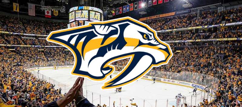
The Nashville Predators logo stands as one of the most distinctive marks in professional hockey. It features a saber-toothed tiger head, paying tribute to fossil remains discovered in Tennessee during excavation for the team’s arena.
Within NHL logos, the Predators mark holds a unique position. It emerged during the league’s late 1990s expansion era when teams pushed for bolder, more aggressive imagery.
The current primary logo debuted in 2011, designed by the team’s in-house creative department. Nashville joined the NHL as an expansion franchise in 1998, and the organization has used three main logo versions throughout its history.
What Is the Nashville Predators Logo?

The Nashville Predators logo is a saber-toothed tiger head facing left, rendered in gold, navy blue, and white. Officially introduced in its current form on June 22, 2011, this emblem was created by the team’s internal design staff and symbolizes prehistoric power connected to Tennessee’s fossil discoveries.
Design Type: Mascot-based combination mark
Primary Elements: Saber-toothed tiger (Smilodon) head with exposed fangs, angular features, and fierce expression
Official Introduction Date: June 22, 2011 (current version)
Designer/Agency: Nashville Predators internal creative team
Trademark Status: Registered trademark of the Nashville Predators, protected under NHL licensing agreements
Color Palette:
- Predators Gold (#FFB81C)
- Navy Blue (#041E42)
- White (#FFFFFF)
Usage Context: Center ice, jerseys, merchandise, digital platforms, Bridgestone Arena signage, broadcast graphics, and all official team communications
How Has the Nashville Predators Logo Evolved Over Time?

The Predators have used three distinct primary logos since 1998. Each version maintained the saber-toothed tiger concept while refining the execution.
The original was more detailed and three-dimensional. The 2011 redesign stripped away complexity for a cleaner, more modern look.
Original Nashville Predators Logo (1998-2011)
Years Active: 1998-2011
Design Description: A three-dimensional saber-toothed tiger head with heavy shading, detailed fur texture, and a more realistic rendering style. The cat appeared more naturalistic with pronounced musculature and shadow work.
Color Scheme: Navy blue, silver, gold, and orange accents
Designer: SME Branding
Context: Created for Nashville’s NHL expansion debut. The saber-toothed tiger concept came from Smilodon fossils found during construction in downtown Nashville. A fitting logo for a brand-new franchise looking to establish regional identity.
Key Features: Silver outlining created a metallic appearance. The tiger faced left, unusual for sports logos that typically face right (toward the future). Orange highlights added warmth to the otherwise cool palette.
Cultural Significance: Established Nashville as a legitimate hockey market. The prehistoric cat gave the team instant local mythology to build around.
Refined Nashville Predators Logo (2011-Present)
Years Active: 2011-present
Design Description: A flattened, simplified saber-toothed tiger head. Gone are the three-dimensional effects and detailed texturing. The new mark uses clean lines and geometric shapes.
Color Scheme: Gold became the dominant color, replacing silver. Navy blue provides contrast. White highlights add definition.
Designer: Nashville Predators internal creative team
Context: Part of a complete brand overhaul that made gold the team’s signature color. This shift coincided with the “Smashville” identity taking hold among fans.
Key Changes from Previous: Removed silver entirely. Eliminated 3D shading. Simplified fur detail into angular shapes. Made gold the primary color instead of an accent. Created sharper, more aggressive angles on the fangs and facial features.
Cultural Significance: Coincided with the team’s rise to competitiveness. This logo appeared during their 2017 Stanley Cup Final run. Became synonymous with Nashville’s passionate hockey culture.
What Do the Design Elements of the Nashville Predators Logo Mean?
The saber-toothed tiger represents both prehistoric power and regional heritage. Smilodon fossils were literally unearthed where Bridgestone Arena now stands.
The exposed fangs communicate aggression and dominance. Angular lines throughout the design reinforce this intensity.
Why Did the Predators Choose These Specific Colors?
Predators Gold (#FFB81C)
This is the team’s signature shade since 2011. Gold represents excellence, victory, and Nashville’s reputation as a world-class entertainment city.
The color psychology here is straightforward. Gold projects confidence. It stands out in arenas. It photographs well on broadcast.
The team specifically chose this hue to distinguish themselves from other NHL clubs. Nobody else owned gold quite this way.
Navy Blue (#041E42)
Navy provides grounding and tradition. It connects the Predators to classic sports aesthetics while balancing the flashy gold.
The deep blue creates strong visual hierarchy when paired with gold. It reads well at distance and scales effectively across applications.
White (#FFFFFF)
White provides definition and separation. It outlines key elements and ensures the logo remains legible across backgrounds.
What Typography Style Is Used in the Nashville Predators Logo?

The Predators wordmark uses a custom sans-serif font with aggressive angles. Every letter features pointed terminals that echo the tiger’s fangs.
The letterforms are condensed and tightly kerned. This creates density and power.
Readability holds up well at various sizes. The custom typeface was designed specifically for sports applications.
Earlier versions used different typography elements. The 2011 redesign unified the type treatment with the simplified logo aesthetic.
What Are the Hidden Meanings in the Nashville Predators Logo?
The tiger faces left, which is unusual. Most sports logos face right, toward “the future.” The Predators’ leftward gaze connects to the prehistoric nature of the Smilodon.
Look at the negative space around the fangs. It creates a subtle downward V shape suggesting attack motion.
The angular styling throughout mirrors guitar pick shapes. A nod to Nashville’s music identity? The team hasn’t confirmed this, but the connection feels intentional.
How Does the Nashville Predators Logo Compare to Competitor Logos?
Among Central Division rivals, the Predators mark stands apart through its color dominance. Nobody else commits to gold this aggressively.
The Dallas Stars logo uses clean geometric shapes. The Colorado Avalanche logo relies on motion and flow. The Minnesota Wild logo hides imagery within nature scenes.
Nashville takes a more direct approach. It’s a predator. It looks like a predator. No subtlety required.
Compared to other cat-based NHL logos like the Florida Panthers logo, Nashville’s mark feels more stylized and aggressive. The Panthers went realistic. The Predators went iconic.
The San Jose Sharks logo shares some DNA with Nashville’s approach. Both feature predatory animals rendered with sharp angles and forward aggression. But the Sharks use teal as their differentiator while Nashville owns gold.
What Are the Technical Specifications of the Nashville Predators Logo?
Official Color Codes:
Primary Color: Predators Gold
Secondary Color: Navy Blue
- Hex: #041E42
- RGB: (4, 30, 66)
- CMYK: (100, 85, 36, 35)
- Pantone: 289 C
Accent Color: White
- Hex: #FFFFFF
- RGB: (255, 255, 255)
- CMYK: (0, 0, 0, 0)
Dimensions and Proportions:
- Aspect ratio: Approximately 1:1 for primary mark
- Minimum size: 0.5 inches for print design, 50 pixels for digital
- Clear space: Equal to the height of one fang on all sides
- The logo functions as vector graphics for infinite scalability
What Cultural Impact Has the Nashville Predators Logo Had?
The gold saber-toothed tiger became synonymous with the “Smashville” phenomenon. It appears everywhere in Nashville, from downtown murals to country music videos.
The 2017 Stanley Cup run cemented the logo’s cultural status. Gold flooded Broadway. The cat face became Nashville’s unofficial second flag.
The catfish-throwing tradition created memorable moments featuring the logo on arena ice. It’s now inseparable from Nashville’s identity as a sports city.
How Does the Nashville Predators Logo Fit Into the Overall Brand Identity?

The logo anchors a comprehensive brand guidelines system that touches every aspect of the organization. It dictates uniform design, arena aesthetics, and marketing materials.
Gnash, the team mascot, extends the logo’s personality into a physical form. The mascot’s costume directly references the primary mark’s features.
Secondary marks include guitar pick shapes and the “SMASHVILLE” wordmark. These supporting elements work together following graphic design principles that reinforce the primary logo’s energy.
The gold-forward approach extends to everything from team aircraft livery to retail packaging.
How Should the Nashville Predators Logo Be Used?
Official Usage Guidelines:
- Never alter colors outside the approved palette
- Maintain clear space requirements at all times
- Do not stretch, distort, or rotate the logo
- Never place the logo on busy backgrounds that reduce legibility
- Use only approved logo files from official sources
Where to Access Official Logos:
The Nashville Predators media relations department provides approved logo files to credentialed media and licensed partners. The NHL also maintains logo assets through their official brand portal.
Licensing Information:
Commercial use requires licensing through NHL Enterprises. The team actively protects its marks and pursues unauthorized usage. Fanatics holds primary merchandise licensing rights.
Trademark Protection:
The saber-toothed tiger design is registered with the United States Patent and Trademark Office. The “Predators” name and “Smashville” phrase also carry trademark protection. Unauthorized reproduction can result in legal action.
FAQ on The Nashville Predators Logo
What Animal Is on the Nashville Predators Logo?
The logo features a saber-toothed tiger, specifically a Smilodon. This prehistoric cat’s fossils were discovered during excavation in downtown Nashville.
The team chose this creature to create instant local mythology. It connects Tennessee hockey to the region’s ancient history.
When Was the Current Nashville Predators Logo Introduced?
The current primary logo debuted on June 22, 2011. It replaced the original 1998 design that had served the franchise since its NHL expansion debut.
This redesign simplified the team emblem significantly. The three-dimensional effects disappeared in favor of cleaner lines.
What Do the Nashville Predators Colors Represent?
Predators Gold represents excellence and Nashville’s entertainment prestige. Navy blue provides tradition and stability.
The color palette shifted dramatically in 2011. Gold became dominant, replacing silver from the original scheme. Understanding color theory explains why this combination works so effectively.
Who Designed the Nashville Predators Logo?
SME Branding created the original 1998 logo. The team’s internal creative department handled the 2011 redesign.
Both versions followed core logo design principles. The in-house team understood Smashville’s culture better than outside agencies could.
Why Did Nashville Choose a Saber-Toothed Tiger?
Workers discovered Smilodon bones while building the arena site. This fossil find gave the franchise a unique storytelling angle.
No other NHL team could claim this connection. The prehistoric predator became Nashville’s hockey identity instantly.
Has the Nashville Predators Logo Changed Since 1998?
Yes. The franchise has used three main versions. The original featured detailed, three-dimensional rendering with silver accents.
The 2011 update flattened everything. Gold replaced silver. Angular shapes replaced realistic fur texture. The design elements became bolder and more modern.
What Font Does Nashville Use in Their Logo?
The Predators use a custom font with aggressive, pointed terminals. Every letter echoes the tiger’s fangs.
This typography was built specifically for sports applications. The condensed letterforms project power and intensity on jerseys and merchandise.
Where Can I Find Official Nashville Predators Logo Files?
Media members contact Predators communications for approved assets. Licensed partners access files through NHL brand portals.
The team protects its trademark aggressively. Unauthorized use of the Predators symbol or team crest design results in legal action.
What Makes the Predators Logo Different From Other NHL Logos?
Gold dominance sets it apart. While teams like the Pittsburgh Penguins logo or Detroit Red Wings logo use classic approaches, Nashville commits fully to one bold color.
The tiger also faces left. Most sports logos face right. This directional choice references the prehistoric nature of the Smilodon.
Why Do Nashville Fans Throw Catfish on the Ice?
Fans started this tradition by copying Detroit’s octopus throwing. Catfish represent Tennessee’s fishing culture and rivers.
The tradition exploded during the 2017 Stanley Cup Final. Now the catfish and the Predators logo are inseparable parts of Bridgestone Arena’s game-night experience.
Conclusion
The Nashville Predators logo tells a story rooted in Tennessee soil. Smilodon bones became a hockey identity. That’s not something you can manufacture.
From the 1998 expansion debut to the gold-dominant 2011 redesign, this team emblem evolved alongside Smashville’s passionate fan culture.
The saber-toothed tiger now ranks among the most recognizable symbols in professional hockey. It works on Predators jerseys, merchandise, and Bridgestone Arena’s center ice.
Few NHL franchises connect their brand style guide so directly to regional history. Nashville found something real and built around it.

Renowned for his expertise in logo design and visual branding, Bogdan has developed a multitude of logos for various clients.
His skills extend to creating posters, vector illustrations, business cards, and brochures. Additionally, Bogdan's UI kits were featured on marketplaces like Visual Hierarchy and UI8.
He also wrote in the past years on sites like Design Your Way, WebDesignerDepot, WPDean, Designmodo, Speckyboy, Slider Revolution, and more.
- The Windsurf Logo History, Colors, Font, And Meaning - 10 October 2026
- How to Remove Background From Product Photos (No Photoshop) - 10 October 2026
- How Designers can Build a Stronger Online Creative Identity - 9 October 2026

Bogdan Sandu is a seasoned designer who has been designing websites since 2008. Renowned for his expertise in logo design and visual branding, Bogdan has developed a multitude of logos for various clients. His skills extend to creating posters, vector illustrations, business cards, and brochures. Additionally, Bogdan's UI kits were featured on marketplaces like Visual Hierarchy and UI8. He also wrote in the past years on sites like Design Your Way, WebDesignerDepot, WPDean, Designmodo, Speckyboy, Slider Revolution, and more.
You Might Also Like