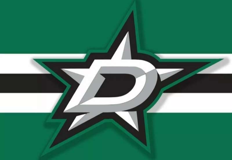
A logo tells you everything about a team before you even see them play. The Dallas Stars logo does exactly that. It captures Texas pride, hockey tradition, and a franchise that relocated from Minnesota in 1993.
The current emblem features a stylized “D” containing a star, rendered in Victory Green, black, and silver. This mark represents the only NHL team based in Texas and carries the visual weight of a Stanley Cup championship won in 1999.
Since arriving in Dallas, the franchise has used three distinct logo designs. Each version reflects different eras of team identity and branding philosophy. The current iteration, introduced in 2013, stripped away complexity in favor of bold simplicity.
What Is the Dallas Stars Logo?
![]()
The Dallas Stars logo is a combination mark featuring a stylized letter “D” with an integrated five-pointed star. It was introduced in 2013 and designed by the team’s internal creative department. The mark symbolizes Texas identity through the Lone Star motif while maintaining NHL visual standards.
Design Specifications
- Design Type: Combination mark (letterform with integrated symbol)
- Primary Elements: Stylized “D” letterform, five-pointed star, circular border on alternate versions
- Official Introduction Date: June 4, 2013
- Designer/Agency: Dallas Stars internal creative team
- Trademark Status: Registered trademark of the Dallas Stars Hockey Club
- Color Palette: Victory Green (#006847), Black (#000000), Silver (#8A8D8F), White (#FFFFFF)
- Usage Context: Center ice, jerseys, merchandise, digital platforms, arena signage, broadcast graphics
How Has the Dallas Stars Logo Evolved Over Time?
The franchise underwent three major identity changes since relocating to Texas. The original 1993 design emphasized traditional hockey aesthetics.
A 2013 rebrand modernized everything. Victory Green replaced the previous color scheme entirely.
Each redesign reflected broader trends in sports branding and the team’s desire to establish deeper roots in Dallas.
Original Dallas Stars Logo (1993-2013)
- Years Active: 1993-2013
- Design Description: A gold star with the word “STARS” in green block letters, placed above “DALLAS” in smaller text. The star featured a black outline with gold fill.
- Color Scheme: Green (#006D43), Gold (#BC9C1E), Black, White
- Designer: NHL Properties creative division
- Context: Created when the Minnesota North Stars relocated to Dallas. The design needed to honor the “Stars” name while establishing a new Texas identity.
- Key Changes from Previous: Complete departure from the Minnesota North Stars “N” logo. Removed all references to Minnesota.
- Cultural Significance: This logo appeared on the jerseys when the team won their only Stanley Cup in 1999. It became synonymous with the franchise’s golden era.
Transitional Dallas Stars Logo (2013-Present Primary Mark)
- Years Active: 2013-present
- Design Description: A bold “D” shape with a star cut into the negative space. The star points extend to the edges of the letterform, creating visual tension.
- Color Scheme: Victory Green (#006847), Black (#000000), Silver (#8A8D8F)
- Designer: Dallas Stars internal creative team with consultation from Adidas
- Context: Part of a complete brand overhaul that introduced “Victory Green” as the signature color. The rebrand coincided with new ownership under Tom Gaglardi.
- Key Changes from Previous: Eliminated gold entirely. Simplified the wordmark. Introduced the integrated D-star concept.
- Cultural Significance: Represents the franchise’s modern era and commitment to building a distinct visual identity separate from the championship years.
What Do the Design Elements of the Dallas Stars Logo Mean?
The star represents Texas. That’s the obvious reading.
But the integration of that star within a “D” creates something more specific. It says this isn’t just any Texas team. It’s Dallas.
The negative space technique makes the logo feel contemporary while keeping the symbolism clear.
Why Did Dallas Stars Choose These Specific Colors?
Victory Green anchors the entire identity. The team invented this specific shade.
You won’t find it anywhere else in the NHL. That was intentional.
- Victory Green: Hex #006847, Pantone 3425 C. Symbolizes growth, ambition, and Texas landscapes. Creates immediate recognition. No other NHL team uses this exact shade.
- Black: Hex #000000. Provides contrast and grounds the brighter green. Adds sophistication and ties into hockey’s traditional aesthetic.
- Silver: Hex #8A8D8F. Secondary accent color representing the steel and modern architecture of Dallas. Also references the team’s blade imagery.
What Typography Style Is Used in the Dallas Stars Logo?
The wordmark uses a custom sans-serif font designed specifically for the brand.
It’s aggressive. Angular. The letters lean forward slightly, suggesting motion.
Sharp terminals on letters like “S” and “A” echo the points of the star itself. This creates unity between the icon and text elements.
What Are the Hidden Meanings in the Dallas Stars Logo?
The five points of the star carry meaning beyond Texas symbolism.
Some fans interpret them as representing the five players on ice (excluding the goalie). The team hasn’t confirmed this officially.
The “D” shape also subtly resembles a hockey puck from certain angles. Whether intentional or not, it reinforces the sport connection without being obvious about it.
How Does the Dallas Stars Logo Compare to Competitor Logos?
Most NHL logos fall into predictable categories. Animal mascots dominate.
The Stars took a different path. They built identity around geography and symbolism rather than a creature.
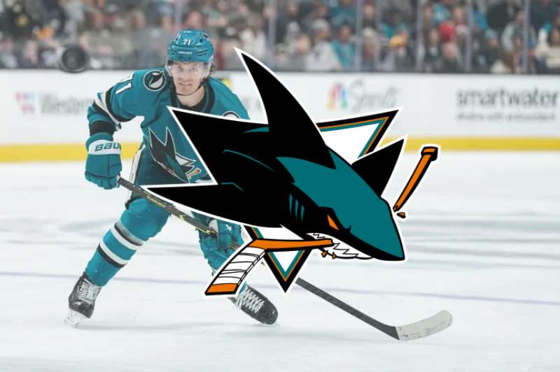
Compare this to the Minnesota Wild logo, which depicts a wilderness animal. Or the San Jose Sharks logo with its aggressive shark biting a hockey stick.
The Stars approach feels more like the Toronto Maple Leafs logo, where a simple national symbol carries all the weight.
Among Western Conference rivals, the Colorado Avalanche logo uses abstract motion, while the Nashville Predators logo goes full mascot with a saber-toothed cat.
The Stars sit somewhere in between. Symbolic but not abstract. Recognizable but not literal.
What Are the Technical Specifications of the Dallas Stars Logo?
Official Color Codes
Victory Green (Primary)
Black (Secondary)
- Hex: #000000
- RGB: (0, 0, 0)
- CMYK: (0, 0, 0, 100)
- Pantone: Black C
Silver (Accent)
- Hex: #8A8D8F
- RGB: (138, 141, 143)
- CMYK: (0, 0, 0, 44)
- Pantone: Cool Gray 7 C
Dimensions and Proportions
- Aspect Ratio: The primary “D” mark fits within a 1:1 square boundary
- Minimum Size: 0.5 inches (print), 50 pixels (digital)
- Clear Space: Minimum clearance equal to the height of the star point on all sides
- File Formats: Available as vector graphics (AI, EPS, SVG) and raster formats (JPEG, PNG)
What Cultural Impact Has the Dallas Stars Logo Had?
The Victory Green rebrand actually worked. You see it everywhere in Dallas now.
The color has become associated with hockey culture in a city dominated by football. That’s not easy to accomplish in Cowboys country.
The logo appears on everything from arena signage to local business partnerships. When the team makes playoff runs, that green star shows up on billboards, cars, and storefronts across the metroplex.
How Does the Dallas Stars Logo Fit Into the Overall Brand Identity?
The logo anchors a complete visual system. The team’s brand guidelines extend this identity across every touchpoint.
Jersey designs use the primary mark on the chest with secondary star patches on shoulders. The American Airlines Center incorporates Victory Green throughout its interior.
Merchandise follows strict standards. The color palette remains consistent whether you’re looking at a hat, a bumper sticker, or a $300 authentic jersey.
How Should the Dallas Stars Logo Be Used?
Official Usage Guidelines
- Do: Maintain clear space around the logo. Use approved color combinations. Scale proportionally.
- Don’t: Stretch or distort the mark. Apply unapproved colors. Place over busy backgrounds without proper contrast.
- Approved Backgrounds: White, black, Victory Green (with reversed logo)
Access and Licensing
- Official Assets: Available through NHL media portals for credentialed media
- Merchandise Licensing: Controlled through NHL Properties and Fanatics partnership
- Trademark Protection: Registered with the United States Patent and Trademark Office. Unauthorized commercial use is prohibited.
- Fan Use: Personal, non-commercial use generally tolerated. Commercial reproduction requires licensing agreement.
FAQ on The Dallas Stars Logo
What Does the Dallas Stars Logo Represent?
The Stars logo represents Texas identity through the Lone Star symbol integrated into a “D” letterform.
It connects the NHL franchise to Dallas while honoring the state’s iconic imagery. The psychology of shapes here reinforces strength and direction.
When Was the Current Dallas Stars Logo Introduced?
The current primary mark debuted on June 4, 2013. This came as part of a complete team rebrand.
The redesign introduced Victory Green and replaced the gold color scheme from the Stanley Cup era.
What Colors Are in the Dallas Stars Logo?
The official team colors are Victory Green, black, silver, and white.
Understanding color psychology explains why green dominates. It conveys growth and ambition while standing out among NHL franchises.
Who Designed the Dallas Stars Logo?
The Dallas Stars internal creative team handled the 2013 redesign. They worked alongside Adidas on jersey integration.
The original 1993 logo came from NHL Properties when the Minnesota North Stars relocated to Texas.
What Is Victory Green?
Victory Green is a custom hue created specifically for the Stars brand identity.
No other NHL team uses this exact shade. The hex code is #006847. It replaced the franchise’s previous green and gold scheme entirely.
How Many Logos Have the Dallas Stars Had?
The franchise has used three primary logos since the 1993 relocation from Minnesota.
The logo evolution moved from a traditional star-and-wordmark design to today’s integrated D-star mark. Each version reflected different eras of Stars branding.
What Font Does the Dallas Stars Logo Use?
The Stars wordmark uses a custom typeface designed for the brand.
It features angular, forward-leaning letterforms. The sharp terminals on letters mirror the star’s points, creating cohesive typography throughout.
Can I Download the Dallas Stars Logo?
Official logo files are available through NHL media portals for credentialed press.
Fans can find Dallas Stars merchandise with authentic logos through Fanatics and NHL Shop. Commercial use requires licensing from NHL Properties.
What Happened to the Old Dallas Stars Logo?
The 1993-2013 logo featured a gold star above green “STARS” text. It still appears on throwback jerseys and retro merchandise.
That mark carries significant history. It was on the team’s 1999 Stanley Cup championship uniforms.
Why Did the Dallas Stars Change Their Logo?
New ownership under Tom Gaglardi wanted fresh team identity in 2013.
The rebrand applied logo design principles focused on simplicity and recognition. Victory Green became the focal point of a modern NHL franchise identity.
Conclusion
The Dallas Stars logo stands as one of the most distinctive team emblems in the NHL. It works because of restraint.
Victory Green gives the franchise instant recognition. The integrated D-star mark communicates both city and state identity without overcomplicating things.
From the American Airlines Center ice to hockey jerseys worn across the Central Division, this sports logo design has earned its place.
The 2013 rebrand succeeded where many fail. It honored the past while building something fresh for a new generation of Stars fans in Texas.
Renowned for his expertise in logo design and visual branding, Bogdan has developed a multitude of logos for various clients.
His skills extend to creating posters, vector illustrations, business cards, and brochures. Additionally, Bogdan's UI kits were featured on marketplaces like Visual Hierarchy and UI8.
He also wrote in the past years on sites like Design Your Way, WebDesignerDepot, WPDean, Designmodo, Speckyboy, Slider Revolution, and more.
- The Best Fonts for Real Estate Branding and Marketing - 15 July 2026
- Hosting in the USA: How to Choose Dedicated Servers for the North American Market - 15 July 2026
- NHL Team Color Codes - 14 July 2026
Bogdan Sandu is a seasoned designer who has been designing websites since 2008. Renowned for his expertise in logo design and visual branding, Bogdan has developed a multitude of logos for various clients. His skills extend to creating posters, vector illustrations, business cards, and brochures. Additionally, Bogdan's UI kits were featured on marketplaces like Visual Hierarchy and UI8. He also wrote in the past years on sites like Design Your Way, WebDesignerDepot, WPDean, Designmodo, Speckyboy, Slider Revolution, and more.
You Might Also Like