The Calgary Flames Logo History, Colors, Font, And Meaning

Ignite the spirit, and you’ll see a blaze; a unique marque of fiery passion, carved into the heart of Alberta—a symbol that transcends sport.
The Calgary Flames logo isn’t merely a motif; it’s an encapsulation of heritage, a visual anthem resonating through the veins of hockey enthusiasts.
From its conception, the emblem has mirrored the pulse of a city that thrives on the ice. As we delve into the nuances behind this iconic insignia, one discovers a narrative of sports logo design that’s more profound than the stitches on the jerseys worn by ardent fans.
You’re here because understanding the visage of a team is not just for the curious but for those who savor every detail in the tapestry of professional hockey apparel.
This piece unravels the layers. We’ll explore the origin, the evolution, and the indelible impact upon the NHL merchandise sphere. From the die-hard supporter to the aesthete, there’s a stitch in this emblem’s fabric for everyone.
By the end, you’ll perceive this emblem not just as a mark but as a beacon of ardor and affiliation.
The Meaning Behind the Calgary Flames Logo
![]()
The Calgary Flames logo. Ah, what an emblem!
It’s not just a mere design, it’s an embodiment of passion, energy, and the spirit of a team that burns brightly. It’s like a visual anthem, you know? Let’s dive deeper.
A Burst of Energy
The flaming ‘C’? It’s not just about representing Calgary. It signifies a burst of energy. It’s that vibe when the team takes the ice, full of zest and enthusiasm. That’s the spark the logo stands for.
More Than Just Flames
While the flames are the most evident, they’re not the only thing. They represent perseverance, passion, and the fiery spirit of the team. They’re about igniting the spirit of the game and sparking that fire in the hearts of fans.
The History of the Calgary Flames Logo
![]()
Ah, history. Every great logo has a story, and so does the Flames’.
Humble Beginnings
Before they were the Calgary Flames, the team originally hailed from Atlanta. But when they made the move up north, so did their emblem’s evolution. It transformed, adapting to its new home, capturing the spirit of Calgary.
The Evolution
Over the years, the Flames’ logo has seen tweaks, but the essence remains. The flame has always been a consistent element, symbolizing the enduring spirit and legacy of the team.
The Colors of the Calgary Flames Logo
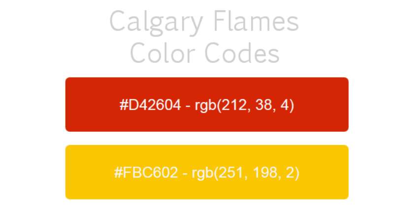
Colors ain’t just colors when it comes to logos. They speak.
Fiery Red
Red in the logo? That’s the heart and soul right there. It embodies passion, energy, and the fiery spirit of the Flames. When you see that red, you feel the heat.
Touch of Gold
Gold isn’t just for luxury; it symbolizes quality. A touch of gold in the logo emphasizes the excellence and top-notch performance the team brings to the ice.
The Font Used in the Calgary Flames Logo
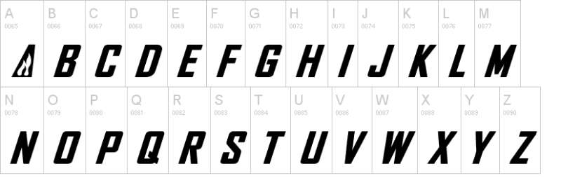
Fonts, man, they’re like the unsung heroes of logos. They convey mood, tone, and vibe without shouting.
Bold and Strong
The typeface used for ‘Calgary Flames’? It’s bold, it’s strong, and it’s assertive. Just like the team. It’s not just about readability; it’s about making a statement.
The Impact on Fans
Let’s talk about us, the fans, and the connection.
A Symbol of Pride
For the die-hard fans, this logo is not just a design. It’s a symbol of pride, an emblem they wear on their jerseys, caps, and hearts. Every glance at that fiery ‘C’ ignites memories of great games and roaring crowds.
More Than Merchandise
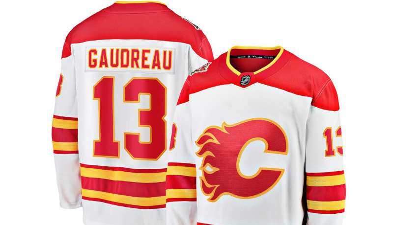
Merchandise sporting the Flames logo? It’s not just gear. It’s a testament. Wearing it is like pledging allegiance to the team, showcasing support and undying love for the Flames.
The Global Perception
Beyond Calgary, how’s the logo seen?
Recognizability
Globally, in the hockey community, that flaming ‘C’ stands out. It’s synonymous with the team’s spirit, making it one of the most recognizable symbols in the sport.
Inspiration to Others
Many teams and designers look at the Calgary Flames logo as a beacon of inspiration. It stands as proof that a logo can encapsulate the spirit, history, and essence of a team so brilliantly.
FAQ On The Calgary Flames Logo
What is the Significance of the Calgary Flames Logo?
The logo, a blazing red ‘C’, stands for Calgary, capturing the city’s spirit and the team’s fiery tenacity. It’s more than a symbol; it’s a banner under which fans unite, a beacon calling the Calgary Flames community together, resonating beyond just the NHL merchandise.
How Has the Calgary Flames Logo Evolved Over Time?
Evolution is subtle yet profound; beginning with the Atlanta Flames, the logo’s journey to Calgary saw color shifts, design tweaks, and textural changes. The mark’s essence remained—a constant reminder of its rich heritage within the sports logo design landscape.
Is the Calgary Flames Logo Inspired by Any Historical Elements?
Indeed, the logo’s inspiration draws from the city’s 19th-century Great Fire and its firefighting efforts. Historical elements amalgamate, yielding a crest that’s both a nod to the past and a symbol of resurgence and vitality in the realm of professional hockey apparel.
What Colors are Used in the Calgary Flames Logo and What Do They Represent?
Red, yellow, and white—the trinity that ignites the Flames’ emblem. Red symbolizes energy, yellow reflects the Flames’ name with its fiery palette, and white grounds the logo with clarity, together forming a visual anthem echoing through Scotiabank Saddledome.
How Often Has the Calgary Flames Logo Changed Since the Team’s Inception?
Changes are rare, indicating brand solidity. Since relocating to Calgary in 1980, only nuances in color and design refinements have occurred, a testament to the logo’s enduring legacy and unwavering identity within the fabric of ice hockey team branding.
Are There Any Alternate Versions of the Calgary Flames Logo?
Yes, alternate versions exist for special occasions or secondary branding purposes. These include the shoulder patches on jerseys with historic and modern takes, offering diversity in representation while maintaining the Flames’ essence.
What is the Reception of the Calgary Flames Logo Among Fans?
Reception is largely positive; fans don the emblem with pride. It’s synonymous with the team’s fighting spirit, holding a dear place in the hearts of many, signifying more than just a logo, but a storied identity woven into Canada’s ice hockey emblems.
Has the Calgary Flames Logo Ever Been Involved in Controversies?
Relatively unscathed by controversy, the logo is applauded for its dignified portrayal and avoidance of contentious motifs. Its steadfast imagery has traversed the high-stakes domain of trademark sports symbols with integrity and general fanfare.
How Do the Calgary Flames Logo and Branding Affect Team Merchandise Sales?
Impressively, the logo fuels merchandise sales, adorning a myriad of NHL fan gear. Its distinctive look captivates, driving the commercial success of the team’s products—evidence that the visual identity significantly impacts the market.
Can the Calgary Flames Logo Be Used for Personal or Commercial Purposes?
Caution is key; official use demands licensing due to trademark protection. Personal use falls within fan expression, yet commercial endeavors must navigate the legalities associated with NHL trademarks—respecting the sacrosanctity of the emblem.
Conclusion
In the world of sports, a logo is more than mere design. It conjures a realm of loyalty, spirit, and pride. The Calgary Flames logo stands as a heraldic icon amidst the cacophony of NHL emblems, a torchbearer of history and aspiration etched into the fabric of Alberta’s cultural tapestry.
As we’ve toured the evolution of this emblem, its colors now carry stories—a saga woven in red and gold, a narrative of resilience, echoing through the aisles of Scotiabank Saddledome. From the gentle iteration of the design to the staunch loyalty it commands in merchandise sales, it remains unequivocal in its message.
Thus we close this journey, having unraveled the threads that compose the fiery insignia. A symbol doesn’t just live; it evolves, burns bright, and binds its followers in an unspoken pledge of unity. This is not just the emblem of an ice hockey team; it is an indelible mark of hockey culture, a badge worn with unwavering zeal by fans aplenty—a timeless testament to the Calgary Flames.
If you liked this article about the Calgary Flames logo, you should check out this article about the Buffalo Sabres logo.
There are also similar articles discussing the Carolina Hurricanes logo, the Chicago Blackhawks logo, the Colorado Avalanche logo, and the Columbus Blue Jackets logo.
And let’s not forget about articles on the Dallas Stars logo, the New Jersey Devils logo, the New York Islanders logo, and the Washington Capitals logo.
Bogdan Sandu, a seasoned designer with 15 years of diverse experience, has been designing websites since 2008.
Renowned for his expertise in logo design and visual branding, Bogdan has developed a multitude of logos for various clients.
His skills extend to creating posters, vector illustrations, business cards, and brochures. Additionally, Bogdan's UI kits were featured on marketplaces like Visual Hierarchy and UI8.
Latest posts by Bogdan Sandu (see all)
- The Bungie Logo History, Colors, Font, And Meaning - 27 April 2024
- After Dark: Night Color Palettes for Mysterious Designs - 27 April 2024
- The Capcom Logo History, Colors, Font, And Meaning - 26 April 2024