The Buffalo Sabres logo stands as one of the most recognizable emblems in professional hockey. Since the franchise joined the NHL in 1970, the team has gone through several visual identities that reflect both the city’s character and the sport’s intensity.
What makes this logo interesting is how it balances aggression with regional pride. The current design, introduced in 2010, returned to a classic aesthetic after a controversial mid-2000s experiment.
Buffalo’s visual identity has seen five major iterations. Each version tells a story about where the franchise was headed and what fans expected from their team. The crossed sabres remain the constant thread connecting every era.
What is the Buffalo Sabres Logo?
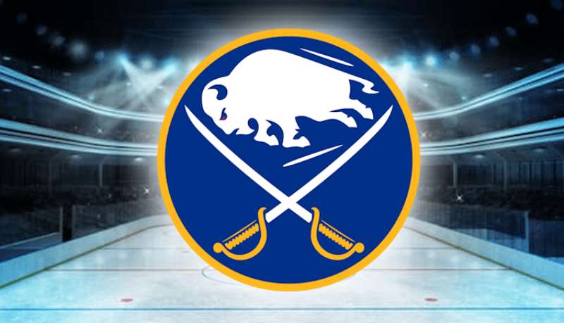
The Buffalo Sabres logo features two crossed blue sabres behind a charging buffalo, rendered in royal blue and gold. Introduced in 2010, this design by the team’s internal creative department symbolizes strength, speed, and Western New York pride.
Design Specifications
- Design Type: Combination mark (symbol with integrated elements)
- Primary Elements: Charging buffalo silhouette, two crossed sabres, circular frame
- Official Introduction Date: June 2010
- Designer/Agency: Buffalo Sabres internal creative team
- Trademark Status: Registered trademark of Pegula Sports and Entertainment
- Color Palette: Royal Blue (#003087), Gold (#FFB81C), White (#FFFFFF)
- Usage Context: Jerseys, merchandise, arena signage, digital platforms, broadcast graphics
How Has the Buffalo Sabres Logo Evolved Over Time?
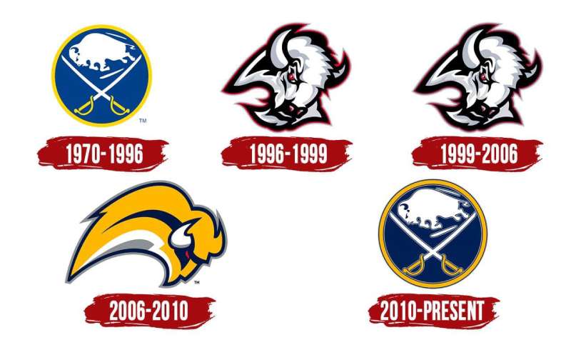
The Sabres have used five distinct logos since 1970. The original design lasted 26 years before the franchise experimented with modernization.
The most controversial change came in 1996 with the “Goathead” design. Fans eventually pushed for a return to traditional imagery.
The 2006 “Buffaslug” logo lasted only four seasons. It remains one of the least popular redesigns in NHL history.
Original Buffalo Sabres Logo (1970-1996)
- Years Active: 1970-1996
- Design Description: A charging buffalo centered over two crossed sabres, enclosed in a circular border. The buffalo faces left with an aggressive stance.
- Color Scheme: Royal blue, gold, white
- Designer: Robert Grier (disputed, with contributions from the Knox family)
- Context: Created for the 1970 NHL expansion. The design needed to represent both the city name and the team name in one cohesive mark.
- Cultural Significance: This logo accompanied the French Connection era and became deeply embedded in Western New York sports culture.
Goathead Logo (1996-2006)
- Years Active: 1996-2006
- Design Description: An aggressive buffalo head facing forward with red eyes, set against a modernized color palette. The sabres became stylized and angular.
- Color Scheme: Black, red, silver, white
- Designer: NHL Creative Services
- Context: Part of the mid-90s trend where NHL teams adopted fiercer, more aggressive imagery. The rebrand coincided with the move to Marine Midland Arena.
- Key Changes from Previous: Complete departure from circular design. Buffalo became menacing rather than majestic. Gold was eliminated entirely.
- Cultural Significance: Despite initial backlash, this logo saw the team reach the 1999 Stanley Cup Finals. Some fans developed nostalgia for it.
Buffaslug Logo (2006-2010)
- Years Active: 2006-2010
- Design Description: A stylized “B” containing an abstract buffalo shape. The design used flowing, curved lines meant to suggest motion and speed.
- Color Scheme: Navy blue, gold, silver, white
- Designer: Reebok design team
- Context: Launched alongside the Reebok Edge jersey system. The franchise attempted to modernize while partially returning to blue and gold.
- Key Changes from Previous: Removed the aggressive buffalo head. Created an abstract interpretation that many felt lacked personality.
- Cultural Significance: Widely mocked by fans and media. The nickname “Buffaslug” stuck immediately. It accelerated fan demand for a traditional return.
Current Buffalo Sabres Logo (2010-Present)
- Years Active: 2010-present
- Design Description: A refined version of the original 1970 design. The charging buffalo sits atop crossed sabres with cleaner lines and modernized proportions.
- Color Scheme: Royal blue (#003087), gold (#FFB81C), white
- Designer: Buffalo Sabres internal creative team
- Context: Fan pressure and new ownership (Terry Pegula) drove the return to traditional imagery. The rebrand signaled respect for franchise history.
- Key Changes from Previous: Complete abandonment of the abstract approach. The buffalo regained its classic charging pose.
- Cultural Significance: Represents a franchise reconnecting with its roots. The design bridges generational fan bases.
What Do the Design Elements of the Buffalo Sabres Logo Mean?
The logo combines two symbols representing the team name. The buffalo honors the city, while the crossed sabres add military precision and athletic aggression.
Together, they create a mark that’s both regionally specific and universally understood as competitive.
Why Did the Buffalo Sabres Choose These Specific Colors?

Royal blue connects to tradition and trust. It’s a color associated with stability and has been present in most of the team’s history.
Gold represents excellence and championship aspirations. The combination reads as classic sports branding without feeling dated.
Understanding color theory helps explain why this palette works so well on ice.
- Royal Blue (#003087): Primary color representing loyalty, depth, and the team’s connection to Buffalo’s blue-collar identity. Strong visibility against white ice.
- Gold (#FFB81C): Secondary color symbolizing achievement, energy, and premium quality. Provides warmth against the cool blue.
- White (#FFFFFF): Accent color for clarity and contrast. Creates breathing room between blue and gold elements.
What Typography Style Is Used in the Buffalo Sabres Logo?
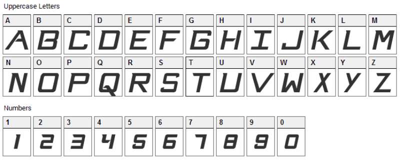
The primary logo relies on imagery rather than typography. Wordmarks appear separately on jerseys and merchandise.
When text is used, it features a custom sans-serif font with sharp angles. The lettering echoes the pointed tips of the sabres.
Jersey numbers and player names use a proprietary typeface designed for readability at broadcast distances.
What Are the Hidden Meanings in the Buffalo Sabres Logo?
The crossed sabres form an “X” shape, which some interpret as marking Buffalo’s spot on the hockey map. The buffalo’s forward lean suggests perpetual motion.
The circular border creates unity between elements. It also references the shape of a hockey puck, tying the mark to the sport itself.
No hidden easter eggs exist officially, but fans have noted the negative space creates subtle secondary shapes.
How Does the Buffalo Sabres Logo Compare to Competitor Logos?
Among Atlantic Division rivals, Buffalo’s logo stands out for its traditional approach. The Toronto Maple Leafs logo uses a cleaner, more minimal leaf symbol.
The Detroit Red Wings logo takes simplicity even further with its iconic winged wheel.
Buffalo’s combination mark carries more visual weight than most Eastern Conference competitors. The Montreal Canadiens logo achieves similar brand recognition with far fewer elements.
Compared to newer franchises like the Vegas Golden Knights logo, Buffalo’s mark feels deliberately classic.
What Are the Technical Specifications of the Buffalo Sabres Logo?
Official Color Codes
Royal Blue
Gold
- Hex: #FFB81C
- RGB: (255, 184, 28)
- CMYK: (0, 28, 89, 0)
- Pantone: 123 C
White
- Hex: #FFFFFF
- RGB: (255, 255, 255)
- CMYK: (0, 0, 0, 0)
Dimensions and Proportions
- Aspect Ratio: 1:1 (circular primary mark)
- Minimum Size: 0.5 inches diameter for print, 50 pixels for digital
- Clear Space: Minimum padding equal to 10% of logo width on all sides
- File Formats: Available in vector graphics (AI, EPS, SVG) and raster (JPEG, PNG)
What Cultural Impact Has the Buffalo Sabres Logo Had?
The original logo became inseparable from 1970s hockey culture. It appeared on countless products throughout Western New York.
The Goathead era, despite criticism, defined a decade of Sabres fandom. Jerseys from that period now sell as collectors’ items.
The current logo represents something bigger than design. It’s a statement about honoring history while moving forward.
Buffalo fans wear the logo as regional identity, not just team support.
How Does the Buffalo Sabres Logo Fit Into the Overall Brand Identity?
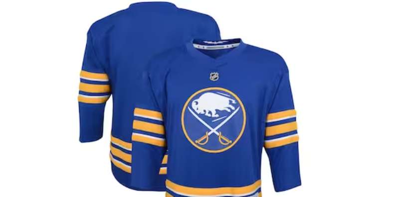
The logo anchors a complete visual system. Every touchpoint, from the arena to social media, references the same core elements.
The brand guidelines ensure consistent application across all platforms. Colors, spacing, and usage rules are strictly enforced.
Secondary marks include a standalone buffalo, crossed sabres without the buffalo, and various wordmarks. Each serves specific applications within the broader identity.
The KeyBank Center’s interior design, team merchandise, and broadcast graphics all pull from the same visual DNA.
How Should the Buffalo Sabres Logo Be Used?
Official Usage Guidelines
- Do: Maintain minimum clear space around the logo
- Do: Use official color codes only
- Do: Download assets from official team sources
- Don’t: Stretch, rotate, or distort the logo
- Don’t: Apply unauthorized color variations
- Don’t: Place the logo on busy backgrounds without proper contrast
Accessing Official Logos
Media and licensed partners can request official logo files through the Buffalo Sabres communications department. The NHL also maintains a central media portal for credentialed outlets.
Licensing and Trademark
The Buffalo Sabres logo is a registered trademark of Pegula Sports and Entertainment. Commercial use requires written licensing agreements through NHL Properties.
Fan art and personal use generally fall under fair use, but selling merchandise featuring the logo without authorization is prohibited. The team actively protects its intellectual property through legal channels.
FAQ on The Buffalo Sabres Logo
What Does the Buffalo Sabres Logo Represent?
The Buffalo Sabres logo combines a charging buffalo with two crossed sabres. It represents the city of Buffalo and the team’s fighting spirit.
The imagery ties Western New York identity to hockey culture. Simple, direct, memorable.
When Was the Current Buffalo Sabres Logo Introduced?
The current logo debuted in June 2010. It marked a return to the classic blue and gold color palette after years of experimentation.
Terry Pegula’s ownership group pushed for this traditional look. Fans welcomed the change.
Why Did the Sabres Change Their Logo Multiple Times?
NHL teams often rebrand to boost merchandise sales and refresh their image. The Sabres tried modernization in 1996 and again in 2006.
Neither attempt resonated with fans. The franchise learned that storytelling through heritage mattered more than trendy updates.
What Are the Official Colors of the Buffalo Sabres Logo?
Royal blue and gold define the current identity. These colors connect to the original 1970 design and carry strong color psychology associations.
Blue signals trust and stability. Gold represents excellence and championship aspirations.
Who Designed the Original Buffalo Sabres Logo?
The 1970 logo is credited to Robert Grier, though the Knox family contributed ideas. Documentation from that era remains incomplete.
What matters is the result. That original design influenced every version that followed.
What Is the Goathead Logo?
The “Goathead” was the Sabres’ logo from 1996 to 2006. It featured an aggressive buffalo head with red eyes against a black and red scheme.
Fans nicknamed it because the buffalo looked more like a goat. It’s now a nostalgia piece.
Why Was the Buffaslug Logo So Unpopular?
The 2006 “Buffaslug” used an abstract “B” shape that lacked personality. Fans felt it abandoned the team’s visual identity completely.
The design ignored logo design principles that made the original work. It lasted only four seasons.
Can I Use the Buffalo Sabres Logo for Personal Projects?
Personal, non-commercial use typically falls under fair use. Fan art and home projects rarely face issues.
Selling merchandise requires official licensing through NHL Properties. The team protects its trademark actively.
Where Can I Download the Official Buffalo Sabres Logo?
Credentialed media can access logos through the NHL media portal. The team’s communications department handles other requests.
For print design work, always use official vector files. Screen grabs won’t cut it.
How Does the Buffalo Sabres Logo Compare to Other NHL Logos?
Buffalo’s combination mark carries more visual hierarchy than minimal designs like the Carolina Hurricanes logo or Columbus Blue Jackets logo.
It balances tradition with regional identity. Not every franchise achieves that balance.
Conclusion
The Buffalo Sabres logo tells a story of trial, error, and eventual return to what works. Five decades of NHL hockey, five distinct visual identities.
The current design honors the 1970 original while feeling fresh enough for modern merchandise and digital platforms.
What makes this emblem succeed comes down to solid graphic design principles. The charging buffalo creates a clear focal point. The crossed sabres add balance.
Royal blue and gold deliver instant recognition across KeyBank Center, team jerseys, and fan gear throughout Western New York.
Some franchises chase trends. Buffalo found something better: a timeless mark that connects generations of hockey fans.

Renowned for his expertise in logo design and visual branding, Bogdan has developed a multitude of logos for various clients.
His skills extend to creating posters, vector illustrations, business cards, and brochures. Additionally, Bogdan's UI kits were featured on marketplaces like Visual Hierarchy and UI8.
He also wrote in the past years on sites like Design Your Way, WebDesignerDepot, WPDean, Designmodo, Speckyboy, Slider Revolution, and more.
- The Windsurf Logo History, Colors, Font, And Meaning - 10 October 2026
- How to Remove Background From Product Photos (No Photoshop) - 10 October 2026
- How Designers can Build a Stronger Online Creative Identity - 9 October 2026

Bogdan Sandu is a seasoned designer who has been designing websites since 2008. Renowned for his expertise in logo design and visual branding, Bogdan has developed a multitude of logos for various clients. His skills extend to creating posters, vector illustrations, business cards, and brochures. Additionally, Bogdan's UI kits were featured on marketplaces like Visual Hierarchy and UI8. He also wrote in the past years on sites like Design Your Way, WebDesignerDepot, WPDean, Designmodo, Speckyboy, Slider Revolution, and more.
You Might Also Like