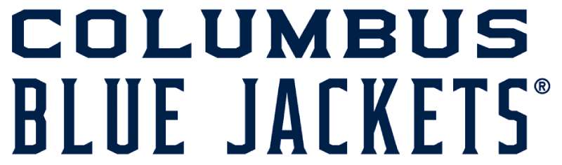
The Columbus Blue Jackets logo stands as one of the more distinctive marks in professional hockey. It tells a story rooted in Ohio history and American heritage.
A logo serves as the visual anchor for any sports franchise. The Blue Jackets’ emblem does exactly that while paying tribute to the state’s Civil War legacy.
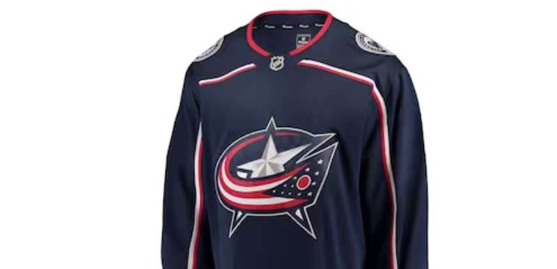
Introduced when the team joined the NHL as an expansion franchise in 2000, the logo has gone through several iterations. The current primary mark debuted in 2007. It features a star wrapped in the American flag, complete with a cannon overlay.
The design emerged from a collaboration between the franchise and NHL branding teams. Three main logo versions have existed since the team’s founding. Each one carries forward the patriotic themes that define this Midwestern hockey club.
What Is the Columbus Blue Jackets Logo?
The Columbus Blue Jackets logo is a combination mark featuring a star shape filled with American flag elements, overlaid with a Civil War-era cannon. Introduced in 2007, it replaced the original “Stinger” mascot design and represents Ohio’s Union Army heritage.
Design Type: Combination mark (emblem with integrated wordmark)
Primary Elements:
- Five-pointed star shape
- American flag pattern (stars and stripes)
- Civil War cannon silhouette
- Team wordmark
Official Introduction Date: 2007 (current version)
Original Franchise Logo: 2000
Designer/Agency: NHL Creative Services in collaboration with franchise ownership
Trademark Status: Registered trademark of the Columbus Blue Jackets Hockey Club
Color Palette:
- Union Blue (#002654)
- Goal Red (#CE1126)
- Capital Silver (#A4A9AD)
- White (#FFFFFF)
Usage Context: Game jerseys, arena signage, merchandise, digital platforms, broadcast graphics, and all official team communications
How Has the Columbus Blue Jackets Logo Evolved Over Time?
The Blue Jackets have used three primary logo designs since entering the NHL in 2000.
The original featured an aggressive insect mascot named Stinger.
A major rebrand in 2007 shifted the focus entirely. The team moved toward patriotic imagery that better reflected the franchise name’s historical meaning.
Minor refinements followed in subsequent years, but the core star-and-cannon concept has remained intact.
Original Columbus Blue Jackets Logo (2000-2007)
Years Active: 2000-2007
Design Description: A green and blue wasp-like insect character named “Stinger” wearing a Union Army kepi hat. The mascot held a hockey stick and appeared ready for action. The design featured an aggressive, forward-leaning pose meant to convey intensity.
Color Scheme: Forest green, navy blue, red, silver, and white
Designer: NHL Creative Services
Context: The expansion team wanted something fierce and memorable. The insect character represented a “blue jacket” in literal terms. Think yellowjacket, but blue. The concept didn’t quite land with fans as hoped.
Key Features: Cartoon mascot approach, heavy use of green (unusual for the later brand), aggressive character design
Cultural Significance: While it built initial brand recognition, many fans felt the logo missed the deeper historical connection to Ohio’s Civil War heritage. The mascot approach also seemed juvenile compared to other NHL marks.
Redesigned Columbus Blue Jackets Logo (2007-2017)
Years Active: 2007-2017
Design Description: Complete departure from the mascot approach. A bold star shape filled with American flag elements became the focal point. A Civil War-era cannon sat prominently in the center. The Ohio state flag’s distinctive shape influenced the overall composition.
Color Scheme: Union Blue, Goal Red, Capital Silver, White
Designer: Franchise design team with NHL oversight
Context: Ownership recognized the original logo failed to capture what “Blue Jackets” actually meant. The rebrand leaned hard into the Union Army soldiers who wore blue jackets during the Civil War. Ohio contributed more troops to the Union cause than any other state.
Key Changes from Previous: Complete elimination of mascot character, introduction of star shape, patriotic color scheme, historical military imagery, more sophisticated and mature aesthetic
Cultural Significance: This version established the visual identity that fans now associate with the franchise. It connected the team to genuine Ohio history rather than a made-up insect character.
Current Columbus Blue Jackets Logo (2017-Present)
Years Active: 2017-present
Design Description: Refined version of the 2007 mark. Cleaner lines throughout. The star shape remains central, but proportions were adjusted for better reproduction across digital and print applications.
Color Scheme: Union Blue, Goal Red, Capital Silver, White (unchanged)
Key Changes from Previous: Subtle refinements to line weights, improved scalability, sharper detail on cannon elements, enhanced digital compatibility
Cultural Significance: Represents the mature, established identity of a franchise that has now existed for over two decades. The refinements show a team confident in its visual direction.
What Do the Design Elements of the Columbus Blue Jackets Logo Mean?
Every element in the Blue Jackets logo carries intentional meaning.
The star shape references both the American flag and Ohio’s own state iconography.
The cannon speaks directly to Civil War history. Ohio was a major manufacturing center for Union Army artillery during the conflict.
Even the stripes within the star echo the flag that soldiers fought under.
Why Did Columbus Blue Jackets Choose These Specific Colors?
Understanding color theory helps explain these choices.
Union Blue (#002654)
Named directly after the uniform color worn by Union soldiers. This deep navy blue serves as the primary brand color. It conveys tradition, trust, and strength.
The psychological impact of color here is significant. Blue builds credibility.
Goal Red (#CE1126)
Represents the red stripes of the American flag. It adds energy and intensity to the palette. Red draws the eye and creates excitement. Perfect for a sports brand.
Capital Silver (#A4A9AD)
References Columbus as Ohio’s capital city. Silver adds a modern, professional touch. It provides contrast against the deeper colors without competing for attention.
White (#FFFFFF)
Completes the patriotic palette. Provides necessary breathing room in the design. Creates clean separation between elements.
What Typography Style Is Used in the Columbus Blue Jackets Logo?
The team uses a custom sans-serif font for its wordmark.
It features bold, blocky letterforms with slightly condensed proportions. The typography communicates strength without unnecessary decoration.
Letter spacing is tight but readable. Each character feels solid and grounded.
The wordmark works independently of the primary logo mark when needed. You’ll see it on merchandise and arena signage where the full emblem might be too complex.
What Are the Hidden Meanings in the Columbus Blue Jackets Logo?
The star shape does double duty. It’s an American symbol, yes. But it also mirrors the burgee shape of Ohio’s unique state flag.
Look closely at the cannon. It faces left, which in heraldic tradition suggests defense rather than aggression.
The stripes within the star aren’t random. They follow the exact proportions of the American flag’s stripes. Designers stated they wanted authenticity in the patriotic elements.
Some fans see the overall shape as resembling a military medal or badge of honor. Whether intentional or not, it reinforces the service and sacrifice themes.
How Does the Columbus Blue Jackets Logo Compare to Competitor Logos?
Among Eastern Conference teams, the Blue Jackets logo takes a distinctly different approach.
Most Metropolitan Division rivals use letter-based or mascot-driven designs. The patriotic emblem stands apart.
This creates strong brand differentiation during divisional matchups.
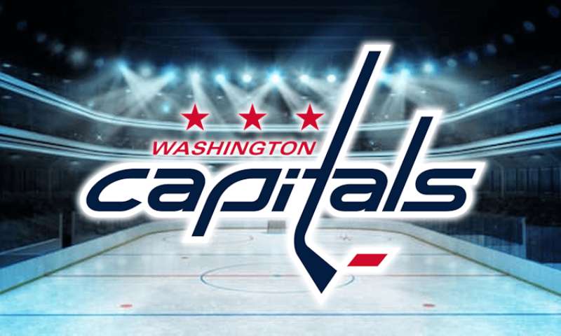
Compare it to the Washington Capitals logo, which also uses red, white, and blue. Both teams reference American themes. But the execution differs entirely. Washington leans into letterforms while Columbus commits to symbolic imagery.
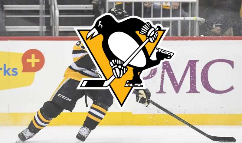
The Pittsburgh Penguins logo represents another divisional rival. Their mascot-based approach is what Columbus abandoned back in 2007. The penguin character works for Pittsburgh’s brand, but the Blue Jackets clearly wanted something more serious.
Looking at the Carolina Hurricanes logo, you see a more abstract approach to regional identity. Both teams reference local significance. Carolina uses weather imagery while Columbus uses historical military symbols.
The Philadelphia Flyers logo offers another comparison point. That iconic winged P has barely changed since 1967. Columbus took the opposite route. They made major changes to find their visual identity.
What Are the Technical Specifications of the Columbus Blue Jackets Logo?
Official Color Codes:
Union Blue (Primary)
Goal Red (Secondary)
- Hex: #CE1126
- RGB: (206, 17, 38)
- CMYK: (0, 100, 90, 10)
- Pantone: 186 C
Capital Silver (Accent)
- Hex: #A4A9AD
- RGB: (164, 169, 173)
- CMYK: (35, 25, 25, 0)
- Pantone: Cool Gray 6 C
White
- Hex: #FFFFFF
- RGB: (255, 255, 255)
- CMYK: (0, 0, 0, 0)
Dimensions and Proportions:
- Aspect ratio: Approximately 1:1 for primary mark
- Minimum size: 0.75 inches (print), 72 pixels (digital)
- Clear space: Equal to height of one star point on all sides
- The logo is provided in vector graphics formats for scalability
What Cultural Impact Has the Columbus Blue Jackets Logo Had?
The logo helped establish Columbus as a legitimate hockey market.
When the team rebranded in 2007, it signaled maturity. The franchise was no longer the new kid. It had staying power.
Local fans embraced the historical connection. Ohio pride runs deep here. The Union Army reference resonates with residents who know the state’s Civil War contributions.
The cannon imagery also connects to the in-arena experience. A replica cannon fires after every Blue Jackets goal. The logo and the tradition reinforce each other.
How Does the Columbus Blue Jackets Logo Fit Into the Overall Brand Identity?
The logo anchors a complete visual system.
Every touchpoint reflects the same patriotic themes. Arena graphics, social media templates, merchandise designs. All of it ties back to the star and cannon.
The team’s brand guidelines specify exactly how each element should appear. Consistency matters when you’re building recognition.
Jersey designs feature the primary logo prominently on the chest. Alternate uniforms sometimes emphasize secondary marks, but the core identity stays recognizable. Shoulder patches, helmet decals, and equipment all follow the established system.
How Should the Columbus Blue Jackets Logo Be Used?
Official Usage Guidelines:
Do:
- Use official files from team media resources
- Maintain minimum clear space requirements
- Reproduce in approved color combinations only
- Scale proportionally without distortion
Don’t:
- Alter colors outside official palette
- Add effects like shadows or gradients
- Stretch or compress the logo
- Place on busy backgrounds that reduce legibility
- Recreate or redraw the logo manually
Where to Access Official Logos:
Media members and licensed partners can obtain official logo files through the Columbus Blue Jackets media relations department or NHL Brand Resources portal.
Licensing Information:
Commercial use requires licensing through NHL Properties. Fan art and non-commercial use falls under different guidelines. When in doubt, contact the team directly.
Trademark Protection:
The Columbus Blue Jackets logo and all variations are registered trademarks. Unauthorized commercial reproduction faces legal consequences under trademark law.
FAQ on The Columbus Blue Jackets Logo
What does the Columbus Blue Jackets logo represent?
The Columbus Blue Jackets logo honors Ohio’s Civil War heritage. Union Army soldiers wore blue jackets during the conflict.
The star shape and cannon imagery reference this history directly. Ohio sent more troops to the Union cause than any other state.
When was the current Blue Jackets logo introduced?
The current primary logo debuted in 2007. It replaced the original Stinger mascot design that launched with the NHL expansion team in 2000.
Minor refinements came in 2017. The core design elements remained unchanged.
What are the official Columbus Blue Jackets colors?
The official color palette includes Union Blue, Goal Red, Capital Silver, and White.
Each color carries meaning. Union Blue references soldier uniforms. Capital Silver honors Columbus as Ohio’s capital city.
Why did Columbus Blue Jackets change their logo?
The original Stinger mascot failed to connect with fans. It missed the deeper historical meaning behind “Blue Jackets.”
Ownership wanted something more mature. The 2007 rebrand delivered a patriotic emblem with genuine Ohio significance.
What is the cannon in the Blue Jackets logo?
The cannon represents Civil War artillery. Ohio was a major manufacturing hub for Union Army weapons during the 1860s.
It also connects to the in-arena tradition. A replica cannon fires after every CBJ goal at Nationwide Arena.
Who designed the Columbus Blue Jackets logo?
NHL Creative Services developed the logo in collaboration with franchise ownership. The 2007 redesign involved the same partnership.
No individual designer receives public credit. Team branding projects typically involve multiple contributors working together.
What font does the Columbus Blue Jackets use?
The team uses a custom typeface for its wordmark. Bold, blocky letterforms with condensed proportions define the look.
The psychology behind font choices matters here. These letters communicate strength and stability.
Can I use the Columbus Blue Jackets logo for my project?
Commercial use requires licensing through NHL Properties. The logo is a registered trademark with legal protections.
Fan art and non-commercial use fall under different rules. Contact the team’s media relations department for official files and guidance.
How does the Blue Jackets logo compare to other NHL logos?
Most Metropolitan Division rivals use lettermarks or mascot designs. The Blue Jackets’ patriotic emblem stands apart visually.
Teams like the New Jersey Devils and New York Rangers take completely different approaches to hockey team branding.
What file formats is the Blue Jackets logo available in?
Official logos come in vector formats for print design work. These scale without quality loss.
Raster versions exist for web design applications. Media partners access files through NHL Brand Resources or team communications staff.
Conclusion
The Columbus Blue Jackets logo stands as a strong example of sports team identity done right. It tells a story that matters to Ohio residents.
From the original Stinger mascot to the current star and cannon emblem, the franchise found its visual voice. The journey took time. But the result works.
Every element serves a purpose. The Union blue color palette, the military imagery, the clean wordmark. These choices create a cohesive brand style guide that translates across hockey jerseys, merchandise, and digital platforms throughout the Metropolitan Division.
Good logo design principles show here.
Renowned for his expertise in logo design and visual branding, Bogdan has developed a multitude of logos for various clients.
His skills extend to creating posters, vector illustrations, business cards, and brochures. Additionally, Bogdan's UI kits were featured on marketplaces like Visual Hierarchy and UI8.
He also wrote in the past years on sites like Design Your Way, WebDesignerDepot, WPDean, Designmodo, Speckyboy, Slider Revolution, and more.
- Canva for Teams Review: Is It Worth the Business Plan? - 24 July 2026
- 5 Brand Compliance Checkpoints Every Enterprise Should Automate - 23 July 2026
- Timeless Open Sans Font Pairing for Any Project - 22 July 2026
Bogdan Sandu is a seasoned designer who has been designing websites since 2008. Renowned for his expertise in logo design and visual branding, Bogdan has developed a multitude of logos for various clients. His skills extend to creating posters, vector illustrations, business cards, and brochures. Additionally, Bogdan's UI kits were featured on marketplaces like Visual Hierarchy and UI8. He also wrote in the past years on sites like Design Your Way, WebDesignerDepot, WPDean, Designmodo, Speckyboy, Slider Revolution, and more.
You Might Also Like