The Chicago Blackhawks Logo History, Colors, Font, And Meaning
In a city celebrated for its iconic skyline and deep-dish pizza, a particular emblem embodies the spirit of both the metropolis and a pastime etched into its heart—the Chicago Blackhawks logo.
This emblem isn’t merely a design; it is a tapestry of history, passion, and identity interwoven into the fabric of the National Hockey League.
Venture into the storied journey behind the Indian Head insignia, where every stitch speaks to the heritage of a storied franchise. From the glint of the Stanley Cup Championships to the echoing cheer at the United Center, the logo stands as a beacon of hockey prestige.
With each turn of the page, anticipate an unveiling; the evolution, controversies, and artistry that render this logo timeless. Professionals respect its nuanced design principles while fans adore its representation of Chicago sports valor.
Here’s the revelation: logos do more than brand—they narrate. By article’s end, the connection between a city and its emblem will no longer be a mere concept, but an intimate understanding of its symbolical prowess.
The Meaning Behind the Chicago Blackhawks Logo
A Burst of Culture and Tradition
![]()
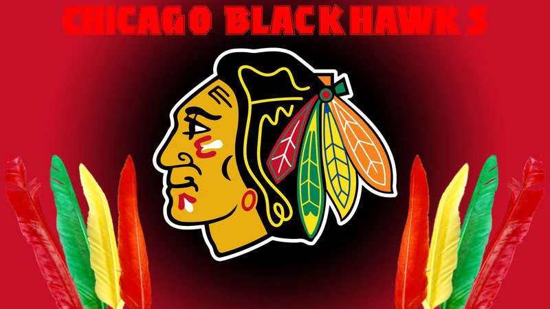
The Chicago Blackhawks logo is not just a symbol; it’s a story. It speaks of heritage, strength, and a deep connection to the past. The primary icon of the team, the Native American profile, has been the center of attention and discussions over the years.
The Name Connection
The team’s name, Blackhawks, is inspired by the 86th Infantry Division of World War I, also known as “Black Hawk.” This division was named in honor of the Sauk leader Black Hawk, a notable figure in Illinois’ history. This incorporation provides a touch of regional relevance to the logo’s origins.
Pride and Power
Featuring a detailed depiction of a Native American’s profile, the logo is a nod to strength, determination, and courage. It symbolizes not just a hockey team but a proud legacy and a commitment to excellence.
The History of the Chicago Blackhawks Logo
The Initial Days
![]()
Back in the day, when the Chicago Blackhawks first took to the ice in the 1920s, their logo was a simplistic black and white sketch. It had the same foundational Native American head profile we recognize today.
Evolution over Time
Like many logos, the Blackhawks emblem has undergone refinements. Over time, it has incorporated more details, vibrant colors, and artistic tweaks. This evolution ensures that while the core essence remains consistent, the logo feels fresh and relevant in its modern context.
Debates and Discussions
The logo’s portrayal of Native American imagery has stirred controversies over the years. While some view it as a respectful nod to history, others feel it might be culturally insensitive. Regardless of where one stands on this issue, the logo’s historical roots in the team’s history cannot be denied.
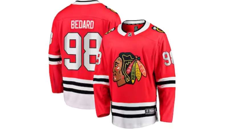
The Colors of the Chicago Blackhawks Logo
Black: Strength and Dominance
The black color in the logo represents strength, power, and determination. It’s a symbol of the team’s relentless pursuit of victory.
Red: Passion and Energy
Red stands for the fiery passion of the players and the fans alike. It’s the adrenaline, the excitement, the pulsating heartbeat of every game.
White: Purity and Integrity
White balances out the intensity of black and red. It speaks of sportsmanship, honesty, and playing the game with integrity.
The Font Used in the Chicago Blackhawks Logo
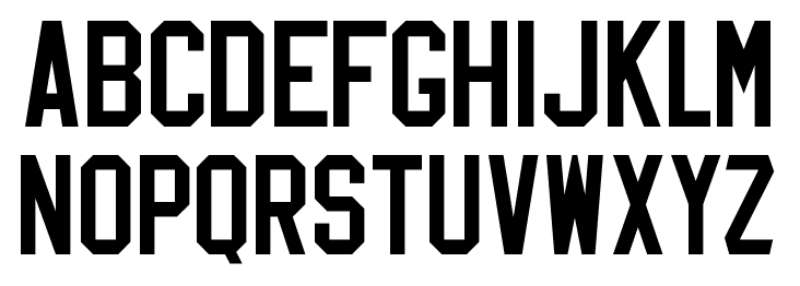
Unique and Distinguished
The typography in the logo isn’t your everyday, run-of-the-mill typeface. It’s unique to the team, showcasing flair and individuality.
Bold and Dynamic
The font used in the Blackhawks logo is bold, making a statement of its own. It complements the iconic image, ensuring that every element stands out, yet remains harmoniously integrated.
The Artistry and Craftsmanship
Hand-Drawn Origins
The intricate details, especially in the older versions of the logo, suggest that it might have been hand-drawn initially. This adds a touch of human artistry, contrasting today’s digital designs.
Integration with Other Team Elements
The Chicago Blackhawks logo isn’t just a standalone piece. It seamlessly integrates with the team’s jerseys, merchandise, and even their home rink, creating a cohesive brand presence.
The Global Impact and Recognition
A Symbol Beyond Borders
Even those who might not be hardcore hockey fans might recognize the Blackhawks logo. It has become a symbol not just of a team, but of the sport itself.
Merchandise and Pop Culture
From jerseys to caps to posters, the Blackhawks logo has left its mark. Its iconic imagery has been featured in films, music videos, and even street art, showcasing its vast cultural reach.
FAQ On The Chicago Blackhawks Logo
Why does the Chicago Blackhawks logo use an Indian head?
The emblem traces back to the team’s founder, Frederic McLaughlin, who served in the 86th Infantry Division during World War I, nicknamed the “Blackhawk Division,” itself named after the Sauk leader Black Hawk.
The logo pays tribute to the division and the historical figure, fusing Chicago sports heritage with a martial legacy.
Has the Chicago Blackhawks logo changed over time?
Indeed, it has evolved. The sports logo history of the Blackhawks reveals subtle alterations in the Indian head’s portrayal, with changes to its color palette and the detailing on the feathers.
This logo evolution signifies the team’s response to design trends while respecting the emblem’s integrity.
What is the controversy surrounding the Chicago Blackhawks logo?
The controversy revolves around cultural sensitivity. Critics argue that the use of an Indigenous figure for a sports team mascot can perpetuate stereotypes.
Supporters believe it honors both Black Hawk and the 86th Infantry. The conversation continues, reflecting a broader discourse on iconic sports logos and respectfulness.
How do fans perceive the Chicago Blackhawks logo?
Amongst fans, the logo embodies pride and a storied tradition. Many see it as an emblem of perseverance and triumph, connecting generations of hockey enthusiasts.
This strong identification with the logo amplifies the sale of fan merchandise graphics and is testament to its success as a hockey crest design.
Is the Chicago Blackhawks logo trademarked?
Absolutely, it is protected as intellectual property. As an essential part of professional hockey branding, trademarks safeguard the logo from unauthorized use.
This not only secures legal rights but also ensures that fan gear design elements and sports memorabilia maintain their authenticity and value.
What do the colors in the Chicago Blackhawks logo represent?
The black and red of the logo are symbolic of strength and intensity; white infuses a sense of balance—a powerful combination reflecting the tenacity of a hockey team on ice. The team colors have become synonymous with the Blackhawks’ identity.
How has the Chicago Blackhawks logo influenced NHL branding?
As an Original Six franchise, the Blackhawks’ logo has been a trailblazer in the NHL, setting precedents in brand identity with its distinctive and enduring design—it’s a hallmark of National Hockey League (NHL) merchandising, iconic sports logos, and sports team marketing.
Are there any alternate Blackhawks logos used by the team?
Yes, the team has employed secondary logos, like the ‘C’ with tomahawks, for alternate Blackhawks logos on the shoulder patches of jerseys.
These designs offer fresh merchandise opportunities while staying true to the central themes of the Chicago NHL team symbol.
How does the logo impact the team’s merchandise sales?
The logo is instrumental to merchandise sales due to its recognizability and emotional connection with fans. Items adorned with the Indian head signify exclusivity and belonging in the realm of sports team branding, driving sports memorabilia revenue.
Will the Chicago Blackhawks logo be redesigned in the future?
Speculation exists, but any decision would require navigating a bevy of sentiments from the domain of heritage and present-day cultural awareness.
As logo design aligns closely with identity, any potential logo redesign would weigh fan allegiance and societal consciousness in equal measure.
Conclusion
The threads of the Chicago Blackhawks logo have been woven through the very fabric of this city’s illustrious sports tapestry. As the final sketch on this piece, cast a lens on the enduring legacy it etches within the NHL’s heart and the fanfare it ignites.
Beyond the emblem’s contours, lies the resonance of every slap shot and cheer within the cavernous shrine of the United Center, echoing through the streets where the wind howls as fiercely as the fans. Whether embarking on a stroll past the iconic Stanley Cup Championships banners or tracing the stitches on a coveted jersey, the indelible mark of the Blackhawks logo whispers the tales of icy battles and hallowed victories.
Thus, let this closing note ring with certainty—the Blackhawks insignia stands not just as a design but as an indomitable hockey team branding force, immortalizing a saga of passion, pride, and an ever-persistent quest for glory.
If you liked this article about the Chicago Blackhawks logo, you should check out this article about the Buffalo Sabres logo.
There are also similar articles discussing the Calgary Flames logo, the Carolina Hurricanes logo, the Colorado Avalanche logo, and the Columbus Blue Jackets logo.
And let’s not forget about articles on the Dallas Stars logo, the New Jersey Devils logo, the New York Islanders logo, and the Washington Capitals logo.
Bogdan Sandu, a seasoned designer with 15 years of diverse experience, has been designing websites since 2008.
Renowned for his expertise in logo design and visual branding, Bogdan has developed a multitude of logos for various clients.
His skills extend to creating posters, vector illustrations, business cards, and brochures. Additionally, Bogdan's UI kits were featured on marketplaces like Visual Hierarchy and UI8.
Latest posts by Bogdan Sandu (see all)
- Rainbow Color Palettes for Joyful Designs - 29 April 2024
- The Bethesda Logo History, Colors, Font, And Meaning - 28 April 2024
- Out of This World: Space Color Palettes for Cosmic Designs - 28 April 2024