The Colorado Avalanche Logo History, Colors, Font, And Meaning
Swift as a slapshot and bold as a breakaway, the emblem of a team can capture the spirit of the game like no other. The Colorado Avalanche logo—a symbol etched in the hearts of Denver’s denizens and hockey enthusiasts afar—stands as a testament to this.
Embracing the vibrant culture of the NHL and the heritage of a storied franchise, it’s more than just a trademark; it’s the pulse of a fanbase.
In this unraveling of threads, colors, and forms, we delve into the essence of the Avalanche’s identity. From the burgundy and blue hues to the snow-flecked letter “A,” each element mirrors a narrative; a visual saga of ice battles waged under the gaze of the Rocky Mountains.
By the close, you’ll unravel the enigma of symbols—how a mere logo encapsulates history, triumph, and community.
We’ll skate through topics like sports branding, the evolution of team insignias, and the impact on a franchise’s identity. Uncover the saga woven into the fabric of a logo that is not just seen, but felt.
The Meaning Behind the Colorado Avalanche Logo
![]()
Ah, the Avalanche. When you first gaze upon the logo, it’s so much more than just a mark on a jersey.
Emotion in Motion
Firstly, that iconic swoosh – like an avalanche tumbling down – it’s not just about a natural phenomenon.
It’s about speed, power, and momentum. Think about it: an avalanche, once it starts, is almost impossible to stop. Kinda like a hockey team in the zone, right?
Mountains, Man!
Then, there’s the mountain outline, reminding us of Colorado’s majestic landscapes. The Rockies, right? Nature’s skyscrapers.
It’s a nod to home, a testament to the grandeur and beauty of the state they represent. For the players and the fans, that logo is a symbol of pride, of belonging.
The History of the Colorado Avalanche Logo
![]()
The Avalanche haven’t always been the Avalanche. Mind-boggling, right?
The Days Before the Drift
Before they were making snowstorms in Colorado, this team was up north in Quebec as the Nordiques. Different vibe, different logo. But when they moved to Colorado in ’95, everything changed.
Birth of the Avalanche
That’s when the Avalanche was born. It’s been tweaked here and there, but the essence remains. A team’s identity, wrapped up in that iconic imagery.
The Colors of the Colorado Avalanche Logo
Oh man, those colors! They’re not just picked out of thin air.
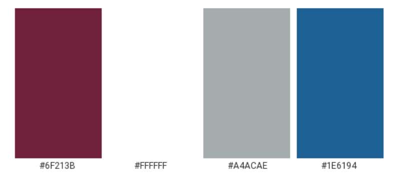
Burgundy and Blue
The rich burgundy, it’s deep and passionate, kind of like the heartbeat of the fans. The blue? Think of it like the vast Colorado sky or those crisp winter mornings.
Silver Lining
And don’t get me started on that silver! It’s not just there to look pretty. It signifies triumph, a nod to the Stanley Cups won.
The Font Used in the Colorado Avalanche Logo
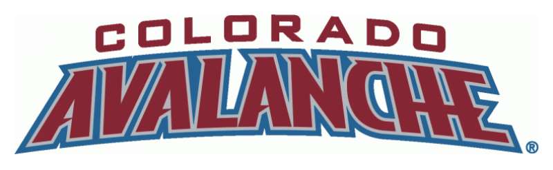
Typography, my friends, is an art. And the Avalanche? They nailed it.
Bold and Beautiful
The font’s boldness screams confidence. It stands tall, like a challenge to any opponent.
Slight Italicization
Notice that slight lean? It’s like the logo is always in motion, always pushing forward, just like the team.
The Evolution Over the Years
Logos, they’re like wine, getting better over time.
Subtle Changes
Over the years, there’ve been minute changes, tweaks to keep it fresh. But always maintaining its core essence.
Modern Flair
Today’s version has a modern flair, yet it’s rooted in tradition. A bridge between the old guard and the new.
The Influence on Merchandise
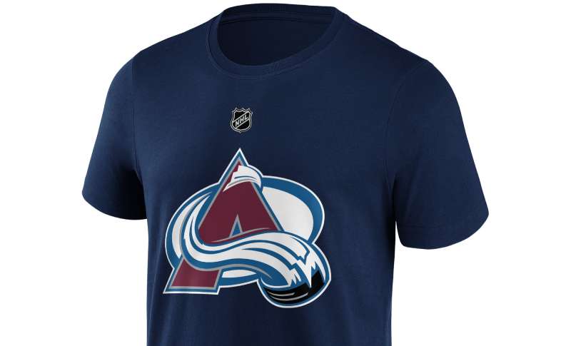
Ever noticed how some logos just look epic on gear?
Wear it Loud and Proud
From jerseys to caps, the Avalanche logo stands out. It’s not just about supporting a team. It’s a statement.
Merch Evolution
Over time, as the logo evolved, so did the merch. The colors, the style, the swagger – it’s all interconnected.
FAQ On The Colorado Avalanche Logo
What is the significance of the Colorado Avalanche logo?
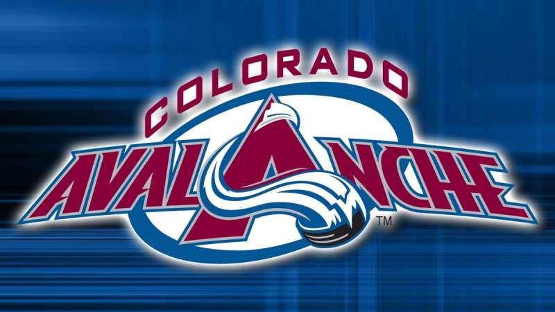
The Colorado Avalanche logo encapsulates the spirit of the team and its connection to the region. The snow-capped letter ‘A’ framed by an oval represents the snowy peaks and the landscape’s natural force, etching the team’s identity in the annals of NHL history.
How has the Avalanche logo evolved over time?
Initially, the Avalanche logo remained largely unchanged, a testament to its strong design.
Minor refinements reflect modern tastes, ensuring that the sports team branding resonates with new generations while honoring the franchise’s storied past and Stanley Cup victories.
What do the colors of the Avalanche logo mean?
Burgundy and blue dominate the Avalanche logo, colors that evoke a sense of passion, energy, and connection to the chilly ethos of hockey. These hues are entwined with the region’s landscape, a nod to mountainous terrain and icy challenges.
Why does the Avalanche logo feature a yeti foot?
The yeti foot on the shoulder patch pays homage to the folklore of mountainous terrains, embodying mystery and strength. It’s a unique element that adds character and distinguishes their emblem design in sports circles.
Is the Colorado Avalanche logo one of the most recognized in the NHL?
Yes, the Colorado Avalanche logo ranks highly in recognition within the NHL community. Its iconic design and consistent presence in the league contribute to its familiarity and esteemed standing among the professional hockey logos.
Who designed the original Colorado Avalanche logo?
The original designer prefers anonymity, but the inception of the Colorado Avalanche logo is rooted in 1995 when the team relocated from Quebec.
Their branding was crafted to resonate with the new home, encompassing the spirit and vibrancy of the Denver professional teams.
Are there any alternate versions of the Avalanche logo used for merchandise?
Indeed, the Avalanche mascot and the secondary mark—a stylized ‘C’ enveloping a puck—are often featured on merchandise. These variations allow for a broader branding strategy engaging fans with a diversity of NHL team emblems across merchandise.
How do Avalanche fans feel about the team’s logo?
The fan base regards the Avalanche logo with pride. It’s not just an ice hockey team identity, it’s a banner under which community and fandom unite, celebrating every power play and goal with unwavering support for their hometown heroes.
Has the Colorado Avalanche logo ever been controversial?
Controversy isn’t a term typically associated with the Avalanche logo. Its acceptance and love from the fanbase reflect its design’s thoughtfulness, connecting the Colorado sports crest deeply with the team’s ethos and regional pride.
What are the legal protections for the Colorado Avalanche logo?
As an intellectual property of the franchise, the Avalanche logo is trademarked. This ensures the sports franchise’s graphics are safeguarded against unauthorized use, maintaining the exclusivity and authenticity of the team’s branding and team logo history.
Conclusion
Navigating the icy waters of branding, the journey now circles back to where we started: contemplating the allure behind the Colorado Avalanche logo. From its inception to its perch atop the peaks of the NHL’s visual landscape, we’ve uncovered the threads of design that interlace to form this enduring emblem.
The logo stands as more than a mere icon; it is the pulsating heart of the franchise, an essence distilled into burgundy and blue, a badge of honor proudly worn by those who brave the chill of the rink. The spirited tales of Avalanche’s Stanley Cup triumphs and the roar of the Ball Arena faithful—all encapsulated within the contours of an ‘A’.
In conclusion, this insignia is not just etched in the jerseys or the merchandise of Denver’s professional teams; it is etched in memories, in victories savored, and in the timeless narrative of hockey itself. A symbol, a story, a legacy—woven irrevocably into the fabric of sports culture.
If you liked this article about the Colorado Avalanche logo, you should check out this article about the Buffalo Sabres logo.
There are also similar articles discussing the Calgary Flames logo, the Carolina Hurricanes logo, the Chicago Blackhawks logo, and the Columbus Blue Jackets logo.
And let’s not forget about articles on the Dallas Stars logo, the New Jersey Devils logo, the New York Islanders logo, and the Washington Capitals logo.
Bogdan Sandu, a seasoned designer with 15 years of diverse experience, has been designing websites since 2008.
Renowned for his expertise in logo design and visual branding, Bogdan has developed a multitude of logos for various clients.
His skills extend to creating posters, vector illustrations, business cards, and brochures. Additionally, Bogdan's UI kits were featured on marketplaces like Visual Hierarchy and UI8.
Latest posts by Bogdan Sandu (see all)
- After Dark: Night Color Palettes for Mysterious Designs - 27 April 2024
- The Capcom Logo History, Colors, Font, And Meaning - 26 April 2024
- Earth Color Palettes Grounded in Nature: 40 Examples - 26 April 2024