The wrong font can make a child stop reading. The right one disappears into the page.
Choosing the best fonts for children’s books goes well beyond aesthetics. Typeface selection directly affects letter recognition, reading speed, and whether a young reader can decode text comfortably at all.
Most guides treat this as a design question. It’s actually a readability one.
This article covers the fonts that genuinely work across picture books, early readers, and chapter books — evaluated by structure, not style. You’ll find options for body text, display headings, and cover typography, with clear guidance on sizing, pairing, and licensing for both print and digital publishing.
The Best Fonts For Children’s Books
Picking a font for a children’s book isn’t just a design choice. It directly affects whether a child can decode the text, stay engaged, and build early reading habits. The wrong choice causes friction. The right one disappears into the page.
Below are ten fonts that genuinely work for children’s publishing, covering picture books, early readers, and chapter books, each evaluated by structure, not aesthetics.
A few quick benchmarks that apply across all entries:
- Body text for picture books: 16–24pt, leading at least 4–6pt above the text size
- Early readers: 14–18pt with generous letter-spacing
- Chapter books: 12–16pt with clear word spacing
- Single-storey “a” and “g” letterforms consistently help early readers recognize letters correctly
Understanding font psychology also helps when pairing a cover display font with interior body text — the emotional tone needs to match across both.
—
Sassoon Primary
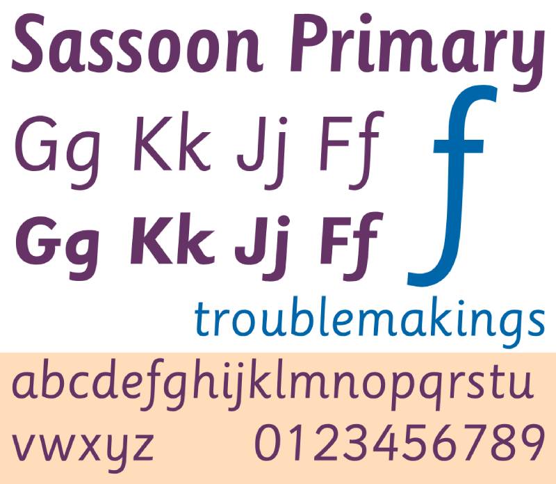
Sassoon Primary is a humanist sans-serif typeface designed by Dr. Rosemary Sassoon, in partnership with Adrian Williams, first released in 1985 through Sassoon-Williams. It was developed specifically for children’s books and teaching materials, following two years of UK research into which letterforms young readers find easiest to decode.
Sassoon Primary works best for early reader body text because its letterforms include exit strokes at the baseline, a slight natural slant, and single-storey “a” and “g” characters that closely match how children are taught to write by hand.
It has been adopted widely by UK publishers and educational material producers precisely because it was tested empirically, not just designed intuitively.
What makes Sassoon Primary suitable for children’s books?
Exit strokes at the baseline guide the eye naturally from letter to letter, reducing the stop-start effect that slows beginning readers. The letterforms have clearly differentiated shapes, which reduces confusion between similar-looking characters like “b,” “d,” “p,” and “q.” Its moderate x-height supports legibility at sizes between 14pt and 24pt without distortion.
Key attributes:
| Attribute | Value |
| Classification | Humanist sans-serif |
| Designer | Rosemary Sassoon & Adrian Williams, 1985 |
| Weight range | Regular, Bold (6 styles total in the family) |
| Variable font | No |
| Recommended sizes | 14pt–24pt for body text; 28pt+ for picture books |
| License | Commercial (Sassoon-Williams / MyFonts) |
| Available on | MyFonts, Linotype, Sassoon foundry direct |
| Price | Paid — varies by style and license type |
How does Sassoon Primary perform for children’s book body text?
At 16–24pt, Sassoon Primary renders cleanly in both digital and print formats. Its exit strokes prevent the letterforms from looking too static on the page, which matters for early readers who benefit from visual flow cues. The slight slant is subtle enough not to read as italic, yet adds enough movement to keep the text approachable.
What are the best pairings for Sassoon Primary in children’s books?
Sassoon Primary pairs with Fredoka One for cover titles, where the rounded display weight creates contrast against the structured body text. It also works alongside Chewy for callout text or character dialogue, when a looser, more expressive tone is needed within the same layout.
What are the limitations of Sassoon Primary for children’s books?
It carries a commercial license, which adds cost for self-publishers. The weight range is limited compared to variable font options, so hierarchy must be achieved through size rather than weight variation.
Sassoon Primary — Recommended Use Cases Within Children’s Books
- Best for: Body text in picture books and early readers; educational materials for ages 4–8
- Avoid for: Chapter book body text at sizes below 12pt; cover display text
- Optimal weight: Regular for body; Bold for emphasis or read-aloud cues
- Optimal size range: 16pt–24pt for picture books; 14pt–18pt for early readers
—
Andika
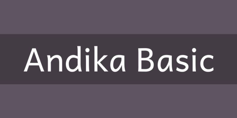
Andika is a sans-serif typeface designed by Victor Gaultney (and Annie Olsen), released by SIL International in 2008. It was built specifically for literacy programs, drawing on research in letter recognition psychology, early Dutch typefounding, and Carolingian manuscript calligraphy. USAID has listed it as a best practice font for developing reading materials.
Andika suits beginning reader body text because its letterforms are deliberately differentiated — no two characters share a shape close enough to cause confusion, which directly addresses a core challenge in early childhood reading.
What makes Andika suitable for children’s books?
Version 6.200 and later include over 3,800 glyphs, with stylistic variants for letters like “a,” “g,” and “t” that allow publishers to match the letterform style used in local handwriting instruction. Open apertures in letters like “c,” “e,” and “a” prevent misidentification at smaller sizes. The font supports Latin, Cyrillic, and IPA characters, making it practical for multilingual publishing.
Key attributes:
| Attribute | Value |
| Classification | Sans-serif (literacy-specific) |
| Designer | Victor Gaultney / SIL International, 2008 |
| Weight range | Regular, Bold, Italic, Bold Italic |
| Variable font | No |
| Recommended sizes | 14pt–22pt for picture books; 12pt–16pt for early readers |
| Letter-spacing default | Wide (intentional for literacy use) |
| License | OFL (SIL Open Font License) — free for commercial use |
| Available on | Google Fonts, SIL International direct download |
| Price | Free |
How does Andika perform for beginning reader text?
Literacy specialists in South Sudan reported that Andika reads “nice and clear and spaced out enough to be easily read, even on a small phone screen” when used in e-book readers built on SIL’s Reading App Builder. Its wide default letter-spacing prevents letter crowding, which is one of the documented causes of reading errors in early readers. Teachers working with students with dyslexia have also reported improved print legibility compared to standard sans-serif alternatives.
What are the best pairings for Andika in children’s books?
Andika pairs with Fredoka One for chapter headings and cover display text, where the rounded display weight provides tonal contrast without clashing. It also works alongside Nunito for digital children’s books where both fonts need to render cleanly on screens of varying resolution.
What are the limitations of Andika for children’s books?
Andika offers only four weights (Regular, Bold, Italic, Bold Italic), which limits typographic hierarchy in complex layouts. Its wide letter-spacing, while beneficial for beginning readers, can cause text to run long, requiring careful layout planning for shorter picture book spreads.
Andika — Recommended Use Cases Within Children’s Books
- Best for: Body text in early readers and educational books; multilingual children’s publishing
- Avoid for: Cover display text; decorative or thematic heading use
- Optimal weight: Regular for body; Bold for vocabulary words or emphasis
- Optimal size range: 14pt–20pt for print; 16pt–22pt for digital picture books
—
Chewy
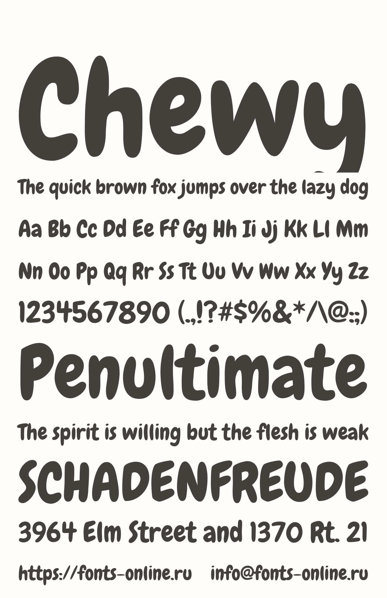
Chewy is a display sans-serif typeface designed by Font Diner (DBA Sideshow), released in 2010 and distributed through Google Fonts under the Apache license. Its bubble-like letterforms with consistent stroke width were designed for headline and display use, not extended body text.
Chewy works best for picture book titles and cover headings because its high cap-height and bold stroke weight produce strong visual impact at sizes above 28pt, remaining readable even when viewed from a distance on a bookshelf.
What makes Chewy suitable for children’s book covers and headings?
Consistent stroke width across all letterforms means Chewy maintains shape integrity at very large display sizes without the ink traps or contrast shifts that can distort other display fonts. Its condensed width allows longer titles to fit cover layouts without forced line breaks.
Key attributes:
| Attribute | Value |
| Classification | Display sans-serif |
| Designer | Font Diner / Sideshow, 2010 |
| Weight range | Bold only (single weight) |
| Variable font | No |
| Recommended sizes | 28pt+ for cover titles; 18pt–24pt for chapter headings |
| License | Apache License 2.0 (free for commercial use) |
| Available on | Google Fonts |
| Price | Free |
How does Chewy perform for cover and heading use in children’s books?
At 36pt and above, Chewy renders with high contrast against illustrated backgrounds due to its bold, uniform stroke. Its cartoon-adjacent character makes it recognizable as children’s content from a visual scan, which matters for bookshelf discoverability. The single weight limits its use to display contexts only.
What are the best pairings for Chewy in children’s books?
Chewy pairs with Andika for interior body text, where the neutral literacy font contrasts cleanly against the expressive cover treatment. It also works alongside Quicksand at Regular 400 for subheadings and captions inside the book when a softer rounded tone is needed without repeating the display weight.
What are the limitations of Chewy for children’s books?
Single weight only. It cannot provide typographic hierarchy on its own and must always be paired with a separate body text font. Chewy also becomes hard to read in body text below 18pt due to the cartoon-style letterform variations that read as noise at small sizes.
Chewy — Recommended Use Cases Within Children’s Books
- Best for: Cover titles, chapter headings, dialogue callouts for picture books
- Avoid for: Body text at any size; captions below 16pt
- Optimal weight: Bold (only weight available)
- Optimal size range: 28pt–72pt for covers; 18pt–24pt for interior headings
—
Nunito

Nunito is a rounded-terminal sans-serif typeface originally created by Vernon Adams in 2013, later extended by Jacques Le Bailly to a full weight range, and released through Google Fonts under the OFL license. It is a variable font as of its most recent major release, supporting weight, width, and optical size axes.
Nunito suits digital children’s books and app-based reading content because its rounded stroke terminals reduce the angular harshness of standard sans-serifs, while its 8-weight range supports clear typographic hierarchy across headings, subheadings, and body text.
Worth noting: avoid the Light (300) and ExtraLight (200) weights for body text in children’s books. They break down in print at typical reading sizes.
What makes Nunito suitable for children’s books?
Rounded stroke terminals at cap and baseline make individual letterforms look less mechanical, which reduces the perceptual distance between typed text and handwritten text — a relevant factor for pre-literate children encountering print. The variable font axis supports weight values from 200 to 900 in a single file, which simplifies font management in digital publishing workflows. Its x-height is moderate, supporting legibility at 14pt–22pt without requiring enlarged type settings.
Key attributes:
| Attribute | Value |
| Classification | Rounded sans-serif |
| Designer | Vernon Adams, Jacques Le Bailly, 2013 |
| Weight range | ExtraLight 200 – Black 900 (8 weights) |
| Variable font | Yes |
| Recommended sizes | 14pt–22pt for body; 24pt+ for headings |
| License | OFL (free for commercial use) |
| Available on | Google Fonts, Adobe Fonts |
| Price | Free |
How does Nunito perform in digital children’s book formats?
Nunito’s variable font structure makes it particularly practical for reflowable ebook formats and reading apps, where a single font file covers all weight needs. At weight 400–600 and 16pt–20pt, it renders clearly on both low and high-DPI screens. The rounded terminals hold their shape well even at smaller screen sizes, unlike geometric sans-serifs with hard terminals that can pixelate.
What are the best pairings for Nunito in children’s books?
Nunito pairs with Fredoka One for display headings on chapter openers or cover text, where the bolder display weight creates visual contrast. For pairing fonts in educational picture books, Nunito at SemiBold 600 for body copy works alongside Patrick Hand for handwritten-style callout text and character speech.
What are the limitations of Nunito for children’s books?
Lighter weights (200–300) lose clarity in print below 16pt and should be avoided for body text. Its double-storey “a” and “g” in the default setting may conflict with some early-reading handwriting programs that teach single-storey letterforms.
Nunito — Recommended Use Cases Within Children’s Books
- Best for: Digital children’s books, reading apps, middle grade ebooks
- Avoid for: Body text below 14pt; contexts requiring single-storey letterforms
- Optimal weight: Regular 400 or Medium 500 for body; Bold 700 for headings
- Optimal size range: 16pt–22pt for digital body text; 24pt–36pt for headings
—
Fredoka One

Fredoka One is a rounded display sans-serif designed by Milena Brandão in 2011, released under the OFL license through Google Fonts. The expanded Fredoka family now includes 5 weights across 3 widths (condensed, regular, extended), though Fredoka One refers specifically to the original single-weight bold release.
Fredoka One works best for picture book cover titles and chapter headings because its high cap-height, thick uniform strokes, and curved terminals create strong visual contrast that reads clearly in both print and digital preview contexts.
What makes Fredoka One suitable for children’s book display use?
The typeface uses rounded terminals at stroke ends and large, open letterforms that produce strong figure-ground contrast against illustrated backgrounds. At 36pt and above, individual glyphs remain distinctly shaped without optical crowding. Its 235 glyphs and 13 ligatures support most Latin-language publishing needs.
Key attributes:
| Attribute | Value |
| Classification | Rounded display sans-serif |
| Designer | Milena Brandão, 2011 |
| Weight range | Bold only (Fredoka One); Light–Bold in full Fredoka family |
| Variable font | No (Fredoka One); Yes (Fredoka variable family) |
| Recommended sizes | 28pt+ for cover titles; 20pt–28pt for chapter headings |
| License | OFL (free for commercial use) |
| Available on | Google Fonts |
| Price | Free |
How does Fredoka One perform for cover and heading use?
The bold, rounded strokes hold their shape well across both print and screen at display sizes. Toy stores, educational app publishers, and children’s media brands regularly use this typeface (or close equivalents) for headlines precisely because it reads as playful without losing legibility at a glance. It is not suited for body text — at sizes below 18pt, the heavy weight and rounded forms compress into visual noise.
What are the best pairings for Fredoka One in children’s books?
Fredoka One pairs with Andika for body text, where the neutral literacy font provides clear contrast against the expressive heading. It also pairs with Nunito at Regular 400 for subheadings, where the weight difference creates hierarchy and the shared rounded character keeps the tone consistent.
What are the limitations of Fredoka One for children’s books?
As a single-weight display font, Fredoka One cannot support internal typographic hierarchy. It is unsuitable for any body text application, and its bold weight can overpower delicate illustration styles if the cover design isn’t carefully balanced.
Fredoka One — Recommended Use Cases Within Children’s Books
- Best for: Cover titles, section headers in activity books, educational poster headings
- Avoid for: Body text at any size; captions; fine-print elements
- Optimal weight: Bold (only weight in the One variant)
- Optimal size range: 28pt–72pt for cover and display use
—
Quicksand
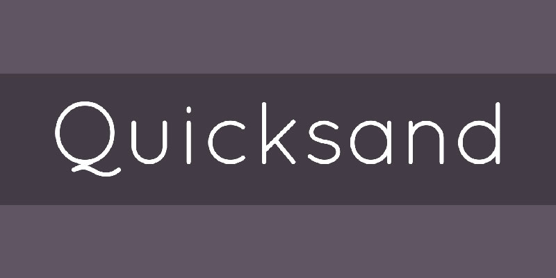
Quicksand is a geometric display sans-serif designed by Andrew Paglinawan in 2008, redrawn as Quicksand 2.0 in 2013, revised by Thomas Jockin in 2016, and converted to a variable font by Mirko Velimirovic in 2019, released through Google Fonts under the OFL license.
Quicksand suits subheadings and callout text in picture books and early readers because its rounded terminals and geometric foundation produce clean letterforms at mid-range sizes (18pt–28pt) without the heavy display weight of fonts like Fredoka One.
What makes Quicksand suitable for children’s books?
Quicksand’s rounded terminals soften the angular quality of geometric sans-serifs, producing letterforms that read as approachable at reading sizes. Its variable weight axis spans Light 300 to Bold 700, which allows single-font hierarchy across headings and subheadings in a digital layout. The 2016 revision improved optical spacing and glyph differentiation, specifically addressing issues in the earlier version where similar letterforms like “l,” “I,” and “1” were hard to distinguish.
Key attributes:
| Attribute | Value |
| Classification | Geometric display sans-serif |
| Designer | Andrew Paglinawan, 2008 (revised 2013, 2016) |
| Weight range | Light 300 – Bold 700 (variable) |
| Variable font | Yes (weight axis) |
| Recommended sizes | 18pt–28pt for subheadings; 500–700 weight for body use above 16pt |
| License | OFL (free for commercial use) |
| Available on | Google Fonts, Adobe Fonts |
| Price | Free |
How does Quicksand perform in children’s book layouts?
At weight 500–700 and 16pt+, Quicksand renders with enough stroke thickness to remain legible in print. At lighter weights (300–400) and small sizes, stroke definition drops, making it unreliable for body text in print picture books. It performs better in digital formats where screen rendering compensates for thin strokes.
What are the best pairings for Quicksand in children’s books?
Quicksand pairs with Sassoon Primary for body text in illustrated educational books, where the literacy-focused body font handles the reading load and Quicksand handles subheadings and pull quotes. It also works alongside Nunito, both sharing rounded geometric origins — use weight contrast (Quicksand Bold vs. Nunito Regular) to establish hierarchy.
What are the limitations of Quicksand for children’s books?
Light and ExtraLight weights are not reliable for body text in print. The geometric uniformity of the letterforms can produce reading fatigue in long text passages, limiting its use to display and subheading roles in children’s publishing.
Quicksand — Recommended Use Cases Within Children’s Books
- Best for: Subheadings, pull quotes, and callout text in picture books; digital children’s app UI
- Avoid for: Extended body text in print; weights below 400 for any reading context
- Optimal weight: Medium 500 for subheadings; Bold 700 for emphasis
- Optimal size range: 18pt–28pt for print subheadings; 16pt–22pt digital
—
Patrick Hand
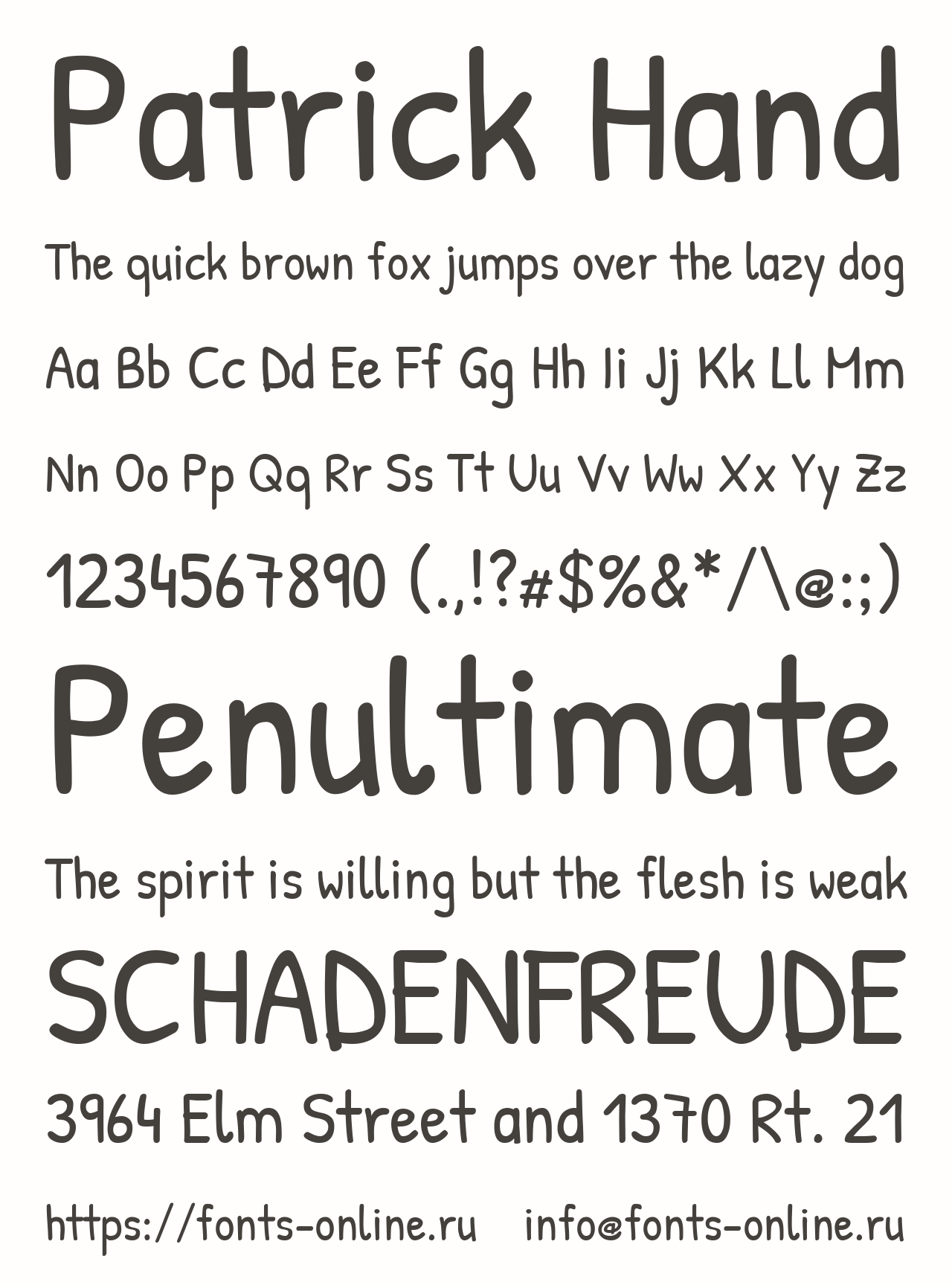
Patrick Hand is a handwriting-style typeface designed by Patrick Wagesreiter, released under the OFL license through Google Fonts in 2012. It is based on the designer’s own handwriting and was built to produce a natural handwritten appearance while maintaining consistent stroke weight and clean spacing.
Patrick Hand suits dialogue text, character captions, and handwritten-style callout boxes in picture books because its consistent stroke weight — unlike most casual script fonts — keeps letterforms readable at mid-range sizes without the stroke variation that causes legibility problems.
What makes Patrick Hand suitable for children’s books?
Unlike most script fonts, Patrick Hand maintains consistent stroke weight across all characters, which prevents the thin-stroke dropout that makes decorative handwriting fonts fail at smaller sizes. Letterforms are slightly irregular, matching the natural variation of handwriting, while keeping individual glyphs distinct. It supports multilingual Latin-script publishing, including Western, Central, and South-Eastern European languages.
Key attributes:
| Attribute | Value |
| Classification | Handwriting / Script |
| Designer | Patrick Wagesreiter, 2012 |
| Weight range | Regular only |
| Variable font | No |
| Recommended sizes | 16pt–24pt for callout text; avoid below 14pt in print |
| License | OFL (free for commercial use) |
| Available on | Google Fonts, Adobe Fonts |
| Price | Free |
How does Patrick Hand perform for callout and dialogue text in children’s books?
Patrick Hand reads clearly in short text passages at 16pt–24pt, making it a practical choice for speech bubbles, character captions, or handwritten-style notes within illustrated pages. Its consistent stroke weight prevents the legibility drop that affects more decorative handwriting fonts when printed at moderate sizes. For long body text passages it becomes tiring to read — the slightly irregular letterforms that feel natural in short bursts accumulate into visual noise over multiple paragraphs.
What are the best pairings for Patrick Hand in children’s books?
Patrick Hand pairs with Andika for body text, where the structured literacy font handles sustained reading and Patrick Hand marks dialogue or special elements. It also works alongside Nunito for digital picture books, where Patrick Hand appears in interactive callouts and Nunito handles the main narrative text.
What are the limitations of Patrick Hand for children’s books?
Single weight only — no bold or italic variants. This limits its ability to create emphasis within text blocks. It is not suitable for extended body text in print, and its handwriting character may not align with handwriting instruction programs that teach different letter formations.
Patrick Hand — Recommended Use Cases Within Children’s Books
- Best for: Dialogue callouts, speech bubbles, handwritten notes within illustrated pages
- Avoid for: Body text longer than 3–4 lines; sizes below 14pt in print
- Optimal weight: Regular (only weight available)
- Optimal size range: 16pt–24pt for callout and dialogue text
—
Bubblegum Sans
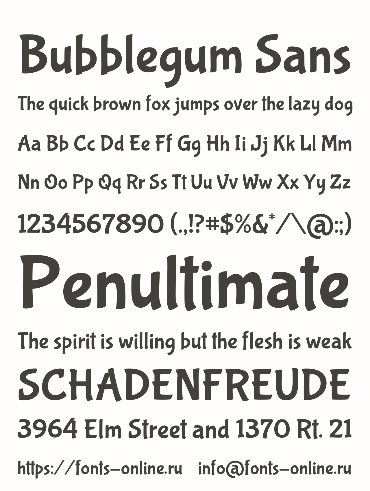
Bubblegum Sans is a display sans-serif typeface designed by Angel Koziupa and produced by Alejandro Paul, released in 2011 by Sudtipos and available through Google Fonts under the OFL license. The design draws from 1930s commercial lettering traditions, updated for 21st-century use.
Bubblegum Sans suits cover headings, chapter titles, and activity book headers because its bold weight, slightly condensed proportions, and brush-influenced letterforms produce strong visual presence at display sizes while remaining readable at 20pt+ in interior headings.
What makes Bubblegum Sans suitable for children’s books?
The typeface’s brush-influenced stroke endings give it slightly irregular texture that reads as energetic rather than mechanical — a quality that works well for children’s content where the typography contributes to the emotional tone. Bold weight combined with slightly condensed proportions allows longer titles to fit cover layouts without forced line breaks or significant size reduction. Its single weight keeps the design consistent across all uses.
Key attributes:
| Attribute | Value |
| Classification | Display sans-serif (brush-influenced) |
| Designer | Angel Koziupa / Alejandro Paul, 2011 |
| Weight range | Regular (single weight, inherently bold) |
| Variable font | No |
| Recommended sizes | 22pt+ for interior headings; 36pt+ for covers |
| License | OFL (free for commercial use) |
| Available on | Google Fonts, Font Squirrel |
| Price | Free |
How does Bubblegum Sans perform for display and heading use in children’s books?
At 36pt and above on book covers, Bubblegum Sans holds strong visual contrast against illustrated backgrounds. Its slightly condensed letterforms help long titles fit standard picture book cover dimensions without the font needing to be reduced to an unreadable size. In very small doses (short words or 3–4 word titles) it can be used at 18pt–20pt for interior callouts, but it is not a body text font under any circumstances.
What are the best pairings for Bubblegum Sans in children’s books?
Bubblegum Sans pairs with Sassoon Primary for interior body text in early readers, where the structured literacy font draws a clear line between heading and body roles. It also works alongside Andika for educational book interiors, with Bubblegum Sans handling activity headings and Andika handling instructional text.
What are the limitations of Bubblegum Sans for children’s books?
Single weight only. The brush-influenced texture that works at display sizes becomes illegible noise below 16pt, so it must stay in heading and display roles. Avoid using it for sustained body text — even short paragraphs.
Bubblegum Sans — Recommended Use Cases Within Children’s Books
- Best for: Cover titles, chapter headings, activity book section headers
- Avoid for: Body text; captions; any text below 16pt
- Optimal weight: Regular (only weight available)
- Optimal size range: 22pt–28pt for interior headings; 36pt–72pt for cover display
—
Bembo Infant

Bembo Infant is a serif typeface variant published by Monotype, derived from the Bembo family originally designed by the Monotype Corporation in 1928–1929 based on Francesco Griffo’s 1495 typeface for Aldus Manutius. The Infant variant was developed specifically for children’s books and educational materials, and is the only member of the Bembo family recommended by publishing professionals for early reader body text.
Bembo Infant suits chapter book and early reader body text because its single-storey “a” and “g” letterforms replace the double-storey versions found in standard Bembo, matching the letterforms children are taught to write, which reduces decoding errors in beginning readers.
It’s a favourite of professional children’s book editors. I’ve seen it recommended consistently by publishing consultants over decades — and for good reason.
What makes Bembo Infant suitable for children’s books?
The Infant variant’s defining attribute is its single-storey “a” and “g,” which match the handwriting forms taught in most primary education systems. Standard Bembo’s double-storey “a” and “g” — while normal for adult typography — create confusion for early readers who encounter a printed letterform that doesn’t match what they’ve been taught to write. Bembo Infant retains the original Bembo’s generous x-height, moderate stroke contrast, and horizontal serifs, which together support sustained reading at 12pt–18pt.
Key attributes:
| Attribute | Value |
| Classification | Old-style serif |
| Designer | Francesco Griffo (1495) / Monotype Corporation (1928–1929 revival) |
| Weight range | 5 styles (Regular, Bold, Italic, Bold Italic + SC) |
| Variable font | No |
| Recommended sizes | 12pt–18pt for body text; 14pt–22pt for early readers |
| License | Commercial (Monotype) |
| Available on | MyFonts, Linotype, Adobe Fonts |
| Price | Paid |
Before licensing, check the specific font licensing terms for Bembo Infant, as Monotype’s EULA distinguishes between desktop, ebook embedding, and print publishing rights.
How does Bembo Infant perform for chapter book body text?
At 12pt–16pt with 16pt–22pt leading, Bembo Infant produces an even grey on the page that reduces eye strain over extended reading sessions. Its horizontal serifs guide the eye consistently across lines of text, which is particularly useful in chapter books where children read multiple paragraphs at a time. Prominent users of the broader Bembo family include Penguin Books, Oxford University Press, and Cambridge University Press — strong indicators of its long-term body text performance.
What are the best pairings for Bembo Infant in children’s books?
Bembo Infant pairs with Fredoka One for chapter headings, where the bold rounded display creates clear contrast against the restrained serif body text. It also works alongside Bubblegum Sans for section headers in illustrated chapter books targeting ages 7–10.
What are the limitations of Bembo Infant for children’s books?
It is a paid commercial font with licensing costs that may be prohibitive for self-publishers. Ebook embedding requires a separate license from Monotype. Its five-weight range is narrower than variable font alternatives, limiting digital hierarchy flexibility.
Bembo Infant — Recommended Use Cases Within Children’s Books
- Best for: Body text in chapter books and early readers for ages 6–10; print-first educational publishing
- Avoid for: Cover display use; digital ebook formats without confirming embedding license
- Optimal weight: Regular for body; Bold for chapter titles within the same font
- Optimal size range: 12pt–18pt for chapter books; 14pt–22pt for early readers
—
Century Gothic
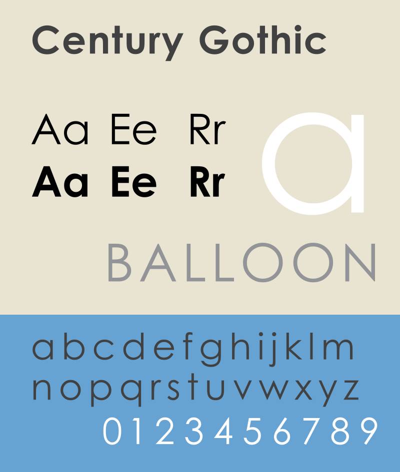
Century Gothic is a geometric sans-serif typeface designed by Monotype in 1991, released through Microsoft Windows and available via Adobe Fonts. It was influenced by ITC Avant Garde Gothic and draws on the geometric sans-serif tradition of the 1920s–1930s, updated with an enlarged x-height for digital legibility.
Century Gothic works for children’s book body text at 14pt and above, in shorter text passages, because its wide letter-spacing default and large open counters make individual letterforms easy to distinguish — particularly useful for early readers who are still building letter-shape recognition.
What makes Century Gothic suitable for children’s books?
Century Gothic’s open counters in letters like “o,” “c,” “e,” and “a” prevent the enclosed interior spaces from filling in at typical reading sizes, which supports character recognition in beginning readers. Its wide default letter-spacing reduces visual crowding between words. The enlarged x-height compared to earlier geometric sans-serifs means lowercase characters are proportionally larger relative to capitals, improving readability at standard book sizes.
That said, this is genuinely better for short picture book texts than full chapter books. The geometric uniformity starts to work against you in longer reading sessions.
Key attributes:
| Attribute | Value |
| Classification | Geometric sans-serif |
| Designer | Monotype, 1991 |
| Weight range | Regular, Bold, Italic, Bold Italic |
| Variable font | No |
| Recommended sizes | 14pt–22pt for picture book body; 12pt+ for early readers with generous leading |
| Letter-spacing default | Wide |
| License | Bundled with Windows / commercial via Monotype and Adobe |
| Available on | Microsoft Windows (bundled), Adobe Fonts |
| Price | Bundled / Paid for standalone licensing |
How does Century Gothic perform in children’s book body text?
At 14pt–22pt with 1.5× leading, Century Gothic renders clearly in both print and screen contexts. Its geometric letterforms print cleanly without ink spread issues that affect some serif fonts at larger sizes. The University of Wisconsin-Green Bay’s widely reported 2010 study found Century Gothic uses roughly 30% less ink than Arial — a practical consideration for print-heavy educational publishers. Below 12pt, thin strokes begin to lose definition, limiting its use to larger text settings.
What are the best pairings for Century Gothic in children’s books?
Century Gothic pairs with Fredoka One for cover headings, where the bold rounded display creates strong contrast against the clean geometric body text. For a serif vs sans-serif pairing within the same book, Bembo Infant at heading sizes alongside Century Gothic body text creates tonal contrast between chapter openers and running text.
What are the limitations of Century Gothic for children’s books?
Only four weights available (Regular, Bold, Italic, Bold Italic), which limits typographic hierarchy in complex layouts. Geometric uniformity causes reading fatigue in extended text passages — it is not suitable as the sole body text font for chapter books above 50 pages.
Century Gothic — Recommended Use Cases Within Children’s Books
- Best for: Body text in picture books with short text per page; educational workbooks with short instructional passages
- Avoid for: Extended chapter book body text; body text below 12pt
- Optimal weight: Regular for body; Bold for headings and vocabulary words
- Optimal size range: 14pt–22pt for picture book body; 18pt–24pt for educational headers
—
Choosing the Right Font: A Quick Reference
The choice usually comes down to three factors: the age of the reader, the format (print vs. digital), and the role the font needs to play (body text vs. display).
| Attribute | Value |
| Classification | Geometric sans-serif |
| Designer | Monotype, 1991 |
| Weight range | Regular, Bold, Italic, Bold Italic |
| Variable font | No |
| Recommended sizes | 14pt–22pt for picture book body; 12pt+ for early readers with generous leading |
| Letter-spacing default | Wide |
| License | Bundled with Windows / commercial via Monotype and Adobe |
| Available on | Microsoft Windows (bundled), Adobe Fonts |
| Price | Bundled / Paid for standalone licensing |
One thing that doesn’t get said enough: most successful children’s books use at least two fonts. A display font for the cover and headings, and a legibility-focused font for the body text. Trying to make one font do everything usually means the body text is too decorative or the headings are too dull.
If you’re working on a self-published picture book with a tight budget, the free combination of Andika (body) and Fredoka One (headings) covers both roles without any licensing cost. That’s where I’d start.
For fonts for accessibility more broadly — including dyslexia-friendly options — it’s worth checking how letterform differentiation in fonts like Andika and OpenDyslexic has been applied in educational publishing, since some of the same principles apply to general children’s book design.
Also worth reading: the discussion on fonts built specifically for reading covers performance characteristics that overlap significantly with children’s book typography, particularly around x-height and letter-spacing research.
What Makes a Font Readable for Children?
Font choice in children’s books is not a branding decision. It is a decoding decision. The structural attributes of a typeface directly affect whether a child can distinguish one letter from another, track across a line of text, and build reading fluency over time.
A 2024 study published in Education Sciences tested 8 fonts and 3 spacing variations on third- to fifth-graders. Optimal font-and-spacing combinations produced gains of up to 29 words per minute and 20% greater reading accuracy compared to the least suitable format.
The core criteria that determine readability for children are structural, not stylistic.
What font attributes support letter recognition in beginning readers?
Single-storey letterforms are the single most important structural attribute for beginning readers. The “a” and “g” characters in most adult typefaces use double-storey forms that don’t match how children are taught to write.
When the printed letter doesn’t match the handwritten version, young readers lose a key decoding cue.
Additional structural attributes that support letter recognition:
- Open counters: The enclosed spaces inside “c,” “e,” “a,” and “o” must remain open at standard book sizes (14pt–24pt)
- Differentiated letterforms: “b,” “d,” “p,” and “q” must have enough visual distinction to prevent mirror confusion
- Consistent stroke weight: High-contrast fonts (thin strokes vs. thick strokes) create visual noise for early readers at smaller sizes
- Exit strokes: Baseline exit strokes guide the eye from one letter to the next, as seen in Sassoon Primary
Research from the Readability Group, surveying over 2,000 participants, found that even readers with strong dyslexic traits preferred standard well-spaced fonts (such as Verdana and Helvetica) over specialized fonts — reinforcing that clean structure outperforms novelty.
How does font size and line spacing change by age group?
Font size benchmarks by format and reader age:
| Book type | Reader age | Body text size | Minimum leading |
| Picture books | 3–6 | 18pt–24pt | Text size + 6pt |
| Early readers | 5–8 | 14pt–18pt | Text size + 5pt |
| Chapter books | 7–12 | 12pt–16pt | Text size + 4pt |
A common publishing mistake is applying adult leading ratios (1–2pt above text size) to children’s books. Children benefit from 4–6pt of additional leading above the text size. Text that looks “too spaced out” to an adult is often the right density for a young reader.
The difference between a display font (covers, chapter titles) and a body text font matters structurally. Display fonts are designed for visual impact at 28pt+. They are not optimized for sustained reading at 14pt, and using them for body text is one of the most common errors in self-published children’s books.
—
Body Text Fonts for Picture Books and Early Readers
The global children’s books market was valued at USD 15.9 billion in 2023, according to Verified Market Research, with picture books representing approximately 40% of all children’s book sales. With that volume of content reaching young readers, font selection for body text is a consequential design decision.
The fonts below are evaluated specifically for their structural fitness as body text — not as display or cover fonts.
Sassoon Primary
Sassoon Primary is the most research-backed body text font for children’s publishing. Dr. Rosemary Sassoon spent two years studying which letterforms children found easiest to read before designing it in 1985, in partnership with Adrian Williams through the Sassoon-Williams foundry.
It is the result of a UK research project, not a design preference.
Structural attributes that make it work:
- Exit strokes at the baseline guide the eye from letter to letter without relying on the reader to supply that tracking movement
- Single-storey “a” and “g” match handwriting instruction letterforms exactly
- Slight natural slant creates movement without reading as italic
- Six styles in the family, including Bold for emphasis in read-aloud texts
Recommended range: 16pt–24pt for picture books; 14pt–18pt for early readers.
Sassoon Primary carries a commercial license through MyFonts and Linotype, making it a paid option. For publishers working on educational materials, the investment is justified by its proven track record in UK schools and publishing. For self-publishers on tighter budgets, Andika covers similar structural ground for free.
Andika
A USAID report on best practices for developing reading materials explicitly recommends Andika as “a free font, designed with the beginning reader in mind.” That is a rare endorsement from a credible institutional source.
Designed by Victor Gaultney for SIL International in 2008, Andika draws on early Dutch typefounding, Carolingian manuscript calligraphy, and letter recognition psychology. Version 7 includes over 3,800 glyphs with stylistic variants for “a,” “g,” and “t” — allowing publishers to match the exact letterform their target readers are being taught to write.
License: SIL Open Font License (OFL) — free for commercial print and digital use, including ebook embedding.
Andika’s default letter-spacing is wider than most text fonts. That is intentional. Wider inter-letter spacing reduces visual crowding, which is one of the documented causes of reading errors in early readers. The tradeoff is that text runs longer, requiring careful layout planning on shorter picture book spreads.
Pairs well with: Fredoka One (headings), Nunito (digital subheadings).
Bembo Infant
Bembo Infant is the only member of the Bembo family that belongs in a children’s book. The standard Bembo uses double-storey “a” and “g” letterforms. The Infant variant replaces them with single-storey versions, making it appropriate for readers who are still building letter-shape recognition.
Bembo itself has been used by Penguin Books, Oxford University Press, and Cambridge University Press for decades — evidence of its body text performance at scale. The Infant variant retains all of that structural quality while adapting the letterforms for young readers.
Key limitation: Commercial license through Monotype. Ebook embedding requires a separate license from the desktop version. Verify licensing before committing to it for a digital-first project.
Optimal use: Chapter book body text at 12pt–16pt with 16pt–22pt leading; print-first publishing for ages 6–10.
Century Gothic
Century Gothic is a geometric sans-serif font designed by Monotype in 1991. It is not a specialist literacy font. But its wide default letter-spacing and large open counters make it a practical choice for picture book body text, particularly for publishers working within bundled system fonts.
A widely reported 2010 study by the University of Wisconsin-Green Bay found that Century Gothic uses approximately 30% less ink than Arial — a practical consideration for print-heavy educational publishers producing high print runs.
Its geometric uniformity causes reading fatigue in extended text. It is not suitable as the sole body text font for chapter books above 50 pages. Keep it to picture books with short per-page text, or educational workbooks with brief instructional passages.
Recommended size: 14pt–22pt for picture books. Avoid below 12pt in any print context.
—
Display and Heading Fonts for Children’s Book Covers and Chapter Titles
Picture books dominate the children’s book market, representing roughly 40% of all sales (Market Growth Reports, 2023). Cover typography is the first brand signal a child or parent encounters — and the structural demands of a cover font are completely different from a body text font.
Display fonts need to hold their shape at 36pt–72pt, produce strong figure-ground contrast against illustrated backgrounds, and read as children’s content at a glance. None of the body text fonts above do this well.
Fredoka One
Milena Brandão designed Fredoka One in 2011 and released it through Google Fonts under the OFL license. It has since become one of the most widely used free display fonts in children’s publishing, used by educational app publishers and toy brands globally.
What makes it work at display sizes:
- Consistent stroke weight holds shape at 36pt+ without optical distortion
- Rounded terminals signal “child-directed” content without reducing legibility
- 235 glyphs with 13 ligatures cover most Latin-language publishing needs
The full Fredoka variable family (not just Fredoka One) now includes 5 weights across 3 widths — condensed, regular, and extended. For publishers who want flexibility beyond the original single-weight bold, the variable family is a free upgrade.
Avoid it for: Any body text application. Heavy rounded forms compress into visual noise below 18pt.
Chewy
Font Diner released Chewy in 2010 through Google Fonts under the Apache license. It is a single-weight display font with a cartoon-adjacent character driven by uniform stroke width and slightly condensed proportions.
The condensed proportions are actually useful for longer titles on picture book covers. A title like “The Very Hungry Dragon Who Wanted Pancakes” fits a standard cover layout at a legible size in Chewy, where a wider font would require a size reduction that undermines impact.
Real-world use: Children’s content brands use Chewy-style rounded display fonts extensively in packaging, app UI, and digital media specifically because uniform stroke weight at large sizes produces clean contrast against colorful illustrated backgrounds.
Single weight only. It cannot create typographic hierarchy on its own. Always pair with a separate body text font.
Bubblegum Sans
Designed by: Angel Koziupa, produced by Alejandro Paul (Sudtipos), 2011.
Structural character: Brush-influenced stroke endings give Bubblegum Sans slightly irregular texture that reads as energetic at display sizes. Available free through Google Fonts under OFL.
Its slightly condensed proportions serve the same cover-layout function as Chewy, but with a warmer, brush-influenced aesthetic that suits illustration styles with softer or more painterly qualities.
Size thresholds to respect:
- 22pt–28pt: interior chapter headings and activity book section headers
- 36pt–72pt: cover display
- Below 16pt: avoid entirely — brush texture becomes illegible noise
—
Rounded Sans-Serif Fonts for Digital Children’s Books and Reading Apps
Digital children’s book consumption is rising. Over 30% of children engage with ebooks or audiobooks at least once a week, according to Market Growth Reports (2023), and digital sales in the US children’s book market have increased 2–3% annually over the past five years.
Digital formats create different font requirements from print. Screen rendering, reflowable text in ebook formats, and variable screen resolutions all affect which fonts perform reliably.
Nunito
Nunito is the strongest free option for digital children’s books. Vernon Adams created the original as a rounded-terminal sans-serif for display use in 2013. Jacques Le Bailly extended it to a full weight range. The current version is a variable font with a weight axis spanning ExtraLight 200 to Black 900 — all in a single file.
That single-file variable structure is a practical advantage in reflowable ebook formats, where a single font file covers all weight needs without requiring multiple font declarations.
Performance at screen sizes: At weight 400–600 and 16pt–20pt, Nunito renders clearly on both low and high-DPI screens. Rounded terminals hold their shape without the pixelation that affects geometric fonts with hard terminal endings.
Avoid weights 200–300 for body text. Light and ExtraLight strokes lose clarity in print below 16pt and on lower-resolution screens. They look fine on a 4K monitor. They fall apart on a standard tablet at reading size.
Nunito is available free on Google Fonts and Adobe Fonts under OFL.
Quicksand
Quicksand has gone through three significant iterations: Andrew Paglinawan’s original 2008 release, the 2013 redrawn version (Quicksand 2.0), and a 2016 revision by Thomas Jockin that specifically addressed glyph differentiation problems in the earlier versions — particularly for similar letterforms like “l,” “I,” and “1.”
The 2016 revision matters because it makes Quicksand more reliable in educational content contexts where confusable letterforms cause real decoding problems for young readers.
In 2019, Mirko Velimirovic converted the family to a variable font with a weight axis from Light 300 to Bold 700.
Role in children’s books: Subheadings and callout text at 18pt–28pt. Not for extended body text in print — geometric uniformity builds reading fatigue over multiple paragraphs.
Free on Google Fonts under OFL.
| Font | Variable | Best digital role | Minimum effective size |
| Nunito | Yes (200–900) | Body text + headings | 14pt body; 24pt headings |
| Quicksand | Yes (300–700) | Subheadings, callouts | 18pt |
| Patrick Hand | No | Dialogue, speech bubbles | 16pt |
Patrick Hand, designed by Patrick Wagesreiter and released in 2012, uses consistent stroke weight across all characters — unlike most handwriting-style fonts where thin-stroke dropout kills legibility at smaller sizes. It is available free through Google Fonts under OFL, and works specifically for dialogue callouts and speech bubbles, not for running body text.
—
How to Pair Fonts in a Children’s Book
Most successful children’s books use at least two fonts. One handles display roles (cover, chapter headings). One handles body text. Trying to make one font do both usually produces a cover that looks too restrained, or body text that is too decorative to read comfortably.
Pairing fonts in children’s books follows a simple structural logic: the two fonts should share a tonal quality (both rounded, or both structured) but differ clearly in weight and visual density. That contrast creates hierarchy without visual conflict.
What font pairs work for picture books aimed at ages 3–6?
Picture books in this age group use very short text per page — often 1 to 3 sentences. The body text font needs to be large, open, and simple. The cover and heading font needs to read instantly at a glance from a distance.
Recommended pairings for ages 3–6:
- Fredoka One (display) + Andika (body): Both are free under OFL. Fredoka One’s bold rounded display creates strong cover contrast, while Andika’s wide letter-spacing and open counters make body text easy to decode. Zero licensing cost.
- Chewy (display) + Sassoon Primary (body): Stronger body text quality through Sassoon’s research-backed letterforms, with Chewy handling cover titles at 48pt+. Sassoon Primary requires a commercial license.
- Bubblegum Sans (display) + Century Gothic (body): An all-system-accessible pairing for publishers working within bundled fonts. Both carry wide letter-spacing and rounded character. Weakest for sustained reading but practical for picture books with 1–2 sentences per page.
What font pairs work for chapter books aimed at ages 7–10?
The Children and Young Adult Books market is projected to reach USD 13.81 billion by 2030 (The Business Research Company), with chapter books representing a growing share of that segment as digital-first and hybrid formats expand.
Chapter books carry much more text per page. Body text readability matters more than in picture books — and display font use shifts to chapter openers and part titles rather than every spread.
Bembo Infant (body) + Fredoka One (chapter openers): The strongest pairing for print chapter books targeting ages 6–10. Bembo Infant’s old-style serif provides excellent sustained readability at 12pt–14pt, while Fredoka One creates visual energy at chapter title sizes (24pt–36pt). Bembo Infant requires a commercial Monotype license.
Nunito Regular (body) + Fredoka One (headings): The strongest free pairing for digital chapter books. Both are OFL, both are available on Google Fonts, and the variable font structure of Nunito handles the full typographic hierarchy within a single file.
Use a font pairing generator to preview combinations before committing to a layout — particularly when working with serif body fonts alongside rounded display fonts where visual contrast can tip into conflict at certain size ratios.
Font size hierarchy for chapter books:
- Cover title: 48pt–72pt (display font)
- Chapter title: 24pt–36pt (display font or bold weight of body font)
- Subheading: 16pt–20pt (medium or semibold weight)
- Body text: 12pt–16pt (regular weight, leading at text size + 4pt minimum)
—
Font Licensing for Children’s Book Publishing
Self-published authors captured 51% of overall ebook unit sales on major platforms in 2023, according to Bookstats data. Most of those authors are making font decisions without professional design guidance, which creates real licensing exposure.
The core mistake: assuming that “free to download” means “free to use commercially.” Font name recognition is not font license recognition. A font called “Garamond” may exist in multiple versions from different foundries, each with different terms.
OFL vs. commercial licenses: what each permits
The SIL Open Font License (OFL) is the most permissive license in common use. It allows free use in print publishing, ebook embedding, app embedding, and commercial projects without royalties or per-copy fees.
OFL fonts used in this article: Andika, Nunito, Fredoka One, Chewy (Apache, equivalent terms), Quicksand, Patrick Hand, Bubblegum Sans — all free for commercial print, ebook, and digital use.
Commercial licenses (Monotype, Sassoon-Williams) work differently. Desktop, web, ebook embedding, and app use are separate license types with separate costs. A desktop license that lets you design a book interior does not automatically give you the right to embed that font in an EPUB or Kindle file.
Google Fonts has over 1,500 options available under open-source licenses, downloadable and installable for print, web, and app projects at no cost, according to Creative Bloq. For most self-published children’s book projects, the free options documented here are fully sufficient.
Ebook embedding and what publishers miss
Ebook embedding is the most commonly missed licensing requirement in children’s publishing. Kindlepreneur’s font licensing guide confirms that most authors never need to purchase a font for standard print book publishing — but digital formats are a different matter.
Adobe Fonts permits embedding in EPUB, iBooks, and Kindle (MOBI) formats for active Creative Cloud subscribers. Monotype’s EULA separates ebook embedding into a distinct license category from desktop use.
What to verify before publishing digitally with a paid font:
- Does the license cover ebook embedding explicitly (EPUB, MOBI, PDF)?
- Is the license per-publication or unlimited impressions?
- Does the license cover app embedding if you plan a reading app version?
The practical recommendation for self-publishers: use OFL fonts for any project where the digital distribution format isn’t fully resolved. Andika, Nunito, Fredoka One, and Quicksand cover every role in a children’s book — body text, headings, display — with zero licensing risk across print and digital formats.
For more on how font type affects broader design decisions, the font licensing guide covers the full scope of license types, restrictions, and commercial use requirements across foundries. And if the question of serif vs sans-serif fonts for your specific age group is still open, the structural comparison there covers the readability research directly relevant to children’s publishing contexts.
FAQ on The Best Fonts For Children’s Books
What is the best font for children’s books?
There is no single best font. For body text, Sassoon Primary and Andika are the most research-backed options. For covers and headings, Fredoka One and Chewy perform consistently well. The right choice depends on reader age and book format.
What font size should children’s books use?
Picture books aimed at ages 3–6 need 18pt–24pt body text. Early readers work best at 14pt–18pt. Chapter books for ages 7–12 typically use 12pt–16pt. Always add at least 4–6pt of leading above the chosen text size.
Are serif or sans-serif fonts better for children’s books?
Sans-serif fonts are generally preferred for picture books and early readers because their simpler letterforms reduce visual noise. Serif fonts like Bembo Infant work well for older children in chapter books, where longer reading sessions benefit from baseline-guided eye tracking.
What font does most children’s books use?
There is no universal standard. Sassoon Primary is widely used in UK educational publishing. In the US, Century Schoolbook, Georgia, and Bembo Infant appear frequently in traditionally published chapter books. Self-publishers commonly use Google Fonts options like Nunito and Fredoka One.
Is Comic Sans good for children’s books?
Comic Sans has open counters and single-storey letterforms that support early reading. However, it is widely considered unprofessional in published books. Andika and Sassoon Primary deliver the same readability advantages with far better typographic quality and publishing credibility.
What fonts are free to use in children’s books?
Andika, Nunito, Fredoka One, Quicksand, Patrick Hand, Chewy, and Bubblegum Sans are all available under the SIL Open Font License or Apache license. All are free for commercial use in print and digital publishing, including ebook embedding.
What font is best for dyslexia-friendly children’s books?
Research does not support specialized dyslexia fonts like OpenDyslexic. Peer-reviewed studies found no improvement in reading speed or accuracy. Wide letter-spacing and open counters in standard fonts like Andika are more effective than novelty typefaces designed specifically for dyslexic readers.
How do I pair fonts in a children’s book?
Use one font for display roles (cover, headings) and a separate font for body text. A reliable free combination: Fredoka One for headings and Andika for body text. Both share a rounded character but differ clearly in weight and visual density.
Can I use Google Fonts in a published children’s book?
Yes. Google Fonts are released under open-source licenses permitting commercial use in print books, ebooks, and apps. Fonts like Nunito, Fredoka One, and Quicksand are fully cleared for children’s book publishing without royalties or per-copy fees.
What font should I use for a children’s book cover?
Cover fonts need strong visual impact at large sizes. Fredoka One, Chewy, and Bubblegum Sans all perform reliably at 36pt–72pt against illustrated backgrounds. Use them at 28pt minimum. Below that threshold, rounded display fonts lose their defining character and readability drops.
Conclusion
This conclusion is for an article presenting the best fonts for children’s books — a topic where the stakes are higher than most typography decisions.
Font choice affects whether a child can decode text, build fluency, and stay engaged with a story.
The key takeaways are simple. Use single-storey letterforms for early readers. Match font size to age group. Separate your display font from your body text font. For free options with zero licensing risk, Andika, Nunito, and Fredoka One cover every role from picture book covers to chapter book interior text.
For print publishing with a budget, Sassoon Primary and Bembo Infant remain the strongest paid options — backed by decades of educational publishing use.
Good kid-friendly typeface selection is not complicated. It just requires knowing what to prioritize.

Renowned for his expertise in logo design and visual branding, Bogdan has developed a multitude of logos for various clients.
His skills extend to creating posters, vector illustrations, business cards, and brochures. Additionally, Bogdan's UI kits were featured on marketplaces like Visual Hierarchy and UI8.
He also wrote in the past years on sites like Design Your Way, WebDesignerDepot, WPDean, Designmodo, Speckyboy, Slider Revolution, and more.
- The Windsurf Logo History, Colors, Font, And Meaning - 10 October 2026
- How to Remove Background From Product Photos (No Photoshop) - 10 October 2026
- How Designers can Build a Stronger Online Creative Identity - 9 October 2026

Bogdan Sandu is a seasoned designer who has been designing websites since 2008. Renowned for his expertise in logo design and visual branding, Bogdan has developed a multitude of logos for various clients. His skills extend to creating posters, vector illustrations, business cards, and brochures. Additionally, Bogdan's UI kits were featured on marketplaces like Visual Hierarchy and UI8. He also wrote in the past years on sites like Design Your Way, WebDesignerDepot, WPDean, Designmodo, Speckyboy, Slider Revolution, and more.
You Might Also Like