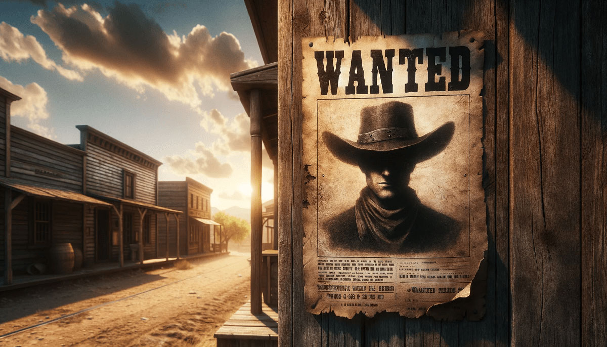
Making a movie poster is the process of creating promotional artwork that displays film information, characters, and visual themes using graphic design software.
Filmmakers, designers, and marketing teams need this when promoting films, creating portfolio pieces, or developing theatrical materials.
This guide covers 8 steps requiring 45-60 minutes and Photoshop CC 2024 or later.
You’ll learn how to make a movie poster from canvas setup to final export.
Prerequisites
Before starting your film poster creation, gather these requirements:
Software & Skills:
- Adobe Photoshop CC 2024 or later
- Basic knowledge of layers, masks, and text tools
- Understanding of color theory for mood setting
Technical Specifications:
- High-resolution images (300 DPI minimum, 2000 x 3000 pixels)
- Stock photos or film stills (licensed or owned)
- Time estimate: 45-60 minutes
Design Resources:
- Reference poster design examples
- Fonts for posters installed
- Color grading references from similar genre films
Step 1: How Do You Set Up the Document Canvas for Print Specifications?

Document setup determines print quality and proper theatrical display dimensions.
Create a new document at 2700 x 4000 pixels (27 x 40 inches at 100 DPI) using CMYK color mode for offset printing.
Action:
- File > New (Ctrl+N): Width 2700 pixels, Height 4000 pixels, Resolution 300 DPI, Color Mode CMYK/8-bit
- View > Rulers (Ctrl+R): Drag guides to create 0.5-inch margins on all sides for bleed area
- Window > Info: Displays pixel dimensions and color values for accurate placement
Purpose: Standard theatrical poster dimensions ensure compatibility with cinema display cases and commercial printing presses.
Professional printers require CMYK for accurate color reproduction on paper versus RGB screen colors.
Step 2: How Do You Create the Background Composition?
Background establishes genre, mood, and visual hierarchy before adding character elements.
Import your main background image, apply color adjustments to match genre aesthetics, and position within the safe area.
Action:
- File > Place Embedded (Shift+Ctrl+P): Select background image file, press Enter to confirm, transform to cover full canvas plus bleed
- Layer > New Adjustment Layer > Curves: Adjust RGB channels independently (Red +15, Green -10, Blue +20 for cool cinematic tone)
- Layer > New Adjustment Layer > Hue/Saturation (Ctrl+U): Reduce saturation by 15-20% for dramatic effect
Purpose: Background sets the focal point and atmospheric context.
Adjustment layers preserve original image data for non-destructive editing throughout the design process.
Step 3: How Do You Add and Blend Character Images?
Character placement creates emphasis and guides viewer attention through the composition.
Extract characters from source images using selection tools, refine edges for clean integration, and arrange using the rule of thirds.
Action:
- Select > Subject (Alt+Ctrl+R): Photoshop automatically detects main character, Select > Select and Mask: Refine Edge Brush Tool (R) to clean hair and complex edges, Output to New Layer with Layer Mask
- Edit > Free Transform (Ctrl+T): Scale character to occupy 40-60% of canvas height, position according to the rule of thirds grid intersections
- Layer > Layer Mask > Density 95%: Softens edges slightly, Set layer Blending Mode to Normal, Opacity 100%, add Layer > New Adjustment Layer > Color Balance clipped to character layer
Purpose: Proper masking eliminates harsh cutout appearance.
The rule of thirds placement creates natural balance and professional composition.
Step 4: How Do You Apply Color Grading and Mood?
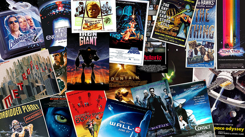
Color grading unifies separate elements and signals genre through color psychology.
Create adjustment layers affecting all visible elements, establish a complementary color scheme, and apply film-specific gradient overlays.
Action:
- Layer > New Adjustment Layer > Selective Color: Target specific color ranges (Reds: Cyan -20%, Magenta +15% for warmer skin tones; Blues: Cyan +25% for deeper shadows)
- Layer > New Fill Layer > Gradient: Style Radial, Scale 150%, Angle 90°, Colors from #1a1a2e (dark blue) to transparent, Blending Mode Multiply, Opacity 40%
- Filter > Camera Raw Filter: Temperature +8, Tint -5, Clarity +15, Vibrance +10, Split Toning Highlights 45° (orange) Saturation 15%, Shadows 220° (blue) Saturation 20%
Purpose: Complementary color schemes (orange/blue for action, green/purple for horror) communicate genre instantly.
Gradient vignettes direct attention to central elements by darkening edges.
Step 5: How Do You Design the Title Typography?
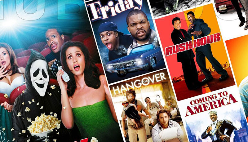
Title typography dominates visual hierarchy and communicates genre through font psychology.
Select genre-appropriate typefaces, establish proper tracking and kerning, and apply dimensional effects without obscuring readability.
Action:
- Type Tool (T): Click canvas, type title in ALL CAPS, select font (sans-serif fonts like Bebas Neue for action, serif fonts like Trajan for drama), Size 180-220pt, Character Panel > Tracking +50 for increased letter spacing
- Window > Character: Set Leading to 85% of font size (153pt for 180pt font), adjust Kerning manually between letter pairs (especially A/V, W/A combinations) using Alt+Left/Right arrows
- Layer > Layer Style > Stroke: Size 4px, Position Outside, Color #000000; Drop Shadow: Distance 10px, Spread 15%, Size 20px, Angle 120°, Opacity 75%
Purpose: Tracking expansion creates dramatic, cinematic presence across the canvas width.
Kerning refinement prevents awkward spacing between specific letter combinations that disrupt typographic hierarchy.
Step 6: How Do You Add Supporting Text Elements?
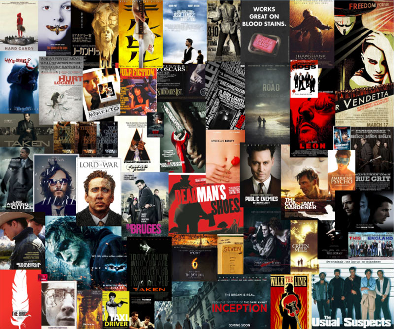
Supporting text provides credits, taglines, and billing information required for professional theatrical posters.
Create typographic hierarchy through size variation, add legally compliant billing blocks, and position taglines for maximum impact.
Action:
- Type Tool (T): Create tagline at top third of poster, font size 36-48pt, tracking +25, center alignment, color #FFFFFF with 2px black stroke
- Credits text at bottom: Actor names 24pt (pairing fonts with title font), director credit 18pt, production company logo placement at 1 inch from bottom edge
- Billing block: 6-8pt condensed sans-serif font, leading 7-9pt, alignment center, positioned 0.25 inches from bottom, includes SAG-AFTRA logos and MPAA rating
Purpose: Typographic hierarchy guides eye movement from title to tagline to credits.
Billing block size and placement follow contractual requirements and industry standards for actor/crew recognition.
Step 7: How Do You Apply Final Effects and Textures?
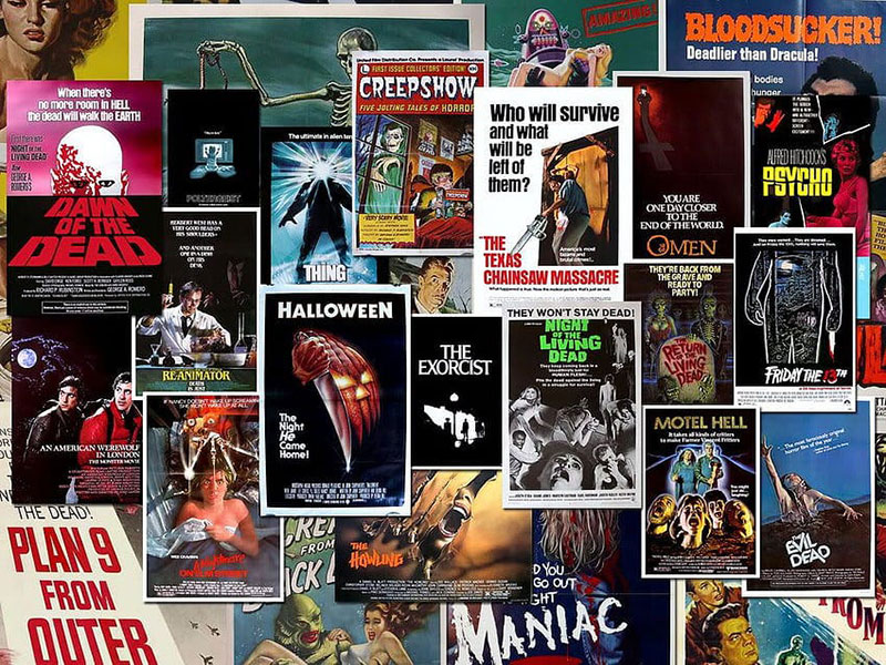
Final effects add cinematic polish, depth, and professional finish to the composition.
Apply film grain for authentic texture, add atmospheric lighting, and sharpen strategic areas for print clarity.
Action:
- Layer > Flatten Image, Filter > Convert for Smart Filters, Filter > Noise > Add Noise: Amount 2-4%, Distribution Gaussian, Monochromatic checked (simulates film grain texture)
- New Layer > Set to Overlay mode, Edit > Fill > 50% Gray, Filter > Render > Lighting Effects: Spotlight from top-left at 45°, Intensity 35%, Contrast adds depth
- Filter > Sharpen > Unsharp Mask: Amount 80%, Radius 1.5 pixels, Threshold 0 levels (sharpens title and character edges for print reproduction)
Purpose: Film grain creates organic, non-digital appearance matching theatrical film aesthetic.
Directional lighting reinforces focal point and adds dimensional quality to flat elements.
Step 8: How Do You Export for Different Formats?
Export specifications determine final output quality for print production and digital distribution.
Create separate files for theatrical printing (CMYK, high resolution) and web use (RGB, optimized size).
Action:
- File > Save As: Format Photoshop (.PSD), preserves all layers for future edits; File > Save a Copy: Format TIFF, Color Mode CMYK, Resolution 300 DPI, LZW Compression
- Image > Mode > RGB Color (for web version), Image > Image Size: 2000px width (maintains scale and proportion), Resample Bicubic Sharper
- File > Export > Save for Web (Legacy) (Alt+Shift+Ctrl+S): JPEG format, Quality 85%, Progressive checked, Embed Color Profile sRGB, Metadata Copyright only
Purpose: CMYK TIFF files ensure accurate ink reproduction on commercial offset presses.
RGB JPEG format reduces file size 70-80% for email distribution and social media promotion without visible quality loss.
Verification
Check print dimensions at 27 x 40 inches (standard theatrical poster sizes).
Verify text legibility at thumbnail size (reduce view to 10% in Photoshop).
Compare CMYK output to RGB screen version using View > Proof Setup > Working CMYK to preview color shifts.
Confirm resolution meets 300 DPI for print, 72 DPI minimum for digital distribution.
Troubleshooting
Text Appears Blurry When Printed
Select Type Tool (T), Character Panel > Anti-aliasing > Sharp for maximum edge definition.
Verify document is 300 DPI (Image > Image Size to check).
Rasterize text layer (Layer > Rasterize > Type) only after final approval since this prevents further editing.
Colors Look Different in Print vs Screen
View > Proof Setup > Working CMYK shows print preview within Photoshop.
Adjust Hue/Saturation (Ctrl+U) to compensate for CMYK‘s narrower gamut.
Always request physical proof from printer before final 1,000+ print run to verify Pantone color accuracy.
File Size Too Large for Email or Upload
File > Export > Save for Web (Legacy) (Alt+Shift+Ctrl+S) creates compressed version.
Select JPEG, Quality 80%, Image Size maximum 2000px width reduces file to 2-4MB.
Creates separate web version without affecting master PSD file with full resolution layers.
Jagged Edges on Character Cutouts
Select > Select and Mask: Increase Feather to 0.3-0.5 pixels for softer transitions.
Refine Edge Brush Tool (R): Paint over problem areas, increase Shift Edge slider to +10-20%.
Layer Mask > Mask Edge: Smooth 2, Feather 0.5px, Contrast +5%, Shift Edge +5% eliminates harsh cutout appearance.
Title Text Lacks Impact
Layer Style > Bevel and Emboss: Depth 100%, Size 5px, Soften 0px adds dimensional quality.
Duplicate title layer (Ctrl+J), move behind original, apply Motion Blur (Filter > Blur > Motion Blur) Angle 0°, Distance 20px creates speed effect.
Add Gradient Overlay to title: Style Linear, Angle 90°, Colors from light to dark matching poster color palette.
Related Processes
How to make a poster covers general techniques applicable to all poster types.
How to frame a poster explains presentation methods for finished theatrical posters.
How to hang a poster details mounting techniques without damage to printed artwork.
Poster design principles apply graphic design principles to promotional artwork.
Understanding design elements improves composition decisions throughout the creation process.
Alternative Tools and Methods
Adobe Photoshop (Current Guide)
- Time: 45-60 minutes
- Complexity: Intermediate
- Best for: Print-ready theatrical posters with precise color control and professional photo manipulation
Adobe Illustrator
- Time: 60-90 minutes
- Complexity: Advanced
- Best for: Vector graphics designs requiring infinite scalability without resolution loss, geometric poster styles
Canva
- Time: 20-30 minutes
- Complexity: Beginner
- Best for: Social media posters and quick mockups without print design specifications or advanced motion graphics needs
GIMP (Free Alternative)
- Time: 50-70 minutes
- Complexity: Intermediate
- Best for: Budget-conscious designers needing similar functionality to Photoshop for indie film posters without subscription costs
Choose Photoshop when print quality and advanced photo manipulation are required.
Choose Illustrator when typography and vector graphics dominate the design with minimal photo editing.
FAQ on How To Make A Movie Poster
What software do I need to make a movie poster?
Adobe Photoshop CC 2024 is the industry standard for professional movie poster design.
Alternatives include GIMP (free), Adobe Illustrator for vector graphics, or Canva for beginners.
Professional theatrical posters require advanced photo manipulation, color grading, and print design capabilities.
What size should a movie poster be?
Standard theatrical poster sizes measure 27 x 40 inches (one-sheet format).
Create documents at 2700 x 4000 pixels with 300 DPI resolution for print quality.
Digital versions typically use 2000 x 3000 pixels at 72 DPI for web distribution and social media.
Should I use CMYK or RGB color mode?
Use CMYK color mode for printed theatrical posters to match commercial printing press ink reproduction.
RGB mode works for digital distribution, social media, and screen display only.
Always create separate files for each format to maintain proper color theory accuracy.
What fonts work best for movie posters?
Sans-serif fonts like Bebas Neue suit action films; serif fonts like Trajan fit dramas.
Horror uses distressed or script fonts; thrillers prefer condensed bold typefaces.
Check fonts for posters and verify font licensing for commercial use before printing.
How do I remove backgrounds from character images?
Select > Subject (Alt+Ctrl+R) automatically detects characters in Photoshop CC 2024.
Select > Select and Mask refines edges using Refine Edge Brush Tool for hair and complex details.
Output to New Layer with Layer Mask for non-destructive editing and contrast adjustments.
What resolution is needed for printing?
300 DPI minimum ensures sharp, professional-quality theatrical poster printing.
Image > Image Size displays current DPI settings; never use Image > Resample to artificially increase resolution from low-quality sources.
72 DPI suffices for digital screens but appears pixelated when printed at large poster sizes.
How do I create a cinematic color grade?
Layer > New Adjustment Layer > Selective Color targets specific color ranges for mood adjustment.
Apply complementary color schemes like orange/blue for action or green/purple for horror through hue/saturation controls.
Filter > Camera Raw Filter provides professional color grading with split toning capabilities.
What file format should I use for printing?
TIFF format with CMYK color mode preserves maximum quality for commercial offset printing.
JPEG compression reduces file size but introduces artifacts at high scale and proportion ratios.
Always save original PSD with layers before flattening for print design specifications.
How do I make text stand out on busy backgrounds?
Layer Style > Stroke adds 3-4px black outline; Drop Shadow creates depth at 10px distance.
Apply contrast through gradient overlays behind text or darken background areas using Curves adjustment layers.
Proper typographic hierarchy through size variation and tracking improves readability on complex compositions.
Can I use stock photos for commercial movie posters?
Stock photos require commercial licensing for theatrical distribution and film promotion materials.
Always verify font licensing and image rights before printing 1,000+ copies for cinema display.
Professional productions use original photography; indie films often combine licensed stock with custom graphic design elements.
Conclusion
Learning how to make a movie poster transforms raw film footage and promotional concepts into compelling theatrical artwork.
Mastering Photoshop techniques from canvas setup through final export ensures professional results for indie productions and portfolio pieces.
Color grading establishes genre through color psychology, while typographic hierarchy communicates film identity instantly.
Proper CMYK specifications guarantee accurate commercial printing. Visual hierarchy guides viewer attention through character placement and focal point composition.
Understanding graphic design principles like balance, contrast, and emphasis separates amateur mockups from theatrical-quality promotional materials.
Apply these film poster creation methods consistently to develop distinctive storytelling through visual composition and cinematic aesthetics.
If you liked this article about how to make a movie poster, you should check out this article about how to make a poster.
There are also similar articles discussing poster sizes, how to make a beer poster, how to create a poster in PowerPoint, and how to make a wanted poster.
And let’s not forget about articles on making a poster in Word, how to hang a poster, how to frame a poster, and how to flatten a poster.

Renowned for his expertise in logo design and visual branding, Bogdan has developed a multitude of logos for various clients.
His skills extend to creating posters, vector illustrations, business cards, and brochures. Additionally, Bogdan's UI kits were featured on marketplaces like Visual Hierarchy and UI8.
He also wrote in the past years on sites like Design Your Way, WebDesignerDepot, WPDean, Designmodo, Speckyboy, Slider Revolution, and more.
- The Cursor Logo History, Colors, Font, And Meaning - 24 September 2026
- Top 7 Web Design Subscription Services That Replace Full-Time Hires - 24 September 2026
- Canva vs PowerPoint: Which Is Better for Presentations? - 22 September 2026

Bogdan Sandu is a seasoned designer who has been designing websites since 2008. Renowned for his expertise in logo design and visual branding, Bogdan has developed a multitude of logos for various clients. His skills extend to creating posters, vector illustrations, business cards, and brochures. Additionally, Bogdan's UI kits were featured on marketplaces like Visual Hierarchy and UI8. He also wrote in the past years on sites like Design Your Way, WebDesignerDepot, WPDean, Designmodo, Speckyboy, Slider Revolution, and more.
You Might Also Like