


Making a beer poster is the process of designing promotional artwork that communicates brand identity, product features, and visual appeal using graphic design software.
Breweries, bars, and marketing teams need this when promoting new releases, events, or building brand recognition.
This guide covers 8 steps requiring 45-60 minutes and Adobe Photoshop CC 2024 or later.
Prerequisites
Before you start your beer advertising poster design, gather these items:
Software & System Requirements:
- Adobe Photoshop CC 2024 (or later version)
- Screen resolution: 1920×1080 minimum for workspace
- 8GB RAM minimum for smooth layer management
Design Assets:
- Beer product photography (high-resolution images, minimum 300 DPI)
- Brand assets (logo files in .AI, .EPS, or .PNG format with transparency)
- Font files (brand typefaces installed on system)
Skill & Time:
- Basic Photoshop knowledge (layers, selection tools, text formatting)
- Time estimate: 45-60 minutes
Missing proper product photography kills most poster projects before they start. Your beer bottle or can image needs clean lighting and enough resolution to scale without pixelation.
If you’re short on time or don’t have access to advanced design software, an AI poster generator can help streamline the process. Tools like Venngage’s AI Poster Generator allow you to quickly create professional-looking beer posters using smart layouts, customizable templates, and automated design suggestions without needing deep Photoshop expertise.
Step 1: How Do You Set Up the Document Dimensions for Print or Digital Display?
Configure canvas size and color mode based on final output requirements.
Print posters require CMYK at 300 DPI while digital screens need RGB at 72-150 DPI.
Action:
- File > New > Width: 24 inches, Height: 36 inches (standard poster), Resolution: 300 DPI
- Color Mode: CMYK Color (for print) or RGB Color (for digital screens)
- Background Contents: White or Transparent based on design needs
Purpose: Correct dimensions and color mode prevent quality loss during printing or digital display and match industry standard poster sizes.
Understanding Color Modes for Different Output
CMYK handles commercial printing because printers use cyan, magenta, yellow, and black inks.
RGB works for screens (social media, websites, digital displays) where light creates color differently.
Converting from RGB to CMYK late in the process shifts colors unpredictably. Start in the right mode.
Standard Poster Dimensions
24×36 inches dominates craft beer poster layouts. Fits standard frames, hangs well in taprooms and retail spaces.
18×24 inches works for smaller promotional materials or table displays.
11×17 inches serves as economical option for mass distribution or event handouts.
Digital formats follow different rules. Instagram posts need 1080×1080 pixels, Facebook covers want 1200×630 pixels.
Step 2: What Background Style Should You Create for Beer Brand Context?

Establish visual foundation using textures, gradients, or solid colors that communicate beer style characteristics.
Dark backgrounds for stouts, warm tones for IPAs, clean whites for lagers.
Action:
- Layer > New Fill Layer > Solid Color/Gradient (select based on beer type)
- Blending Mode: Normal, Opacity: 100% (adjust after adding other elements)
- Filter > Texture > Texturizer (for wood grain, fabric, or paper effects matching brewery aesthetic)
Purpose: Background sets visual tone and directs viewer attention to product while reinforcing beer style identity.
Matching Background to Beer Style
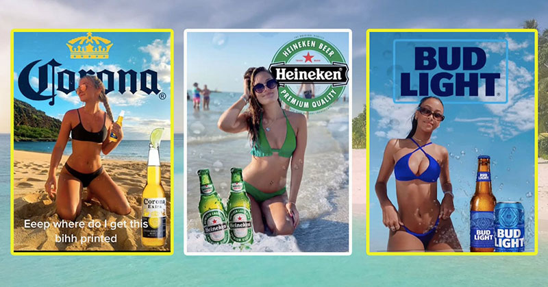
Stouts and porters call for deep browns, blacks, or dark textures that mirror the beer’s appearance.
IPAs and pale ales benefit from vibrant oranges, golds, or hop-green hues reflecting citrus and botanical notes.
Lagers and pilsners demand clean, crisp backgrounds. White, light blue, or subtle textures keep things minimal.
Texture Application Techniques
Wood grain textures connect craft beer to barrel aging and traditional brewing methods.
Fabric or canvas textures add tactile quality without overwhelming the composition.
Keep texture opacity between 20-40% so it supports rather than competes with foreground elements.
Color theory matters here. Analogous colors (neighbors on the color wheel) create harmony while complementary color schemes generate tension and energy.
Creating Depth with Gradients
Radial gradients place the product at the center of light, drawing eyes inward.
Linear gradients from dark (bottom) to light (top) mimic natural lighting and feel stable.
Avoid harsh transitions. Subtle shifts in saturation work better than dramatic color jumps.
Step 3: How Do You Position and Edit the Beer Bottle or Can Photography?

Place product image with proper sizing, lighting adjustments, and background removal to make the beer container the primary visual focus.
Action:
- File > Place Embedded > Select beer photo > Transform (Ctrl+T) to scale 40-50% of canvas height
- Select > Subject (AI selection) or Pen Tool (P) for manual selection > Layer Mask
- Image > Adjustments > Levels (Ctrl+L): adjust Input Levels for contrast, Curves for highlights
Purpose: Isolated product with corrected exposure becomes the central design element that captures attention and displays product accurately.
Product Placement and the Focal Point
Position your beer bottle or can using the rule of thirds.
Place the label or most recognizable feature at intersection points where gridlines meet.
The focal point needs breathing room. Don’t crowd edges or corners with the main product.
Background Removal Methods
Photoshop’s AI selection (Select > Subject) works fast for clean product shots with good contrast.
Pen Tool gives precise control for complex bottle shapes or reflective surfaces.
Refine Edge (Select and Mask) cleans up selection boundaries, especially around condensation droplets or label details.
Adjusting Product Lighting
Levels adjustment brings out bottle detail without blowing out highlights on glass.
Curves allow targeted adjustments. Lift shadows while keeping highlights controlled.
Dodge Tool (O) brightens specific areas like beer foam or label typography. Burn Tool darkens glass edges for definition.
Color correction might be needed if your photography used different lighting than your background. Match temperature and tone.
Step 4: Where Do You Add Typography for Beer Name and Descriptive Information?
Insert text layers with hierarchy (beer name as primary heading, style and ABV as secondary details) using brand typefaces at specific sizes for readability.
Action:
- Type Tool (T) > Beer name: 96-120 pt, bold weight, positioned in upper third
- Beer style descriptor: 36-48 pt, regular or italic weight, positioned below name
- Character Panel (Window > Character): Tracking +50 to +100 for breathing room, Leading 110-120% of font size
Purpose: Text hierarchy guides reader through information from brand identity to product specifications in order of importance.
Establishing Typographic Hierarchy

Your beer name dominates. Make it 2-3 times larger than secondary text.
Style descriptors (IPA, Stout, Pilsner) sit below at medium size and weight.
ABV, IBU, and other technical details go smallest, often 18-24 pt.
Visual hierarchy in typography controls reading order. Size, weight, color, and position all signal importance.
Font Selection for Beer Branding
Craft breweries lean toward custom display fonts that reflect brand personality.
Traditional breweries stick with serif fonts suggesting heritage and quality.
Modern beer brands prefer clean sans-serif fonts for contemporary appeal.
Check fonts for posters and review your brand guidelines before choosing typefaces.
Typography Spacing Adjustments
Kerning fixes awkward gaps between specific letter pairs (like “AV” or “To”).
Tracking spreads entire words or lines for dramatic effect or improved legibility at large sizes.
Leading (line spacing) at 120% prevents text from feeling cramped. Tighter leading (100-110%) works for bold, impactful headlines.
Text Placement Strategy
Keep primary text above or beside the product, never obscuring the label.
Alignment matters. Center alignment feels formal and traditional. Left alignment reads naturally but can look casual.
White space around text prevents visual clutter. Let your typography breathe.
Step 5: How Do You Incorporate the Brewery Logo with Proper Brand Guidelines?
Position logo file maintaining brand spacing requirements and size proportions specified in brand standards.
Action:
- File > Place Embedded > Logo file (.AI or .PNG with transparency)
- Transform (Ctrl+T) > Hold Shift to scale proportionally to 15-20% of poster width
- Position: Top corner or bottom center with minimum 0.5-inch margin from edges
Purpose: Logo placement reinforces brand ownership and meets trademark usage requirements while maintaining visual balance.
Logo Sizing Standards
Your brewery logo shouldn’t dominate unless it’s the primary message.
15-20% of total poster width keeps branding visible without overwhelming product photography.
Too small and it disappears. Too large and it screams amateur hour.
Respecting Clear Space Requirements
Most brand style guides specify minimum clear space around logos.
Common rule: leave space equal to the height of one logo element on all sides.
No text, graphics, or design elements should invade this protected zone.
Logo Placement Options
Top corners work for secondary branding when the product is the star.
Bottom center placement anchors the design and feels official, almost like a signature.
Side placement (left or right margin) suits vertical poster layouts or when other elements fill top and bottom areas.
File Format Considerations
Vector graphics (.AI, .EPS, .SVG) scale infinitely without quality loss.
PNG files with transparency work when vector formats aren’t available. Just confirm resolution is high enough.
Avoid JPEG logos. Compression artifacts and no transparency make them problematic for poster design.
Step 6: What Visual Elements Communicate Beer Characteristics and Brewing Details?
Add icons, illustrations, or photography representing ingredients (hops, malt, yeast), brewing process, or flavor profile relevant to the specific beer style.
Action:
- Custom Shape Tool (U) or Place Embedded for ingredient icons
- Position near product or as background pattern at 20-30% opacity
- Layer Style > Color Overlay to match brand color palette
Purpose: Visual cues about ingredients and process educate consumers and differentiate the beer from competitors in the same category.
Ingredient Iconography
Hop cones signal IPA bitterness and aroma profiles.
Barley or wheat illustrations reference malt backbone and grain bills.
Citrus slices, coffee beans, or vanilla pods show flavor additions without text overload.
Keep icons simple. Overly detailed illustrations compete with your product photography rather than supporting it.
Pattern and Repetition
Repetition of small icons creates texture and rhythm across empty spaces.
Reduce opacity to 20-30% so patterns stay subtle and don’t dominate.
Proximity groups related elements. Cluster hop icons near IBU information, malt near ABV percentages.
Using Brewing Process Imagery
Barrel aging deserves oak barrel imagery or wood texture.
Kettle brewing benefits from copper equipment or steam visuals.
Cold-crafted or mountain-sourced beers pair with ice crystals, snowflakes, or geographic elements.
Match imagery style to overall design aesthetic. Vintage brewery needs vintage illustrations, modern craft brand wants clean vector shapes.
Creating Visual Unity
Unity comes from consistent visual treatment across all supporting graphics.
Same line weight, same color treatment, same level of detail.
Variety adds interest but too much creates chaos. Stick to 2-3 visual styles maximum.
Step 7: How Do You Apply Color Grading That Matches Beer Style and Brand Identity?
Create adjustment layers that unify all elements through cohesive color treatment based on beer type (amber for ales, golden for pilsners, deep brown for porters).
Action:
- Layer > New Adjustment Layer > Color Lookup > Select .3DL or .CUBE file matching beer warmth
- Layer > New Adjustment Layer > Hue/Saturation > Master: Saturation +5 to +15 for vibrancy
- Blending Mode options and Opacity 60-80% to control intensity
Purpose: Unified color treatment creates professional polish and triggers psychological associations with beer style characteristics.
Understanding Color Psychology
Color psychology drives emotional response and purchase decisions.
Amber and orange tones suggest approachability, warmth, craft tradition.
Deep browns and blacks communicate boldness, intensity, premium quality.
Gold and yellow signal refreshment, celebration, classic beer enjoyment.
Adjustment Layer Workflow
Color Lookup tables apply cinematic grading instantly.
Hue/Saturation tweaks specific color ranges without affecting everything.
Curves provide precise control over shadows, midtones, and highlights separately.
Stack multiple adjustment layers for complex looks. Turn them on and off to compare versions.
Maintaining Brand Color Consistency
Reference your brand guidelines or brand style guide for approved colors.
Some breweries specify Pantone colors for print accuracy.
Monochrome colors (single hue variations) create sophisticated, cohesive designs.
Testing Color Modes
View > Proof Setup > Working CMYK shows how RGB colors convert for print.
Colors shift between modes. Bright RGB blues and greens often dull in CMYK.
Design in your final output mode from the start to avoid surprises.
Step 8: What Export Settings Preserve Quality for Print Production or Digital Posting?
Save final files in format and resolution matching distribution channel (PDF for commercial printing, JPEG or PNG for social media and web).
Action:
- For Print: File > Save As > Photoshop PDF > Preset: High Quality Print, Compression: None
- For Digital: File > Export > Export As > Format: JPEG, Quality: 90-100%, Resolution: 72 DPI (web) or 150 DPI (high-quality digital screens)
- For Editable Archive: File > Save As > .PSD with all layers intact
Purpose: Appropriate file format and settings prevent quality degradation during reproduction while optimizing file size for intended use.
Print Export Requirements
PDF format embeds fonts, preserves CMYK colors, and maintains vector sharpness.
TIFF works for some commercial printers but creates massive file sizes.
Include bleed area (0.125 inches beyond trim) if printer requires it.
Compress nothing. Quality matters more than file size for print production.
Digital Export Strategy
JPEG compresses file size while maintaining acceptable quality at 90-100% settings.
PNG preserves transparency but creates larger files than JPEG.
Resize before exporting. Don’t make viewers download 5000-pixel images for 1080-pixel displays.
Resolution Guidelines by Platform
Instagram posts: 1080×1080 pixels at 72 DPI.
Facebook covers: 1200×630 pixels at 72 DPI.
Twitter headers: 1500×500 pixels at 72 DPI.
Print posters: maintain 300 DPI at final dimensions for sharp output.
Archiving Editable Files
Save layered PSD files before flattening for export.
Name files descriptively (BeerName_Poster_24x36_CMYK_v3.psd).
Version control prevents overwriting previous designs when clients request revisions.
Verification
Open exported files to confirm text is sharp at reading distance, colors match brand standards, and images display without pixelation or compression artifacts.
For print files, request proof from printer before full run.
Visual Quality Checks
Zoom to 100% and scan entire poster for blurry text or pixelated edges.
Check layer alignment on product photos and logo placement.
Confirm all text is editable or properly rasterized (no missing font warnings).
Color Accuracy Testing
Print test sheet on office printer to spot major color issues.
Colors won’t match commercial output exactly but catch obvious problems.
Check CMYK percentages don’t exceed printer capabilities (usually 300-320% total ink coverage maximum).
Brand Standard Compliance
Compare final poster against brand guidelines for logo size, color usage, font selection.
Measure margins and spacing to confirm professional standards.
Show draft to stakeholders before sending to print.
Troubleshooting
Issue: Text appears blurry in exported JPEG
Solution: File > Export > Export As > Quality slider to 100%, ensure Resolution matches display DPI (72 for web, 150-300 for high-res screens).
Issue: CMYK colors look different than RGB on screen
Solution: View > Proof Setup > Working CMYK to preview print colors, adjust Hue/Saturation if needed before final export.
Issue: File size too large for social media upload
Solution: Image > Image Size > Resample to 2000px on longest edge, Export as JPEG at Quality 80-85%.
Printer Rejection Problems
Printers reject files with low resolution (under 300 DPI at print size).
Convert all text to outlines (Type > Create Outlines) if printer can’t access your fonts.
Expand bleed area if artwork runs to edges.
Layer Organization Issues
Name layers descriptively (Background_Texture, Product_Photo, Logo, not Layer 1, Layer 2).
Group related layers (select multiple, Ctrl+G) for easier management.
Lock background layers to prevent accidental edits.
Color Shift Between Monitors
Different monitors display colors differently. Calibrate if accuracy matters.
Soft proofing (View > Proof Setup) approximates print output.
Request physical proof from printer for color-critical projects.
Related Processes
After finishing your beer poster design, explore these connected poster creation workflows.
Other Poster Design Tutorials
How to make a poster covers general poster design principles beyond beer-specific layouts.
How to make a movie poster shares similar composition and typography techniques.
How to create a poster in PowerPoint offers alternatives when Photoshop isn’t available.
Physical Poster Handling
How to hang a poster without damaging walls or artwork.
How to frame a poster for professional display in taprooms or retail.
How to flatten a poster that arrives rolled or creased.
Advanced Design Concepts
Study poster design theory for deeper understanding of composition and messaging.
Review graphic design principles that apply across all visual communication.
Explore design elements that build effective layouts.
Expanding Your Design Skills
Packaging design applies similar principles to beer labels and box design.
Print design encompasses broader commercial printing knowledge.
Understanding emphasis helps direct viewer attention to key poster elements.
FAQ on How To Make A Beer Poster
What software do I need to design a beer poster?
Adobe Photoshop CC 2024 or later handles most beer poster projects with professional results. Alternatives include Adobe Illustrator for vector graphics, Canva for simpler layouts, or GIMP as free software. Choose based on your skill level and output requirements.
What size should a beer poster be?
Standard poster dimensions are 24×36 inches for commercial display. Smaller 18×24-inch formats work for limited spaces while 11×17 inches serves promotional handouts. Digital formats need 1080×1080 pixels for Instagram or 1200×630 pixels for Facebook.
Should I use RGB or CMYK color mode?
Use CMYK color mode at 300 DPI for commercial printing since printers use cyan, magenta, yellow, and black inks. Choose RGB at 72-150 DPI for digital screens, social media, or website display where light creates color differently.
What resolution is required for print quality?
Print posters require 300 DPI (dots per inch) at final dimensions to prevent pixelation. Digital screens need 72-150 DPI depending on display quality. Lower resolution causes blurry text and poor image quality when printed at full size.
How do I choose fonts for beer posters?
Select fonts matching your brewery’s brand personality. Craft breweries use custom display fonts, traditional brands prefer serif fonts suggesting heritage, modern breweries choose clean sans-serif options. Check brand guidelines before finalizing typography selections.
What background colors work best for different beer styles?
Dark backgrounds (browns, blacks) suit stouts and porters. Warm tones (oranges, golds) match IPAs and pale ales. Clean whites or light blues fit lagers and pilsners. Apply color theory and color psychology to reinforce beer style identity through visual treatment.
Where should I position the brewery logo?
Place your logo in top corners for secondary branding or bottom center for official signatures. Scale to 15-20% of poster width and maintain clear space requirements from brand guidelines. Use vector graphics formats for sharp scaling.
How do I export files for printing versus social media?
Save print files as Photoshop PDF with CMYK, 300 DPI, no compression. Export digital versions as JPEG at 90-100% quality, RGB, 72 DPI for web. Resize to platform specifications before exporting to optimize file size and loading speed.
What visual elements should I include besides the product?
Add ingredient icons (hops, malt, citrus) representing flavor profiles. Include brewing process imagery like barrels or kettles. Use graphic design patterns at 20-30% opacity. Apply emphasis through visual hierarchy to guide viewer attention without overwhelming the composition.
How do I ensure my poster matches brand standards?
Reference your brand style guide for approved colors, font choices, logo sizing, and spacing requirements. Use Pantone colors for print accuracy. Request proofs before full production runs. Verify alignment, balance, and overall design elements meet professional standards.
Conclusion
Learning how to make a beer poster requires understanding both technical execution and creative vision.
From setting proper canvas size and color modes to applying sophisticated color grading techniques, each step builds toward professional promotional artwork.
Your design workflow depends on mastering layer management, typography spacing, and export settings that preserve quality across print and digital channels.
Successful beer advertising combines product photography, brand assets, and visual elements that communicate style characteristics without overwhelming viewers.
Pay attention to design composition, verify colors against brand standards, and test files before final production.
The difference between amateur and professional poster work shows in details like proper DPI settings, strategic logo placement, and cohesive visual treatment.
Start practicing these techniques today. Your brewery’s next release deserves artwork that sells beer.
If you liked this article about how to make a beer poster, you should check out this article about how to make a poster.
There are also similar articles discussing poster sizes, how to create a poster in PowerPoint, how to make a wanted poster, and making a poster in Word.
And let’s not forget about articles on how to make a movie poster, how to hang a poster, how to frame a poster, and how to flatten a poster.

Renowned for his expertise in logo design and visual branding, Bogdan has developed a multitude of logos for various clients.
His skills extend to creating posters, vector illustrations, business cards, and brochures. Additionally, Bogdan's UI kits were featured on marketplaces like Visual Hierarchy and UI8.
He also wrote in the past years on sites like Design Your Way, WebDesignerDepot, WPDean, Designmodo, Speckyboy, Slider Revolution, and more.
- The Windsurf Logo History, Colors, Font, And Meaning - 10 October 2026
- How to Remove Background From Product Photos (No Photoshop) - 10 October 2026
- How Designers can Build a Stronger Online Creative Identity - 9 October 2026

Bogdan Sandu is a seasoned designer who has been designing websites since 2008. Renowned for his expertise in logo design and visual branding, Bogdan has developed a multitude of logos for various clients. His skills extend to creating posters, vector illustrations, business cards, and brochures. Additionally, Bogdan's UI kits were featured on marketplaces like Visual Hierarchy and UI8. He also wrote in the past years on sites like Design Your Way, WebDesignerDepot, WPDean, Designmodo, Speckyboy, Slider Revolution, and more.
You Might Also Like


