


A blank canvas stares back at you, waiting to become a poster that stops people mid-scroll or mid-step.
Learning how to make a poster transforms that intimidation into creative control, whether you’re promoting an event, building brand awareness, or showcasing your design skills.
This guide walks through the complete poster design process in Photoshop, from document setup to final export.
You’ll master layout composition, typography hierarchy, color application, and professional printing specifications in 8 actionable steps requiring just 30-45 minutes.
How to Make a Poster in Photoshop
Poster making is creating a visual design in Photoshop using templates, images, text, and graphics to promote events, products, or messages.
Users need this when advertising events, announcing sales, promoting brands, or displaying information.
This guide covers 8 steps requiring 30-45 minutes and Photoshop CC 2024 or later.
Prerequisites
Before starting your poster design, gather these requirements:
- Adobe Photoshop CC 2024 (or CS6 minimum)
- Basic Photoshop knowledge (layers, tools, text)
- Time estimate: 30-45 minutes
- High-resolution images (300 DPI minimum for print)
- Access to fonts (Adobe Fonts or installed system fonts)
- Printer specifications (if printing)
Step 1: How Do You Set Up the Document?

Create a new Photoshop document with exact dimensions and resolution for your poster format.
Action:
- File > New (Ctrl+N): Opens New Document dialog
- Width: 18 inches, Height: 24 inches (standard poster), Resolution: 300 DPI
- Color Mode: RGB for digital display, CMYK for professional printing
- Background Contents: White or Transparent
- Click Create: Document workspace appears with specified dimensions
Purpose: Correct setup prevents quality loss, ensures proper printing, and matches display requirements.
Alternative Poster Sizes
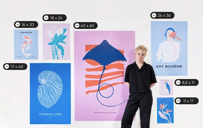
11×17 inches works for smaller spaces, bulletin boards, and indoor displays.
24×36 inches suits outdoor advertising, storefront windows, and large event spaces.
A4 (8.5×11 inches) handles handouts, flyers, and personal printer output.
Choose based on viewing distance (closer viewers need smaller sizes, distant viewers need larger formats).
Resolution Requirements
Print posters require 300 DPI minimum to avoid pixelation and maintain sharpness.
Digital posters (social media, websites) work at 72-150 DPI since screens display at lower resolutions.
Large-format printing (banners, billboards) can use 150-200 DPI because viewers stand farther away.
Step 2: How Do You Choose and Apply the Background?
Select and configure the foundation layer that supports all other design elements.
Action:
- Solid Color: Layer > New Fill Layer > Solid Color, choose color from picker
- Gradient: Gradient Tool (G), select style (linear, radial), drag across canvas
- Image Background: File > Place Embedded, select image, scale to fit (Shift+drag corners)
- Pattern Fill: Edit > Fill > Pattern, select from preset patterns
- Blending Mode: Adjust layer opacity (20-80%) in Layers panel for subtle effects
Purpose: Background establishes mood, provides contrast for text, and creates visual foundation.
Color Selection Strategy
Apply color theory principles to match your message and audience.
Event posters use vibrant, high-saturation colors to grab attention and create energy.
Corporate posters favor monochrome colors or muted palettes for professional appearance.
Product promotions match brand guidelines and existing color palette specifications.
Test your background against your main text color for sufficient readability (check at actual viewing distance).
Background Image Tips
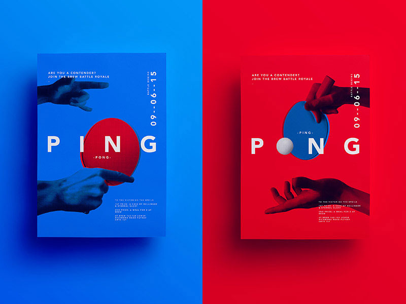
Images should be high-resolution (minimum 300 DPI at final size) to prevent quality degradation.
Apply subtle blur (Filter > Blur > Gaussian Blur, 3-8 pixel radius) to background photos so text remains readable.
Darken or lighten background images using Levels (Ctrl+L) or Curves (Ctrl+M) adjustment layers.
Add overlay layers (black or white at 30-50% opacity) to create uniform text placement areas.
Step 3: Where Do You Add Images and Graphics?
Import and position visual elements that communicate your message and create focal points.
Action:
- File > Place Embedded: Navigate to image file, click Place
- Transform (Ctrl+T): Drag corners while holding Shift to maintain proportions
- Position: Drag image to desired location following the rule of thirds
- Layer Order: Drag layers up/down in Layers panel to adjust stacking
- Smart Object: Right-click layer > Convert to Smart Object for non-destructive editing
Purpose: Images convey information quickly, establish visual interest, and guide viewer attention through the design.
Image Formats and Quality
Use JPEG for photographs (smaller file size, good color range).
PNG files preserve transparency and work for logos, icons, and layered graphics.
Place vector graphics (AI, EPS files) for infinite scalability without quality loss.
Avoid enlarging bitmap images beyond their original dimensions (causes blurriness and pixel degradation).
Placement and Composition
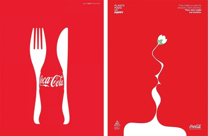
Position primary images at intersection points using grid systems (View > Show > Grid).
Leave adequate white space around images (minimum 0.25-0.5 inches from poster edges).
Apply Gestalt principles to group related images and create visual relationships.
Check balance by evaluating visual weight distribution across the entire canvas.
Image Editing Within Photoshop
Adjustment Layers (Brightness/Contrast, Hue/Saturation, Color Balance) modify images non-destructively.
Remove backgrounds using Quick Selection Tool (W) then Layer Mask for clean cutouts.
Apply filters (Filter menu) sparingly since excessive effects reduce professional appearance.
Maintain consistent color treatment across all images for unified visual presentation.
Step 4: How Do You Create the Text Hierarchy?
Structure text elements with varying sizes, weights, and positions to guide reading order and emphasis.
Action:
- Type Tool (T): Click on canvas, type headline text
- Character Panel (Window > Character): Set font, size, leading, tracking
- Headline: 72-120 pt, bold weight, positioned in upper third of poster
- Subheadline: 36-48 pt, medium weight, below headline with adequate spacing
- Body Copy: 18-24 pt minimum (readable from 3-4 feet), standard weight
- Details (date, time, location): 14-18 pt, placed near bottom or relevant graphic elements
Purpose: Typographic hierarchy directs viewer attention, communicates information priority, and ensures readability at viewing distance.
Font Selection
Choose fonts for posters based on mood, readability, and brand alignment.
Sans-serif fonts (Helvetica, Futura, Arial) provide clean, modern appearance and excellent distance readability.
Serif fonts (Garamond, Times New Roman, Baskerville) convey tradition, elegance, and formal tone.
Display fonts work for headlines only (never body text) and should match poster theme.
Limit designs to 2-3 font families maximum to maintain visual coherence.
Typography Best Practices
Apply proper kerning (Alt+Left/Right Arrow) to adjust spacing between individual letter pairs.
Set appropriate line spacing (1.2-1.5x font size) to prevent cramped or scattered appearance.
Align text consistently (alignment options: left, center, right, justified) based on design structure.
Use font spacing adjustments (tracking) to fill or condense text areas without changing font size.
Text Color and Readability
Create sufficient contrast between text and background (minimum 4.5:1 ratio for body text).
White text on dark backgrounds or black text on light backgrounds provides maximum readability.
Avoid placing text directly over busy image areas (add semi-transparent shape layers behind text).
Test legibility by zooming out to 25-50% view and checking if text remains clear.
Step 5: What Color Scheme Should You Apply?
Select and implement a coordinated set of colors that supports your message and creates visual hierarchy.
Action:
- Define Primary Color: Choose dominant hue that represents brand or message
- Color Picker (Foreground): Click foreground color square, select from spectrum or enter hex code
- Swatches Panel (Window > Swatches): Save custom colors for consistent reuse
- Apply to Elements: Use Eyedropper Tool (I) to sample and apply saved colors
- Color Scheme Type: Select complementary, analogous, or triadic arrangement
Purpose: Cohesive color schemes create professional appearance, guide attention, and trigger emotional responses aligned with your message.
Color Scheme Types
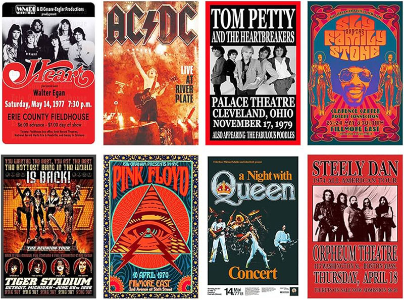
Complementary color schemes (opposite on color wheel) provide maximum contrast and visual energy.
Analogous colors (adjacent on wheel) create harmonious, calming designs with subtle variation.
Triadic color schemes (three equally-spaced hues) offer vibrant balance without overwhelming contrast.
Monochromatic (single hue with varying saturation and brightness) ensures unified, sophisticated appearance.
Color Application Guidelines
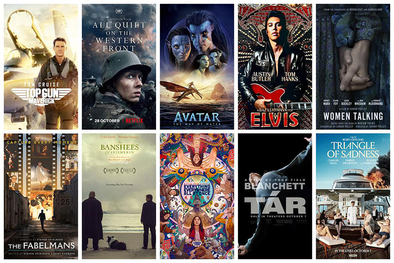
Limit palette to 3-4 main colors plus neutral tones (black, white, gray) for clean execution.
Use 60-30-10 rule: 60% dominant color, 30% secondary color, 10% accent color for visual interest.
Consider color psychology (red = urgency/passion, blue = trust/calm, yellow = optimism/energy).
Match colors to Pantone values if working with professional printers for color accuracy.
Color Mode Selection
RGB mode handles all digital displays (websites, social media, digital screens) with wider color gamut.
CMYK mode prepares files for offset printing, ensuring colors appear as expected on paper.
Convert RGB to CMYK (Image > Mode > CMYK Color) before sending to print services.
Note that some vibrant RGB colors shift when converted to CMYK (check proof colors before printing).
Step 6: How Do You Add Visual Effects?
Apply enhancements that create depth, draw attention, and polish the overall poster design.
Action:
- Layer Styles: Right-click layer > Blending Options, select Drop Shadow (distance 5-10px, opacity 75%)
- Outer Glow: Adds luminous edge around text or objects (spread 5%, size 10-20px)
- Bevel and Emboss: Creates 3D appearance (depth 5-10%, size 3-8px)
- Adjustment Layers: Layer > New Adjustment Layer > select type (Curves, Levels, Vibrance)
- Filter Gallery: Filter > Filter Gallery for artistic effects (use sparingly)
Purpose: Effects create dimension, improve text readability against complex backgrounds, and add professional polish without overwhelming the core message.
Effect Application Guidelines
Drop shadows should match light source direction across all elements for realistic consistency.
Limit effects to 2-3 per design (excessive effects create cluttered, amateur appearance).
Adjust opacity on effect layers (30-70%) to maintain subtlety and prevent harsh results.
Copy layer styles (right-click > Copy Layer Style, paste to similar elements) for uniform treatment.
Text Enhancement Techniques
Add stroke outline (1-3px) to text placed over photographic backgrounds for separation.
Apply subtle inner shadow (distance 2-4px, opacity 50%) to create letterpress effect on headlines.
Use color overlay with blending modes (Multiply, Screen, Overlay) to integrate text with background tones.
Gradient overlays on large headline text add visual interest without additional graphic elements.
Image Enhancement
Sharpen images slightly (Filter > Sharpen > Unsharp Mask: Amount 80-120%, Radius 1-1.5px).
Apply vignette (Lens Correction > Custom > Vignette: Amount -15 to -30) to focus attention centrally.
Color grade consistently using Curves adjustment layer for cohesive visual treatment.
Add subtle noise (Filter > Noise > Add Noise: 1-3%, Gaussian) to digital elements for texture.
Step 7: Where Do You Place the Call to Action?
Position clear, actionable instruction that tells viewers the next step to take.
Action:
- Text Tool (T): Create text layer with direct instruction (“Register Now,” “Visit Website,” “Call Today”)
- Size: 24-36 pt, bold or semi-bold weight for visibility
- Location: Bottom third of poster or near key visual element
- Background Shape: Rectangle Tool (U), place behind CTA text, fill with contrasting color
- Button Effect: Add 2-3px stroke, subtle drop shadow for dimensional appearance
Purpose: Call to action converts poster viewers into participants, customers, or attendees by providing clear next step.
CTA Best Practices
Use action verbs that create urgency (Register, Join, Discover, Claim, Order).
Place contact information (phone, website, email) directly adjacent to or within CTA area.
Create visual separation using border, background color, or surrounding white space.
Size CTA prominently (should be 3rd or 4th largest text element after headline and subheadline).
Information Hierarchy
Event details (date, time, location) appear in middle to lower third using structured layout.
Contact information stays consistent in corner or bottom edge across poster series.
Legal disclaimers or fine print: 8-10pt, low contrast color, positioned at absolute bottom.
Social media handles or hashtags: 14-18pt, integrated near logo or CTA area.
Creating Visual Direction
Arrange design elements to guide eye flow toward CTA using diagonal lines or curves.
Use framing techniques (borders, shapes) to isolate and highlight CTA section.
Apply movement through repeated shapes or directional arrows pointing toward action area.
Contrast CTA background dramatically against surrounding poster area for immediate visibility.
Step 8: How Do You Export the Final Poster?
Save and output the completed design in appropriate format for printing or digital distribution.
Action:
- File > Save As (Ctrl+Shift+S): Save PSD file with all layers for future editing
- Flatten Image: Layer > Flatten Image (only on copy, keep layered original)
- File > Export > Export As: Choose format, quality, and size settings
- Print Format: Select PDF (Photoshop PDF preset: High Quality Print)
- Digital Format: Select PNG (24-bit, transparent background if needed) or JPEG (quality 10-12)
- Resolution: Maintain 300 DPI for print, reduce to 72-150 DPI for web/social
Purpose: Proper export ensures design quality survives reproduction, file sizes remain manageable, and format matches intended use.
Print Export Settings

PDF format preserves color accuracy, embeds fonts, and handles professional print workflows.
Include bleed area (0.125-0.25 inches beyond trim) if printer requires (Image > Canvas Size).
Embed color profile (Edit > Convert to Profile > select printer’s ICC profile) before final export.
Save separate CMYK version specifically for offset printing to match commercial press output.
Digital Export Settings
PNG format maintains transparency, works for overlays, and avoids compression artifacts.
JPEG format creates smaller files for email, websites, and social media sharing.
Web optimization: File > Export > Save for Web (Legacy), select quality 60-80 for balance.
Social media specs: Instagram 1080x1080px, Facebook 1200x630px, Twitter 1024x512px (create separate versions).
File Naming Conventions
Use descriptive names: “EventName_Poster_18x24_CMYK_v3.pdf” for clarity and version tracking.
Include dimensions, color mode, and version number in filename.
Maintain organized folder structure (Project > Finals > Print, Project > Finals > Digital).
Archive layered PSD files separately from flattened export files for future modifications.
Pre-Export Checklist
Spell-check all text layers (Edit > Check Spelling) to catch errors before printing.
Verify all images are high resolution and properly embedded (not linked externally).
Confirm color mode matches output method (CMYK for print, RGB for digital).
Check document size matches intended poster dimensions exactly.
Verification
Proof your completed poster to confirm it meets quality standards and communicates effectively.
Open exported file at 100% zoom to inspect sharpness, alignment, and color accuracy.
Print test copy at smaller scale (50% or 25%) to evaluate overall composition and readability.
View from intended distance (3-6 feet for medium posters, 10+ feet for large formats).
Confirm all text is spelled correctly, contact information is accurate, and dates are current.
Check that CTA stands out and visual hierarchy guides viewer through intended reading sequence.
Troubleshooting
Issue: Text Appears Blurry or Pixelated
Solution: Increase document resolution to 300 DPI minimum (Image > Image Size, uncheck Resample).
Ensure text layers remain as vector type (avoid rasterizing unless applying specific effects).
Use higher quality fonts, avoid extreme scaling of small fonts to large sizes.
Issue: Colors Look Different on Screen vs Print
Solution: Convert to CMYK color mode before printing (Image > Mode > CMYK Color).
Request ICC color profile from printer, apply using Edit > Convert to Profile.
Order test print on actual paper stock to evaluate color shift before full run.
Issue: File Size Too Large for Upload or Email
Solution: Reduce resolution for digital distribution (72-150 DPI sufficient for screens).
Flatten unnecessary layers (keep master PSD separate with all layers intact).
Export as JPEG with quality setting 8-10 instead of maximum quality.
Use file compression tools or cloud sharing links for large files.
Issue: Images Look Stretched or Distorted
Solution: Hold Shift while dragging corner handles to maintain aspect ratio.
Convert layers to Smart Objects before transforming to preserve quality.
Replace with higher resolution source images if enlarging beyond original dimensions.
Issue: Poster Design Looks Cluttered
Solution: Remove 30-40% of elements, prioritize only critical information and primary visual.
Increase white space around key elements (minimum 0.5-inch margins from edges).
Consolidate text into fewer, larger blocks rather than scattered small chunks.
Simplify color palette to 2-3 main colors plus neutrals.
Alternative Methods
Method B (Canva)
Time: 15-20 minutes
Complexity: Beginner
Best for: Quick digital posters, social media, beginners, template-based designs
Free tier available, drag-and-drop interface, thousands of templates.
Limited customization compared to professional software.
Automatic brand kit storage, collaboration features, direct social media publishing.
Method C (Illustrator)

Time: 45-60 minutes
Complexity: Advanced
Best for: Vector graphics, scalable designs, typography focus, logo integration
Creates resolution-independent artwork scalable to any size without quality loss.
Steeper learning curve, better for geometric and text-heavy designs than photographic.
Preferred for large-format printing (billboards, banners) requiring extreme enlargement.
Method D (PowerPoint)

Time: 20-30 minutes
Complexity: Beginner
Best for: Simple event posters, presentations, basic layouts, office environments
No additional software cost for Microsoft Office users.
Limited design capabilities, basic image editing, template availability.
Export as PDF or high-resolution PNG for printing.
Method Selection Criteria
Choose Photoshop when working with photographs, requiring advanced editing, or preparing commercial print files.
Choose Canva when prioritizing speed, working collaboratively, or lacking design experience.
Choose Illustrator when creating vector-based designs, needing infinite scalability, or focusing on typography.
Choose PowerPoint when restricted to office software, creating simple layouts, or sharing editable files.
Related Processes
Learn complementary design workflows that extend your poster creation capabilities.
Creating Marketing Materials
Poster design principles apply directly to flyers, brochures, and other print design projects.
Study graphic design principles to understand fundamental concepts across all visual communication.
Explore design elements (line, shape, texture, space) for stronger compositions.
Typography and Layout Techniques
Master typography fundamentals for any text-heavy design project.
Learn pairing fonts to create harmonious, readable combinations.
Apply proximity principles to group related elements effectively.
Design System Development
Create brand guidelines to maintain consistency across multiple posters.
Build mood boards to explore visual direction before starting design work.
Develop reusable templates with established layout, colors, and style for poster series.
Advanced Design Concepts
Study minimalist design to communicate more with fewer elements.
Understand asymmetry to create dynamic, modern compositions.
Apply repetition and rhythm for visual consistency and flow.
Research graphic design movements for historical context and inspiration.
FAQ on How To Make A Poster
What software is best for making a poster?
Adobe Photoshop handles photo-heavy designs and print-ready files with professional color control.
Canva works for quick digital posters with templates. Illustrator excels at vector graphics and typography. PowerPoint suits basic layouts when professional software isn’t available.
What size should a poster be?
Standard poster sizes include 18×24 inches for general use, 11×17 inches for smaller spaces, and 24×36 inches for large displays.
Choose based on viewing distance and display location. Digital posters use platform-specific dimensions like 1080x1080px for Instagram.
What resolution do I need for printing posters?
Set resolution to 300 DPI minimum for professional print quality at final poster size.
Large-format prints (banners, billboards) work at 150-200 DPI since viewers stand farther away. Digital-only posters need just 72-150 DPI for screen display.
How many fonts should I use on a poster?
Limit designs to 2-3 font families maximum to maintain visual coherence and readability.
Use one font for headlines, another for body text, and optionally a display font for accents. More fonts create cluttered, unprofessional appearance.
What makes a good poster design?
Strong visual hierarchy guides viewers through headline, images, and call to action in clear sequence.
Adequate white space, readable typography from viewing distance, cohesive color scheme, and single focused message create effective poster designs.
Should I use RGB or CMYK for posters?
Use CMYK color mode for professional printing to ensure accurate color reproduction on paper.
RGB works for digital displays, websites, and social media. Convert RGB to CMYK before sending files to print services to avoid unexpected color shifts.
How do I make text readable on a poster?
Maintain minimum 4.5:1 contrast ratio between text and background colors for readability.
Set body text at 18-24pt minimum, use clean fonts, add semi-transparent shapes behind text over busy images, and test legibility from actual viewing distance.
What file format should I export my poster as?
Export as PDF for professional printing (preserves quality, embeds fonts, maintains color profiles).
PNG works for digital use with transparency needs. JPEG creates smaller files for web sharing and social media. Keep layered PSD for future edits.
How much should I charge to design a poster?
Rates vary by experience, complexity, and client type.
Beginners charge $50-150, intermediate designers $150-500, professionals $500-2000+. Consider rush fees, revision limits, usage rights, and whether client provides content or you source everything.
Can I make a poster without design experience?
Start with poster templates in Canva, Adobe Express, or similar platforms for beginner-friendly workflows.
Focus on customizing colors, swapping images, and editing text rather than creating layouts from scratch. Study existing posters to understand effective design patterns.
Conclusion
Mastering how to make a poster in Photoshop gives you control over every design element, from canvas size and resolution settings to final export specifications.
The eight-step workflow covers document setup, background design, image placement, typography hierarchy, color schemes, visual effects, call-to-action positioning, and professional file preparation.
Whether creating event promotions, brand advertising, or marketing collateral, these graphic design fundamentals apply across print and digital formats.
Start with proper DPI settings and CMYK color mode for print projects. Apply design principles like contrast, balance, and white space for visual impact.
Your poster making process becomes faster with reusable templates and established design workflows.
Practice transforms technical knowledge into creative execution that communicates messages effectively at any viewing distance.
If you liked this article about how to make a poster, you should check out this article about poster sizes.
There are also similar articles discussing how to make a beer poster, how to create a poster in PowerPoint, how to make a wanted poster, and making a poster in Word.
And let’s not forget about articles on how to make a movie poster, how to hang a poster, how to frame a poster, and how to flatten a poster.

Renowned for his expertise in logo design and visual branding, Bogdan has developed a multitude of logos for various clients.
His skills extend to creating posters, vector illustrations, business cards, and brochures. Additionally, Bogdan's UI kits were featured on marketplaces like Visual Hierarchy and UI8.
He also wrote in the past years on sites like Design Your Way, WebDesignerDepot, WPDean, Designmodo, Speckyboy, Slider Revolution, and more.
- The Windsurf Logo History, Colors, Font, And Meaning - 10 October 2026
- How to Remove Background From Product Photos (No Photoshop) - 10 October 2026
- How Designers can Build a Stronger Online Creative Identity - 9 October 2026

Bogdan Sandu is a seasoned designer who has been designing websites since 2008. Renowned for his expertise in logo design and visual branding, Bogdan has developed a multitude of logos for various clients. His skills extend to creating posters, vector illustrations, business cards, and brochures. Additionally, Bogdan's UI kits were featured on marketplaces like Visual Hierarchy and UI8. He also wrote in the past years on sites like Design Your Way, WebDesignerDepot, WPDean, Designmodo, Speckyboy, Slider Revolution, and more.
You Might Also Like


