Brandon Grotesque dominates modern branding, but its popularity creates a problem. Your designs start looking like everyone else’s.
Finding fonts similar to Brandon Grotesque gives you that same geometric elegance without the overuse. You need alternatives that match its clean lines and friendly proportions while bringing fresh personality to your projects.
This guide breaks down 29 alternatives across every budget and style preference. Free Google Fonts options sit alongside premium typefaces from boutique foundries.
You’ll discover which geometric sans-serif fonts share Brandon’s architectural precision, which ones work better for body text, and where to find hidden gems that deliver professional quality without the premium price tag. Each option includes real technical specs, licensing details, and honest comparisons to help you choose the right alternative for your specific project needs.
Fonts Similar To Brandon Grotesque
| Font Name | Classification | Key Characteristics | Best Use Cases |
|---|---|---|---|
| Neutraface | Geometric Sans-Serif | Geometric letterforms with architectural precision, rounded terminals, moderate x-height | Editorial design, branding, architectural presentations |
| Avenir | Humanist Geometric | Balanced geometric construction with humanist warmth, clean terminals, excellent readability | Corporate communications, UI design, print materials |
| Verlag | Neo-Grotesque | Condensed proportions, strong vertical stress, industrial aesthetic, compact spacing | Headlines, posters, editorial headlines |
| FF Super Grotesk | Contemporary Grotesque | Wide character set, open counters, neutral personality with subtle geometric influence | Digital interfaces, branding systems, wayfinding |
| FF DIN Round | Rounded Geometric | Rounded terminals on geometric base, friendly appearance, industrial heritage with softness | Tech branding, UI elements, children’s products |
| Cocogoose Classic | Display Geometric | Bold geometric forms, distinctive uppercase, high contrast weight distribution | Logos, headlines, packaging design |
| Mr Eaves Modern | Humanist Sans-Serif | Based on Baskerville structure, large x-height, humanist proportions with contemporary feel | Book design, editorial content, long-form reading |
| Futura | Classic Geometric | Pure geometric shapes, circular forms, iconic modernist design, near-perfect circles | Fashion branding, luxury products, modernist design |
| Josefin Sans | Vintage Geometric | Tall x-height, vintage-inspired geometric construction, Google Fonts availability | Web typography, headers, artistic projects |
| Cabin | Humanist Web Font | Optimized for screen reading, friendly humanist qualities, extensive language support | Web body text, mobile interfaces, accessibility-focused design |
| Lato | Humanist Sans-Serif | Semi-rounded letterforms, warm character, strong structure with friendly appearance | Corporate websites, presentations, web applications |
| Ageo | Modern Geometric | Contemporary geometric sans with slightly condensed forms, clean and minimal aesthetic | Modern branding, tech startups, minimalist design |
| Neretto | Condensed Sans-Serif | Narrow proportions, efficient spacing, strong presence in smaller sizes | Space-constrained layouts, mobile apps, compact designs |
| Baston | Rounded Geometric | Soft rounded terminals, playful yet professional, balanced weight distribution | Friendly brands, educational materials, lifestyle products |
| Larosa | Contemporary Sans-Serif | Elegant proportions, refined details, versatile weight range | Premium branding, fashion editorial, upscale packaging |
| Departura | Display Sans-Serif | Airport signage-inspired, high legibility, utilitarian aesthetic | Wayfinding systems, transportation design, information graphics |
| Phenom Grotesque | Neo-Grotesque | Neutral character, systematic construction, wide weight range | Corporate identity, systematic branding, multi-platform design |
| Golden Grotesque | Vintage Grotesque | Classic grotesque proportions, refined details, historical character | Heritage brands, classic editorial, refined branding |
| Catesque | Contemporary Display | Bold display characteristics, distinctive personality, attention-grabbing forms | Headlines, posters, advertising campaigns |
| Osande TXT | Text Sans-Serif | Optimized for continuous reading, clear letterforms, balanced proportions | Body text, documentation, long-form content |
| Abside | Geometric Sans-Serif | Architectural influence, precise geometry, modern sensibility | Architecture firms, design studios, tech branding |
| TT Commons Pro | Universal Grotesque | Versatile typeface family, extensive weights, multilingual support | Brand systems, UI/UX design, international projects |
| TT Neoris | Soft Geometric | Rounded corners, friendly aesthetic, contemporary proportions | Digital products, app interfaces, modern branding |
| TT Fors | Industrial Grotesque | Strong character, industrial roots, clear functionality | Industrial design, technical documentation, manufacturing brands |
| TT Gertika | Modern Grotesque | Clean lines, neutral personality, systematic design approach | Corporate communications, digital interfaces, scalable systems |
| Halis Grotesque | Classic Grotesque | Traditional grotesque construction, robust forms, timeless appeal | Traditional branding, print media, established organizations |
| Klein | Minimalist Geometric | Ultra-minimal forms, reduced to essentials, contemporary aesthetic | Minimalist branding, luxury products, art direction |
| Clarika | Humanist Grotesque | Warm grotesque structure, organic terminals, readable at small sizes | Healthcare, education, community-focused organizations |
| Ligurino | Contemporary Geometric | Italian design heritage, elegant proportions, refined details | Fashion brands, Italian design, premium editorial |
Neutraface
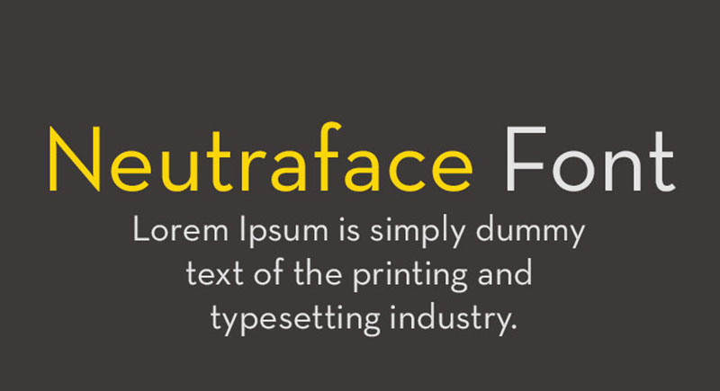
Christian Schwartz designed Neutraface for House Industries in 2002, inspired by architect Richard Neutra’s modernist lettering found on building facades in California.
Visual Characteristics
The typeface follows geometric principles with precise circular forms. Lowercase letters feature a notably small x-height compared to capitals, creating distinctive proportions that work exceptionally well for display applications.
Vertical strokes maintain consistent weight throughout. The crossbars sit unusually low (especially in the lowercase “e”), giving the design its signature architectural quality.
Use Cases
Advertising and branding remain Neutraface’s strongest applications. Wendy’s used it extensively in marketing campaigns. Real estate developments favor it for that gentrification aesthetic (some critics even call it the “gentrification font“).
The Guggenheim Museum adopted it. Cookbook publishers love it. Movie posters for House of Wax and Quantum of Solace featured it prominently.
Technical Specifications
Display version includes five weights with regular and alternate variations plus a unique titling style. Text version adds enhanced readability features.
Neutraface No. 2 (released 2007) raises the crossbars for better body text performance. Neutraface Slab expands the family into slab serif territory.
Extended Latin character support. OpenType features include ligatures, stylistic alternates, and multiple figure sets.
Similarities to Brandon Grotesque
Both embrace geometric construction based on circular forms. Small x-height proportions appear in each. The monolinear stroke treatment creates similar visual rhythm.
Architectural modernism influences both designs. Neither feels purely mechanical despite the geometric foundations.
Key Differences
Neutraface’s crossbars sit dramatically lower than Brandon’s. The lowercase “e” especially diverges from standard grotesque proportions.
Brandon maintains more conventional apertures. Neutraface pushes the Art Deco influence harder with those stylized letter details that reference 1920s signage.
Licensing & Availability
Commercial license through House Industries. Desktop licenses start around $99 per weight. Complete family pricing reaches premium tier ($400+).
Web font licenses available separately. Not available as a free alternative.
Avenir
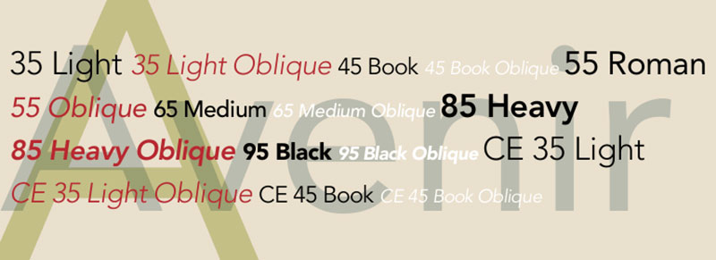
Adrian Frutiger designed Avenir in 1987, released by Linotype in 1988. The name means “future” in French.
Visual Characteristics
Geometric sans-serif with humanist touches distinguishes Avenir from pure geometric designs like Futura. The “o” isn’t a perfect circle but optically corrected for better balance.
Vertical strokes slightly thicker than horizontals. Two-story “a” and “t” with a subtle curl add warmth. Generous apertures improve legibility at text sizes.
Frutiger considered this his finest work. And honestly? The craftsmanship shows in every curve.
Use Cases
Originally designed with six weights for different printing conditions. Book weight works perfectly for body text while Light handles captions and subheads.
Amsterdam adopted it as the official city typography in 2003. Apple used it in iOS 6 Maps. Disney+ pairs it with FF Real Text throughout their streaming interface.
The Consumer Financial Protection Bureau, Bloomberg, and Snapchat all standardized on Avenir Next for brand guidelines.
Technical Specifications
Original release: 6 weights (Light, Book, Roman, Medium, Heavy, Black) with matching italics (12 fonts total).
Avenir Next (2004): Expanded to 24 fonts initially, now 32 fonts including Ultra Light and Thin. Condensed width added. Small caps, text figures, subscript/superscript characters included.
Full Latin, Greek, and Cyrillic support. OpenType features cover standard ligatures, fractions, localized forms, scientific inferiors.
Similarities to Brandon Grotesque
Both balance geometric structure with humanist warmth. Optical corrections prevent mechanical appearance. Clean, neutral aesthetic works across multiple applications.
Strong performance in both display and text sizes. Professional appearance suits corporate identity work.
Key Differences
Avenir’s two-story “a” contrasts with Brandon’s single-story version. Brandon has a smaller x-height creating more elegant proportions.
Avenir feels slightly warmer, less pure geometric. Brandon pushes the 1920s geometric reference more directly.
Licensing & Availability
Commercial license through Monotype/Linotype. Desktop licenses approximately $40 per weight, full family packages $200-400.
Included in Microsoft Office and Apple systems (varies by version). Web font licensing available through Fonts.com and Adobe Fonts subscription.
Verlag
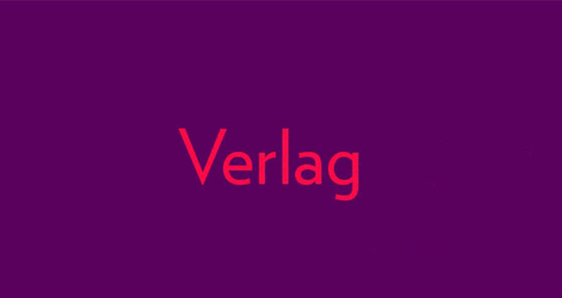
Jonathan Hoefler designed Verlag in 1995 for the Solomon R. Guggenheim Museum as a response to Frank Lloyd Wright’s iconic facade lettering.
Visual Characteristics
Geometric sans-serif with small lowercase and tall ascenders characteristic of early modernist typography. Monolinear stroke treatment throughout.
The design references 1930s newsroom grotesques like Ludlow Tempo and Intertype Vogue while maintaining contemporary refinement. Euclidean proportions create crisp, architectural quality.
Compressed and Condensed widths offer exceptional versatility. Each maintains the geometric purity of the regular width.
Use Cases
Originally exclusive to Guggenheim magazine, now standard for Guggenheim Foundation branding. Museum and gallery publications favor it for that contemporary art aesthetic.
Editorial design and architectural publications. Works brilliantly for clean, modernist layouts where geometric precision matters.
Strong web design performance due to comprehensive width options and excellent screen rendering.
Technical Specifications
60 fonts total: 5 weights (Extra Light, Light, Book, Medium, Black) × 3 widths (Regular, Condensed, Compressed) × 2 styles (Roman, Italic).
Extended Latin support covering 100+ languages. OpenType features include proportional and tabular figures, fractions, case-sensitive punctuation.
Similarities to Brandon Grotesque
Geometric construction with careful optical corrections. Small lowercase relative to capitals matches Brandon’s proportions closely.
Both draw from 1920s-30s modernist tradition. Clean, professional appearance suitable for institutional branding.
Key Differences
Verlag maintains stricter geometric purity. Brandon incorporates more subtle curves and warmth in letter terminals.
Verlag’s compressed and condensed widths offer layout flexibility Brandon doesn’t provide. The architectural quality feels more rigid, less friendly than Brandon.
Licensing & Availability
Premium commercial license through Hoefler & Co. Desktop licenses start around $199 per font, full family exceeds $2000.
Web font licenses available but expensive. No free alternatives match its distinctive character.
FF Super Grotesk
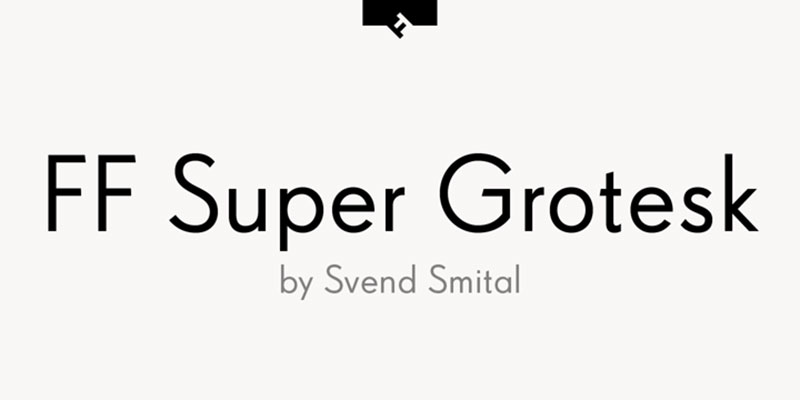
FF Super Grotesk was created for FontFont in 2001, creating a neo-grotesque with Swiss modernist roots.
Visual Characteristics
Clean geometric letterforms with minimal stroke contrast. Neutral appearance follows Swiss design principles of clarity and objectivity.
Open apertures enhance readability. The forms stay true to grotesque tradition while feeling contemporary through refined details and spacing.
Lowercase maintains consistent rhythm. Capitals show balanced proportions without mannered details.
Use Cases
Corporate identity work where neutral professionalism matters. Swiss and German designers favor it for that authentic grotesque quality.
Editorial layouts requiring clean hierarchy. Posters and signage benefit from the straightforward legibility.
Technical documentation and informational design. The no-nonsense character communicates clearly without personality distractions.
Technical Specifications
Multiple weights from Light to Bold. Extended Latin character set supports Western and Central European languages.
OpenType features include standard ligatures, proportional figures, and case-sensitive punctuation. Well-suited for print design and screen applications.
Similarities to Brandon Grotesque
Both embrace geometric sans-serif principles. Clean, modern appearance works across diverse applications. Professional quality suitable for branding.
Neutral character allows the design to recede when needed or stand confidently when featured prominently.
Key Differences
FF Super Grotesk maintains stricter neo-grotesque tradition. Brandon allows more geometric playfulness in details.
Brandon’s smaller x-height creates more elegant text color. Super Grotesk prioritizes pure functionality over stylistic distinction.
Licensing & Availability
Commercial license through FontFont/Monotype. Mid-range pricing tier (approximately $40-60 per weight).
Available through Adobe Fonts subscription. Web font licenses available separately.
FF DIN Round
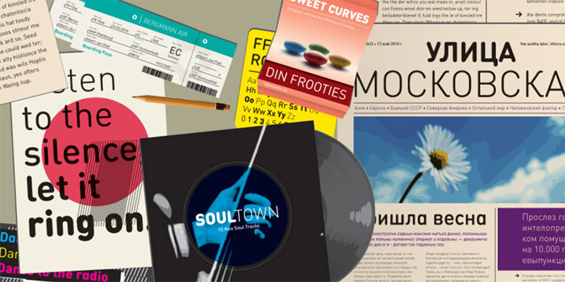
Albert-Jan Pool’s original FF DIN adapted the German industrial standard DIN 1451. The Round variant softens those industrial edges with rounded terminals.
Visual Characteristics
Geometric letterforms based on engineering specifications get humanized through rounded corners. The industrial heritage remains visible but feels approachable.
Stroke weight stays consistent. Open counters maintain DIN’s exceptional legibility while rounded terminals prevent the cold mechanical feeling.
Numbers particularly shine with this treatment. The rounded corners make them feel modern rather than strictly utilitarian.
Use Cases
Signage systems where friendliness matters alongside clarity. Wayfinding in retail environments and hospitality.
Tech startups wanting approachable professionalism. The rounded treatment softens corporate materials without sacrificing authority.
Children’s products and educational materials benefit from the warmer character. Still maintains excellent readability for instructional content.
Technical Specifications
Multiple weights from Light to Black. Condensed width options available. Extended character support includes Central European languages.
OpenType features cover standard ligatures, tabular figures for data presentation, and scientific symbols. Originally designed for maximum legibility in challenging conditions.
Similarities to Brandon Grotesque
Geometric construction creates similar rhythm. Both balance functionality with contemporary style through refined details.
Strong performance across size ranges. Professional appearance suitable for corporate and editorial applications.
Key Differences
DIN Round’s rounded terminals create distinctly different personality. Brandon maintains sharp terminals for crisper appearance.
DIN’s industrial origins show through more utilitarian proportions. Brandon emphasizes elegance over pure function.
Licensing & Availability
Commercial license through FontFont/Monotype. Mid-range pricing (approximately $40-50 per weight).
Available through Adobe Fonts subscription. Web font licenses sold separately.
Cocogoose Classic
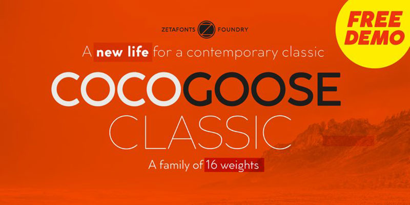
Cosimo Lorenzo Pancini released Cocogoose in 2012 through Zetafonts as a bold geometric alternative drawing from both grotesque and gothic traditions.
Visual Characteristics
High contrast between thick and thin strokes distinguishes it from monolinear grotesques. Rounded details soften the geometric construction.
The UltraBold weight particularly shines with massive presence perfect for logos and headlines. Even distribution of weight creates strong visual impact.
Geometric shapes maintain clarity even at extreme weights. The classic variant offers more traditional proportions than the original Cocogoose.
Use Cases
Logo design where bold personality matters. Sports branding and youth-oriented products.
Packaging design requiring shelf impact. The heavy weights command attention in retail environments.
Headlines and display applications. Works especially well for craft beer labels, music festivals, and street wear brands.
Technical Specifications
Multiple weights from Light to UltraBold. Complete Latin character set with extended punctuation and symbols.
OpenType features include stylistic alternates, ligatures, and multiple figure styles. Web font formats available.
Similarities to Brandon Grotesque
Geometric foundation with attention to optical refinement. Both work exceptionally well at display sizes.
Contemporary interpretation of 1920s geometric tradition. Professional execution suitable for commercial projects.
Key Differences
Cocogoose Classic shows more weight variation in strokes. Brandon maintains more consistent monolinear treatment.
Cocogoose pushes bolder, more assertive personality. Brandon offers more restraint and elegance.
Licensing & Availability
Commercial license through Zetafonts. Desktop licenses start around $39 per weight, full family approximately $299.
Free demo weights sometimes available. Full commercial use requires purchase.
Mr Eaves Modern
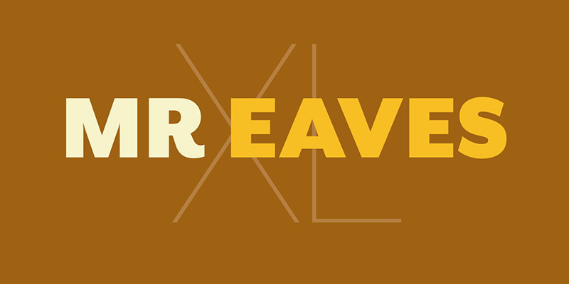
Zuzana Licko designed Mr Eaves Modern for Emigre in 2009 as a sans-serif companion to her Mrs Eaves typeface (itself based on Baskerville).
Visual Characteristics
Geometric sans-serif with subtle quirks inherited from Baskerville proportions. The relationship to classical serif typography creates unique character.
Slightly condensed proportions give efficient text setting. Lowercase shows humanist touches that prevent pure geometric coldness.
Rounded details appear selectively, adding warmth without overwhelming the geometric structure. The design balances history with contemporary style.
Use Cases
Editorial design where classical reference matters but sans-serif functionality needed. Magazine layouts benefit from the typographic hierarchy options.
Book design and literary publications. The Baskerville connection adds sophistication while maintaining contemporary appeal.
Branding for arts organizations and cultural institutions. Bridges traditional and modern aesthetics naturally.
Technical Specifications
Multiple weights available. Full character set includes small caps, old style figures, and extensive ligature support.
OpenType features particularly rich compared to typical geometric sans-serifs. Designed for professional typography with attention to detail.
Similarities to Brandon Grotesque
Both reinterpret geometric sans-serif tradition through contemporary lens. Clean, sophisticated appearance suitable for professional applications.
Works well at both display and text sizes. Versatile enough for diverse design contexts.
Key Differences
Mr Eaves Modern carries classical proportions from Baskerville. Brandon follows pure 1920s geometric tradition more directly.
Mr Eaves feels more literary and refined. Brandon emphasizes architectural modernism.
Licensing & Availability
Commercial license through Emigre. Mid-range pricing typical for boutique foundry fonts.
Web font licenses available. Emigre’s licensing terms straightforward for commercial use.
Futura

Paul Renner designed Futura between 1924-1926, released by Bauer Type Foundry in 1927 as the defining geometric sans-serif of the modernist movement.
Visual Characteristics
Pure geometric construction based on circle, triangle, and square. The original modernist vision made tangible through mathematical precision.
Perfect circles form “o” shapes. Triangular “A” with peak at apex. The capital “Q” tail extends from the circle at a precise angle.
Stroke weight perfectly even throughout. No optical corrections in early versions (later refinements added subtle adjustments).
Use Cases
Iconic display font for anything referencing modernism, Bauhaus, or mid-century design. The Apollo 11 memorial plaque used Futura.
Volkswagen, IKEA, and Supreme all built brand identities around Futura. Wes Anderson films feature it prominently.
Fashion and luxury brands favor it for clean sophistication. Works especially well in all-caps settings where geometric purity shines.
Technical Specifications
Original family included Light, Book, Medium, Demi, Bold, Extra Bold. Modern digital versions expanded to include more weights.
Multiple foundries released versions over decades, creating slight variations. Neufville Digital and URW++ offer contemporary digital versions.
Extended character sets vary by version. OpenType features depend on specific digital release.
Similarities to Brandon Grotesque
Both interpret 1920s geometric tradition. Circular construction creates similar visual rhythm in key letters.
Clean, modernist aesthetic appeals to similar design sensibilities. Professional appearance suitable for diverse applications.
Key Differences
Futura maintains purer geometric construction. Brandon incorporates more optical corrections for improved functionality.
Futura’s tall ascenders and perfect circles create more extreme proportions. Brandon offers more balanced, practical geometry for contemporary use.
Licensing & Availability
Multiple licensing options through various foundries. Neufville Digital, URW++, and others offer commercial licenses.
Pricing varies widely by foundry and version. Some versions included in Adobe Fonts and other subscription services.
Josefin Sans
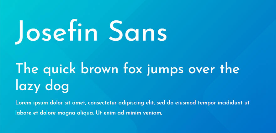
Santiago Orozco created Josefin Sans as a free Google Font, referencing 1930s geometric sans-serifs with distinctive personality.
Visual Characteristics
Geometric construction with quirky details distinguishes it from straightforward grotesques. Thin weights show delicate elegance perfect for fashion and lifestyle design.
Small x-height creates elegant proportions. Tall ascenders emphasize the vertical quality. Some letters include unexpected details that add character without disrupting readability.
Stroke weight stays consistent but lighter weights feel almost delicate. Heavier weights maintain the geometric foundation with more presence.
Use Cases
Fashion websites and boutique branding. The elegant proportions work beautifully for luxury positioning on a free font budget.
Wedding invitations and event materials where vintage sophistication matters. Display headers for lifestyle blogs and magazines.
Web design projects needing personality without licensing costs. Particularly effective for hero sections and large typography treatments.
Technical Specifications
Seven weights from Thin to Bold. Full Latin character set with extended punctuation.
Available as variable font offering smooth weight interpolation. Google Fonts provides web-optimized WOFF2 format.
Open source license allows commercial use without fees. Self-hosting or Google CDN options available.
Similarities to Brandon Grotesque
Both reference 1920s geometric tradition. Small x-height creates similar elegant proportions.
Versatile enough for display and limited text use. Contemporary interpretation of historical style.
Key Differences
Josefin Sans includes more quirky details and personality. Brandon maintains more restrained, professional neutrality.
Free availability makes Josefin accessible but Brandon’s premium refinement shows in subtle details. Josefin works best at display sizes while Brandon handles text better.
Licensing & Availability
Free and open source through Google Fonts. No commercial license required.
Download directly from Google Fonts or use their CDN. Desktop installation fully permitted under SIL Open Font License.
Cabin
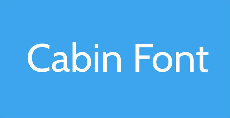
Pablo Impallari and Rodrigo Fuenzalida designed Cabin in 2011 as a humanist sans-serif available through Google Fonts.
Visual Characteristics
Humanist sans-serif with geometric influences. Slightly condensed proportions create efficient text setting without feeling cramped.
Rounded corners soften the overall appearance. Open apertures support strong readability at text sizes. The stroke weight shows subtle modulation rather than pure monolinear treatment.
Lowercase letters include humanist details while capitals maintain geometric simplicity. The balance between warmth and clarity works across diverse contexts.
Use Cases
Body text for websites and digital publications. The condensed width allows more words per line without sacrificing readability.
Mobile applications where space efficiency matters. Corporate presentations and business documents requiring professional appearance.
Email newsletters and marketing materials. Performs consistently across different email clients and browsers.
Technical Specifications
Four weights (Regular, Medium, Semi-Bold, Bold) with matching italics. Extended Latin character support.
Variable font version available offering continuous weight adjustment. Optimized for screen rendering with careful hinting.
Open source license permits commercial use. Available through Google Fonts CDN or self-hosted.
Similarities to Brandon Grotesque
Both balance geometric structure with humanist warmth. Professional appearance suitable for corporate applications.
Strong text performance alongside display capabilities. Neutral character allows design to take center stage.
Key Differences
Cabin shows more humanist influence in stroke modulation. Brandon maintains stricter geometric monolinear treatment.
Cabin’s condensed proportions differ from Brandon’s more standard width. Brandon offers more weights for finer typographic control.
Licensing & Availability
Free through Google Fonts under SIL Open Font License. No commercial restrictions.
Web font formats optimized for performance. Desktop versions available for local installation.
Lato

Łukasz Dziedzic designed Lato in 2010 as a humanist sans-serif balancing warmth with stability, released through Google Fonts.
Visual Characteristics
Semi-rounded letterforms create warm but serious personality. The strokes show subtle curves that soften geometric construction.
Large x-height maximizes legibility at text sizes. Open counters and generous spacing support readability across devices and sizes.
Italics designed as true cursive rather than slanted romans. This attention to detail shows in thousands of websites where Lato performs reliably.
Use Cases
One of most popular web fonts globally. Corporate websites, applications, and digital products rely on its extensive weight range.
Email signatures and business communications. Marketing materials from brochures to presentations.
Mobile interfaces benefit from excellent screen optimization. The free availability makes it default choice for countless projects.
Technical Specifications
Ten weights from Hairline to Black with matching italics (18 fonts total). Variable font version provides continuous weight adjustment.
Extended Latin character coverage includes Central European languages. OpenType features support professional typography including ligatures and figure variants.
Carefully hinted for optimal screen rendering. WOFF2 format ensures efficient web delivery.
Similarities to Brandon Grotesque
Both balance geometric foundation with humanist refinement. Professional appearance works across diverse contexts.
Extensive weight ranges provide typographic flexibility. Contemporary style appeals to similar design sensibilities.
Key Differences
Lato’s larger x-height optimizes for screen reading. Brandon’s smaller x-height creates more elegant proportions better for display.
Lato leans more humanist in stroke treatment. Brandon maintains cleaner geometric purity with less modulation.
Licensing & Availability
Free through Google Fonts under SIL Open Font License. Commercial use fully permitted.
Available via CDN or self-hosting. Desktop installation allowed without restrictions.
Ageo
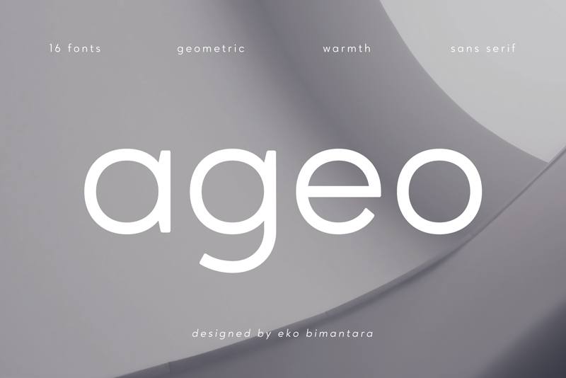
Type Dynamic designed Ageo as a geometric sans-serif combining clean modernism with functional versatility.
Visual Characteristics
Geometric construction with perfectly circular “o” forms. Minimal stroke contrast creates even typographic color throughout.
The letterforms stay true to geometric principles while incorporating practical refinements. Capitals show balanced proportions suitable for professional applications.
Clean terminals and consistent rhythm make it reliable workhorse for diverse projects. Nothing flashy but everything works correctly.
Use Cases
Branding projects requiring modern geometric aesthetic without Brandon Grotesque budget. Startups and small businesses benefit from affordable licensing.
Web and app interfaces where geometric precision matters. Presentations and corporate materials needing clean professionalism.
Poster design and editorial layouts. The extensive weight range handles both display and text requirements.
Technical Specifications
Nine weights from Thin to Black with matching italics. Extended Latin character support.
OpenType features include ligatures, alternate characters, and multiple figure styles. Web font formats available.
Similarities to Brandon Grotesque
Geometric sans-serif foundation creates similar visual impression. Both reference 1920s modernist tradition.
Clean, neutral appearance works for professional contexts. Versatile across display and text applications.
Key Differences
Ageo maintains more consistent weight across full range. Brandon shows more refinement in optical corrections.
Pricing and availability differ significantly. Ageo offers budget-friendly alternative to premium geometric sans options.
Licensing & Availability
Commercial license through Type Dynamic. Budget-friendly pricing (full family typically under $100).
Desktop and web licenses available. Self-hosting permitted under standard license terms.
Neretto
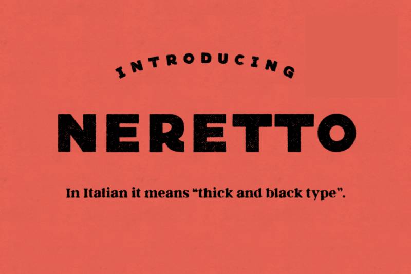
Alessandro Longo designed Neretto through Zetafonts as a contemporary geometric sans-serif with Italian design sensibility.
Visual Characteristics
Geometric letterforms with subtle softening at terminals. The construction stays true to circular foundations while adding warmth through refined details.
Consistent stroke weight creates even texture. Open counters support readability while maintaining geometric precision.
Modern interpretation feels fresh without abandoning geometric tradition. Details show careful craftsmanship throughout weight range.
Use Cases
Contemporary branding where geometric clarity matters but warmth needed. Tech companies and creative agencies favor the modern aesthetic.
Editorial layouts for design publications. Advertising where standout headlines required without sacrificing professionalism.
Digital products and websites. The clean forms render well across screens while maintaining personality.
Technical Specifications
Multiple weights from Light to Black. Extended Latin character set includes European language support.
OpenType features cover standard ligatures and alternate characters. Web font formats optimized for performance.
Similarities to Brandon Grotesque
Geometric construction with humanized details. Both balance modernist precision with approachable warmth.
Professional quality suitable for commercial applications. Contemporary style appeals to similar audiences.
Key Differences
Neretto includes more subtle softening in terminals. Brandon maintains sharper geometric edges.
Italian design influence shows in Neretto’s refinement. Brandon’s German-influenced proportions feel slightly different in rhythm.
Licensing & Availability
Commercial license through Zetafonts. Mid-range pricing tier (approximately $39-49 per weight).
Full family bundles offer value. Web licenses available separately from desktop.
Baston
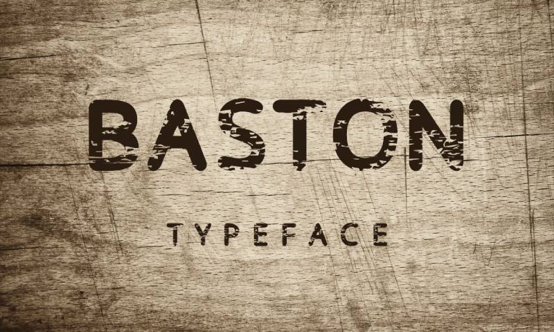
Eduardo Tunni created Baston as an open-source geometric sans-serif through Google Fonts with rounded terminal treatment.
Visual Characteristics
Rounded terminals soften the geometric foundation. The circles and curves maintain precision while feeling approachable.
Consistent construction across weights creates reliable typographic system. Details stay refined even in bolder weights.
Modern geometric interpretation that works harder than typical free fonts. The craftsmanship exceeds expectations for no-cost option.
Use Cases
Web projects requiring friendly geometric aesthetic without budget. Startups and personal projects benefit from quality without expense.
Children’s educational materials and products. The rounded treatment feels appropriate for younger audiences.
Tech interfaces wanting approachable modernity. Marketing materials for companies emphasizing accessibility and warmth.
Technical Specifications
Multiple weights with italics. Extended Latin character support for multilingual applications.
Variable font version available through Google Fonts. Optimized for web performance with careful hinting.
Open source under SIL Open Font License. Commercial use fully permitted.
Similarities to Brandon Grotesque
Geometric sans-serif foundation with refined details. Both work across display and text applications.
Contemporary interpretation of modernist tradition. Professional execution despite different price points.
Key Differences
Baston’s rounded terminals create distinctly warmer personality. Brandon’s sharp terminals maintain crisper appearance.
Free availability makes Baston accessible but Brandon’s premium refinement shows in subtle optical adjustments. Weight range and feature set differ significantly.
Licensing & Availability
Free through Google Fonts. No licensing fees for commercial projects.
Self-hosting or Google CDN options. Desktop installation permitted under open license.
Larosa
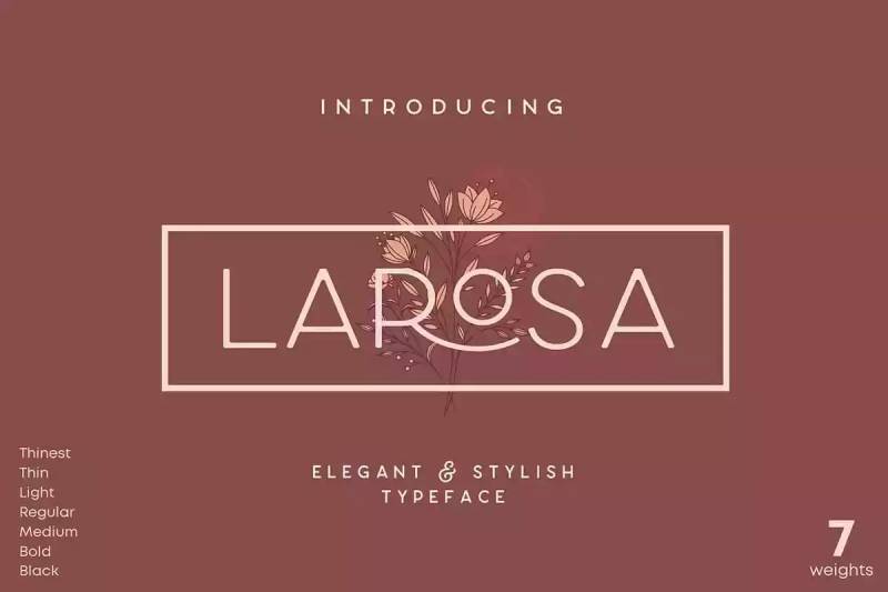
Hubert Jocham designed Larosa for Hubert Jocham Type foundry as a geometric sans-serif with contemporary European design sensibility.
Visual Characteristics
Clean geometric letterforms with sophisticated proportions. The construction shows meticulous attention to optical balance.
Stroke weight stays consistent while curves flow smoothly. Terminals show precision without feeling mechanical.
German design tradition influences the systematic approach to weight progression and spacing. Professional quality throughout.
Use Cases
High-end branding where refined geometry matters. Luxury products and services benefit from sophisticated appearance.
Editorial design for design-focused publications. Corporate communications requiring distinctive professionalism.
Websites and digital products where quality signals matter. The refined details communicate attention to design excellence.
Technical Specifications
Multiple weights available. Extended Latin character support includes Central European languages.
OpenType features support professional typography. Web font licensing available through foundry.
Similarities to Brandon Grotesque
Geometric sans-serif with carefully refined proportions. Both suitable for premium branding applications.
Contemporary interpretation of modernist tradition. Professional execution throughout weight range.
Key Differences
Larosa shows slightly more European design influence in details. Brandon’s proportions reference different historical models.
Availability and pricing differ. Each offers premium quality at boutique foundry level.
Licensing & Availability
Commercial license through Hubert Jocham Type. Premium pricing reflects boutique foundry quality.
Desktop and web licenses sold separately. Custom licensing available for specific needs.
Departura
Eduardo Tunni and Nicolas Silva created Departura as a geometric sans-serif exploring the space between Futura and contemporary grotesques.
Visual Characteristics
Geometric construction with subtle humanist touches. The forms stay true to circular foundations while allowing practical adjustments.
Consistent weight treatment creates even color. Details refined for contemporary applications while respecting historical references.
Modern interpretation that works reliably across contexts. Nothing revolutionary but everything executed competently.
Use Cases
Versatile applications from branding to editorial. The neutral character adapts to diverse design requirements.
Web and digital products. Print design from business cards to posters.
Budget-conscious projects needing professional geometric sans-serif. Mid-market branding benefits from quality at accessible price.
Technical Specifications
Multiple weights covering typical range. Extended character support for Western and Central European languages.
OpenType features include standard ligatures and figure variants. Web font formats available.
Similarities to Brandon Grotesque
Geometric foundation with refined execution. Both work professionally across diverse applications.
Contemporary style suitable for modern design contexts. Neutral enough to support rather than dominate designs.
Key Differences
Departura leans slightly more toward pure geometric tradition. Brandon incorporates more subtle warmth in details.
Pricing and market positioning differ. Both offer quality within their respective price tiers.
Licensing & Availability
Commercial license available through type distributors. Mid-range pricing tier.
Desktop and web licenses typically sold separately. Standard commercial terms apply.
Phenom Grotesque
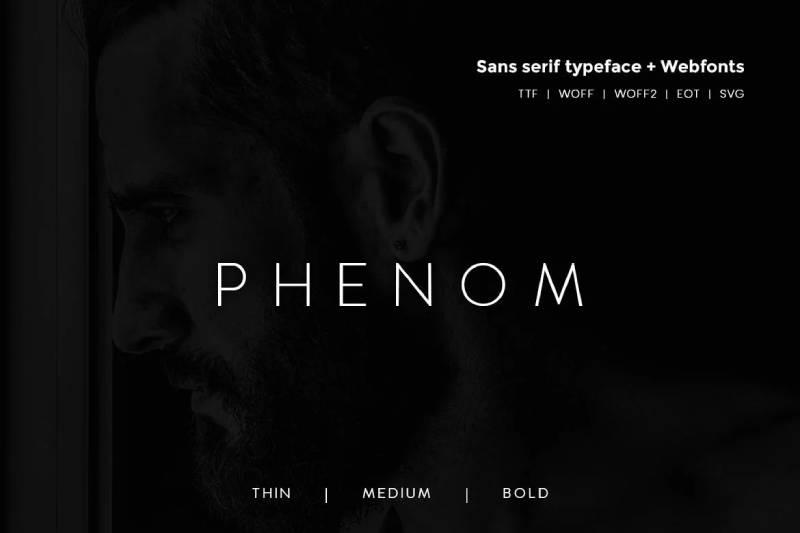
Plamen Motev designed Phenom Grotesque through Fontfabric as a neo-grotesque with geometric precision and contemporary versatility.
Visual Characteristics
Neo-grotesque letterforms with geometric influence. The construction balances Swiss design tradition with modern refinement.
Consistent stroke weight and precise curves. Open apertures support excellent legibility across size ranges.
Professional execution shows in details like kerning and spacing. The weight progression feels systematic and reliable.
Use Cases
Corporate branding requiring Swiss-influenced professionalism. Tech companies favor the clean modernist aesthetic.
Editorial layouts and magazine design. Information design and data visualization projects.
Web applications and digital products. The neutral character works across diverse interface contexts.
Technical Specifications
Extensive weight range from Thin to Black. Condensed width options available.
Extended Latin character support. OpenType features include ligatures, alternate characters, and multiple figure styles.
Web font licenses available. Desktop licensing through Fontfabric.
Similarities to Brandon Grotesque
Geometric sans-serif foundation with professional refinement. Both suitable for corporate and editorial applications.
Neutral character allows design to take center stage. Contemporary interpretation of modernist tradition.
Key Differences
Phenom Grotesque leans more toward neo-grotesque tradition. Brandon emphasizes geometric purity more directly.
Width options differ. Each offers distinctive proportions within geometric sans category.
Licensing & Availability
Commercial license through Fontfabric. Mid-range pricing typical for professional type foundry.
Desktop and web licenses available. Bundle pricing offers value for full family.
Golden Grotesque
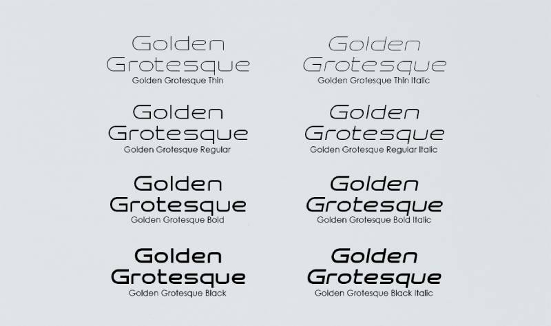
This geometric sans-serif explores the intersection of mathematical proportion and functional typography with refined contemporary execution.
Visual Characteristics
Geometric letterforms based on mathematical relationships. The construction shows systematic approach to proportion and rhythm.
Consistent stroke treatment creates even typographic color. Details refined for optimal performance across applications.
Clean, modernist aesthetic without excessive personality. Professional quality suitable for diverse contexts.
Use Cases
Branding projects emphasizing precision and clarity. Tech products and services benefit from systematic appearance.
Editorial design for design-focused content. Corporate materials requiring clean professionalism.
Digital products where geometric precision matters. The neutral character adapts to specific design requirements.
Technical Specifications
Multiple weights available. Character support covers Western and Central European languages.
OpenType features support professional typography. Web font formats available for digital applications.
Similarities to Brandon Grotesque
Geometric sans-serif foundation. Both reference modernist design principles through contemporary lens.
Professional execution suitable for commercial applications. Versatile across display and text uses.
Key Differences
Mathematical proportion approach may create slightly different rhythm. Brandon’s optical corrections prioritize visual balance over pure geometry.
Market positioning and availability differ. Each serves specific design needs within geometric sans category.
Licensing & Availability
Commercial license through foundry. Pricing varies based on specific license requirements.
Desktop and web options available. Standard commercial terms typically apply.
Catesque
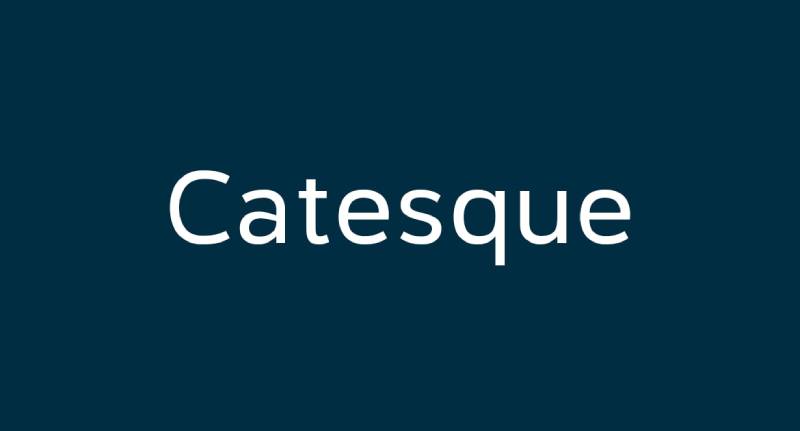
Ryoichi Tsunekawa designed Catesque through Dharma Type as a geometric grotesque with quirky personality and contemporary edge.
Visual Characteristics
Geometric construction with unexpected details. The letterforms stay functional while adding distinctive character.
Consistent weight but with personality showing through terminal treatments and proportions. More playful than typical grotesques.
The design balances usability with individuality. Works professionally while standing apart from generic geometric options.
Use Cases
Branding for creative businesses and startups. The personality helps brands stand out without sacrificing readability.
Editorial design for lifestyle and culture publications. Display typography where distinction matters.
Packaging for products targeting younger demographics. Web design for brands emphasizing creativity.
Technical Specifications
Multiple weights available. Extended Latin character support.
OpenType features include alternates that emphasize quirky personality. Standard ligatures and figure variants.
Similarities to Brandon Grotesque
Geometric sans-serif foundation. Contemporary interpretation of modernist tradition.
Professional quality suitable for commercial work. Both work across display and limited text applications.
Key Differences
Catesque pushes more personality and quirk. Brandon maintains more neutral, restrained character.
Target audiences differ slightly. Catesque serves more creative, youth-oriented markets while Brandon works broader professional contexts.
Licensing & Availability
Commercial license through Dharma Type. Budget-friendly pricing reflects indie foundry model.
Desktop and web licenses available. Self-hosting permitted under license terms.
Osande TXT
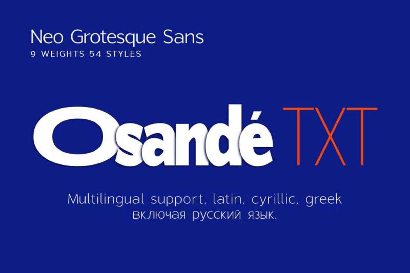
Osande TXT represents a text-optimized geometric sans-serif designed specifically for extended reading while maintaining clean geometric character.
Visual Characteristics
Geometric foundation refined for text performance. Larger x-height improves readability at smaller sizes.
Open counters and generous spacing support comfortable extended reading. Terminals and stroke endings optimized for text rather than pure geometric display.
Weight progression designed for typographic hierarchy in text-heavy documents. Details show consideration for actual reading conditions.
Use Cases
Body text in books, magazines, and long-form digital content. Documentation and technical writing requiring extended reading.
Corporate reports and professional documents. Newsletters and content-heavy websites.
Editorial applications where geometric aesthetic needed but text performance critical. Academic publications and educational materials.
Technical Specifications
Weights optimized for text hierarchy (typically Regular, Medium, Bold). Extended character support for multilingual publishing.
OpenType features include old style figures, small caps, and text-specific alternates. Careful hinting for optimal screen rendering.
Similarities to Brandon Grotesque
Geometric sans-serif foundation. Both suitable for professional applications.
Contemporary design approach. Neutral character works across contexts.
Key Differences
Osande TXT specifically optimized for text rather than display. Brandon excels more at display sizes with text as secondary function.
Proportions differ to serve different primary purposes. Each succeeds within intended application range.
Licensing & Availability
Commercial license available through type distributors. Pricing reflects text-specific optimization.
Desktop and web licenses available. Standard commercial terms.
Abside
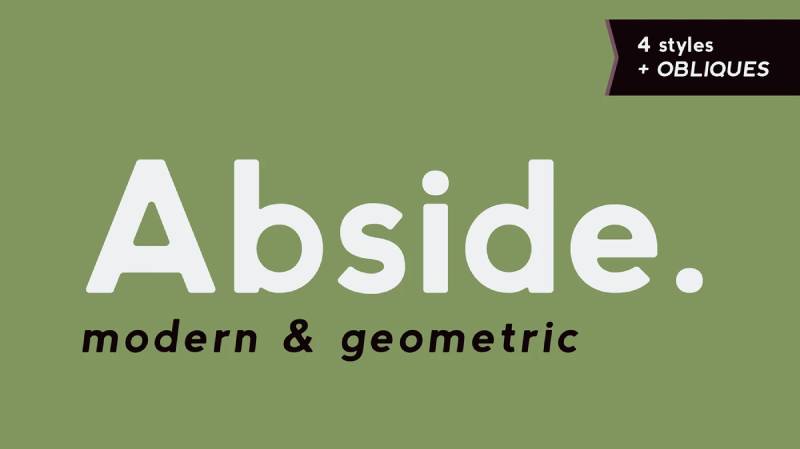
Raúl Plancarte designed Abside through BAT Foundry as a geometric sans-serif with contemporary Latin American design sensibility.
Visual Characteristics
Clean geometric letterforms with refined proportions. The construction shows systematic approach to form and spacing.
Consistent stroke weight throughout. Curves flow smoothly with careful attention to optical balance.
Professional execution with distinctive character that sets it apart from generic geometric options. Details show thoughtful design decisions.
Use Cases
Branding for modern businesses emphasizing clarity and professionalism. Tech startups and creative agencies.
Editorial design and magazine layouts. Corporate communications requiring contemporary aesthetic.
Web design and digital products. The clean forms work reliably across platforms and contexts.
Technical Specifications
Multiple weights covering typical range. Extended Latin character support includes Spanish and Portuguese.
OpenType features support professional typography. Web font licensing available.
Similarities to Brandon Grotesque
Geometric sans-serif with careful refinement. Both suitable for professional branding and editorial work.
Contemporary interpretation of modernist principles. Neutral enough to work across diverse applications.
Key Differences
Latin American design influence shows in subtle proportions and rhythm. Brandon’s European design tradition creates slightly different character.
Market positioning differs. Each serves specific design communities and needs.
Licensing & Availability
Commercial license through BAT Foundry. Mid-range pricing reflects professional quality.
Desktop and web licenses available. Standard commercial terms apply.
TT Commons Pro
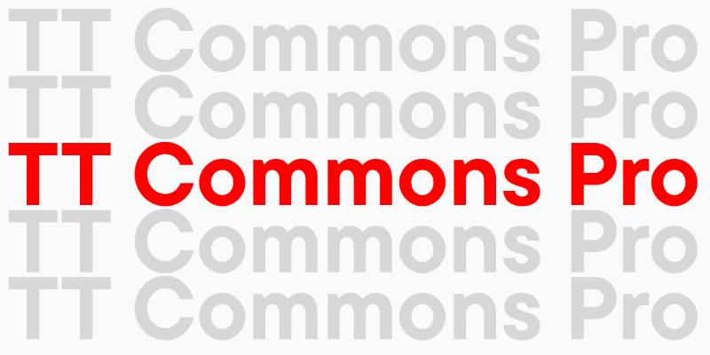
TypeType designed TT Commons Pro as an extensive geometric grotesque system offering exceptional versatility for professional typography.
Visual Characteristics
Comprehensive geometric sans-serif with multiple width options. The systematic design approach creates reliable typographic palette.
Neutral geometric character allows design to take precedence. Stroke weight stays consistent across extensive weight range.
Professional refinement throughout. Nothing flashy but everything works correctly for serious typography.
Use Cases
Large-scale branding systems requiring extensive typographic palette. Corporate identity work where systematic approach matters.
Editorial design from magazines to books. Web and app interfaces needing comprehensive type system.
Multilingual projects benefit from extensive language support. The neutral character adapts to diverse cultural contexts.
Technical Specifications
Extensive weight range (10+ weights) with multiple width options. Full Latin, Cyrillic, and Greek character sets.
Comprehensive OpenType feature set includes ligatures, stylistic sets, alternates, and figure variants. Over 1000 glyphs per font.
Variable fonts available offering smooth interpolation across weight and width axes. Web font packages optimized for performance.
Similarities to Brandon Grotesque
Geometric sans-serif foundation. Both suitable for professional branding and editorial applications.
Contemporary design approach. Neutral character works reliably across contexts.
Key Differences
TT Commons Pro offers far more extensive type system. Brandon provides focused weight range rather than comprehensive palette.
Multilingual support more extensive in TT Commons Pro. Each serves different scale of design requirements.
Licensing & Availability
Commercial license through TypeType. Professional pricing reflects comprehensive feature set.
Desktop and web licenses available. Volume licensing for large organizations.
TT Neoris
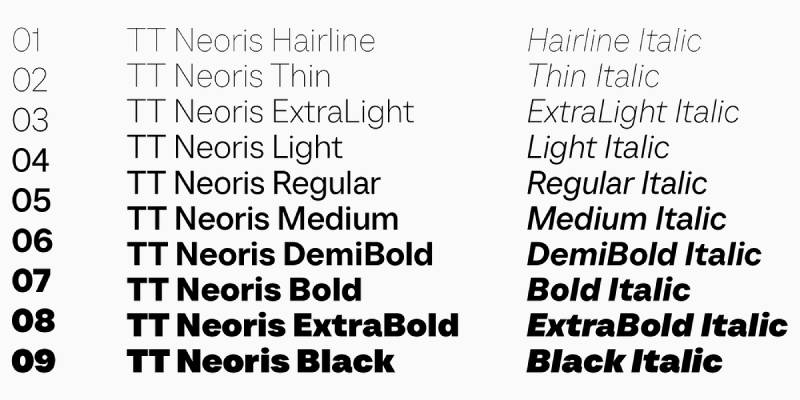
TypeType created TT Neoris as an elegant neo-grotesque combining geometric precision with refined contemporary details.
Visual Characteristics
Neo-grotesque letterforms with geometric influence. The construction balances systematic structure with humanist refinement.
Slightly condensed proportions create elegant text setting. Stroke modulation more subtle than pure humanist but present.
Sophisticated details throughout weight range. Professional refinement shows TypeType’s systematic design approach.
Use Cases
High-end branding for fashion, luxury, and design-focused businesses. The elegant proportions suit premium positioning.
Editorial design for sophisticated publications. Corporate communications requiring refined professionalism.
Web design for brands emphasizing quality and attention to detail. Digital products where typography signals quality.
Technical Specifications
Wide weight range from Thin to Black. Extended character support includes Latin, Cyrillic, and Greek.
Comprehensive OpenType features. Variable font versions available for smooth weight interpolation.
Professional-grade spacing and kerning. Multiple figure styles and ligatures.
Similarities to Brandon Grotesque
Geometric foundation with refined execution. Both suitable for premium branding applications.
Contemporary aesthetic appeals to similar design sensibilities. Professional quality throughout.
Key Differences
TT Neoris leans more neo-grotesque in character. Brandon maintains purer geometric tradition.
Condensed proportions in Neoris create different text color. Brandon’s standard width offers different rhythm.
Licensing & Availability
Commercial license through TypeType. Professional pricing reflects boutique quality.
Desktop and web licenses available. Custom licensing for specific requirements.
TT Fors
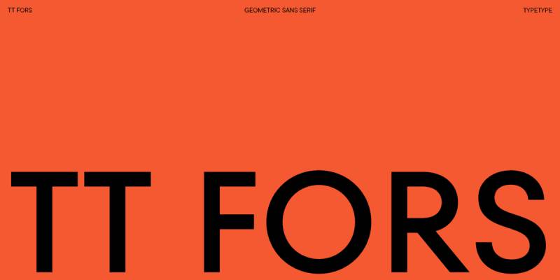
TypeType designed TT Fors as a versatile geometric grotesque for contemporary branding and digital applications with systematic approach.
Visual Characteristics
Geometric letterforms with functional refinement. The construction shows systematic design thinking.
Consistent stroke weight creates even typographic color. Details optimized for both print and screen performance.
Professional execution across extensive weight range. Nothing revolutionary but reliable and well-crafted.
Use Cases
Corporate branding requiring neutral professionalism. Tech companies and startups benefit from clean modernist aesthetic.
Web and mobile applications. The systematic design works reliably across digital contexts.
Editorial layouts and presentations. Marketing materials from digital to print.
Technical Specifications
Wide weight range with matching italics. Extended character support includes multiple scripts.
OpenType features cover professional typography needs. Variable font versions available.
Optimized for screen rendering with careful hinting. Web font packages include WOFF2 formats.
Similarities to Brandon Grotesque
Geometric sans-serif foundation. Both work across diverse professional applications.
Neutral character allows design to dominate. Contemporary interpretation of modernist principles.
Key Differences
TT Fors designed more explicitly for screen optimization. Brandon excels across both print and digital equally.
Systematic approach in Fors creates different personality than Brandon’s more artisanal refinement.
Licensing & Availability
Commercial license through TypeType. Professional pricing with good value for extensive family.
Desktop and web licenses available. Volume licensing for organizations.
TT Gertika
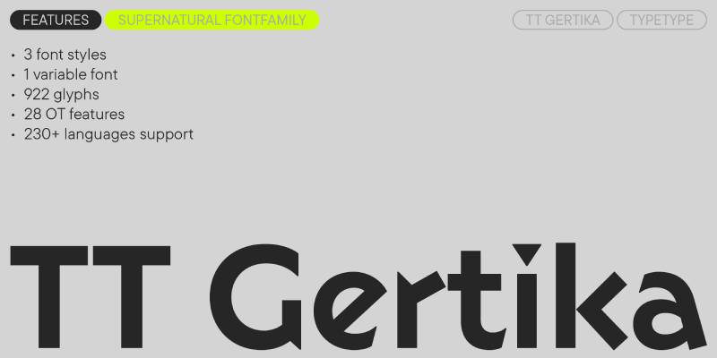
TypeType’s TT Gertika brings a fresh take on geometric grotesque tradition with distinctive personality while maintaining professional versatility.
Visual Characteristics
Geometric construction with unique details. The letterforms balance systematic structure with individual character.
Stroke weight consistent but details add warmth and personality. Open counters support excellent readability.
Modern interpretation that stands apart from generic geometric options. Professional quality with distinctive voice.
Use Cases
Branding for businesses wanting geometric clarity with personality. Creative agencies and design studios.
Editorial design where distinction matters. Marketing materials requiring standout typography.
Web design for brands emphasizing modernity and individuality. Digital products where typography contributes to brand identity.
Technical Specifications
Multiple weights with matching italics. Extended character sets include Latin and Cyrillic scripts.
OpenType features include stylistic alternates that emphasize distinctive personality. Standard ligatures and figure variants.
Variable font technology offers smooth weight interpolation. Web font packages optimized for performance.
Similarities to Brandon Grotesque
Geometric sans-serif foundation. Both work professionally across applications while offering distinctive character.
Contemporary design approach. Suitable for branding and editorial work.
Key Differences
TT Gertika pushes more individual personality. Brandon maintains more neutral, versatile character.
Details and proportions create different rhythm. Each appeals to slightly different design sensibilities.
Licensing & Availability
Commercial license through TypeType. Professional pricing reflects quality execution.
Desktop and web licenses available. Standard commercial terms.
Halis Grotesque
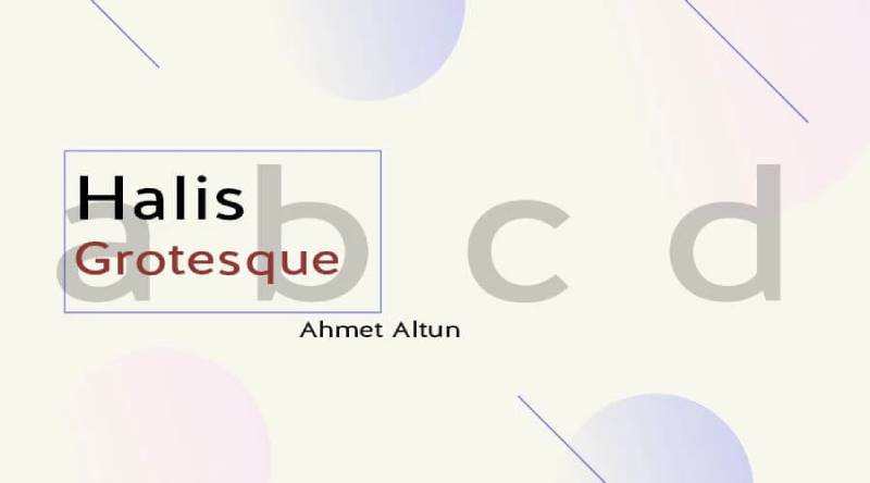
Ahmet Altun designed Halis Grotesque through Turkish foundry as a geometric grotesque with distinctive proportions and contemporary refinement.
Visual Characteristics
Geometric letterforms with unique proportions. The construction shows careful attention to optical balance and rhythm.
Consistent stroke treatment creates even color. Details refined throughout extensive weight range.
Turkish design sensibility influences subtle aspects of proportion and spacing. Professional execution throughout.
Use Cases
International branding projects. The extended language support makes it valuable for multilingual applications.
Editorial design and corporate communications. Web and digital products requiring reliable professional typography.
Brands seeking geometric sans with distinctive character that stands apart from overused options.
Technical Specifications
Extensive weight range from Thin to Black. Multiple width options (Compressed, Condensed, Normal).
Extended Latin character support with excellent Turkish language coverage. Cyrillic and Greek scripts included.
Comprehensive OpenType features. Variable font versions available for smooth interpolation.
Similarities to Brandon Grotesque
Geometric sans-serif foundation. Both suitable for professional branding and editorial applications.
Contemporary interpretation of modernist principles. Versatile across diverse contexts.
Key Differences
Halis Grotesque offers more width options. Brandon focuses on standard width with more refined details.
Turkish design influence creates subtly different character. Each brings unique perspective to geometric tradition.
Licensing & Availability
Commercial license through foundry. Professional pricing reflects extensive feature set.
Desktop and web licenses available. Good value for comprehensive family.
Klein
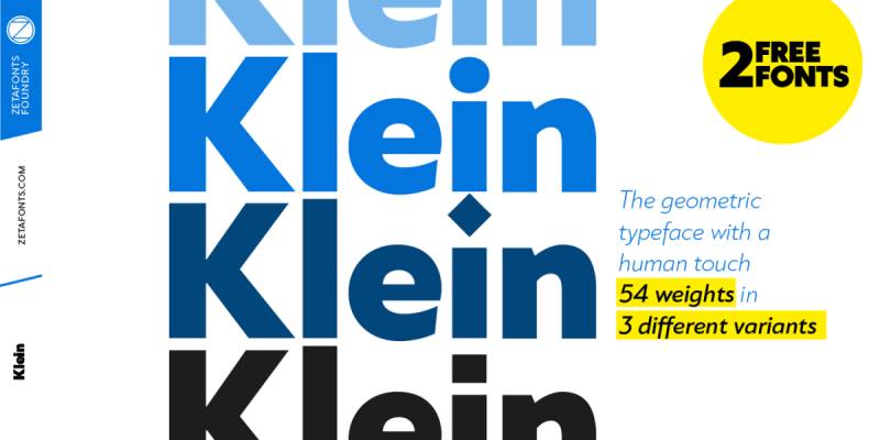
Kai Bernau designed Klein for Swiss Typefaces as a precise geometric grotesque with Swiss design tradition informing every detail.
Visual Characteristics
Pure geometric construction with Swiss precision. The letterforms show mathematical rigor applied with optical refinement.
Perfectly consistent stroke weight. Geometric forms based on circle and straight line with minimal deviation.
Professional execution reflects Swiss typography tradition. Clean, precise, systematic.
Use Cases
High-end branding for design-conscious clients. Swiss and German markets particularly value the rigorous approach.
Editorial design for architecture and design publications. Corporate identity where precision signals quality.
Wayfinding and environmental graphics. The clarity works excellently for information design.
Technical Specifications
Multiple weights covering typical range. Extended Latin character support.
OpenType features support professional typography. Meticulous spacing and kerning throughout.
Premium quality execution throughout. Every detail considered and refined.
Similarities to Brandon Grotesque
Geometric sans-serif with careful refinement. Both reference modernist design principles.
Professional quality suitable for premium applications. Contemporary execution of historical tradition.
Key Differences
Klein maintains stricter Swiss design discipline. Brandon incorporates slightly more warmth and flexibility.
Market positioning as premium Swiss Typefaces product. Pricing reflects boutique foundry quality.
Licensing & Availability
Commercial license through Swiss Typefaces. Premium pricing reflects Swiss quality standards.
Desktop and web licenses available. Professional-grade licensing terms.
Clarika
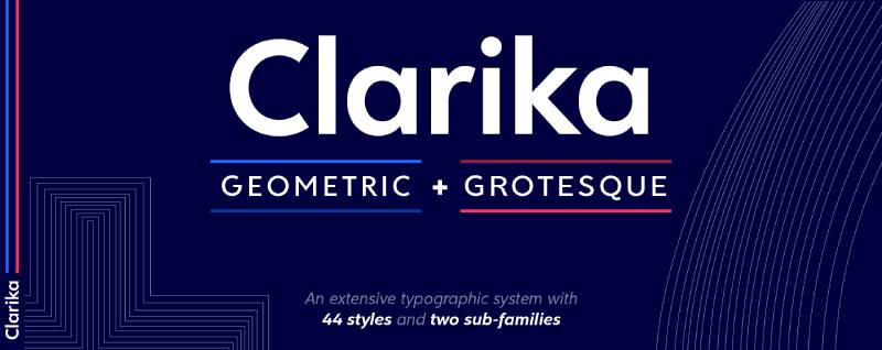
José Hernández designed Clarika through Indian Type Foundry as a geometric grotesque exploring the space between sharp precision and organic warmth.
Visual Characteristics
Geometric letterforms with selective softening. The construction balances sharp geometric precision with organic curves.
Notched terminals and angled cuts add distinctive character. The details feel modern without being trendy.
Careful balance between sharp and soft creates unique personality. Professional execution throughout weight range.
Use Cases
Contemporary branding wanting geometric foundation with personality. Design studios and creative agencies.
Editorial design for design and lifestyle publications. Packaging requiring standout typography.
Digital products where typography contributes strongly to brand identity. Web design for brands emphasizing modernity.
Technical Specifications
Wide weight range from Thin to Black. Extended Latin character support includes European languages.
Comprehensive OpenType features include stylistic alternates highlighting distinctive details. Multiple figure styles.
Variable font versions available. Web font packages optimized for performance.
Similarities to Brandon Grotesque
Geometric sans-serif foundation. Both offer professional quality with distinctive character.
Contemporary design approach suitable for modern branding. Versatile across applications.
Key Differences
Clarika’s notched terminals and angled cuts create more distinctive personality. Brandon maintains cleaner, more neutral character.
Details and rhythm differ significantly. Each appeals to different design sensibilities within geometric category.
Licensing & Availability
Commercial license through Indian Type Foundry. Professional pricing.
Desktop and web licenses available. Good value for extensive family.
Ligurino
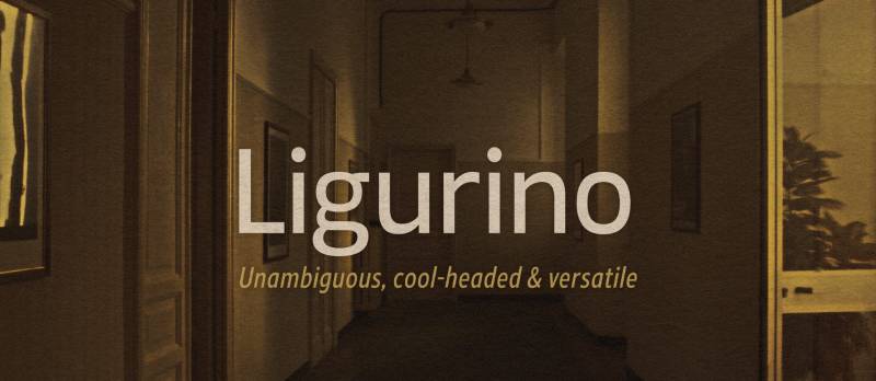
This contemporary geometric sans-serif offers clean modernist aesthetic with careful attention to functional details and professional refinement.
Visual Characteristics
Clean geometric letterforms with neutral character. The construction shows systematic approach to form and proportion.
Consistent stroke weight throughout. Curves flow smoothly with attention to optical balance.
Professional execution without distinctive personality. Reliable workhorse for diverse applications.
Use Cases
General purpose geometric sans for branding and editorial work. Corporate communications and marketing materials.
Web and digital applications. Print design from business cards to posters.
Projects requiring geometric aesthetic without premium budget. Mid-market positioning serves broad design needs.
Technical Specifications
Multiple weights covering typical range. Extended Latin character support.
OpenType features include standard ligatures and figure variants. Web font formats available.
Professional quality spacing and kerning. Reliable technical execution.
Similarities to Brandon Grotesque
Geometric sans-serif foundation. Both work professionally across diverse contexts.
Neutral character adapts to various design requirements. Contemporary modernist aesthetic.
Key Differences
Ligurino maintains more neutral positioning. Brandon offers more refined details and distinctive proportions.
Market positioning and pricing differ. Each serves specific segment of geometric sans market.
Licensing & Availability
Commercial license available through foundry. Mid-range pricing.
Desktop and web licenses typically sold separately. Standard commercial terms.
FAQ on Fonts Similar To Brandon Grotesque
What is the closest free alternative to Brandon Grotesque?
Montserrat from Google Fonts offers the closest match with geometric construction and similar proportions. Josefin Sans provides another solid option with elegant x-height and 1920s geometric influence. Both work reliably for web design without licensing costs.
Why is Brandon Grotesque so expensive?
Premium font licensing from HVD Fonts reflects meticulous craftsmanship and commercial value. The typeface took years to develop with careful optical corrections at each weight. Professional foundries price based on development investment, ongoing support, and market positioning for corporate clients.
Can I use Brandon Grotesque for logos?
Standard licenses typically allow logo usage, but verify your specific license terms. Some foundries restrict trademark use or require extended licenses. The small x-height and geometric letterforms work exceptionally well for brand identity when properly licensed.
What font pairing works best with Brandon Grotesque alternatives?
Pair geometric sans-serifs with serif fonts like Minion Pro or Georgia for strong contrast. Slab serifs like Rockwell create bold hierarchy. Avoid pairing fonts with similar geometric characteristics that compete rather than complement.
Is Avenir better than Brandon Grotesque?
Avenir excels for body text with larger x-height and humanist warmth. Brandon performs better at display sizes with elegant proportions. Neither surpasses the other universally. Choose based on whether you prioritize text readability or display elegance in your specific project.
What brands use fonts similar to Brandon Grotesque?
Apple adopted Avenir for iOS 6. Snapchat standardized on Avenir throughout their app. The Guggenheim Museum uses Verlag exclusively. Numerous tech startups and creative agencies favor geometric sans-serifs for clean modernist branding that signals contemporary design sensibility.
How many weights does Brandon Grotesque include?
Six weights span the family: Thin, Light, Regular, Medium, Bold, and Black. Each weight includes matching italics for 12 fonts total. This range covers most typographic hierarchy needs from delicate display to bold headlines without requiring multiple typeface families.
What makes a font “geometric”?
Geometric typefaces use circles, triangles, and squares as construction basis. Perfect or near-perfect circular letterforms characterize the o, e, and c. Minimal stroke contrast creates even weight. This approach originated in 1920s modernist movements like Bauhaus design.
Are Brandon Grotesque alternatives good for body text?
Some alternatives like Avenir and Lato handle extended text excellently. Brandon itself works better for display and limited text blocks. Check x-height proportions and font spacing when selecting for body text. Larger x-heights generally improve readability at smaller sizes.
Where can I download Brandon Grotesque legally?
Purchase through MyFonts, Adobe Fonts marketplace, or directly from HVD Fonts. Adobe Creative Cloud subscription includes access through Adobe Fonts. Never download from free font sites claiming to offer Brandon Grotesque. Those violate copyright and often contain corrupted files.
Conclusion
These fonts similar to Brandon Grotesque give you options across every budget and design requirement. From free Google Fonts like Montserrat to premium offerings like Verlag, each alternative brings geometric precision with unique personality.
Your choice depends on specific project needs. Need body text performance? Avenir or Lato deliver superior readability.
Want pure geometric display power? Futura and Neutraface push architectural modernism harder. Budget constraints? Josefin Sans and Cabin provide professional quality without licensing fees.
The best sans-serif font isn’t always the most popular one. Testing alternatives in your actual layouts reveals which typeface serves your design elements best.
Consider kerning, x-height, and OpenType features alongside aesthetic appeal. The right geometric grotesque elevates your work beyond generic solutions into distinctive visual hierarchy that communicates clearly.
If you enjoyed reading this article on fonts similar to Brandon Grotesque, you should check out these articles with fonts similar to Eurostile, Gotham, Calibri, Trajan, Rockwell, Baskerville, Oswald, and Montserrat.

Renowned for his expertise in logo design and visual branding, Bogdan has developed a multitude of logos for various clients.
His skills extend to creating posters, vector illustrations, business cards, and brochures. Additionally, Bogdan's UI kits were featured on marketplaces like Visual Hierarchy and UI8.
He also wrote in the past years on sites like Design Your Way, WebDesignerDepot, WPDean, Designmodo, Speckyboy, Slider Revolution, and more.
- The Windsurf Logo History, Colors, Font, And Meaning - 10 October 2026
- How to Remove Background From Product Photos (No Photoshop) - 10 October 2026
- How Designers can Build a Stronger Online Creative Identity - 9 October 2026

Bogdan Sandu is a seasoned designer who has been designing websites since 2008. Renowned for his expertise in logo design and visual branding, Bogdan has developed a multitude of logos for various clients. His skills extend to creating posters, vector illustrations, business cards, and brochures. Additionally, Bogdan's UI kits were featured on marketplaces like Visual Hierarchy and UI8. He also wrote in the past years on sites like Design Your Way, WebDesignerDepot, WPDean, Designmodo, Speckyboy, Slider Revolution, and more.
You Might Also Like