Rockwell’s geometric slab serif structure has dominated headlines and branding for decades, but licensing costs and overuse push designers toward fresh alternatives. Finding fonts similar to Rockwell that maintain that chunky, authoritative presence while offering unique personality traits requires understanding what makes geometric slabs work.
This guide examines 25 typefaces that deliver Rockwell’s bold impact through different approaches. Some lean into vintage charm with bracketed serifs, others embrace pure geometric precision, and a few add humanist warmth through rounded terminals.
You’ll discover both premium options from established foundries and free Google Fonts alternatives. Each entry breaks down visual characteristics, optimal use cases, pairing recommendations, and licensing details.
Whether you need something for editorial headlines, web interfaces, or brand identity systems, these alternatives span the full spectrum of slab serif typography.
Fonts Similar To Rockwell
| Font Name | Key Characteristics | Best Use Context | Similarity to Rockwell |
|---|---|---|---|
| Clarendon | Bold slab serifs, bracketed terminals, geometric structure with traditional warmth | Display headlines, advertising materials, editorial emphasis, vintage branding | Very High – Direct ancestor |
| Archer | Humanist slab serif, rounded terminals, approachable and friendly appearance | Brand identity, editorial design, web typography, marketing collateral | High – Softer alternative |
| Memphis | Geometric slab serif, uniform stroke width, minimal contrast, Art Deco influence | Retro designs, poster typography, architectural signage, modernist layouts | High – Geometric variant |
| Courier | Monospaced slab serif, typewriter aesthetic, uniform character width | Code documentation, technical writing, screenplay formatting, tabular data | Moderate – Functional slab |
| Museo Slab | Contemporary slab serif, multiple weights, clean lines, excellent legibility | Corporate branding, museum exhibits, wayfinding systems, digital interfaces | High – Modern interpretation |
| Roboto Slab | Neo-grotesque slab serif, optimized for screens, clean and mechanical feel | Web applications, mobile interfaces, digital publications, tech branding | Moderate – Digital-first design |
| Slabo | Extended slab serif family, designed for specific text sizes, newspaper heritage | Long-form reading, blog posts, news articles, editorial content online | Moderate – Specialized sizes |
| ChunkFive | Ultra-bold slab serif, high impact, chunky letterforms, condensed proportions | Bold headlines, event posters, attention-grabbing banners, logo design | Moderate – Display emphasis |
| Caecilia | Refined slab serif, calligraphic influence, elegant and approachable design | Book typography, magazine layouts, corporate communications, premium branding | High – Sophisticated cousin |
| Sentinel | Sturdy slab serif, newspaper roots, optimized readability, multiple widths | News websites, magazine mastheads, editorial applications, informational design | High – Editorial workhorse |
| Stymie | Classic slab serif from 1930s, squared terminals, strong presence, vintage charm | Retro branding, heritage designs, Art Deco projects, historical recreations | High – Historical parallel |
| Kameron | Open-source slab serif, rationalised letterforms, functional and clean design | Web projects with budget constraints, open-source applications, educational materials | Moderate – Accessible option |
| Freight Micro Pro | Robust slab serif optimized for small sizes, exceptional clarity in compact text | Reference materials, footnotes, captions, densely-set body text, directories | Moderate – Size-specific |
| Rokkitt | Narrow slab serif with industrial aesthetic, condensed proportions, high contrast | Space-efficient designs, poster art, vintage-modern hybrids, display typography | Moderate – Condensed variant |
| Slabien | Smooth slab serif, rounded edges, friendly personality, contemporary feel | Casual branding, lifestyle products, modern marketing, approachable interfaces | Moderate – Softer character |
| Nordin Slab | Display slab serif with Nordic influence, strong geometric foundation, clean design | Minimalist branding, Scandinavian design projects, modern architecture portfolios | Moderate – Regional variant |
| Hardora | Strong display slab with rugged character, industrial feel, bold and assertive | Sports branding, adventure marketing, bold headlines, masculine-themed designs | Low – Stylistic departure |
| Alexside | Contemporary slab serif with decorative elements, stylized letterforms | Fashion branding, creative projects, boutique design, artistic applications | Low – Decorative focus |
| Shoreline | Beach-inspired slab serif with casual personality, relaxed and informal appearance | Coastal branding, vacation marketing, surf shops, summer campaigns, resort materials | Low – Thematic specialization |
| Wildstone | Rustic slab serif with organic texture, handcrafted feel, weathered appearance | Outdoor branding, craft products, organic labels, artisanal packaging, nature themes | Low – Stylistic interpretation |
| Tigreal | Gaming-inspired slab serif with aggressive angles, modern esports aesthetic | Gaming logos, esports branding, tech startups, dynamic digital interfaces | Low – Niche application |
| Campfire | Warm slab serif with nostalgic character, friendly and inviting personality | Community projects, storytelling applications, camping brands, nostalgic designs | Low – Emotional positioning |
| Courage Union | Bold military-inspired slab serif, strong and authoritative presence | Military themes, strength-focused branding, patriotic designs, authority messaging | Low – Thematic divergence |
| Nought | Minimal slab serif with stark simplicity, reduced forms, ultra-modern aesthetic | Contemporary art, minimalist interfaces, avant-garde projects, conceptual design | Low – Minimalist approach |
| Breton | European-influenced slab serif with refined details, balanced proportions | Luxury branding, European markets, sophisticated editorial, upscale packaging | Moderate – Refined alternative |
Clarendon

Clarendon delivers the original Victorian-era boldness that influenced Rockwell’s geometric structure. Robert Besley designed this in 1845 for Fann Street Foundry.
Classification & Style
Bracketed slab serif with transitional characteristics. Created during the 1840s Industrial Revolution in Britain. Features refined brackets connecting serifs to main strokes.
Visual Characteristics
Bracketed serifs soften the bold slab appearance.
The x-height sits lower than Rockwell’s, creating traditional proportions. Weight ranges from Light to Extra Bold across multiple foundries. Ball terminals appear on C, G, and S. Upturned foot on R distinguishes it from geometric slabs.
Use Cases
Editorial headlines in newspapers and magazines. Poster work requiring traditional authority. Book titles and chapter headings. Branding for financial and institutional organizations.
Pairing Recommendations
Works with Trade Gothic for modern editorial layouts. Combines with Garamond for traditional publishing. Pairs with Helvetica for clean corporate materials.
Technical Details
Available through Adobe Fonts, Linotype, Monotype. Hermann Eidenbenz revival from 1953 remains widely used. OTF and TTF formats. Extended Latin, basic Cyrillic support in recent versions. Commercial licensing required for most versions.
Key Differences from Rockwell
Bracketed serifs create softer transitions vs Rockwell’s abrupt angles. Condensed proportions in original vs Rockwell’s wider stance. More variation in stroke weight. Traditional feel vs Rockwell’s mechanical precision.
Archer
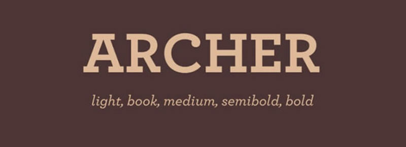
Archer brings warmth to the geometric slab structure through rounded terminals. Tobias Frere-Jones and Jonathan Hoefler created this in 2001 for Martha Stewart Living.
Classification & Style
Humanist geometric slab serif. Early 2000s design combining mid-century inspiration with contemporary refinement. Ball terminals soften the geometric foundation.
Visual Characteristics
Rounded ball terminals on uppercase C, G, J, and lowercase a, c, e.
Large x-height matching Rockwell’s readability. Eleven weights from Hairline to Ultra with corresponding italics. True italics (not slanted romans) with redrawn letterforms. Open apertures in c, e, s improve legibility at small sizes.
Use Cases
Magazine typography for body and display. Brand identities requiring approachable professionalism. Packaging design for premium consumer goods. Website headers and UI elements.
Pairing Recommendations
Matches with Gotham for contemporary branding. Combines with Mercury Text for editorial work. Works with Avenir for clean digital interfaces.
Technical Details
Available exclusively through Hoefler & Co. Premium licensing costs $199-$599 per weight. Desktop, web, and app licenses sold separately. Extensive character set with over 600 glyphs per font. Supports Western European languages fully.
Key Differences from Rockwell
Ball terminals vs Rockwell’s geometric cuts. More humanist proportions with organic curves. Wider weight range (11 vs Rockwell’s 5). Higher price point reflects custom design pedigree.
Memphis
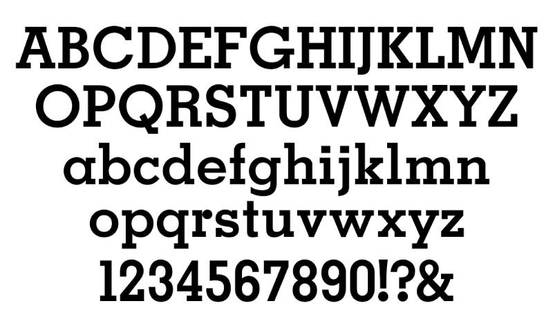
Memphis pioneered the geometric slab category in 1929. Rudolf Wolf designed this for Stempel Type Foundry.
Classification & Style
Pure geometric slab serif. Late 1920s design influenced by Futura’s geometric principles. Monoline construction with single-story a.
Visual Characteristics
Strictly geometric circles and rectangles define letterforms.
Single-story ‘a’ (handwriting style) vs Rockwell’s two-story. Perfect circles in O, Q, C, G. Monoline strokes with no weight variation. Multiple weights from Light to Extra Bold.
Use Cases
Retro branding evoking 1920s-1950s aesthetics. Sporting event materials and athletic branding. Headline typography for bold impact. Display purposes where geometric precision matters.
Technical Details
Available through Linotype and Bitstream. Also released as “Geometric Slabserif 703” by Bitstream. OTF format with basic Latin coverage. Originally included decorative swash alternates (rarely digitized). Standard commercial licensing.
Key Differences from Rockwell
More rigidly geometric vs Rockwell’s subtle optical corrections. Single-story ‘a’ creates distinctive text texture. Slightly narrower overall proportions. Less refined for extended text reading.
Courier
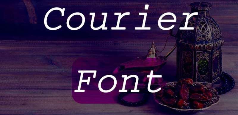
Courier defined monospaced typography for typewriters. Howard “Bud” Kettler designed this for IBM in 1955.
Classification & Style
Monospaced slab serif. Mid-1950s typewriter face. Fixed-width characters for mechanical consistency.
Visual Characteristics
Every character occupies identical horizontal space (monospaced).
Slab serifs maintain typewriter aesthetic. Minimal stroke contrast creates even color. Large x-height optimizes readability at 10-12pt sizes. Square dots and punctuation.
Use Cases
Screenplays (industry standard formatting). Coding and programming environments. Technical documentation. Legal documents requiring specific formatting.
Pairing Recommendations
Combines with sans-serif fonts for modern documentation. Works with Helvetica for technical manuals. Pairs with system UI fonts for development tools.
Technical Details
Public domain (IBM never trademarked the name). Courier New is Microsoft’s digital adaptation. Available free on virtually all systems. Multiple variants: Courier Prime, Courier Screenplay, Dark Courier. TTF and OTF formats widely distributed.
Key Differences from Rockwell
Monospaced vs proportional spacing fundamentally changes text rhythm. Designed for mechanical constraints vs optical refinement. Thinner overall weight in digital versions. Typewriter aesthetic vs display typography purpose.
Museo Slab

Museo Slab modernizes the slab serif category with friendly geometric precision. Jos Buivenga released this in 2009 through Exljbris.
Classification & Style
Contemporary geometric slab serif. 21st-century design balancing geometric structure with warmth. Companion to Museo Sans family.
Visual Characteristics
Geometric foundation with humanist touches.
Large x-height creates open, readable text. Six weights (100, 300, 500, 700, 900, 1000) plus italics. Slightly rounded corners soften geometric precision. Well-balanced proportions across weights.
Use Cases
Modern branding requiring approachable authority. Web typography for headers and navigation. App interfaces and digital products. Marketing materials balancing friendly and professional.
Pairing Recommendations
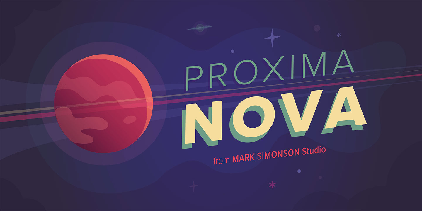
Designed to pair with Museo Sans. Works with Proxima Nova for digital interfaces. Combines with geometric sans faces naturally.
Technical Details
Available through MyFonts and Adobe Fonts. Pricing: $35 per weight, family packages available. OTF, WOFF, WOFF2 formats for web use. Approximately 455 glyphs per font. OpenType features include ligatures, old-style figures, fractions.
Key Differences from Rockwell
More weights provide greater flexibility (12 vs 5). Contemporary friendly appearance vs Rockwell’s vintage authority. Better web font optimization. Slightly more condensed at comparable weights.
Roboto Slab
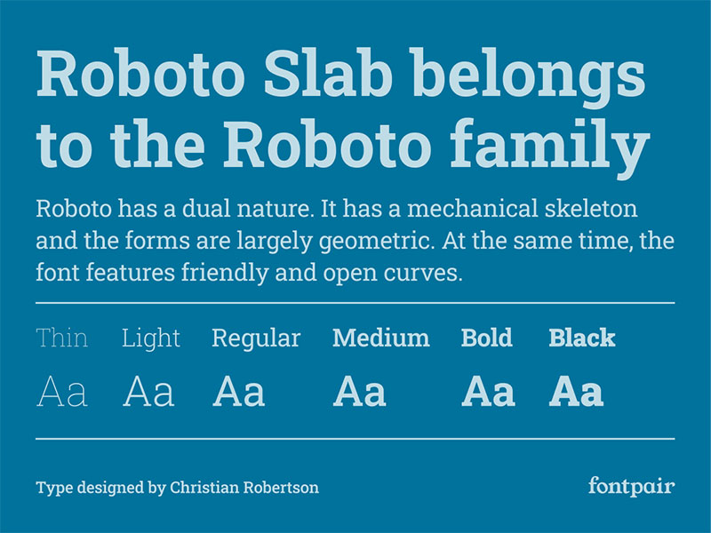
Roboto Slab brings Google’s Material Design philosophy to slab serifs. Christian Robertson designed this in 2013 for Google.
Classification & Style
Geometric neo-grotesque slab serif. 2010s design for cross-platform digital use. Variable font technology in 2019 update.
Visual Characteristics
Mechanical skeleton with geometric letterforms.
Tall x-height maximizes screen legibility. Originally four weights (Thin, Light, Regular, Bold); expanded to nine in 2019. Slightly condensed proportions optimize screen space. Open apertures in a, c, e, s improve rendering at small sizes.
Use Cases
Android app interfaces and Google products. Web typography for headers and emphasis. Digital branding requiring modern neutrality. Cross-platform applications.
Pairing Recommendations
Designed to pair with Roboto and Roboto Condensed. Works with Material Design component libraries. Combines with Open Sans for accessible interfaces.
Technical Details
Free through Google Fonts (Apache License 2.0 / OFL). Variable font version allows weight customization (100-900). WOFF, WOFF2, TTF formats. Extensive language support including Latin, Greek, Cyrillic. Commercial use fully permitted.
Key Differences from Rockwell
Digital-first optimization vs print heritage. Variable font technology offers infinite weight variations. More neutral personality vs Rockwell’s vintage character. Free availability vs Rockwell’s commercial licensing.
Slabo
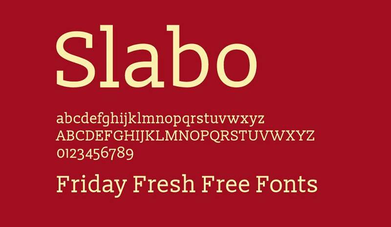
Slabo delivers size-specific optimization for web advertising. John Hudson and Tiro Typeworks created this in 2013.
Classification & Style
Size-optimized slab serif. 2010s design for specific pixel sizes (13px and 27px). Web-focused optical sizing.
Visual Characteristics
Two distinct versions optimized for 13px or 27px display.
Slabo 27px features heavier weight and wider proportions. Slabo 13px maintains clarity through increased spacing. Geometric structure with traditional slab terminals. Single weight per size variant.
Use Cases
Web banner advertising at specific sizes. Digital headlines at 27px. Small text blocks at 13px. Projects requiring pixel-perfect rendering.
Pairing Recommendations
Works with Roboto for Google ecosystem projects. Combines with Open Sans for web applications. Pairs with system fonts for predictable rendering.
Technical Details
Free through Google Fonts (SIL Open Font License). Source available on GitHub. TTF and WOFF formats. Latin character set covering Western European languages. No italic or alternate weights.
Key Differences from Rockwell
Size-specific optimization vs universal scaling. Limited to two specific sizes. Free open-source vs commercial licensing. Web-first design constraints.
ChunkFive
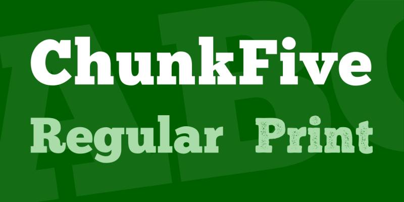
ChunkFive delivers ultra-bold impact for display work. Meredith Mandel (FontFabric) designed this.
Classification & Style
Ultra-bold display slab serif. Contemporary design emphasizing maximum weight. Single weight focused on headline impact.
Visual Characteristics
Extremely heavy weight creates strong presence.
Condensed proportions maximize space efficiency. Square geometric construction. Limited character set optimized for headlines. Minimal stroke contrast maintains boldness.
Use Cases
Poster headlines requiring maximum impact. Logo designs needing bold geometric forms. Banner advertising and promotional materials. Short display text only (not suitable for body copy).
Pairing Recommendations
Requires light sans serif for contrast (Lato, Source Sans Pro). Works with condensed sans faces. Needs ample white space for breathing room.
Technical Details
Free for personal use through FontFabric. Commercial licensing available. OTF format. Basic Latin character set. Single weight limits versatility.
Key Differences from Rockwell
Ultra-bold weight vs Rockwell’s moderated boldness. Display-only functionality vs text-capable design. More condensed proportions. Limited character set vs Rockwell’s complete family.
Caecilia
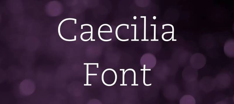
Caecilia refines the slab serif for extended reading. Peter Matthias Noordzij designed this in 1990 for Linotype.
Classification & Style
Humanist slab serif. 1990s design bridging traditional and contemporary. Text-optimized structure.
Visual Characteristics
Subtle bracketing on serifs creates reading flow.
Moderate x-height balances impact and elegance. Four weights (Light, Roman, Bold, Heavy) with italics. Slightly calligraphic curves in bowls. Refined details support extended reading.
Use Cases
Book typography for novels and non-fiction. Magazine body text. Annual reports requiring sophistication. Long-form documents needing reader comfort.
Pairing Recommendations
Combines with Syntax for clean sans contrast. Works with Optima for humanist harmony. Pairs with Frutiger for contemporary layouts.
Technical Details
Available through Linotype and Monotype. Commercial licensing required. Complete character set with extensive language support. OpenType features in recent digital versions. Multiple format options (OTF, TTF).
Key Differences from Rockwell
Humanist construction vs geometric precision. Bracketed serifs create gentler appearance. Optimized for extended reading vs display emphasis. More refined details vs Rockwell’s bold simplicity.
Sentinel

Sentinel modernizes the Scotch Roman tradition within slab serif structure. Jonathan Hoefler and Tobias Frere-Jones designed this in 2009.
Classification & Style
Contemporary Scotch-style slab serif. Early 2000s design reviving 19th-century proportions. Editorial-focused construction.
Visual Characteristics
Vertical stress in rounded letterforms.
High contrast between thick and thin strokes (for slab serif). Eight weights with matching italics. Ball terminals on select letters. Tall ascenders create elegant proportions.
Use Cases
Magazine editorial design. News publications requiring authority. Brand identities for media companies. Sophisticated digital platforms.
Pairing Recommendations
Designed to work with Gotham. Combines with Whitney for editorial systems. Pairs with Verlag for contemporary contrast.
Technical Details
Available through Hoefler & Co. Premium pricing reflects custom development. Complete OpenType feature set. Extensive language support. Web font licensing available separately.
Key Differences from Rockwell
Higher stroke contrast creates more refined appearance. Vertical stress vs Rockwell’s even weight distribution. More weights in family (16 vs 5). Editorial optimization vs general display purpose.
Stymie

Stymie delivers American geometric boldness from the early slab era. Morris Fuller Benton designed this in 1931 for ATF.
Classification & Style
Geometric slab serif. Early 1930s American design. Bold display orientation.
Visual Characteristics
Geometric circles and rectangles.
Monoline construction similar to Memphis. Multiple weights from Light to Extra Bold. American proportions (wider than European contemporaries). Clean geometric terminals.
Use Cases
Retro branding evoking 1930s-1950s America. Vintage-style posters and packaging. Headlines requiring period authenticity. Display typography for nostalgic projects.
Pairing Recommendations
Works with geometric sans faces (Futura, Avenir). Combines with script fonts for vintage charm. Pairs with condensed sans for modern contrast.
Technical Details
Available through various digital foundries. Public domain status allows multiple versions. Quality varies between digitizations. OTF format most common. Character set completeness depends on version.
Key Differences from Rockwell
More American proportions (wider). Older design heritage (1931 vs 1934). Less refined than Rockwell’s later development. Multiple competing digitizations affect consistency.
Kameron

Kameron provides a free alternative with condensed proportions. Vernon Adams designed this for Google Fonts.
Classification & Style
Contemporary slab serif. 2010s design for web use. Condensed structure.
Visual Characteristics
Slightly condensed proportions save horizontal space.
Four weights (Regular through Bold). Geometric foundation with subtle curves. Large x-height for screen readability. Clean slab terminals without brackets.
Use Cases
Web typography on budget constraints. Digital interfaces requiring condensed text. Blog headers and article titles. Projects needing free commercial fonts.
Pairing Recommendations
Works with Open Sans for Google Font ecosystems. Combines with Lato for modern websites. Pairs with Raleway for clean interfaces.
Technical Details
Free through Google Fonts (SIL Open Font License). WOFF, WOFF2, TTF formats. Basic Latin character set. No italics in original release. Limited OpenType features.
Key Differences from Rockwell
Condensed vs Rockwell’s wider stance. Free availability vs commercial licensing. Fewer weights (4 vs 5). Web-optimized vs universal use design.
Freight Micro Pro

Freight Micro Pro tackles small-size legibility challenges. Joshua Darden designed this for Darden Studio.
Classification & Style
Micro-text slab serif. Contemporary design optimized for 6-9pt sizes. Display and text hybrid approach.
Visual Characteristics
Exaggerated features compensate for small sizes.
Wider proportions prevent collapse at tiny sizes. Open counters maintain clarity. Short descenders reduce line collision. Four weights with italics.
Use Cases
Financial documents with dense information. Legal fine print requiring legibility. Data-heavy infographics. Reference materials with space constraints.
Pairing Recommendations
Works with Freight Sans and Freight Text family. Combines with larger display faces for hierarchy. Pairs with condensed sans for information design.
Technical Details
Available through Darden Studio. Commercial licensing required. Complete family pricing reflects specialization. Extensive OpenType features. Multiple format support.
Key Differences from Rockwell
Optimized for micro sizes vs Rockwell’s general use. Exaggerated features vs optical refinement. Wider proportions at small sizes. Specialized application vs versatile display font.
Rokkitt

Rokkitt delivers free geometric slabs with personality. Vernon Adams designed this for Google Fonts.
Classification & Style
Contemporary geometric slab serif. 2011 design for web use. Distinctive angular details.
Visual Characteristics
Geometric structure with angular quirks.
Six weights from Thin to Black with variable font version. Sharp angles on select terminals. Moderate x-height. Distinctive ‘g’ and ‘y’ letterforms.
Use Cases
Web headlines seeking character. Branding projects on limited budgets. Digital publications needing free fonts. Personal projects and portfolios.
Pairing Recommendations
Works with Montserrat for contemporary sites. Combines with Nunito for friendly layouts. Pairs with Poppins for modern interfaces.
Technical Details
Free through Google Fonts (SIL Open Font License). Variable font provides weight flexibility. WOFF, WOFF2, TTF formats. Extended Latin character set. No italic styles.
Key Differences from Rockwell
Angular details vs Rockwell’s rounded forms. Variable font technology vs static weights. More quirky personality vs traditional authority. Free vs commercial pricing.
Slabien
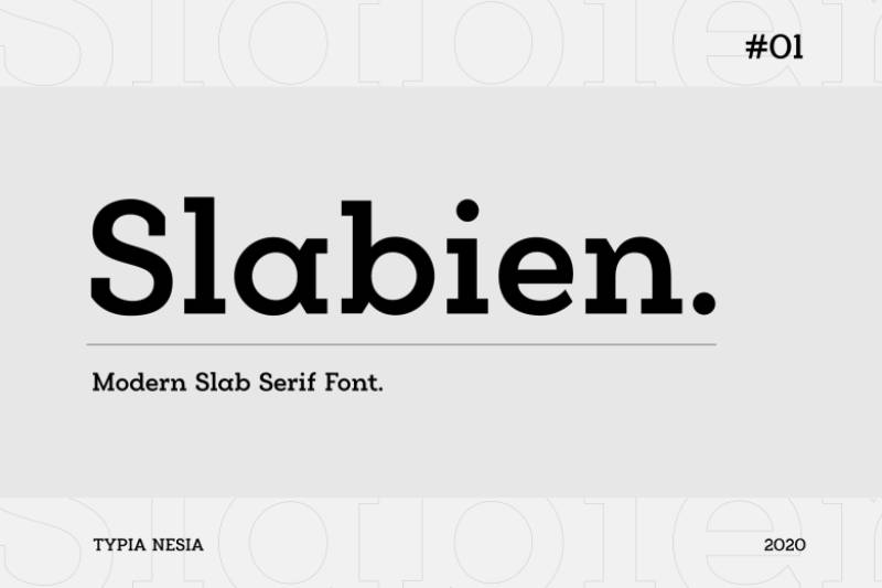
Slabien offers a modern free slab alternative with clean lines.
Classification & Style
Contemporary geometric slab serif. Recent design for digital applications. Minimal aesthetic.
Visual Characteristics
Clean geometric construction.
Multiple weights typically available. Simplified letterforms for clarity. Modern proportions. Unadorned slab terminals.
Use Cases
Modern branding projects. Digital interfaces and apps. Web typography. Minimalist design systems.
Pairing Recommendations
Works with geometric sans faces. Combines with modern display fonts. Pairs with system UI fonts.
Technical Details
Available through independent foundries. Licensing varies by source. Digital formats (OTF, TTF, WOFF). Character set varies. Check specific version for features.
Key Differences from Rockwell
More minimal approach vs Rockwell’s traditional details. Contemporary proportions. Varying availability and quality. Different licensing models.
Nordin Slab
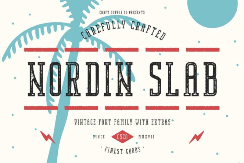
Nordin Slab brings Nordic design sensibilities to slab serifs.
Classification & Style
Contemporary slab serif. Scandinavian design influence. Clean, functional approach.
Visual Characteristics
Simplified geometric forms.
Moderate weight range. Clean slab terminals. Balanced proportions. Functional rather than decorative.
Use Cases
Scandinavian-influenced branding. Modern editorial design. Corporate materials. Digital and print applications.
Pairing Recommendations
Works with Nordic-style sans serifs. Combines with minimalist typefaces. Pairs with functional display fonts.
Technical Details
Commercial font (check specific foundry). Digital formats available. Language support varies. Standard licensing applies. Feature set depends on version.
Key Differences from Rockwell
Scandinavian minimalism vs American boldness. More restrained aesthetic. Different cultural design influences. Contemporary vs vintage character.
Hardora
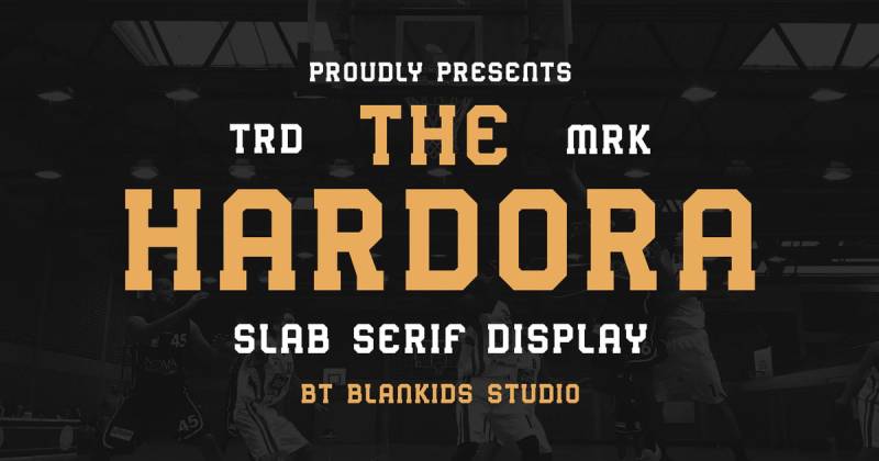
Hardora delivers bold display impact with slab structure.
Classification & Style
Display slab serif. Contemporary bold design. Headline-focused construction.
Visual Characteristics
Heavy weight emphasis.
Strong geometric foundation. Bold slab terminals. Display-optimized proportions. Limited text use suitability.
Use Cases
Poster headlines. Logo design. Advertising displays. Short impactful messaging.
Pairing Recommendations
Requires light sans serif contrast. Works with condensed fonts. Pairs with minimal typefaces.
Technical Details
Available through independent foundries. Check licensing per source. Format availability varies. Character set completeness varies. Limited weights typical.
Key Differences from Rockwell
More aggressive display emphasis. Heavier default weight. Less versatile for body text. Different design era.
Alexside
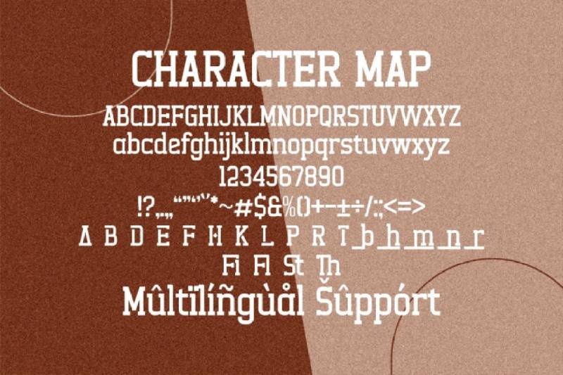
Alexside offers geometric slab characteristics with modern refinement.
Classification & Style
Contemporary slab serif. Modern geometric approach. Versatile weight range.
Visual Characteristics
Geometric letterform construction.
Clean slab serif terminals. Multiple weights available. Contemporary proportions. Balanced readability.
Use Cases
Modern branding. Digital applications. Print materials. Web typography.
Pairing Recommendations
Works with modern sans serifs. Combines with geometric typefaces. Pairs with contemporary display fonts.
Technical Details
Commercial availability (foundry-specific). Standard digital formats. Licensing per vendor. Feature set varies. Language support depends on version.
Key Differences from Rockwell
More contemporary aesthetic. Different weight distribution. Modern design sensibility. Varying availability.
Shoreline
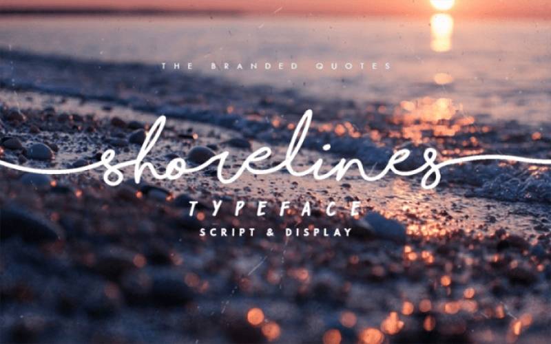
Shoreline provides casual slab serif characteristics with approachable style.
Classification & Style
Contemporary casual slab serif. Friendly geometric approach. Display-oriented design.
Visual Characteristics
Rounded, friendly forms.
Geometric foundation with softened edges. Bold weight emphasis. Large x-height. Approachable character.
Use Cases
Casual branding. Children’s materials. Friendly advertising. Display headers.
Pairing Recommendations
Works with rounded sans serifs. Combines with friendly typefaces. Pairs with casual scripts.
Technical Details
Available through font marketplaces. Commercial licensing typical. Digital format support. Basic character sets. Limited weight ranges.
Key Differences from Rockwell
Casual vs formal presentation. Rounded vs sharp geometry. Friendly vs authoritative tone. Display-only vs text capability.
Wildstone
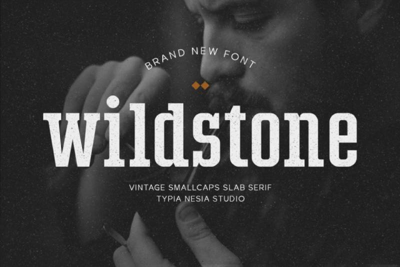
Wildstone brings rugged character to slab serif design.
Classification & Style
Display slab serif. Rustic aesthetic. Bold, textured approach.
Visual Characteristics
Heavy, bold construction.
Rough, organic edges. Strong visual impact. Display-optimized. Limited text suitability.
Use Cases
Outdoor and adventure branding. Rustic product packaging. Masculine brand identities. Poster and sign design.
Pairing Recommendations
Works with rough-hewn sans serifs. Combines with vintage typefaces. Pairs with condensed fonts for contrast.
Technical Details
Available through independent foundries. Commercial licensing required. Standard digital formats. Basic character coverage. Typically single weight.
Key Differences from Rockwell
Rustic texture vs clean geometry. Masculine character vs neutral authority. Display-only focus. Decorative vs functional emphasis.
Tigreal
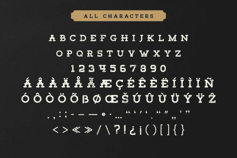
Tigreal offers modern slab characteristics with athletic energy.
Classification & Style
Contemporary display slab serif. Athletic, energetic aesthetic. Bold display orientation.
Visual Characteristics
Strong angular forms.
Athletic proportions. Bold weight emphasis. Dynamic character. Geometric foundation.
Use Cases
Sports branding. Athletic apparel design. Energy drink packaging. Youth-oriented advertising.
Pairing Recommendations
Works with athletic sans serifs. Combines with condensed bold faces. Pairs with energetic display fonts.
Technical Details
Commercial availability varies. Digital format support. Basic to extended character sets. Licensing per vendor. Limited weights common.
Key Differences from Rockwell
Athletic energy vs traditional authority. More aggressive angularity. Youth market orientation. Display-specific optimization.
Campfire
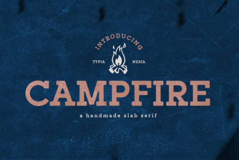
Campfire evokes outdoor adventure through slab serif warmth.
Classification & Style
Display slab serif. Rustic, outdoor aesthetic. Warm, approachable character.
Visual Characteristics
Rounded, friendly slabs.
Warm geometric forms. Bold to medium weights. Casual letterforms. Outdoor brand compatibility.
Use Cases
Outdoor equipment branding. Camping product packaging. Adventure travel materials. Rustic hospitality design.
Pairing Recommendations
Works with woodgrain textures. Combines with casual sans serifs. Pairs with script fonts for vintage appeal.
Technical Details
Available through font marketplaces. Commercial licensing applies. Standard digital formats. Basic character sets. Limited family sizes.
Key Differences from Rockwell
Outdoor casualness vs urban sophistication. Warmer character. Niche market focus. Display-oriented vs versatile.
Courage Union
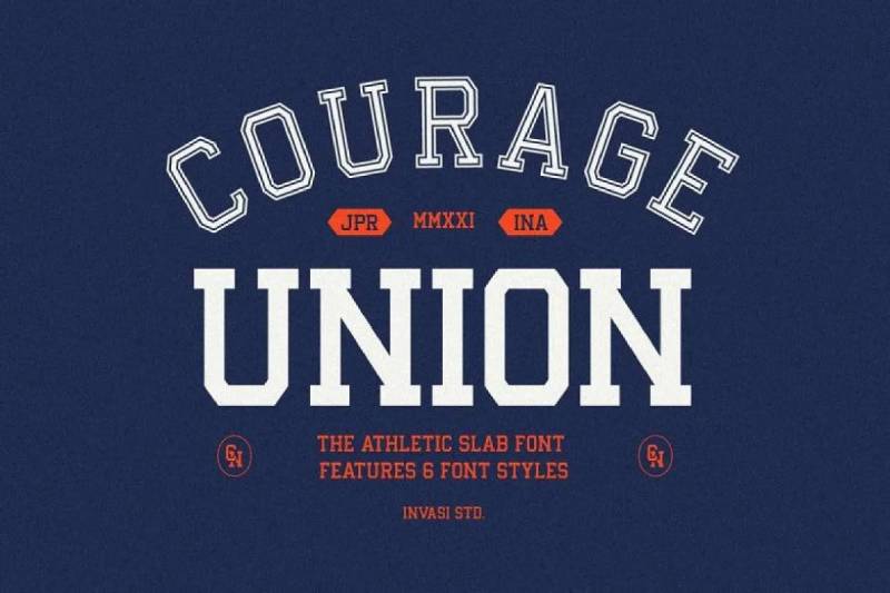
Courage Union delivers bold patriotic aesthetics through slab structure.
Classification & Style
Display slab serif. Americana-inspired design. Bold, confident character.
Visual Characteristics
Strong, bold letterforms.
Geometric slab construction. Patriotic proportions. Display-weight emphasis. Limited text functionality.
Use Cases
Americana branding. Patriotic campaigns. Vintage American aesthetics. Bold headline work.
Pairing Recommendations
Works with condensed sans faces. Combines with vintage scripts. Pairs with star-and-stripe motifs.
Technical Details
Commercial font availability. Digital format support. Basic character coverage. Standard licensing. Typically single or few weights.
Key Differences from Rockwell
Patriotic theming vs neutral authority. More decorative approach. Niche aesthetic focus. Display-only orientation.
Nought
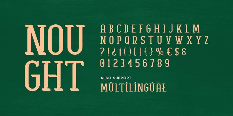
Nought provides minimalist slab serif characteristics with contemporary edge.
Classification & Style
Contemporary minimal slab serif. Clean, modern aesthetic. Geometric simplicity.
Visual Characteristics
Stripped-down letterforms.
Minimal slab details. Clean geometric construction. Multiple weights. Contemporary proportions.
Use Cases
Modern minimalist branding. Tech company materials. Contemporary editorial design. Clean digital interfaces.
Pairing Recommendations
Works with minimal sans serifs. Combines with geometric typefaces. Pairs with system fonts.
Technical Details
Commercial availability. Standard digital formats. Modern character sets. OpenType features vary. Web font formats included.
Key Differences from Rockwell
Minimalist vs traditional approach. Contemporary vs vintage character. Different design philosophy. Modern application focus.
Breton
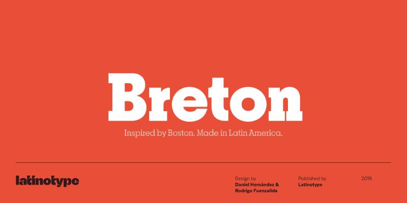
Breton refines the slab serif tradition with editorial sophistication.
Classification & Style
Contemporary editorial slab serif. Sophisticated geometric approach. Text and display versatility.
Visual Characteristics
Refined geometric forms.
Multiple weights for hierarchy. Editorial proportions. Subtle detailing. Text-capable construction.
Use Cases
Editorial publications. Sophisticated branding. Annual reports. Corporate communications.
Pairing Recommendations
Works with editorial sans serifs. Combines with traditional serif text faces. Pairs with contemporary grotesques.
Technical Details
Commercial licensing required. Professional feature sets. Extended character support. Multiple format options. Family packages available.
Key Differences from Rockwell
Editorial refinement vs display boldness. More sophisticated detailing. Contemporary proportions. Different weight distribution.
FAQ on Fonts Similar To Rockwell
What is the closest free font to Rockwell?
Roboto Slab delivers the closest free alternative through Google Fonts. Christian Robertson designed this geometric slab serif with similar weight distribution and x-height proportions. The variable font version provides weight customization from 100 to 900, matching Rockwell’s versatility without licensing costs.
Which font pairs best with Rockwell alternatives?
Sans-serif fonts create optimal contrast with slab serif typefaces. Helvetica, Futura, and Gotham work universally across most Rockwell alternatives. For contemporary projects, pair Museo Slab with Proxima Nova or Roboto Slab with Open Sans for balanced typographic hierarchy in digital interfaces.
Can I use Courier instead of Rockwell?
Courier serves different purposes due to monospaced structure. While both feature slab serifs, Courier’s fixed-width characters suit coding and screenplays, not display typography. Rockwell’s proportional spacing and optical refinement make it superior for headlines, branding, and general design work requiring visual impact.
What makes Memphis different from Rockwell?
Memphis employs stricter geometric construction with perfect circles and monoline strokes. The single-story ‘a’ creates distinctive text texture compared to Rockwell’s two-story design. Rudolf Wolf designed Memphis in 1929, predating Rockwell by five years with more rigid geometric principles from Bauhaus influence.
Is Clarendon older than Rockwell?
Yes. Robert Besley created Clarendon in 1845 for Fann Street Foundry, nearly 90 years before Rockwell. Clarendon features bracketed serifs that soften the bold slab appearance, while Rockwell maintains geometric precision. Clarendon’s Victorian heritage influenced later geometric slab serif designs including Rockwell’s 1934 release.
Which Rockwell alternative works best for body text?
Caecilia excels at extended reading through humanist slab serif construction. Peter Matthias Noordzij designed this in 1990 specifically for text-optimized legibility. Subtle bracketing and refined details support comfortable reading in books, magazines, and long-form documents where Rockwell’s display emphasis becomes fatiguing.
Are there variable font versions of slab serifs?
Roboto Slab and Rokkitt offer variable font technology through Google Fonts. Variable fonts provide infinite weight customization along continuous axes rather than fixed weights. This flexibility enables precise font spacing adjustments and responsive typography that adapts to different screen sizes without loading multiple font files.
What’s the difference between Archer and Rockwell?
Archer features rounded ball terminals on uppercase and lowercase letters, creating warmer personality. Hoefler & Frere-Jones designed this humanist geometric slab in 2001 with eleven weights versus Rockwell’s five. Archer costs $199-$599 per weight, positioning it as premium alternative with sophisticated refinement and extensive character sets.
Can I legally use Rockwell for free?
No. Rockwell requires commercial licensing through Monotype or Adobe Fonts subscriptions. The typeface remains under copyright protection despite its 1934 origin. Free alternatives include Roboto Slab, Slabo, Rokkitt, and Kameron through Google Fonts, all released under SIL Open Font License permitting commercial use.
Which slab serif font works best for logos?
Archer, Museo Slab, and Clarendon deliver strong logo design performance through distinctive character. Choice depends on brand personality: Archer for approachable sophistication, Museo Slab for contemporary friendliness, Clarendon for traditional authority. Single-weight display faces like ChunkFive suit bold minimalist marks requiring maximum impact.
Conclusion
Exploring fonts similar to Rockwell reveals the depth of slab serif typography beyond a single typeface. From Clarendon’s Victorian brackets to Roboto Slab’s digital optimization, each alternative serves distinct aesthetic and functional requirements.
Budget considerations shape selection between premium options like Archer and free alternatives through Google Fonts. Technical needs around variable fonts, web performance, and language support narrow choices further.
The geometric slab category extends from pure minimalism in Memphis to humanist warmth in Museo Slab. Understanding these distinctions enables precise font psychology applications in branding and editorial design.
Test multiple candidates in actual project contexts. Kerning, weight distribution, and x-height ratios behave differently across applications. What works for print headlines might fail in mobile interfaces.
The right typeface choice balances visual impact, readability, licensing constraints, and brand personality requirements.
If you enjoyed reading this article on The best fonts similar to Rockwell, you should check out these articles with fonts similar to Gotham, Calibri, Trajan, Montserrat, Baskerville, Oswald, and Brandon Grotesk.

Renowned for his expertise in logo design and visual branding, Bogdan has developed a multitude of logos for various clients.
His skills extend to creating posters, vector illustrations, business cards, and brochures. Additionally, Bogdan's UI kits were featured on marketplaces like Visual Hierarchy and UI8.
He also wrote in the past years on sites like Design Your Way, WebDesignerDepot, WPDean, Designmodo, Speckyboy, Slider Revolution, and more.
- The Cursor Logo History, Colors, Font, And Meaning - 24 September 2026
- Canva vs PowerPoint: Which Is Better for Presentations? - 22 September 2026
- How to Install Fonts on Mac (Step-by-Step Guide) - 20 September 2026

Bogdan Sandu is a seasoned designer who has been designing websites since 2008. Renowned for his expertise in logo design and visual branding, Bogdan has developed a multitude of logos for various clients. His skills extend to creating posters, vector illustrations, business cards, and brochures. Additionally, Bogdan's UI kits were featured on marketplaces like Visual Hierarchy and UI8. He also wrote in the past years on sites like Design Your Way, WebDesignerDepot, WPDean, Designmodo, Speckyboy, Slider Revolution, and more.
You Might Also Like