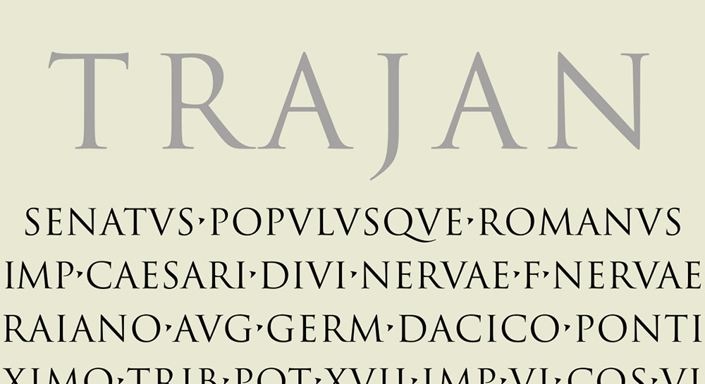
Trajan dominates movie posters and luxury branding, but overuse has dulled its impact. Designers need fresh alternatives that capture the same classical authority without triggering immediate recognition fatigue.
Finding fonts similar to Trajan means understanding what makes inscriptional capitals work. The carved stone aesthetic, elegant serif details, and Roman monument proportions create that timeless, prestigious feel clients demand.
This guide presents 14 typefaces offering Trajan’s DNA with distinct personalities. You’ll discover options ranging from Vatican-inspired inscriptional letters to contemporary interpretations of classical forms.
Each font entry covers visual characteristics, optimal applications, licensing details, and strategic pairing recommendations. Whether you’re designing film titles, premium packaging, or institutional materials, these alternatives deliver classical elegance without the cliche.
Fonts Similar To Trajan
| Font Name | Primary Characteristics | Best Use Cases | Similarity to Trajan |
|---|---|---|---|
| Monotype Classic Roman | Classical proportions with refined serifs, traditional Roman letterforms | Editorial design, book covers, formal documents | High – authentic Roman inscription style |
| Pontif | Ecclesiastical heritage, elegant capitals with chiseled characteristics | Religious publications, ceremonial materials, luxury branding | Very High – shares monumental qualities |
| Pietra | Stone-carved appearance, weathered texture, organic irregularities | Historical projects, rustic branding, architectural signage | High – emphasizes carved stone aesthetic |
| Cresci | Calligraphic influences, Renaissance-inspired capitals with flourishes | Fine art publications, classical music branding, invitations | Moderate – more decorative than Trajan |
| Stevens Titling | Display-oriented capitals, theatrical presence, strong contrast | Movie titles, book covers, dramatic headlines | High – similar cinematic gravitas |
| Porte | Architectural proportions, gateway-inspired structure, balanced forms | Corporate identity, architectural firms, institutional materials | Moderate – more geometric approach |
| Armadira Display | Bold display capitals, armored aesthetic, contemporary edge | Gaming, fantasy branding, action movie posters | Moderate – shares strength but more modern |
| Novante | Art Deco influences, geometric elegance, refined proportions | Luxury fashion, high-end packaging, premium branding | Low – different stylistic era |
| Karin | Delicate capitals, feminine qualities, refined stroke variation | Beauty brands, wedding materials, upscale retail | Low – lighter, more delicate treatment |
| The Broads | Wide letterforms, commanding presence, bold spacing | Poster design, banners, impactful headlines | Moderate – similar impact, different structure |
| Loki | Mythological character, angular features, mysterious quality | Fantasy media, Norse-themed projects, video games | Low – thematic rather than structural similarity |
| OptimusPrinceps | Imperial Roman heritage, authoritative structure, classical proportions | Historical publications, museum materials, educational content | Very High – direct Roman inspiration |
| Ringbearer Medium | Fantasy-inspired, Tolkien aesthetic, epic storytelling qualities | Fantasy literature, RPG materials, medieval-themed projects | Moderate – shares gravitas for epic narratives |
| Catwoman | Sleek capitals, feline elegance, contemporary superhero styling | Comic books, superhero media, action branding | Low – modern cinematic style vs. classical |
Monotype Classic Roman
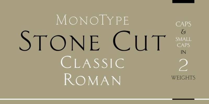
Monotype Classic Roman draws directly from inscriptional capitals found on Roman monuments. This all-capitals display font shares Trajan’s DNA through its study of the same historical sources.
Visual Characteristics
The letterforms feature refined serif structures with beautifully proportioned capitals.
Light Classic Roman presents delicate stroke weights with minimal contrast between thick and thin elements. The fineline construction creates an airy quality that distinguishes it from Trajan’s more robust forms.
Extended Latin character support covers standard punctuation and basic diacritics.
The capitals maintain classical proportions rooted in stone carving traditions.
Design Origin
Designed by Monotype Design Studio Released through Monotype’s foundry Based on Roman inscriptional lettering
The design references the same classical sources that inspired Carol Twombly’s work on Trajan.
Optimal Use Cases
Works for headline applications requiring refined classical aesthetics. The Light weight particularly suits elegant title cards and premium branding materials where emphasis without heaviness matters.
Publishing houses favor it for book titles and chapter headings.
Cultural institutions use it for exhibition materials and commemorative pieces.
Performs well in print at larger sizes but less suitable for extended body text.
Licensing & Availability
Commercial license through Monotype Available via MyFonts and Fonts.com Desktop licensing starts at approximately $39
Contains 2 style variations within the family.
Font licensing terms permit use in logos and commercial projects under standard Monotype agreements.
Pairing Recommendations
Pair with neutral sans-serif body fonts like Helvetica or Univers for institutional materials.
Combine with Renaissance-era text faces such as Bembo for historical publishing projects.
Use alongside script fonts for wedding invitations and formal announcements.
Works within classical type systems emphasizing historical authenticity.
Pontif
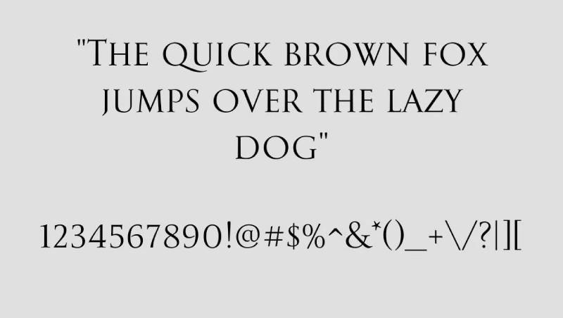
Pontif recreates the inscriptional work of Luca Horfei, the Vatican scribe who designed major inscriptions for Pope Sixtus V’s 16th-century transformation of Rome. This connects it to the same Baroque lettering traditions that influenced modern Roman capitals.
Visual Characteristics
Based on Horfei manuscript studies and on-site research in Rome conducted in 1996.
The capitals display distinctive baseline stability with classical proportions derived from Renaissance inscriptional practices. Stroke terminals show the influence of carved stone letterforms.
Character set includes standard Latin uppercase with numerals and punctuation.
Letterform details reflect hand-drawn qualities before stone cutting.
Design Origin
Designer: Garrett Boge Foundry: LetterPerfect Release: 1996
Development involved manuscript analysis and field research at Vatican inscription sites. Part of LetterPerfect’s Baroque Set collection focused on historical revival.
Optimal Use Cases
Excels in formal titling where historical gravitas matters.
Religious publications and ceremonial documents benefit from its Vatican pedigree. Museum exhibition materials and commemorative plaques suit its carved letter aesthetic.
Academic publishing houses use it for classical studies materials.
Print applications work better than digital due to detail density.
Licensing & Availability
Commercial license through LetterPerfect Available on MyFonts platform Single style offering
Desktop licenses support standard commercial use including logo design.
Webfont and app licenses available separately.
Pairing Recommendations
Combine with Centaur or Jenson for Renaissance-themed editorial work.
Pair with clean sans-serif fonts like Avenir for modern institutional branding.
Works alongside Perpetua for book design requiring classical authority.
Integrates well with other LetterPerfect Baroque Set typefaces for period-authentic projects.
Pietra
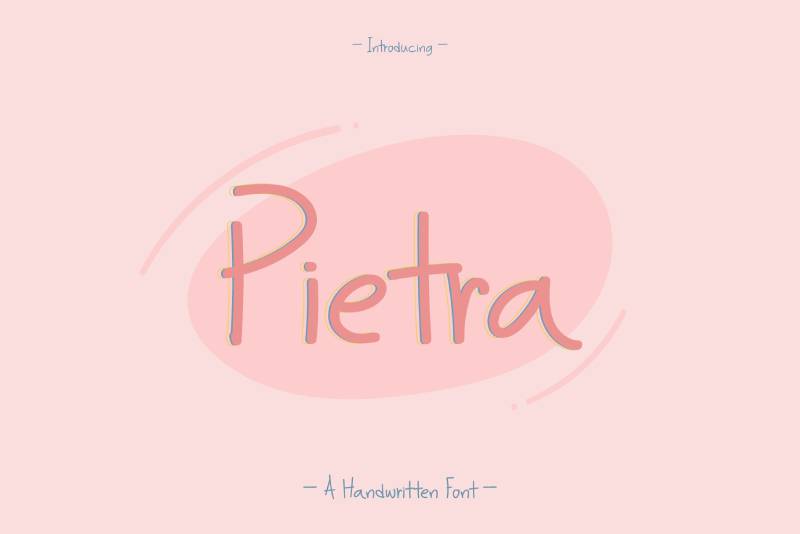
Pietra derives from massive five-foot mosaic lettering positioned high above St. Peter’s Basilica floor in Rome. This Baroque-inspired design captures monumental inscriptional forms at architectural scale.
Visual Characteristics
All-majuscule design featuring bold, architectural letterforms.
The capitals reflect mosaic construction with substantial stroke weight and commanding presence. Proportions adapt monumental scale inscriptions to text sizes.
Character structure shows influence of tile-based letter construction.
Includes basic Latin uppercase, numerals, and essential punctuation marks.
Design Origin
Designer: Garrett Boge Foundry: LetterPerfect Development based on St. Peter’s Basilica mosaic inscriptions
Field research in Rome informed the revival of these Baroque architectural letters.
Optimal Use Cases
Architectural signage and monument lettering applications.
Poster design requiring bold, authoritative headlines. Religious and ceremonial publications benefit from its Vatican origins.
Museum installations and exhibition graphics where architectural scale matters.
Performs optimally in large display sizes reflecting its monumental source material.
Licensing & Availability
Commercial license via LetterPerfect Distributed through MyFonts Single weight available
Pricing starts around $39 for desktop use.
Standard LetterPerfect terms cover commercial applications.
Pairing Recommendations
Pair with lighter serif text faces like Garamond for typographic hierarchy.
Use with architectural sans-serif fonts such as DIN for contemporary institutional projects.
Combine with other LetterPerfect historical revivals for period-consistent work.
Works alongside Trajan itself when varied weight ranges enhance visual hierarchy.
Cresci
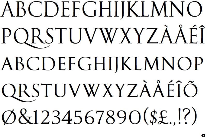
Cresci references the calligraphic traditions of Ludovico degli Arrighi, the 16th-century papal scribe whose chancery cursive influenced Renaissance typography. While Arrighi focused on italic forms, revivals of his work connect to the same period that shaped Roman capital traditions.
Visual Characteristics
Letterforms show calligraphic influence with flowing strokes.
The design maintains Renaissance proportions with elegant x-height relationships. Characters display the hand of a master scribe translated into type.
Includes both uppercase and lowercase in most revivals.
Extended character sets support multilingual typography.
Design Origin
Based on Ludovico degli Arrighi’s 16th-century lettering Various revivals by different foundries throughout the 20th century
Arrighi’s La Operina (1522) writing manual documented his influential script. Modern interpretations by designers including Frederic Warde and Robert Slimbach brought these forms to digital typography.
Optimal Use Cases
Editorial design for literary publications and poetry collections.
Fine book cover design emphasizing Renaissance aesthetics. Luxury branding requiring sophisticated calligraphic qualities.
Invitation design and formal correspondence materials.
Works across print and digital media with appropriate sizing.
Licensing & Availability
Multiple versions from different foundries (P22, Adobe, Monotype) Pricing varies by specific revival Some versions included in Adobe Fonts subscription
P22 Operina offers comprehensive OpenType features with over 1200 glyphs.
Pairing Recommendations
Pairs naturally with Centaur, as Arrighi historically served as Centaur’s companion italic.
Works with Adobe Jenson for authentic Renaissance typography systems.
Combine with Roman display capitals like Trajan for elegant contrast.
Suitable alongside modern serif text faces when classical refinement matters.
Stevens Titling

Stevens Titling references the Trajan Column alphabet while showing brush-drawn letterforms before stone carving. The four style variations reveal progressive levels of visible brushwork from refined to expressive.
Visual Characteristics
Four weights named after brush types: Sable, Badger, Boar, and Wolf.
Sable Brush shows minimal brush evidence with polished, formal capitals including small caps for classical titling. Badger Brush presents compact, firm strokes. Boar Brush reveals dramatic, visible brushwork. Wolf Brush displays strong, textured dry-brush effects.
All styles maintain inscriptional capital proportions.
Each variant offers distinct texture while preserving classical letterform integrity.
Design Origin
Designers: Ryuichi Tateno and John Stevens Foundry: Linotype Release: 2011
Collaborative work between two calligraphers exploring pre-carved letter stages. Design shows how Roman capitals appeared when sketched on marble before chiseling.
Optimal Use Cases
Film title design and movie posters requiring cinematic gravitas.
Entertainment industry branding and promotional materials. Historical drama productions and period content.
Album covers and music packaging for classical or dramatic genres.
Print materials where textural variation adds visual interest beyond standard Trajan applications.
Licensing & Availability
Commercial license through Linotype/Monotype Available on MyFonts and Fonts.com Four style family package or individual weights
Complete family approximately $296, individual styles around $74.
Desktop, webfont, and app licenses available.
Pairing Recommendations
Combine with modern sans-serif body fonts like Franklin Gothic for contemporary applications.
Use with Times New Roman or Georgia for traditional publishing contexts.
Pair lighter weights with heavier ones within the family for nuanced hierarchy.
Works alongside Trajan when projects need both polished and textured variants.
Porte
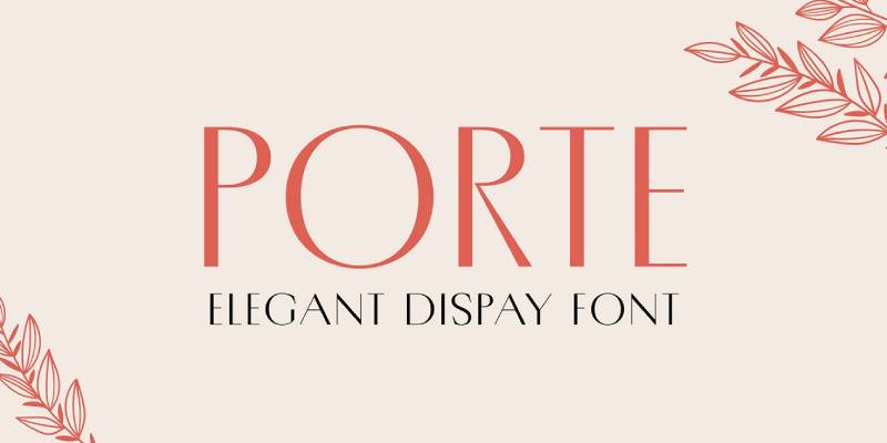
Porte draws from architectural lettering traditions emphasizing formal, structured capitals. Design characteristics align with monument inscription aesthetics.
Visual Characteristics
All-capitals construction with architectural precision.
Letterforms display strong vertical stress with balanced proportions. Serifs show influence of carved stone details.
Character spacing optimized for display applications.
Design Origin
Contemporary design inspired by classical architectural lettering Specific designer and foundry details vary by implementation
References same Roman capital traditions as Trajan.
Optimal Use Cases
Architectural firm branding and building signage.
Real estate marketing materials and property branding. Museum and cultural institution communications.
Print design requiring formal, authoritative presence.
Licensing & Availability
Licensing terms depend on specific version Check with distributing foundry for current availability
Multiple interpretations exist across different type libraries.
Pairing Recommendations
Pair with architectural sans-serif fonts for cohesive institutional identity.
Combine with serif text faces for editorial applications.
Works within classical type systems requiring formal capitals.
Armadira Display
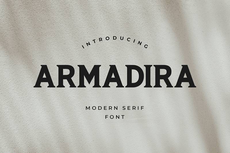
Armadira Display offers a contemporary take on classical capitals with refined detailing suited for luxury and premium applications.
Visual Characteristics
Display-optimized letterforms with elegant proportions.
Capitals show refined serif construction with sophisticated details. Stroke modulation creates visual interest while maintaining readability.
Character set supports extended Latin typography.
Design Origin
Contemporary design with classical influences Digital optimization for modern display applications
Balances historical references with current aesthetic sensibilities.
Optimal Use Cases
Luxury brand identity and high-end product packaging.
Fashion editorial headlines and boutique retail applications. Premium hospitality and lifestyle branding.
Digital and print media requiring sophisticated presence.
Licensing & Availability
Commercial licensing through publishing foundry Desktop and webfont formats available
Specific pricing varies by license scope.
Pairing Recommendations
Combine with elegant sans-serif fonts like Futura or Avenir.
Pair with luxury script fonts for fashion and beauty branding.
Works with modern serif text faces in editorial contexts.
Suitable for premium type systems emphasizing refinement.
Novante
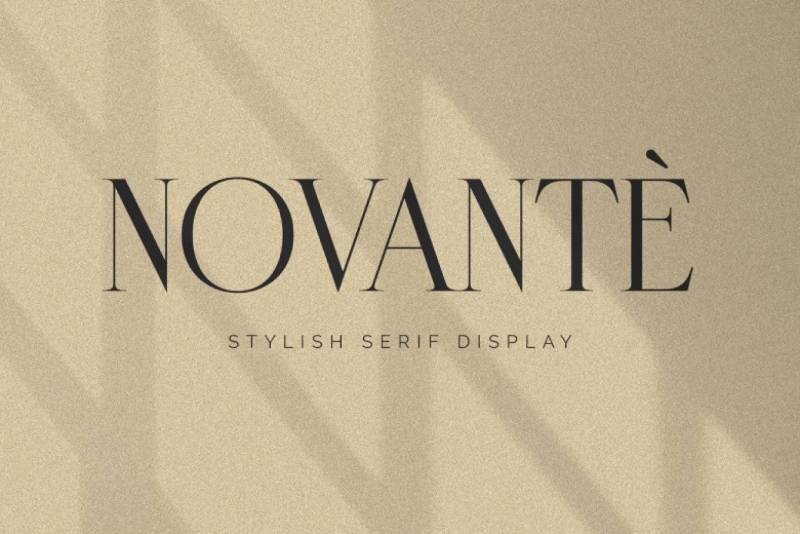
Novante presents classical capital forms with contemporary refinement suited for modern applications requiring historical resonance.
Visual Characteristics
Capital letterforms with balanced classical proportions.
Design maintains inscriptional qualities while optimizing for current media. Stroke details reference carved letter traditions.
Design Origin
Contemporary interpretation of Roman capitals Digital design for versatile application
Synthesizes historical forms with modern technical requirements.
Optimal Use Cases
Corporate branding requiring classical authority.
Editorial design for business and professional publications. Marketing materials needing sophisticated presence.
Versatile across print and digital platforms.
Licensing & Availability
Commercial license through distributing foundry Standard desktop and web formats
Check current vendors for specific terms.
Pairing Recommendations
Pair with professional sans-serif fonts for business communications.
Combine with traditional serif text faces for formal documents.
Works in contemporary type systems needing classical elements.
Karin
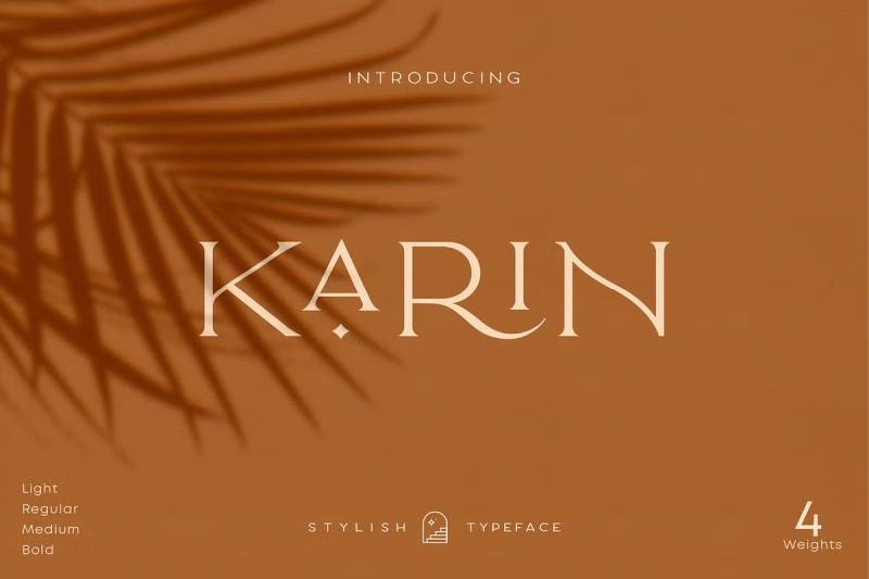
Karin offers delicate capital forms with refined detailing appropriate for elegant applications requiring understated sophistication.
Visual Characteristics
Lightweight capitals with graceful proportions.
Letterforms show subtle stroke variation with refined serif details. Character spacing maintains openness and clarity.
Design Origin
Contemporary design with classical influences Optimized for display typography
Emphasizes elegance over robustness.
Optimal Use Cases
Wedding invitations and formal event materials.
Beauty and wellness brand identity. Boutique retail and artisanal product packaging.
Applications where delicacy and refinement matter most.
Licensing & Availability
Commercial licensing available Desktop and webfont versions
Specific terms vary by distributor.
Pairing Recommendations
Combine with elegant script fonts for formal invitations.
Pair with light sans-serif fonts for contemporary feminine branding.
Works with other refined serif faces in luxury contexts.
The Broads
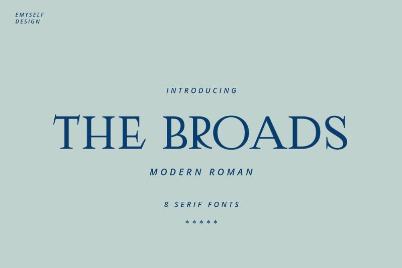
The Broads presents wide, commanding capitals with bold presence suitable for impactful display applications.
Visual Characteristics
Extended width capitals with substantial weight.
Letterforms feature strong horizontal emphasis with balance across character widths. Serifs provide stability while maintaining visual interest.
Design Origin
Contemporary design emphasizing width and presence Optimized for attention-grabbing applications
Width variations create distinctive character.
Optimal Use Cases
Advertising and promotional headline design.
Poster applications requiring bold statements. Packaging design where shelf presence matters.
Media requiring immediate visual impact.
Licensing & Availability
Commercial license available Standard format offerings
Check with foundry for current terms.
Pairing Recommendations
Pair with condensed or narrow fonts for dynamic contrast.
Combine with neutral body text faces for readability.
Works in systems emphasizing typographic variety.
Loki
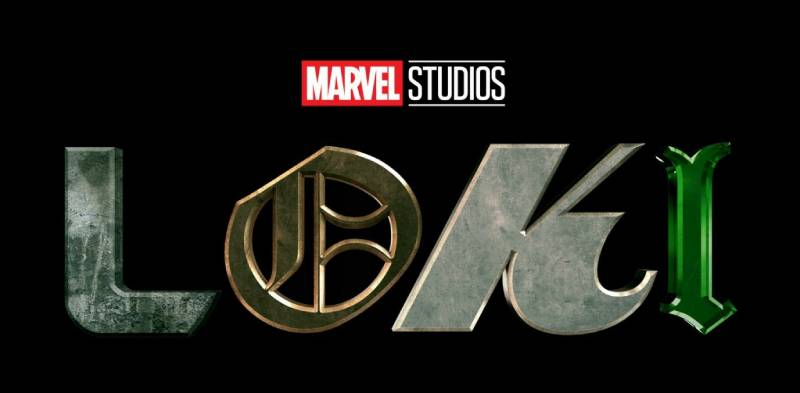
Loki interprets classical forms with distinctive character suited for projects requiring personality alongside historical reference.
Visual Characteristics
Capital forms with unique stylistic details.
Letterforms balance classical structure with contemporary interpretation. Character design includes distinctive elements that differentiate from standard Roman capitals.
Design Origin
Contemporary design with classical foundation Individual character in letterform details
Adds personality to traditional inscriptional forms.
Optimal Use Cases
Creative industry branding and design studios.
Entertainment and media applications. Cultural projects needing distinctive voice.
Situations where standard classical fonts feel too conventional.
Licensing & Availability
Commercial licensing available Desktop and digital formats
Terms vary by specific implementation.
Pairing Recommendations
Combine with modern sans-serif fonts for creative contexts.
Pair with playful or expressive secondary typefaces.
Works when projects need classical reference with personality.
OptimusPrinceps

OptimusPrinceps offers bold, authoritative capitals derived from Roman inscriptional traditions with emphasis on command and presence.
Visual Characteristics
Robust capital letterforms with strong stroke weight.
Characters display classical proportions with enhanced visual authority. Serif construction emphasizes stability and permanence.
Full uppercase alphabet with numerals and punctuation.
Design Origin
Contemporary design rooted in Roman imperial inscriptions Emphasizes strength and authority in letterforms
Name references Latin terms for “best” and “emperor” reflecting its commanding aesthetic.
Optimal Use Cases
Government and institutional communications.
Legal and financial services branding. Historical and educational publications.
Applications requiring authoritative classical presence.
Corporate identity for established organizations.
Licensing & Availability
Free for personal use in most distributions Commercial licensing may require separate agreement
Available through various font repositories.
Check specific license terms before commercial deployment.
Pairing Recommendations
Pair with traditional serif text faces like Times New Roman for formal documents.
Combine with professional sans-serif fonts for business materials.
Works alongside other Roman capital fonts when weight variation creates hierarchy.
Suitable for classical type systems requiring bold display elements.
Ringbearer Medium

Ringbearer Medium replicates the lettering used in Peter Jackson’s “The Lord of the Rings” trilogy logo. While not historically based like Trajan, it shares similar formal capital characteristics with fantasy aesthetic elements.
Visual Characteristics
All-capitals design with decorative details.
Letterforms feature tapered strokes and distinctive terminals creating medieval/fantasy character. Proportions reference classical capitals while adding stylistic embellishment.
Character set includes 152 glyphs covering basic Latin range.
Stroke modulation creates dramatic contrast.
Design Origin
Designer: Pete Klassen Created before 2005 Fan-made recreation of movie logo lettering
Developed after extensive search for the original Lord of the Rings logo font proved unsuccessful. Based on various international logo variations from the film trilogy.
Optimal Use Cases
Fantasy gaming and entertainment branding.
Science fiction and fantasy book covers. Movie poster design for genre films.
Fan projects and creative works inspired by fantasy literature.
Role-playing game materials and fantasy-themed events.
Licensing & Availability
Free for personal use Commercial use may require permission Available on DaFont and various free font sites
Over 1.1 million downloads indicate widespread adoption.
Verify current licensing terms before commercial projects.
Pairing Recommendations
Combine with medieval or Gothic-style script fonts.
Pair with rugged serif text faces for fantasy publishing.
Works alongside decorative initial caps in book design.
Use with Celtic or fantasy-themed ornamental elements.
Catwoman
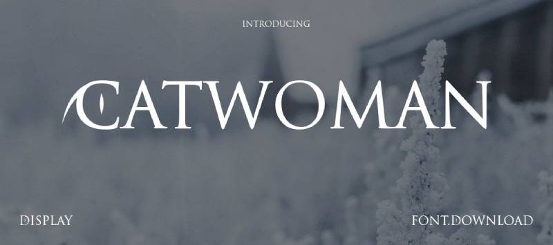
Catwoman provides bold, dramatic capitals with distinctive character suited for entertainment and creative applications requiring strong personality.
Visual Characteristics
Heavy weight capitals with dramatic presence.
Letterforms feature distinctive stylistic elements differentiating from standard Roman capitals. Character design emphasizes visual impact and memorability.
Stroke weight creates commanding presence at display sizes.
Design Origin
Contemporary design with entertainment industry appeal Named styling suggests comic book or pop culture influence
Balances classical capital structure with distinctive character details.
Optimal Use Cases
Entertainment industry branding and motion graphics.
Comic book and graphic novel typography. Video game title design and promotional materials.
Youth-oriented brand identity requiring energy and impact.
Applications where standard classical fonts lack necessary personality.
Licensing & Availability
Free for personal use widely available Commercial licensing status varies
Found on various font download platforms.
Verify license terms for specific commercial applications.
Pairing Recommendations
Combine with modern sans-serif fonts for contemporary projects.
Pair with other bold display faces when layered typography desired.
Works with dynamic, energetic type systems for entertainment brands.
Use alongside action-oriented graphic elements and bold color palettes.
FAQ on Fonts Similar To Trajan
What makes a font similar to Trajan?
Serif fonts resembling Trajan share inscriptional capital characteristics from Roman monuments. Key features include classical proportions, elegant stroke terminals, carved stone aesthetics, and all-caps construction. These typefaces reference the same historical lettering traditions that inspired Carol Twombly’s original design.
Are there free alternatives to Trajan?
OptimusPrinceps, Ringbearer Medium, and Catwoman offer free personal licenses with Trajan-like characteristics. However, commercial projects typically require paid alternatives like Stevens Titling or Pontif. Free options often lack the refinement and complete character sets of professional typefaces.
Which font is closest to Trajan Pro?
Monotype Classic Roman and Stevens Titling Sable Brush most closely match Trajan’s refined inscriptional qualities. Both derive from identical Roman capital sources. Stevens Titling adds small caps, while Classic Roman offers fineline elegance. Neither replicates Trajan exactly but capture its classical authority.
Can I use Trajan alternatives for movie posters?
Stevens Titling specifically targets film title design with four textural variants. Pontif, Pietra, and OptimusPrinceps also work for cinematic applications. These fonts deliver Roman capital gravitas without Trajan’s overexposure in entertainment branding and promotional materials.
What’s the best Trajan alternative for luxury branding?
Armadira Display and Karin provide sophisticated refinement for premium applications. Pontif suits religious or ceremonial luxury contexts. Monotype Classic Roman Light works for understated elegance. Selection depends on whether brands need bold presence or delicate sophistication.
Do these fonts work for body text?
No. These display fonts optimize for headlines and titles, not extended reading. All-caps construction and decorative details reduce readability in body text. Pair them with readable serif or sans-serif text faces. Use for headlines only.
How do I pair Trajan-style fonts with body text?
Combine inscriptional capitals with Renaissance serif text faces like Jenson, Bembo, or Garamond for historical projects. Use neutral sans-serif fonts like Helvetica or Avenir for contemporary applications. Maintain clear typographic hierarchy with substantial size differences.
Are these fonts suitable for web design?
Most work better in print due to intricate serif details requiring larger display sizes. Webfont licenses exist for digital use, but test rendering across devices. Simpler alternatives like OptimusPrinceps translate better to screens than heavily detailed carved letter styles.
What industries use Trajan-style fonts most?
Entertainment, luxury goods, publishing, museums, religious institutions, and legal services favor classical Roman capitals. These industries value historical authority, timeless elegance, and prestigious associations. Architectural firms and educational institutions also use inscriptional typefaces for formal communications.
How much do commercial Trajan alternatives cost?
Professional alternatives range from $39 to $296 depending on family size and foundry. Single weights like Pontif or Pietra cost around $39-74. Complete families like Stevens Titling (4 weights) approach $300. Font licensing terms vary by intended use.
Conclusion
These fonts similar to Trajan expand your typography toolkit beyond the overused default. Each alternative brings distinct character while maintaining the inscriptional capital aesthetic clients expect.
Stevens Titling offers versatility through four brush variants. Pontif and Pietra deliver Vatican authenticity for ceremonial applications.
Monotype Classic Roman provides refined elegance, while OptimusPrinceps adds bold authority.
Success depends on matching typeface personality to project context. Film titles need different energy than museum exhibitions. Luxury branding requires subtlety that legal documents don’t.
Test alternatives at actual use sizes before committing. What works in poster design may fail in packaging.
Consider font licensing terms early in projects. Free options suit personal work, but commercial applications demand proper licenses.
These classical alternatives keep your work fresh while honoring Roman lettering traditions that have lasted millennia.
If you enjoyed reading this article about fonts similar to Trajan, you should check out these articles with fonts similar to Gotham, Calibri, Montserrat, Rockwell, Baskerville, Oswald, and Brandon Grotesk.

Renowned for his expertise in logo design and visual branding, Bogdan has developed a multitude of logos for various clients.
His skills extend to creating posters, vector illustrations, business cards, and brochures. Additionally, Bogdan's UI kits were featured on marketplaces like Visual Hierarchy and UI8.
He also wrote in the past years on sites like Design Your Way, WebDesignerDepot, WPDean, Designmodo, Speckyboy, Slider Revolution, and more.
- Versatile Georgia Font Pairing for Timeless Layouts - 24 October 2026
- How to Turn Inconsistent UI into One Design System (Without a Full Redesign) - 24 October 2026
- Beautiful Fonts Similar to Poppins You Should Try - 22 October 2026

Bogdan Sandu is a seasoned designer who has been designing websites since 2008. Renowned for his expertise in logo design and visual branding, Bogdan has developed a multitude of logos for various clients. His skills extend to creating posters, vector illustrations, business cards, and brochures. Additionally, Bogdan's UI kits were featured on marketplaces like Visual Hierarchy and UI8. He also wrote in the past years on sites like Design Your Way, WebDesignerDepot, WPDean, Designmodo, Speckyboy, Slider Revolution, and more.
You Might Also Like