

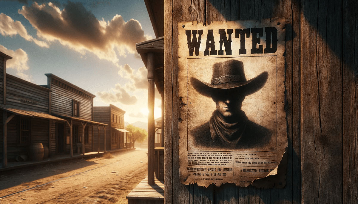
Making a wanted poster is the process of creating a vintage-style design featuring a subject’s photo, description, and reward information using graphic design software or online tools.
People need this for costume parties, themed events, classroom projects, or creative gifts.
This guide covers how to make a wanted poster in 8 steps requiring 20-30 minutes and basic design software knowledge.
Prerequisites
Before starting your vintage poster design, gather these resources:
- Design software: Adobe Photoshop CC 2024, Canva (free or paid), or GIMP
- Subject photograph: High-resolution image (minimum 1200×1600 pixels for print)
- Skill level: Beginner acceptable (basic software navigation helpful)
- Time estimate: 20-30 minutes for complete poster
- Display method: Digital sharing or physical printing
- Printer access: If creating printable wanted poster
Step 1: How Do You Choose the Format and Dimensions?
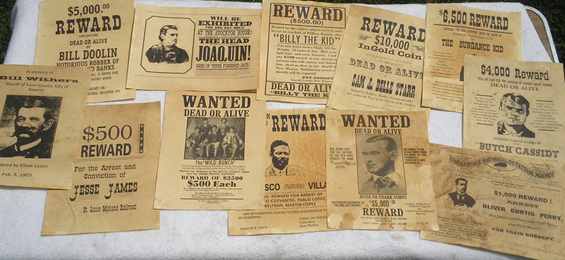
Select your poster format based on intended use, digital displays need RGB color mode at 72 DPI, while printed versions require CMYK at 300 DPI.
Standard poster sizes range from 8.5×11 inches (letter) to 18×24 inches (medium poster).
Action:
- Document Setup: File > New > Custom dimensions
- Width and Height: 8.5×11 inches (standard), 11×17 inches (tabloid), or 18×24 inches (display)
- Resolution: 300 DPI for print output / 72 DPI for digital screens
- Color Mode: CMYK for physical printing / RGB for web use
- Canvas result: Blank artboard appears with specified dimensions
Purpose: Format selection determines output quality and prevents pixel degradation when scaling.
Step 2: Where Do You Add the Background Color or Texture?
Create an aged paper effect using sepia tones (#F4E4C1 to #D4B896) or apply distressed texture overlays to simulate old west poster authenticity.
The background establishes your visual hierarchy and sets period-appropriate context.
Action:
- Background Layer Creation: Layer > New Fill Layer > Solid Color
- Color Selection: Sepia tone (#E8D5B7), aged yellow (#F5DEB3), or cream (#FFF8DC)
- Texture Application: Filter > Texture > Texturizer > Sandstone (100% scale, 4 relief)
- Distressing Method: Layer > Layer Style > Pattern Overlay > Grunge texture (50-70% opacity)
- Result: Vintage-aged appearance with authentic wear
Understanding hue and saturation helps create period-accurate color schemes.
Apply monochrome colors for extreme vintage authenticity.
Purpose: Background texture provides historical context and improves text legibility through contrast.
Step 3: How Do You Insert and Position the Subject Photo?
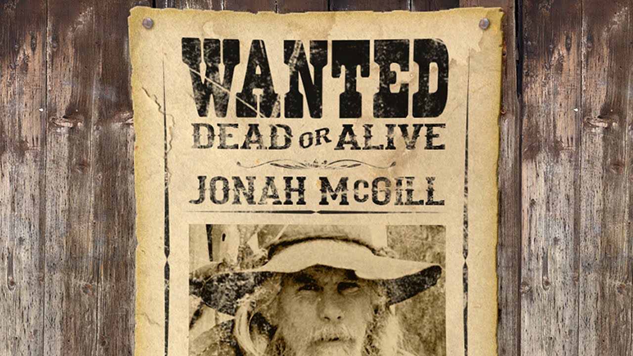
Import your subject photograph and position it in the upper third of the canvas, maintaining proper scale and proportion for optimal focal point creation.
The subject photo requires a border to separate it from background elements.
Action:
- Image Import: File > Place Embedded (Photoshop) / Uploads tab > Your image (Canva)
- Transform Tool: Select image > Ctrl+T (Windows) / Cmd+T (Mac)
- Sizing: Hold Shift key > Drag corner handles to 4×5 inch dimensions
- Position Coordinates: Center horizontally at 4.25 inches / Vertical position at 2 inches from top
- Border Creation: Edit > Stroke > 8-12 pixels > Black (#000000) > Inside
- Result: Framed mugshot photograph centered in upper composition
Lock aspect ratio during scaling to prevent image distortion.
Bitmap images lose quality when enlarged-source images must meet minimum resolution requirements.
The focal point draws immediate attention to the subject’s identity.
Purpose: Proper image placement follows the rule of thirds and maintains balance in poster composition.
Step 4: Where Do You Add the “WANTED” Header Text?
Position the “WANTED” text at the top of your design using bold western typography-slab serif fonts like Playbill, Clarendon Bold, or Rockwell Extra Bold work best.
Header size should be 72-96 points depending on canvas dimensions.
Action:
- Text Tool Selection: Type Tool (T) from toolbar
- Font Settings: Typeface = Playbill or Clarendon Bold / Size = 84pt / Style = Bold / Color = #000000
- Text Input: Type “WANTED” in all capitals
- Position: Top margin at 0.5 inches / Center alignment (Ctrl+Shift+C / Cmd+Shift+C)
- Optional Distressing: Filter > Distort > Roughen Edges (3-pixel radius)
- Result: Bold header establishing immediate poster recognition
Consider pairing fonts that complement the western aesthetic.
Display fonts grab attention but should be limited to headers.
Proper kerning between letters prevents awkward spacing (adjust to -50 for tighter appearance).
Purpose: Header text establishes immediate poster identity and leverages font psychology to convey authority.
Step 5: How Do You Include Subject Information Details?
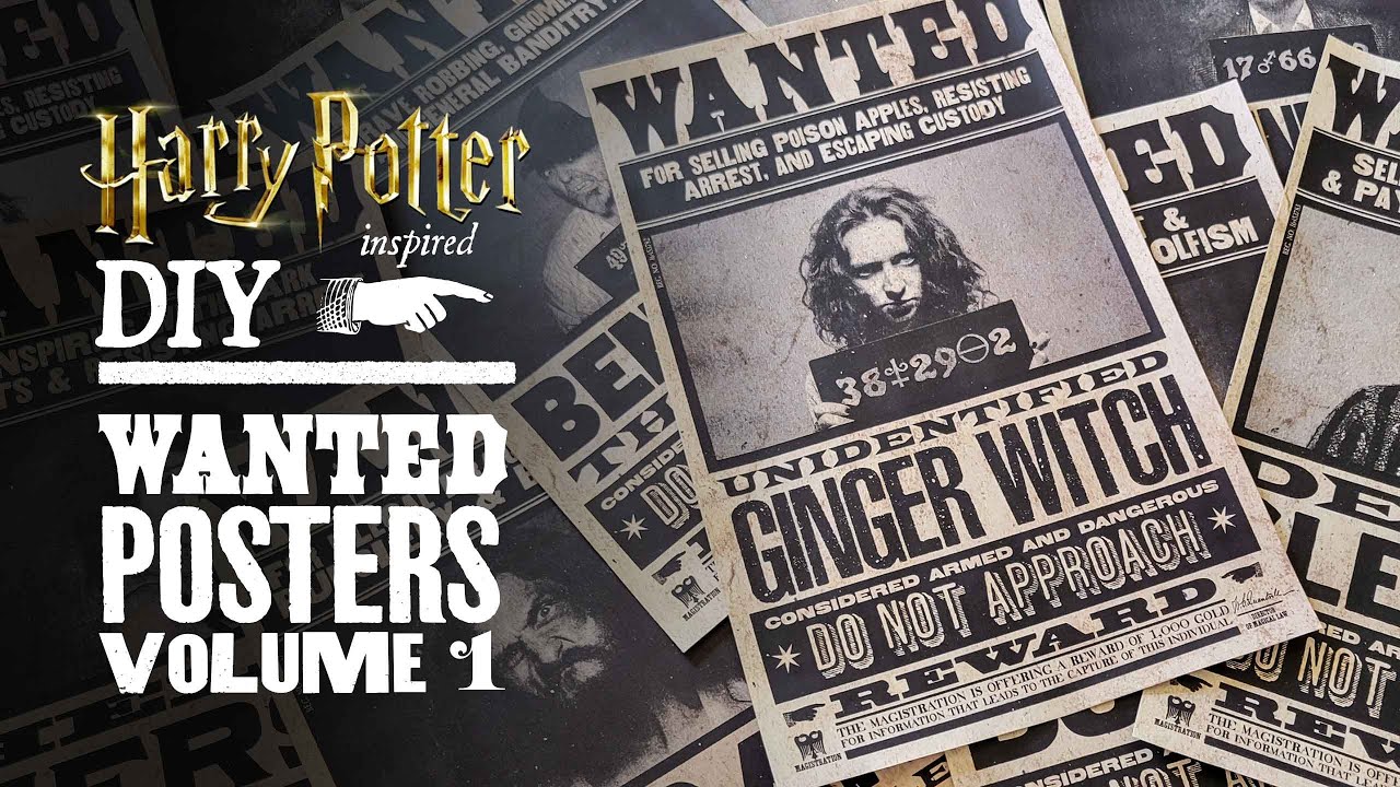
Add subject details in hierarchical text blocks-name, alias, crime, physical description, and reward amount use descending font sizes for proper typographic hierarchy.
Information formatting follows old west bounty poster conventions.
Action:
- Name Field: Type Tool > Font = 36pt Serif font > “NAME: [Subject Name]” > Position below photo at 7 inches vertical
- Alias/Details: Font = 24pt > Line spacing (leading) = 32pt > “ALIAS: [Nickname]”, “CRIME: [Offense]”
- Physical Description: Font = 18pt > “HEIGHT: [X feet]”, “WEIGHT: [X lbs]”, “DISTINGUISHING MARKS: [Features]”
- Reward Amount: Font = 48pt bold > “REWARD: $[Amount]” > Position at 10 inches vertical
- Text Alignment: Center all fields (horizontal alignment at 4.25 inches)
- Result: Structured information hierarchy with scannable details
Use baseline alignment to maintain vertical rhythm across text blocks.
Adjust tracking to +25 for improved readability in body text.
Implementing font spacing prevents text from appearing cramped.
Purpose: Information hierarchy guides eye movement from most to least critical details using emphasis principles.
Step 6: How Do You Add Decorative Border Elements?
Apply ornamental borders using rectangular frames, western-style corner decorations, or simple black strokes to contain design elements and create authentic period styling.
Border thickness ranges from 8-20 pixels depending on canvas size.
Action:
- Rectangle Tool Selection: Tools panel > Rectangle Tool (U)
- Border Creation: Draw outline 0.25 inches from canvas edge > Fill = None > Stroke = 12 pixels black
- Corner Decorations: Insert > Shapes > Ornamental corners (optional) > Position at four corners
- Double Border: Layer > Duplicate Layer > Offset inner border by 0.125 inches
- Style Options: Solid line, dashed pattern (12px dash, 6px gap), or decorative rope pattern
- Result: Professional framing that contains composition
Symmetry in border placement maintains visual stability.
Border design follows graphic design principles of containment and direction.
Purpose: Borders establish clear content boundaries and reinforce unity across design elements.
Step 7: Where Do You Add Contact or Footer Information?
Insert footer details at bottom margin-issuing authority name, date, contact method, or reward claim instructions use smaller typography (12-16pt) for supporting information.
Footer text provides authenticity and context completion.
Action:
- Text Tool: Type Tool (T) > Click bottom area at 10.5 inches vertical
- Content Input: “ISSUED BY: [Sheriff/Marshal Name]” / “DATE: [Period-appropriate date]” / “CONTACT: [Location/Station]”
- Font Settings: Sans-serif font = 14pt / Color = #333333 (dark gray)
- Alignment: Center horizontally > 0.25 inches from bottom edge
- Optional Elements: “DEAD OR ALIVE” tagline, jurisdiction seal, warning text
- Result: Complete attribution establishing poster authority
Footer follows proximity principle by grouping related information.
Proper scale and proportion keeps footer subordinate to main content.
Purpose: Supporting details complete narrative while maintaining information hierarchy through size differentiation.
Step 8: How Do You Export the Final Poster?
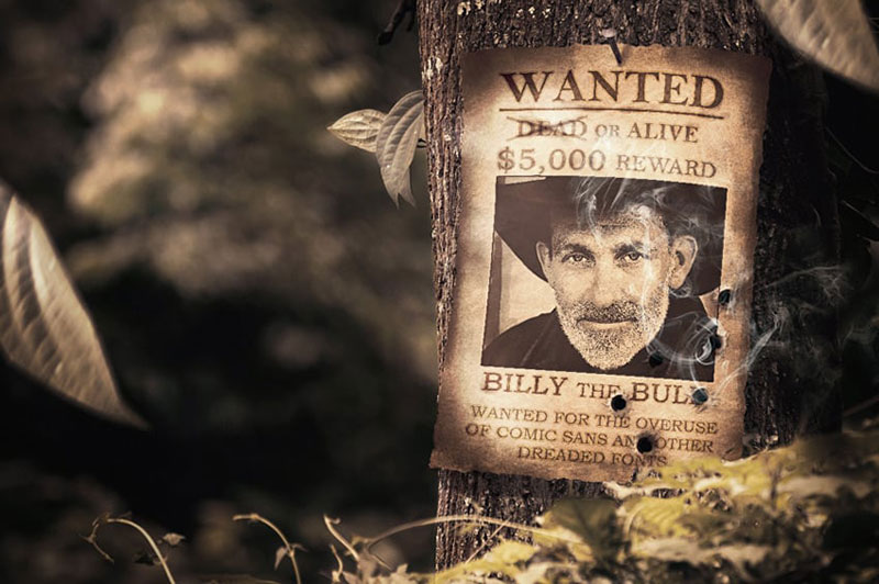
Image source: Tutsplus
Save your wanted poster design in appropriate file format-PDF maintains quality for printing, PNG preserves transparency for digital use, JPEG creates smaller files for web sharing.
Export settings determine final output quality and file size.
Action:
- Export Menu Access: File > Export > Export As (Photoshop) / Download button (Canva)
- Format Selection: PDF (print quality, 300 DPI), PNG-24 (digital with transparency), JPEG (web sharing, quality 10-12)
- Resolution Verification: Confirm 300 DPI for print / 72 DPI for screen display
- Color Profile: Embed ICC profile > CMYK for print / sRGB for digital
- Save Location: Desktop > Posters folder > Filename “wanted-poster-[subject-name]”
- Result: Print-ready or web-optimized file in specified format
PDF format embeds fonts and preserves vector graphics for scalability.
PNG supports transparency for layering over different backgrounds.
Purpose: Proper export maintains design integrity across different output methods and viewing contexts.
Verification
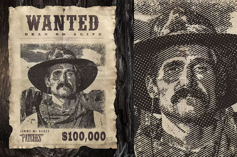
Check final poster quality before distribution or printing.
Visual Inspection:
- Text legibility at 3 feet viewing distance (print test at actual size)
- Subject photo clarity without pixelation or blur
- Color accuracy matching intended aged appearance
- Border alignment and symmetry across all edges
- White space distribution preventing overcrowding
Technical Confirmation:
- File resolution meets output requirements (300 DPI print minimum)
- Color mode matches production method (CMYK print / RGB digital)
- File size appropriate for intended use (under 5MB for email, larger acceptable for printing)
- Font embedding confirmed in PDF exports
- Image dimensions match ordered print size
Print one test copy before ordering large quantities.
View digital versions on multiple screen sizes to confirm responsive scaling.
Troubleshooting
Text Appears Pixelated or Blurry
Verify resolution settings match output method-300 DPI minimum for physical printing.
Check text remains as editable type layers, not rasterized pixels.
Solution: Image > Image Size > Resolution = 300 pixels/inch > Resample = Preserve Details 2.0.
Convert any flattened text back to vector by retyping on new layers.
Colors Look Different When Printed
Confirm CMYK color mode for print projects instead of RGB screen colors.
Monitor displays cannot accurately preview CMYK output-request printed proof from print service.
Solution: Image > Mode > CMYK Color before exporting.
Run test print on identical paper stock as final production.
Use Pantone color matching system for critical brand colors.
Photo Quality Degraded in Final Output
Source image resolution insufficient for canvas dimensions at print resolution.
Enlarging bitmap images beyond 120% introduces visible quality loss.
Solution: Replace subject photo with higher resolution version (minimum 1200×1600 pixels for 4×5 inch print area).
Calculate required pixels: (desired inches × DPI) = minimum pixel dimensions.
Use image upscaling software only as last resort-native resolution always superior.
File Size Too Large for Digital Sharing
High-resolution print files (300 DPI) create multi-megabyte documents unsuitable for email or web hosting.
Compression reduces file size but may introduce artifacts.
Solution: Create separate digital version at 72-96 DPI with optimized compression.
File > Export > Save for Web > JPEG quality 80 (balances size and appearance).
Crop canvas to minimum dimensions needed for digital display.
Alternative Methods
Method A: Graphic Design Software (Current Guide)
Specifications:
- Time: 20-30 minutes
- Complexity: Moderate (requires software familiarity)
- Tools: Adobe Photoshop CC 2024, GIMP, Affinity Photo
- Cost: $10-55/month subscription or $70 one-time purchase
- Best for: Professional quality with complete customization control
- Output: High-resolution files suitable for any reproduction method
- Skill requirement: Basic layer management and tool navigation
Full control over every design element from background texture to font selection.
Produces print-ready files meeting commercial printing specifications.
Method B: Online Template Tools
Specifications:
- Time: 10-15 minutes
- Complexity: Low (drag-and-drop interface)
- Tools: Canva, PosterMyWall, Adobe Express
- Cost: Free to $13/month
- Best for: Quick creation without installed software
- Output: Template-based designs with preset layouts
- Skill requirement: None-point and click operation
Pre-designed templates provide instant structure and styling.
Limited customization compared to professional software but adequate for casual use.
Browser-based operation requires stable internet connection.
Method C: Word Processor Method
Specifications:
- Time: 15-20 minutes
- Complexity: Low (basic document editing)
- Tools: Microsoft Word, Google Docs, Pages
- Cost: Free (Google) to $7/month (Microsoft 365)
- Best for: Simple posters without advanced effects or precise control
- Output: Basic layouts suitable for home printing
- Skill requirement: Text and image insertion only
Insert > Pictures handles photo placement, Insert > Text Box manages information fields.
Lacks texture effects, precise positioning, and professional typography controls.
Acceptable for classroom projects, party decorations, or rough drafts.
Selection Criteria:
Choose Method A when output requires commercial printing or professional presentation standards.
Choose Method B when speed matters more than complete design control or software access unavailable.
Choose Method C when creating simple versions for immediate casual use without quality requirements.
Related Processes
After creating your vintage poster design, explore these connected techniques:
Design Enhancement:
- How to make a poster for comprehensive poster creation fundamentals
- How to make a movie poster applies similar dramatic presentation techniques
- Distressed texture creation in Photoshop for authentic aging effects
Typography Skills:
- Fonts for posters covers optimal typeface selection for impact
- Western typography selection for period-accurate font choices
- Typography principles guide professional text treatment
Output Preparation:
- How to frame a poster for professional display mounting
- How to hang a poster without damage to walls or print
- How to flatten a poster removes shipping creases and curls
Related Design Projects:
- How to make a beer poster uses similar vintage aesthetic techniques
- Poster design explores broader principles and applications
- Print design fundamentals for professional output preparation
Design Theory:
- Color theory informs sepia tone and vintage color selection
- Design elements breakdown for composition understanding
- Repetition principles create visual consistency across poster elements
FAQ on How To Make A Wanted Poster
What software works best for creating a wanted poster?
Adobe Photoshop CC 2024 provides complete control over design elements including texture overlays, typography adjustments, and layer management. Canva offers template-based creation with drag-and-drop simplicity for beginners. GIMP serves as free alternative with professional features but steeper learning curve.
Can I make a wanted poster without design experience?
Online poster generators like Canva and PosterMyWall provide pre-designed western style templates requiring only photo insertion and text editing. These tools need zero graphic design software knowledge. Templates handle layout composition, font selection, and decorative border elements automatically.
What resolution should my subject photo be?
Source images need minimum 1200×1600 pixels for standard 4×5 inch photo placement at 300 DPI print resolution. Digital-only posters accept 72 DPI but print quality suffers. Calculate required pixels by multiplying desired print inches by resolution (5 inches × 300 DPI = 1500 pixels minimum).
Which fonts look most authentic for vintage wanted posters?
Slab serif fonts like Playbill, Clarendon Bold, Rockwell Extra Bold, and Egyptian Slate replicate old west typography accurately. Western-themed display fonts emphasize bold, condensed letterforms. Pair decorative headers with readable serif body text for information fields maintaining period authenticity.
What file format should I use for printing?
PDF format at 300 DPI with embedded fonts and CMYK color mode ensures print shops receive complete specifications. PNG-24 preserves transparency and quality but creates larger files. JPEG compresses well for digital sharing but avoid for professional printing due to lossy compression artifacts.
How do I create an aged paper texture effect?
Apply sepia tone colors (#E8D5B7 to #D4B896) as background fill, then add Texturizer filter with Sandstone setting at 100% scale. Layer grunge pattern overlays at 50-70% opacity creates wear marks. Distort edges using Roughen filter with 3-pixel radius for torn appearance matching vintage poster aesthetics.
What size should I make my wanted poster?
Standard letter size (8.5×11 inches) works for home printing and handheld viewing. Tabloid (11×17 inches) increases visibility for wall displays. Medium poster size (18×24 inches) suits party decorations or photo opportunities. Match poster dimensions to intended display context and available printing capabilities.
Can I use my phone to create a wanted poster?
Mobile apps including Canva, Adobe Express, and PosterMyWall offer touch-based editing with template libraries. Phone cameras provide adequate subject photos if well-lit and properly focused. Export limitations on mobile may restrict resolution-transfer to computer for high-quality print preparation exceeding basic sharing needs.
How much does it cost to print a wanted poster?
Home printing costs $0.50-2 per letter-size sheet depending on ink and paper quality. Online print services charge $5-15 for single 18×24 inch posters on standard paper. Specialty papers (aged parchment, cardstock) add $3-10 per print. Bulk orders reduce per-unit costs significantly for party or event quantities.
What information belongs on a traditional wanted poster?
Include “WANTED” header, subject photograph with border, name field, alias or nickname, crime description, physical characteristics (height, weight, distinguishing marks), reward amount prominently displayed, issuing authority name, date, and contact method. Footer adds jurisdiction details or “Dead or Alive” tagline for authenticity matching historical bounty poster conventions.
Conclusion
Creating authentic vintage wanted posters requires balancing period-appropriate design elements with modern graphic design software capabilities. Understanding how to make a wanted poster involves mastering western typography, aged paper textures, proper image placement, and export settings matching your output method.
Software selection determines workflow efficiency. Adobe Photoshop offers complete control over every design element from background gradients to decorative border details. Canva provides faster template-based creation suitable for party decorations and casual projects.
Print quality depends on resolution settings and color mode selection. Commercial printing demands 300 DPI with CMYK color profiles, while digital sharing accepts 72 DPI RGB formats with smaller file sizes.
Master these fundamentals and you’ll produce reward posters matching old west bounty aesthetics. Whether for costume events, classroom activities, or creative gifts, proper technique transforms simple layouts into authentic-looking criminal identification notices that capture Wild West period styling perfectly.
If you liked this article about how to make a wanted poster, you should check out this article about how to make a poster.
There are also similar articles discussing poster sizes, how to make a beer poster, how to create a poster in PowerPoint, and making a poster in Word.
And let’s not forget about articles on how to make a movie poster, how to hang a poster, how to frame a poster, and how to flatten a poster.

Renowned for his expertise in logo design and visual branding, Bogdan has developed a multitude of logos for various clients.
His skills extend to creating posters, vector illustrations, business cards, and brochures. Additionally, Bogdan's UI kits were featured on marketplaces like Visual Hierarchy and UI8.
He also wrote in the past years on sites like Design Your Way, WebDesignerDepot, WPDean, Designmodo, Speckyboy, Slider Revolution, and more.
- Canva vs PowerPoint: Which Is Better for Presentations? - 22 September 2026
- How to Install Fonts on Mac (Step-by-Step Guide) - 20 September 2026
- From Mockup to Code: How AI-Augmented Development Speeds Up the Design Handoff - 19 September 2026

Bogdan Sandu is a seasoned designer who has been designing websites since 2008. Renowned for his expertise in logo design and visual branding, Bogdan has developed a multitude of logos for various clients. His skills extend to creating posters, vector illustrations, business cards, and brochures. Additionally, Bogdan's UI kits were featured on marketplaces like Visual Hierarchy and UI8. He also wrote in the past years on sites like Design Your Way, WebDesignerDepot, WPDean, Designmodo, Speckyboy, Slider Revolution, and more.
You Might Also Like


