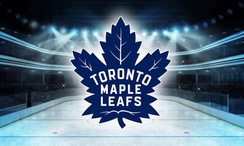
The Toronto Maple Leafs logo stands as one of the most recognized symbols in professional hockey. It’s been around since 1927, which makes it older than most NHL franchises even exist today.
This emblem sits alongside other Original Six team marks as a piece of hockey history that fans treat almost like a religious symbol. The current version you see on jerseys hit the ice in 2016, though the basic maple leaf shape goes back nearly a century.
Toronto’s franchise itself dates to 1917 (originally the Toronto Arenas). The team has gone through roughly 12 distinct logo variations. Some changes were dramatic. Others? You’d need a magnifying glass to spot the differences.
What is the Toronto Maple Leafs Logo?
![]()
The Toronto Maple Leafs logo is a blue maple leaf emblem featuring the team name in white letters across its center. Introduced in its current form on February 2, 2016, this mark was designed by the team’s internal creative department. It symbolizes Canadian identity and pays tribute to soldiers who wore maple leaf badges in World War I.
Design Type: Emblem (combination mark with integrated wordmark)
Primary Elements:
- 31-point maple leaf shape
- Integrated “TORONTO MAPLE LEAFS” wordmark
- Pointed, angular leaf structure
- Clean internal veining details
Official Introduction Date: February 2, 2016 (current version)
Designer/Agency: Toronto Maple Leafs internal design team, with input from Maple Leaf Sports & Entertainment
Trademark Status: Registered trademark of Maple Leaf Sports & Entertainment Ltd.
Color Palette:
- Maple Leafs Blue: #00205B
- White: #FFFFFF
Usage Context: Game jerseys, merchandise, Scotiabank Arena signage, digital platforms, broadcast graphics, and all official team communications
How Has the Toronto Maple Leafs Logo Evolved Over Time?
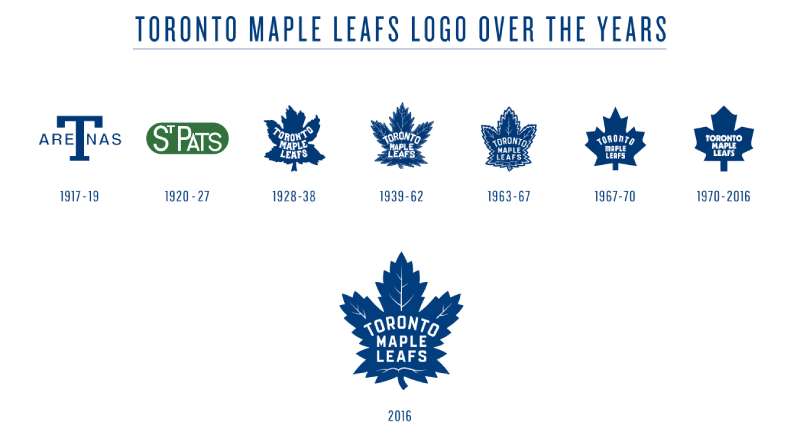
The Toronto Maple Leafs logo has changed roughly 12 times since 1927. Most updates refined the leaf’s shape and adjusted the typography inside.
The biggest shifts happened in 1938, 1967, and 2016. Each redesign reflected the era’s design trends while keeping the core maple leaf symbol intact.
Toronto Arenas and St. Patricks Era (1917-1927)
Years Active: 1917-1927
Design Description: Before becoming the Maple Leafs, the franchise used completely different branding. The Toronto Arenas featured a simple “T” monogram. The St. Patricks era brought a green color scheme with a shamrock, which feels wild to imagine now.
Color Scheme: The St. Pats wore green and white. Not a hint of blue anywhere.
Context: Conn Smythe purchased the team in 1927 and immediately rebranded to the Maple Leafs. He chose the name to honor Canadian military units who wore maple leaf badges.
Cultural Significance: This pre-Leafs period is largely forgotten by modern fans, but it explains why the franchise technically dates to 1917 while the Maple Leafs name only goes back to 1927.
Original Maple Leafs Logo (1927-1938)
Years Active: 1927-1938
Design Description: The first true Maple Leafs logo featured a simple, somewhat rounded maple leaf shape. The team name appeared in a curved arrangement inside the leaf. It looked handmade, almost like something you’d see on a vintage postcard.
Color Scheme: Blue and white, establishing the palette that continues today
Designer: Attributed to Conn Smythe’s direction, though specific designers aren’t documented
Context: Smythe wanted a symbol that represented Canada broadly while honoring military veterans. The maple leaf was already appearing on Canadian military insignia.
Cultural Significance: This logo established the visual identity that would define the franchise. The choice of blue and white reportedly came from Smythe’s connection to the University of Toronto.
Pointed Leaf Era (1938-1967)
Years Active: 1938-1967
Design Description: The leaf became more angular and aggressive. Typography shifted to a cleaner, more structured arrangement. The overall shape grew pointier at the tips.
Color Scheme: Same blue and white, though the exact shade of blue varied over the years
Key Changes from Previous: More defined points on the leaf. Straighter text alignment. Generally sharper overall appearance.
Context: This version coincided with some of the franchise’s greatest success, including multiple Stanley Cup championships. Fans associate this era with legends like Syl Apps and Ted Kennedy.
Cultural Significance: The 1938-1967 logo covered the team’s golden age. When older fans get nostalgic, this is often the version they picture.
Centennial Logo (1967-1970)
Years Active: 1967-1970
Design Description: A special version created for Canada’s centennial celebration. The leaf incorporated a more stylized, modernist look with 11 points representing Canada’s provinces and territories at the time.
Color Scheme: Blue and white maintained
Key Changes from Previous: Completely redrawn leaf shape with specific point count symbolism. More geometric construction.
Context: 1967 marked Canada’s 100th birthday, and the NHL expanded from six to twelve teams. The Leafs won the Stanley Cup that year, making it the perfect moment for a commemorative design.
Cultural Significance: This version holds special meaning as it represents the last time Toronto won the Stanley Cup. Fans still waiting for another championship look at this logo with complicated feelings.
Classic Modern Era (1970-2016)
Years Active: 1970-2016
Design Description: The leaf returned to a more traditional look after the centennial experiment. Rounder edges, softer appearance. The wordmark stayed centered inside.
Color Scheme: Blue and white, with the blue shade varying slightly through different decades
Key Changes from Previous: Softer points. More organic leaf shape compared to the geometric centennial version.
Context: This long stretch covered the Harold Ballard ownership years (a controversial period), the team’s time at Maple Leaf Gardens, and eventually the move to what’s now Scotiabank Arena.
Cultural Significance: Most current adult fans grew up with this version. It covered the Wendel Clark era, the Mats Sundin years, and countless playoff disappointments that shaped the franchise’s reputation.
Current Logo (2016-Present)
Years Active: 2016-Present
Design Description: Sharp, angular leaf with 31 points (representing the 31 NHL teams at time of the league’s last expansion before Seattle). The wordmark uses a custom serif typeface that feels both modern and classic.
Color Scheme: Maple Leafs Blue (#00205B) and White (#FFFFFF)
Designer: Internal MLSE creative team
Key Changes from Previous: Dramatically sharper points. Bolder leaf veins. Updated typography with more pronounced serifs. Overall more aggressive stance.
Context: The 2016 rebrand coincided with the franchise’s rebuild around young stars like Auston Matthews. MLSE wanted a fresh start that honored history while signaling a new era.
Cultural Significance: This version represents hope. The Matthews generation. A franchise trying to shake decades of disappointment. Whether it succeeds remains to be seen.
What Do the Design Elements of the Toronto Maple Leafs Logo Mean?
The maple leaf connects directly to Canadian national identity. It appears on the country’s flag, currency, and countless government symbols.
For the Leafs specifically, Conn Smythe chose it to honor Canadian soldiers. Military units wore maple leaf badges in World War I, and Smythe (himself a veteran) wanted that association.
Why Did Toronto Maple Leafs Choose These Specific Colors?
Blue represents loyalty and stability. It’s one of the most common colors in sports branding because it reads well at distance and photographs cleanly.
White provides contrast and cleanliness. Together, the pairing creates a sophisticated, almost regal appearance.
Conn Smythe reportedly chose blue and white because of his University of Toronto connection. The school uses similar colors, and Smythe played hockey there.
Maple Leafs Blue
- Hex: #00205B
- RGB: 0, 32, 91
- Pantone: 289 C
- Meaning: Loyalty, trust, Canadian winter skies, stability
White
- Hex: #FFFFFF
- Meaning: Ice, purity, clean competition, snow
The two-color palette keeps things simple. No complicated color combinations to manage across merchandise and media.
What Typography Style Is Used in the Toronto Maple Leafs Logo?
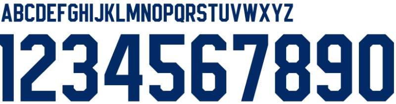
The current logo uses a custom typeface with pronounced serifs. It feels traditional without looking dated.
The letters curve slightly to follow the leaf’s interior shape. This integration makes the wordmark feel like part of the symbol rather than text slapped on top.
Earlier versions used different type treatments. Some were more rounded. Others featured heavier weights. The current approach balances readability with character.
At small sizes, the wordmark remains legible. That matters for merchandise and digital applications where the logo shrinks significantly.
What Are the Hidden Meanings in the Toronto Maple Leafs Logo?
The 31 points on the current leaf reference the number of NHL teams when it was designed. Though Seattle has since joined the league, the point count remains.
Some fans see the leaf’s aggressive angles as representing a new, more competitive franchise attitude. Whether the designers intended this is debatable.
The leaf’s vein structure mirrors actual maple leaf anatomy. It’s a detail most people don’t notice, but it adds biological authenticity to the abstracted shape.
Military connection runs deep in the logo’s DNA. Smythe never forgot his service, and that influence persists through the symbol’s very existence.
How Does the Toronto Maple Leafs Logo Compare to Competitor Logos?
Among NHL team emblems, the Leafs logo stands out for its simplicity. No mascot illustration. No elaborate crest. Just a clean maple leaf.
This approach mirrors other Original Six franchises. The Detroit Red Wings use a simple winged wheel. The Montreal Canadiens rely on their iconic “CH” monogram.
Newer expansion teams tend toward more complex designs. The Vegas Golden Knights have an elaborate helmet crest. The Seattle Kraken feature a detailed tentacle “S” with a hidden eye.
Toronto’s straightforward approach dates to an era before sports branding became a specialized industry. That simplicity now reads as classic and timeless.
Canadian rivals like the Ottawa Senators, Calgary Flames, Edmonton Oilers, and Vancouver Canucks all use more illustrative approaches. Toronto remains the purist.
What Are the Technical Specifications of the Toronto Maple Leafs Logo?
Official Color Codes:
Primary Color (Maple Leafs Blue)
Secondary Color (White)
- Hex: #FFFFFF
- RGB: 255, 255, 255
- CMYK: 0, 0, 0, 0
Dimensions and Proportions:
- Aspect ratio: Approximately 1:1 (square bounding box)
- Minimum size: 0.5 inches for print applications
- Clear space: Minimum padding equal to the height of the “T” in the wordmark on all sides
- The logo should never be stretched, rotated, or altered from official files
File Formats Available:
- Vector formats (AI, EPS, SVG) for scalable applications
- Raster formats (PNG, JPEG) for digital use
- Single-color versions for limited printing situations
What Cultural Impact Has the Toronto Maple Leafs Logo Had?
The Leafs logo transcends hockey in Canada. It appears on clothing worn by people who’ve never watched a game. It represents Toronto itself as much as the team.
International recognition is strong. Hockey fans worldwide know the maple leaf symbol even if they can’t name a single player on the current roster.
The logo carries complicated emotional weight. For Toronto fans, it represents both undying loyalty and decades of frustration since the last championship in 1967.
Merchandise featuring the logo sells consistently well regardless of team performance. That’s rare in professional sports, where bad seasons typically hurt retail numbers.
How Does the Toronto Maple Leafs Logo Fit Into the Overall Brand Identity?
The logo anchors everything MLSE does with the Leafs brand. Jersey designs, arena signage, digital presence, merchandise. It all starts with that maple leaf.
Scotiabank Arena incorporates the logo throughout its design. You can’t walk through the building without seeing it dozens of times.
The team’s brand guidelines maintain strict control over how the logo appears. Colors must match exactly. Proportions can’t change. Backgrounds must provide sufficient contrast.
Sub-brands like the Toronto Marlies (AHL affiliate) use modified versions that maintain visual connection to the parent club.
How Should the Toronto Maple Leafs Logo Be Used?
Official Usage Guidelines:
- Always use official logo files from MLSE
- Never alter colors, proportions, or orientation
- Maintain required clear space around the logo
- Don’t place the logo on busy backgrounds that reduce legibility
- Never add effects like drop shadows or gradients to the official mark
Where to Access Official Logos:
- Media credentials through MLSE communications department
- Licensed partners receive files through official channels
- NHL media portal for credentialed journalists
Licensing Information:
- All commercial use requires licensing agreement with MLSE
- Fan art and personal use exist in a gray area (the team generally tolerates non-commercial fan expression)
- Counterfeit merchandise is actively pursued legally
Trademark Protection:
- The logo is registered with the Canadian Intellectual Property Office
- US trademark protection through USPTO
- International protections in key markets
- MLSE legal team monitors unauthorized usage
FAQ on The Toronto Maple Leafs Logo
When Was the Toronto Maple Leafs Logo First Created?
The first Toronto Maple Leafs logo appeared in 1927 when Conn Smythe renamed the Toronto St. Patricks.
The blue and white maple leaf emblem has represented the NHL franchise ever since. It’s one of the oldest hockey team logos still in active use today.
Who Designed the Current Toronto Maple Leafs Logo?
The current version was created by Maple Leaf Sports & Entertainment’s internal design team in 2016.
No single designer receives public credit. The project involved multiple stakeholders within MLSE’s creative department working on the hockey logo redesign.
What Do the Blue and White Colors Represent?
Blue symbolizes loyalty, trust, and Canadian winter. White represents ice and purity.
Conn Smythe chose these team colors based on his University of Toronto connection. The school uses a similar palette. Simple, but the reasoning stuck.
How Many Times Has the Leafs Logo Changed?
The franchise has used approximately 12 distinct logo variations since 1927.
Most changes refined the leaf shape or updated the typography. Major redesigns happened in 1938, 1967, and 2016. Some updates were so subtle fans barely noticed.
What Does the Maple Leaf Symbol Mean?
The maple leaf represents Canadian identity and honors military veterans.
Smythe, a World War I veteran himself, chose it because Canadian soldiers wore maple leaf badges. The symbol connects the team to national pride and sacrifice.
Why Does the Current Logo Have 31 Points?
The 31 points represented the number of NHL teams when the logo launched in 2016.
Seattle has since joined the league as team 32. The Leafs haven’t updated the point count. Maybe they will eventually. Maybe not.
What Font Style Appears in the Toronto Maple Leafs Logo?
The wordmark uses a custom serif font designed specifically for the team.
Letters curve to follow the leaf’s interior shape. This creates visual unity between text and symbol. Earlier versions used different typography treatments with varying weights.
Can I Use the Toronto Maple Leafs Logo for Personal Projects?
Commercial use requires licensing from MLSE. They protect the trademark aggressively.
Personal fan art exists in a gray area. The team generally tolerates non-commercial expression. But selling merchandise with the Leafs emblem? That’ll get you a cease and desist letter.
Where Can I Find Official Toronto Maple Leafs Logo Files?
Media professionals access files through MLSE’s communications department or the NHL media portal.
Licensed partners receive official assets through formal channels. Random fans looking for high-quality downloads? You’re mostly stuck with what’s publicly available online.
How Does the Leafs Logo Compare to Other Original Six Logos?
Toronto’s approach is cleaner than most. No mascot. No elaborate crest. Just the leaf.
The Chicago Blackhawks and Boston Bruins use more detailed illustrations. The Leafs share minimalist design DNA with Detroit’s winged wheel and Montreal’s CH monogram.
Conclusion
The Toronto Maple Leafs logo carries nearly a century of hockey heritage within its angular blue and white form. It’s more than a sports emblem.
From Conn Smythe’s military tribute in 1927 to the sharp 31-point redesign unveiled at Scotiabank Arena, this symbol has witnessed Stanley Cup triumphs and decades of Leafs Nation heartbreak.
The design remains simple. Intentionally so.
While other NHL franchises chase trendy aesthetics, Toronto sticks with what works. A maple leaf. Canadian identity. Blue and white forever on the jersey.
That’s the whole point, really.
Renowned for his expertise in logo design and visual branding, Bogdan has developed a multitude of logos for various clients.
His skills extend to creating posters, vector illustrations, business cards, and brochures. Additionally, Bogdan's UI kits were featured on marketplaces like Visual Hierarchy and UI8.
He also wrote in the past years on sites like Design Your Way, WebDesignerDepot, WPDean, Designmodo, Speckyboy, Slider Revolution, and more.
- The Figma Logo History, Colors, Font, And Meaning - 25 July 2026
- Canva for Teams Review: Is It Worth the Business Plan? - 24 July 2026
- 5 Brand Compliance Checkpoints Every Enterprise Should Automate - 23 July 2026
Bogdan Sandu is a seasoned designer who has been designing websites since 2008. Renowned for his expertise in logo design and visual branding, Bogdan has developed a multitude of logos for various clients. His skills extend to creating posters, vector illustrations, business cards, and brochures. Additionally, Bogdan's UI kits were featured on marketplaces like Visual Hierarchy and UI8. He also wrote in the past years on sites like Design Your Way, WebDesignerDepot, WPDean, Designmodo, Speckyboy, Slider Revolution, and more.
You Might Also Like