The right typeface can make a brand feel like it belongs in a flagship store on Avenue Montaigne. The wrong one can undo years of positioning in seconds.
Typography is one of the most underestimated tools in luxury branding. Before a customer reads a single word, the letterforms have already communicated something – heritage, exclusivity, confidence, or the lack of it.
The best fonts for luxury brands share specific qualities: refined stroke contrast, precise letterform proportions, and a visual weight that signals craftsmanship without shouting about it.
This guide covers the 10 typefaces most used across high-end fashion, beauty, jewelry, and lifestyle brands – from classic choices like Didot and Bodoni to more accessible options like Playfair Display – with details on who uses them, why they work, and how to pair them.
Didot
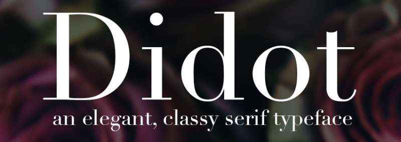
A high-contrast serif with razor-thin hairlines and dramatic thick strokes. It reads as expensive – and it has for over 200 years.
Who Uses It
Vogue (since 1955), Versace, Harper’s Bazaar, Zara (logo redesign), CBS.
Why It Works for Luxury Branding
Didot was cut by Firmin Didot between 1784 and 1811 in Paris. It came out of the French neoclassical movement – the same era that gave us the Louvre editions, printed on wove paper in runs of 250 copies. That heritage carries weight.
The extreme stroke contrast signals craftsmanship. It is literally harder to print well. Luxury brands lean into that. A 2014 survey cited by typeroom.eu found Didot was considered the most “expensive-looking” typeface among over 370 respondents, with lighter weights and high contrast scoring highest for perceived price.
One thing to watch: the hairlines create a “dazzle” effect at small sizes, making it hard to read. Best kept large.
Best Use Cases
- Fashion magazine mastheads and cover titles
- Luxury brand logos and wordmarks
- High-end packaging and editorial spreads
- Display headlines on luxury e-commerce sites
Font Characteristics
- Classification: Modern serif (Didone)
- Designer: Firmin Didot
- Released: 1784–1811
- Weights available: Multiple; Hoefler & Co. version offers 42 fonts across 7 optical sizes
Pairing Suggestions
Pair with Futura or Avenir for body copy. The contrast between Didot’s ornate serifs and a clean geometric sans creates strong visual hierarchy without competing for attention.
Where to Get It
Hoefler & Co. (HTF Didot), Linotype (bundled with macOS), Adobe Fonts. Commercial license required for brand use.
Bodoni
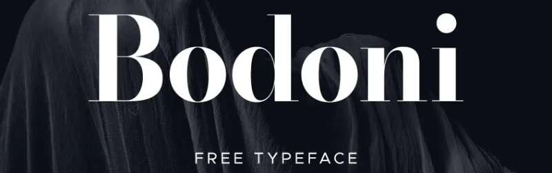
Bodoni is Didot’s Italian counterpart – slightly more geometric, a touch heavier, and built for drama. It’s been in the fashion world since the 18th century and shows no signs of leaving.
Who Uses It
Vogue (throughout its pages), Calvin Klein, Zara, Giorgio Armani, Nirvana (logo).
Why It Works for Luxury Branding
Giambattista Bodoni developed this serif typeface in Parma, Italy, in the late 18th century. He was known as the “King of Printers.” The letterforms feature flat, unbracketed serifs and extreme thick-thin contrast – pushed further than even Didot.
Compared to Didot, Bodoni reads as more authoritative and geometric. Didot feels Parisian and delicate; Bodoni feels architectural. Both share the Didone classification, but they signal slightly different brand personalities. ITC Bodoni solved the small-size legibility problem with optical sizes at 6, 12, and 72 point.
Best Use Cases
- Fashion brand logos
- Luxury packaging and perfume labels
- Editorial headlines and magazine covers
- High-end advertising campaigns
Font Characteristics
- Classification: Modern serif (Didone)
- Designer: Giambattista Bodoni
- Released: Late 18th century; digital versions include Bauer Bodoni, ITC Bodoni, Bodoni MT
- Weights available: ITC Bodoni includes optical sizes; Bodoni Moda available on Google Fonts
Pairing Suggestions
Bodoni pairs well with Futura for a classic high-contrast combination used across fashion branding. For body text, try Baskerville – both share vertical stress and rational structure, but Baskerville handles small sizes far better.
Where to Get It
Monotype (Bauer Bodoni), Adobe Fonts (Bodoni Poster), Google Fonts (Bodoni Moda – free). Check font licensing terms carefully; some versions carry strict commercial restrictions.
Garamond

If Didot signals fashion, Garamond signals heritage. It’s the typeface choice of brands that want to communicate history, trust, and long-standing authority.
Who Uses It
Lancôme (hairline Garamond for navigation), Abercrombie & Fitch, Harry Potter books, The Hunger Games series, Duke University.
Why It Works for Luxury Branding
Claude Garamont cut the original designs in 16th-century France. That’s 500 years of use. No other typeface on this list carries that kind of history.
The diagonal stress, low contrast, and gently bracketed serifs reflect the pen-influenced letterforms of the Renaissance. It reads as warm, legible, and trustworthy – qualities that more dramatic Didone faces can sacrifice. For heritage luxury brands, it’s a natural fit. It also performs well as body text, where Didot and Bodoni tend to struggle.
Best Use Cases
- Heritage luxury brand identity
- Luxury packaging body text
- Editorial and print design
- Brand guidelines and formal documents
Font Characteristics
- Classification: Old-style serif
- Designer: Claude Garamont (original); Adobe Garamond revived by Robert Slimbach (1989)
- Released: 16th century; digital revival 1989
- Weights available: EB Garamond (free), Adobe Garamond Pro (commercial), Cormorant Garamond (free on Google Fonts)
Pairing Suggestions
Pairs well with Futura or Helvetica for a classic serif-plus-geometric-sans combination. For an all-serif layout, try Bodoni or Baskerville as a contrasting display face while Garamond handles body copy.
Where to Get It
Adobe Fonts (Adobe Garamond Pro), Google Fonts (EB Garamond, Cormorant Garamond – both free). Commercial foundry versions from Monotype also available.
Baskerville

A 2012 New York Times study found Baskerville was the typeface most likely to make readers believe a statement was true. For luxury brands that sell trust, that’s not a small thing.
Who Uses It
Kate Spade New York, Clarins (similar Baskerville-style serif), Yale University Press, Better Homes & Gardens. The Burberry logo uses a bespoke Bodoni variant, but Baskerville is widely used across its category.
Why It Works for Luxury Branding
John Baskerville created this typeface in Birmingham, England, in 1757. It sits between old-style serif and modern serif – more contrast than Garamond, less extreme than Bodoni or Didot.
That middle ground is exactly what makes it useful. It carries the credibility of a classical serif without the legibility problems of high-contrast Didone faces. Typographic hierarchy comes naturally with Baskerville – headings, subheadings, and body text all work at different scales. Amazon’s Kindle offers it as a reading option. That tells you everything about its legibility.
Best Use Cases
- Luxury brand identity and wordmarks
- Premium packaging and labels
- Body text in print materials
- Heritage-positioning brand campaigns
Font Characteristics
- Classification: Transitional serif
- Designer: John Baskerville (punchcutter John Handy)
- Released: 1757; multiple revivals including Libre Baskerville (free, Google Fonts)
- Weights available: Regular, italic, bold; Libre Baskerville available free
Pairing Suggestions
Baskerville + Helvetica is a proven combination – Helvetica’s neutrality lets Baskerville lead. For more drama, use Bodoni as the display face with Baskerville handling body copy. See more ideas in this Baskerville font pairing guide.
Where to Get It
Google Fonts (Libre Baskerville – free), Monotype (commercial versions), Adobe Fonts. Some system fonts include Baskerville as a default.
Futura
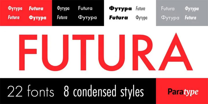
Futura is geometric. Precise. Built from circles and lines. And somehow, it has become one of the most recognizable luxury fonts in the world.
Who Uses It
Louis Vuitton (logo), Supreme, IKEA (until 2010), Calvin Klein, Crayola, NASA (Apollo 11 moon plaque).
Why It Works for Luxury Branding
Paul Renner designed Futura in 1927 in Germany. It came out of the same modernist thinking that shaped Bauhaus design – though Renner himself wasn’t part of the Bauhaus. The letterforms are built from pure geometry: the O is nearly a perfect circle, the stroke weight is even, the spacing is precise.
That precision reads as confidence. Louis Vuitton pairs it with Granjon in logo treatments – the geometric sans with a classic serif creates a tension that signals both modernity and tradition. For contemporary luxury brands that want to avoid the heritage associations of serif fonts, Futura is the obvious alternative.
Best Use Cases
- Contemporary luxury logos and wordmarks
- Fashion brand packaging and retail environments
- Minimalist luxury advertising
- Supporting text paired with high-contrast display serifs
Font Characteristics
- Classification: Geometric sans-serif
- Designer: Paul Renner
- Released: 1927
- Weights available: Light to ExtraBold; multiple condensed and extended variants
Pairing Suggestions
Futura + Bodoni or Futura + Garamond. Both combinations appear across luxury fashion. The geometric sans grounds the ornate serif and prevents the pairing from feeling too historical. Check the Futura font pairing guide for more options.
Where to Get It
Linotype (commercial), Adobe Fonts. Free alternatives include Century Gothic (bundled with Windows) and League Spartan on Google Fonts.
Optima
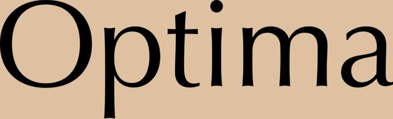
No serifs, but it doesn’t feel like a typical sans-serif either. That ambiguity is precisely what makes Optima work for luxury.
Who Uses It
Estée Lauder (long-term brand typeface), Aston Martin, Yves Saint Laurent, Pandora Jewelry, Vietnam Veterans Memorial, 9/11 Memorial.
Why It Works for Luxury Branding
Hermann Zapf designed Optima between 1952 and 1955 for D. Stempel AG in Frankfurt. The idea came to him in Florence in 1950 – he was looking at Renaissance-era gravestone inscriptions in the Basilica of Santa Croce and sketched initial characters on a 1,000-lire banknote.
The result is a humanist sans-serif with subtly flared terminals that echo classical Roman lettering without being a serif. It’s quiet luxury made typographic. Estée Lauder uses it in a light weight alongside large imagery and navy – a combination that feels serious without being cold. Monotype describes it as “elegant, subtle, and a tall x-height.” That tall x-height matters for legibility across scales.
Best Use Cases
- Prestige beauty and cosmetics branding
- High-end hospitality and hotel identity
- Luxury packaging and product labels
- Brands positioning around “quiet luxury”
Font Characteristics
- Classification: Humanist sans-serif (serifless roman)
- Designer: Hermann Zapf
- Released: 1958 (D. Stempel AG); Optima Nova released 2002 (web-optimized)
- Weights available: Regular to Bold; Optima Nova adds condensed and expanded widths
Pairing Suggestions
Pair Optima with Palatino – both were designed by Hermann Zapf, and the shared design philosophy creates an unusually harmonious system. For modern contrast, DIN alongside Optima works well for architecture and design-forward brands.
Where to Get It
Linotype / Monotype (commercial). Optima is bundled with macOS. Optima Nova (web-optimized version) available through Monotype licensing.
Helvetica
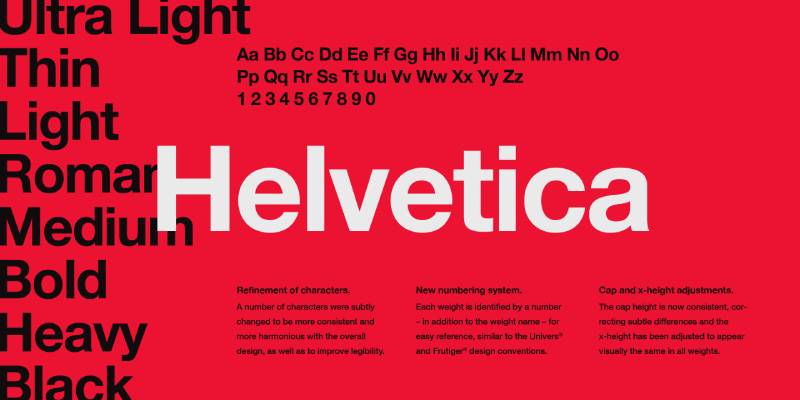
Helvetica isn’t glamorous. It’s neutral. And that’s exactly why high-end brands use it – it gets out of the way and lets the product do the talking.
Who Uses It
Chanel (supporting font, Helvetica or variants throughout), Fendi (Helvetica-inspired custom font), The North Face, A.P.C., American Airlines, BMW, Jeep.
Why It Works for Luxury Branding
Max Miedinger and Eduard Hoffmann designed Helvetica in 1957 in Switzerland. It came out of the Swiss design movement – the idea that typography should be functional, neutral, and free of personal expression.
For luxury brands, that neutrality is a feature. When Chanel’s logo or campaign imagery dominates the layout, Helvetica in the supporting text doesn’t fight back. It simply carries information. Monotype research noted that many luxury fashion brands use Helvetica or Gotham as their primary secondary typeface, keeping all visual weight on the logo and imagery. The letterforms are also extremely well-hinted for screen use – something that matters more every year.
Best Use Cases
- Supporting body text in luxury brand systems
- Navigation and UI text on luxury e-commerce sites
- Campaign copy where imagery is primary
- Minimalist contemporary luxury brands
Font Characteristics
- Classification: Neo-grotesque sans-serif
- Designer: Max Miedinger, Eduard Hoffmann
- Released: 1957 (Haas Type Foundry, Switzerland)
- Weights available: Thin to Black; Neue Helvetica expands to 51 weights
Pairing Suggestions
Helvetica + Garamond, Helvetica + Didot, or Helvetica + Baskerville – all proven editorial and luxury brand combinations. Helvetica’s neutrality makes it a reliable supporting player for almost any high-contrast serif. See options in the Helvetica font pairing guide.
Where to Get It
Monotype / Linotype (commercial). Neue Helvetica available through Adobe Fonts. Arial (bundled with Windows) is a close but imperfect free alternative – most typographers prefer the real thing for luxury work.
Trajan
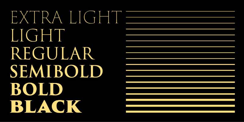
Trajan is all-caps by nature – there are no lowercase letters. That constraint forces a specific use pattern, and within that pattern, it delivers serious authority.
Who Uses It
Cartier, Christian Dior (Didone category), Columbia University, Rice University. Widely used on film posters (Titanic, most famously) and high-end certificates and award programs.
Why It Works for Luxury Branding
Carol Twombly designed Trajan for Adobe in 1989, based on the inscriptions carved at the base of Trajan’s Column in Rome – first century A.D. Those letterforms were originally written with a brush, then chiselled into stone. Twombly translated that into a digital display typeface.
The result carries the authority of ancient Rome without feeling like a costume. Refined wedge-shaped serifs, elegant proportions, and crisp triangular details give it immediate visual weight. For jewelry brands, luxury hospitality, and formal invitations, Trajan signals permanence. It’s a font that says the brand has been around, or intends to be.
Best Use Cases
- Luxury logo design where all-caps works
- Formal invitations and premium stationery
- High-end certificates, plaques, and signage
- Jewelry and watchmaker brand identity
Font Characteristics
- Classification: Classical serif (Roman inscriptional)
- Designer: Carol Twombly (and Robert Slimbach)
- Released: 1989 (Adobe Originals)
- Weights available: Regular, Bold (Trajan Pro 3 expands the family)
Pairing Suggestions
Pair with Adobe Garamond or Minion for body text – both historical serifs that share Trajan’s classical register. For a modern contrast, Optima works well given both draw from Roman stone-carving traditions.
Where to Get It
Adobe Fonts (Trajan Pro 3 – included with Creative Cloud). Also available through Monotype. Cinzel on Google Fonts is a free open-source alternative with a similar feel.
Caslon
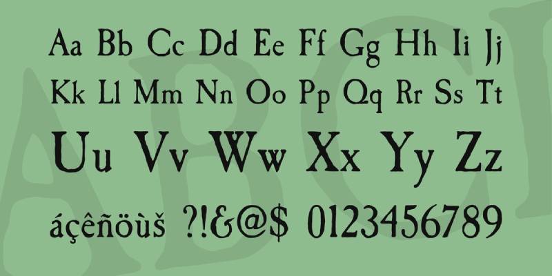
There’s a saying among designers: “When in doubt, use Caslon.” Benjamin Franklin barely used anything else. The US Declaration of Independence was printed in it. For luxury brands rooted in the Anglo-American tradition, that heritage is hard to beat.
Who Uses It
The New Yorker (body text, Adobe Caslon), University of Virginia, University of Southern California. Used across high-end publishing and heritage brand identity.
Why It Works for Luxury Branding
William Caslon cut his first typefaces in 1722 in London, influenced by Dutch Baroque type. His designs were known for warmth, readability, and what one designer described as being “comfortable and inviting.”
Carol Twombly revived Caslon for Adobe in 1990 after studying Caslon’s own specimen pages from 1734 to 1770. The result is faithful to the original, with modern additions: small caps, old-style figures, swash letters, ligatures, and alternates. For luxury brands that want the credibility of old-style typography elements without the drama of Didone faces, Caslon is the reliable choice. It’s also a genuinely good body text font – rare in this list.
Best Use Cases
- Heritage brand identity and stationery
- Luxury publishing and book design
- Premium packaging body text
- Editorial layouts where extended reading is expected
Font Characteristics
- Classification: Old-style serif
- Designer: William Caslon (original); Carol Twombly for Adobe Caslon revival
- Released: 1722 (original); 1990 (Adobe Caslon)
- Weights available: Adobe Caslon Pro includes regular, italic, semibold, semibold italic, bold, bold italic
Pairing Suggestions
Caslon + Futura bridges classical and modern design sensibilities. Use Caslon for body text and Futura for headings. For an all-serif layout, Baskerville as a display face with Caslon body text is a historically resonant combination.
Where to Get It
Adobe Fonts (Adobe Caslon Pro – included with Creative Cloud), Monotype. Libre Caslon on Google Fonts is a free open-source alternative.
Playfair Display

The most accessible font on this list. Free, well-supported, designed specifically for screens, and still capable of looking genuinely high-end when used well.
Who Uses It
Fashion blogs, luxury lifestyle publications, high-end e-commerce sites, wedding brands, and boutique hospitality. Common across independent luxury brands and editorial-focused websites.
Why It Works for Luxury Branding
Claus Eggers Sørensen designed Playfair Display in 2011, drawing from the late 18th-century type tradition – the same era as Bodoni and Baskerville. The influence shows: strong serifs, high stroke contrast, open counters, and a large x-height.
The key difference from its historical inspiration is that Playfair was built for screens from the start. Optical adjustments keep the fine details sharp at headline sizes on digital displays, something that Didot and Bodoni often struggle with. In 2023, a variable font update added body text designs with an optical size axis. The font psychology here leans upscale – high contrast and refined ball terminals signal the same status cues as Didone faces, but the licensing cost is zero. For startups and independent luxury brands, that matters.
Best Use Cases
- Luxury e-commerce headlines and hero sections
- Fashion and lifestyle editorial headings
- Wedding and event brand identity
- Premium blog and magazine web design
Font Characteristics
- Classification: Transitional serif (Didone-influenced)
- Designer: Claus Eggers Sørensen
- Released: 2011; updated with variable font support in 2023
- Weights available: Regular to Black; italic across all weights; Cyrillic and Greek support
Pairing Suggestions
Playfair Display + Lato is one of the most common pairings in luxury editorial web design. Also works well with Montserrat, Open Sans, or Raleway as body text. Check the Playfair Display font pairing guide for more combinations.
Where to Get It
Google Fonts (free, open-source). Also available through Adobe Fonts. No licensing cost for commercial use under the Open Font License.
What Makes a Font Feel Luxurious
A typeface does not just display text. It shapes how people assign value to what they’re reading before they process a single word.
A 2023 study found that 78% of participants associated specific fonts with higher-priced, premium products based on letterform shape alone (Inkbot Design). That number is hard to ignore when you’re building a brand identity from scratch.
The visual cues that trigger premium perception are consistent across high-end brand aesthetics:
- High stroke contrast: A dramatic difference between thick and thin strokes (as seen in Didot and Bodoni) reads as refined and intentional.
- Generous negative space: Luxury typefaces breathe. Tight, cramped letterforms signal mass-market efficiency, not exclusivity.
- Restrained weight: Thin and light weights dominate luxury logos. Bold weights are used for emphasis, not default identity.
- Vertical stress axis: Most classic luxury serifs orient their thinnest strokes vertically, giving the letterforms a formal, upright quality.
Font psychology plays a direct role here. Consumers connect letterform structure to brand values without being aware they’re doing it. A typeface with calligraphic origins communicates handcraft. A geometric sans signals precision. Neither is better; they are just different signals.
The editorial publishing world reinforced these associations over decades. Typefaces used by Vogue, Harper’s Bazaar, and similar publications became proxies for prestige. When a fragrance brand chooses Didot for its packaging, it is borrowing that accumulated cultural meaning. That is how iconic fonts earn their place in luxury branding.
Serif vs. Sans-Serif in Luxury Brand Typography
The choice between a serif font and a sans-serif font is not about which is more luxurious. It is about which best matches what the brand needs to communicate.
A 2021-2022 Monotype and Neurons study found that classic serif typography increases perceived quality by 13% and reliability by 9% compared to baseline brand assets. Geometric sans-serif fonts, by contrast, improved message memorability by 6% and perceived competitive advantage by 12%.
| Classification | Perception signal | Typical use case |
|---|---|---|
| Classic serif (Didot, Bodoni) | Heritage, craftsmanship, timelessness | Fashion, jewelry, fragrance |
| Geometric sans-serif (Futura) | Precision, modernity, confidence | Luggage, accessories, web identity |
| Humanist sans-serif | Authenticity, approachability | Modern luxury, hospitality |
| Transitional serif (Garamond, Baskerville) | Authority, literary refinement | Publishing-adjacent, spirits, real estate |
When Luxury Brands Use Serif Fonts
Heritage houses default to serifs. Dior’s Nicolas Cochin Regular, with its delicate serifs and refined stroke contrast, anchors the brand in classic elegance.
Gucci’s serif wordmark has stayed consistent through multiple creative director shifts because the letterforms carry enough authority to absorb reinterpretation without losing recognition.
Hermes uses a bespoke slab serif that draws on its equestrian and craft heritage. The typography tells the brand story without the brand needing to say anything.
Lancôme uses Garamond in navigation and body copy. The hairline thin strokes communicate heritage and quality across both print campaigns and digital touchpoints.
When Luxury Brands Choose Sans-Serif
Minimalism reads as modern luxury when executed with precision. Chanel’s Couture sans-serif wordmark uses clean, modern lines paired with a strict black-and-white palette to project chic restraint.
Louis Vuitton uses Futura across its broader visual identity. The geometric proportions signal precision and timeless refinement, which aligns well with LV’s position as the flagship brand of LVMH, whose revenues exceeded 86 billion euros in 2023.
The Balenciaga rebrand under Demna pushed further into stark grotesque territory. That shift to a condensed sans-serif was a deliberate signal about audience and creative direction, not just an aesthetic preference.
Burberry made the same move in 2018, replacing a traditional serif logotype with a bold clean sans-serif designed by Peter Saville. The shift communicated youth and modernity and repositioned the brand toward a directional fashion customer.
How Spacing and Weight Affect Luxury Typography
Tracking changes everything. The same typeface set at default spacing versus wide tracking reads as completely different brands.
Loose tracking is consistently associated with exclusivity and elegance in luxury brand typography (Daily Creative Co, 2025). Tight tracking in a luxury context reads as rushed or economical; two things premium brands actively avoid.
Here is how the technical decisions map to perception outcomes:
Tracking (letter-spacing): Luxury wordmarks typically use 50-200 tracking units above default, depending on the typeface. All-caps settings almost always require manual tracking adjustment to avoid a mechanical, compressed feel.
Font weight: Light and thin weights dominate luxury logos. The visual restraint of a thin weight signals confidence. Mass-market brands tend to use medium and bold because they need to compete at shelf level; luxury brands generally do not.
Leading (line-height): Generous leading signals quality in body copy. A tight-packed paragraph reads as cheap, regardless of which typeface is used. Font spacing decisions at the body copy level are just as relevant as logo-level choices.
Kerning: Logo-level typography needs optical kerning, not mechanical. The space between “AV” reads differently than the space between “NN” at the same mathematical value. Luxury type at large sizes exposes these inconsistencies immediately.
Aesop, the Australian skincare brand, applies all of these principles consistently across packaging, retail environments, and digital. The result is a typographic system that reads as premium without relying on expensive or exclusive typefaces.
Pairing Fonts in a Luxury Brand Identity System
The standard formula: a high-contrast display serif for headlines, a restrained geometric or humanist sans-serif for body copy.
It works because contrast creates hierarchy without conflict. The two typefaces serve clearly different roles, so there is no competition for attention.
Display and Body Font Combinations That Work
The Futura plus Bodoni combination is one of the most established pairings in graphic design history (BIZRI Design, 2026). Futura’s circular geometry balances Bodoni’s dramatic vertical stress. Use Bodoni for headlines at 60pt and above; use Futura for body text and UI elements.
Three reliable combinations for luxury identity systems:
- Didot + Helvetica Neue: The editorial formula. Didot at headline sizes, Helvetica anchoring body text. Used across fashion magazine mastheads for decades.
- Bodoni + Futura: Classic luxury branding. Fashion lookbooks, fragrance packaging, event invitations. Maximum stroke contrast between the two.
- Garamond + Futura: Heritage with modernist tension. Best for brands that balance tradition with a forward-facing positioning. Museum exhibitions use this combination regularly.
For pairing fonts in a multi-touchpoint brand system, always test at actual production sizes. A combination that looks perfect at 72pt in Figma may fail at 15px on a mobile screen.
Common Pairing Mistakes in Luxury Typography
Two serifs together rarely works unless the roles are extremely clear and a neutral sans handles all body text.
Pairing two typefaces from the same structural family produces confusion, not contrast. Two geometric sans-serifs, two old-style serifs, or two grotesques will look like a mistake rather than a design choice.
Using a display font as body copy is where most non-specialists go wrong. Didot and Bodoni are not designed for extended reading. Their hairline strokes break down at small sizes and on low-resolution screens. Pair them with a workhorse body font and let them do what they are built for: commanding attention at large sizes.
A script font as a third accent typeface is almost always unnecessary in luxury branding. It adds complexity without adding hierarchy. If your two primary typefaces are not doing enough work on their own, the problem is execution, not font count.
Font Licensing for Luxury Brand Use
A single font file misuse can cost $150,000. That is the per-infringement amount Production Type demanded from Nike in 2023 for using a typeface outside its license terms (DesignYourWay, 2026).
Font licensing is not a formality for luxury brands. It is a commercial risk with real financial exposure, especially for brands running global campaigns across print, digital, and broadcast simultaneously.
| License type | What it covers | What it misses |
|---|---|---|
| Desktop | Print design, PDF embedding | Web, app, broadcast |
| Webfont | Website display | App UI, server-side rendering |
| App | Embedded in mobile UI | Broadcast, OOH advertising |
| Broadcast | TV, film, video | Interactive/app use |
About 70% of websites now use some form of self-hosted font (HTTP Archive, 2024), which adds a separate layer of licensing consideration beyond standard web font agreements.
For luxury brands specifically, there are three practical paths:
Commercial license (Monotype, Adobe Fonts, type foundry direct): Adobe Fonts clears its library for personal and commercial use within Creative Cloud. For app embedding, self-hosting, or custom modifications, separate licensing from the foundry is required.
Open-source with commercial clearance: Fonts under the SIL Open Font License (like many Google Fonts) allow commercial use without per-seat or per-view fees. Playfair Display and EB Garamond are both OFL-licensed and usable for brand work without additional cost.
Custom or bespoke typeface: The safest long-term investment for an established luxury brand. Hermès, Balmain, Fendi, and Burberry all own custom typefaces. A bespoke font is unique, ownable, and never available to a competitor.
The larger a brand’s geographic and channel reach, the more likely a custom typeface becomes cost-effective compared to managing multi-territory commercial licenses across print, digital, and environmental applications.
Fonts Used by Leading Luxury Brands
Luxury houses do not choose typefaces arbitrarily. Every font decision maps to heritage, positioning, and a deliberate target audience signal.
Heritage Houses and Their Typeface Choices
Chanel uses the Couture sans-serif font for its wordmark, designed by Chase Babb. Paired with a strict black-and-white palette, the clean lines project minimalist confidence. Chanel also uses Helvetica as supporting typography, which projects “pure, chic, and timeless” brand qualities (Fontfabric).
What font does Chanel use? The short answer is a proprietary design in the Didone family for the wordmark, with Helvetica doing supporting work across the system.
Dior uses Nicolas Cochin Regular, a custom serif with stylish, subtly bold character. Its delicate serifs and refined stroke contrast create a sophisticated visual rhythm. Paired with black lettering on white, Dior’s typography communicates a balance of heritage and contemporary sensibility.
What font does Dior use across its full identity system? Century Gothic Light and Arial appear in website body copy, with Nicolas Cochin anchoring all primary brand communications.
Gucci’s serif wordmark features elegant proportions and high-contrast stroke weight. The letterforms are slightly more expressive than Chanel or Dior, which reflects the brand’s Italian theatrical identity. Gotham appears across Gucci’s marketing, packaging, and retail environments as a secondary typeface.
What font does Gucci use for its broader communications? The brand mixes its proprietary serif wordmark with Gotham, balancing heritage identity with clean, readable marketing copy.
Contemporary Luxury Brands Redefining Typography
Louis Vuitton uses Futura as its primary geometric sans-serif. The brand also pairs Futura with Granjon in logo treatments, balancing modern precision with classical reference. The bold uppercase L and V on the LV monogram communicate luxury and sophistication without requiring a serif at all.
What font does Louis Vuitton use? Futura is the primary typeface across the visual identity system, supported by a proprietary serif in specific logo applications that draws on Garamond or Caslon traditions.
Balenciaga made a sharp break from convention by adopting Utah Condensed Bold, a stark all-caps sans-serif that reads as confrontational and directional. The font decision signaled the brand’s alignment with a younger, streetwear-adjacent customer, separating it from the heritage positioning of older fashion houses.
Vogue uses a Bodoni-derived display serif in its masthead. That single typeface choice has defined the visual language of luxury publishing for over a century and made Bodoni synonymous with editorial prestige. What font does Vogue use for its masthead? It is a Bodoni-derived proprietary design with proportions optimized for large-scale editorial display.
The Gucci font, the Chanel font, and the Louis Vuitton font share one common quality: consistency. The brands that carry the most equity in luxury typography are the ones that have not changed their core typeface approach in decades. That consistency is itself a signal of confidence. And confidence, in the luxury market, is most of the job.
FAQ on The Best Fonts For Luxury Brands
What makes a font look luxurious?
High stroke contrast, thin serifs, and refined letterform proportions are the main signals. Research by type expert Sarah Hyndman found that lighter weights with serifs test as more expensive-looking than bold, rounded typefaces.
It’s also about restraint. Luxury brand typography tends to use generous white space, all-caps settings, and tight tracking – not the font alone, but how it’s used.
Should luxury brands use serif or sans-serif fonts?
Both work, but for different brand personalities.
Serif fonts (Didot, Bodoni, Garamond, Baskerville) signal heritage, craftsmanship, and tradition. They’re dominant in fashion, beauty, and jewelry. Sans-serif fonts (Futura, Helvetica, Optima) signal modernity, confidence, and minimalism. Louis Vuitton uses Futura. Chanel uses a geometric sans. Neither is wrong – the choice depends on what the brand is communicating.
Optima sits between both categories. It reads as a sans-serif font technically, but its flared terminals give it warmth closer to a classical roman. That’s why it works so well for prestige beauty brands that want elegance without the drama of a full Didone face.
What font does Vogue use?
Vogue has used Didot as its cover title typeface since 1955. The specific version is closely associated with the Hoefler & Co. revival, originally designed for Harper’s Bazaar in 1991. Vogue’s full font details are covered in a separate guide.
What font does Chanel use?
Chanel’s logo uses a custom sans-serif – bold, geometric, spaced-out letters set in all caps. The supporting typeface used across their website and communications is Helvetica or a Helvetica-adjacent variant. Chanel’s exact font is covered in a dedicated post.
What font does Gucci use?
Gucci uses a custom geometric serif for its logo, with Helvetica-family fonts as primary supporting text across marketing materials. Gucci’s full font breakdown has more details.
What font does Louis Vuitton use?
Louis Vuitton’s logo is set in pure Futura. The brand pairs it with Granjon in some logo treatments – balancing the geometric sans with a more classical serif. Louis Vuitton’s font details are covered separately.
What font does Dior use?
Dior uses a custom Didone-style serif in its logo, with a contrasted sans as supporting text. The typography reflects the brand’s neoclassical design values. Dior’s typeface is covered in a dedicated article.
Can free fonts work for luxury branding?
Yes – with the right choice and execution. Playfair Display and EB Garamond are both free on Google Fonts and genuinely capable of high-end results. Libre Baskerville and Cormorant Garamond are also worth looking at.
The traps to avoid: Comic Sans-adjacent script fonts, low-quality free serif downloads with poor hinting, and anything that looks homemade at headline scale. The typeface itself matters less than the spacing, sizing, and the overall system it operates in.
Do luxury brands use custom fonts?
Many do. Hermès uses a bespoke slab serif. Burberry uses a custom expansion of Bodoni. Fendi’s logo typeface is a light, airy Helvetica-inspired custom design. Bespoke typefaces create brand differentiation that off-the-shelf fonts can’t fully replicate – especially in a market where multiple brands may be reaching for the same Didot.
That said, most supporting text in luxury brand systems uses licensed commercial fonts. Custom type is typically limited to logos and wordmarks.
How do I pair fonts for a luxury brand?
The standard approach: one high-contrast display serif for headlines, one neutral sans-serif for body copy. Didot + Futura, Bodoni + Helvetica, Playfair Display + Lato – all of these follow the same logic.
The principle is contrast. The display font carries the brand personality; the body font stays out of the way. Never pair two high-contrast serifs. Keep kerning tight on display headings and generous on body copy. Use generous white space. More detail on this in the font pairing guide.
What role does font licensing play in luxury branding?
A major one that often gets overlooked. Using Didot, Bodoni, or Optima for commercial brand use requires proper licensing from Hoefler & Co., Monotype, or Adobe Fonts. The cost ranges from a few hundred to several thousand dollars annually depending on usage rights.
Most brand identity systems require web font licensing, desktop licensing, and sometimes digital ad licensing separately. Some foundries also restrict font use in logo files. Read the EULA carefully before committing a typeface to a brand identity.
What is the difference between Didot and Bodoni?
Both are Didone-classification serifs with extreme stroke contrast. Didot originated in France (1784), Bodoni in Italy (late 1700s). Didot’s serifs have subtle curves; Bodoni’s are flat and geometric. Didot reads as more delicate and Parisian, Bodoni as more architectural and authoritative. In fashion, Didot is considered more feminine, Bodoni more structural – though both are used across all categories of luxury branding.
Are luxury fonts good for web use?
High-contrast serifs like Didot and Bodoni were designed for print, and their hairlines can struggle on low-resolution screens or at small sizes. The “dazzle” effect – where thick verticals draw the eye away from thin strokes – is worse on screen than in print.
Playfair Display was built specifically for screen display and handles this well. Libre Baskerville was optimized for digital rendering. If you’re using Didot or Bodoni for web, use them large, test carefully across screen resolutions, and pair them with a sturdy sans-serif for any text below 24px. Variable fonts are also worth exploring – they let you fine-tune weight and optical size for different screen contexts.
Conclusion
This conclusion is for an article presenting the best fonts for luxury brands – and the core takeaway is simple: premium typography is not decoration, it’s positioning.
Didone faces like Bodoni and Garamond carry centuries of heritage. Geometric sans-serifs like Futura signal modern confidence. Optima sits between both worlds and works quietly but effectively.
The font choice matters. But so does how you use it – the typographic hierarchy, the kerning, the weight, the white space around it.
Whether you’re building a jewelry brand identity, a high-end packaging system, or a luxury e-commerce site, the right typeface will do a lot of the work for you.
Pick one that fits the brand. Then execute it well.

Renowned for his expertise in logo design and visual branding, Bogdan has developed a multitude of logos for various clients.
His skills extend to creating posters, vector illustrations, business cards, and brochures. Additionally, Bogdan's UI kits were featured on marketplaces like Visual Hierarchy and UI8.
He also wrote in the past years on sites like Design Your Way, WebDesignerDepot, WPDean, Designmodo, Speckyboy, Slider Revolution, and more.
- The Windsurf Logo History, Colors, Font, And Meaning - 10 October 2026
- How to Remove Background From Product Photos (No Photoshop) - 10 October 2026
- How Designers can Build a Stronger Online Creative Identity - 9 October 2026

Bogdan Sandu is a seasoned designer who has been designing websites since 2008. Renowned for his expertise in logo design and visual branding, Bogdan has developed a multitude of logos for various clients. His skills extend to creating posters, vector illustrations, business cards, and brochures. Additionally, Bogdan's UI kits were featured on marketplaces like Visual Hierarchy and UI8. He also wrote in the past years on sites like Design Your Way, WebDesignerDepot, WPDean, Designmodo, Speckyboy, Slider Revolution, and more.
You Might Also Like