Louis Vuitton uses Futura Medium, a geometric sans-serif font designed by Paul Renner and originally released by the Bauer Type Foundry in 1927.
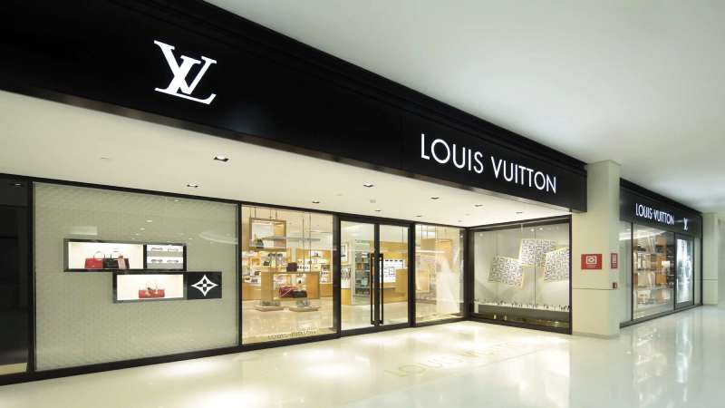
The wordmark “LOUIS VUITTON” appearing beneath the LV monogram is set in a slightly modified version of Futura, rendered in all capitals. The LV monogram itself is a hand-drawn logotype, not a font.
—
What Type of Font Is Futura?
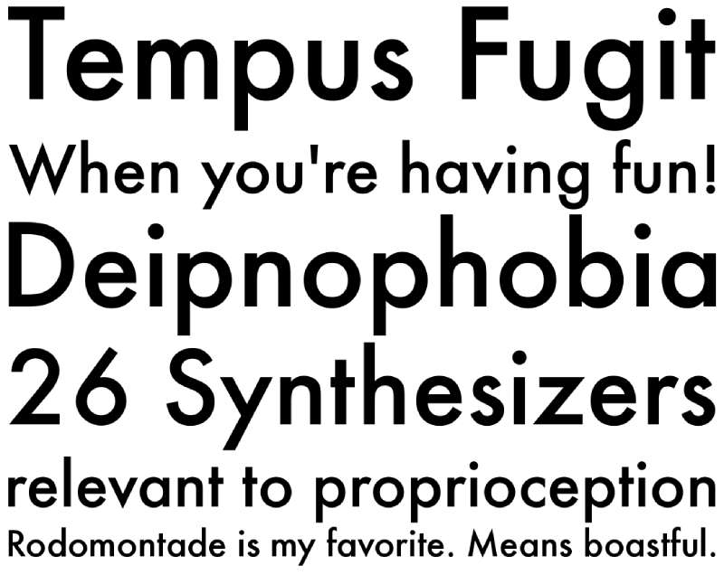
Futura is a geometric font in the sans-serif category. Its letterforms are built around pure geometric shapes: circles, triangles, and squares.
A few things that define it visually:
- Near-perfect circular “O” and “C” shapes
- Single-storey lowercase “a” (no second loop)
- Uniform stroke weight with minimal contrast
- Low x-height compared to most modern geometric sans-serifs
- Even tracking that gives text a rigid, structured rhythm
That geometric precision is exactly why Louis Vuitton licensed it. The LV wordmark is set in all-caps Futura with wide kerning, which gives it the stretched, commanding look associated with luxury brand typography.
Futura sits alongside Bauhaus design aesthetics, though Renner was never a Bauhaus member. The school’s ideas of functional, geometric modernism shaped his thinking all the same.
—
Who Designed Futura?
Paul Renner (1878–1956) designed Futura between 1924 and 1927. He was a German typographer, painter, and design teacher, not affiliated with the Bauhaus school but clearly influenced by the same modernist thinking that produced it.
The Bauer Type Foundry in Frankfurt commissioned and published the typeface in 1927, marketing it as “die Schrift unserer Zeit” (“the font of our time”). Futura is a commercial typeface. Louis Vuitton licensed it rather than commissioning a bespoke design, which makes it accessible to anyone willing to pay for the rights.
Multiple foundries now distribute digital versions: Linotype, URW Type Foundry, Monotype (as “Futura Now”), and Bauer Types, among others. The rights situation is fragmented because of decades of licensing agreements and competing versions across different regions.
—
Is Futura Free to Use?
No. Futura is a commercial font. It is not available on Google Fonts and is not free for personal or commercial use in its standard releases.
Here’s a quick breakdown of your options:
| Source | Version | License | Cost |
| Linotype / Monotype | Futura / Futura Now | Commercial | Paid |
| URW Type Foundry | Futura (multiple weights) | Commercial | Paid |
| Adobe Fonts | Futura PT (by Paratype) | CC subscription | Included in plan |
| Font Library | Futura Renner (open-source) | OFL | Free |
If you have an Adobe Creative Cloud subscription, Futura PT is accessible through Adobe Fonts at no extra charge. That’s probably the easiest path for most designers.
Worth knowing: using Futura in a brand context doesn’t automatically make your brand look like Louis Vuitton. LV’s wordmark relies on the all-caps setting, wide letter spacing, and the visual contrast against the hand-drawn LV monogram. The font alone won’t replicate that.
For more context on how font licensing works in general, it’s worth understanding the difference between desktop, web, and commercial-use licenses before you buy.
—
What Font Did Louis Vuitton Use Before?
The LV monogram dates back to 1896, when Georges Vuitton, son of founder Louis Vuitton, hand-drew the interlocking “L” and “V” to protect the brand against counterfeiting. That original hand-lettered monogram was inspired by classical Roman serif letterforms.
The wordmark beneath the monogram originally used typefaces from the early 20th century, none of which match the clean geometric structure of Futura. In early brand materials from the 1920s and 1930s, Louis Vuitton used period-appropriate typefaces that read as far more ornate than the current wordmark.
1997 was the turning point. When Marc Jacobs joined as creative director, the brand leaned further into the LV monogram, eventually stripping the wordmark from many marketing materials altogether. The all-caps Futura-based logotype became the primary typographic identity going forward.
Today, some limited-edition products and archival collections still reference the older lettering styles, but those are deliberate throwbacks rather than an active typographic choice.
—
Free Alternatives to Futura for Your Projects
If you want that clean, geometric LV-adjacent look without paying for Futura, these 5 alternatives are worth knowing.
| Font | Why It Works | License | Source |
| Jost | Closest structural match to Futura; 90% similarity score; single-storey “a” available via CSS | OFL (free) | Google Fonts |
| Josefin Sans | Art Deco proportions, tall and geometric; great for display use and luxury branding | OFL (free) | Google Fonts |
| Nunito | Geometric base with softened terminals; more approachable feel, multiple weights | OFL (free) | Google Fonts |
| Poppins | Geometric sans with softer curves; widely used in luxury-adjacent digital branding | OFL (free) | Google Fonts |
| Futura PT | Official Futura variant by Paratype; includes Cyrillic; closest to the real thing | Adobe CC | Adobe Fonts |
For the LV wordmark look specifically, Jost in all-caps with increased tracking gets surprisingly close. Pair it with a strong visual hierarchy and generous leading and it reads as premium without any licensing costs.
If you’re working on something in the fashion space, check out these roundups of the best fonts for clothing brands and best fonts for luxury brands for more options beyond the Futura family.
The Josefin Sans font pairing guide and the Nunito font pairing guide are also worth reading if you need a secondary typeface to go with whichever option you pick.
—
How to Use a Futura Alternative in Design Tools
In Figma or Canva
Jost and Josefin Sans are available directly inside both tools without any installation. In Figma, search by name in the font picker. In Canva, they appear under the fonts panel.
Set the text to all-caps, increase letter spacing to around 200–300 (Figma units) or 4–6px, and use a medium or regular weight for the wordmark. Bold weights tend to look heavy rather than luxurious at large sizes.
For Web Use
If you’re embedding via Google Fonts, the HTML embed for Jost looks like this:
“ <link href="https://fonts.googleapis.com/css2?family=Jost:wght@300;400;500&display=swap" rel="stylesheet"> `
Then in your CSS:
` font-family: 'Jost', sans-serif; text-transform: uppercase; letter-spacing: 0.25em; font-feature-settings: "ss01" 1; / enables single-storey 'a' / `
That last line is the trick most people miss. Without it, Jost uses a double-storey “a” by default, which looks slightly less Futura-like. Enable it and the resemblance gets noticeably closer.
If you want to add fonts to Figma or need to upload fonts to Canva (for a purchased version of Futura), both tools support custom font uploads for paid plans.
—
Why Did Louis Vuitton Choose Futura?
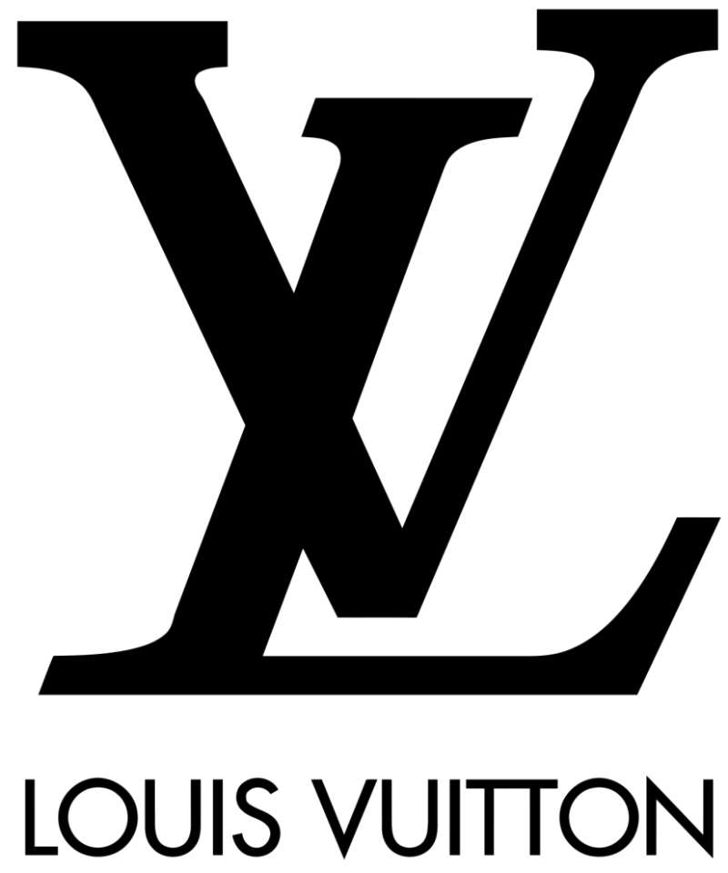
Futura communicates modernity without effort. There is no decorative detail to distract from the letterforms themselves, which means the brand name sits cleanly alongside the complex visual language of the LV monogram without creating visual noise.
The contrast is the point. The LV monogram is a hand-drawn, historically rooted symbol with thick serifs and interlocking strokes. Futura, set in all-caps with wide spacing, is the exact opposite: mechanical, rational, contemporary. That pairing of old-world craft with modernist typography is a deliberate logo design choice.
Futura also carries genuine cultural weight in the luxury fashion space. According to Monotype’s research into elite fashion brand typography, geometric sans-serifs appear in roughly 70% of top luxury fashion brands. Futura and Proxima Nova lead that group. Louis Vuitton’s use of Futura is part of a broader industry preference, though LV adopted it long before the trend took hold.
The other practical reason: font performance across surfaces. Louis Vuitton appears on handbag linings, store facades, shopping bags, magazine ads, digital campaigns, and product tags. Futura’s geometric construction means it holds up at both 8pt and 80cm. That kind of vector-friendly consistency across scales is genuinely useful for a brand operating at this scope.
Comparable luxury brands have made similar calls. Dior and Chanel both lean on clean, high-contrast typography. Gucci takes a different approach with its serif-based identity. Each reflects a distinct brand position, but they all share the same underlying logic: typography should do the heavy lifting of communicating status without relying on ornamentation.
Futura’s font psychology is well-documented: geometric sans-serifs signal precision, confidence, and forward-thinking values. For a brand that has sold the same product category since 1854 while staying relevant across generations, that balance of authority and modernity is not accidental.
Other brands known for using Futura in their identity include Volkswagen, FedEx, Red Bull, and Gillette. It also appeared on the Apollo 11 lunar plaque in 1969. That’s a fairly convincing resume for a typeface that was already nearly a century old when Louis Vuitton leaned into it as a primary brand font.
Curious how other luxury and fashion brands handle their typography? See what Balenciaga, Vogue, and Adidas use, or browse the broader list of luxury brand fonts to compare approaches.
FAQ on What Font Does Louis Vuitton Use
What font does Louis Vuitton use in its logo?
Louis Vuitton uses Futura Medium for the wordmark “LOUIS VUITTON,” set in all capitals.
The LV monogram is hand-drawn, not a font. It was created by Georges Vuitton in 1896, loosely inspired by classical Roman letterforms.
Is the Louis Vuitton font a custom typeface?
Not entirely. The wordmark uses a modified version of Futura, a commercially available geometric sans-serif typeface.
The LV monogram is a fully custom, hand-lettered mark. It cannot be replicated using any existing font.
Who designed the Futura typeface used by Louis Vuitton?
Paul Renner designed Futura between 1924 and 1927. The Bauer Type Foundry in Frankfurt published it in 1927.
Renner was a German typographer influenced by modernist design movements, though he was never a Bauhaus member.
Can I download the Louis Vuitton font for free?
Futura is a paid commercial font. It is not available on Google Fonts.
A free open-source version called Futura Renner exists on Font Library under an OFL license. For the closest paid version, Futura PT is accessible through Adobe Fonts with a Creative Cloud subscription.
What are the best free alternatives to the Louis Vuitton font?
The top free options are Josefin Sans, Jost, and Nunito, all available on Google Fonts.
Jost is the closest structural match to Futura, with a 90% similarity score. Enable the single-storey “a” using font-feature-settings: “ss01” 1 in CSS for an even more accurate result.
What type of font classification does Louis Vuitton use?
Futura Medium is a geometric sans-serif typeface. Its letterforms are built on circles, triangles, and squares with near-uniform stroke widths.
This classification connects it to the same design tradition as Bauhaus design, which prioritized function and geometry over decorative detail.
Does Louis Vuitton use the same font across all its branding?
The all-caps Futura-based wordmark appears consistently across packaging, store signage, marketing materials, and digital platforms.
Some archival and limited-edition products reference older lettering styles from the early 20th century, but those are deliberate historical references, not the current brand standard.
What font did Louis Vuitton use before Futura?
In the 1920s and 1930s, Louis Vuitton used period typefaces that were more ornate than Futura.
The shift toward the current geometric typography became more defined after Marc Jacobs joined as creative director in 1997, when the brand stripped the wordmark from many materials and pushed the LV monogram to the front.
How does Louis Vuitton’s font compare to other luxury brands?
LV’s use of geometric sans-serif typography aligns with around 70% of top luxury fashion houses, according to Monotype research.
Chanel uses a high-contrast serif logo, while Gucci leans serif throughout. Louis Vuitton’s pairing of a geometric wordmark with a hand-drawn monogram is a less common but more distinctive approach among luxury brand fonts.
Why did Louis Vuitton choose a geometric sans-serif font?
Futura’s clean, rational structure contrasts directly with the ornate, hand-drawn LV monogram. That tension between old-world craft and modernist typography is intentional.
Geometric sans-serifs also scale cleanly across every surface, from handbag linings to six-meter store facades, which matters for a brand operating at global scale.
Conclusion
So, what font does Louis Vuitton use? Futura Medium, a geometric sans-serif designed by Paul Renner in 1927, set in all-caps with wide letter spacing for the LV wordmark.
The LV monogram is a separate story entirely. Hand-drawn by Georges Vuitton in 1896, it sits in a different typographic category altogether.
If you need something similar for your own projects, Jost and Josefin Sans are solid free starting points. Both capture that clean, geometric brand typography feel without the licensing cost.
For more on how iconic fonts shape luxury brand identity, the comparisons with Dior and Balenciaga are worth a look.

Renowned for his expertise in logo design and visual branding, Bogdan has developed a multitude of logos for various clients.
His skills extend to creating posters, vector illustrations, business cards, and brochures. Additionally, Bogdan's UI kits were featured on marketplaces like Visual Hierarchy and UI8.
He also wrote in the past years on sites like Design Your Way, WebDesignerDepot, WPDean, Designmodo, Speckyboy, Slider Revolution, and more.
- Canva vs PowerPoint: Which Is Better for Presentations? - 22 September 2026
- How to Install Fonts on Mac (Step-by-Step Guide) - 20 September 2026
- From Mockup to Code: How AI-Augmented Development Speeds Up the Design Handoff - 19 September 2026

Bogdan Sandu is a seasoned designer who has been designing websites since 2008. Renowned for his expertise in logo design and visual branding, Bogdan has developed a multitude of logos for various clients. His skills extend to creating posters, vector illustrations, business cards, and brochures. Additionally, Bogdan's UI kits were featured on marketplaces like Visual Hierarchy and UI8. He also wrote in the past years on sites like Design Your Way, WebDesignerDepot, WPDean, Designmodo, Speckyboy, Slider Revolution, and more.
You Might Also Like