Your font choice says something about your brand before a single product is seen.
For clothing brands, typography is not decoration. It shapes how customers feel about your label the moment they see it, whether on a hang tag, a website header, or a logo wordmark.
The wrong typeface can make a luxury brand look cheap. The right one builds recognition that lasts for decades. Chanel, Supreme, and Gucci all prove this.
This guide covers the best fonts for clothing brands across every style, from high-end fashion to streetwear to boutique apparel. You will find out which serif and sans-serif typefaces work best, how to pair them, and where to get them.
The Best Fonts For Clothing Brands
| Font | Best For | Notable Brands | Key Watch-Out |
|---|---|---|---|
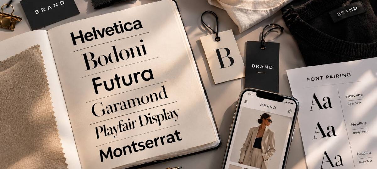
| Helvetica Neutral sans-serif, 1957 |
Minimalist and contemporary apparel, gender-neutral lines, brands prioritizing clarity over personality | Calvin Klein, American Apparel, Uniqlo | Licensed through Linotype. Arial is not a suitable substitute for premium brands. Free alternative: Haas Grotesk. |
| Bodoni High-contrast serif, late 18th century |
High-end and luxury fashion labels, women’s editorial brands, premium positioning | Vogue, Giorgio Armani, various haute couture labels | Extreme stroke contrast breaks down at small sizes. Body text use is strongly discouraged. Free alternative: Bodoni Moda on Google Fonts. |
| Futura Geometric sans-serif, 1927 |
Streetwear and urban apparel, sportswear and activewear, modern design-conscious brands | Supreme, Louis Vuitton | Licensed through Bauer Type Foundry. Pure geometry can feel cold in brand-forward contexts. Free alternatives: Nunito, Josefin Sans. |
| Garamond Old-style serif, 16th century |
Heritage and legacy clothing brands, outdoor and craft workwear, premium basics with a brand story | Abercrombie & Fitch, various heritage menswear labels | Small x-height requires generous line-height and sizing for screen use. Free alternatives: EB Garamond, Cormorant Garamond on Google Fonts. |
| Playfair Display High-contrast display serif |
Women’s boutiques, bridal and eveningwear labels, brands wanting an upscale look on a free font budget | Widely used across independent fashion brands and Shopify fashion stores | Hairline strokes lose definition below 32px on screen. Headline use only. Free on Google Fonts. |
| Montserrat Geometric sans-serif, urban-influenced |
Contemporary and fast-fashion brands, DTC clothing startups, brands needing one font across all touchpoints | Widely adopted across e-commerce fashion on Shopify and Squarespace | Overused across e-commerce. Regular weight kills heading distinction. Heavy weights only for display. Free on Google Fonts. |
| Didot Neoclassical high-contrast serif |
Luxury and high-end fashion labels, minimalist brands with a French or European aesthetic, lookbooks and editorial | Chanel (wordmark association), Harper’s Bazaar | Unforgiving at small sizes. Hairline serifs break on low-res screens. No true free alternative. GFS Didot on Google Fonts is the closest option. |
| Bebas Neue Condensed all-caps display sans |
Streetwear, skate, and urban brands, activewear and sportswear labels, graphic-heavy apparel and merch | Independent streetwear brands, music merch, athletic apparel | All-caps only, one weight. Unusable for mixed-case text or long heading runs. Display sizes only. Free on Google Fonts. |
| Gotham Geometric sans-serif, 2000 |
American-heritage and workwear brands, premium basics, brands aiming for a polished and established image | Obama 2008 campaign, widely adopted by fashion and lifestyle brands | Licensed through Hoefler & Co. only. Not available free. Montserrat is the closest free substitute. |
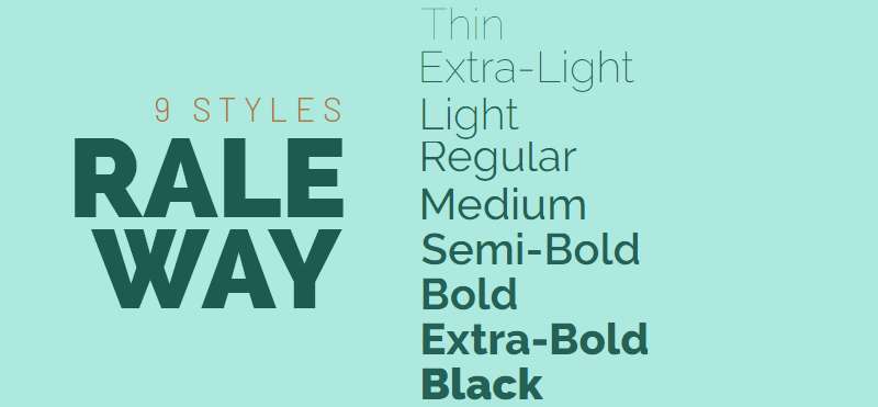
| Raleway Elegant thin sans-serif, Art Deco influence |
Contemporary women’s fashion, minimalist clothing lines with a soft aesthetic, brands using white space as part of their identity | Independent fashion brands, beauty labels, lifestyle e-commerce | Thin weights disappear on hang tags and small labels. Use Medium or SemiBold below display size. Free on Google Fonts. |
Choosing the right typeface for a clothing brand is one of the most consequential decisions in building a visual identity. The wrong font doesn’t just look off – it sends the wrong signal to the wrong audience.
Font psychology plays a bigger role in fashion branding than most people expect. A typeface shapes perception before a single word is read.
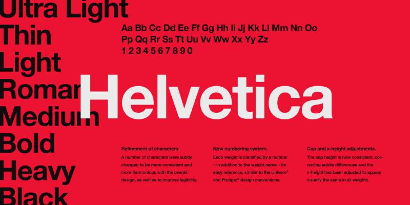
Helvetica
What It Is
A sans-serif font developed in 1957 by Max Miedinger. One of the most widely used typefaces in the world.
Why It Works for Clothing Brands
Neutral, clean, and adaptable. Works at any size, in any color, on any medium – hang tags, labels, lookbooks, websites.
It doesn’t compete with the product. That’s the point.
Best For
- Minimalist and contemporary apparel brands
- Gender-neutral and unisex clothing lines
- Brands prioritizing clarity over personality
Brands Using It
Calvin Klein, American Apparel, Uniqlo (heavily influenced).
Pairing Suggestions
Pair with Garamond or Bodoni for contrast. Helvetica font pairing works well with high-contrast serifs for editorial use.
Where to Get It
Licensed through Linotype. Available via Adobe Fonts. Free alternative: Haas Grotesk or Arial (not recommended for premium brands).
Bodoni
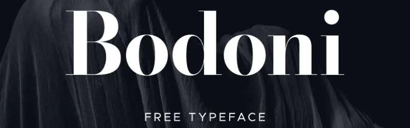
What It Is
A serif font with extreme thick-thin stroke contrast. Designed by Giambattista Bodoni in the late 18th century.
Why It Works for Clothing Brands
High contrast strokes read as luxurious and editorial. It’s dramatic without being decorative.
Vogue built an entire visual identity around it. That says enough.
Best For
- High-end and luxury fashion labels
- Women’s clothing with an editorial aesthetic
- Brands targeting premium positioning
Brands Using It
Vogue (magazine, deeply tied to fashion), Giorgio Armani, various haute couture labels.
Pairing Suggestions
Pair with a clean sans-serif like Futura or Helvetica. Heavy Bodoni headlines with light body text create strong typographic hierarchy.
Where to Get It
Available on Adobe Fonts. Google Fonts has Bodoni Moda as a free alternative.
Futura

What It Is
A geometric font designed by Paul Renner in 1927. Based on geometric shapes – circles, triangles, squares.
Why It Works for Clothing Brands
Modern, forward-looking, and precise. Communicates confidence.
Works especially well for streetwear and contemporary brands that want a strong, structured look without feeling stiff.
Best For
- Streetwear and urban apparel brands
- Sportswear and activewear lines
- Brands with a modern, design-conscious identity
Brands Using It
Supreme (heavily associated), Louis Vuitton, Volkswagen (cross-industry reference for versatility).
Pairing Suggestions
Pairs well with humanist typefaces to soften the geometric rigidity. Try it with Garamond for an unexpected contrast.
Where to Get It
Licensed through Bauer Type Foundry. Nunito and Josefin Sans are solid free alternatives – check out Josefin Sans font pairing options for clothing use cases.
Garamond

What It Is
A classic old-style serif with roots in 16th-century French typography. One of the most legible typefaces at small sizes.
Why It Works for Clothing Brands
Carries a sense of heritage, craft, and refinement. Feels earned rather than designed.
Ideal when a brand’s story matters as much as its product.
Best For
- Heritage and legacy clothing brands
- Outdoor and workwear brands with a craft narrative
- Premium basics and wardrobe staples
Brands Using It
Abercrombie & Fitch, various heritage menswear brands.
Pairing Suggestions
Garamond font pairing works well with Futura or Gill Sans for a classic-meets-modern contrast. Also pairs naturally with Cormorant Garamond – a free, more refined variation.
Where to Get It
Adobe Fonts, Google Fonts (EB Garamond). Cormorant Garamond is free and more refined – see Cormorant Garamond font pairing for fashion-specific combinations.
Playfair Display

What It Is
A high-contrast display font with strong serif strokes. Designed for editorial and headline use.
Why It Works for Clothing Brands
Elegant and feminine without being delicate. Strong enough for large headings, refined enough for boutique branding.
It reads luxury without requiring a luxury budget to license.
Best For
- Women’s boutiques and contemporary fashion brands
- Bridal and eveningwear labels
- Brands that want an upscale look with free font access
Brands Using It
Widely used across independent fashion brands, beauty, and lifestyle. A staple in Shopify fashion stores.
Pairing Suggestions
Playfair Display font pairing works best with clean sans-serifs like Raleway or Montserrat. Strong headline, light body – keep the contrast deliberate.
Where to Get It
Free on Google Fonts.
Montserrat

What It Is
A geometric sans-serif inspired by urban Buenos Aires signage. One of the most downloaded fonts on Google Fonts.
Why It Works for Clothing Brands
Versatile, modern, and highly readable across screen and print. Works at small label sizes and large campaign headers equally well.
Nothing flashy. Just solid.
Best For
- Contemporary and fast-fashion brands
- Direct-to-consumer clothing startups
- Brands needing one font to cover all touchpoints
Brands Using It
Widely adopted across e-commerce fashion brands, especially on Shopify and Squarespace storefronts.
Pairing Suggestions
Pairs well with Playfair Display for a classic editorial combination. Also works with Raleway for an all-sans approach – check Raleway font pairing for fashion-specific examples.
Where to Get It
Free on Google Fonts. One of the best free Google Fonts for brand use.
Didot
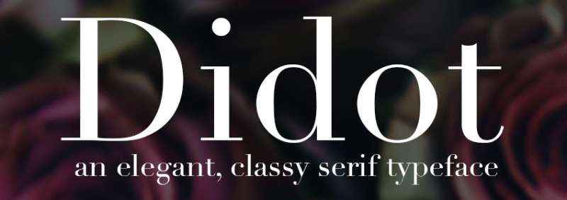
What It Is
A neoclassical serif with very high stroke contrast. Part of the same design family as Bodoni, but more refined and razor-thin in its details.
Why It Works for Clothing Brands
Communicates exclusivity and sophistication. The thin hairline serifs feel expensive – which is exactly the point for luxury apparel.
It’s unforgiving at small sizes, so it needs careful use.
Best For
- Luxury and high-end fashion labels
- Minimalist brands with a French or European aesthetic
- Lookbooks, campaigns, editorial contexts
Brands Using It
Chanel’s wordmark is closely associated with Didot. Also used by Harper’s Bazaar and similar fashion-adjacent publications.
Pairing Suggestions
Pair with a neutral sans-serif like Helvetica or Gill Sans. Avoid pairing with other high-contrast serifs – it gets cluttered fast.
Where to Get It
Licensed through Linotype and Adobe Fonts. No true free alternative, but GFS Didot is available through Google Fonts.
Bebas Neue
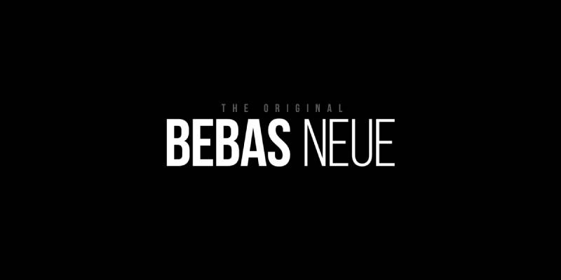
What It Is
A condensed all-caps sans-serif. Bold, tall, and made for impact.
Why It Works for Clothing Brands
Streetwear and sportswear love it for a reason. It commands attention, scales well on apparel graphics, and reads instantly from a distance.
Not subtle. That’s not what it’s for.
Best For
- Streetwear, skate, and urban clothing brands
- Activewear and sportswear labels
- Graphic-heavy apparel and merch
Brands Using It
Widely used across independent streetwear brands, music merch, and athletic apparel.
Pairing Suggestions
Pair with a lightweight sans-serif for body copy contrast. Works well with Montserrat Light or Raleway Thin to balance the visual weight.
Where to Get It
Free on Google Fonts. Also available on Adobe Fonts.
Gotham
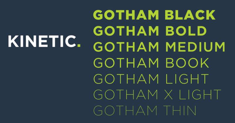
What It Is
A geometric sans-serif designed by Tobias Frere-Jones in 2000. Inspired by mid-century American signage.
Why It Works for Clothing Brands
Confident, clean, and American in character. Feels established without feeling old.
It’s the kind of font that makes a brand feel like it’s been around longer than it has.
Best For
- American-heritage and workwear brands
- Premium basics and wardrobe essentials
- Brands aiming for a polished, professional image
Brands Using It
Used in Barack Obama’s 2008 campaign (established its cultural weight). Widely adopted by fashion and lifestyle brands since.
Pairing Suggestions
Pairs well with Chronicle or Sentinel for editorial contrast. For a free alternative, Montserrat handles similar territory – see best Google Fonts for websites for pairing ideas.
Where to Get It
Licensed through Hoefler&Co. Not available free – Montserrat is the closest free substitute.
Raleway
What It Is
An elegant, thin sans-serif with Art Deco influences. Available in multiple weights on Google Fonts.
Why It Works for Clothing Brands
Light and graceful at large sizes. The thin weights carry a quiet luxury feel that suits fashion branding well.
At small sizes, stick to medium or semi-bold weights – the thin variants disappear on tags and labels.
Best For
- Contemporary women’s fashion brands
- Minimalist clothing lines with a soft aesthetic
- Brands using white space and clean layouts as part of their identity
Brands Using It
Popular among independent fashion brands, beauty labels, and lifestyle brands across e-commerce platforms.
Pairing Suggestions
Raleway font pairing works naturally with Playfair Display or Cormorant Garamond for a refined editorial look. Pairing fonts with contrasting weights is key here.
Where to Get It
Free on Google Fonts.
What Makes a Font Work for a Clothing Brand?
Picking a font for a clothing brand isn’t just about aesthetics. It’s a positioning decision that affects how customers read price, quality, and personality before they’ve touched a single product.
Monotype’s 2024 Font Use & Forecasting Survey found that 83% of designers say typography plays a key role in brand identity. That tracks with what you see across the clothing industry, where typeface selection consistently signals which shelf a brand belongs on.
How Font Personality Matches Brand Category
Luxury: High-contrast serifs, wide tracking, minimal weight. Think Didot, Bodoni, custom Didone-style cuts.
Streetwear: Condensed sans-serifs, bold weight, tight spacing. Bebas Neue, Utah Condensed, Impact-adjacent styles.
Contemporary/minimalist: Neutral geometric sans-serifs. Futura, Helvetica Neue, Avant Garde.
Heritage/outdoor: Slab serifs or humanist serifs with weight. Clarendon, Rockwell, Freight.
The category matters because font psychology tells us that consumers form brand impressions within milliseconds of seeing a wordmark. Getting the category wrong is harder to fix than getting the color wrong.
Legibility Across Clothing Applications
A font that looks elegant at 72pt on a lookbook page can completely fall apart at 6pt on a woven care label.
Thin hairline serifs (the kind Chanel and Dior use) are the most common culprit. Monotype’s own research on luxury fashion brands found that many high-end labels prioritize style over legibility, with layouts on major brand websites described as “fundamentally unreadable on screen” at smaller sizes.
Applications to test before committing to a typeface:
- Hang tags and woven labels (small sizes, often embossed or printed on textured material)
- Website navigation and product descriptions
- Social media profile text and story graphics
- Lookbook headers and editorial spreads
- Packaging and shopping bags
If a typeface fails more than two of those, it’s not the right choice regardless of how good it looks in a mockup.
Serif vs. Sans-Serif Fonts for Clothing Brands
The choice between a serif font and a sans-serif font isn’t a matter of taste. It’s a strategic signal tied to brand positioning and target audience.
Research from Monotype on luxury fashion brand typography found that 80% of the top luxury apparel brands use a serif typeface in their logo. That number holds across Gucci, Dior, Louis Vuitton, Prada, and Versace.
When Serif Fonts Signal Luxury in Fashion
Serifs carry specific cultural weight in fashion because of their association with print heritage, editorial publishing, and European craftsmanship. Dior uses Nicolas Cochin Regular. Gucci uses Granjon Roman. Both are high-contrast serifs with roots in classical French and Italian typography.
The pattern is clear:
- Didone-style serifs (Didot, Bodoni, Cochin): extreme stroke contrast, Parisian editorial associations, best for luxury and premium positioning
- Old-style serifs (Garamond, Caslon): warmth and heritage, good for heritage brands and mid-market premium
- Transitional serifs (Baskerville, Times): authoritative and reliable, better for brand communications than logos
Geometric sans-serif fonts used in luxury advertising improve message memorability by 6% and perceived competitive advantage by 12%, according to Monotype research on luxury branding and typography.
When Sans-Serif Fonts Work Better for Contemporary Clothing Brands
Contemporary, fast-fashion, and athletic clothing brands almost uniformly go sans-serif.
| Brand | Typeface | Category |
|---|---|---|
| Balenciaga | Utah Condensed Bold (sans-serif) | Luxury streetwear |
| YSL | Helvetica Neue Bold | Modern luxury |
| H&M | Custom modern sans-serif | Fast fashion |
| Calvin Klein | Avant Garde Gothic | Minimalist contemporary |
| Nike | Custom sans-serif | Athletic |
The logic: sans-serifs read as modern, clean, and democratic. For brands targeting younger buyers or positioning around performance and accessibility rather than heritage, a strong geometric or humanist sans-serif matches buyer expectations better than a serif ever could.
And if a slab serif font appeals to you, that category fits outdoor, workwear, and heritage-adjacent brands (think Carhartt or Patagonia-style aesthetics) where durability and function are part of the brand story.
How Typography Affects Clothing Brand Perception
Typography influences purchase decisions before a customer reads a single word. Visual semiotics research from Tao and Mohamed (2023) shows that premium visual finishes, including typography, affect impulse purchase intentions directly.
81% of consumers say brand trust is a deciding factor in making a purchase (Edelman). Typography is one of the fastest ways to build or break that trust.
How Typeface Weight Signals Price Point
Font weight is one of the most under-discussed tools in clothing brand typography.
Thin and light weights (100-300) read as elevated, exclusive, and expensive. There’s a reason Chanel’s supporting web typography uses Futura Light rather than Futura Bold.
Heavy weights read as energetic, accessible, and youth-oriented. Streetwear brands default to this deliberately. Supreme’s box logo uses Futura Heavy in all caps precisely because the weight signals confidence rather than refinement.
A 2024 systematic literature review on brand visual identity (ResearchGate, covering 34 studies from 2004-2024) confirmed that typography and font style consistently shape consumer perceptions and purchase attitudes across brand categories.
Letter Spacing as a Signal of Refinement
Wide tracking (letter-spacing) is a quiet signal that a brand operates at a premium level.
Most luxury fashion brands use generous tracking in their wordmarks. It creates visual space that reads as unhurried and considered. It also makes thin fonts more legible at small sizes without changing the weight. Balenciaga, despite using a condensed sans-serif, applies wide tracking to maintain that sense of space.
Tight tracking signals urgency, energy, and high volume. It’s everywhere in fast fashion and streetwear. That’s not wrong; it’s just a different message.
Font spacing controls a lot of the emotional register of clothing brand typography, often more than the typeface itself. Two brands using Futura can look completely different based on tracking alone.
Free vs. Paid Fonts for Clothing Brands
Budget matters, but font licensing matters more. Getting that wrong is the expensive mistake.
70% of designers turn to popular marketplaces for font purchases, with budget constraints being the primary driver of font acquisition decisions, according to Monotype’s 2024 survey.
Google Fonts Worth Using for Clothing Brands
Free doesn’t mean generic. Several Google Fonts hold up well for clothing brand typography, especially at the contemporary and mid-market tier.
Cormorant Garamond: High-contrast display serif with dramatic proportions and calligraphic roots. Closest free approximation to the Didone aesthetic used by luxury brands. Works for logos, lookbook headers, and editorial layouts. Developed by Christian Thalmann in 2015.
Raleway: Geometric sans-serif with elegant, distinctive letterforms. The unusual “W” character gives it personality that most sans-serifs lack. Good for contemporary brand wordmarks and headings. Available in 18 weights.
Playfair Display: Transitional serif with high contrast and editorial authority. Used regularly across fashion fonts and premium lifestyle brands. Best at display sizes, not body text.
Josefin Sans: Thin, geometric sans-serif with a 1920s typographic sensibility. Works well for minimalist clothing brands targeting a design-forward audience.
Bebas Neue: Condensed display sans-serif. All-caps, bold, commanding. Appropriate for streetwear and youth-oriented apparel brands where impact matters more than refinement.
For anyone building a clothing brand site, the resources on the best free Google Fonts cover the full library with context, which saves a lot of trial and error.
What Font Licensing Means for Apparel Brands
This is where many clothing startups get into trouble. A standard desktop font license covers use on your own computer for documents. It does not cover commercial use on physical products.
Desktop license: Screen and print use on your own devices. Does NOT cover merchandise, labels, or packaging at commercial scale.
Web license: Use via CSS on your website. Separate from print licensing.
Commercial/extended license: Covers use on physical products, labels, hang tags, packaging, and merchandise for sale. This is what clothing brands need.
Custom/exclusive license: Full ownership or exclusivity rights. What major luxury houses pay for with bespoke typefaces.
Google Fonts are licensed under the SIL Open Font License, which is genuinely free for commercial use including physical products. That’s a real advantage for startups. Most paid fonts from foundries like Monotype, Adobe, or Font Bureau require an extended commercial license for merchandise use, and those can run from a few hundred to several thousand dollars per typeface.
How to Pair Fonts for a Clothing Brand Identity
Most clothing brands need two typefaces. A logo or display font, and a supporting font for body copy, product descriptions, and web content. Using more than two usually creates visual noise rather than hierarchy.
Pairing fonts well for clothing branding means contrast without conflict. A high-contrast serif headline needs a neutral sans-serif body font. A bold geometric sans-serif logo needs a lighter, more readable companion.
Proven Font Pairings for Clothing Brands
The pairings below are based on what actually works across fashion brand typography, not just what looks interesting in a specimen.
| Heading Font | Body Font | Best For |
|---|---|---|
| Playfair Display | Raleway Light | Premium/contemporary brands |
| Cormorant Garamond | Montserrat | Luxury and editorial |
| Futura | Garamond | Fashion-forward with heritage |
| Bebas Neue | Open Sans | Streetwear and youth brands |
| Josefin Sans | Lora | Minimalist/artisan clothing |
Research confirms Playfair Display + Raleway is specifically noted as “best for premium brands, the wedding industry, and sophisticated consumer products,” a category that maps directly onto higher-end clothing and lifestyle apparel.
For Cormorant Garamond pairings, Montserrat is the most common recommendation for clothing and fashion brands because the high-contrast serif headline and neutral geometric body create typographic contrast without tonal clash.
Testing Pairings Across Real Touchpoints
Picking a pairing that looks good in Google Fonts previewer isn’t enough.
Test every combination across:
- Logo lockup at small sizes (under 30px)
- Hang tag copy at 8-10pt
- Instagram post header at 60-80pt
- Website body copy at 16px
- Email subject line and header
A font pairing generator speeds up the visual comparison step, but the real test is always in context. Mockups on actual product photography reveal rendering problems that clean white-background previews hide completely.
Single-family pairings (using multiple weights from one typeface) are underused in clothing branding. Using Montserrat Hairline for headings and Montserrat Regular for body text is more cohesive and sometimes more distinctive than a two-family pairing. It’s worth testing before defaulting to two separate fonts.
Typography Mistakes Clothing Brands Make
Most typography problems in clothing branding come from one of two places: choosing fonts for aesthetics without thinking about application, or treating type decisions as low-priority.
46% of consumers say they are willing to pay more for a brand they trust. Typography is one of the fastest visual signals of whether a brand deserves that trust.
Choosing Trendy Fonts Over Timeless Ones
Trend-following in typography ages badly. A font that looks current in year one can look dated by year three, and rebranding a clothing line costs money, time, and brand equity.
The brands with the most durable visual identities (Chanel, Levi’s, Carhartt) have largely resisted typographic trends since establishing their identity. Chanel’s wordmark has remained essentially unchanged for decades.
This doesn’t mean using something deliberately old-fashioned. It means choosing typefaces with proven longevity: Futura (1927), Garamond (16th century revival), Helvetica (1957), Bodoni (18th century). These have lasted because they’re structurally excellent, not because they were fashionable.
Ignoring Font Behavior on Physical Applications
Screen previews lie. Thin hairline serifs look refined at 200pt in Adobe Illustrator. They disappear entirely when embroidered at 8mm.
Common failure points:
- Embroidery: minimum stroke width required; thin serif strokes and script fonts typically cannot be reproduced at small sizes
- Screen printing: fine details fill in; avoid fonts with tight counters or extremely thin strokes
- Woven labels: low resolution; simple, open letterforms perform best
- Foil stamping: high contrast reads well, but tiny text loses detail
Patagonia’s typography works on labels, hang tags, and outdoor signage because they chose a typeface family with enough weight variation to scale down without breaking. That’s not accidental.
Using Too Many Typefaces
Three or more unrelated typefaces across a clothing brand’s touchpoints creates inconsistency that reads as unpolished. Customers may not articulate why a brand feels disjointed, but they feel it.
The rule that actually works: one display/logo typeface, one body/supporting typeface. Use weight variation within each family for hierarchy rather than introducing a third font.
Consistent visual branding through typography increases brand recall and strengthens emotional connections with consumers, according to a 2025 literature review on visual brand identity consistency (Journal Ar Ro’is Mandalika). Inconsistent font use across web, print, and product is one of the most common ways clothing brands undermine the trust they’re trying to build.
FAQ on The Best Fonts For Clothing Brands
What is the best font for a clothing brand logo?
It depends on your brand identity. Helvetica, Futura, and Bodoni are reliable choices used by major fashion labels. Serif fonts signal luxury. Sans-serif fonts feel modern and clean. Match the font to the feeling your brand needs to project.
Should clothing brands use serif or sans-serif fonts?
Both work, for different reasons. Serif fonts suit luxury and heritage brands. Sans-serif fonts work better for streetwear, minimalist, and contemporary labels. Look at your target customer and brand positioning before deciding.
What fonts do luxury fashion brands use?
Most luxury labels lean on high-contrast serifs. Chanel uses Didot. Dior uses a custom serif. Louis Vuitton relies on a geometric sans-serif. The pattern is consistent: clean, high-end, and minimal.
Can I use Google Fonts for my clothing brand?
Yes. Montserrat, Playfair Display, and Raleway are strong free options available on Google Fonts. They are web-ready and print-friendly. Just check the license if you plan to use the font commercially on garment labels or packaging.
What font does Supreme use?
Supreme uses Futura Bold in its iconic box logo. It is a geometric sans-serif known for its strong, uniform strokes. Simple, bold, and instantly recognizable. That combination is exactly why it works so well for streetwear brand identity.
What font works best for garment labels?
Clean sans-serif fonts with open letterforms read best at small sizes. Montserrat, Gill Sans, and Proxima Nova are solid picks. Avoid thin scripts or decorative typefaces. They lose legibility when printed or woven onto fabric at small scales.
How do I pair fonts for a clothing brand?
Pair a display or serif font for headings with a clean sans-serif for body text. Contrast is key. Try Playfair Display with a neutral sans-serif, or Bodoni paired with Futura. Use a font pairing generator to test combinations fast.
What font is good for a streetwear brand?
Futura, Gotham, and condensed grotesque fonts are popular in streetwear. Bold, geometric, and strong. All-caps settings add attitude. Brands like Supreme and Off-White built their entire visual identity around this kind of unapologetic typography.
Do I need to license a font for commercial clothing use?
Yes, in most cases. Free fonts often have restrictions on commercial use, especially for packaging and product labels. Always read the license terms. For full protection, consider purchasing a commercial license or working with a type foundry directly.
What makes a font good for fashion branding?
Legibility, personality, and scalability. A good fashion brand font reads clearly at any size, from a billboard to a care label. It also needs to reflect the brand’s tone, whether that is elegant, edgy, playful, or minimal. Versatility matters a lot.
Conclusion
This conclusion is for an article presenting the best fonts for clothing brands, and the core takeaway is simple: typeface selection directly affects how customers perceive your label.
Bodoni and Didot carry elegance. Futura and Gotham project confidence. Montserrat and Raleway keep things modern without losing warmth.
Your font needs to hold up on garment labels, lookbooks, hang tags, and your website header. Versatility is non-negotiable.
Pay attention to font licensing before committing, especially for commercial apparel use. A great brand typography system also means knowing how to pair fonts well, not just picking one you like.
Get that right, and your visual identity will do a lot of the selling for you.

Renowned for his expertise in logo design and visual branding, Bogdan has developed a multitude of logos for various clients.
His skills extend to creating posters, vector illustrations, business cards, and brochures. Additionally, Bogdan's UI kits were featured on marketplaces like Visual Hierarchy and UI8.
He also wrote in the past years on sites like Design Your Way, WebDesignerDepot, WPDean, Designmodo, Speckyboy, Slider Revolution, and more.
- The Windsurf Logo History, Colors, Font, And Meaning - 10 October 2026
- How to Remove Background From Product Photos (No Photoshop) - 10 October 2026
- How Designers can Build a Stronger Online Creative Identity - 9 October 2026

Bogdan Sandu is a seasoned designer who has been designing websites since 2008. Renowned for his expertise in logo design and visual branding, Bogdan has developed a multitude of logos for various clients. His skills extend to creating posters, vector illustrations, business cards, and brochures. Additionally, Bogdan's UI kits were featured on marketplaces like Visual Hierarchy and UI8. He also wrote in the past years on sites like Design Your Way, WebDesignerDepot, WPDean, Designmodo, Speckyboy, Slider Revolution, and more.
You Might Also Like