You’ve been staring at that Avenir license price for five minutes.
The fonts similar to Avenir you need exist, and some cost nothing. Avenir’s clean geometric sans-serif design made it a modern classic, but Adrian Frutiger’s masterpiece isn’t your only option.
Budget constraints, licensing limitations, or simply wanting fresh alternatives shouldn’t stop your project.
This guide breaks down 24 professional typefaces that capture Avenir’s balanced proportions, humanist warmth, and versatile character. You’ll find free Google Fonts, premium alternatives with expanded features, and specialized options for specific design needs.
We’ll cover each font’s weight range, visual characteristics, and ideal use cases. By the end, you’ll know exactly which Avenir alternative fits your branding, web design, or print project-without compromising on quality or breaking your budget.
Fonts Similar To Avenir
| Font Name | Primary Characteristics | Best Use Context | Similarity Level |
|---|---|---|---|
| Helvetica Neue | Clean geometric sans-serif with neutral personality and refined proportions | Corporate identity, user interfaces, editorial design | Very High |
| Montserrat | Geometric structure inspired by urban typography with wide letterforms | Web interfaces, modern branding, digital publications | Very High |
| Proxima Nova | Balanced hybrid combining geometric and humanist proportions with warmth | Professional websites, marketing materials, mobile applications | Very High |
| Futura | Strict geometric construction based on circles and straight lines | Headlines, luxury branding, fashion, architectural signage | High |
| Gotham | Geometric sans-serif inspired by architectural lettering with strong presence | Brand identity, political campaigns, editorial headlines | High |
| Lato | Humanist sans-serif with semi-rounded details offering friendly readability | Body text, web content, long-form reading | High |
| Nunito Sans | Rounded geometric terminals with balanced proportions and clarity | UI design, dashboards, friendly brand applications | Moderate |
| Roboto | Neo-grotesque with mechanical skeleton and friendly curves | Android interfaces, material design, digital products | High |
| Raleway | Elegant thin weights with geometric construction and sophistication | Minimal websites, fashion brands, portfolio sites | Moderate |
| Circular | Geometric sans with circular shapes and contemporary aesthetic | Tech startups, modern brands, app interfaces | Very High |
| TT Norms Pro | Versatile geometric grotesque with neutral character and flexibility | Corporate systems, extensive text hierarchies, presentations | Very High |
| MuseoSans | Low-contrast humanist sans with sturdy letterforms and warmth | Museums, cultural institutions, educational content | Moderate |
| Sofia Pro | Geometric with subtle humanist touches and extensive weight range | Premium branding, packaging, lifestyle products | Very High |
| Avenir Next | Refined evolution of Avenir with improved metrics and optical sizes | Direct Avenir replacement, Apple platforms, professional documents | Identical Family |
| Mulish | Minimalist geometric with slightly condensed proportions | Web applications, data displays, compact layouts | Moderate |
| Manrope | Open geometric with balanced spacing and modern professionalism | SaaS platforms, digital products, fintech applications | High |
| Figtree | Contemporary grotesque with clean lines and functional clarity | Design tools, creative portfolios, modern interfaces | High |
| Eau | Soft geometric with rounded terminals and approachable character | Wellness brands, lifestyle content, casual applications | Moderate |
| FF Meta | Humanist sans-serif with distinctive personality and excellent legibility | Transportation, wayfinding, public information systems | Moderate |
| Cera Pro | Geometric grotesque with organic terminals and balanced character | Brand identity systems, advertising, contemporary design | Very High |
| Neue Haas Unica | Neo-grotesque revival with improved spacing and refined details | International brands, multilingual content, professional typography | High |
| JUST Sans | Geometric construction with clean proportions and modern utility | E-commerce, digital publishing, web content | High |
| Prompt | Geometric sans with technical precision and systematic structure | Tech documentation, coding environments, system fonts | Moderate |
| Muli | Minimalist sans with open apertures and clean geometric forms | Web typography, minimalist designs, readable interfaces | Moderate |
Helvetica Neue
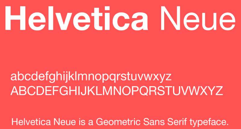
Neo-grotesque sans-serif font refined from the original Helvetica, released in 1983 by D. Stempel AG with expanded weights and unified proportions.
Primary Characteristics
51 fonts across nine weights (Thin through Black) in three widths. Unified cap heights and adjusted x-heights for optical consistency across all weights. Improved legibility through widened crossbars on lowercase f and t. Stronger punctuation marks and increased figure spacing compared to original Helvetica.
Visual Similarities to Avenir
Neutral, professional appearance suitable for corporate applications. Clean letterforms without decorative elements. Excellent readability at both display and text sizes. Wide range of weights for typographic hierarchy.
Best Use Cases
Corporate branding where neutrality is desired. Interface design for applications and websites. Professional documents requiring timeless aesthetics. Signage systems needing maximum legibility.
Key Differences
More mechanical and rigid compared to Avenir’s humanist warmth. Helvetica Neue lacks true italics (uses obliques instead). Higher x-height creates denser text blocks. Less geometric, more derived from nineteenth-century grotesques.
Montserrat

Geometric sans-serif typeface designed by Julieta Ulanovsky in 2011, inspired by 1920s Buenos Aires signage and widely adopted as a free Avenir alternative.
Primary Characteristics
Nine weights from Thin (100) to Black (900) with matching italics. Large x-height and short descenders for compact text setting. Wide apertures and near-circular bowls in geometric construction. Over 250 glyphs supporting extensive Latin character sets and Cyrillic.
Visual Similarities to Avenir
Geometric sans structure with clean, modern appearance. Versatile across both display and text applications. Neutral tone suitable for professional and creative projects. Multiple weights allow comprehensive design systems.
Best Use Cases
Web design where licensing costs matter. Brand identity systems requiring extensive weight range. Editorial layouts needing compact, efficient typography. Digital interfaces prioritizing readability and modern aesthetics.
Key Differences
Free and open-source via Google Fonts. Slightly more condensed proportions in heavier weights. More geometric and less humanist than Avenir. Taller ascenders that rise above cap height.
Proxima Nova
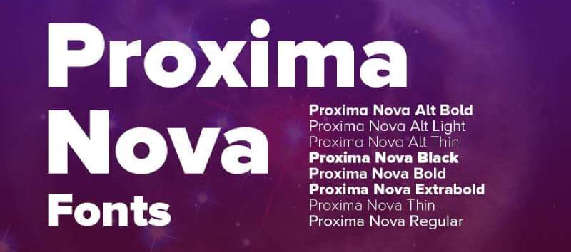
Humanist geometric sans-serif released in 2005 by Mark Simonson, blending Futura’s geometric structure with Akzidenz Grotesk’s versatility across 48 fonts.
Primary Characteristics
Eight weights (Thin through Black) in three widths (Normal, Condensed, Extra Condensed). 48 total fonts with matching italics for all styles. Small caps and multiple figure styles (lining, oldstyle, tabular, proportional). Extensive language support including Greek, Cyrillic, Vietnamese, Arabic, Thai, and Devanagari.
Visual Similarities to Avenir
Nearly identical proportions and x-height in medium weights. Warm, approachable character despite geometric foundation. Balanced stroke weights throughout letterforms. Highly legible at all sizes from body text to display.
Best Use Cases
Corporate websites requiring professional warmth. Branding systems needing extensive flexibility. User interfaces balancing friendliness with clarity. Long-form reading environments where Avenir would typically work.
Key Differences
More rounded letterforms in certain characters. Slightly tighter default kerning at display sizes. 48 fonts versus Avenir’s 12 basic weights. Broader language coverage in single purchase.
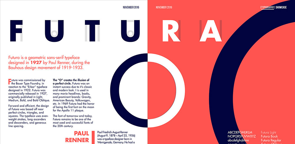
Futura

Geometric sans-serif designed by Paul Renner in 1927, featuring pure geometric forms based on circles, triangles, and squares with low stroke contrast.
Primary Characteristics
Six standard weights plus condensed and display variants. Near-perfect circular forms in lowercase a, g, and o. Tall ascenders rising above cap line. Monolinear strokes with minimal thick-thin variation. Single-story a and g common to geometric sans designs.
Visual Similarities to Avenir
Geometric construction with mathematical precision. Modern, forward-looking aesthetic. Versatile across commercial applications. Strong impact in display sizes.
Best Use Cases
Display typography requiring geometric purity. Poster design emphasizing modernist aesthetic. Headlines and titles needing architectural clarity. Branding projects with futuristic or minimalist direction.
Key Differences
Stricter geometric forms (perfect circles) versus Avenir’s optical adjustments. Lower x-height creates lighter text color. Less suitable for long body text. Tall ascenders make line spacing critical.
Gotham
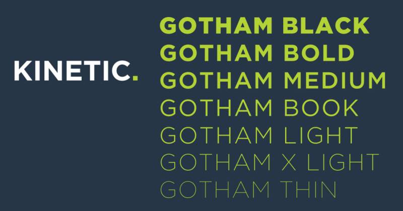
Geometric sans-serif designed by Tobias Frere-Jones in 2000, inspired by New York architectural lettering with wide, confident letterforms across 132 styles.
Primary Characteristics
Eight weights (Thin through Ultra) in four widths (Normal, Narrow, Extra Narrow, Condensed). 132 total styles including matching italics for all combinations. Uniform character widths more consistent than classical proportions. Larger bowls and wide stance create authoritative presence.
Visual Similarities to Avenir
Professional, trustworthy character. Geometric foundation with practical refinements. Excellent performance in corporate contexts. Range of weights supporting complete typographic systems.
Best Use Cases
Corporate identity requiring American aesthetic. Political and institutional communications. Magazine editorial where authority matters. Logo design needing confident, grounded presence.
Key Differences
Wider letterforms create more horizontal spread. More masculine, engineered feel versus Avenir’s warmth. Inspired by American vernacular not European modernism. Squared forms rather than Avenir’s subtle curves.
Lato

Humanist sans-serif designed by Lukasz Dziedzic in 2010, balancing warmth with structure through semi-rounded details and strong letterforms across nine weights.
Primary Characteristics
Nine weights from Thin (100) to Black (900) with matching italics. Semi-rounded details in letters while maintaining serious structure. Classical proportions in capital letters. Wide character set supporting 100+ Latin-based languages.
Visual Similarities to Avenir
Warm, friendly appearance despite professional application. Balanced proportions work well for body text. Neutral enough for diverse projects. Complete weight range for design systems.
Best Use Cases
Corporate websites balancing approachability with professionalism. Long-form web content requiring comfortable reading. Brand systems needing both warmth and authority. Digital interfaces prioritizing friendliness without casualness.
Key Differences
More humanist influence visible in stroke endings. Slightly narrower than Avenir in comparable weights. Designed primarily for screen readability. Free via Google Fonts versus Avenir’s licensing.
Nunito Sans
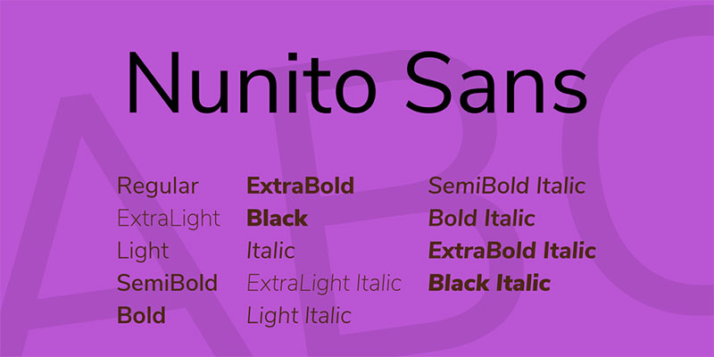
Geometric sans-serif with straighter lines designed as companion to rounded Nunito, featuring balanced proportions and excellent screen rendering across seven weights.
Primary Characteristics
Seven weights (ExtraLight through Black) with matching italics. Straighter, less rounded than original Nunito. Well-balanced letterforms optimized for digital screens. Large x-height improving readability at small sizes.
Best Use Cases
Web interfaces requiring friendly but professional tone. Mobile applications needing excellent legibility. Brand guidelines balancing warmth with clarity. Dashboard and data visualization projects.
Key Differences
More geometric than Avenir while maintaining approachability. Slightly condensed feel in medium weights. Optimized specifically for screen rendering. Free alternative to commercial geometric sans options.
Roboto

Neo-grotesque sans-serif designed by Christian Robertson in 2011 as Android system font, featuring six weights with mechanical skeleton and geometric forms.
Primary Characteristics
Six weights (Thin through Black) with oblique styles. Neo-grotesque classification with dual nature (mechanical and humanist). Optimized for UI with excellent screen rendering. Includes Roboto Condensed and Roboto Slab variants.
Visual Similarities to Avenir
Modern, clean appearance for digital environments. Professional tone suitable for corporate use. Complete weight range for interface hierarchy. Neutral character works across applications.
Best Use Cases
Android app development and mobile interfaces. Web applications prioritizing screen clarity. Material Design implementations. Digital products requiring familiar, accessible typography.
Key Differences
More mechanical, less humanist than Avenir. Condensed proportions save space in interfaces. Obliques rather than true italics. Designed primarily for screens not print.
Raleway
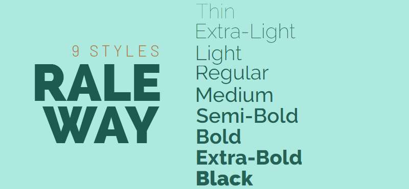
Elegant geometric sans-serif originally designed as single thin weight in 2010, expanded to nine weights by Pablo Impallari with distinctive uppercase elegance.
Primary Characteristics
Nine weights (Thin through Black) with matching italics. Elegant geometric construction with refined details. Distinctive W adds character to uppercase. Narrow overall proportions create sophisticated appearance.
Visual Similarities to Avenir
Geometric foundation with refined execution. Multiple weights for complete typographic systems. Modern aesthetic suitable for contemporary design. Works for both display and text applications.
Best Use Cases
Fashion and luxury branding emphasizing elegance. Editorial headlines requiring sophistication. Wedding and event materials needing refinement. Portfolio websites balancing style with readability.
Key Differences
More delicate and refined than Avenir’s sturdy construction. Narrower proportions create more vertical emphasis. Lighter weights more usable for display. Free via Google Fonts.
Circular

Geometric sans-serif designed by Lineto in 2013, featuring perfectly circular forms and wide spacing across seven weights, adopted by Spotify as brand typeface.
Primary Characteristics
Seven weights (Book through Bold) with matching italics. Wide letter spacing and generous proportions. Circular forms in bowls and counters. Large x-height with short ascenders and descenders.
Visual Similarities to Avenir
Geometric construction with friendly appearance. Professional yet approachable character. Suitable for brand identity systems. Excellent legibility across sizes.
Best Use Cases
Music and entertainment branding. Digital platforms requiring friendly professionalism. Mobile apps emphasizing accessibility. Social media content and marketing materials.
Key Differences
More rounded and friendly than Avenir. Wider spacing increases horizontal space requirements. More contemporary feel. Associated with Spotify brand identity.
TT Norms Pro
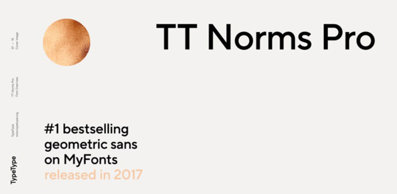
Geometric grotesque sans-serif by TypeType with 22 styles, combining classic grotesque proportions with contemporary detailing and extensive OpenType features.
Primary Characteristics
22 fonts across eleven weights with matching italics. Classic grotesque proportions with modern refinements. Extensive OpenType features including alternates and ligatures. Pan-European language support.
Visual Similarities to Avenir
Balanced geometric construction. Versatile across display and text. Professional appearance for corporate use. Complete weight range.
Best Use Cases
Brand identity systems requiring extensive options. Editorial design balancing tradition and modernity. Corporate communications needing flexibility. Web design with comprehensive typographic needs.
Key Differences
More weights and styles than standard Avenir. Slightly more condensed proportions. Includes more alternates and special characters. Contemporary interpretations of classic forms.
MuseoSans
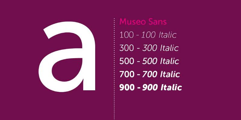
Humanist sans-serif designed by Jos Buivenga, released in 2008 with geometric underpinnings and subtle contrast variations across ten weights.
Primary Characteristics
Ten weights (Thin through Black) with matching italics. Subtle stroke contrast unusual for geometric sans. Slightly condensed proportions improve text efficiency. Strong personality while maintaining versatility.
Visual Similarities to Avenir
Clean, modern appearance suitable for varied applications. Multiple weights supporting design systems. Balanced proportions for text and display. Professional character.
Best Use Cases
Museum and cultural institution branding. Editorial projects balancing personality with clarity. Corporate communications requiring subtle distinction. Exhibition and signage systems.
Key Differences
More personality and character than Avenir’s neutrality. Subtle stroke contrast adds visual interest. Slightly condensed creates denser text. More affordable licensing tiers.
Sofia Pro
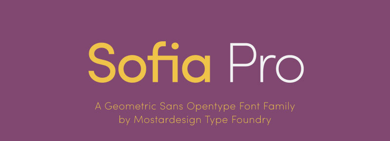
Geometric sans-serif designed by Olivier Gourvat in 2014, featuring clean lines and balanced proportions across eight weights with refined geometric forms.
Primary Characteristics
Eight weights (Ultra Light through Black) with matching italics. Clean geometric construction with subtle humanist refinements. Balanced proportions optimize versatility. Includes alternate characters for customization.
Visual Similarities to Avenir
Geometric foundation with approachable execution. Suitable for brand identity and editorial. Professional appearance across applications. Complete weight range.
Best Use Cases
Startup and tech company branding. Modern editorial layouts. Web and mobile interfaces. Marketing materials requiring contemporary aesthetic.
Key Differences
More contemporary feel than Avenir’s timeless quality. Slightly narrower proportions. More alternates and stylistic sets. Designed for digital-first environments.
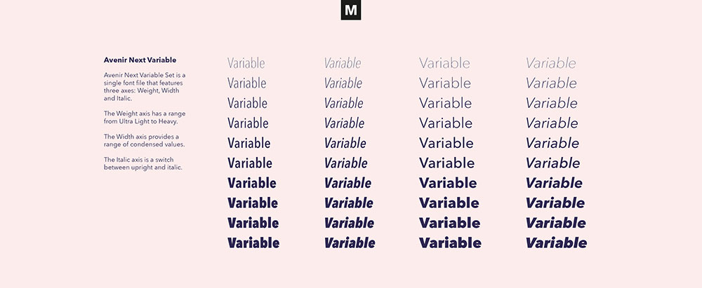
Avenir Next
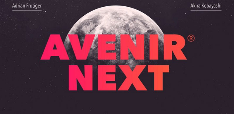
Evolution of original Avenir designed by Adrian Frutiger and Akira Kobayashi, released by Linotype with expanded weights, refined proportions, and improved technical execution.
Primary Characteristics
18 weights across six widths with matching italics. Refined letterforms with improved consistency. Enhanced optical sizes for different point ranges. Expanded language support including Cyrillic and Greek.
Visual Similarities to Avenir
Direct evolution maintaining core Avenir characteristics. Same humanist geometric foundation. Familiar proportions and spacing. Maintained Frutiger’s design principles.
Best Use Cases
Projects requiring updated Avenir with more options. Multilingual typography needing expanded character sets. Brand refreshes updating from original Avenir. Print and digital requiring optical size variants.
Key Differences
More weights and widths than original Avenir. Improved technical execution and spacing. Better screen rendering. Refined details throughout character set. Official successor to original design.
Mulish
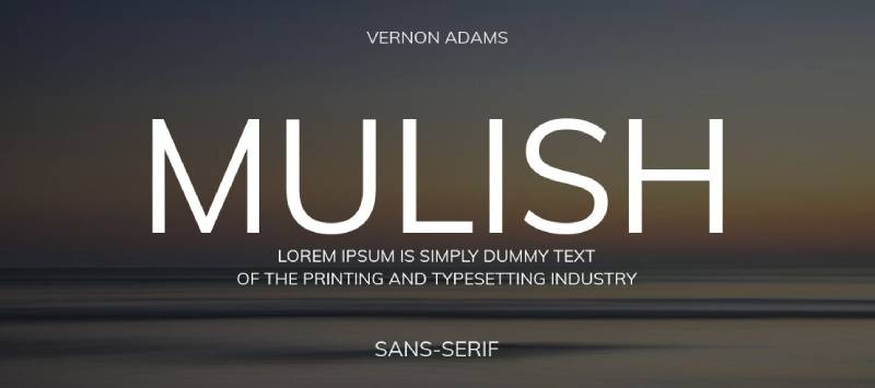
Minimalist sans-serif by Vernon Adams updated for contemporary use, featuring low stroke contrast and balanced letterforms across nine variable weights.
Primary Characteristics
Nine weights with variable font technology. Low stroke contrast creates even text color. Slightly condensed proportions improve efficiency. Clear, straightforward letterforms prioritize function.
Visual Similarities to Avenir
Neutral, versatile character. Suitable for text and interface. Professional without coldness. Complete weight spectrum.
Best Use Cases
Web projects leveraging variable fonts. Interface design requiring font loading efficiency. Corporate communications needing reliability. Digital products prioritizing performance.
Key Differences
Variable font technology reduces file sizes. More utilitarian than Avenir. Simpler forms with less refinement. Free via Google Fonts.
Manrope
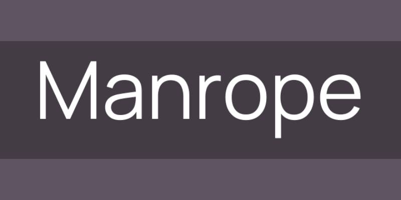
Modern geometric sans-serif designed by Mikhail Sharanda, featuring semi-condensed proportions and optimized for digital interfaces across eight weights.
Primary Characteristics
Eight weights (ExtraLight through ExtraBold) with variable font option. Semi-condensed proportions save horizontal space. Optimized hinting for screen rendering. Open-source with active development.
Visual Similarities to Avenir
Geometric construction with practical execution. Professional appearance. Versatile across applications. Multiple weights.
Best Use Cases
Web and app interfaces requiring screen optimization. Dashboard and data-heavy layouts. Responsive designs needing space efficiency. Open-source projects.
Key Differences
More condensed than Avenir. Optimized specifically for digital screens. Variable font technology. Free and open-source.
Figtree
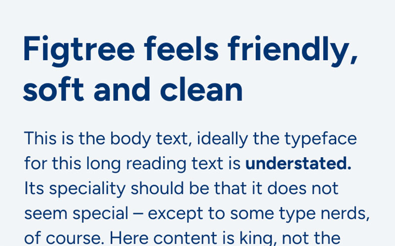
Contemporary geometric sans-serif with wide apertures and friendly character, designed for optimal screen rendering across five weights with variable font support.
Primary Characteristics
Five weights (Light through Black) with variable font technology. Wide apertures improve legibility at small sizes. Balanced geometric construction. Optimized for digital interfaces.
Visual Similarities to Avenir
Clean, approachable appearance. Geometric foundation. Professional yet friendly. Works across sizes.
Best Use Cases
Modern web applications. Mobile interfaces. Digital products. Contemporary branding projects.
Key Differences
Fewer weights than Avenir. Designed digital-first. Variable font option. Free via Google Fonts.
Eau
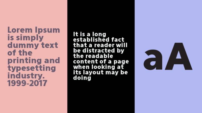
Minimalist geometric sans-serif with extremely light default weight and refined geometric forms, designed for display and editorial applications.
Primary Characteristics
Focus on lighter weights with refined geometry. Pure geometric construction. Emphasis on elegance over versatility. Limited character set focused on Latin scripts.
Visual Similarities to Avenir
Geometric foundation. Clean modern aesthetic. Professional appearance.
Best Use Cases
Fashion and luxury editorial. Display typography. Minimalist design projects. High-end branding.
Key Differences
More specialized display focus. Lighter weight emphasis. Less comprehensive than Avenir. More editorial than utilitarian.
FF Meta
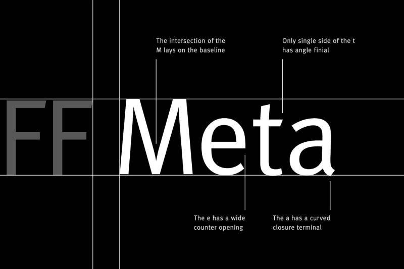
Humanist sans-serif designed by Erik Spiekermann in 1991, featuring narrow proportions and distinctive personality, influential in digital typography development.
Primary Characteristics
Multiple weights from Thin through Black. Narrow proportions optimize space efficiency. Distinctive details including slanted terminals. Strong personality while maintaining legibility.
Visual Similarities to Avenir
Professional quality for corporate use. Complete weight system. Versatile across media. High legibility standards.
Best Use Cases
Corporate identity systems. Editorial and publishing. Signage requiring efficient space use. Interface design needing character.
Key Differences
More condensed than Avenir. Stronger personality and character. Humanist not geometric. Distinctive rather than neutral.
Cera Pro
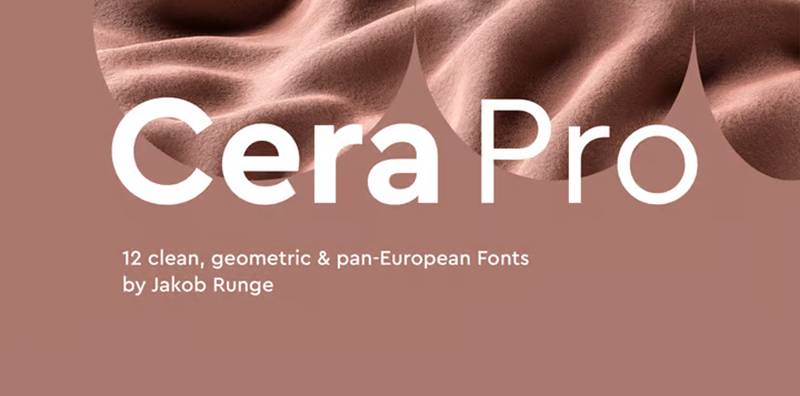
Geometric grotesque by TypeMates combining geometric principles with grotesque functionality across nine weights, designed for contemporary branding and interface design.
Primary Characteristics
Nine weights (Thin through Black) with matching italics. Geometric construction with grotesque refinements. Balanced proportions work across applications. Extensive OpenType features.
Visual Similarities to Avenir
Geometric foundation with practical execution. Professional versatility. Complete weight range. Modern appearance.
Best Use Cases
Contemporary brand identity. Interface design. Editorial layouts. Marketing materials.
Key Differences
More contemporary than Avenir’s timeless quality. Combines geometric and grotesque traditions. More stylistic alternates. Designed for current design trends.
Neue Haas Unica
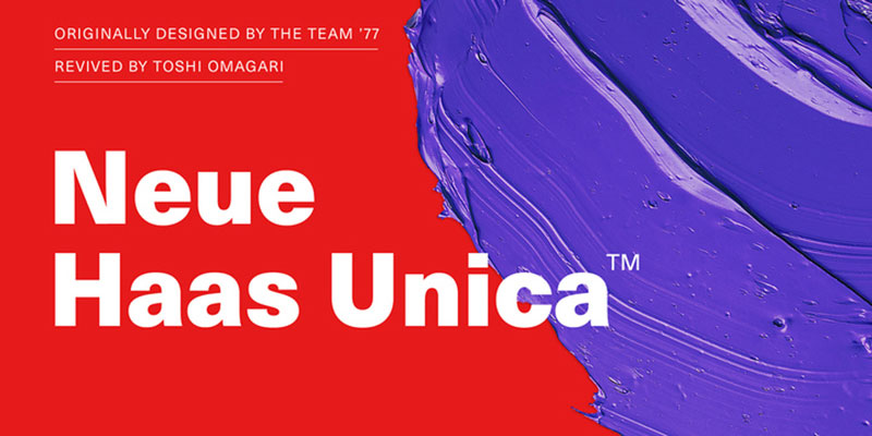
Rationalist sans-serif unifying Helvetica and Univers characteristics, released in 2015 as contemporary interpretation of 1980s design combining both typeface traditions.
Primary Characteristics
Five weights (Ultra Light through Black) with matching italics. Synthesis of Helvetica’s ubiquity and Univers’ system. Rationalist construction with even proportions. Contemporary execution of modernist principles.
Visual Similarities to Avenir
Neutral professional character. Complete weight system. Versatile corporate applications. Swiss design heritage.
Best Use Cases
Corporate identity requiring Swiss precision. Editorial balancing multiple typographic needs. Signage systems. Brand systems valuing design history.
Key Differences
More neutral than Avenir. Combines two typeface traditions. Different historical reference. More utilitarian approach.
JUST Sans
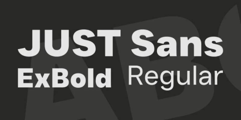
Contemporary geometric sans-serif with balanced proportions and friendly character, designed for brand and interface applications with emphasis on versatility.
Primary Characteristics
Multiple weights supporting complete systems. Balanced geometric construction. Friendly without sacrificing professionalism. Optimized for digital and print.
Visual Similarities to Avenir
Geometric foundation. Professional versatility. Approachable character. Complete weight range.
Best Use Cases
Brand identity systems. Web and mobile interfaces. Marketing materials. Contemporary design projects.
Key Differences
More contemporary design language. Different detail treatment. Designed for current digital requirements.
Prompt
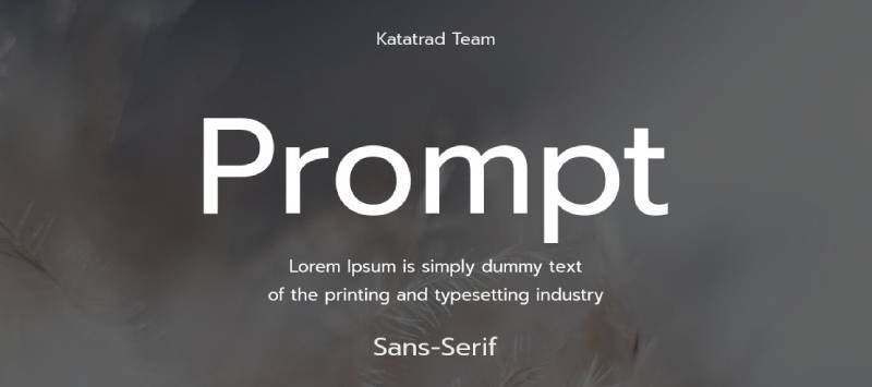
Thai-Latin sans-serif by Cadson Demak featuring loopless Thai design with matched Latin characters, optimized for multilingual settings across nine weights.
Primary Characteristics
Nine weights (Thin through Black) with matching italics. Loopless Thai design matched with Latin. Both scripts designed with equal attention. Optimized for screen rendering.
Visual Similarities to Avenir
Geometric sans-serif structure. Professional appearance. Complete weight system. Versatile applications.
Best Use Cases
Thai-English bilingual projects. International brands operating in Thailand. Multilingual web applications. Editorial requiring Thai support.
Key Differences
Designed for Thai-Latin pairing. Different design priorities. Specific language requirements. Free via Google Fonts.
Muli
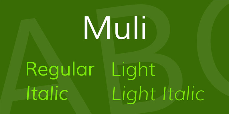
Minimalist sans-serif by Vernon Adams featuring low contrast and balanced proportions across seven weights, later renamed to Mulish with expanded character set.
Primary Characteristics
Seven weights with low stroke contrast. Even text color throughout weights. Balanced proportions suitable for text and interface. Clean, straightforward forms.
Visual Similarities to Avenir
Neutral versatile character. Professional quality. Suitable for extended reading. Complete weight system.
Best Use Cases
Web content requiring reliability. Interface design emphasizing clarity. Corporate communications. Digital products prioritizing legibility.
Key Differences
More utilitarian approach. Simpler forms. Less refined details. Free alternative via Google Fonts.
FAQ on Fonts Similar To Avenir
What makes a font similar to Avenir?
Geometric sans-serif structure with humanist warmth defines Avenir alternatives. Look for balanced proportions, clean letterforms, low stroke contrast, and versatile weight ranges. The best matches combine mathematical precision with approachable character, suitable for both body text and display applications.
Is Montserrat a good free alternative to Avenir?
Yes. Montserrat offers geometric construction, nine weights with italics, and comparable readability through Google Fonts. While slightly more condensed in heavier weights, it captures Avenir’s modern professional aesthetic perfectly for web design and branding without licensing costs.
Which Avenir alternative works best for websites?
Proxima Nova and Lato excel for web typography. Both offer extensive weight ranges, excellent screen rendering, and humanist warmth similar to Avenir. Proxima Nova provides 48 fonts across multiple widths, while Lato delivers comparable quality free through Google Fonts.
Can I use Helvetica Neue instead of Avenir?
Helvetica Neue works but feels more neutral and mechanical. It lacks Avenir’s humanist warmth and uses obliques rather than true italics. Choose Helvetica Neue for corporate applications requiring maximum neutrality, not projects needing Avenir’s friendly approachability.
What’s the difference between Avenir and Avenir Next?
Avenir Next expands the original with 18 weights across six widths, refined letterforms, and improved technical execution. It adds Cyrillic and Greek support plus optical size variants. Avenir Next represents Adrian Frutiger’s official evolution with enhanced consistency and expanded language coverage.
Are there affordable Avenir alternatives for print design?
MuseoSans and Sofia Pro offer professional quality at lower price points. Both provide multiple weights, geometric construction with personality, and excellent print performance. TT Norms Pro delivers 22 styles with extensive OpenType features, suitable for editorial and corporate print projects.
Which font pairs well with Avenir alternatives?
Pair geometric sans alternatives with transitional serifs like Baskerville or humanist serifs like Merriweather. For sans-only pairings, combine different structural approaches like pairing Montserrat with condensed grotesques. Ensure sufficient weight and style contrast for clear visual hierarchy.
Does Gotham replace Avenir effectively?
Gotham provides different character. It feels more American, engineered, and authoritative with wider proportions than Avenir’s European elegance. Choose Gotham for projects requiring confident, grounded presence rather than Avenir’s balanced versatility and warmth.
What’s the best Avenir alternative for mobile apps?
Roboto and Nunito Sans optimize for digital interfaces with excellent screen rendering and comprehensive weight ranges. Both offer variable font options for performance. Roboto brings neo-grotesque clarity while Nunito Sans provides friendlier geometric warmth similar to Avenir.
Can I mix multiple Avenir alternatives in one project?
Avoid mixing similar geometric sans typefaces in single projects. Choose one Avenir alternative for consistency throughout your design system. If needing variety, pair your geometric sans with contrasting font classifications like serifs or slab serifs rather than another geometric alternative.
Conclusion
Finding fonts similar to Avenir doesn’t mean settling for second best. Each alternative in this guide offers unique strengths for different design contexts.
Proxima Nova delivers the closest match with expanded features. Montserrat provides free access through Google Fonts without sacrificing quality.
Gotham brings American confidence while Helvetica Neue offers Swiss neutrality.
Your choice depends on specific project requirements. Consider licensing budget, language support needs, and whether you’re designing for print or digital platforms. Font licensing models vary significantly between options.
Test candidates with your actual content before committing. Pay attention to kerning, leading, and how weights perform across your typographic hierarchy.
The right typeface supports your message without demanding attention.
If you enjoyed reading this article about fonts similar to Avenir, you should check out these articles with fonts similar to Proxima Nova, Comic Sans, Lato, Papyrus, Old English, Century Gothic, Minion Pro, Gill Sans, and Eurostile.

Renowned for his expertise in logo design and visual branding, Bogdan has developed a multitude of logos for various clients.
His skills extend to creating posters, vector illustrations, business cards, and brochures. Additionally, Bogdan's UI kits were featured on marketplaces like Visual Hierarchy and UI8.
He also wrote in the past years on sites like Design Your Way, WebDesignerDepot, WPDean, Designmodo, Speckyboy, Slider Revolution, and more.
- From Mockup to Code: How AI-Augmented Development Speeds Up the Design Handoff - 19 September 2026
- The Beehiiv Logo History, Colors, Font, And Meaning - 18 September 2026
- Why Small Teams Wait Too Long to Bring On Specialist Engineers - 17 September 2026

Bogdan Sandu is a seasoned designer who has been designing websites since 2008. Renowned for his expertise in logo design and visual branding, Bogdan has developed a multitude of logos for various clients. His skills extend to creating posters, vector illustrations, business cards, and brochures. Additionally, Bogdan's UI kits were featured on marketplaces like Visual Hierarchy and UI8. He also wrote in the past years on sites like Design Your Way, WebDesignerDepot, WPDean, Designmodo, Speckyboy, Slider Revolution, and more.
You Might Also Like