18 Fonts Similar To Century Gothic That Work Great
Fonts. They’re not just the clothes our words wear but the whisper of personality in each letter.
Picture this—you’ve fallen for Century Gothic’s charm, its sans-serif smile, and knockout neatness. But the world’s vast, and so is the universe of typefaces. Ever wonder about exploring beyond the stars of Gothic’s celestial family?
Now imagine a treasure trove, fonts similar to Century Gothic, but each with a twist. Whether it’s on a screen blazing with pixels or a page crisp from the press, these hidden gems shine with clarity.
We’re about to navigate the geometric twists, the elegant lines, and the stylish alternatives that give your brand, your project—the you in every dot and tittle—that same readable, modern vibe without the same old song and dance.
Stick around. By the end of our journey, you’ll have a map to the fonts that echo that familiar comfort yet dare to stand out in the silent symphony of design.
Expect fresh takeaways on typography design, web typography strategies, and visual communication—no compass needed.
Fonts similar to Century Gothic
| Font | Design Style | X-Height | Distinctive Features | Usage |
|---|---|---|---|---|
| Muli | Minimalist Sans-serif | Medium | Simplified letterforms, good screen legibility | Web UI, text-heavy content |
| Didact Gothic | Modern Sans-serif | Tall | Straightforward, educational feel | Educational, body text |
| Palas | Geometric Sans-serif | Tall | Circular elements, modern appearance | Headlines, branding |
| Questrial | Contemporary Sans-serif | Medium | Clean, versatile aesthetic | Body text, web design |
| Clarity Nuvo | Humanist Sans-serif | Medium | Open counters, friendly vibe | Print, digital design |
| Spartan | Geometric Sans-serif | Tall | Uniform, balanced look | Display, editorial |
| Equinox | Geometric Sans-serif | Medium to Tall | Symmetric design, uniform | Logos, branding |
| Futura PT | Geometric Sans-serif | Medium | Classic design, iconic Bauhaus elements | Wide range of applications |
| Axon | Contemporary Sans-serif | Medium | Mix of soft and strict forms | Corporate, editorial, web |
| ITC Avant Garde Gothic | Geometric Sans-serif | Medium | Elegant curves, unique ligatures | Advertising, headlines |
| Bergen Grotesk Font | Neo-Grotesque Sans-serif | Medium | Clean, classic grotesque look | Editorial, branding, UI design |
| Galano Grotesque | Grotesque Sans-serif | Medium | Versatile, modern geometric tone | Web design, branding |
| Sheylla Sans Serif Typeface | Modern Sans-serif | Medium | Rounded shapes, friendly | Children’s books, casual design |
| Grafic | Modernist Sans-serif | Medium | Refined lines, high legibility | Various, favored in graphic design |
| Dr | Contemporary Sans-serif | High | Streamlined aesthetic, sans-serif | Branding, UI design |
| Chronograph | Slab Serif | Tall | Mixing serif and sans-serif attributes | Editorial, headline |
| Linotype Aroma No. 2 | Humanist Sans-serif | Medium | Elegant, calligraphic touches | Body text, print |
| Adriell Sans Serif Fonts Family | Neo-Grotesque Sans-serif | Medium | Modern structure, clear lines | Corporate, web, advertising |
Muli
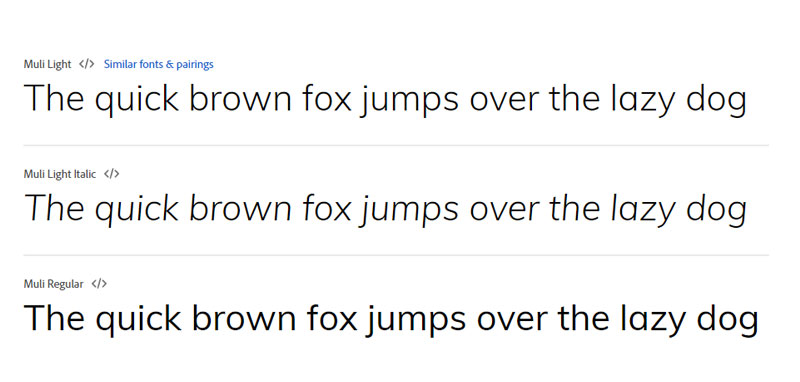
Topping off our list, Muli deserves the spotlight. It nearly mirrors the geometric sans-serif beauty of Century Gothic, boasting an impressive 95% letter match. You’ll notice the differences in its lowercase ‘t,’ ‘g,’ and ‘y,’ where Muli introduces subtle curves, giving it a softer, more approachable vibe. It’s a match made not just for print but web design too, making it a versatile ally in visual communication.
Didact Gothic
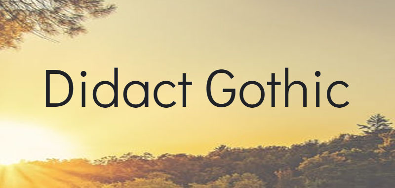
Didact Gothic stands proud with its condensed character kit, rivaling Century Gothic’s clean lines. It strikes a balance between simplicity and legibility, making it a fantastic pick for a range of typography projects. As an added perk, this web-safe font can be snagged from Google Fonts at no charge—a delightful pick for your digital canvas.
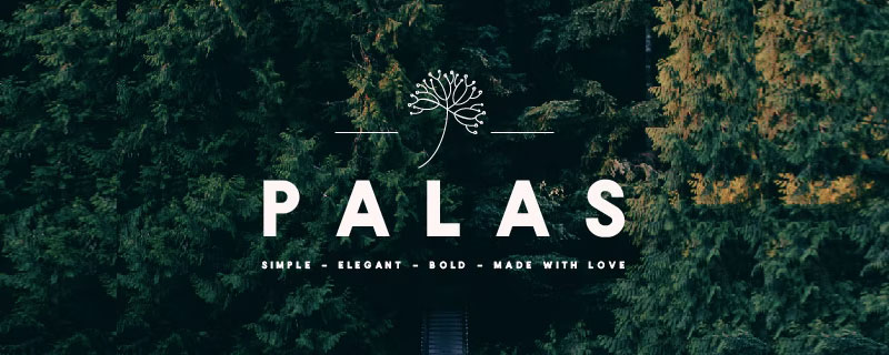
Palas
Step into the strong, bold world of Palas. This typeface claims its own as a Century Gothic double, being the perfect typography choice for impactful headlines and posters. Just like its inspiration, Palas offers versatility with four different weights. It’s a font to consider when you want your message to pack a punch and leave a lasting impression.
Questrial

Questrial excels in dual worlds; as masterful in headlines as it is in body text. This typography star brings a modern flair reminiscent of time-honored lettering. Designers are smitten with its legibility and compatibility. Touting a Swiss origin, Questrial’s grotesque appearance could draw parallels with the ubiquitous Helvetica. It comes feature-packed, supporting a broad spectrum of languages for wider reach in graphic design and digital design applications.
Clarity Nuvo
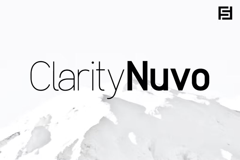
Inspired by the elegance of Century Gothic, Clarity Nuvo marches to the forefront with its minimalism and readability. Flawlessly transitioning between web and print design, it boasts an impressive suite of ten fonts across five weights, each paired with a stylish italic counterpart. It’s a prime candidate for designers eying the subtlety of Century Gothic with just enough departure to make a distinct statement.
Spartan
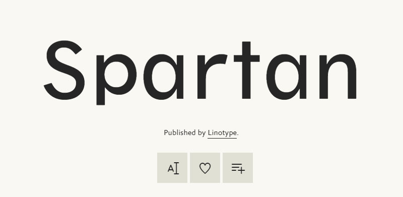
Spartan reflects an American twist on Futura, boasting a historic charm since its 1936 debut. Its utility spans multiple uses, from packaging designs to classified advertising, making it a robust typeface choice for designers working with varying sizes and large x-heights. Adept for big and small applications alike, Spartan is for those who appreciate versatility in a font.
Equinox
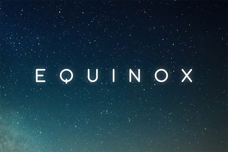
Equinox stands as the spitting image of Century Gothic, wearing modernity and minimalism as its badges. Its superior legibility is cut for the clarity-craving designer, though it boldly steps as an uppercase character specialist. A dive into its offerings reveals comprehensive multilingual support, alternate letters, and more—a fine pick for refined digital work.
Futura PT
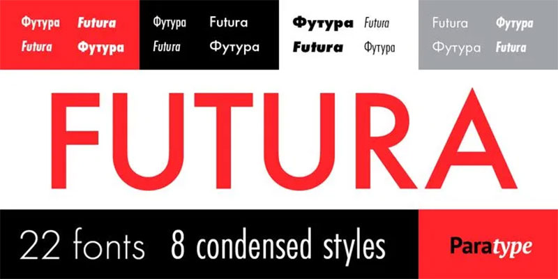
Futura PT, while distanced from being a Century Gothic clone, commands respect with its expressive geometric shapes and eye-pleasing aesthetics. Recalling the golden era of Bauhaus designs of the 1920s, it’s a worthy investment for a wide breadth in typographical work. From a rich array of weights to multiform obliques, creativity knows no bounds here.
Axon
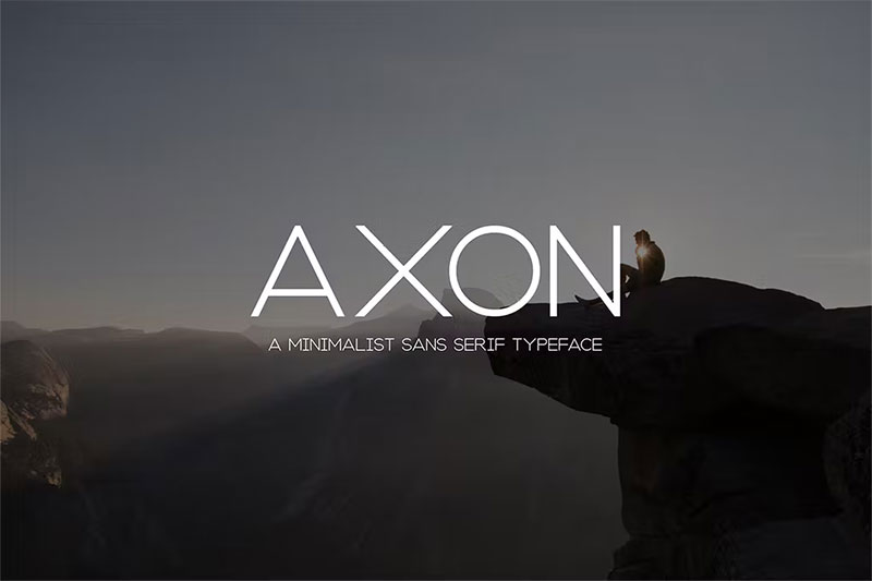
If minimalism is the north star of your design philosophy, Axon is your guiding light. Inheriting Century Gothic’s grace, it transitions smoothly between various mediums. From popular magazine layouts to bespoke invitations, Axon lends an air of elegance with a nod to modernity, making every peek at a design a memorable encounter.
ITC Avant Garde Gothic
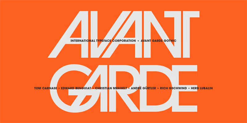
Born from Herb Lubalin’s vision for the ideal clean headline typeface, ITC Avant Garde Gothic took flight. Its versatile typography roster expanded thanks to Tom Carnase, Ed Benguiat, and other noted designers who added condensed obliques and various weights. This font offers no-frills functionality while still providing ample options to find that perfect typographic match for your designs.
Bergen Grotesk Font
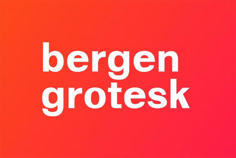
Bergen Grotesk is an eye-catcher. It’s categorized as neutral yet consistently yields attractive results. Ideal for both body text and headlines, this sans-serif typeface doesn’t ask for a dime and still delivers extras like ligatures and arrows. It’s a perfectly balanced choice for a wide range of design applications.
Galano Grotesque
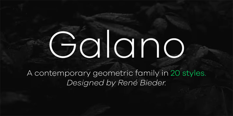
Galano Grotesque stands out due to its strict geometric consistency reminiscent of Avant-Garde and Futura. It offers a collection of harmonized widths, making the typeface simultaneously modern and legible. What’s more, it’s not just simplistic; it’s power-packed with extensive OpenType features, multilingual support, and that universal compatibility which makes it invaluable for designers everywhere.
Sheylla Sans Serif Typeface
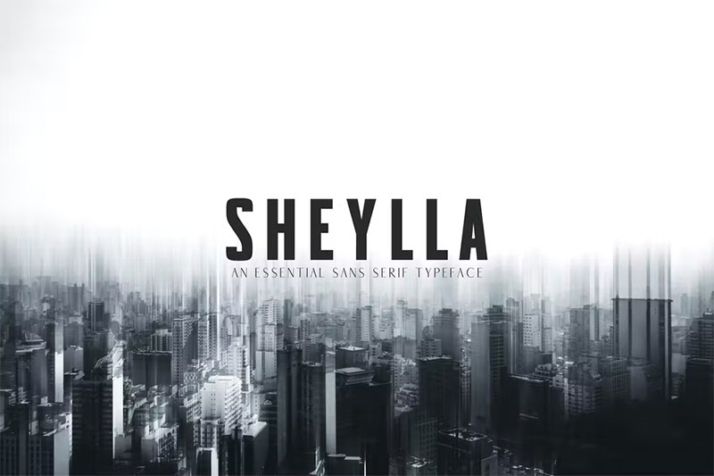
A leap from Century Gothic’s standards, Sheylla Sans injects more condensed and fashionable elements into designs. This font excels in print layouts, business flyers, and magazines, providing that necessary edge. If space-saving without losing style is the game, Sheylla Sans is the name.
Grafic
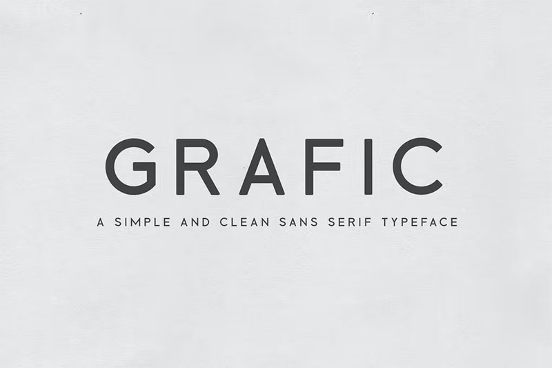
Simple yet effective, Grafic serves a tasty alternative to Century Gothic. Best used in tandem with a decorative script, it elevates any project to a jovial level. Apply it to posters or album covers to bring out the best in your design’s potential with a smile.
Dr
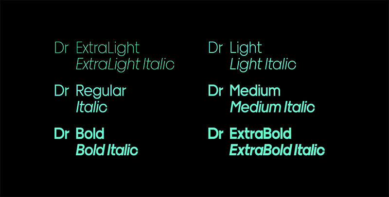
Prepare for the unexpected with Dr. Quirky proportions meet minimal optical correction, resulting in a strikingly distinctive sans serif. It’s the out-of-the-box choice for a boldly precise design, perfect for those aiming for an unparalleled playful aesthetic. This is definitely for those who color outside the lines.
Chronograph
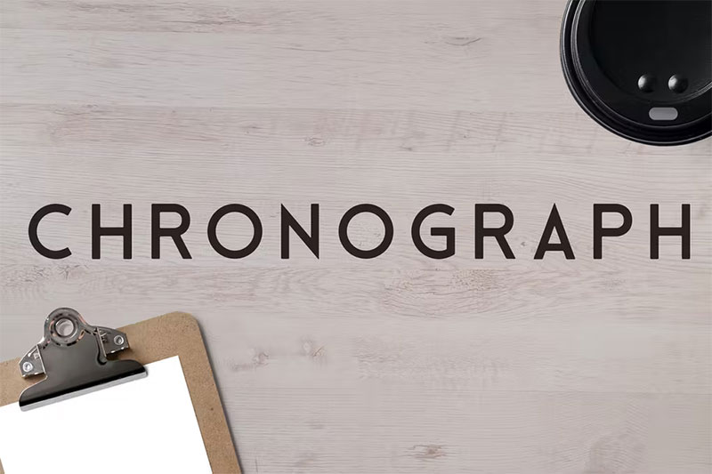
Chronograph is bound to catch the eye of Century Gothic aficionados. Offering a suite of styles, it guarantees flexibility for clean, attention-commanding headlines. While lending a vintage touch, this expressive sans serif fits like a glove for logos and posters, backed by Light, Regular, Semi-bold, and Bold options.
Linotype Aroma No. 2
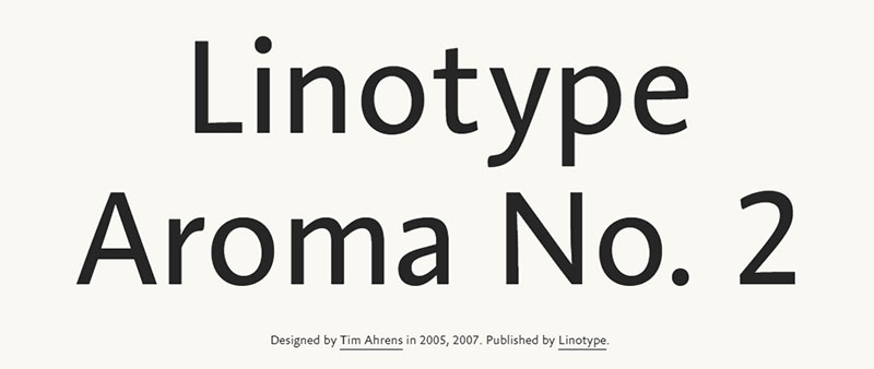
Distinctive for its parabolic contours and lowercase ‘r’, Aroma achieves an effortlessly organic feel. This sans serif animates any design with its lively character. Favored for large text blocks, Aroma conveys messages with precision and flair. Offering a wide array of OpenType features, small caps, and new weights, it’s a font with plentiful zest.
Adriell Sans Serif Fonts Family
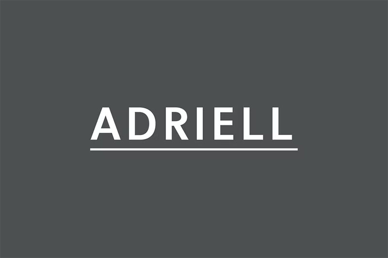
Whether it’s for quotes, headlines, or branding, Adriell’s five weights boast impeccable versatility. Free to use, it extends beyond English character sets, providing a holistic approach to design needs. This font family is a go-to for diverse creative undertakings.
Here wraps our journey through the best Century Gothic alternatives. By threading through the realms of geometric sans-serifs and exploring the modern legacies of typography, may your projects be emboldened by the character and clarity these fonts offer.
FAQ on Fonts Similar To Century Gothic
What fonts are considered close relatives to Century Gothic?
Well, first off, meet Avant Garde and Futura – cousins from the same clean-cut, geometric family. They share sans-serif roots and Gotham’s another chic relative. If we’re talking extended family, Montserrat and Avenir also swing by the family reunions.
What makes a font similar to Century Gothic?
It boils down to the vibe, you know? Fonts channeling Century Gothic flaunt those crisp geometric lines and proportions. They’re the crowd-pleasers with a sans-serif flair, optimal kerning, generous x-height, and an air of simplicity that doesn’t compromise on legibility.
Are there any free fonts like Century Gothic?
Absolutely! We’ve got Google Fonts offering Montserrat—a real gem that mirrors that geometric sans-serif elegance, no cost attached. Open Sans is another great candidate. Keep your digital design hats on, though; licensing is key when going from screen to print.
Which fonts are similar to Century Gothic but better for web use?
Oh, for the web typographers out there, consider Open Sans and Lato. They’re not only kindred spirits in design but also boast great screen legibility. They’re web-safe fonts, crafted for the digital realms, ensuring that web typography isn’t sacrificed for style.
Is Helvetica similar to Century Gothic?
Honestly, they’re like neighbors in the same stylish neighborhood. Helvetica’s the more popular one, with a bit more traditional sans-serif body. Century Gothic’s more about that geometric precision—but you’ll catch them borrowing cups of sugar from time to time.
Can I use fonts like Century Gothic for commercial projects?
You bet, but here’s the hook—check those licenses. Fonts like Avant Garde or its open-source counterparts, like Montserrat, need a clean bill of license for commercial typography adventures. Always read the fine print before your brand identity takes on that new font suit.
How do I choose the best Century Gothic alternative for my project?
Think context. We’re talking readability, kerning, and whether you’re into digital design or print layout. For web wonders, look at web-safe fonts. Print purists, consider the font’s weight and readability on the physical page.
What are the benefits of using Century Gothic-like fonts in design?
They’re your visual communication secret weapon. It’s those sleek lines boosting readability that makes your digital design pop. Plus, they’re versatile, from dominating web typography to making print layout a piece of art.
How can I pair fonts similar to Century Gothic with other fonts?
It’s like creating harmony in visual hierarchy: contrast and complement. Pair a bold sans-serif with a soft serif for editorial zest. Mix Century Gothic siblings with playful scripts to balance professionalism and creativity in your branding typefaces.
Are Century Gothic alternatives more accessible for users with visual impairments?
Dead on. Many alternatives pride themselves on accessibility in typography. Look for ones with strong x-heights and clear letterforms. Fonts like Open Sans are designed to be unambiguous at various sizes, a real boon for the visually impaired.
Conclusion on Century Gothic Alternatives
And just like the last puzzle piece clicks into place, we wrap our dive into the world where fonts similar to Century Gothic live. It’s been a chat about form, about the sleek and the neat, about typefaces dripping with character and yet so approachably familiar.
- We talked geometric sans-serif buddies, spinning the same yarn of simplicity.
- We touched on options, those that won’t ask for more than a nod when it comes to licensing.
- Oh, and the treasure chest of free fonts? It’s unlocked, brimming with Open Sans and mates.
Remember, whether it’s sprucing up a screen with web typography or laying ink on paper in a print layout, finding that perfect Century Gothic cousin isn’t just a game of mix and match. It’s understanding why each letter stands out and resonates.
Through this trek, may the fonts be with you, ready to whisper your story with the same clarity and modish flair.
If you enjoyed reading this article on Fonts similar to Century Gothic, you should check out these articles with fonts similar to Proxima Nova, Avenir, Lato, Papyrus, Old English, Comic Sans, Minion Pro, Gill Sans, and Eurostile.
Bogdan Sandu, a seasoned designer with 15 years of diverse experience, has been designing websites since 2008.
Renowned for his expertise in logo design and visual branding, Bogdan has developed a multitude of logos for various clients.
His skills extend to creating posters, vector illustrations, business cards, and brochures. Additionally, Bogdan's UI kits were featured on marketplaces like Visual Hierarchy and UI8.
Latest posts by Bogdan Sandu (see all)