


19 Fonts Similar To Minion Pro That Look As Great
Ever had that moment where a font just speaks to you? Minion Pro has that effect on folks, whispering sophistication with each serif-kissed letterform. It’s like that trusty hammer in a designer’s toolkit, making words not just read but felt.
Here’s the deal: Not every project can waltz with Minion Pro. Maybe it’s a licensing hiccup or a quest for something fresh. That’s cool. We’ve all been there. That’s why I’m diving deep into this world of serif fonts similar to Minion Pro.
This typographic adventure we’re about to embark on will dish out a curated list of alternatives. We’ll explore the DNA of these typefaces—things like font characteristics, and why the legibility in print is a game-changer. You’re not just going to get names; you’re also signing up for a rundown on typography, the OpenType features they flaunt, and key font pairings that’ll take your work from good to ‘can’t-take-my-eyes-off-it’ great.
Ready for this font-finding mission? Let’s type-set our way through it.
Fonts similar to Minion Pro
| Font | Designer/Publisher | Release Year | Serif Style | Notable Features |
|---|---|---|---|---|
| Crimson Text | Sebastian Kosch | 2011 | Old-Style | Designed for book production, open-source |
| Alegreya | Juan Pablo del Peral | 2012 | Old-Style | Literary feel, good for extended reading |
| Sabon | Jan Tschichold | 1964 | Old-Style | Elegant, adapted from Garamond designs |
| Equity | Matthew Butterick | 2011 | Transitional | Legal documents, inspired by Times New Roman |
| Lyon Text Roman | Kai Bernau | 2009 | Old-Style | Contemporary, adapted from Renaissance types |
| Galliard | Matthew Carter | 1978 | Old-Style | Crisp, dynamic, based on Robert Granjon work |
| Harriet | Okay Type | 2012 | Transitional | Includes a range of styles and weights |
| ITC Stone Serif | Sumner Stone | 1987 | Transitional | Humanist, part of a superfamily |
| Eldorado | Tobias Frere-Jones | 1993 | Old-Style | Based on 16th-century sources, unique quirks |
| FF Celeste | Chris Burke | 1994 | Old-Style | Good for body text, traditional feel |
| Garamond | Claude Garamond | 16th century | Old-Style | Classic, widely used, numerous variations |
| Utopia | Robert Slimbach | 1989 | Transitional | Versatile, large family, for many purposes |
| Verdigris | Mark van Bronkhorst | 2006 | Old-Style | Elegant, high legibility, for literature |
| Plantin | Frank Hinman Pierpont | 1913 | Old-Style | Based on Robert Granjon’s designs |
| Rotation | Hellmut G. Bomm | 2002 | Transitional | Clear, functional design |
| Concorde | Guenter Gerhard Lange | 1969 | Transitional | Clear-cut, versatile |
| Life | W. Bilz/Rudolf Wolf | 1965 | Transitional | Excellent legibility, for newspapers |
| Freight Text | Joshua Darden | 2005 | Old-Style | Large family, robust for editorial work |
| Pilgrim | Robin Nicholas | 1999 | Old-Style | Based on Jenson’s designs, for body text |
Crimson Text
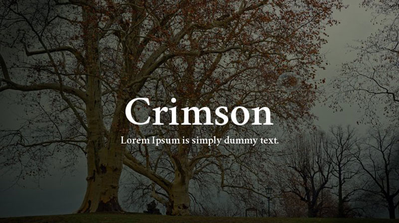
Amidst the sea of serif typefaces, Crimson Text sails close beside Minion Pro in the realms of tradition and that old-world charm. Revered as a typographic masterpiece blending the craftsmanship of Robert Slimbach, Jonathan Hoefler, and Jan Tschichold, this font earns its accolades. Crimson Text isn’t just pretty letters; it’s a workhorse bringing the old-style perks—from fleurons to math characters—sans Helvetica’s and Times’ notorious hiccups. Expect nothing less for your print design and typographic endeavors.
Alegreya
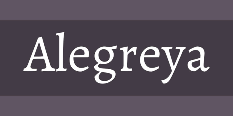
Step aside, Minion Pro; Alegreya’s entered the chat, offering a close-knit font relationship—the kind with kerning that’ll make you do a double-take. Cast an eye over each glyph, and it’s almost a mirror reflection, save for the J, Q, and g. It’s a fontscape where digital typesetting aficionados find solace, celebrating the sameness with only whispers of difference.
Sabon
Jan Tschichold does it again with Sabon, channeling the spirits of legendary Claude Garamond and Robert Granjon. It’s a potent blend of heritage and contemporary, making Sabon less seen on the web but a titan in book design. Combining timeless elements, Sabon proudly represents how historical influence permeates modern typography.
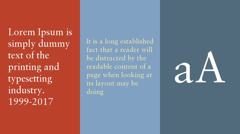
Equity
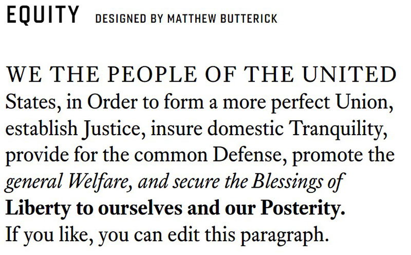
Equity, a nifty font family, branches out with a practical flair—serving up weight options like a barista tailoring your coffee order. Whether you’re firing up an office printer or finessing a high-end output, Equity is boasting a feature we wish more fonts mimicked.
Lyon Text Roman
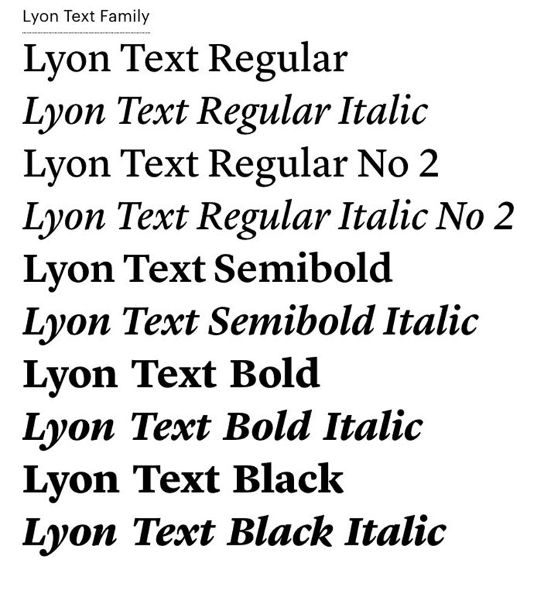
Making its debut in the “New York Times Magazine,” Lyon Text Roman treads the ground of the Royal Academy of Arts in Hague. It’s the kind of font innovating repeatedly before taking the stage. And it’s much like Sabon with bits of Robert Granjon’s excellence—looking sharp in the late Renaissance scene but perfectly at home in today’s print and digital layouts.
Galliard
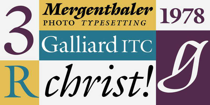
Galliard dances into the whimsical Minion Pro alternative scene with a 16th-century groove. Crafted by Matthew Carter, inspired by Robert Granjon, Galliard is the serif that’s all about that historical weight, offered in four dignified weights to balance your designs.
Harriet
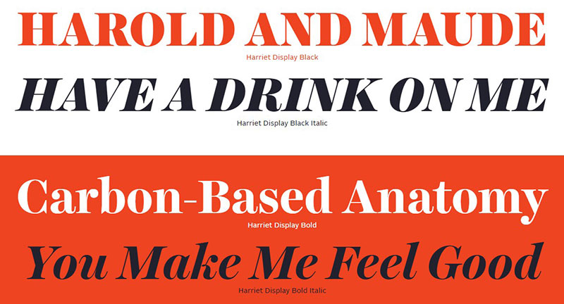
Imagine mixing Baskerville with a hint of Scotch Roman. Meet Harriet: the versatile font family with just enough optical sizes to dazzle in large text settings. It’s a storyteller in typography, drawing readers into narratives spun with elegance and just a sprinkle of sass.
ITC Stone Serif
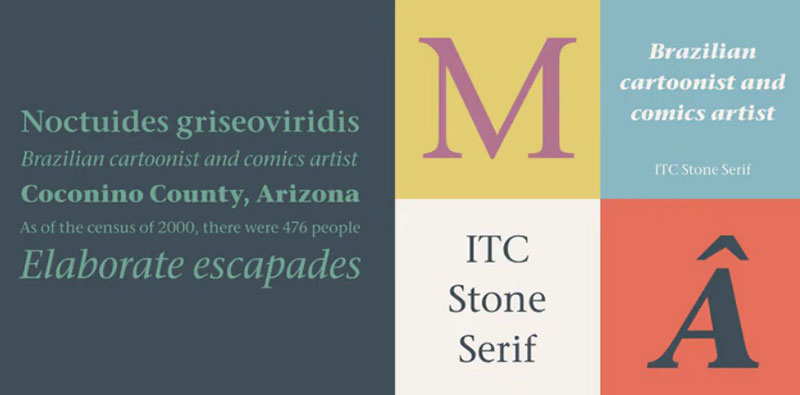
Hats off to Adobe’s own Bob Ishi and designer Sumner Stone for whipping up the Stone serif family— informal, serif, sans serif, all part of this polished trifecta. It’s all about modern style, but doesn’t get all high-and-mighty with its legibility. These fonts are your digital-rendered handshakes—firm, impressive, modern.
Eldorado
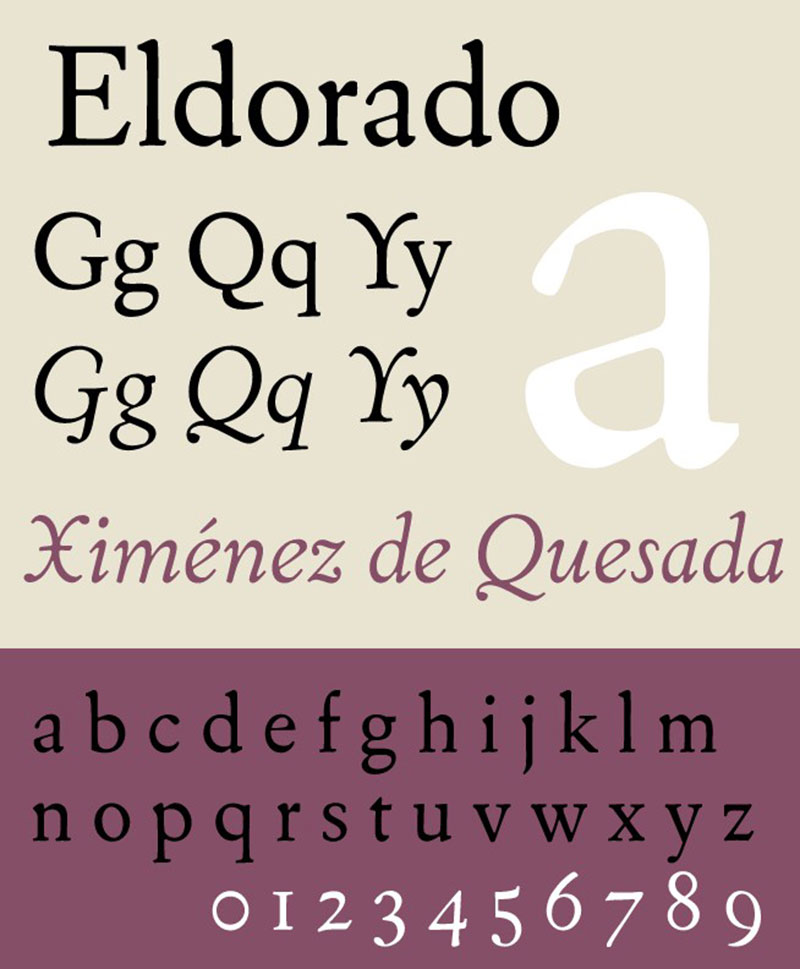
Eldorado, a 1953 Wiliam Addison Dwiggins original, has evolved with a little help from friends like Tom Rickner, Tobias Frere-Jones, and David Berlow. Fast-forward, and it’s a typeface teeming with options for text, micro, and display, ready for a mix of commercial and editorial use. It’s history reimagined for the page and screen.
FF Celeste
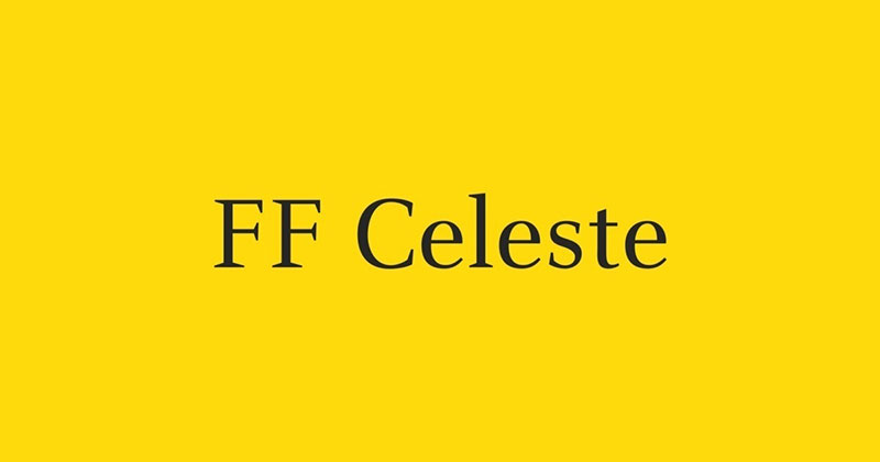
If Walbaum or Bodoni have caught your fancy, pencil in FF Celeste. Here’s a typeface that straddles Renaissance flare and dynamic reading experience, holding calligraphy at arm’s length for a pinch of the triangular without going full-blown rationalized. Chris Burke’s brainchild fits snug into offset printing and digital typesetting pro leagues, especially when you’re big on accurate contrast.
Garamond
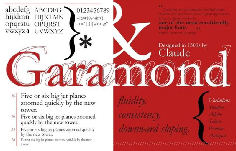
Circling back to Adobe’s cache, Garamond stands tall, a typeface with tendrils reaching into the 16th century, chiseled under Robert Slimbach’s skilled hands. It’s preferred by designers who favor print over web, a nod to history in contemporary wraps.
Utopia
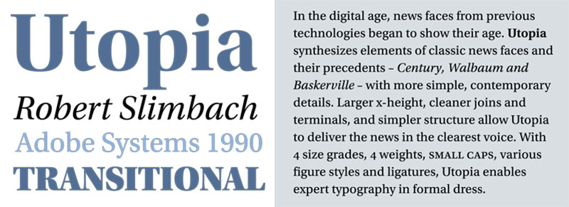
On Adobe’s stage, Robert Slimbach’s Utopia takes a bow. It’s the typeface ushered in to tip the scales of typographic usability in official documents and beyond. Packaged with numerals, bold, small caps, and even scientific markers, this font remains poised and graceful, catching the eyes and keeping the pages turning.
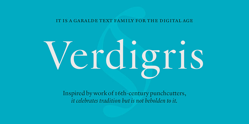
Verdigris
Verdigris flows from the Garalde lineage, with digital age finesse at the forefront. Bucking tradition but keeping grounded its historical roots, Verdigris stages a typographic performance as vibrant on the paper as it is on the cutting-edge of typeset technology. It’s a classic reborn for today’s paper and press and digital design maestros.
Plantin
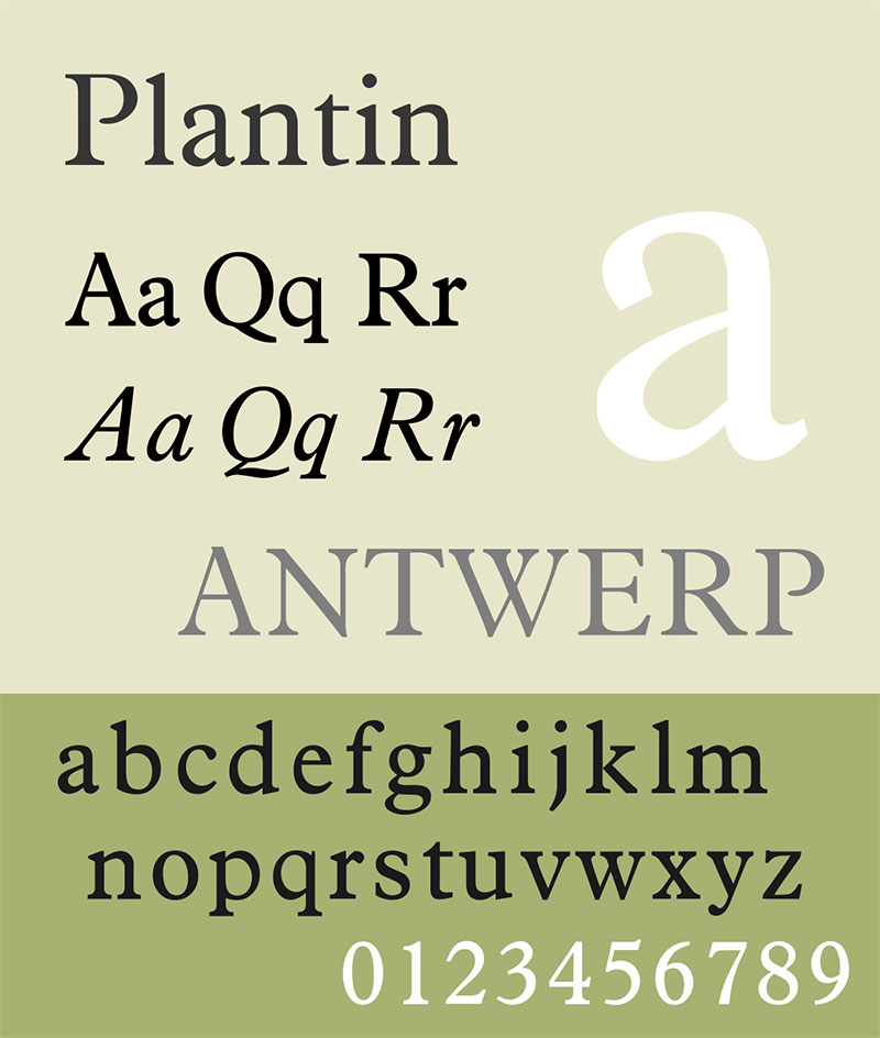
Plantin is all about adaptability, eschewing the thin for a robust form that excels on glossy pages. With letters huddled close but still breathing easy, Plantin’s no stranger to making the most out of space without scrimping on impact. In corporate worlds where strength is key, Plantin is a prime choice.
Rotation
Post-war Europe saw Rotation seize the headlines, a Linotype marvel spinning off the presses. While it eventually made way for other faces, none quite held onto its nimbleness. A trailblazer then, it still deserves a nod for bringing a touch of finesse to the newsprint.
Concorde
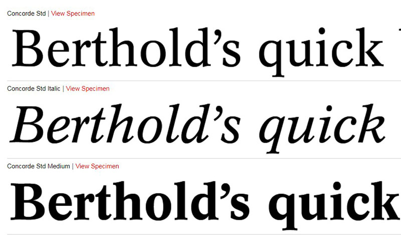
A contemporary of Rotation, Concorde soared with aspirations to redefine print technology. Now, it’s a staple for web crafters, an elegant twist on the ubiquitous Times New Roman. It’s a font that’s conquered the real and virtual pages alike.
Life
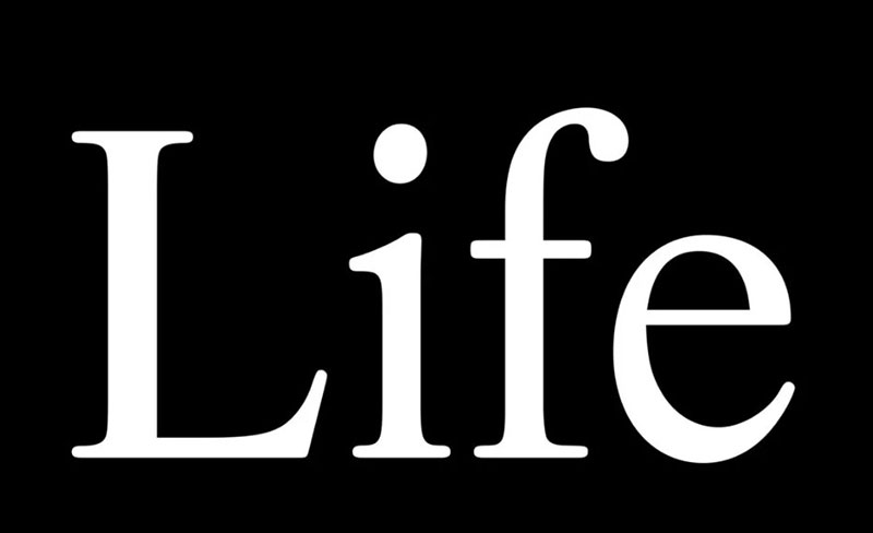
Crafted in ’64, Life is a typographic chameleon, assimilating styles and facing the vicissitudes of design trends head-on. Whether it’s a novel or a newspaper, Life infuses each word with a breath of, well, life—a reflection of the ever-evolving type design landscape.
Freight Text
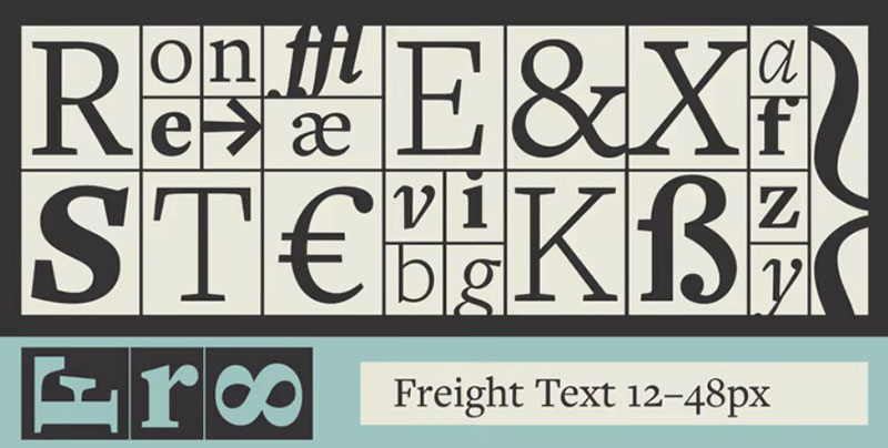
Freight Text is the Swiss Army knife of serif fonts—an arsenal of styles and weights adapting to settings from manuals to timetables. With its universal application, it’s the design community’s go-to for projects demanding versatility and precision.
Pilgrim
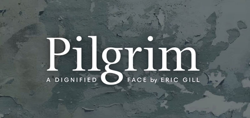
Unveiled by New York’s Limited Edition Club, Pilgrim steps out of the shadows of Eric Gill’s Joanna font history with boldness and precision. Straddling Roman tradition and boasting bracketed serifs, its contrasts are nothing short of well-mannered, making it a font for all reasons and seasons.
FAQ on These Fonts Similar to Minion Pro
What alternatives capture the essence of Minion Pro?
In the sprawling universe of serif fonts, those like Garamond, Baskerville, and Times New Roman tango on the same dance floor. They carry that timeless grace, those refined twists at the ends that give your paragraphs undeniable class. Though not twins, they definitely feel like family.
Is licensing an issue with fonts similar to Minion Pro?
Boy, can it be! Font licensing is a labyrinth, with each typeface having its own set of do’s and don’ts. Looking for alternatives means scrutinizing those license agreements—a snooze fest, but crucial for keeping your project on the up-and-up without any legal hiccups.
Can I use Minion Pro’s cousins for web and print?
Absolutely! The magic of OpenType format fonts means they’re versatile. Go ahead, dress up a website or let that print project shine. The trick is mastering CSS for the web and knowing your print design specs for that crisp, physical touch.
How do Minion Pro alternatives fare in readability?
Legibility is key, right? Well, the relatives of Minion Pro aren’t slacking off. They’ve been crafted to be easy on the eyes, whether in a dense report or a breezy blog post. Proper typeface classification means clarity doesn’t take a backseat—thankfully!
Are there free fonts akin to Minion Pro?
The hunt for freebies can lead to hidden gems. Enter Google Fonts: a treasure trove where dreamy types like Roboto Slab give off that Minion Pro vibe. They’re wallet-friendly and a cinch to integrate into your digital publishing platforms.
What about Minion Pro makes it such a go-to font?
Minion Pro’s just got that allure, you know? With design pulled from the Renaissance, it’s got the chops for extensive typesetting and it’s a rockstar in the typography scene—oozing professionalism.
Do any Minion Pro alternatives offer better digital performance?
Some say performance is key in our digital era. Enter Lato and Merriweather, serifs that are tweaked for screens. They’re designed to keep pixels sharp and readers engaged—a win for any digital typesetting endeavor!
Which fonts pair well with Minion Pro’s lookalikes?
Font pairing—it’s like matchmaking but for letters. Classic combos like Georgia and Helvetica sit well with Minion Pro’s buds, making sure designs come off cohesive and style-savvy.
How do I choose the best Minion Pro substitute for my brand?
It’s all about that brand vibe. Serifs ooze tradition, but go for a font that reflects your identity. Ponder on your brand’s heart, its voice. Want a more modern twist? Fonts like Roboto or Source Serif Pro might be your jam.
What are the typographic nuances to consider when selecting similar fonts?
Typography’s a craft. Font design nuances, like x-height, weight, and contrast, can make or break your layout. Swapping Minion Pro for a doppelganger? Study them curves and lines—ensure they harmonize with your design’s melody.
Conclusion on These Minion Pro Alternatives
So here we are, at the tail end of our serif-studded journey through fonts similar to Minion Pro. It’s been quite the deep dive into this classic-styled pool. You’ve seen them, those typefaces booking it with grace across your screen—each a storyteller, a charmer with tales spun in typography and Digital Typesetting.
Bold or bashful, they’ve strutted their stuff. The OpenType features, the elegance in each curve, they’re just itching to amp up your next piece, be it a sharp website or a sleek brochure. And those font pairings we gabbed about? Like perfect pitch in design—oh so critical.
Remember, whether you go for Garamond’s old-school cool or Merriweather’s digital savvy smoothness, it’s all about that fit—like your favorite jeans, but for text. They’re out there, waiting to give your words a home that’s both cozy and chic, wrapping up your message in nothing but style.
If you enjoyed reading this article on fonts similar to Minion Pro, you should check out these articles with fonts similar to Proxima Nova, Avenir, Lato, Papyrus, Old English, Century Gothic, Comic Sans, Gill Sans, and Eurostile.
Bogdan Sandu, a seasoned designer with 15 years of diverse experience, has been designing websites since 2008.
Renowned for his expertise in logo design and visual branding, Bogdan has developed a multitude of logos for various clients.
His skills extend to creating posters, vector illustrations, business cards, and brochures. Additionally, Bogdan's UI kits were featured on marketplaces like Visual Hierarchy and UI8.
Latest posts by Bogdan Sandu (see all)
- Deep Dive: Sea Color Palettes for Tranquil Designs - 3 May 2024
- The Stella Artois Logo History, Colors, Font, And Meaning - 2 May 2024
- Sky Color Palettes for Fresh Designs: 40 Examples - 2 May 2024