Typography can make or break a website. The wrong typeface kills readability. The right one builds trust before a single word is read.
The best free Google Fonts give designers and developers access to professional-grade web typography at zero cost, with no licensing headaches.
Google Fonts hosts over 1,500 open source typefaces, covering everything from clean sans-serif fonts for UI design to elegant serif fonts built for long-form reading.
Not all of them are worth using. This guide cuts through the noise and covers the top picks based on readability, font loading speed, versatility, and real-world usage across web and branding projects.
The Best Free Google Fonts
Roboto

Neo-grotesque sans-serif font designed by Christian Robertson for Google. Originally built as Android’s system font, now one of the most downloaded typefaces in the Google Fonts library.
Key Characteristics
- Classification: Neo-grotesque sans-serif
- Weights: Thin (100) through Black (900), plus condensed styles
- Tall x-height, geometric forms with open, friendly curves
- Covers Latin, Greek, and Cyrillic scripts
Best Use Cases
- Mobile and web UI design
- Body text and headings across Android apps
- Corporate websites, dashboards, product interfaces
Readability and Performance
Performs well at small sizes on screen. The tall x-height keeps lowercase letters readable even at 12-14px.
One known issue: narrow apertures can reduce legibility in dense body text compared to more open designs like Inter or Open Sans.
Font Pairing Suggestions
- Roboto + Playfair Display for editorial layouts
- Roboto + Merriweather for long-form reading
How to Use It
Add to your project via the Google Fonts API:
<link href="https://fonts.googleapis.com/css2?family=Roboto:wght@400;700&display=swap" rel="stylesheet">
Use 400 for body text, 700 for headings. Pair with a 16px base size and 1.5 line height for comfortable reading.
—
Inter

Designed by Rasmus Andersson specifically for screen interfaces. Inter has become the go-to humanist sans-serif for UI designers, and for good reason.
Key Characteristics
- Classification: Neo-grotesque / humanist sans-serif
- Weights: Thin (100) through Black (900)
- Very tall x-height, wide apertures, optimized letter spacing
- Available as a variable font
Best Use Cases
- SaaS dashboards and web applications
- Data-heavy interfaces where legibility at small sizes matters
- Design systems (used by NASA, Slack, The New York Times)
Readability and Performance
One of the most legible free fonts at small sizes. The open apertures and carefully tuned letter spacing make it stand out in dense UI text.
The variable font version loads efficiently. One file handles all weights.
Font Pairing Suggestions
- Inter + Playfair Display for editorial contrast
- Inter + Oswald for dashboard headings
How to Use It
<link href="https://fonts.googleapis.com/css2?family=Inter:wght@400;600;700&display=swap" rel="stylesheet">
Use Inter Regular (400) for body, 600 or 700 for headings and labels. Works cleanly at sizes as small as 11px.
—
Open Sans

Designed by Steve Matteson. A clean, open humanist sans-serif with a wide character set and no sharp corners. One of the most widely used fonts on the web.
Key Characteristics
- Classification: Humanist sans-serif
- Weights: Light (300) through ExtraBold (800)
- High legibility at all sizes, neutral personality
- Supports 100+ languages
Best Use Cases
- Body text for blogs, news sites, and documentation
- UI text for apps and web platforms
- Works across nearly any industry without feeling out of place
Readability and Performance
Excellent on both screen and print. The open letterforms reduce eye strain in long reading sessions. Google uses it across several of its own products.
Font Pairing Suggestions
- Open Sans + Oswald for bold editorial contrast
- Open Sans + Raleway for minimal, modern designs
How to Use It
<link href="https://fonts.googleapis.com/css2?family=Open+Sans:wght@400;600;700&display=swap" rel="stylesheet">
Best at 16-18px for body text. Pairs well with condensed display fonts where strong contrast is needed.
—
Montserrat

Created by Julieta Ulanovsky, inspired by urban signage in the Montserrat neighborhood of Buenos Aires. A geometric sans-serif with a strong personality. Great for headings, branding, and anything that needs presence.
Key Characteristics
- Classification: Geometric sans-serif
- Weights: Thin (100) through Black (900), including italics
- Distinctive letterforms, strong visual identity
- Works as both a display font and body text
Best Use Cases
- Logo design and brand identity
- Landing page headings and hero text
- Fashion, creative, and lifestyle websites
Readability and Performance
Highly readable at large sizes. At small body text sizes it can feel tight, so pair it with a more neutral font like Open Sans or Lato for paragraphs.
Font Pairing Suggestions
- Montserrat + Merriweather for editorial work
- Montserrat + Lora for fashion and lifestyle brands
How to Use It
<link href="https://fonts.googleapis.com/css2?family=Montserrat:wght@400;700;900&display=swap" rel="stylesheet">
Use Black (900) or Bold (700) for headings. Avoid using it below 14px for paragraph text.
—
Lato

Designed by Lukasz Dziedzic. Lato means “summer” in Polish, and the font lives up to it. Warm, semi-rounded, and professional. One of the most downloaded fonts in the Google Fonts library for a reason.
Key Characteristics
- Classification: Humanist sans-serif
- Weights: Thin (100) through Black (900)
- Subtle rounded details in the letterforms give it warmth without being playful
- Slightly condensed compared to Open Sans
Best Use Cases
- Corporate and business websites
- Long-form content and blog posts
- Tech startups and SaaS landing pages
Readability and Performance
Strong performance on both screen and print. The humanist structure keeps it readable across all weights, and the Light (300) weight works well for larger subheadings.
Font Pairing Suggestions
- Lato + Raleway for minimal, modern designs
- Lato + Oswald for strong heading contrast
How to Use It
<link href="https://fonts.googleapis.com/css2?family=Lato:wght@300;400;700&display=swap" rel="stylesheet">
Regular (400) for body, Bold (700) for headings. Light (300) works well for intro paragraphs or large subheadings.
—
Poppins
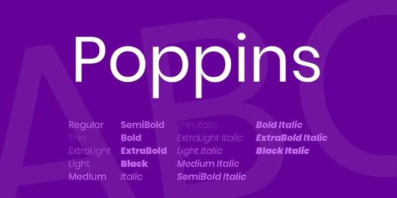
A geometric sans-serif from Indian Type Foundry, released in 2014. Each letter fits in a circle, which gives Poppins its clean, uniform look. It has become a favorite for modern UI design and creative projects.
Key Characteristics
- Classification: Geometric sans-serif
- Weights: Thin (100) through Black (900) with italics
- Perfectly circular curves, uniform stroke width
- Supports Latin and Devanagari scripts
Best Use Cases
- Modern web design and mobile apps
- Tech, education, and creative industry sites
- UI components, buttons, navigation
Readability and Performance
Very clean on screen. The circular forms make it feel structured but friendly. Works well for both headings and body text, though at very small sizes Inter or Open Sans edge it out on legibility.
Font Pairing Suggestions
- Poppins + Merriweather for blog and editorial work
- Poppins + Playfair Display for a modern-meets-classic look
How to Use It
<link href="https://fonts.googleapis.com/css2?family=Poppins:wght@400;600;700&display=swap" rel="stylesheet">
SemiBold (600) works well for subheadings. Use Regular (400) for body text and stick to 16px minimum.
—
Playfair Display

A transitional serif font designed by Claus Eggers Sorensen, inspired by the typefaces of the late 18th century. High contrast strokes, strong serifs, and an elegant italic that is genuinely hard to beat for headings.
Key Characteristics
- Classification: Transitional serif (high-contrast)
- Weights: Regular through Black, including italics
- Strong thick-thin stroke contrast, open counters, large x-height
- Updated to variable font format in 2022 (v2.0)
Best Use Cases
- Editorial headings and article titles
- Luxury brands, fashion, hospitality, wine
- Portfolio sites and creative agencies
Readability and Performance
Outstanding at large sizes. At small body text sizes, the delicate stroke contrast can hurt legibility, especially on low-resolution screens. Keep it above 24px for best results.
The variable font version covers width, weight, and optical size axes, making it more flexible than most free fonts.
Font Pairing Suggestions
- Playfair Display + Lato for refined editorial layouts
- Playfair Display + Inter for modern contrast
How to Use It
<link href="https://fonts.googleapis.com/css2?family=Playfair+Display:ital,wght@0,700;1,400&display=swap" rel="stylesheet">
Use Bold or Black for headings. The italic is particularly strong for pull quotes and feature text.
—
Merriweather
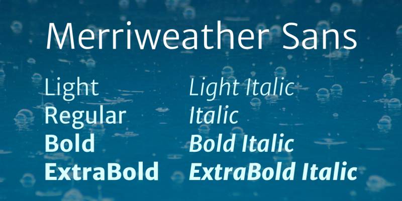
Designed by Eben Sorkin specifically for screen reading. A slightly condensed serif with strong typographic contrast. If you need a serif font for long-form body text on the web, Merriweather is one of the most reliable choices available.
Key Characteristics
- Classification: Slab-influenced transitional serif
- Weights: Light (300) through Black (900) with italics, 14 styles total
- Slightly condensed, high x-height, strong contrast between strokes
- Designed for screen legibility at small sizes
Best Use Cases
- Blog body text and long-form articles
- News and magazine layouts
- Any project needing a readable serif at small sizes
Readability and Performance
Where Playfair Display is all about headings, Merriweather handles body text. It stays clear at 14-16px where most serifs start to break down. The slightly condensed design also helps fit more content without crowding.
Font Pairing Suggestions
- Merriweather + Montserrat for editorial sites
- Merriweather + Oswald for news-style layouts
How to Use It
<link href="https://fonts.googleapis.com/css2?family=Merriweather:wght@300;400;700&display=swap" rel="stylesheet">
Regular (400) for body text. Set line height to at least 1.6 for comfortable reading in long paragraphs.
—
Nunito

Created by Vernon Adams. A rounded sans-serif that manages to feel both friendly and professional. Duolingo uses it. Spotify has used it in parts of their UI. It has real-world usage behind it, not just design awards.
Key Characteristics
- Classification: Rounded sans-serif
- Weights: ExtraLight (200) through Black (900) with italics
- Rounded terminals on all letterforms, high x-height
- Available as Nunito (rounded) and Nunito Sans (standard terminals)
Best Use Cases
- Education and e-learning platforms
- Health, wellness, and lifestyle apps
- Any brand that needs an approachable, non-corporate feel
Readability and Performance
The rounded terminals keep it readable and visually comfortable across all sizes. Works for both headings and body text without feeling too playful for professional contexts.
Font Pairing Suggestions
- Nunito + Oswald for heading and body contrast
- Nunito + Playfair Display for editorial warmth
How to Use It
<link href="https://fonts.googleapis.com/css2?family=Nunito:wght@400;600;700&display=swap" rel="stylesheet">
SemiBold (600) for UI labels and buttons, Regular (400) for body text. Works well at sizes from 14px to 72px.
—
Oswald
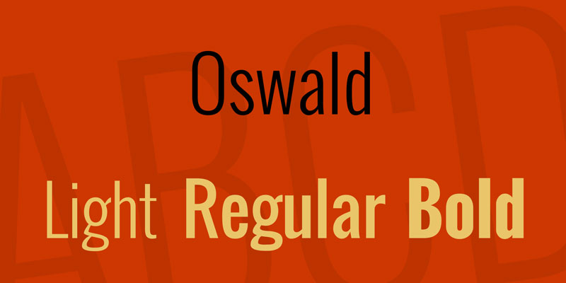
A rework of the classic American gothic typeface style, redesigned by Vernon Adams for digital screens. Tall, condensed, and bold. Oswald grabs attention fast, which makes it one of the most downloaded display fonts in the Google Fonts library.
Key Characteristics
- Classification: Condensed sans-serif / gothic display
- Weights: ExtraLight (200) through Bold (700)
- Tall x-height, narrow proportions, minimal stroke contrast
- Straight, uniform strokes for a clean, assertive look
Best Use Cases
- Headlines, hero text, and banner typography
- Sports, fitness, and news platforms
- Anywhere bold headings need to occupy minimal horizontal space
Readability and Performance
Built for headings, not body text. At small sizes the condensed proportions can become hard to read. Keep it above 24px and use it alongside a wider, more open body font.
Loads fast. The condensed design means fewer pixels per character, which helps on tight layouts.
Font Pairing Suggestions
- Oswald + Open Sans for editorial news layouts
- Oswald + Lato for agency and portfolio sites
How to Use It
<link href="https://fonts.googleapis.com/css2?family=Oswald:wght@400;700&display=swap" rel="stylesheet">
Bold (700) for primary headlines. Regular (400) works for navigation and labels where space is tight.
What Makes a Google Font Worth Using
With 1,826 font families now available in the Google Fonts library (Photutorial, 2025), narrowing down your choices isn’t easy.
Most people just pick whatever looks nice in the preview. That’s fine for a side project, but it’s a real problem when the font falls apart at 14px body text or breaks your layout on mobile.
Here’s what actually matters when evaluating any free typeface from Google’s library.
Available Weights and Styles
Weight range: A font with only one weight is almost always a dead end. You need at minimum Regular, Bold, and ideally Light or Medium for design flexibility.
Check for italic variants too. Many Google Fonts ship without a true italic, which means browsers fake it with a slant that looks off.
- Regular (400) and Bold (700) as a baseline minimum
- Medium (500) or SemiBold (600) if you’re building UI
- Italic cuts for editorial or long-form reading contexts
Readability at the Size You Actually Need
Body text and display use are genuinely different requirements. A font that looks sharp as a 64px hero headline can be completely unreadable at 16px in a paragraph.
The key things to check: x-height, stroke contrast, and letter spacing at small sizes.
High stroke contrast (think Playfair Display) looks beautiful in headings. It turns into a blurry mess at body sizes on low-res screens. Inter and Lato, by contrast, were specifically designed with screen readability in mind.
Dribbble research shows 85% of websites use sans-serif fonts for on-screen text, which reflects a real readability preference, not just a trend.
Character Set and Language Support
This one gets ignored until it’s a problem.
Noto Sans and Noto Serif from Google cover over 1,000 languages and 150 writing systems. Most popular Google Fonts cover only Latin characters and a handful of extended Latin glyphs.
If your site serves international users or pulls in dynamic content that might include accented characters, verify character coverage before committing to a font.
Update History and Maintenance
Check the font’s GitHub history on the Google Fonts repo.
Actively maintained fonts get optical size improvements, additional weights, and variable font upgrades. Abandoned ones stay at whatever state they were in three years ago.
How Google Fonts Affects Web Performance
57% of websites use Google Fonts according to the 2024 HTTP Archive Web Almanac, making it by far the dominant web font service. But “popular” doesn’t mean “zero performance cost.”
Font loading is one of the less obvious contributors to poor Core Web Vitals scores. It directly affects LCP, CLS, and perceived load time.
The <link> vs. @import Problem
This is the first decision most people get wrong.
Using @import inside a CSS file to load Google Fonts means the browser has to download the CSS first, parse it, discover the import, and only then start the font request. That’s a serial dependency that delays everything.
<link rel="preconnect"> in the HTML <head> is the right approach. Pair it with dns-prefetch as a fallback for older browsers.
<link rel="preconnect" href="https://fonts.googleapis.com">
<link rel="preconnect" href="https://fonts.gstatic.com" crossorigin>
Cloudflare data (2023) shows CDN delivery cuts font load times by up to 50%, and proper preconnect hints can shave 100-300ms off connection setup.
Font Display and Layout Shift
font-display: swap is the most common recommendation, but it’s not always the best choice.
swap shows fallback text immediately, then swaps to the web font once it loads. This prevents invisible text but causes layout shift if the fallback and web font have different metrics.
For fonts used in large headings, font-display: optional is worth considering. It skips the web font entirely on slow connections, which avoids the shift and keeps LCP clean.
The Guardian switched to a system font stack in February 2024 and saw a 24% improvement in LCP scores. That’s an extreme solution, but it shows how much font loading affects real-world performance.
Variable Fonts as a Performance Option
Google Fonts served 92% of all variable fonts on the web in 2024 (HTTP Archive Web Almanac), down slightly from 97% in 2022 as self-hosting grew.
Variable fonts package multiple weights and styles into a single file. Studies show they can reduce typography file sizes by 35-45% compared to loading separate static font files (Business Research Insights, 2024).
As of 2024, 33% of websites use variable fonts, up from 28% in 2022. The growth is real, though adoption has slowed compared to the near-tripling seen between 2020 and 2022.
Worth knowing: variable font files can be larger than individual static weights if you only need one or two weights. The performance win shows up when you need four or more weights from the same family.
Self-Hosting as an Alternative
The 2024 Web Almanac shows 28% of websites now self-host fonts exclusively, up from previous years.
Self-hosting removes the third-party DNS lookup and gives you full control over caching headers. The tradeoff is that you lose the potential browser cache benefit from Google’s CDN (though in practice this benefit is minimal since Google changed its cross-site caching policy in 2020).
WOFF2 is the format to use. It’s on 81% of desktop websites (HTTP Archive, 2024) and offers the best compression of any web font format.
Google Fonts for Body Text vs. Headlines: Different Rules Apply
People pick a font they like and use it for everything. Then they wonder why the page feels off.
The reason is usually that they’ve applied a display-optimized typeface to body copy, or vice versa.
Fonts That Hold Up at Small Sizes
Inter was specifically designed for screen interfaces. The x-height is large, letter spacing is generous, and it stays readable at 12px. It’s one of the most used fonts for apps precisely because it works across sizes.
Lato has similar traits. Open Sans was built with screen legibility as its primary goal, which is why it’s been the most used Google Font on professional sites for years (Toner Buzz data shows it on over 14,000 lawyer websites alone).
For body text specifically, these are worth looking at:
- Inter, Lato, Open Sans for clean sans-serif readability
- Source Sans 3 for a slightly warmer, less corporate feel
- Noto Sans when character coverage matters
- Merriweather or Lora if you want a serif font that holds up in long-form reading
Display Fonts: Keep Them Above the Fold
Playfair Display, Oswald, Abril Fatface. These are headline fonts. Full stop.
High stroke contrast and tight letter spacing make them pop in large formats. At 16px in a body paragraph, the thin strokes disappear on most screens.
Dribbble research found that 58% of H1 headers use sans-serif fonts, but only 28% of body text uses serif. That gap reflects a real design pattern: designers mix categories rather than applying one font to everything.
| Font | Best Use | Avoid For |
|---|---|---|
| Inter | Body, UI, labels | Decorative headlines |
| Playfair Display | Headlines, pull quotes | Body text below 20px |
| Oswald | Subheadings, callouts | Long-form paragraphs |
| Merriweather | Blog body text, articles | Navigation, UI labels |
| Poppins | Headings, cards, UI | Dense body copy |
The Mixed-Classification Approach
Pairing a sans-serif font for body with a serif or display font for headings is the most reliable approach in web design.
It creates visual hierarchy without fighting itself. The contrast is intentional and legible rather than accidental.
What doesn’t work: two display fonts competing with each other, or a decorative script font used as body text.
How to Pair Google Fonts Effectively
Font pairing trips people up more than almost any other typography decision.
The most common mistake is picking two fonts that are too similar. Two geometric sans-serifs, for example, look like you couldn’t decide rather than like you made a choice.
The Contrast Principle
Contrast drives good pairings. That means different classifications, different moods, different visual weights working together.
The classic approach: one serif or display typeface for headlines, one clean sans-serif for body text.
Some pairings that consistently work well in practice:
- Playfair Display + Source Sans 3 (editorial, editorial-leaning blogs)
- Inter + Merriweather (clean UI with readable long-form content)
- Poppins + Lora (modern rounded headers with warm serif body)
- Oswald + Open Sans (high contrast, works well for fonts for websites with news-style layouts)
If you’re not sure where to start, a font pairing generator can show you combinations side by side with real text before you commit to anything.
Shared Proportions as a Secondary Check
Two fonts can contrast stylistically but still need to feel like they belong together.
x-height compatibility is the main thing to check. If one font has a tall x-height and the other is more condensed, the body and headline text look like they’re from different projects.
Set both at the same pixel size and look at them side by side. If the lowercase letters look dramatically different in height, you’ll need to adjust sizing in CSS to compensate.
When One Font Family Is Enough
Not every project needs two typefaces.
A well-chosen font with five or more weights, like Roboto or Nunito, can carry an entire design on its own. Use Light (300) for captions, Regular (400) for body, Medium (500) for labels, and Bold (700) for headings.
Google Font pairing guides tend to suggest two fonts because it looks more interesting in a demo. In practice, using a single family with good weight variation is often the cleaner, faster-loading choice for fonts for blogs and straightforward site builds.
A font pairing generator can help with both scenarios.
Google Fonts Licensing and Commercial Use
This is the section people skim and then panic about later when a client asks.
The short answer: almost every Google Font is free for commercial use. The slightly longer answer is worth understanding.
The SIL Open Font License
Most Google Fonts are released under the SIL Open Font License (OFL). According to Google’s own FAQ, this covers commercial use explicitly, including products sold commercially.
What OFL permits:
- Web use, print, apps, logos, branding
- Commercial products including client work
- Embedding fonts in apps or software
- Modifying fonts for your own use
What OFL restricts:
- Selling the raw font files themselves as a standalone product
- Distributing modified versions without renaming them
No attribution is required on final designs. You can use Playfair Display in a logo, print it on merchandise, and deploy it in a paid app without crediting the font designer. The OFL FAQ (updated November 2023) is clear on this.
The Apache License 2.0 Subset
A smaller number of Google Fonts use the Apache License 2.0 instead of OFL.
Apache 2.0 also permits commercial use freely. The main difference is in how attribution works when you redistribute the font files themselves, not when you use the font in a design.
For practical design and web work, both licenses function identically. You’re covered.
One Verification Step Worth Taking
Before using any font in a high-stakes commercial project, go to that font’s page on fonts.google.com and check the license listed.
It takes ten seconds. Most will say SIL OFL. Some older fonts in the library have been updated, and a few have had their licensing terms clarified (Google itself released several previously internal fonts under OFL in late 2025 per the Google Fonts FAQ).
Understanding font licensing matters more than most designers think, especially when handing deliverables to clients who plan to embed fonts in apps or distribute design files.
How to Add Google Fonts to Your Project
The implementation varies depending on whether you’re writing code, using a CMS, or working in a design tool. Here’s how each actually works.
Adding Google Fonts in CSS
The API approach is the fastest way to get started.
Go to fonts.google.com, select your font, choose your weights, and copy the <link> code it generates. Paste it in the <head> of your HTML before your main stylesheet.
<link rel="preconnect" href="https://fonts.googleapis.com">
<link rel="preconnect" href="https://fonts.gstatic.com" crossorigin>
<link href="https://fonts.googleapis.com/css2?family=Inter:wght@400;500;700&display=swap" rel="stylesheet">
Then in CSS:
body {
  font-family: 'Inter', sans-serif;
}
One thing most tutorials skip: only request the weights you actually use. Requesting the full font family by default pulls in every weight, which bloats page load unnecessarily.
Understanding font spacing and line-height alongside font-family will get your typography performing correctly once the font loads.
Using Google Fonts in WordPress
WordPress handles this differently depending on whether you’re using a block theme or a classic theme.
Block themes (WordPress 6.0+):
- Go to Appearance > Editor > Styles > Typography
- Many block themes include Google Fonts built-in via the theme.json configuration
- You can also use the Google Fonts plugin to add fonts directly to the editor
Classic themes:
- Enqueue the Google Fonts stylesheet in
functions.phpusingwp_enqueue_style() - Avoid adding the
<link>tag directly to header.php; it won’t respect WordPress’s asset management
The WordPress font setup matters for performance because how you enqueue fonts affects whether they’re render-blocking.
Using Google Fonts in Figma
Figma pulls fonts from your system and from the Figma plugin ecosystem.
For Google Fonts specifically:
- Install the Google Fonts plugin from the Figma Community
- Browse and apply fonts directly from the plugin panel without leaving Figma
- Alternatively, download the font files from fonts.google.com and install them on your OS; Figma will detect them automatically on restart
The second method (installing locally) is more reliable for handoff because it ensures fonts are available in exported assets and to other designers opening the same file on different machines.
This is the same workflow used when you need to how to use Google Fonts across design tools more broadly.
FAQ on The Best Free Google Fonts
What are the best free Google Fonts for websites?
The most reliable picks for web design are Roboto, Inter, Open Sans, Lato, and Poppins.
All five load fast, cover multiple weights, and hold up at any screen size. They work across industries without feeling generic or out of place.
Are Google Fonts actually free to use commercially?
Yes. All fonts in the Google Fonts library are released under open source licenses, mostly the SIL Open Font License.
That means free use in personal and commercial projects, including client work, printed materials, and logos. Always check the specific license on the font’s page to be sure.
Which Google Font is best for body text and readability?
Merriweather and Inter are the top choices for body text.
Merriweather was designed specifically for screen reading. Inter handles dense UI text better than almost any other free option. Both stay legible at small sizes.
What is the most popular Google Font?
Roboto holds the top spot by a wide margin. It’s the default font for Android and Material Design, which means billions of daily impressions.
Open Sans and Montserrat follow closely behind in total usage across the web.
How do I add Google Fonts to my website?
The fastest method is via the Google Fonts API. Add a link tag to your HTML head with your chosen font and weights.
You can also download font files directly and self-host them, which avoids third-party requests and can improve page load performance.
Which Google Fonts work best for headings?
Oswald, Montserrat, and Playfair Display are strong heading fonts.
Oswald works for bold, condensed headlines. Montserrat brings geometric structure to titles. Playfair Display is the go-to for editorial and luxury-facing designs that need elegance.
What are the best Google Font combinations?
Strong Google Font pairings usually mix a display or heading font with a neutral body font.
Reliable combos include Playfair Display + Lato, Oswald + Open Sans, and Montserrat + Merriweather. Each pairing creates clear typographic hierarchy without visual noise.
Do Google Fonts slow down my website?
They can, if used carelessly. Loading too many weights from the Google Fonts CDN adds render-blocking requests.
Best practice: load only the weights you actually use, add display=swap to your embed code, or self-host the files to cut external dependency entirely.
Which Google Font is best for branding and logos?
Montserrat, Raleway, and Nunito are popular for branding work.
Montserrat’s geometric structure gives logos a clean, modern edge. For brands needing warmth, Nunito’s rounded forms work well. Both hold up well at small pixel sizes.
Are Google Fonts good for accessibility?
Several are. Inter, Open Sans, and Roboto score well for font accessibility due to their open letterforms and strong x-height.
For users with dyslexia, Nunito and OpenDyslexic (also available free) reduce common reading errors. Always pair font choice with sufficient contrast and a 16px minimum size.
Conclusion
This conclusion is for an article presenting the best free Google Fonts available today, and the takeaway is simple: you don’t need a budget to get professional web typography.
Whether you need a clean geometric font for a landing page or a readable serif for long-form content, the Google Fonts library has a solid option.
Roboto and Inter handle most UI work. Playfair Display and Merriweather cover editorial and reading-heavy projects. Montserrat and Oswald bring presence to headings and brand identity work.
The key is matching the right typeface to your project’s tone and audience, then pairing fonts with intention rather than habit.
Pick one or two, load only the weights you need, and keep your typographic hierarchy clear. That’s it.

Renowned for his expertise in logo design and visual branding, Bogdan has developed a multitude of logos for various clients.
His skills extend to creating posters, vector illustrations, business cards, and brochures. Additionally, Bogdan's UI kits were featured on marketplaces like Visual Hierarchy and UI8.
He also wrote in the past years on sites like Design Your Way, WebDesignerDepot, WPDean, Designmodo, Speckyboy, Slider Revolution, and more.
- Best Visual Regression Testing Tools for Web and App Design in 2026 - 13 October 2026
- Jujutsu Kaisen Font Generator - 12 October 2026
- The Windsurf Logo History, Colors, Font, And Meaning - 10 October 2026

Bogdan Sandu is a seasoned designer who has been designing websites since 2008. Renowned for his expertise in logo design and visual branding, Bogdan has developed a multitude of logos for various clients. His skills extend to creating posters, vector illustrations, business cards, and brochures. Additionally, Bogdan's UI kits were featured on marketplaces like Visual Hierarchy and UI8. He also wrote in the past years on sites like Design Your Way, WebDesignerDepot, WPDean, Designmodo, Speckyboy, Slider Revolution, and more.
You Might Also Like