


The right font can make or break a design. Choose wrong and your message falls flat. Choose well and people remember your work.
Finding the best iconic fonts saves hours of scrolling through endless font libraries. These typefaces earned their status through decades of real-world performance across branding, UI design, editorial layouts, and digital interfaces.
This guide covers proven performers from foundries like Hoefler & Co., Dalton Maag, and Google Fonts. You’ll learn what makes each font tick, where it works best, and how to integrate it into your projects.
Expect specifics on design characteristics, licensing, platform support, and accessibility considerations.
The Best Iconic Fonts
| Font Name | Classification & Era | Primary Use Context | Design Characteristics |
|---|---|---|---|
| Helvetica | Neo-Grotesque Sans, 1957 | Corporate branding, signage, universal applications | Neutral, high x-height, tight spacing, closed apertures |
| Futura | Geometric Sans, 1927 | Headlines, luxury branding, modernist design | Perfect circles, geometric forms, wide letterforms |
| Arial | Neo-Grotesque Sans, 1982 | Digital interfaces, Microsoft ecosystem, screen reading | Similar to Helvetica, softer curves, open apertures |
| Garamond | Old Style Serif, 16th century | Book typography, editorial design, academic publishing | Low contrast, angled serifs, organic proportions |
| Times New Roman | Transitional Serif, 1931 | Newspapers, documents, academic papers | High readability, compact, moderate contrast |
| Bodoni | Didone/Modern Serif, 1798 | Fashion, high-end magazines, display typography | Extreme contrast, vertical stress, hairline serifs |
| Didot | Didone/Modern Serif, 1799 | Luxury branding, editorial covers, elegant displays | Extreme stroke contrast, unbracketed serifs, refined |
| Akzidenz Grotesk | Grotesque Sans, 1896 | Swiss design, minimalist branding, editorial | Neutral, low contrast, pragmatic, influenced Helvetica |
| Caslon | Old Style Serif, 1722 | Historical documents, traditional books, legal papers | Moderate contrast, irregular forms, warm character |
| Proxima Nova | Humanist Sans, 2005 | Web design, tech startups, modern interfaces | Geometric with humanist warmth, versatile weights |
| Gotham | Geometric Sans, 2000 | American branding, political campaigns, corporate | Based on architectural lettering, sturdy, authoritative |
| Avenir | Geometric Sans, 1988 | Corporate identity, wayfinding, clean applications | Refined Futura alternative, humanized geometry |
| Montserrat | Geometric Sans, 2011 | Web typography, free font alternative, digital design | Open-source, inspired by Buenos Aires signage |
| Roboto | Neo-Grotesque Sans, 2011 | Android UI, Google ecosystem, screen interfaces | Mechanical skeleton, friendly curves, optimized for screens |
| Inter | Neo-Grotesque Sans, 2016 | UI design, small screen text, interface typography | Optimized for digital displays, large x-height, open counters |
| Neue Montreal | Neo-Grotesque Sans, 2020 | Contemporary branding, editorial design, digital platforms | Soft curves, distinctive details, modern neutral aesthetic |
| Aktiv Grotesk | Neo-Grotesque Sans, 2010 | Tech branding, clean interfaces, Swiss-style design | Refined neutrality, balanced proportions, extensive weights |
| Bebas Neue | Display Sans, 2010 | Headlines, posters, attention-grabbing displays | Condensed, uppercase only, bold impact |
| DIN | Industrial Sans, 1931 | Technical documentation, German signage, industrial design | Based on engineering standards, functional, geometric |
| Clarendon | Slab Serif, 1845 | Posters, newspapers, Western aesthetic, vintage branding | Bold slab serifs, bracketed, sturdy construction |
Helvetica
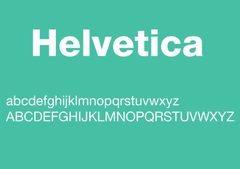
Originally named Neue Haas Grotesk, this neo-grotesque sans-serif font was designed in 1957 by Max Miedinger and Eduard Hoffmann at the Haas Type Foundry in Switzerland. Linotype renamed it Helvetica in 1960, derived from the Latin word for Switzerland.
Design Characteristics
- High x-height for improved readability at distance
- Stroke terminals cut horizontally or vertically
- Tight letter spacing creates a dense appearance
- Neutral, unadorned letterforms with minimal personality
The design drew heavy inspiration from Akzidenz-Grotesk but refined the proportions for better consistency.
Primary Use Cases
Helvetica works well for corporate branding, wayfinding systems, and government communications. Its neutrality makes it popular for companies wanting to project efficiency without personality. BMW, Lufthansa, Microsoft, and Apple have all used Helvetica extensively.
Platform Integration
Bundled with macOS and included in most PostScript 3 printers. Neue Helvetica (1983 rework) offers improved consistency across weights. Licensed through Monotype with various tiers for desktop, web, and app usage.
Browser/Device Compatibility
Renders consistently across platforms due to widespread system installation. Falls back to Arial on Windows systems without issue. Web embedding works reliably through Adobe Fonts or direct font licensing.
Notable Implementations
New York City subway signage (designed by Massimo Vignelli), NASA graphics, countless airline identities. The 2007 documentary film by Gary Hustwit brought mainstream attention to its cultural significance.
Accessibility Considerations
Strong legibility at small sizes due to the tall x-height. The tight default tracking can cause issues for some readers; consider loosening letter spacing in body text. Not ideal for users with dyslexia due to similar letterforms for b, d, p, and q.
Futura

German typographer Paul Renner designed this geometric sans-serif in 1927 for the Bauer Type Foundry. It emerged from the New Frankfurt housing project and reflects Bauhaus design ideals, though Renner wasn’t formally part of the movement.
Design Characteristics
- Near-perfect geometric shapes (circles, triangles, squares)
- Low x-height compared to other sans-serifs
- Even stroke width throughout most letterforms
- Tall ascenders that extend beyond cap height
- Single-story lowercase ‘a’ in some weights
The strict geometry gives way to optical adjustments where pure math would look wrong. Took me a while to notice that.
Primary Use Cases
Works brilliantly for headlines, logo design, and branding that needs a forward-thinking vibe. IKEA used it until 2010. Also common in aerospace (Boeing cockpits) and automotive dashboards (Mercedes-Benz).
The font traveled to the moon. Literally. The Apollo 11 commemorative plaque left on the lunar surface is set in Futura.
Platform Integration
Available through URW, Bitstream, and various other foundries with digitized versions. Monotype released Futura Now in 2020 with 102 styles. ParaType offers Cyrillic support.
Browser/Device Compatibility
Not a system font, so requires web font embedding. Performance is solid with modern font-loading strategies. Various libre alternatives exist (like Jost) for projects with limited budgets.
Notable Implementations
Stanley Kubrick’s 2001: A Space Odyssey. Wes Anderson films. Supreme streetwear. The Volkswagen logo. Director Christopher Nolan seems to like it too.
Accessibility Considerations
The low x-height reduces readability at small sizes. Not the best choice for long-form body text. Geometric similarity between characters (O and 0, I and l) can confuse readers in certain contexts.
Arial
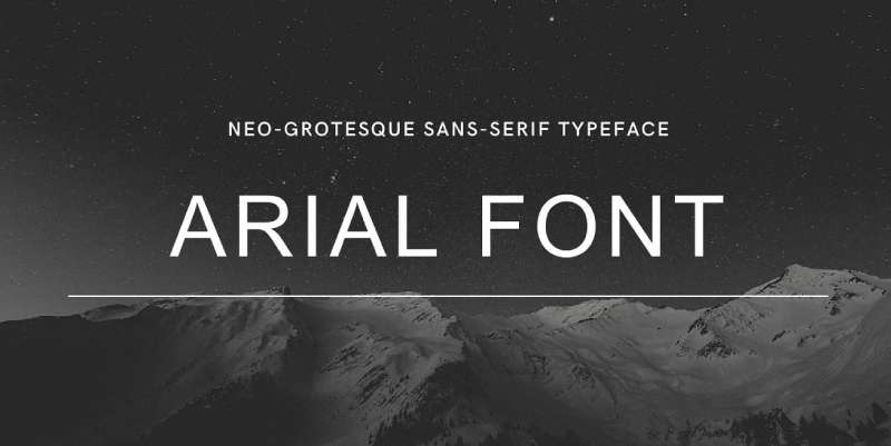
Robin Nicholas and Patricia Saunders designed Arial in 1982 at Monotype Typography for IBM laser printers. Microsoft bundled it with Windows 3.1 in 1992, and it quickly became one of the most widely used fonts in computing history.
Design Characteristics
- Metrically identical to Helvetica (same character widths)
- Softer, more rounded curves than Helvetica
- More open counters and slightly larger x-height
- Diagonal stroke terminals instead of horizontal cuts
Robin Nicholas called it “a generic sans serif; almost a bland sans serif.” That was the point.
Primary Use Cases
Default system font usage. Web-safe fallback. Any situation where Helvetica isn’t licensed but similar proportions are needed. Frankly, most people can’t tell them apart at body text sizes.
Platform Integration
Included in all Windows versions since 3.1 and all versions of macOS. Supports over 95% of Unicode. Arial Unicode MS covers an even broader character range for international documents.
Browser/Device Compatibility
Essentially universal. The safest sans-serif choice for cross-platform consistency. Renders identically because it’s a system font everywhere that matters.
Notable Implementations
Microsoft Office default (before Calibri took over in 2007). Web early days standard. Government forms. Internal corporate documents across thousands of companies.
Accessibility Considerations
Performs well at various sizes. The more open letterforms compared to Helvetica provide slightly better character distinction. Still shares the b/d/p/q similarity problem common to grotesque sans-serifs.
Garamond

Named after 16th-century French punch-cutter Claude Garamond, these old-style serif fonts trace their origins to work done between 1530 and 1545. Modern revivals interpret his original designs with varying degrees of fidelity.
Design Characteristics
- Organic structure that echoes handwritten calligraphy
- Moderate contrast between thick and thin strokes
- Cupped, rounded serifs with bracketing
- Slanted stress in curved letters
- Relatively small x-height
Many “Garamond” fonts aren’t based on Claude Garamond’s work at all. They derive from Jean Jannon’s 17th-century designs, which were misattributed for centuries.
Primary Use Cases
Book typography remains the primary application. Adobe Garamond (Robert Slimbach, 1989) is popular for publishing. Google originally used a Garamond-style font for its logo until 2015.
Platform Integration
Adobe Garamond available through Adobe Fonts. EB Garamond offers a free, high-quality alternative based on historical sources. ITC Garamond differs significantly from historical models.
Browser/Device Compatibility
Not a system font; requires embedding. Thin strokes can appear weak at low screen resolutions or small sizes. Best results on high-DPI displays or print.
Notable Implementations
Harry Potter book series. Dr. Seuss books. Original Google logo. Academic publishing extensively. The typeface has probably been read by more people than any other in history.
Accessibility Considerations
The small x-height can reduce readability for visually impaired readers. Excellent for extended reading on paper due to its comfortable, familiar rhythm. Consider larger sizes for screen display.
Times New Roman
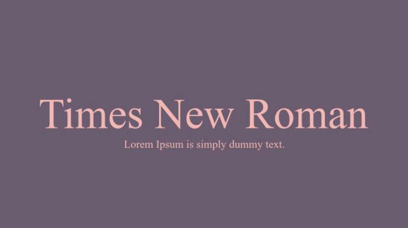
Stanley Morison conceived this typeface in 1931 for The Times newspaper of London, with Victor Lardent executing the drawings. Monotype released it commercially in 1933, and it became their best-selling metal type ever.
Design Characteristics
- Transitional serif classification
- Higher x-height than traditional newspaper faces
- Moderate contrast with sturdy serifs
- Compact width for space efficiency
- Vertical stress axis
The design prioritized two goals: fitting more text per column inch and improving legibility under newspaper printing conditions.
Primary Use Cases
Academic papers and legal documents (often by default). Microsoft Word default font for decades. Government forms. Anything where “professional but unremarkable” is the goal.
Platform Integration
Bundled with Windows and macOS. TrueType version by Monotype included in all major operating systems since the early 1990s. Web-safe status guaranteed.
Browser/Device Compatibility
Universal system font availability. Renders consistently everywhere. The 12pt Times New Roman double-spaced format haunts anyone who’s written a college essay.
Notable Implementations
The Times newspaper (until switching to Times Modern in 1972). Every academic institution ever. Microsoft Office default before Calibri. Court documents worldwide.
Accessibility Considerations
Good readability at typical document sizes. The relatively high x-height helps. Some users find the compact proportions tiring for very long reading sessions. Screen rendering has improved significantly on modern displays.
Bodoni
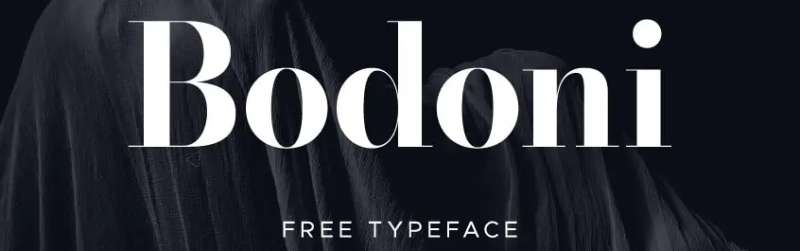
Italian typographer Giambattista Bodoni developed this modern (Didone) serif between 1798 and his death in 1813 at his press in Parma, under patronage of the Duke. Multiple foundries have created revivals with varying interpretations.
Design Characteristics
- Extreme contrast between thick and thin strokes
- Hairline serifs with no bracketing
- Vertical stress throughout
- Geometric, almost architectural construction
- Flat, unbracketed serifs
The original designs showcased Bodoni’s exceptional craftsmanship in type-casting and paper quality. Those hairlines required precision that most printers couldn’t match.
Primary Use Cases
Fashion and luxury branding dominates. Vogue magazine title. Harper’s Bazaar. Giorgio Armani, Calvin Klein, and Guerlain logos. High-end editorial. Anywhere elegance matters more than extended reading.
Platform Integration
ITC Bodoni offers optical sizes (6pt, 12pt, 72pt) for proper rendering at different scales. Poster Bodoni works for display only. Licensed through various foundries including Linotype.
Browser/Device Compatibility
The thin strokes create “dazzle” at small sizes on screens. Requires careful implementation with appropriate optical sizes. Not suitable for body text in web design without careful size selection.
Notable Implementations
Vogue magazine logo since various iterations. Nirvana band logo. Lady Gaga album artwork. Mamma Mia! theatrical poster. Zara’s 2019 rebrand caused quite a debate.
Accessibility Considerations
Poor choice for body text or small sizes. The extreme contrast causes eye strain during extended reading. Best limited to headlines and short display text at large sizes. The hairlines can disappear entirely at low resolutions.
Didot
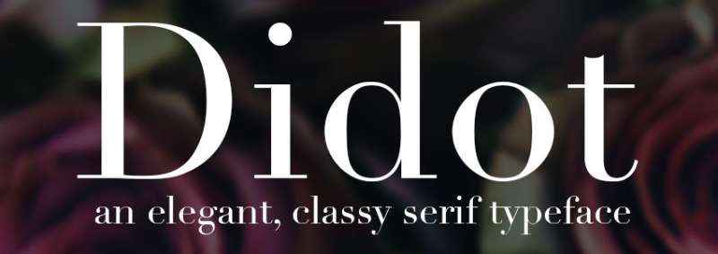
Firmin Didot designed this modern serif between 1784 and 1811 in Paris. His brother Pierre Didot used the types for printing, including a celebrated 1818 edition of Voltaire’s La Henriade. Contemporary to Bodoni’s work in Italy.
Design Characteristics
- Extreme thick/thin stroke contrast (even more than Bodoni)
- Perfectly vertical stress
- Hairline unbracketed serifs
- Elegant, rational letterforms
- Neoclassical proportions
The Didot family also standardized the typographic “point” measurement system. The name “didot” still refers to a slightly different point size than the Anglo-American system.
Primary Use Cases
Fashion magazines and luxury branding. Vogue cover title since 1955. CBS broadcasting network (until 2021). High-fashion advertising. Any context where French elegance is the goal.
Platform Integration
Adrian Frutiger’s Linotype Didot ships with macOS but is display-only (not for body text). Hoefler & Co.’s HTF Didot includes optical sizes. Theano Didot offers a free open-source option.
Browser/Device Compatibility
Same dazzle issues as Bodoni. The hairlines require high-resolution screens or large sizes. Not web-safe; requires embedding. Performs best in print at display sizes.
Notable Implementations
Vogue logo since 1955. Harper’s Bazaar (via custom Hoefler version). CBS eye logo pairing until 2021. Zara controversial 2019 rebrand with ultra-tight kerning.
Accessibility Considerations
Strictly a display font. Never appropriate for body text. Research by Sarah Hyndman found readers perceive Didot as the “most expensive-looking” typeface, which explains its luxury positioning. Avoid at small sizes.
Akzidenz Grotesk
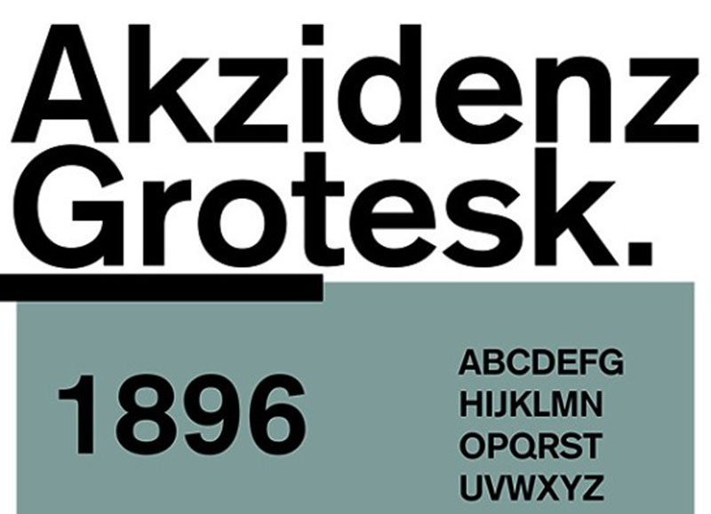
The Berthold Type Foundry released this sans-serif in 1896 (some sources say 1898) in Berlin. “Akzidenz” means commercial or jobbing work in German. Often called the “mother of all sans-serifs.”
Design Characteristics
- Pre-dates geometric and humanist sans categories
- Slight irregularities between weights (not designed as a unified family)
- More personality than its successors Helvetica and Univers
- Squared-off stroke endings in some weights
- Variable proportions between sizes
Günter Gerhard Lange expanded the family throughout the mid-20th century at Berthold, adding weights and styles while maintaining the original character.
Primary Use Cases
The Swiss design movement adopted it before Helvetica existed. Corporate identities for brands wanting something more distinctive than Helvetica. Editorial design. Signage systems.
Platform Integration
Monotype acquired Berthold’s library in 2022, including 60+ Akzidenz-Grotesk styles. Premium pricing reflects its heritage status. Basic Gothic offers a free alternative that captures some characteristics.
Browser/Device Compatibility
Requires licensing for web use. Not a system font anywhere. Consider carefully whether the premium price justifies use over similar free alternatives for web projects.
Notable Implementations
Massimo Vignelli’s original NYC subway designs (before switching to Helvetica). Volvo branding. Red Cross identity. The design directly inspired Max Miedinger when creating Helvetica.
Accessibility Considerations
The subtle irregularities between weights can actually aid character recognition compared to more sterile modern sans-serifs. Good performance at body text sizes. The varied proportions create natural reading rhythm.
Caslon
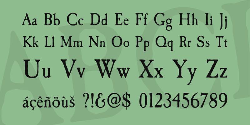
Created by William Caslon I in London around 1722, this serif font became Britain’s first original English typeface. The design was inspired by Dutch Baroque types but carried distinctly English characteristics. “When in doubt, use Caslon” became a printing industry mantra that’s lasted centuries.
Design Characteristics
Caslon features short ascenders and descenders with moderate stroke contrast. The letterforms include a distinctive ‘A’ with a concave hollow at top left and an ‘M’ with straight sides.
Bracketed serifs give the text a warm, readable texture. The ‘W’ has three terminals at the top, while the ‘b’ shows a small tapered stroke ending at bottom left.
Primary Use Cases
Book publishing and editorial work remain Caslon’s sweet spot. The New Yorker and Audubon magazine both rely on it.
Works brilliantly for official documents and anything requiring a classic, authoritative feel. Larger sizes add elegance to headlines.
Platform Integration
Adobe Caslon Pro is widely available through Adobe Fonts. LTC Caslon and Big Caslon offer additional optical sizes.
Most revivals include bold weights and lining figures that weren’t part of Caslon’s original cuts. The Font Bureau release provides extensive OpenType features.
Browser/Device Compatibility
Digital revivals render consistently across modern browsers. Fallback options include Georgia or Times New Roman.
Some screen rendering issues appear at very small sizes due to fine serif details. High-DPI displays handle the delicate strokes better.
Notable Implementations
The first printed version of the U.S. Declaration of Independence used Caslon type. George Bernard Shaw insisted all his books be set in this font.
Boston Magazine and Foreign Affairs currently use Font Bureau’s revival for their editorial layouts.
Accessibility Considerations
Moderate x-height aids readability in body text. The open counters and clear letterform distinctions work well for extended reading.
Loses legibility at very small sizes on screens. Better suited for print or larger digital text applications.
Proxima Nova
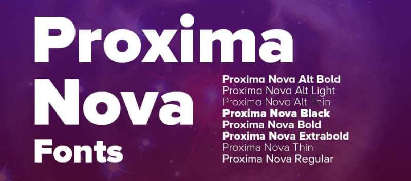
Mark Simonson designed this sans-serif font as a complete reworking of his 1994 Proxima Sans. Released in 2005, it bridges the gap between geometric faces like Futura and humanist grotesques like Akzidenz Grotesk.
Design Characteristics
The hybrid approach combines humanistic proportions with geometric construction. You get even-width proportions alongside friendly curves that feel approachable.
That distinctive lowercase ‘a’ catches attention. The letterforms sit comfortably between cold precision and warm readability.
Primary Use Cases
Web interfaces love Proxima Nova. It became the most popular commercial webfont, appearing on hundreds of thousands of sites.
Rolling Stone magazine adopted it during their 2003 redesign. Headlines and body text both work because of the extensive weight range.
Platform Integration
Available through Adobe Fonts for Creative Cloud subscribers. The family expanded to 80 fonts covering eight weights across five widths.
Language support includes Greek, Cyrillic, Vietnamese, Arabic, Thai, and Devanagari. You can get it via Monotype or directly from Mark Simonson Studio.
Browser/Device Compatibility
Excellent screen rendering, especially on Retina displays. The careful spacing and hinting make it reliable across devices.
WOFF2 format keeps file sizes manageable for web use. Variable font version (Proxima Vara) offers weight and width flexibility.
Notable Implementations
Spotify, BuzzFeed, and Mashable all built their brands around Proxima Nova. The Star Wars: The Original Radio Drama packaging featured an early version back in 1993.
Accessibility Considerations
Strong x-height improves small-size readability. Open apertures help distinguish similar letterforms.
Works well for UI elements and interface text where clarity matters most.
Gotham
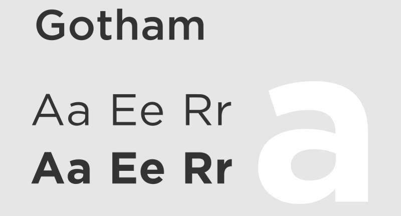
Tobias Frere-Jones designed Gotham in 2000 for GQ magazine, drawing inspiration from mid-century architectural lettering found throughout New York City. The Port Authority Bus Terminal signage served as a key reference point.
Design Characteristics
This geometric sans has broad letterforms with a relatively high x-height and wide apertures. The proportions feel distinctly American.
“Not the kind of letter a type designer would make. It’s the kind of letter an engineer would make,” as Frere-Jones described it. The forms are honest, sturdy, democratic.
Primary Use Cases
Branding and corporate identity work particularly well. Barack Obama’s 2008 presidential campaign made it iconic.
Movie posters, packaging for Coca-Cola, and Netflix’s former wordmark all featured Gotham. The One World Trade Center cornerstone uses it too.
Platform Integration
Published by Hoefler & Co. with desktop and webfont licensing. The family includes four widths, eight weights, plus Rounded and Screen variants.
Cyrillic and Greek support was added in 2015. Total styles exceed 130 fonts.
Browser/Device Compatibility
ScreenSmart versions optimize for screen rendering at small sizes. The broad design maintains legibility across resolutions.
Cloud-based licensing through typography.com makes web implementation straightforward.
Notable Implementations
Twitter briefly used Gotham before reverting. Netflix relied on it until creating their own bespoke font in 2018 to reduce licensing costs.
Gotham is in the permanent collection at MoMA in New York.
Accessibility Considerations
Wide apertures and generous spacing aid recognition. The neutral warmth balances professionalism with approachability.
Works well at both text and display sizes, though the Narrow variants require careful sizing.
Avenir
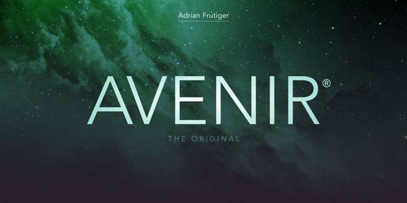
Adrian Frutiger designed Avenir in 1988, calling it his best work. The name means “future” in French, nodding to geometric predecessors like Futura while adding humanist warmth.
Design Characteristics
Vertical strokes are thicker than horizontals. The ‘O’ isn’t a perfect circle, and ascenders are slightly shortened.
Frutiger wanted something more organic than rigid geometric sans serifs of the 1930s. The typography balances mathematical precision with subtle optical adjustments.
Primary Use Cases
Wayfinding and signage systems frequently use Avenir. Dallas Fort Worth and Hong Kong airports both rely on it. Dublin Airport uses it for wayfinding.
Amsterdam selected Avenir as its official city typeface. The Consumer Financial Protection Bureau uses Avenir Next across print and digital formats.
Platform Integration
Bundled with iOS and macOS since Mountain Lion as a system font. Avenir Next (updated with Akira Kobayashi in 2004) expanded the family.
Linotype and Monotype handle licensing. The 2021 Avenir Next World release added support for 150+ languages.
Browser/Device Compatibility
Native support on Apple devices eliminates loading overhead. Web licensing available through standard foundry channels.
Clean rendering at various sizes, though the lighter weights need careful sizing.
Notable Implementations
Snapchat uses Avenir as its main UI font. Best Buy commissioned a custom version. Disney+, Bloomberg, and The Co-operative Group all rely on it.
Accessibility Considerations
Medium apertures and conventional proportions support readability. Each weight was designed for specific purposes, with Book optimized for text blocks.
The updated Avenir Next improves screen performance significantly.
Montserrat
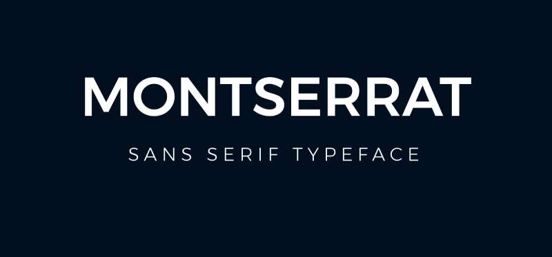
Argentine designer Julieta Ulanovsky created Montserrat to preserve the urban typography of Buenos Aires’ historic Montserrat neighborhood. Released through Google Fonts in 2011, it captures early 20th-century signage aesthetics.
Design Characteristics
Large x-height with short descenders and wide apertures. The geometric construction softens at the corners for improved legibility.
The letterforms draw from 1920s-1950s posters, painted windows, and cafe canopies. Jacques Le Bailly redrrew the family in 2017.
Primary Use Cases
Web design and digital branding favor Montserrat heavily. It ranks among the top four most popular fonts on Google Fonts with over 2.7 trillion views.
Free alternative to premium faces like Gotham and Avenir. Nine weights from Thin to Black handle headlines and body text.
Platform Integration
Fully open source under SIL Open Font License. Available through Google Fonts, Adobe Fonts, and Font Squirrel.
Supports 147+ languages including Latin extended and Cyrillic. Version 7+ added Vietnamese and expanded Cyrillic support.
Browser/Device Compatibility
Variable font version allows weight interpolation without multiple file loads. Google Fonts CDN ensures fast global delivery.
Excellent hinting for screen rendering. The 2017 redesign specifically optimized the Regular weight for longer text.
Notable Implementations
Used on over 19 million websites. The Argentine government and various institutional bodies adopted it officially.
Sister families Montserrat Alternates and Montserrat Subrayada (underlined) extend the design system.
Accessibility Considerations
Tall x-height aids mixed-case legibility. Wide apertures distinguish similar characters clearly.
Works reliably at small sizes due to intentional contrast and open letterforms.
Roboto

Christian Robertson designed Roboto at Google in 2011 as the system font for Android 4.0 “Ice Cream Sandwich.” A 2014 redesign for Android 5.0 “Lollipop” refined the forms significantly.
Design Characteristics
The font has a dual nature. Mechanical skeleton with geometric forms, but friendly and open curves. Letters settle into their natural width rather than forcing rigid rhythm.
Google described it as “modern, yet approachable” and “emotional.” The 2014 update made it rounder and wider.
Primary Use Cases
Default system font on Android and Chrome OS. Material Design’s recommended typeface for UI consistency.
YouTube, Google Maps, Google Images, and most Google services use Roboto. The New York City Subway adopted it for LCD countdown clocks on B Division lines.
Platform Integration
Open source under Apache License (later OFL). Available in 18 styles covering Latin, Cyrillic, and Greek.
Roboto Flex (2022) introduced a variable font with 12 axes. Extensions include Roboto Slab, Roboto Condensed, Roboto Mono, and Roboto Serif.
Browser/Device Compatibility
Dominant on Android ecosystem, accounts for 51% of all Google Font views (with Open Sans). Over 200 billion views and extensive use across tens of millions of websites.
Optimized hinting for various screen resolutions. The variable font reduces file overhead while maintaining flexibility.
Notable Implementations
Unreal Engine 4 uses Roboto Bold as its default font. Nintendo Switch packaging in Europe features Roboto Condensed.
Kodi media center uses Roboto as its interface typeface.
Accessibility Considerations
High legibility in laboratory-based analyses. Ranks consistently among the top performing sans-serifs for on-screen reading.
The taller x-height and open letterforms aid recognition at interface-typical sizes.
Inter

Rasmus Andersson created Inter at Figma in 2016 because Roboto was hard to read at small sizes. Released in 2017, it’s now one of the most widely used typefaces on the internet.
Design Characteristics
Tall x-height and open apertures optimize screen readability. The geometric neo-grotesque style resembles Roboto, Apple San Francisco, and Akkurat.
Contextual alternates adjust punctuation based on surrounding glyphs. Ink traps and bridges add contrast for small text rendering.
Primary Use Cases
User interfaces and application design dominate Inter’s usage. Figma, Notion, and Pixar Presto all use it for UI elements.
Works for web body text where screen legibility matters. Over 414 billion accesses on Google Fonts in the twelve months ending May 2025.
Platform Integration
Free and open source under SIL Open Font License. Nine weights from Thin to Black with matching italics.
Variable font includes optical size and weight axes. Google Fonts version strips some features to reduce file size.
Browser/Device Compatibility
elementary OS and GNOME use Inter as their system font. Outstanding rendering on high-DPI displays.
Self-hosted versions from rsms.me include the complete feature set. CloudFlare CDN ensures fast global distribution.
Notable Implementations
GitLab, ISO, Mozilla, NASA, and Zurich Airport all rely on Inter. It became the 16th most accessed font on Google Fonts with 57% year-over-year growth.
Accessibility Considerations
Designed specifically for high legibility at small-to-medium sizes. Slashed zero option disambiguates ‘0’ from ‘o’.
Tabular figures maintain alignment in data-heavy interfaces. The optical size axis adapts letterforms for different point sizes.
Neue Montreal
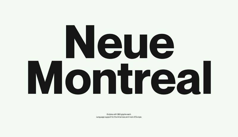
Pangram Pangram Foundry created Neue Montreal to capture Montreal’s modernist design heritage, particularly the visual legacy of Expo 67. This versatile grotesque has the spirit of a display font.
Design Characteristics
Clean, modern grotesque with slightly tighter kerning than typical. The forms reflect mid-century modernist sensibilities filtered through contemporary needs.
Fourteen styles span seven weights with matching italics. The letters balance rational clarity with subtle personality.
Primary Use Cases
Branding and identity work particularly suit Neue Montreal. Fashion, entertainment, and tech industries adopted it widely.
Works for headlines and body text alike. The versatility mirrors Montreal’s bilingual, cosmopolitan design culture.
Platform Integration
Free trial weights available for personal projects. Commercial licensing starts at $40 per style.
Cyrillic support included. Extensions include Neue Montreal Mono (with coding ligatures), Neue Montreal Arabic, and Neue Montreal Squeezed.
Browser/Device Compatibility
Modern web font formats supported. Variable font version available for flexible weight interpolation.
Amélie Bonet designed the Mono variant with a “Button-mode” feature for UI applications.
Notable Implementations
Used by global and local brands across branding, digital, events, and packaging projects.
The Squeezed variant by Off Type offers extreme compression for headline impact.
Accessibility Considerations
Clean structure maintains legibility across weights. The proportional design reads well in extended text.
The comprehensive weight range allows typographic hierarchy without sacrificing consistency.
Aktiv Grotesk
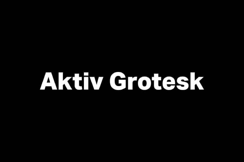
Dalton Maag designed Aktiv Grotesk as a powerful alternative to Helvetica and Akzidenz-Grotesk. Often called a “Helvetica killer,” it takes an authoritative but neutral position that supports any message without overpowering it.
Design Characteristics
Clean lines with balanced proportions and subtle dynamism define the letterforms. The geometric precision maintains a structured appearance while humanist influences add warmth.
Bruno Maag led the design team through meticulous optical adjustments. High x-height improves legibility at small sizes.
Primary Use Cases
Corporate branding and identity systems suit Aktiv Grotesk well. Dalton Maag’s client list includes AT&T, Airbnb, Netflix, BBC, Amazon, BMW, and Intel.
Works across digital interfaces, editorial layouts, and advertising materials. The neutral character lets messaging take priority.
Platform Integration
Available through Adobe Fonts for Creative Cloud subscribers. The family spans 24 styles from Hairline to Black with matching italics.
Variable font axes include Weight, Width, and Italic. Supports ten global writing systems: Arabic, Armenian, Cyrillic, Devanagari, Georgian, Greek, Hebrew, Latin, Malayalam, and Thai.
Browser/Device Compatibility
Extensive language support covers hundreds of languages. CJK versions match Chinese, Japanese, and Korean through partnerships with Arphic and Sandoll.
Desktop, web, and mobile app licensing available directly from Dalton Maag or through fontpass subscriptions.
Notable Implementations
EMST (National Museum of Contemporary Art, Athens) uses a modified version. The foundry customized Aktiv Grotesk to match their rebranded identity.
Rio 2016 Olympics used a custom Dalton Maag typeface based on similar design principles.
Accessibility Considerations
The neutral stance aids readability without distracting stylistic quirks. Open apertures help distinguish similar characters.
Extended character sets ensure consistent rendering across multilingual applications.
Bebas Neue
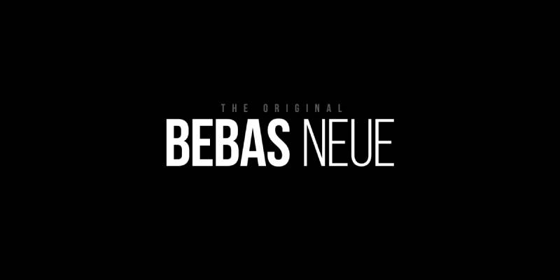
Ryoichi Tsunekawa of Dharma Type designed Bebas Neue in 2010 as a redesign of his original 2005 Bebas typeface. This free display font became one of the most widely used all-caps families in the world.
Design Characteristics
Bold, condensed uppercase letterforms with clean lines and elegant shapes. The monolinear stroke weight creates uniform visual texture.
Tightly spaced letters deliver powerful impact at any scale. Technical straightforwardness meets simple warmth in the design philosophy.
Primary Use Cases
Headlines, movie titles, and display work where impact matters. La La Land’s title treatment used Bebas Neue prominently.
Packaging, posters, and logo design benefit from the bold presence. Not suitable for body text due to the all-caps format.
Platform Integration
Open source under SIL Open Font License since version 2.000. Fontfabric expanded the family in 2014 with additional weights: Thin, Light, Book, Regular, and Bold.
Bebas Neue Pro (commercial) adds lowercase, italics, and Cyrillic support across 40 styles. Available through MyFonts and Adobe Fonts.
Browser/Device Compatibility
WOFF2, OTF, TTF, and WOFF formats available. Extended Latin support covers 80+ languages.
OpenType features include fractions, localization, and ordinals. Source files hosted on GitHub for community contributions.
Notable Implementations
Movie posters, brand logos, and promotional materials worldwide. Dharma Type reports usage across publications, media, and marketing from startups to major corporations.
Accessibility Considerations
Excellent legibility at large display sizes. The uniform stroke weight and open counters aid recognition.
Not recommended for extended reading or small text applications due to all-caps limitation.
DIN

The German Institute for Standardisation (Deutsches Institut für Normung) published DIN 1451 in 1931 for traffic, technical, and administrative applications. Origins trace back to 1905 Prussian railway lettering standards.
Design Characteristics
Geometric simplicity with functional aesthetics defines DIN. Consistent stroke widths create a clean, cohesive appearance based on grid construction.
The letterforms were designed for mechanical reproduction using basic tools. Two primary widths exist: Mittelschrift (medium) and Engschrift (condensed).
Primary Use Cases
German road signs, traffic signage, and wayfinding systems since 1936. Railway stations, house numbers, and public signage throughout Germany.
Corporate identities for BMW, Siemens, and Deutsche Bahn incorporate DIN. Editorial and interface design adopted it after the 1990 digital release.
Platform Integration
Linotype and Adobe released PostScript versions in 1990, sparking widespread adoption. FF DIN by Albert-Jan Pool (FontFont, 1995) added five weights and true italics.
DIN Next by Akira Kobayashi (Linotype) modernized the family further. Multiple foundries offer revivals: Parachute, Paratype, Elsner+Flake.
Browser/Device Compatibility
DIN Alternate Bold comes bundled with macOS. Web font licensing available through major foundries.
Peter Wiegel’s OFL-licensed digitizations provide free alternatives including Mittelschrift and Breitschrift variants.
Notable Implementations
German Autobahn signage remains the iconic use case. Vehicle number plates used DIN from 1956 until 1995.
Cutting-edge designers like David Carson, Erik Spiekermann, and April Greiman popularized it in graphic design during the late 1980s.
Accessibility Considerations
Designed specifically for visual hierarchy at distance. High legibility even at small sizes and from far away was the original engineering goal.
The 1980 revision by Adolf Gropp improved forms for ‘6’ and ‘9’ with more open counters.
Clarendon
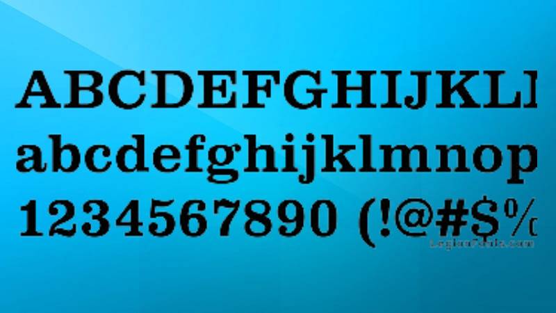
Robert Besley created Clarendon in 1845 for the Fann Street Foundry in London. It became the first typeface ever patented under British law due to its immediate popularity.
Design Characteristics
Slab serif font with bracketed serifs that curve gently into the main strokes. This differs from Egyptian and Antique slab serifs with their abrupt, unbracketed terminals.
Large x-height with short ascenders and descenders. Low stroke contrast creates sturdy, solid letterforms with minimal variation between thick and thin.
Primary Use Cases
Display headlines and poster design dominated early use. American Old West wanted posters made it iconic.
Works as body text due to the bracketed serifs improving inline harmony. Editorial, branding, and advertising continue to rely on Clarendon’s bold presence.
Platform Integration
Hermann Eidenbenz cut a revival in 1953, issued by Haas and Stempel. Monotype released “New Clarendon” in 1960.
Modern versions include:
- Craw Clarendon (American Type Founders, 1955)
- Clarendon Text (Canada Type)
- Belizio (Font Bureau, 1998)
- Besley* (Indestructible Type, open source with variable fonts)
Browser/Device Compatibility
Most major foundries offer digital Clarendon variants. URW, Adobe, and Linotype all carry versions.
Cross-platform rendering works reliably due to the sturdy letterforms. The bold structure holds up at various resolutions.
Notable Implementations
Wells Fargo uses Clarendon in their branding. U.S. National Park Service adopted it for road signs and maps.
Sony’s PlayStation logo historically used Clarendon-style letterforms. The typeface appears throughout American civic and commercial design.
Accessibility Considerations
Large x-height and sturdy serifs aid readability. The balanced proportions work at both text and display sizes.
Bracketed serifs soften the mechanical feel of pure slab serifs, making extended reading more comfortable than geometric alternatives.
FAQ on The Best Iconic Fonts
What makes a font iconic?
Iconic fonts earn their status through widespread adoption, timeless design, and proven performance across multiple contexts. They work reliably for branding, UI design, and editorial layouts.
Longevity matters. Fonts like Helvetica, Caslon, and Gotham remain popular decades after release.
What are the best free icon fonts for web design?
Google Fonts offers excellent free options. Roboto, Montserrat, and Inter dominate web projects worldwide.
Open source licenses (SIL OFL) allow commercial use without fees. Font Awesome and Bootstrap Icons handle icon sets specifically.
How do I choose between geometric and humanist sans-serif fonts?
Geometric fonts (Futura, Avenir) feel modern and precise. Humanist designs (Proxima Nova, Inter) add warmth and readability.
Consider your project’s tone. Cold and technical? Go geometric. Approachable and friendly? Choose humanist.
Which fonts work best for UI and app design?
Inter, Roboto, and SF Pro dominate interface design. They’re optimized for screen rendering at small sizes.
Tall x-heights and open apertures improve legibility. Variable fonts reduce file sizes while offering weight flexibility.
Are premium fonts worth the licensing cost?
For professional branding, absolutely. Gotham, Proxima Nova, and Aktiv Grotesk offer refinement that free alternatives can’t match.
Budget projects can start with Google Fonts. Upgrade when clients demand exclusivity or specific OpenType features.
What’s the difference between a font and a typeface?
A typeface is the design family (Helvetica). A font is a specific weight and style (Helvetica Bold Italic).
Digital usage blurred this distinction. Most designers now use the terms interchangeably without issue.
How do I pair iconic fonts effectively?
Contrast works best. Pair a serif with a sans-serif, or combine different weights from the same family.
Montserrat pairs well with Merriweather. Roboto works alongside Roboto Slab. Stick to two or three fonts maximum.
Which iconic fonts have the best browser compatibility?
System fonts (Arial, Georgia, Times New Roman) render everywhere. For web fonts, Roboto and Open Sans have near-universal support.
WOFF2 format ensures fast loading. Always specify fallback fonts in your CSS stack.
What fonts do major brands use?
Netflix created Netflix Sans. Spotify uses Circular. Apple relies on SF Pro. Google standardized on Roboto.
Many corporations commission custom typefaces. Others license premium options like Gotham or Proxima Nova exclusively.
How important is font accessibility?
Critical. Poor font choices exclude users with visual impairments or dyslexia.
Prioritize adequate font spacing, sufficient weight contrast, and clear letterform distinction. Test at various sizes before finalizing.
Conclusion
Choosing the best iconic fonts comes down to matching your project’s needs with proven performers. Each typeface in this guide earned its reputation through real-world testing across branding, web interfaces, and print applications.
Start with the basics. Roboto and Inter handle UI work. Gotham and Proxima Nova dominate corporate identity. Montserrat offers a free alternative that punches above its weight.
Don’t overlook practical factors like OpenType features, language support, and CDN availability. These details matter when scaling across platforms.
Build your own library of trusted faces. Learn how to pair fonts that complement each other. Test rendering across devices before committing.
The right font choice separates amateur work from professional output.

Renowned for his expertise in logo design and visual branding, Bogdan has developed a multitude of logos for various clients.
His skills extend to creating posters, vector illustrations, business cards, and brochures. Additionally, Bogdan's UI kits were featured on marketplaces like Visual Hierarchy and UI8.
He also wrote in the past years on sites like Design Your Way, WebDesignerDepot, WPDean, Designmodo, Speckyboy, Slider Revolution, and more.
- The Windsurf Logo History, Colors, Font, And Meaning - 10 October 2026
- How to Remove Background From Product Photos (No Photoshop) - 10 October 2026
- How Designers can Build a Stronger Online Creative Identity - 9 October 2026

Bogdan Sandu is a seasoned designer who has been designing websites since 2008. Renowned for his expertise in logo design and visual branding, Bogdan has developed a multitude of logos for various clients. His skills extend to creating posters, vector illustrations, business cards, and brochures. Additionally, Bogdan's UI kits were featured on marketplaces like Visual Hierarchy and UI8. He also wrote in the past years on sites like Design Your Way, WebDesignerDepot, WPDean, Designmodo, Speckyboy, Slider Revolution, and more.
You Might Also Like


