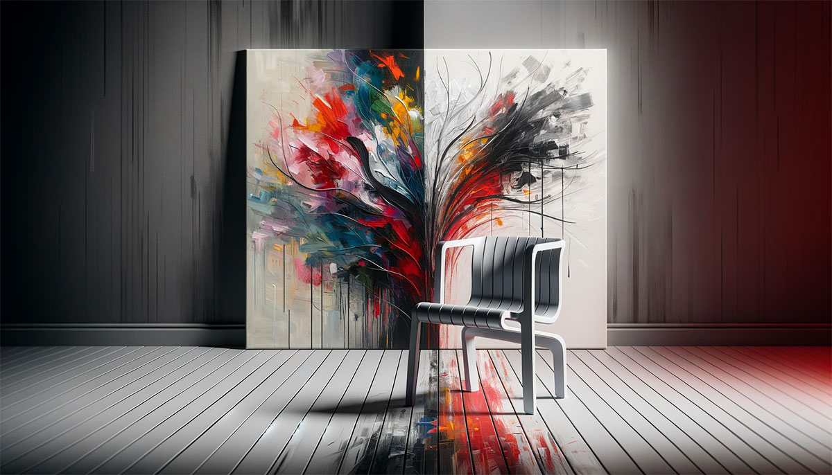

Bold and Unconventional: Brutalist Graphic Design

Stepping into the raw, unfiltered realm of brutalist graphic design, one can’t help but feel the visceral impact of its bold rebellion against the polished norms.
This is design uncensored, unapologetic, driven by a desire for authenticity and utility over the mere aesthetics that often decorate our visual landscape. Here, in the rough concrete and stark lines, we find a different kind of beauty—one that demands attention and thought.
Embarking on this exploration, I’m tearing down the veneer to expose the guts of graphic design, where function and form engage in a gritty dance. What awaits is not just an understanding but an appreciation for the simplicity and honesty of brutalist principles.
This article isn’t just a walk-through; it’s a dive deep into the core of a movement that reshapes how we perceive design.
From the influence of Modernist architecture to the rebellion of anti-design—welcome to a space where grid-based design meets geometric shapes, and text-heavy layouts command the spotlight.
As we throw back to Bauhaus and the starkness of Helvetica, ready yourself to unravel why brutalist graphic design is not just a trend but a resonant voice in the choir of visual communication.
What is Brutalist Graphic Design?
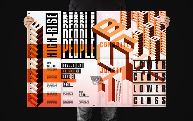
Brutalist Graphic Design is a style that emphasizes raw, unrefined visuals drawing inspiration from Brutalist architecture. It showcases bold, stark typographies and layouts, often incorporating a monochrome color palette and asymmetric patterns to create a deliberately unpolished and impactful aesthetic that stands out for its simplicity and directness.
Characteristics of Brutalist Graphic Design
Aesthetic Elements
Ever stumbled across a design that felt like a splash of cold water on your face? That’s the raw power of brutalist graphic design.
It’s all about peeling back the layers to reveal something unrefined, yet incredibly compelling.
Use of Raw, Minimal Styles and Bold Typography
Picture this: big, in-your-face letters, stripped of any frills. Brutalist graphic design thrives on this kind of bold typography. It’s not just text; it’s a statement.
This style takes cues from industrial style graphics and geometric patterns. It’s like the visual version of punk rock – raw, unpolished, and totally real.
Emphasis on Functionality Over Form and Aesthetics
Now, let’s get real about functionality. In the world of brutalism, it’s king. This isn’t about pretty pictures or fancy decorations.
It’s about designs that work, that make sense, and that tell it like it is. Think about the honest, no-nonsense approach of Bauhaus design principles.
Brutalist design is the visual equivalent of a well-structured argument – clear, direct, and undeniably effective.
Design Techniques
When it comes to brutalist graphic design, technique is everything. It’s what sets it apart from the glossy, mainstream look that’s everywhere these days.
Repetitive, Geometrical Patterns and Modular Designs
Geometry isn’t just for math class. In brutalist design, geometric patterns are the bread and butter.
Modular designs, where everything fits together like a puzzle, are a big deal here. It’s about creating a visual rhythm that’s as predictable as it is pleasing.
The repetition? It’s not boring – it’s hypnotic.
Honesty about Materials and Integrity of Function
Last but not least, let’s talk about honesty – brutal honesty. In brutalist graphic design, what you see is what you get.
No hiding, no pretending. This style celebrates the raw materials it uses, just like the stark, concrete structures in modernist architecture.
It’s not just about looking good; it’s about being true to what you are.
Brutalism in Web Design
Transition to Digital
Remember when websites were just about getting the job done? No frills, just straight-up information delivery.
That’s where brutalist design in digital spaces got its roots. It’s like those early days of the web, where functionality was king, and fancy designs were nowhere in sight.
But, oh, how times have changed!
Early Web Design’s Focus on Functionality Mirroring Brutalist Principles
Back then, websites were like digital versions of brutalist graphic design. Think of it as the online equivalent of a concrete building: sturdy, functional, and straightforward.
You knew exactly where to click and what to do. No confusion, no unnecessary embellishments. This simplicity, this rawness, it’s what made those early websites work so well.
Resurgence as a Reaction to Mainstream Commercial Web Design
Fast forward to today, and there’s a twist. As the web got flooded with glossy, image-perfect designs, some started missing the good old days.
Enter the resurgence of brutalist web design. It’s like a breath of fresh air, cutting through the noise of over-designed websites.
It’s not just nostalgia; it’s a statement against the overly commercial, cookie-cutter web designs we see so often.
Key Features in Web Brutalism
Minimal CSS and Grid-Like Layouts
Let’s break it down: minimal CSS and grid-like layouts. This is the bread and butter of brutalist web design. Imagine a grid, clean and precise.
That’s your canvas. Now, strip away the excess. What you’re left with is a website that’s all about efficiency and ease of use.
It’s straightforward, no beating around the bush. Just like those modular designs and geometric patterns in brutalist graphic design.
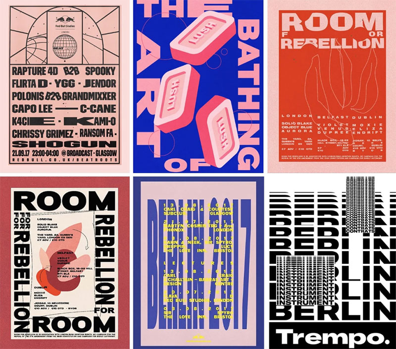
Clashing Color Palettes and Unconventional Navigation
But hey, brutalism isn’t just about being minimal. It’s also about making a statement.
Clashing color palettes? They’re in.
Unconventional navigation? Absolutely.
It’s like flipping the script on what a website should look like. Brutalist graphic design in web form isn’t afraid to challenge your expectations.
It’s bold, it’s different, and it makes you sit up and take notice.
Famous Examples and Influences
Iconic Brutalist Designs
Ever seen something so bold and raw that it sticks in your mind? That’s the magic of brutalist design.
It’s not just about creating visuals; it’s about making a statement, leaving a mark.
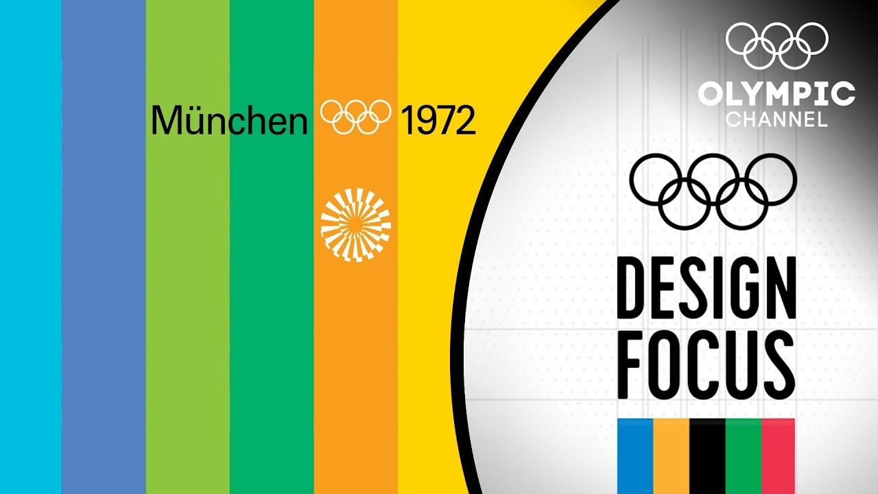
The Beatles’ White Album, 1972 Olympic Games, Obama’s 2008 Campaign
Take The Beatles’ White Album, for instance. It’s like the epitome of minimalism meeting boldness.
Then there’s the 1972 Olympic Games design – a perfect blend of geometric patterns and stark contrasts. And who can forget Obama’s 2008 campaign?
It was groundbreaking, a testament to how powerful simplicity in design can be.
Each of these examples, in their own way, embodies the spirit of brutalist graphic design: unapologetic, impactful, and unforgettable.
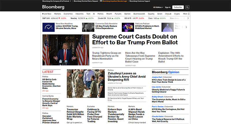
Bloomberg Businessweek Covers: Unconventionally Striking
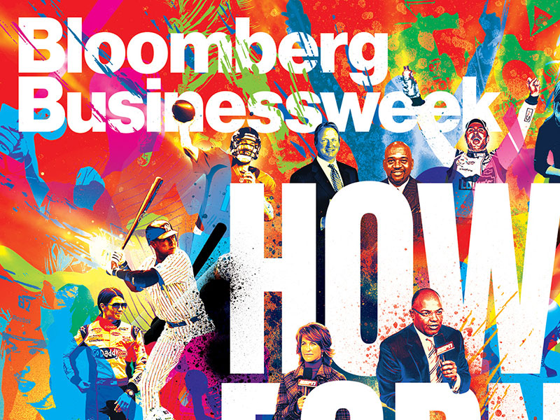
Under Richard Turley’s vision, Bloomberg Businessweek flipped the script between 2010-2014. The covers? Bold fonts, in-your-face layouts.
They shouted Brutalism with every design choice, igniting conversation just as raw concrete does in architecture.
David Carson’s Distinct Disregard for the Norm
Ray Gun? That was Carson’s playground. Typography that makes you squint and lean in—his style. Some call it the groundwork for Brutalist tendencies in design.
He preferred expression over readability, and that has a taste of Brutalism, doesn’t it?
KesselsKramer Advertising Agency: Bold and Bare
Those cats over at KesselsKramer, they know what’s up with Brutalism. Campaigns that land with a thud, imagery that slaps you with simplicity, that’s their jam.
They turn simple into bold; they make minimalism shout.
MTV’s “Look Different”: Shades of Brutal Simplicity
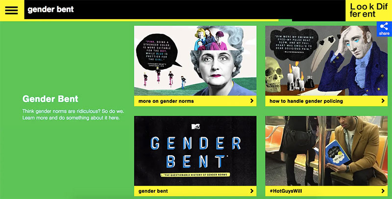
MTV hit the nail. “Look Different” wasn’t just a campaign; it was a manifesto. Stark type, monochromatic tones—it embraced Brutalism’s straight talk.
No frills, just the message, loud and clear.
Spotify’s “Year in Music”: Unapologetically Direct
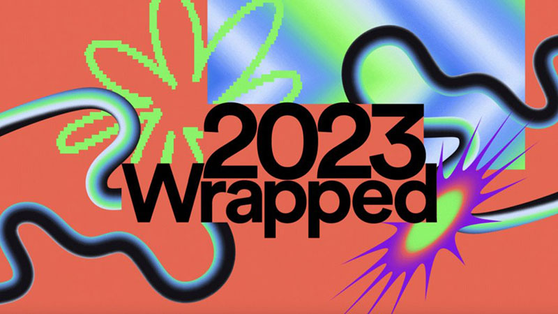
Spotify’s annual breakdowns didn’t just play music; they played with Brutalism. Clear, bold, no-nonsense layouts that tell it like it is.
That’s brutalist harmony right there—a nod to geometric shapes and raw aesthetics.
The Drudge Report: Unembellished Information
The Drudge Report, oh boy, talk about stripped back. News, plain and center, no glossy touch-ups. Isn’t that the essence of Brutalism in digital form?
Content is king, and king alone.
Helvetica Documentary Poster: Type as the Hero
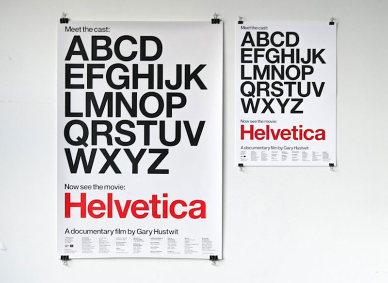
The documentary poster for “Helvetica” made one heck of a statement. The typeface itself stole the show, set against nothingness—an apt metaphor for Brutalism.
It took minimalist design and dialed it up, way up.
Practical Applications and Best Practices
Incorporating Brutalism in Design
Okay, so you’re into brutalist graphic design. It’s cool, it’s edgy, but how do you actually use it without scaring everyone away? It’s all about balance and knowing your audience.
Balancing Functionality with Aesthetic Appeal
Picture this: you’re designing a website. You want it to be bold, make a statement, but it still needs to be usable, right? That’s where the balance comes in.
Think minimal CSS, grid-like layouts from brutalism, but keep it user-friendly. It’s not just about being stark and raw; it’s about being stark, raw, and approachable.
Tips for Integrating Brutalist Elements in Modern Design
Here’s a quick guide:
- Start with bold typography but make sure it’s readable.
- Go for geometric patterns, but don’t let them overwhelm your content.
- Use monochromatic schemes, but add a pop of color for that ‘wow’ factor.
- And remember, in brutalist graphic design, less is usually more.
Challenges and Considerations
So, you’re all set to go brutalist. But hold up. There are a few things to consider first.
Potential Risks and User Experience Concerns
Firstly, not everyone’s going to love the brutalist vibe. It can be off-putting for some, especially if they’re used to more conventional designs.
And then there’s the user experience. Brutalism is cool, but if your website’s hard to navigate, that’s a problem. Always keep your user in mind.
Striking a Balance between Raw Aesthetics and Usability
Here’s the golden rule: mix and match. Blend those raw, minimalist styles with some user-friendly elements. Make it brutalist, but make it welcoming.
Think of it like a coffee with just the right amount of sugar – strong, but not too bitter.
FAQ On Brutalist Graphic Design
How did brutalist graphic design begin?
It started as a rebellion. Designers in the late 1950s and ’60s were inspired by the Brutalist architecture’s honest use of materials and form.
They adopted the same principles in their work, leading to graphics that were as raw and function over form as the buildings themselves.
Why is brutalist graphic design seen as controversial?
People find it jarring because it breaks the rules. The intentional use of harsh lines, exposed structure, and typographic experiments with fonts like Helvetica can be a visual shock.
It challenges the eye, prioritizing grid-based design and monochrome palette over the soft, safe and pleasing designs we’re used to.
What types of projects is brutalist graphic design best suited for?
Edgy brands love it for its ability to stand out. Think of music posters, avant-garde fashion labels, and unconventional marketing campaigns.
Brutalist design embraces text-heavy layout and industrial elements, perfect for messages that aim to be loud, proud, and unapologetically in your face.
What distinguishes brutalist graphic design from minimalist design?
While both celebrate simplicity, brutalism can be noisy, raw, and brutish. It throws geometric shapes and a monochrome palette at you without the gentleness of minimalism’s soft whites and open spaces.
Think more urban design aesthetics rather than straight-up Swiss Style sophistication.
Can brutalist graphic design be considered user-friendly?
It’s a tough love approach. While not traditionally user-friendly, it demands attention and can be incredibly effective for punchy, message-driven interfaces.
Think more simplified user interface, with a visual simplicity that gets straight to the point without any sugar-coating.
How does brutalist graphic design impact user experience?
It’s a disruptor. It throws the typical user-centric web design playbook out the window, opting for an experience that’s confronting and memorable.
Users might find it unrefined, but it creates a raw aesthetics experience that sticks, and that’s the point.
What are the key elements of brutalist graphic design?
Think asymmetrical layouts, bold typography in brutalism, and geometric shapes.
There’s often a text-heavy layout paired with monochrome palette, a mix of function over form, like the creations of Paul Rand. It’s all bound together by a raw aesthetics that doesn’t play nice for the sake of prettiness.
How have digital platforms embraced brutalist graphic design?
The trend’s perfect for the online world. Digital platforms are using brutalist principles to cut through the digital noise.
With CSS Grid Layout and experimental design techniques, websites now mirror physical brutalist sentiments in a simplified user interface that demands clicks.
Is brutalist graphic design a passing trend?
Not at all. It’s cyclic, reflecting the broader ebb and flow of design innovation. Like retrofuturism in visuals, it’s part of a design heritage that’s constantly being rediscovered and reinterpreted.
The underlying principles of brutalism in graphic design continue to inspire, challenge, and evolve with time.
Conclusion
As the exploration of brutalist graphic design wraps up, take a moment to appreciate this fearless frontier of creativity.
It’s a style that’s broken free from the shackles of the overly polished and ventured into the wilderness of raw expression.
Let’s not forget, the potency of a monochrome palette or the deliberate disarray of asymmetrical layouts are not just aesthetics; they’re statements.
- Raw
- Unfiltered
- Gritty
These are the pillars that hold up the brutalist ethos. It’s not just about geometric shapes and minimalist design—it’s the pulse of a movement that dares you to look beyond the surface, to find meaning in the visual simplicity and the bold textures of the concrete.
Remember those who dip into brutalist waters are not just designers; they’re architects of thought, provocateurs of the visual feast. So, when the time comes to craft new stories in pixels and type, consider going brutalist, and make that impact unforgettable.
If you liked this article about Brutalist graphic design, you should check out this article about what is color theory.
There are also similar articles discussing visual hierarchy, Swiss design, graphic design movements, and Bauhaus graphic design.
And let’s not forget about articles on postmodern graphic design, grid systems in graphic design, Gestalt principles of design, and the golden ratio in design.
Bogdan Sandu, a seasoned designer with 15 years of diverse experience, has been designing websites since 2008.
Renowned for his expertise in logo design and visual branding, Bogdan has developed a multitude of logos for various clients.
His skills extend to creating posters, vector illustrations, business cards, and brochures. Additionally, Bogdan's UI kits were featured on marketplaces like Visual Hierarchy and UI8.
Latest posts by Bogdan Sandu (see all)
- The Benefits Of Print on Demand - 13 May 2024
- Earthly Delight: Rich Brown Color Palettes - 13 May 2024
- Designer Fonts: What Font Does Balenciaga Use? - 13 May 2024