


Print still converts. While most marketing budgets chase digital channels, brochures quietly hold a 70-80% higher recall rate than online ads.
So what is brochure design, exactly? It’s the process of structuring layout, typography, imagery, and content across a folded document built to inform, persuade, and get someone to act.
Not a flyer. Not a catalog. A brochure is its own format, shaped entirely by the fold.
This guide covers the core elements of effective brochure design, common fold formats, the differences between print and digital production, the tools professionals actually use, and what the whole process costs. Whether you’re hiring a designer or doing it yourself, you’ll walk away knowing how to build a brochure that works.
What Is Brochure Design
Brochure design is the process of planning and arranging layout, typography, imagery, and content within a foldable printed or digital marketing document. It sits at the crossroads of graphic design, copywriting, and marketing strategy.
Not a flyer. Not a catalog. Not a booklet.
A brochure is something more specific. It’s a compact, self-contained piece of print design that delivers focused information about a product, service, or organization. The fold structure creates panels, and those panels create a reading sequence that guides someone through your message.
The global graphic design market reached roughly $52 billion in 2024, according to NextMSC research. Brochure design lives inside that market as one of its oldest and most persistent formats. Businesses still use brochures because they work differently than screens. Print media has a 70-80% higher recall rate than digital advertising, based on data from Persuasion Nation.
What separates brochure design from general graphic design is the fold. Every design decision (where the headline goes, how images bleed across panels, where the call to action lands) depends on how the paper folds. That physical constraint shapes everything.
And look, I’ve watched people treat brochure design like it’s just “making something pretty in InDesign.” It’s not. A brochure that doesn’t account for reading flow across panels is just a decorated piece of paper. The fold is the design.
Common Brochure Types and Fold Formats
The fold format you pick determines how many panels you have, how content flows, and what the reader sees first. Choose wrong and the whole piece falls apart.
| Fold Type | Panels | Best For |
|---|---|---|
| Bi-fold | 4 | Image-heavy layouts, short presentations |
| Tri-fold | 6 | Sequential info, service overviews |
| Z-fold | 6 | Timelines, step-by-step processes |
| Gate fold | 4-6 | Dramatic reveals, luxury brands |
| Accordion fold | 8+ | Maps, extended product lines |
Standard print sizes include US Letter (8.5 x 11 inches), A4, and DL (which fits a standard envelope). The size you choose pairs directly with the fold type. A tri-fold on Letter stock gives you three panels of about 3.67 inches wide. That’s tight. Every word has to earn its place.
According to a Statista survey, 79% of U.S. small business owners reported using brochures and flyers as part of their marketing activities. The tri-fold remains the most common format because it fits in standard racks and mailer envelopes.
Tri-Fold vs. Bi-Fold: When to Use Each
Tri-fold brochures give you six panels. Information moves in sequence, panel by panel. That makes them a natural fit for service descriptions, menus, and event programs where the reader needs to follow a logical order.
Bi-fold brochures open like a book. Four panels, with one large interior spread. They work better when you need space for big photographs or a single visual statement. Think real estate listings, restaurant features, or product launches where the image does the talking.
Took me a while to stop defaulting to tri-folds for everything. But if your content is more visual than textual, the bi-fold gives you room to breathe. The interior spread is almost like a mini poster.
Core Elements of Brochure Design

Every brochure shares the same building blocks. How you arrange them is what makes the difference between something people keep and something that goes straight into the trash.
Research from PDC Graphics found that consumers hold onto print ads for an average of 17 days. That retention only happens when the design elements work together to create something worth keeping.
Layout grid: The panel structure dictates your grid. Each fold creates a column, and your content sits within those columns. Working with grid systems keeps everything aligned and readable.
Typography choices: You need at least two levels. A headline font that grabs attention and a body font that’s easy to read at small sizes. Typographic hierarchy matters more in brochures than almost anywhere else because space is so limited.
Image selection: Low-quality photos ruin brochures faster than bad copy. Everything needs to be at least 300 DPI for print.
Color palette: Stay consistent with your brand. Three to four colors max.
White space: The temptation to fill every square inch is real. Resist it. Breathing room makes content readable.
Front Panel Design
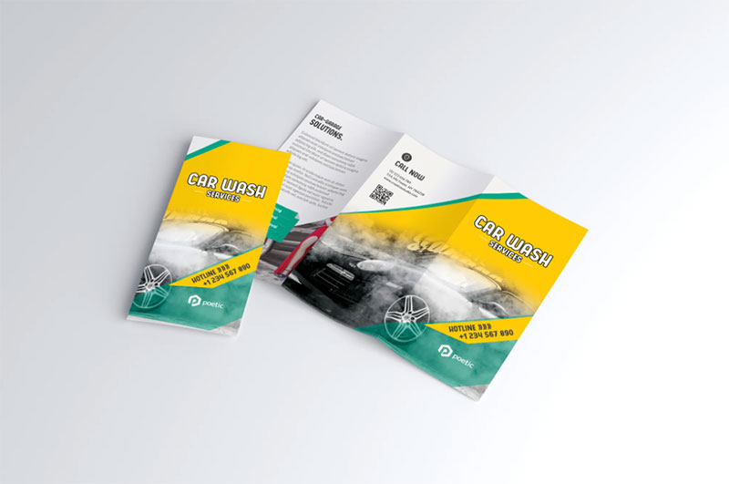
The front panel is doing the same job as a book cover. Someone glances at it and decides in under a second whether they pick it up or walk past.
People form first impressions in about 50 milliseconds, according to research cited by Larry Kim. Your front panel has to work that fast.
Three things go on the front: a headline, a hero image or graphic, and your logo. That’s it. Trying to cram more than that kills the focal point. The reader’s eye needs one clear place to land.
A strong front panel uses contrast between the headline and background to make text pop. Bold hues against a clean background will outperform a busy collage every time.
Inside Panel Layout and Content Flow

The inside panels do the heavy lifting. This is where your actual message lives.
Visual hierarchy controls how readers move through the content. In Western languages, eyes naturally scan left to right, top to bottom. Your layout should respect that pattern or deliberately break it with visual cues like arrows, numbered sections, or color-coded blocks.
Group related information within connected panels. If panels 2 and 3 are visible at the same time when the brochure is open, treat them as a spread. Don’t make them fight each other.
Proximity between related items tells the reader “these things belong together” without needing a label. It’s one of those Gestalt principles that sounds academic until you see a badly spaced brochure. Then it clicks.
Brochure Design for Print vs. Digital
Same content, completely different production rules. The gap between print brochures and digital brochures is wider than most people think.
Print Brochure Specifications
Color mode: Print uses CMYK. If you design in RGB and convert at the last minute, your colors will shift. Bright blues go dull. Reds get muddy. Always start in CMYK if the file is heading to a press.
Resolution: Every image needs 300 DPI minimum. A photo that looks sharp on screen at 72 pixels per inch will print blurry and pixelated.
Paper stock: Gloss, matte, uncoated. Each affects how colors appear and how the brochure feels in hand. Matte finishes reduce glare and look more upscale. Gloss makes colors pop but shows fingerprints.
Print advertising delivers a 112% return on investment in terms of consumer response rates, according to Early Stage Marketing. Print ads also require 21% less mental effort to process compared to digital ads.
Digital Brochure Considerations
Digital brochures live as PDFs, flipbooks, or interactive web pages. Tools like ISSUU and Flipsnack turn static layouts into page-turning experiences with embedded video and clickable links.
Here’s where things get interesting. Digital brochures can include hyperlinks, QR codes, embedded video, and clickable calls to action. None of that exists in print. But the flipside is that digital brochures compete with everything else on someone’s screen, which is a lot.
Design in RGB for digital. Include alt text for accessibility. Keep file sizes reasonable so the document loads quickly on mobile.
| Feature | Print Brochure | Digital Brochure |
|---|---|---|
| Color mode | CMYK | RGB |
| Resolution | 300 DPI | 72-150 PPI |
| Interactivity | None | Links, video, forms |
| Distribution cost | Printing + shipping | Near zero |
| Recall rate | Higher (tactile) | Lower (screen fatigue) |
Tools Used in Brochure Design
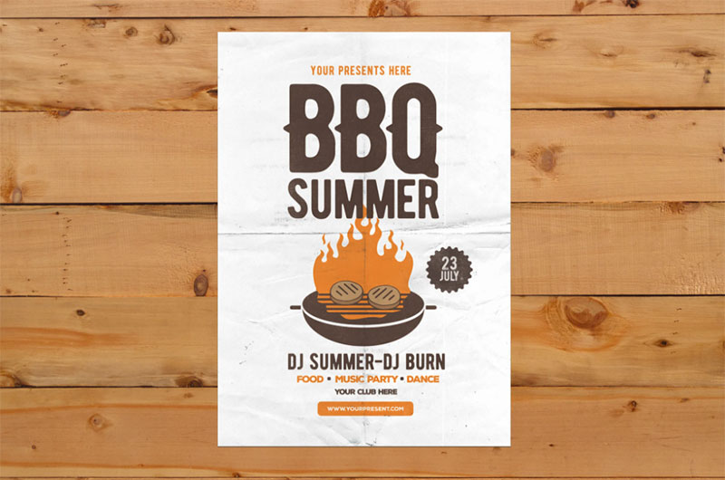
Your tool choice depends on your skill level, budget, and what you’re trying to produce. There’s no single “best” tool. There’s only the right one for your situation.
Canva reached 260 million monthly active users in 2025, according to DemandSage. That tells you something about the demand for accessible design tools. But accessible doesn’t mean professional-grade, and the distinction matters for brochure work.
Adobe InDesign: The industry standard for professional print layout. If you’re producing brochures that go to a commercial printer, InDesign handles bleed, trim, CMYK profiles, and baseline grids better than anything else. It’s not beginner-friendly. The learning curve is steep.
Canva: Best for non-designers who need something fast. The template library is massive, and you can produce a decent tri-fold brochure in under an hour. But you’ll hit limits quickly if you need precise kerning, custom leading, or advanced prepress controls.
Adobe Illustrator: Better suited for brochures with heavy custom illustration or vector graphics. Some designers prefer it for single-page layouts, but it lacks InDesign’s multi-page workflow.
Affinity Publisher: A capable InDesign alternative at a fraction of the price. One-time purchase instead of a subscription. It handles most professional print work well.
Microsoft Publisher: Exists. Works for internal documents. Not recommended for anything that’s going to a commercial print shop. The export options are limited and the typography controls are basic.
Brochure Design Process from Brief to Final File
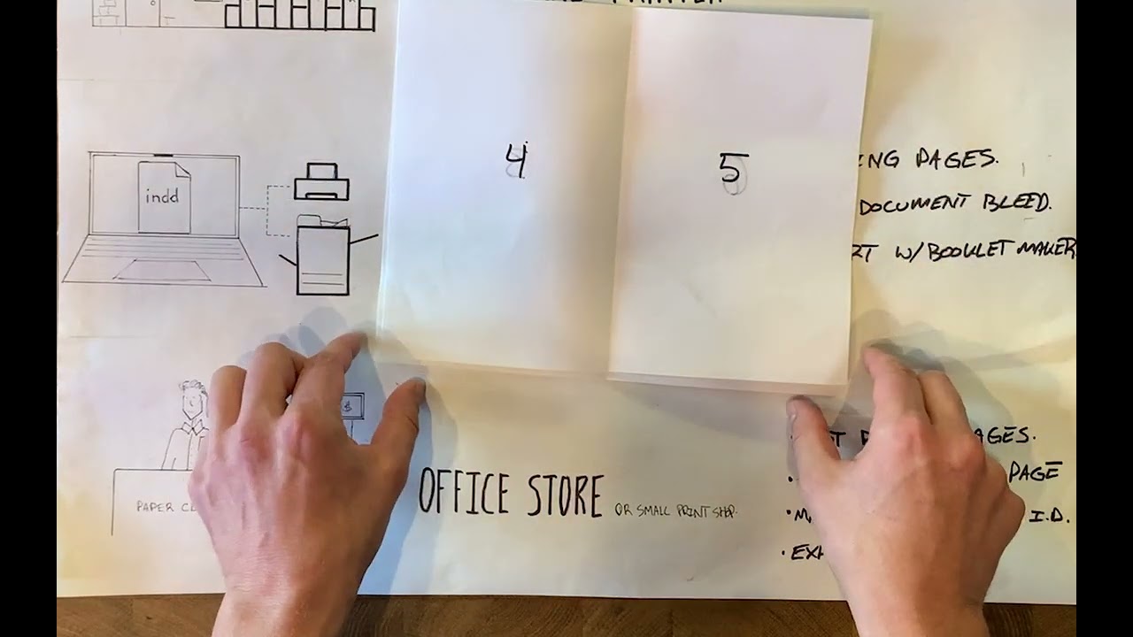
A brochure that works doesn’t start in design software. It starts with questions. Who is this for? What do they need to know? Where will they pick it up?
Venngage’s research shows that 36.7% of marketers say visual content creation is their biggest challenge. Having a clear process cuts through that difficulty.
Creative Brief and Content Planning
The brief defines everything. Audience, objective, distribution method, brand guidelines, and deadline. Skip the brief and you’ll redesign the brochure three times.
Content comes before design. Always. Write the copy first, or at least a detailed outline. Designers who start arranging panels before the text is finalized end up retrofitting words into spaces that don’t fit. That’s how you get brochures with tiny unreadable body text crammed into a panel.
A good brief also references the company’s brand guidelines and style guide so the designer knows which fonts, colors, and logo versions to use from the start.
Design Drafts and Revision Workflow
Start with wireframes. Rough thumbnail sketches that show where headlines, images, and text blocks sit on each panel. This takes five minutes and saves hours later.
Then move into software. First draft, internal review, feedback, revisions. Most professional brochure projects go through two to three revision rounds before approval.
Some designers create a mood board before touching the layout. It helps align everyone on the visual direction early, which reduces the “I don’t like it but I can’t tell you why” feedback loop that kills timelines.
Preparing Files for Professional Printing
This is where amateurs get tripped up. Your design might look perfect on screen and still print wrong.
Bleed: Extend your background and images 3mm (or 0.125 inches) beyond the trim line. Without bleed, you get white edges where the paper cuts.
Safe zone: Keep all text and important content at least 5mm from the trim edge. Paper cutters aren’t perfectly precise.
Font handling: Either embed all fonts in the PDF or convert text to outlines. If the print shop doesn’t have your typeface installed, the software substitutes something else. Your carefully chosen serif headlines suddenly become Times New Roman.
Export format: PDF/X is the standard for commercial printing. It strips out RGB elements, embeds fonts, and flattens transparency. InDesign and Affinity Publisher both export to PDF/X natively.
What Makes a Brochure Design Effective

An effective brochure gets picked up, read, and acted on. That’s the whole test. Everything else is decoration.
Direct mail (which includes brochures) holds an average response rate of 4.4%, according to LS Direct. Compare that to email’s 0.12%. The physical format gives brochures a massive engagement advantage, but only when the design earns it.
Clear Visual Structure
The reader’s eye needs direction. Without a strong set of graphic design principles guiding the layout, people just skim and leave.
Hierarchy does the heavy lifting. Largest text gets read first. Then subheadings. Then body copy. If your headline and call to action aren’t immediately obvious, the brochure fails before anyone reads a word.
Alignment across panels keeps the whole piece feeling intentional. Misaligned elements make a brochure look like it was assembled in a hurry, even if the content is solid.
Content That Matches the Audience
Personalizing direct mail pieces can increase response rates by up to 135%, according to Nerd Wallet data cited by Salesgenie.
A brochure for a medical clinic and a brochure for a skateboard brand shouldn’t look or read the same way. Tone, vocabulary, imagery, font choices, and the amount of detail all shift depending on who picks it up.
Ask: after reading this, will the person feel like they got what they needed? If yes, the content works. If they need to go search for more information somewhere else, the brochure didn’t do its job.
A Single, Obvious Call to Action
One CTA. Not three. Not five.
Deals and offers are the most effective element in direct mail at 89%, based on Third Angle’s research. Give the reader one clear thing to do next, whether that’s visiting a URL, calling a number, or scanning a QR code. Multiple competing actions dilute all of them.
Place the CTA on the back panel (the one visible when the brochure is face-down in a rack) and again on the last inside panel. Those are the two spots where someone makes a decision.
Brand Consistency Across Panels
Every panel should feel like it belongs to the same family. Consistent use of your brand identity builds trust without the reader consciously noticing.
| Element | Consistent | Inconsistent |
|---|---|---|
| Colors | Same palette, every panel | Random colors per section |
| Fonts | 2-3 typefaces max | New font every panel |
| Imagery style | Same photo treatment | Mix of stock and custom |
| Logo placement | Front + back panel | Hidden or missing |
PDC Graphics research found that 82% of consumers ranked print as their most trusted advertising medium when making purchasing decisions. That trust depends on the brochure looking polished and professionally consistent.
Brochure Design Mistakes That Reduce Impact
Most brochure problems aren’t creative failures. They’re structural ones. The wrong fold, the wrong image resolution, the wrong amount of text on a panel. Stuff that’s easy to fix once you know to look for it.
About 40% of people throw away print advertisements, according to Early Stage Marketing. Bad design speeds that decision up. Good design slows it down.
Overcrowding Panels with Text
This is the number one mistake. Every single time.
A tri-fold brochure panel is roughly 3.67 inches wide on Letter stock. That’s not a lot of space. Yet people try to fit entire paragraphs of 10-point text into that panel because they “need to include everything.”
Cut the copy in half. Then cut it again. If a sentence doesn’t directly support the brochure’s goal, remove it. Nobody reads dense walls of text on a folded piece of paper. Strong emphasis on key points beats paragraph after paragraph of explanation.
Using Low-Resolution Images
Images that look fine on a website at 72 PPI will print as a blurry, pixelated mess. This happens constantly with teams that pull images from their website and drop them into a print layout.
Minimum: 300 DPI at the printed size. A photo that’s 600 pixels wide at 300 DPI prints at just 2 inches. So if you need a panel-width image, you need a much larger source file. Use vector-based graphics for logos and icons since those scale to any size without quality loss.
Ignoring Fold Alignment
Text or images breaking across a fold line is visually jarring. Unless it’s an intentional design choice (like a panoramic photo spanning two panels), elements should sit cleanly within their panel boundaries.
Print a test copy. Fold it by hand. Check every panel. Software mockups don’t always show you where content falls awkwardly across a crease. I’ve seen brochures go to print where a person’s face got split right down the middle by a fold. Nobody caught it on screen.
Designing Without Knowing the Final Format
Starting to design before confirming the fold type, paper size, and printing method is backwards. All three of those decisions affect layout, margins, and safe zones.
The number of panels changes the grid. The paper weight changes the feel. The printing method (digital vs. offset) changes the color output. Lock these down before opening your design software.
Brochure Design Cost and Hiring Options
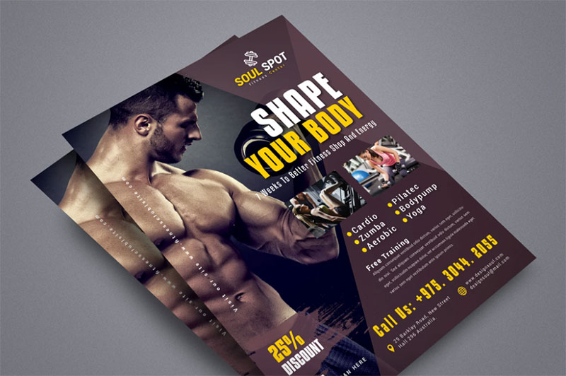
Brochure design costs anywhere from $200 to $1,500, depending on complexity and who does the work. That range covers everything from a Canva template tweaked by an intern to a custom layout from an experienced designer.
The global brochure design service market is projected to grow from $534 million in 2025 to $1.4 billion by 2031, according to Infinity Market Research. Demand is climbing because businesses still need physical marketing materials, even in a mostly digital world.
Freelancer vs. Agency vs. DIY
| Option | Typical Cost | Best For |
|---|---|---|
| DIY (Canva, templates) | $0-50 | Quick internal pieces |
| Freelance designer | $200-1,500 | Custom brochures, small runs |
| Design agency | $1,500-5,000+ | Brand campaigns, large projects |
| Contest platform (99designs) | $299-1,199 | Multiple concepts, logo/brochure bundles |
Thervo data shows freelance graphic designers charge between $20 and $150 per hour. A tri-fold brochure takes roughly 6 hours, so expect $150 on the low end and $900 on the high end from a freelancer.
Where to Find Brochure Designers
Freelance platforms: Fiverr and 99designs are the most common starting points. Fiverr works for budget projects. 99designs works when you want to see multiple concepts before committing.
Portfolio sites: Dribbble and Behance let you browse designers’ actual work before reaching out. This is better if you already know the style you want and need someone who matches it.
Design subscriptions: Services like Design Pickle and ManyPixels offer unlimited design requests for a flat monthly fee. These work if you need ongoing marketing materials, not just a single brochure.
What Drives the Final Price Up
Several factors push brochure design costs beyond the base rate:
- Custom illustration or photography instead of stock images
- More than three revision rounds
- Copywriting included in the scope (most designers don’t write)
- Rush timelines (expect a 25-50% surcharge)
- Print coordination and prepress file preparation
Template marketplaces like Envato and Creative Market sell pre-made brochure layouts for $10-30. These are a good starting point if you have basic design skills and just need a professional structure to customize with your own content and brand colors.
FAQ on What Is Brochure Design
What is brochure design in graphic design?
Brochure design is the process of arranging layout, typography, and imagery across a folded printed or digital document. It combines graphic design with marketing strategy to deliver focused information about a product, service, or organization in a compact format.
What are the most common brochure fold types?
The five main fold types are bi-fold, tri-fold, Z-fold, gate fold, and accordion fold. Tri-fold is the most popular because it fits standard racks and mailer envelopes. Each fold type creates a different number of panels and reading flow.
What software do professionals use for brochure design?
Adobe InDesign is the industry standard for professional print layout. Canva works for quick, template-based designs. Adobe Illustrator handles illustration-heavy brochures, and Affinity Publisher offers a budget-friendly alternative to InDesign.
What is the difference between a brochure and a flyer?
A flyer is a single unfolded sheet. A brochure has folds that create multiple panels, allowing for structured content flow and a reading sequence. Brochures carry more detailed information and typically feel more polished as marketing collateral.
How much does brochure design cost?
Expect to pay between $200 and $1,500 depending on complexity and designer experience. Freelancers charge $20-$150 per hour. A tri-fold brochure takes roughly 6 hours. Template-based DIY options through Canva or Creative Market cost under $50.
What resolution do images need for print brochures?
All images need a minimum of 300 DPI at the printed size. Images pulled from websites (typically 72 PPI) will print blurry. Use high-resolution photography or vector-based artwork that scales without quality loss.
Should I design in CMYK or RGB?
Use CMYK for print brochures and RGB for digital distribution. Designing in RGB and converting later causes color shifts, especially in blues and reds. Start in the correct color mode from the beginning to avoid surprises at the printer.
What makes a brochure design effective?
Clear visual rhythm, strong hierarchy, brand consistency, and a single obvious call to action. Effective brochures guide the reader panel by panel toward one decision. Every design element serves the brochure’s goal, nothing decorative without purpose.
What are common brochure design mistakes?
Overcrowding panels with text, using low-resolution images, breaking content awkwardly across fold lines, and starting design before confirming the fold type and paper size. Printing a test copy before the final run catches most of these problems.
Can I create a brochure without a designer?
Yes. Canva and Adobe Express offer brochure templates that non-designers can customize. Results are decent for internal use or small runs. For commercial printing or brand-critical materials, hiring a professional designer produces noticeably better outcomes.
Conclusion
Brochure design is still one of the most practical skills in visual communication. Understanding what is brochure design gives you a real edge, whether you’re handling marketing collateral yourself or briefing a professional.
The fold format shapes everything. Your choice of typefaces, color saturation, image quality, and panel layout all work together or fall apart together.
Get the content right before you touch any design software. Lock in the paper size, fold type, and color theory basics before placing a single element.
Print isn’t going anywhere. Brochures that respect the reader’s time, present a clear sense of movement through panels, and end with one strong call to action will outperform the ones that try to do everything at once.
Keep it simple. Keep it readable. Make every panel count.

Renowned for his expertise in logo design and visual branding, Bogdan has developed a multitude of logos for various clients.
His skills extend to creating posters, vector illustrations, business cards, and brochures. Additionally, Bogdan's UI kits were featured on marketplaces like Visual Hierarchy and UI8.
He also wrote in the past years on sites like Design Your Way, WebDesignerDepot, WPDean, Designmodo, Speckyboy, Slider Revolution, and more.
- How to Install Fonts on Mac (Step-by-Step Guide) - 20 September 2026
- From Mockup to Code: How AI-Augmented Development Speeds Up the Design Handoff - 19 September 2026
- The Beehiiv Logo History, Colors, Font, And Meaning - 18 September 2026

Bogdan Sandu is a seasoned designer who has been designing websites since 2008. Renowned for his expertise in logo design and visual branding, Bogdan has developed a multitude of logos for various clients. His skills extend to creating posters, vector illustrations, business cards, and brochures. Additionally, Bogdan's UI kits were featured on marketplaces like Visual Hierarchy and UI8. He also wrote in the past years on sites like Design Your Way, WebDesignerDepot, WPDean, Designmodo, Speckyboy, Slider Revolution, and more.
You Might Also Like


