The wrong font can make a sign completely unreadable from 10 feet away.
Font legibility at distance is what separates a sign that works from one that gets ignored. Whether you’re designing a storefront, a wayfinding system, or a large format banner, typeface choice directly affects how fast people absorb your message.
Not every font built for screens or print holds up on signage. Display size, viewing distance, lighting, and contrast all change what readable actually means.
This guide covers the best fonts for signage across every major use case, from bold sans-serif retail signs to elegant serif options for interior architectural lettering, so you can make the right call the first time.
The Best Fonts for Signage
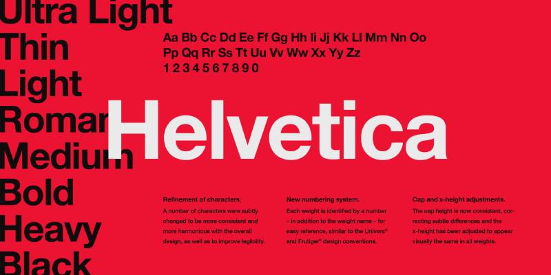
Helvetica
What It Is
A sans-serif font designed by Max Miedinger and Eduard Hoffmann in 1957 at the Haas Type Foundry in Switzerland. One of the most recognized typefaces in commercial design history.
Why It Works for Signage
Neutral letterforms and consistent stroke widths make it highly readable at distance.
Its high x-height keeps lowercase letters clear and open at large sizes. Letter spacing is even across weights, which reduces visual noise on outdoor sign typography.
Best Sign Types
- Corporate and retail storefront signs
- Wayfinding and directional sign lettering
- Vehicle wrap lettering
- Monument sign typography
- ADA compliant sign fonts (meets contrast and legibility requirements)
Weights and Styles Available
Light, Regular, Medium, Bold, Heavy, Black. Condensed variants available. Bold and Black are the go-to choices for high visibility sign fonts.
Potential Drawbacks
Heavily overused. On its own, it can feel generic. Also, the standard version is not free.
Where to Get It
Available via Adobe Fonts (subscription) and Monotype. Paid font licensing required for commercial signage use. Arial is a free alternative with similar proportions.
Futura

What It Is
A geometric sans-serif designed by Paul Renner in 1927 for the New Frankfurt Project. Built on basic shapes: circles, squares, and triangles. Used on the Apollo 11 moon plaque.
Why It Works for Signage
Clean, even strokes and geometric letterforms make it highly organized at large format print sizes.
The uniformity of its shapes keeps it legible across different viewing distances. Low x-height is a known limitation for small text, but at display sizes it performs well.
Best Sign Types
- Modern retail and boutique storefront signs
- Architectural lettering
- Large format signs and banners
- Tech and fashion brand signage
Weights and Styles Available
Light, Book, Medium, Bold, Extra Bold, Heavy. Condensed versions add flexibility for channel letter fonts where horizontal space is tight.
Potential Drawbacks
Low x-height can reduce readability in small printed sign text. Not ideal for long-copy signage.
Where to Get It
Available via Adobe Fonts and Monotype. Paid. Free alternatives include fonts similar to Futura such as Josefin Sans on Google Fonts.
Gotham
What It Is
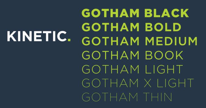
A geometric sans-serif designed by Tobias Frere-Jones and Jonathan Hoefler, released publicly in 2002. Originally commissioned by GQ magazine. Directly inspired by mid-20th century architectural signage from New York City’s Port Authority Bus Terminal.
Why It Works for Signage
High x-height, wide apertures, and tall x-height make it readable from a distance at almost any size.
Open counters and minimal stroke modulation keep individual letterforms distinct, which matters a lot on illuminated sign fonts and wayfinding systems. The NYC MTA uses it across their entire transit signage network.
Best Sign Types
- Wayfinding and directional signs
- Storefront and retail signage
- Architectural and monument sign typography
- Banner font choices for events and campaigns
- Government and institutional signage
Weights and Styles Available
66 styles across four widths. Thin through Ultra. Condensed and Narrow variants included. Bold and Medium are the most used for commercial signage fonts.
Potential Drawbacks
Expensive licensing. Netflix famously spent millions annually on Gotham before creating a custom alternative. Not the right call for small-budget sign projects.
Where to Get It
Hoefler & Co. (fonts.com) or Myfonts. Paid. Montserrat on Google Fonts is the most widely recommended free substitute. Check fonts similar to Gotham for more options.
Franklin Gothic
What It Is
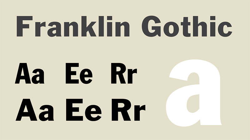
A condensed grotesque sans-serif designed by Morris Fuller Benton for American Type Founders in 1904. One of the oldest display typefaces still in regular use.
Why It Works for Signage
Bold, narrow letterforms with strong visual weight create immediate impact on large signs.
Its kerning is consistent and the negative spacing within letters is well-balanced, which keeps bold signage from feeling heavy or claustrophobic. Works especially well in all-caps for sign making typography.
Best Sign Types
- Bold headline signs and banners
- Retail and commercial storefront lettering
- Large format print fonts
- Safety signage
Weights and Styles Available
Regular, Medium, Demi, Heavy, Extra Condensed. The condensed variants are particularly practical for signs where horizontal space is limited.
Potential Drawbacks
The narrow character width can look squashed in certain contexts. Not the best choice for signs viewed at extreme distances where letter width helps.
Where to Get It
Available through Myfonts and Adobe Fonts. Paid. ITC Franklin Gothic is the most complete version for sign design fonts.
Bebas Neue
What It Is
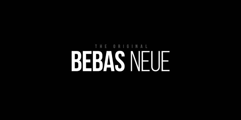
An uppercase-only condensed display font designed by Ryoichi Tsunekawa in 2010 through Dharma Type. Inspired by the DIN typeface family. Minimal design with a strong, geometric feel.
Why It Works for Signage
Tall, condensed letterforms pack a lot of visual impact into a compact horizontal space.
Large x-height and slightly rounded corners improve readability at display sizes. A popular choice for fonts for banners, storefront signs, and bold headline displays.
Best Sign Types
- Headline banners and large format outdoor signs
- Urban storefront and boutique signage
- Menu boards
- Event and trade show signs
Weights and Styles Available
One weight in the free version. The Pro version (Fontfabric) includes Thin, Light, Regular, Bold, and Heavy. The free version is enough for most signage headline use cases.
Potential Drawbacks
Uppercase only. Completely unusable for any sign that needs mixed case, which rules it out for wayfinding and directional sign lettering. Overused in urban branding since 2015.
Where to Get It
Free on Google Fonts (one weight). Pro version available on Fontfabric. Also on Adobe Fonts. Check font licensing if using the free version for commercial signage.
Montserrat

What It Is
A geometric sans-serif designed by Julieta Ulanovsky, inspired by urban signage in the Montserrat neighborhood of Buenos Aires. Released on Google Fonts in 2011.
Why It Works for Signage
Balanced letterforms and clean geometry work across virtually every sign type, from indoor wayfinding to outdoor retail. Its tracking behavior is consistent across weights, which matters when scaling sign text up for large format printing.
Probably the most practical free font for signage currently available.
Best Sign Types
- Storefront and retail signs
- Interior and architectural lettering
- Banner font choices
- Vinyl lettering fonts
- Menu boards and directional signs
Weights and Styles Available
18 styles. Thin through Black, plus italics. Condensed versions available. Bold and ExtraBold are the most used weights for commercial sign making typography.
Potential Drawbacks
So widely used that it can feel generic. Similar issue to Helvetica in that it no longer carries strong brand identity on its own.
Where to Get It
Free on Google Fonts. Open-source. No commercial font licensing required. See Montserrat font pairing ideas for combining it with other typefaces in signage layouts.
Clarendon
What It Is
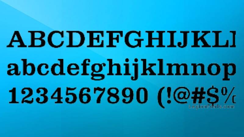
A slab serif font first released by the Fann Street Foundry in London in 1845. One of the earliest display typefaces designed specifically as a bold companion to regular roman type. Revived by Haas Type Foundry in the 1950s, which is the version most commonly used today.
Why It Works for Signage
Heavy slab serifs and strong stroke contrast create bold, readable lettering at large sizes.
The thick horizontal serifs actually help guide the eye along a line of text, which improves readability at distance. High visual weight makes it work well for monument signs and architectural lettering where impact is the priority.
Best Sign Types
- Monument and building signs
- Retail and heritage brand storefront lettering
- Outdoor advertising and large format print
- Vintage-style signage
Weights and Styles Available
Light, Regular, Bold. The Bold is the standard choice for sign making. Limited weight range compared to more modern sans-serif sign fonts.
Potential Drawbacks
The slab serifs can reduce legibility at very small sizes or when the sign uses low-contrast color combinations. Not a good choice for ADA compliant sign fonts where fine details can disappear.
Where to Get It
Available through Adobe Fonts and Myfonts. Paid. Free alternatives include Roboto Slab and Arvo on Google Fonts.
Trajan
What It Is
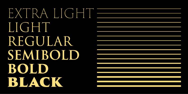
A serif font designed by Carol Twombly for Adobe in 1989. Based on the Roman square capitals chiseled into Trajan’s Column in Rome around 113 AD. Capitals-only display typeface with no true lowercase.
Why It Works for Signage
Even serifs and classically proportioned capitals project authority and permanence on formal signs.
Geometric precision and vertical stress make it readable at large display sizes. Its leading and letter spacing are well-suited for engraved and carved signage. Used in UK government documents and municipal signage.
Best Sign Types
- Institutional and government signage
- Museum and cultural venue wayfinding
- Engraved plaques and monument lettering
- Ceremonial and formal building signs
- Luxury retail architectural lettering
Weights and Styles Available
Regular and Bold only. Limited weight range. Trajan Pro 3 adds more weights and extended language support, but it is a paid upgrade.
Potential Drawbacks
All-caps only. Any sign needing mixed case text is a hard no. Also extremely associated with movie posters (Titanic, Lord of the Rings), which can undermine brand differentiation for some clients.
Where to Get It
Available via Adobe Fonts (subscription) and Myfonts. Not free. See fonts similar to Trajan if the budget or the caps-only limitation is an issue.
Garamond

What It Is
A humanist serif font based on the work of 16th-century Parisian type designer Claude Garamond. Several digital versions exist, with Adobe Garamond Pro and EB Garamond being the most used today.
Why It Works for Signage
Light, open letter strokes and generous negative space make it elegant without sacrificing readability.
Works best where the sign audience has time to read, like restaurant menus, hotel directories, and interior architectural signage. Low contrast between thick and thin strokes keeps it clean at moderate sizes.
Best Sign Types
- Restaurant and hospitality interior signs
- Luxury boutique and fashion retail signage
- Formal plaques and house signs
- Museum interpretive signs
Weights and Styles Available
Regular, Italic, Bold, Bold Italic. Adobe Garamond Pro adds semibold and display optical sizes for larger sign applications.
Potential Drawbacks
Thin strokes reduce visibility at distance. Not suitable for outdoor sign typography where font legibility at distance is the primary concern. Avoid for vehicle wrap lettering or road signs.
Where to Get It
EB Garamond is free on Google Fonts. Adobe Garamond Pro is available via Adobe Fonts (subscription). See Garamond font pairing options for combining it effectively in multi-typeface sign layouts.
Open Sans

What It Is
A humanist sans-serif font designed by Steve Matteson and commissioned by Google. Released in 2011. One of the most widely used typefaces in the world, with over four billion daily views across more than 20 million websites.
Why It Works for Signage
Wide apertures and a tall x-height make lowercase letters appear larger than they technically are.
That quality is valuable for digital sign fonts, LED signs, and illuminated sign fonts where letters need to hold their shape at variable sizes. Open letterforms prevent visual crowding on signs with dense text. Also strong for ADA compliant sign fonts due to its clear character differentiation.
Best Sign Types
- Digital and LED sign displays
- Wayfinding and directional signs
- ADA compliant interior signage
- Retail and commercial indoor signs
- Trade show and event sign displays
Weights and Styles Available
Light, Regular, Medium, SemiBold, Bold, ExtraBold, plus matching italics. A variable font version is also available, which allows continuous weight adjustments for responsive digital signage.
Potential Drawbacks
Neutral personality. Not a strong choice when a sign needs to carry brand character on its own. Works better as a secondary font paired with something more distinctive.
Where to Get It
Free on Google Fonts under the Apache License. No commercial font licensing fees. Also on Adobe Fonts. See Open Sans font pairing options for combining it with display fonts in signage design.
What Makes a Font Work on a Sign?
Most font choices that look great on screen fall apart on a physical sign. The reasons are specific and measurable.
Stroke contrast is the first thing to check. Typefaces with dramatic thick-to-thin stroke variation (think high-contrast serifs like Bodoni) lose their letterform definition at distance. The thin strokes disappear. What’s left is uneven, broken text.
X-height matters more than most designers expect. A tall x-height (the height of lowercase letters relative to capitals) increases the visual size of text without increasing the actual letter height. Fonts like Helvetica and Frutiger have generous x-heights, which is a big part of why they dominate professional wayfinding work.
Open letterforms keep counters (the enclosed spaces inside letters like “o,” “e,” and “a”) readable under backlit conditions or against busy backgrounds. Tight counters fill in visually. Not great for channel letter signs or illuminated displays.
Font weight is straightforward: light-weight fonts are harder to read at distance. Medium to bold weights give strokes enough mass to remain distinct. This is why the standard recommendation for outdoor signage is never to go below regular weight, and often to go heavier.
Letter spacing (tracking) is the final piece. Fonts set too tight at large sizes cause optical merging between characters. Wayfinding specialists at BlinkSigns recommend applying 5 to 10 percent letter spacing beyond standard body copy settings to prevent this. It feels like a small adjustment in the design file. The difference on an actual sign is significant.
Does Font Category Affect Sign Legibility?
Yes. And the research is pretty clear on where the categories stack up.
A study published in the Interdisciplinary Journal of Signage and Wayfinding tested 33 different typefaces on simulated road signs. The top two performers for distance reading were Gill Sans and Avenir Medium, both sans-serif. That result lines up with what sign professionals have known for decades.
| Font Category | Typical Signage Performance | Best Context |
|---|---|---|
| Sans-serif | Strongest at distance | Outdoor, wayfinding, retail |
| Slab serif | Strong, more character | Storefront, monument signs |
| Serif (high contrast) | Weaker at distance | Plaques, formal interior |
| Script / Decorative | Weakest overall | Short accent text only |
When Sans-Serif Is the Safer Choice
Distance reading is where sans-serif fonts consistently outperform other categories.
The open letterforms, consistent stroke weight, and clean counters of typefaces like Helvetica, Frutiger, Interstate, and DIN 1451 reduce the visual noise that builds up when letters are viewed from far away. These fonts are the backbone of road signage, airport wayfinding, transit systems, and most large-format retail environments.
ADA compliance rules reinforce this. Under Section 703.2.3 of the 2010 ADA Standards for Accessible Design, all identification signage must use sans-serif fonts. Italic, oblique, and script typefaces are prohibited. Acceptable fonts under ADA guidelines include Arial, Helvetica, Futura, Verdana, and Century Gothic.
Font style is one of the most frequent areas where sign manufacturers miss compliance (Nova Polymers, 2025). That is a production-level problem, not just a design preference.
Where Serif and Slab Serif Fonts Earn Their Place
Serif fonts are not useless on signs. They just need the right context.
Classic serif typefaces like Trajan and Garamond appear on formal plaques, historic building signage, law firm exteriors, and memorial markers. They carry associations of authority and permanence. A monument sign for a heritage institution using Trajan makes sense in a way that Helvetica Bold simply does not match.
Slab serif fonts sit in a useful middle ground. The serifs are thick and unmodulated, so the stroke contrast problem that weakens high-contrast serifs at distance mostly disappears. Fonts like Rockwell and Clarendon hold up better outdoors than traditional serifs, while still carrying more visual character than a grotesque sans-serif.
The tradeoff is that slab serifs tend to work for shorter text at larger sizes. Long lines of small slab serif body copy on a sign are harder to read than the equivalent in a clean sans-serif.
Script fonts on signs almost always fail functional signage tests. They can work as an accent element for short business names at large sizes (a hand-lettered cafe sign, a wedding venue), but even then, viewing distance is limited. For any sign that needs to be read quickly or from more than 15 feet away, script typefaces are a liability.
How Does Sign Type Change the Font Requirements?
Different sign formats create genuinely different typographic problems. A font that works well on a lobby directory can completely fail on a roadside pylon sign.
The sign type determines viewing distance, viewing duration, lighting conditions, and production method. All four affect which fonts can actually do the job.
Outdoor and Street-Facing Signs
Legibility index is the standard measure for outdoor sign readability. The widely used rule: one inch of letter height equals roughly 10 feet of readability distance.
A sign meant to be read from 100 feet needs letters at least 10 inches tall. That physical scale amplifies every typographic decision. Thin strokes disappear. Tight tracking collapses. Condensed widths merge into visual noise.
For outdoor and street-facing signs, the reliable options are bold-weight sans-serif typefaces with generous letter spacing and open letterforms. Montserrat Bold, Bebas Neue, Oswald, and Futura Heavy are common in retail and commercial sign work. Interstate and FHWA-approved typefaces dominate road and highway applications.
Research from the Texas Transportation Institute found that the Clearview font produced nighttime sign recognition distances 16 percent greater than the standard FHWA Series E(M) typeface, largely due to its wider open counters reducing halation on retroreflective sign material.
Illuminated Signs and Channel Letters
Backlighting changes everything. A font that reads cleanly in print can bloom and blur when illuminated from behind.
- Stroke width: strokes under 20% of letter height tend to lose definition when backlit
- Counter openness: tight enclosed spaces (in “e,” “a,” “g”) fill with light and lose shape
- Weight: medium to bold is the floor; light weight fonts are not usable in channel letter applications
- Rounded terminals: fonts with rounded rather than sharp stroke endings (like Gotham Rounded or VAG Rounded) often perform better in illuminated contexts
The US Access Board found that positive-contrast signs (light letters on dark backgrounds) produced a 29 percent improvement in nighttime legibility distance compared to negative-contrast configurations. Font choice and background contrast work together. Neither factor alone is sufficient.
ADA Signage and Interior Wayfinding
ADA-compliant interior signs follow the strictest typographic rules of any sign category. Most of it comes down to font selection, size, and character spacing.
Required: sans-serif only, character height between 5/8 inch and 2 inches, stroke width under 15 percent of character height, character width between 55 and 110 percent of character height.
Prohibited: italic, oblique, script, condensed, or decorative typefaces.
In 2023, there were 4,605 ADA digital accessibility lawsuits, a 14.1 percent increase from the prior year (Rise Vision, 2024). First-time non-compliance fines start at $75,000. Font style violations are among the most common errors sign manufacturers make at the fabrication stage.
For wayfinding applications, mixed-case text outperforms all-caps for longer messages. A study from MIT’s AgeLab found that uppercase text improved glanceable reading of short strings, but mixed-case maintains word shape recognition for longer phrases and directional text. The practical split used by most wayfinding designers: all-caps for short labels (EXIT, STAIRS), mixed-case for longer room names and directional messages.
What Role Do Spacing and Size Play in Signage Typography?
Font choice and spacing are not separate decisions. A good typeface with poor spacing often performs worse on a real sign than a mediocre typeface with correct spacing.
| Spacing Variable | Common Mistake | Correct Approach |
|---|---|---|
| Tracking (letter spacing) | Default desktop setting | +5 to +10% for large format |
| Word spacing | Too tight on condensed fonts | Visually verify at production scale |
| Line height (leading) | Compressed for space | Minimum 120% of font size |
| Margins around text | Text fills the sign | 40% text, 60% whitespace |
Letter height and viewing distance follow the 10-foot-per-inch rule for standard indoor signs. A person with 20/20 vision can read a 6-inch letter from up to 150 feet (TheSignChef). For roadside and highway signs, freeway applications use 18-inch letters for the furthest readable distance.
Condensed fonts are a real problem for outdoor signage. They save horizontal space in the design file. At distance, the narrow letterforms merge together and the word becomes unreadable significantly faster than regular or extended width versions of the same typeface.
Line height on multi-line signs is frequently compressed to fit more text. Tight leading causes the eye to lose its place between lines, especially in motion (passing drivers) or at viewing angles. A minimum of 120 percent of the font size is a practical floor for multi-line sign applications.
The 40/60 rule applies to white space: sign copy should occupy approximately 40 percent of the sign area, with 60 percent as breathing room. Designers regularly violate this trying to fit more information. The result is a sign that communicates nothing effectively instead of everything poorly.
Are Free Google Fonts Viable for Professional Signage?
Yes, with a few conditions worth knowing upfront.
As of April 2026, Google Fonts contains 1,929 font families, including 543 variable font families (Wikipedia). All are released under the SIL Open Font License or Apache License. Both licenses allow commercial use, including outdoor signage, print, advertising, and fabrication, with no additional licensing fees required.
That covers the legal side. The performance side is a different question.
Google Fonts That Perform Well on Signs
Not all 1,929 families are signage-ready. Weight range, x-height, and letterform quality vary considerably. These consistently show up in professional signage work:
Montserrat is the closest freely available alternative to Futura. Geometric structure, strong weight range (Thin through Black), and open letterforms. Works well on exterior retail signs and dimensional lettering. See how Montserrat pairs with other fonts if you need a secondary typeface for the sign system.
Oswald is a condensed sans-serif with strong legibility at display sizes. Better for single-line name signs or bold headline applications than for multi-line wayfinding text.
Raleway has a clean, slightly geometric structure. Works for interior signage and retail storefronts where a more refined aesthetic is needed. Less ideal for high-speed outdoor applications due to its lighter default stroke weights.
Open Sans is a safe, reliable choice for mixed-case wayfinding text. Wide x-height, generous letter spacing, and a full weight range. Not the most visually distinctive option, but it rarely fails in practice. Pair it thoughtfully using Open Sans font pairing guides if the sign system needs a display companion.
Bebas Neue is a condensed display-weight font. All-caps only. Excellent for short, bold sign headlines where maximum visual impact is the goal. Not suitable for ADA applications or multi-line mixed-case text.
Roboto is a humanist sans-serif with a practical range of weights and a large x-height. It is widely used in wayfinding and digital signage displays. Roboto font pairing options are extensive if you need a companion typeface for a multi-level sign system.
Licensing Limitations to Know Before Production
Google Fonts are open source. That means no per-use fees, no client license transfers, no print run limits.
What you can do: use them in outdoor signage, vinyl lettering, channel letters, dimensional signs, large-format printing, and fabrication without any additional steps. The SIL Open Font License explicitly covers commercial production.
What you cannot do: modify the font files and redistribute them under the original font name. That matters if a sign software tool modifies letterforms during the production process and saves a new file. In practice, most sign production workflows do not trigger this restriction.
The real gap between free Google Fonts and paid professional signage typefaces is not licensing. It is font quality depth. Professional typefaces like Frutiger, Interstate, and Proxima Nova are built with extensive optical size adjustments, wider language support, and tighter kerning tables. For most commercial signage work, the best free options perform well. For high-end architectural signage or complex multilingual wayfinding systems, a licensed typeface investment is often justified.
What Are the Most Common Font Mistakes in Sign Design?
Most signage failures come back to a small set of repeated errors. They are not obscure. They show up constantly in real-world sign work.
Script fonts at functional scale are the most common single error. Script typefaces blur together at distance. Letterforms connect in ways that become indistinguishable past 15 to 20 feet. They look good in mockups. They fail on the sign. If a script font is used at all, it should be limited to large-format single words where viewing distance is controlled and close.
All-caps for long messages reduces word shape recognition. Research consistently shows that mixed-case text allows faster reading because letterforms create distinct word silhouettes. The brain recognizes word shapes before it reads individual letters. All-caps text turns every word into the same rectangular block. For short labels it can work. For anything over three or four words, it slows the reader down.
Insufficient contrast between font color and background. A technically correct font becomes unreadable without adequate contrast. The ADA requires a 70 percent contrast ratio for compliant signage. Even non-ADA outdoor signs benefit from high contrast. The US Access Board found a 29 percent improvement in nighttime legibility with positive-contrast (light text on dark background) configurations.
Over-condensed fonts at outdoor scale:
- Narrow letter widths collapse at viewing distance
- Adjacent letters merge optically, especially in lower lighting
- The horizontal space saved in the design costs legibility in real use
- If a condensed font is needed for space reasons, increase letter spacing to compensate
Mixing too many typefaces on a single sign fragments visual hierarchy and makes the message harder to process. One typeface in two weights is a reliable system. Two complementary typefaces (one display, one text) is acceptable. Three or more typefaces on a single sign is almost always a problem. Sign designers who work with pairing fonts principles for print or screen work often underestimate how much more simplified signage pairings need to be.
Overloading signs with information is less a font mistake than a design strategy error, but it amplifies every font problem. More text at smaller sizes means more legibility failures. The standard rule: one primary message per sign. Website URLs, QR codes, and secondary details belong on secondary surfaces, not crowded onto the main sign face.
FAQ on The Best Fonts For Signage
What is the best font for signage?
Helvetica is the most widely recommended font for commercial signage. Its neutral letterforms, consistent stroke widths, and high x-height make it readable at distance across almost every sign type, from storefronts to wayfinding systems.
Should I use a serif or sans-serif font for signs?
Sans-serif fonts are the standard choice for most outdoor sign typography. Their clean letterforms hold up better at distance and in low-contrast conditions. Serif fonts like Garamond work well for interior signs where viewers have more time to read.
What fonts are used for road and street signs?
Highway Gothic and the FHWA Series fonts are the standard typefaces used on US road signs, as defined by the Manual on Uniform Traffic Control Devices (MUTCD). Clearview was introduced as an alternative but its use has been scaled back.
What makes a font readable on a sign?
High x-height, open letter spacing, consistent stroke width, and strong color contrast all affect font legibility at distance. Avoid decorative or script fonts for any sign that needs to be read quickly or from a moving vehicle.
What are the best free fonts for signage?
Montserrat, Open Sans, and Bebas Neue are all available free on Google Fonts and work well for sign making typography. Montserrat is the most versatile of the three, covering retail signs, banners, and interior architectural lettering.
What font size should I use for signage?
A general rule is 1 inch of letter height per 10 feet of viewing distance. A sign viewed from 50 feet needs letters at least 5 inches tall. Font weight also matters. Bold weights improve visibility more than simply increasing size.
Are there fonts specifically designed for ADA compliant signs?
Yes. Helvetica, Futura, Arial, and Open Sans are all recommended for ADA compliant sign fonts. The ADA Standards for Accessible Design require high contrast, clear letterforms, and specific size ratios between uppercase and lowercase characters.
Can I use script or decorative fonts on signs?
Only in limited contexts. Script fonts reduce readability at distance and fail most legibility standards for outdoor sign typography. They can work on small interior signs, menu boards, or decorative elements where close-up reading is expected.
What is the best font for vinyl lettering on signs?
Bold sans-serif fonts cut cleanly and hold their shape during vinyl lettering application. Helvetica Bold, Franklin Gothic, and Gotham Bold are popular choices. Avoid thin strokes and tight letter spacing, as these tend to lift or tear during installation.
How many fonts should a sign use?
One or two fonts maximum. Using more creates visual clutter and weakens readability. A common approach is one bold display font for the headline and one clean sans-serif for supporting text, with clear typographic hierarchy between the two.
Conclusion
This conclusion is for an article presenting the best fonts for signage, and the core takeaway is simple: font legibility always comes before aesthetics.
Helvetica, Gotham, Futura, and Montserrat dominate commercial sign making typography for good reason. They hold up at distance, across lighting conditions, and at large format print sizes.
For ADA compliant sign fonts, Open Sans and Arial remain reliable. For high-impact wayfinding or bold storefront lettering, Franklin Gothic and Bebas Neue deliver strong visual weight without sacrificing readability.
Serif options like Garamond and Trajan still have a place, but only where viewing distance is short and the context calls for elegance over speed.
Match your typeface choice to how, where, and from how far your sign will be read. That single decision shapes everything else.

Renowned for his expertise in logo design and visual branding, Bogdan has developed a multitude of logos for various clients.
His skills extend to creating posters, vector illustrations, business cards, and brochures. Additionally, Bogdan's UI kits were featured on marketplaces like Visual Hierarchy and UI8.
He also wrote in the past years on sites like Design Your Way, WebDesignerDepot, WPDean, Designmodo, Speckyboy, Slider Revolution, and more.
- Canva vs PowerPoint: Which Is Better for Presentations? - 22 September 2026
- How to Install Fonts on Mac (Step-by-Step Guide) - 20 September 2026
- From Mockup to Code: How AI-Augmented Development Speeds Up the Design Handoff - 19 September 2026

Bogdan Sandu is a seasoned designer who has been designing websites since 2008. Renowned for his expertise in logo design and visual branding, Bogdan has developed a multitude of logos for various clients. His skills extend to creating posters, vector illustrations, business cards, and brochures. Additionally, Bogdan's UI kits were featured on marketplaces like Visual Hierarchy and UI8. He also wrote in the past years on sites like Design Your Way, WebDesignerDepot, WPDean, Designmodo, Speckyboy, Slider Revolution, and more.
You Might Also Like