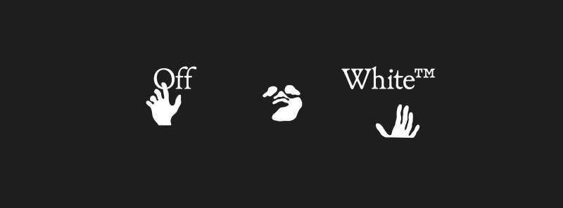
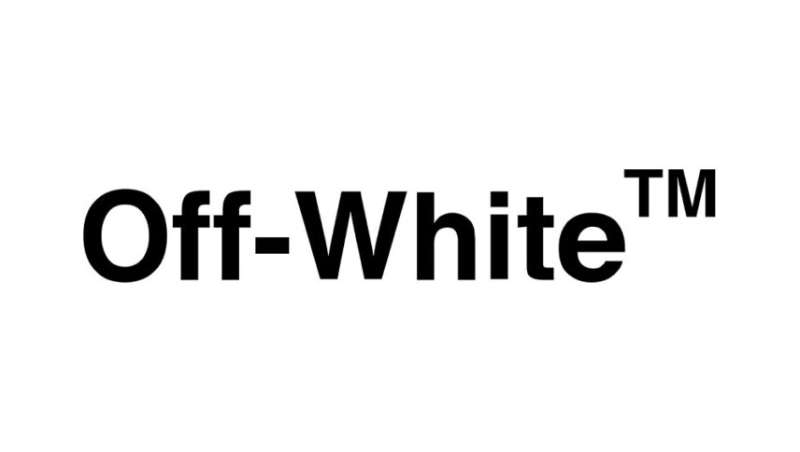
Off-White uses Helvetica Bold as its core wordmark font, licensed from Linotype (now owned by Monotype). For its website and newer digital branding, Off-White commissioned a bespoke typeface adapted from Bookish, a serif font designed by Niklas Ekholm at Helsinki Type Studio. Virgil Abloh introduced the Helvetica Bold wordmark when he launched the brand in Milan in 2012.
The quotation marks that appear across Off-White garments and labels also use Helvetica Bold, specifically set with straight quotes rather than curly ones.
What Type of Font Is Helvetica Bold?
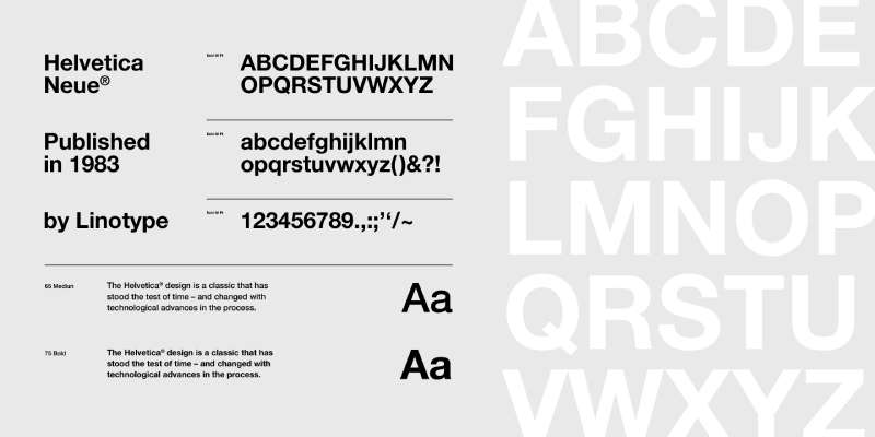
Helvetica Bold is a grotesque sans-serif typeface. It sits in the Swiss International Typographic Style tradition, with uniform stroke widths, tight letter spacing, and a near-neutral visual character.
Key typographic traits:
- Classification: Grotesque sans-serif
- Weight: Bold (75 in Neue Helvetica’s numbering system)
- x-height: Tall relative to cap height, which improves legibility at small sizes
- Spacing: Tight, consistent, geometric
- Stroke contrast: Minimal, almost monoline
This connects directly to Off-White’s visual identity. Abloh chose Helvetica precisely because it was, as he put it, “ubiquitous to the point of being invisible.” The font carries no luxury connotations on its own. That neutrality is the point. You can read more about how typography shapes brand perception and why type choices like this are rarely accidental.
The grotesque category also includes fonts like grotesque typefaces used widely in signage and corporate design, which connects to the industrial aesthetic Off-White consistently referenced.
Who Designed Helvetica Bold?
Max Miedinger designed the original Helvetica typeface in 1957, working under Eduard Hoffmann at the Haas Type Foundry in Switzerland.
It was initially released as Neue Haas Grotesk, then rebranded as Helvetica in 1960 by Linotype to make it more marketable internationally. The name comes from “Helvetia,” the Latin name for Switzerland. Linotype released a refined version called Neue Helvetica in 1983, which is the version most commonly licensed today.
Helvetica Bold is not a custom font created for Off-White. It is a commercially licensed typeface that was already one of the most widely used fonts in the world before Abloh ever touched it. That was the whole idea behind using it. Among the iconic fonts in design history, Helvetica is probably the most documented example of how a neutral typeface can carry almost any brand identity placed on top of it.
Is Helvetica Bold Free to Use?
No. Helvetica Bold is a commercial typeface owned by Monotype and requires a paid license for any use beyond what came pre-installed on your system.
Licensing options via MyFonts and Monotype:
- Desktop license: Covers print, static graphics, and logo design. Prices start around $35 per style for a single-user license.
- Webfont license: Billed annually based on pageviews. Can run $500 or more per year for the full Neue Helvetica family.
- App embedding: Requires a separate app license negotiated directly with Monotype.
Adobe Creative Cloud subscribers can access Helvetica Now (a newer Monotype rework) through Adobe Fonts, which covers desktop and some web use under the CC subscription. That is the most practical route for most designers. Understanding font licensing properly matters here, because the rules differ significantly depending on how you plan to use the typeface.
What Font Did Off-White Use Before, and What Changed?
Off-White has used Helvetica Bold as its wordmark font since the brand launched in 2012. That has not changed.
What did change is the digital and website typography. At some point after the brand’s global growth, Off-White commissioned Helsinki Type Studio to develop a bespoke typeface adapted from Bookish, a serif font designed by Niklas Ekholm. Helsinki Type Studio describes this as “a refined evolution of the Bookish typeface, tailored for the brand’s distinctive aesthetic.”
Before that shift, prior to founding Off-White, Virgil Abloh operated an earlier project called Pyrex Vision (2012), which used a different visual identity. Off-White replaced that entirely when the Milan-based label launched. The Helvetica Bold wordmark was introduced from day one of Off-White and has remained the brand’s primary mark. The Bookish-based custom typeface is a secondary layer added for digital touchpoints.
What Are the Best Free Alternatives to Helvetica Bold?
Since Helvetica Bold requires a paid license, most designers look for free alternatives that replicate its grotesque sans-serif structure. Here are 5 solid options:
| Font | Similarity to Helvetica Bold | License | Source |
| Inter Bold | Similar neutral grotesque structure, slightly more open apertures | Free (OFL) | Google Fonts |
| TeX Gyre Heros | Metric-compatible Helvetica clone, closest match available free | Free (GUST) | CTAN / direct download |
| Arimo Bold | Metric-compatible with Arial, close to Helvetica in weight and spacing | Free (Apache 2.0) | Google Fonts |
| IBM Plex Sans Bold | Grotesque with slightly humanist touches, similar weight | Free (OFL) | Google Fonts |
| Nimbus Sans Bold | Direct Helvetica clone originally developed by URW | Free (AGPL) | URW / various distributors |
TeX Gyre Heros is the closest free match if you genuinely need to replicate Helvetica’s metrics. Inter Bold is a better choice if you want something that feels modern and clean without copying Helvetica directly. If you want to explore broader options for branding-focused fonts that share this minimal grotesque character, there are plenty of well-considered alternatives worth considering.
For clothing brand projects specifically, checking out fonts suited to clothing brand identity can give you a wider picture of what tends to work at different price points.
How to Use Helvetica Bold (or an Alternative) in Design Tools
Figma
If Helvetica is installed on your system, Figma detects it automatically. You can also add fonts to Figma using the Figma Font Installer desktop app, which makes locally installed fonts available inside the browser-based editor.
For TeX Gyre Heros or Inter as free alternatives, download them directly and install them at the system level. Figma picks them up on the next launch.
Photoshop and Illustrator
Helvetica ships pre-installed on macOS, so Mac users running Photoshop or Illustrator already have access. Windows users need to purchase and install it separately. If you want to add fonts to Adobe Illustrator, the process is straightforward: install the font at the OS level and restart the application.
Adobe Fonts (included with Creative Cloud) offers Helvetica Now, which is a redesigned version by Monotype. It is not identical to the classic Helvetica Bold, but it is close enough for most brand-inspired work.
Canva
Canva does not include Helvetica in its free library. Pro subscribers can upload fonts to Canva directly, which allows you to bring in a licensed copy of Helvetica Bold or a free alternative like Inter.
For replicating the Off-White quotation mark style specifically, set the font to bold, use uppercase, and switch to straight quotes instead of typographic curly quotes. That detail matters more than people expect.
Why Did Virgil Abloh Choose Helvetica Bold for Off-White?
Abloh was trained as an architect, not a traditional fashion designer. He studied at the Illinois Institute of Technology, where the curriculum was rooted in Swiss design principles and modernist typography. Helvetica was everywhere in that context.
His stated reasoning, given in an interview with 032c, was direct: Helvetica had become so common that it was essentially invisible. That invisibility was the strategy. By placing a ubiquitous, industrial typeface on luxury products, he created friction. The font said nothing. The quotation marks and context said everything.
This approach connects to postmodern design thinking, where familiar systems are recontextualized rather than replaced. Abloh wasn’t trying to signal luxury through an elegant or exclusive typeface. He was questioning what “luxury” even means by using a font you’d find on a tax form or a road sign.
The quotation marks reinforced this. Words like “SHOELACES” or “SCULPTURE” placed in quotes force the reader to think twice about what the label is actually saying. That’s emphasis used as irony rather than hierarchy. The psychology behind font choices like this is rarely this deliberate in fashion. Most brands chase warmth or prestige through typeface selection. Off-White went the other direction entirely, and it worked.
There’s also a practical dimension. Helvetica Bold reads cleanly at every size, from a 6mm clothing tag to a billboard outside a Paris runway show. That kind of consistency across physical touchpoints is genuinely hard to achieve. Off-White’s branding appears on Nike sneakers, IKEA furniture, and Louis Vuitton campaigns without the wordmark ever breaking down. That’s partly the font doing its job.
If you’re curious how other brands in the same space approached their type identity, looking at what font Balenciaga uses or Gucci’s font choices shows just how differently luxury brands can approach the same problem. Some chase timelessness. Off-White, at least under Abloh, chose to chase relevance instead. And for a while, that was enough to make Helvetica feel like the most interesting font in fashion.
FAQ on What Font Does Off-White Use
What is the main font Off-White uses in its logo?
Off-White uses Helvetica Bold, licensed from Linotype. It’s a grotesque sans-serif typeface designed by Max Miedinger in 1957. Virgil Abloh adopted it from the brand’s 2012 launch and used it consistently across all physical products and branding.
Does Off-White use a custom font?
Partly. The wordmark uses standard licensed Helvetica Bold. However, Off-White later commissioned Helsinki Type Studio to develop a bespoke typeface adapted from Bookish, used on the brand’s website and select digital touchpoints.
What font are the Off-White quotation marks set in?
The quotation marks use Helvetica Bold with straight quotes, not curly typographic ones. This detail is often missed. Abloh used these marks to reframe the meaning of words on garments, turning labels into something closer to visual storytelling.
Is the Off-White font free to download?
Helvetica Bold is not free. It requires a commercial license from Monotype. Some sites offer “Mytupi” as a free stand-in, but it’s a lookalike intended for personal use only. Always check licensing terms before using any alternative commercially.
What font does the Off-White website use?
The Off-White website uses a custom serif typeface developed by Helsinki Type Studio, based on their Bookish font. Niklas Ekholm designed the original Bookish. The adapted version introduces a more structured, regular form suited to digital display and fashion editorial contexts.
Why did Virgil Abloh choose Helvetica for Off-White?
Abloh chose Helvetica because it was, in his words, nearly invisible from overuse. That ubiquity was intentional. Placing a mundane sans-serif font on luxury products created the ironic tension central to Off-White’s entire brand identity.
What are the best free alternatives to the Off-White font?
TeX Gyre Heros Bold is the closest free match to Helvetica Bold metrically. Inter Bold and IBM Plex Sans Bold are strong alternatives available on Google Fonts. All three share the neutral grotesque character that defines Off-White’s visual hierarchy.
Is the Off-White font the same as the Supreme font?
No. Supreme uses Futura Bold in its box logo, a geometric sans-serif with circular forms. Off-White uses Helvetica Bold, a grotesque sans-serif with more neutral, irregular curves. Both are uppercase-heavy streetwear typographies, but they come from different design traditions entirely.
What font style is most associated with Off-White’s garment labels?
Uppercase Helvetica Bold with straight quotation marks. The label typography typically features short, ironic phrases in all caps, such as “SHOELACES” or “FOR WALKING.” This treatment became one of the most recognizable luxury streetwear typography signatures of the 2010s.
How does Off-White’s font choice compare to other luxury fashion brands?
Most luxury houses use refined serif or custom sans-serif fonts to signal exclusivity. Off-White did the opposite. Choosing a universally common grotesque where Louis Vuitton and Dior lean into bespoke lettering, Off-White leaned into familiarity, using type as commentary rather than prestige signaling.
Conclusion
So, what font does Off-White use? Helvetica Bold for the wordmark and quotation mark typography, plus a bespoke Bookish-based serif for digital branding, commissioned from Helsinki Type Studio.
Two typefaces. Completely different classifications. Both deliberate.
Virgil Abloh’s streetwear typography choices were never random. The grotesque sans-serif wordmark, the ironic uppercase label text, the straight quotes – all of it fed into a brand identity that questioned what luxury brand font choices are even supposed to communicate.
If you’re working on something inspired by Off-White’s visual style, start with how other streetwear-adjacent brands handle type and go from there.

Renowned for his expertise in logo design and visual branding, Bogdan has developed a multitude of logos for various clients.
His skills extend to creating posters, vector illustrations, business cards, and brochures. Additionally, Bogdan's UI kits were featured on marketplaces like Visual Hierarchy and UI8.
He also wrote in the past years on sites like Design Your Way, WebDesignerDepot, WPDean, Designmodo, Speckyboy, Slider Revolution, and more.
- NBA Team Color Codes - 26 July 2026
- The Figma Logo History, Colors, Font, And Meaning - 25 July 2026
- Canva for Teams Review: Is It Worth the Business Plan? - 24 July 2026

Bogdan Sandu is a seasoned designer who has been designing websites since 2008. Renowned for his expertise in logo design and visual branding, Bogdan has developed a multitude of logos for various clients. His skills extend to creating posters, vector illustrations, business cards, and brochures. Additionally, Bogdan's UI kits were featured on marketplaces like Visual Hierarchy and UI8. He also wrote in the past years on sites like Design Your Way, WebDesignerDepot, WPDean, Designmodo, Speckyboy, Slider Revolution, and more.
You Might Also Like