MrBeast uses 3 distinct fonts across his brand: Obelix Pro for thumbnails, Third Rail (modified) for his logo, and Komika Axis for video subtitles.
Obelix Pro is a comic-style sans-serif font designed by Russian graphic designer Valentin Antonov (also known as “Vallex”) and first released in 2011.
Third Rail, the logo typeface, was created by BLKBK Fonts. MrBeast’s team modified the letter “e” to give the wordmark a distinctive look that supports trademark protection across merchandise and brand identity.
Komika Axis was designed by Vigilante Typeface Corporation. It handles the subtitle role across MrBeast’s videos, keeping text legible at small sizes.
—
What Type of Font Is Obelix Pro?
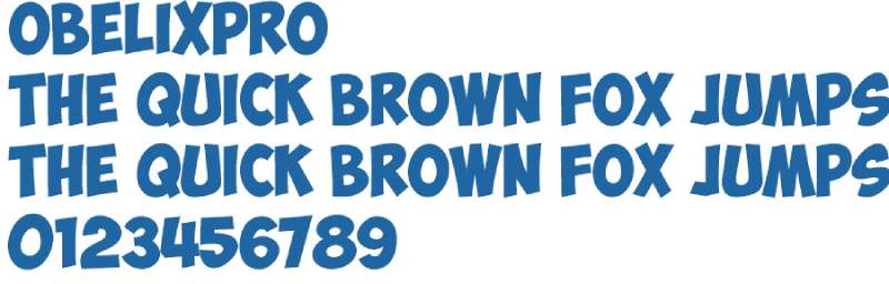
Obelix Pro is a display comic sans-serif typeface. It sits in the same visual family as cartoon lettering, not geometric or humanist sans-serif categories.
The typography elements that define it: exaggerated stroke weight, slightly irregular letterforms, and rounded terminals that stop it from feeling aggressive.
Those thick strokes matter for one practical reason: the font holds up when a thumbnail shrinks to postage-stamp size on mobile, where over 70% of YouTube consumption actually happens.
The x-height is generous, which keeps lowercase characters readable even at smaller sizes. The overall weight sits closer to ExtraBold than regular Bold.
Third Rail, the logo font, belongs to a different category entirely. It is a brush display typeface drawing from urban graffiti culture, with rough edges and high energy stroke variation.
Komika Axis is a comic book-style sans-serif. Rounded, friendly, and deliberately informal. It shares visual DNA with fonts you’d find in graphic novels.
Who Designed the MrBeast Fonts?
Obelix Pro was designed by Valentin Antonov, a Russian graphic designer who published it through his studio. The font draws its name and visual inspiration from the classic French comic series Asterix and Obelix.
Third Rail was created by the design team at BLKBK Fonts, a type foundry focused on bold display and brush typefaces. MrBeast’s team modified the “e” character specifically for his logo, which means the exact version used in branding is not publicly available as-is.
Komika Axis was produced by Vigilante Typeface Corporation (also referenced under Apostrophic Laboratories). It has been a popular choice for comic-style captions for years.
None of these fonts were commissioned by MrBeast. All 3 were pre-existing commercial or freeware releases that his team licensed or adopted.
Are the MrBeast Fonts Free to Use?
Short answer: it depends on which font and what you’re doing with it.
Obelix Pro is free for personal use only. Commercial use requires contacting Valentin Antonov directly through his studio site (divastudio.net). The font is available in OTF and TTF formats.
Third Rail is available as a demo version for free, but the demo is not licensed for commercial use. A full commercial license must be purchased directly from BLKBK Fonts at blkbktyp.com.
Komika Axis is the most permissive of the 3. It is free for commercial use, which makes it the easiest option to actually use in YouTube content without worrying about font licensing.
| Font | License | Commercial Use | Source |
| Obelix Pro | Personal use free | Contact designer | DaFont, Fonts4Free |
| Third Rail | Demo only | Paid license required | blkbktyp.com |
| Komika Axis | Free commercial | Yes | DaFont, Font Squirrel |
What Font Did MrBeast Use Before?
MrBeast’s logo has gone through 3 iterations since the channel launched in 2012.
The original logo featured a roaring tiger in a striped blue frame with no prominent wordmark treatment. This version ran for 6 years.
In 2018, the design was updated with a refined color palette, replacing black with dark blue to modernize the tiger illustration. The font treatment shifted toward bolder, heavier display lettering, though it wasn’t yet standardized.
Just a few months later in mid-2018, MrBeast replaced the tiger with a blue panther featuring a pink lightning bolt from its eye. This rebrand introduced the Third Rail wordmark below the icon, which has remained consistent since.
The early thumbnail typography relied more heavily on Impact and similar condensed display fonts before Obelix Pro became the established standard. Impact was (and still is) the dominant choice across YouTube thumbnail design broadly, so the shift to Obelix Pro helped MrBeast’s content stand out more distinctly.
What Are the Best Free Alternatives to Obelix Pro?
Obelix Pro’s personal-use-only license is the main problem for anyone monetizing a channel. Here are 5 free alternatives that match the bold, playful energy without the licensing headache.
| Font | Similarity | License | Source |
| Bangers | Comic book weight, similar energy | Free (OFL) | Google Fonts |
| Anton | Bold condensed sans-serif, high impact | Free (OFL) | Google Fonts |
| Hero Sandwich | Nearly identical letterform tilt and weight | Free | Various font repos |
| Komika Axis | Same comic style, more suited to subtitles | Free commercial | DaFont |
| CCSignLanguage | Playful, informal display style | Free | ComicCraft |
Bangers is probably the most practical swap. It is available directly through Google Fonts, meaning you can use it in Canva, Figma, and Google Slides without downloading anything. For anyone building YouTube thumbnails, that kind of frictionless access matters.
If you want something closer to Obelix Pro’s irregular, hand-drawn feel, Hero Sandwich is the better match. The letter bases tilt upward in a similar way, and the rounded outlines are almost indistinguishable at thumbnail scale.
Worth knowing: fonts similar to Impact like Anton and Bebas Neue get recommended a lot for YouTube thumbnails, but they lack the cartoon warmth that makes Obelix Pro work for MrBeast’s specific visual tone.
How to Use These Fonts in Your Thumbnails
In Canva
Bangers and Anton are both available inside Canva’s font library by default. Search the font name directly in the text toolbar. No upload needed.
For Obelix Pro or Hero Sandwich, you’ll need to upload the font to Canva manually. This requires a Canva Pro subscription.
In Photoshop
Download the OTF or TTF file, install it to your system’s font folder, then restart Photoshop. The font appears in the character panel automatically.
Need the full steps? The guide on how to add fonts to Photoshop covers the exact process for both Windows and Mac.
MrBeast’s team doesn’t just drop the font on a plain background. The thumbnail text typically uses a thick black stroke outline, a slight drop shadow, and uppercase-only characters. Replicating that treatment in Photoshop is what actually creates the recognizable look, not the font alone.
In Figma
Install the font locally first, then refresh Figma. Local fonts appear in the font picker once Figma Desktop detects them. The guide on how to add fonts to Figma walks through the Figma Desktop app requirement.
In CapCut (for subtitles)
If you want Komika Axis-style subtitles, adding fonts to CapCut is straightforward on mobile: download the TTF, import through CapCut’s font manager in the text settings panel.
Why Did MrBeast Choose These Fonts?
Obelix Pro’s comic-book weight was not an arbitrary pick. The font’s exaggerated thickness means it stays readable at the sizes YouTube compresses thumbnails to on mobile feeds.
Font psychology plays a direct role here. Comic-style display typefaces read as energetic, fun, and slightly unpredictable, which matches the challenge and giveaway format MrBeast built his channel on. A geometric or transitional serif would send completely the wrong signal.
The visual hierarchy in MrBeast thumbnails is also deliberate. Obelix Pro is almost exclusively used for numbers and dollar amounts ($1 vs $1,000,000), not for descriptive words. The number is the hook. Everything else is handled by the face and the background image.
Third Rail for the logo is a different decision entirely. Brush typefaces communicate energy and authenticity, qualities that matter for merchandise where the logo needs to feel like a badge rather than a corporate mark. The modified “e” adds a layer of uniqueness that helps with trademark protection and makes the wordmark harder to replicate.
Komika Axis for subtitles keeps the brand voice consistent across screen types. Whether someone is watching on a TV or a phone, the subtitle font needs to match the overall tone without fighting for attention against the video itself. Rounded, casual comic-style text does that without feeling out of place.
The full system, 3 fonts each serving a specific role, is a textbook example of visual hierarchy applied to YouTube branding. Each typeface operates in its own lane. None of them compete.
For reference, other top YouTubers and creators handle font choices in similarly structured ways. If you’re curious about how different platforms approach brand typography, the breakdown of the YouTube font itself is a useful comparison point.
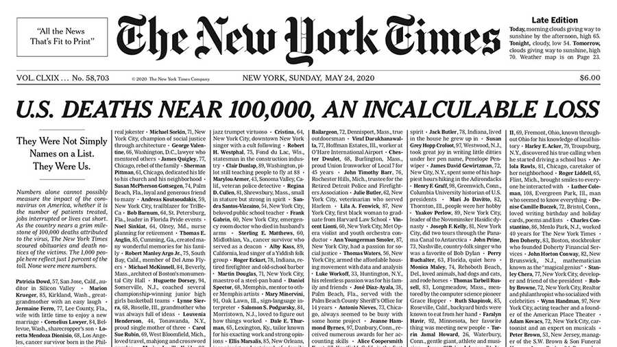
Want to see how other major brands handle their typography systems? The Netflix font and the Twitch font both follow similar logic: one display face for recognition, one functional face for readability.
And if you’re building thumbnails specifically, the full guide on best fonts for YouTube thumbnails covers which options actually move the needle on click-through rates beyond just copying what MrBeast uses.
FAQ on What Font Does MrBeast Use
What font does MrBeast use in his thumbnails?
MrBeast uses Obelix Pro for his thumbnails. It is a comic-style sans-serif typeface designed by Valentin Antonov. The font is free for personal use and available in OTF and TTF formats from sites like DaFont.
What font does MrBeast use for his logo?
The MrBeast logo uses Third Rail, a brush display typeface by BLKBK Fonts. The letter “e” is modified to make the wordmark unique. The demo version is free, but commercial use requires a paid license from blkbktyp.com.
What font does MrBeast use for subtitles?
Komika Axis, designed by Vigilante Typeface Corporation, handles subtitles across MrBeast’s videos. It is a rounded comic-style sans-serif. Unlike Obelix Pro, it is free for commercial use, making it the most accessible of the three fonts.
Is the MrBeast font free to download?
Obelix Pro is free for personal use only. Komika Axis is free for commercial use. Third Rail is available as a demo. None of the three are fully free for commercial projects without contacting the designer or purchasing a license.
What type of font is Obelix Pro?
Obelix Pro is a display comic sans-serif. It features exaggerated stroke weight, rounded terminals, and slightly irregular letterforms. The font draws visual inspiration from the title lettering of the classic French comic series Asterix and Obelix, released in 2011.
Can I use the MrBeast font for my YouTube thumbnails?
You can use Komika Axis commercially without issues. Obelix Pro requires a commercial license if your channel is monetized. For a safe alternative, Bangers from Google Fonts is free under the Open Font License and visually similar.
What are the best free alternatives to the MrBeast thumbnail font?
The closest free options are Bangers, Anton, and Hero Sandwich. Bangers is available directly on Google Fonts. Anton works well for bold condensed thumbnail text. Hero Sandwich most closely matches Obelix Pro’s tilted letterform style and rounded outline.
Did MrBeast always use the same fonts?
No. Early MrBeast thumbnails relied more on Impact and similar condensed display fonts common across YouTube at the time. Obelix Pro became the consistent standard as the channel’s production quality and visual branding developed over time.
Where can I download the MrBeast fonts?
Obelix Pro is available on DaFont and Fonts4Free. Komika Axis can be found on DaFont and Font Squirrel. Third Rail’s demo is on the BLKBK Fonts website. Always check the license file before using any font commercially.
Why does MrBeast use bold comic-style fonts in his thumbnails?
Bold comic-style fonts stay readable when thumbnails shrink on mobile screens. They also signal high energy and fun, matching MrBeast’s challenge and giveaway content. The font choice directly supports click-through rate by making numbers and stakes impossible to miss at a glance.
Conclusion
If you’ve been searching for what font does MrBeast use, the answer comes down to 3 typefaces working together: Obelix Pro for thumbnails, Third Rail for the logo, and Komika Axis for subtitles.
Each font serves a specific role in the channel’s visual identity. None of them are interchangeable.
For creators who want a similar thumbnail style, Bangers and Hero Sandwich are the most practical free alternatives, especially for monetized channels where Obelix Pro’s personal-use license becomes a problem.
The broader takeaway is simple. Bold display typography paired with consistent branding is a measurable part of what drives click-through rates on YouTube, and MrBeast’s font system is a clear example of that working at scale.

Renowned for his expertise in logo design and visual branding, Bogdan has developed a multitude of logos for various clients.
His skills extend to creating posters, vector illustrations, business cards, and brochures. Additionally, Bogdan's UI kits were featured on marketplaces like Visual Hierarchy and UI8.
He also wrote in the past years on sites like Design Your Way, WebDesignerDepot, WPDean, Designmodo, Speckyboy, Slider Revolution, and more.
- The Windsurf Logo History, Colors, Font, And Meaning - 10 October 2026
- How to Remove Background From Product Photos (No Photoshop) - 10 October 2026
- How Designers can Build a Stronger Online Creative Identity - 9 October 2026

Bogdan Sandu is a seasoned designer who has been designing websites since 2008. Renowned for his expertise in logo design and visual branding, Bogdan has developed a multitude of logos for various clients. His skills extend to creating posters, vector illustrations, business cards, and brochures. Additionally, Bogdan's UI kits were featured on marketplaces like Visual Hierarchy and UI8. He also wrote in the past years on sites like Design Your Way, WebDesignerDepot, WPDean, Designmodo, Speckyboy, Slider Revolution, and more.
You Might Also Like