Rolls-Royce. Just the name sounds luxurious, doesn’t it?
Zoom in on their logo, and it’s like stepping into a world of refinement and prestige. The Rolls-Royce Logo – it’s not just a symbol, it’s an experience. A statement.
Imagine the sleek lines, the double R’s intertwined. A design so simple, yet so powerfully evocative.
Crafted with precision, every curve tells a tale of tradition, of heritage. It shouts, without a word, “Excellence lives here.”
- Picture the logo in your mind.
- Feel the weight of the name it represents.
- Hear the soft purr of an engine synonymous with luxury.
This isn’t just about graphic design. It’s about creating a symbol that transcends time and trend. It’s about shaping a vision that embodies an ideal.
In the world of design, the Rolls-Royce logo isn’t just respected. It’s revered.
Today, we’re going on a journey. A journey into the heart of this iconic design, to understand the secrets that make the Rolls-Royce logo more than just a logo.
Fasten your seatbelts, because this is going to be a ride to remember.
The Meaning Behind the Rolls-Royce Logo
A Symbol of Luxury and Excellence
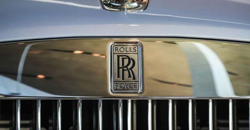
The Rolls-Royce logo is much more than a mere visual mark; it’s a symbol of unparalleled luxury and precision engineering. The logo itself, featuring two overlapping Rs, stands for the names of the company’s founders, Charles Rolls and Henry Royce. It tells the story of their relentless pursuit for perfection and their unwavering commitment to create the best cars in the world.
The Spirit of Ecstasy
An important element of the Rolls-Royce brand, though not directly part of the logo, is the emblem known as the “Spirit of Ecstasy.”
Crafted from pure silver and polished to a mirror finish, it embodies the brand’s pursuit of perfection, its dedication to artistry, and its commitment to pushing the boundaries of possibility.
Double R – A Stamp of Honor
Finally, the overlapped Rs in the logo are a stamp of honor, a mark of quality that assures buyers they are getting an automobile that has been crafted with the highest attention to detail. It’s a promise that every Rolls-Royce car is a masterpiece.
The History of the Rolls-Royce Logo
The Beginning
The journey of the iconic logo began in 1904, when Charles Rolls and Henry Royce formed a partnership.
They aimed to create motor cars that would stand out from the rest. The double R logo was born out of this ambition, and it has since become a global icon of automotive luxury and excellence.
Evolutions and Consistency
Throughout its history, the Rolls-Royce logo has maintained its design, only undergoing minor changes. This consistency has helped the brand maintain its image and reputation. Over time, the logo has become synonymous with the epitome of luxury and class.
The Colors of the Rolls-Royce Logo
A Palette of Prestige
In the Rolls-Royce logo, the colors speak volumes. The use of black and silver conveys a sense of elegance, sophistication, and prestige. Black denotes strength, power, and authority, while silver symbolizes refinement and modernity. Together, they perfectly represent the brand’s philosophy and ethos.
The Font Used in the Rolls-Royce Logo
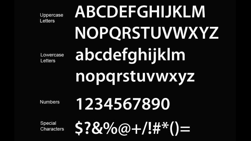
A Typeface of Distinction
The Rolls-Royce logo utilizes a custom, unique typeface. The letters are bold and capitalized, which conveys a sense of dominance and power. The font’s simplicity speaks to the brand’s understated elegance and its commitment to clarity and precision.
The Impact of the Rolls-Royce Logo on Brand Identity
Logo – A Catalyst for Brand Recognition
The Rolls-Royce logo plays a crucial role in the brand’s identity. It’s an instantly recognizable symbol that carries with it an aura of sophistication, reliability, and superior quality. The logo, with its distinct design and colors, enables Rolls-Royce to stand out in the highly competitive luxury automotive market.
A Testament of Trust
Moreover, the logo is a testament of trust for customers, representing a brand that has consistently delivered on its promise of excellence for over a century. It’s a symbol that has become synonymous with the highest standards of luxury, craftsmanship, and performance.
The Influence of the Rolls-Royce Logo in the Automobile Industry
Setting the Benchmark
The Rolls-Royce logo has not only created a distinct identity for the brand, but it has also set the benchmark for logos in the automobile industry. Its timeless and elegant design has influenced many other logos, prompting them to convey similar messages of quality, reliability, and luxury.
A Symbol of Status
Furthermore, the Rolls-Royce logo has become a status symbol. It signifies not just the ownership of a high-end vehicle, but also the attainment of a certain lifestyle marked by grandeur and elegance. The brand’s logo on a car instantly elevates the owner’s status, making it a sought-after emblem in the world of luxury automobiles.
The Artistic Interpretation of the Rolls-Royce Logo
Logo as Art
The Rolls-Royce logo, with its simplicity and elegance, is more than just a brand identifier-it’s a work of art. The thoughtful use of color and typeface, coupled with the emblem’s timeless design, makes it a perfect example of minimalist artistry.
The Spirit of Ecstasy – A Sculptural Marvel
Beyond the double R logo, the Spirit of Ecstasy, the lady that elegantly leaps forward on the bonnet of each Rolls-Royce car, is a sculptural marvel. Originally crafted by artist Charles Robinson Sykes, it’s a perfect blend of art and engineering, embodying the brand’s ethos in a beautifully tangible form.
The Future of the Rolls-Royce Logo
Maintaining Timeless Appeal
As Rolls-Royce moves forward, the logo will continue to maintain its timeless appeal. The company’s commitment to its founding principles of perfection and luxury means that, while models may evolve and technologies may advance, the logo will remain a constant symbol of the brand’s heritage and its promise of excellence.
Adapting to the Digital Age
As the world becomes increasingly digital, the logo too may find itself adapting to new platforms and mediums, while still retaining its classic design. From virtual showrooms to digital marketing, the Rolls-Royce logo will continue to uphold the brand’s legacy, embodying the spirit of luxury and elegance in every pixel.
FAQ on the Rolls-Royce Logo
What’s the significance behind the Rolls-Royce logo?
Ah, the RR logo, it’s really fascinating, you know. It’s actually two Rs which stand for the founders’ initials – Charles Rolls and Henry Royce. Interlocked in a unique design, it radiates a sense of luxury and sophistication.
It’s like a handshake between Rolls and Royce, signifying their partnership and mutual respect.
Who designed the Rolls-Royce logo?
The credit for designing the logo goes to the co-founder himself, Charles Rolls. That’s right! He was not just an automobile enthusiast, but also a pretty talented designer.
Crafting those initials into a symbol of luxury wasn’t a casual endeavor, it was a testament to the brand’s commitment to quality and elegance.
Why is the Rolls-Royce logo red?
Oh, the red color! Initially, the logo was red to symbolize energy and passion. But, did you know it changed to black? Yeah, it did! Around 1933, the color was switched to black.
Some say it was to reflect a more sober, dignified image, while others claim it was to mark the death of Royce. It’s a bit of a mystery.
Has the Rolls-Royce logo changed over time?
Despite the times changing, the logo has remained remarkably consistent.
The only significant change was the color, from red to black, back in 1933. The design, however, has stayed the same – those timeless, intertwined Rs, a symbol of enduring quality and luxury, they’ve remained untouched.
What does the Spirit of Ecstasy represent?
Oh, the Spirit of Ecstasy, it’s a beauty, isn’t it? It’s not technically part of the logo, but it’s very much a symbol of Rolls-Royce.
This graceful lady leaning forward with her arms outstretched behind and her clothes billowing in the wind – it’s all about the spirit of freedom, speed, and forward movement. It perfectly encapsulates the essence of Rolls-Royce – elegance in motion.
Is the Spirit of Ecstasy always present on Rolls-Royce cars?
In most cases, yes, the Spirit of Ecstasy is indeed present on Rolls-Royce cars. It’s like the cherry on top of a fancy cake. It sits proudly on the hood, defining the brand’s identity. However, what’s really cool is that it’s retractable.
That means it can vanish into the hood if disturbed, protecting it from damage or theft.
Why is the Rolls-Royce logo not on the Spirit of Ecstasy?
Well, the Spirit of Ecstasy is a standalone piece of art. It’s a symbol in its own right, not just an embellishment. It doesn’t carry the logo because it doesn’t need to.
The logo and the Spirit of Ecstasy complement each other, each having its own story, yet together, they create a powerful brand identity. It’s a balance of art and branding that works so well.
Are there any special editions of the Rolls-Royce logo?
There’s always something special cooking up in the Rolls-Royce kitchen. While the basic design of the logo remains the same, Rolls-Royce has been known to release special editions of their cars with unique logo designs.
These are usually limited in number and come with a hefty price tag. They’re an expression of exclusivity, something Rolls-Royce is quite famous for.
Can I customize the Rolls-Royce logo on my car?
Customizing a Rolls-Royce? That’s a tricky one. While Rolls-Royce does offer a bespoke program for their cars, altering the logo might not be on the menu. The logo is deeply embedded in the brand’s heritage and identity.
It’s like a badge of honor that signifies the unparalleled quality of Rolls-Royce. So, while you can customize many aspects of your car, the logo, my friend, is sacred.
What’s the difference between the Rolls-Royce logo and the Bentley logo?
Ah, Rolls-Royce and Bentley, two titans of the luxury car world. Their logos, like their cars, reflect their unique heritage. The Rolls-Royce logo, with its interlocking Rs, speaks of the partnership between its founders.
The Bentley logo, on the other hand, features a “B” surrounded by wings, symbolizing speed and freedom. Each logo is a masterpiece in its own right, capturing the essence of the brand it represents.
Ending Thoughts on the Rolls-Royce Logo
We’ve journeyed through the thick and thin of our subject today, the Rolls-Royce logo.
- A logo,
- A symbol,
- A design story that’s mighty in its simplicity.
I want to emphasize that a logo isn’t just a doodle or a sketch. It’s a visual ambassador, you know? It’s the face of a brand, speaking volumes, often louder than words.
Rolls-Royce? Now that’s a brand that needs no introduction. Its logo? Unmatched. It’s so much more than just two R’s intertwined. It’s a legacy. It’s power. It’s luxury.
It’s about the meticulous craftsmanship that goes into each and every car that rolls off their production line. It’s a silent promise of quality and excellence.
In the world of graphic design, we don’t just create logos. We build visual narratives that last, just like the Rolls-Royce logo.
So, remember, next time you see that double R, know it’s not just a logo. It’s a story. And what a marvelous story it is!
Keep your eyes peeled, folks. There are stories everywhere, in every shape and every color. You just need to look.
If you enjoyed reading this article about the Rolls-Royce logo, you should read these as well:
- The Rolls Royce logo (symbol) that was created for the company
- The Ferrari logo and the history behind its design
- The Best New Concept Car Designs For The Future & 96 Vehicles
Renowned for his expertise in logo design and visual branding, Bogdan has developed a multitude of logos for various clients.
His skills extend to creating posters, vector illustrations, business cards, and brochures. Additionally, Bogdan's UI kits were featured on marketplaces like Visual Hierarchy and UI8.
He also wrote in the past years on sites like Design Your Way, WebDesignerDepot, WPDean, Designmodo, Speckyboy, Slider Revolution, and more.
- Canva for Teams Review: Is It Worth the Business Plan? - 24 July 2026
- 5 Brand Compliance Checkpoints Every Enterprise Should Automate - 23 July 2026
- Timeless Open Sans Font Pairing for Any Project - 22 July 2026
Bogdan Sandu is a seasoned designer who has been designing websites since 2008. Renowned for his expertise in logo design and visual branding, Bogdan has developed a multitude of logos for various clients. His skills extend to creating posters, vector illustrations, business cards, and brochures. Additionally, Bogdan's UI kits were featured on marketplaces like Visual Hierarchy and UI8. He also wrote in the past years on sites like Design Your Way, WebDesignerDepot, WPDean, Designmodo, Speckyboy, Slider Revolution, and more.
You Might Also Like


