The Caltech logo is the primary visual mark of the California Institute of Technology, one of the most selective private research universities in the United States. Based in Pasadena, California, the institution has been shaping science and engineering since 1891. Its logo carries the weight of that history, but the design itself is surprisingly restrained. No mascot. No crest. Just a clean wordmark in a specific shade of orange.
Caltech sits among a small group of institutes of technology that focus almost entirely on pure and applied sciences. The branding reflects that focus. Where other university logos lean on ornate seals or detailed illustrations, Caltech went the other direction. The current logo was introduced in 2014, and the institute has gone through roughly three to four distinct visual identity phases since Amos G. Throop founded the school as Throop University over 130 years ago.
What Is the Caltech Logo?

The Caltech logo is a custom wordmark that spells out “Caltech” in a distinctive lowercase letterform rendered in Caltech Orange (Pantone 1585c). Introduced in 2014 as part of a broader identity refresh led by the Office of Strategic Communications, the mark replaced the more frequent use of the institutional seal in everyday materials. It was designed to increase name recognition and to give the institute a more flexible, scalable identity across digital and print applications.
Here is a closer look at its attributes:
- Design Type: Wordmark (logotype). No icon, no symbol paired with it. The word itself is the mark.
- Primary Elements: Custom lowercase lettering spelling “Caltech,” with a slightly stylized “t” that gives the wordmark a unique character. There is no tagline built into the logo.
- Official Introduction Date: 2014. Brand New by UnderConsideration noted the launch on April 9, 2014.
- Designer/Agency: Developed internally through Caltech’s Office of Strategic Communications. External design consultants may have contributed, but Caltech has not publicly credited a specific agency.
- Trademark Status: The Caltech name and logo are registered trademarks of the California Institute of Technology. Any use requires written approval through the Office of Strategic Communications.
- Color Palette: Caltech Orange (Hex #FF6C0C, Pantone 1585c) is the primary logo color. It may also appear in black, gray, or white depending on context.
- Usage Context: Research posters, PowerPoint presentations, newsletters, marketing materials, event flyers, stationery, websites, merchandise, business cards, and all general communications. The seal is reserved for formal occasions only.
How Has the Caltech Logo Evolved Over Time?

The visual identity of Caltech has shifted several times since 1891. What started as a small vocational school grew into a research powerhouse, and its visual marks changed along the way.
The institution went through multiple name changes before settling on California Institute of Technology in 1920. Each phase brought its own visual representation, from early academic crests to the streamlined wordmark used today.
Throop University Era (1891-1920)
- Years Active: 1891-1920
- Design Description: During this period, the school used various names (Throop University, Throop Polytechnic Institute, Throop College of Technology) and had no standardized visual identity in the modern sense. Academic marks from this time were typical of late 19th-century institutions, featuring text-heavy seals with the school name.
- Color Scheme: Not formally established. The school’s identity was still forming.
- Designer: No recorded designer for branding materials.
- Context: Amos G. Throop founded the school as a vocational and preparatory institution. George Ellery Hale joined the board in 1907 and began transforming it into a serious research school.
- Cultural Significance: The branding during this era was about function, not identity building. The school was still figuring out what it wanted to be.
The Caltech Seal Era (1920s-2014)
- Years Active: 1920s through 2014 (seal as primary mark)
- Design Description: The Caltech seal, designed by Belgian sculptor G. DeVreese, features two nude male figures on clouds, one holding a torch. It includes the motto “The truth shall make you free.” This was the dominant mark for decades, used across nearly all communications.
- Color Scheme: Caltech Orange (Pantone 165 for the seal specifically) or black. Always rendered in a single color.
- Designer: G. DeVreese
- Context: The school had been renamed California Institute of Technology in 1920. Chemist Arthur A. Noyes, astronomer George Ellery Hale, and physicist Robert A. Millikan shaped Caltech into a top-tier institution. The seal reflected the seriousness and formality of that transformation.
- Key Changes from Previous: This was the first cohesive, designed mark. The torch and human figures added symbolic depth that earlier text-only marks lacked.
- Cultural Significance: The seal became synonymous with Caltech’s academic reputation. It appeared on diplomas, official letters, and campus signage for nearly a century.
Modern Wordmark Era (2014-Present)
- Years Active: 2014 to present
- Design Description: A custom lowercase wordmark spelling “Caltech” in a clean, modern sans-serif typeface. The letterforms are custom, so this is not a commercially available font. The logo is treated as artwork, not as type that can be recreated.
- Color Scheme: Caltech Orange (#FF6C0C), with approved variations in black, gray, and white.
- Designer: Office of Strategic Communications at Caltech (specific individual designers not publicly credited).
- Context: The institute needed a mark that worked better at small sizes, on screens, and across a wider range of materials. The seal was too detailed for many modern applications.
- Key Changes from Previous: Moved from a detailed illustrative seal to a pure wordmark. Dropped the human figures, the torch, and the motto from everyday use. The seal was kept but reserved strictly for formal and ceremonial purposes.
- Cultural Significance: This shift signaled Caltech’s move toward a cleaner, more accessible identity. It prioritized name recognition over symbolic tradition, a tricky balance for an institution with this much history.
What Do the Design Elements of the Caltech Logo Mean?

The current Caltech logo is a wordmark, which means the design itself is the name. There are no hidden icons tucked into the letterforms, no abstract shapes to decode.
But that does not mean the design choices are random. The lowercase lettering, the custom character shapes, and the specific color all carry intent. And the seal, while no longer the primary mark, still holds deep symbolic meaning for the institution.
What Is the Symbolism Behind the Caltech Seal?
The Caltech seal, designed by G. DeVreese, shows two male figures on clouds, one holding a torch. The torch is a classic symbol of knowledge and enlightenment in academic contexts.
The motto reads “The truth shall make you free,” a direct reference to the institution’s commitment to open inquiry and scientific discovery.
While the seal is no longer the everyday logo, it still appears on diplomas, presidential communications, admission letters, and official transcripts. It carries more formal weight than the wordmark and remains closely guarded by the Office of Strategic Communications.
Why Did Caltech Choose These Specific Colors?
Caltech’s primary color is orange, and it is not a generic orange. The official shade is Pantone 1585c for coated print, with Hex #FF6C0C for digital use.
Orange, from a color psychology standpoint, signals energy, creativity, and enthusiasm. For a science and engineering institution, it is an unusual pick. Most comparable schools lean toward blues, reds, or crimsons. Caltech’s orange makes it instantly recognizable among other brands that use orange.
White is the secondary color. Together, orange and white have represented Caltech since the 1920s rebranding period, when the school formally became the California Institute of Technology.
The identity system also includes neutral colors (Cool Gray 9, PMS 414, and others) and a set of bright accent colors for specific communications needs.
What Typography Style Is Used in the Caltech Logo?
The wordmark itself uses a custom typeface that is not available for purchase or general use. Caltech’s brand guidelines specify that the logo must be treated as artwork. You cannot recreate it by typing the word “Caltech” in any commercial font.
For supporting typography across institutional materials, the identity system pairs two primary fonts. Adobe Caslon Pro serves as the serif typeface for formal applications and body text. Helvetica Neue handles sans-serif needs for headlines and navigation. Arial and Georgia work as acceptable substitutes when the primary fonts are not available.
What Are the Hidden Meanings in the Caltech Logo?
Look, there are no Easter eggs in the Caltech wordmark. No negative space arrow like FedEx. No hidden bear like the Toblerone mountain.
The “hidden meaning” here is more about what the design says through restraint. A school this prestigious could have gone with an elaborate emblem. Instead, the logo is just the name, set in a specific way.
That confidence is the message. The name alone is enough. If anything, the slightly rounded letterforms and lowercase treatment make the mark feel approachable despite the institution’s intimidating academic reputation.
How Does the Caltech Logo Compare to Competitor Logos?

Put the Caltech logo next to its peers and it stands out immediately. Not because it is louder, but because it is simpler.
MIT uses a straightforward blocky wordmark too, but in a heavier, more industrial sans-serif. Stanford has its iconic “S” tree emblem alongside a serif wordmark. Harvard relies on its historic shield with the “VERITAS” motto. Princeton uses a detailed coat of arms.
Caltech’s approach is closer to what you would see from a tech company than a traditional university. That is not an accident. The institute specifically wanted something more scalable and flexible than what a detailed seal could offer.
The orange also helps. Among top research universities, very few claim that color as their primary. It gives Caltech an instant visual identity that does not get lost when placed alongside logos from other Ivy League and top-tier institutions.
What Are the Technical Specifications of the Caltech Logo?
Official Color Codes
- Primary Color: Caltech Orange
- Hex: #FF6C0C
- RGB: (255, 108, 12)
- CMYK: (0, 68, 98, 0)
- Pantone: 1585c (coated), PMS 151 (uncoated)
- Secondary Color: Cool Gray 9
- Hex: #76777B
- RGB: (118, 119, 123)
- Accent: White
- Hex: #FFFFFF
- RGB: (255, 255, 255)
Dimensions and Proportions
- Aspect Ratio: The logo has roughly a 4:1 width-to-height ratio (nominally 208 x 50 pixels in its SVG source file).
- Minimum Size (Print): 0.75 inches wide. The preferred size on standard letter-size print is 1.25 inches wide.
- Minimum Size (Digital): 70 pixels wide.
- Clear Space: At least one-half the height of the lowercase “e” in the logo, measured from all four sides. No other design elements may sit within this space.
- Official Usage Guidelines: The logo must be treated as artwork. No re-creation, no re-typesetting. No color changes, shadows, outlines, surrounding boxes, or using it as a window for imagery. Only approved artwork may be used.
What Cultural Impact Has the Caltech Logo Had?

The Caltech logo may not have the pop culture recognition of a Nike swoosh, but within academic and scientific communities it carries significant weight.
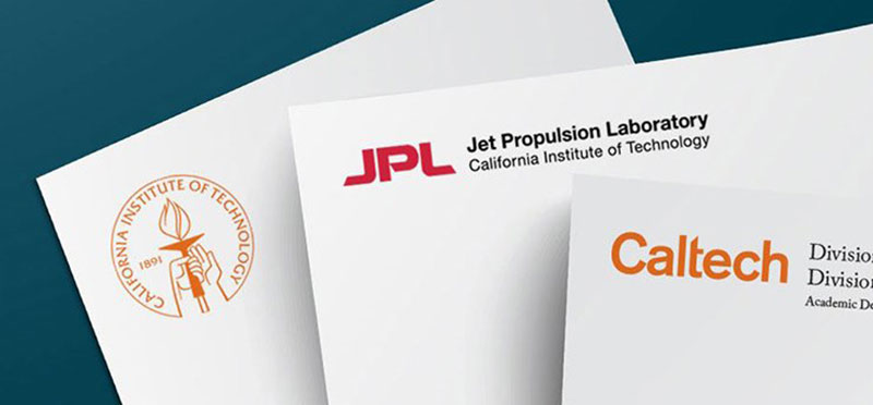
It appears alongside JPL (Jet Propulsion Laboratory) branding on some of the most high-profile space missions in history. When Caltech research makes news, the orange wordmark is right there. The show The Big Bang Theory brought Caltech into millions of living rooms, and while the show used the name constantly, the visual identity got indirect exposure too.
The Beavers athletic mark exists separately for sports contexts (Caltech competes in NCAA Division III), but it does not represent the institution itself. The clean wordmark handles that job.
How Does the Caltech Logo Fit Into the Overall Brand Identity?
Caltech uses a multilevel visual identity system. The wordmark is the primary mark for nearly everything. The seal handles formal occasions. The JPL-Caltech combination logo exists for Jet Propulsion Laboratory contexts. And separate athletics spirit marks cover sports.
These marks never appear together. The brand guidelines are clear: the logo should never be paired with the seal or any other logos. Each element operates independently. Department-level lockups are allowed, where a division name sits alongside the Caltech wordmark in an approved configuration, but these require approval. The brand style guide also specifies placement rules. On printed materials, the logo goes on the front or back. It sits a minimum of 0.75 inches from the top and sides when used in a lockup configuration.
The whole system is managed by the Office of Strategic Communications, and it is strict. That level of control makes sense for an institution where brand consistency matters across research publications, admissions materials, donor communications, and campus signage.
How Should the Caltech Logo Be Used?
Official do’s:
- Use only approved artwork downloaded through the Caltech Identity Toolkit (requires Access.Caltech credentials for high-resolution files).
- Maintain the required clear space around the logo at all times.
- Use the orange version on lighter backgrounds (white, less than 20% black, or more than 80% black).
- Use black or white versions on colored backgrounds with enough contrast.
- Place the logo on the front or back of all printed materials.
Official don’ts:
- Never re-create or typeset the logo. It is artwork, not type.
- Never change the logo color or font.
- Never apply shadows, outlines, or surrounding boxes.
- Never use the logo as a window for imagery.
- Never pair the logo with the seal.
- Never reproduce the logo smaller than minimum size specs (0.75″ print, 70px digital).
Where to access official logos: The Caltech Identity Toolkit at identity.caltech.edu hosts downloadable files. High-resolution versions require institutional login credentials.
Licensing and trademark: All logos incorporating the Caltech mark need approval through the Office of Strategic Communications (identity@caltech.edu). The Caltech name and visual identity are protected trademarks. Unauthorized use, especially on merchandise, can lead to legal action. This is not a case where asking for forgiveness is easier than asking for permission.
FAQ on The Caltech Logo
What does the Caltech logo look like?
The current Caltech logo is a custom wordmark that spells “Caltech” in lowercase lettering. It appears in Caltech Orange (#FF6C0C). No icon or symbol accompanies it. The institute treats this mark as artwork, not as something you can retype in a commercial font.
When was the current Caltech logo introduced?
The modern wordmark launched in 2014. Caltech’s Office of Strategic Communications developed it to replace the widespread use of the institutional seal in everyday materials.
The seal still exists but is now reserved for formal contexts like diplomas and presidential communications.
What are the official Caltech logo colors?
Caltech Orange is the primary color. Its color palette specs are Hex #FF6C0C, RGB (255, 108, 12), and CMYK (0, 68, 98, 0). The logo also appears in black, gray, or white depending on background needs.
What is the difference between the Caltech logo and the Caltech seal?
The Caltech seal is the formal, ceremonial mark designed by G. DeVreese. It features two figures, a torch, and the motto “The truth shall make you free.”
The wordmark handles everything else. They never appear together.
Can I use the Caltech logo on merchandise or personal projects?
No. Not without written approval from the Office of Strategic Communications. The Caltech trademark is legally protected. Unauthorized reproduction on merchandise, websites, or other materials can lead to legal consequences. Contact identity@caltech.edu for licensing questions.
What font does Caltech use in its branding?
The logo itself uses a custom typeface that is not publicly available. For institutional materials, Caltech pairs Adobe Caslon Pro as the serif option with Helvetica Neue for sans-serif applications. Georgia and Arial serve as fallback alternatives.
What does the Caltech seal symbolize?
The seal shows two male figures on clouds, one holding a torch representing knowledge and enlightenment. The motto “The truth shall make you free” reflects the California Institute of Technology’s commitment to scientific inquiry and academic freedom.
Where can I download the official Caltech logo?
The Caltech Identity Toolkit at identity.caltech.edu provides downloadable files. High-resolution vector graphics versions require Access.Caltech login credentials. Low-resolution versions are more broadly accessible for campus use.
Why did Caltech switch from the seal to a wordmark?
The seal was too detailed to work well at small sizes and on screens. The wordmark is more scalable, readable across digital platforms, and clearer for audiences unfamiliar with Caltech. It was a practical decision as much as a branding one.
What are the minimum size requirements for the Caltech logo?
In print, the logo cannot go below 0.75 inches wide. The preferred size on letter-size pages is 1.25 inches. For digital use, 70 pixels wide is the minimum. Clear space equal to half the height of the “e” must surround the mark on all sides.
Conclusion
The Caltech logo does exactly what it needs to do. It puts the name front and center without decoration, letting the institution’s reputation in science and engineering carry the weight.
That 2014 shift from a detailed academic seal to a clean wordmark was a bet on clarity over tradition. And it paid off. The orange mark scales from campus signage down to a 70-pixel favicon without losing readability.
For anyone working with the Caltech visual hierarchy, the rules are strict but well documented. The Identity Toolkit covers everything from DPI specs to clear space requirements.
Sometimes the best logo design principles come down to knowing when less is enough.

Renowned for his expertise in logo design and visual branding, Bogdan has developed a multitude of logos for various clients.
His skills extend to creating posters, vector illustrations, business cards, and brochures. Additionally, Bogdan's UI kits were featured on marketplaces like Visual Hierarchy and UI8.
He also wrote in the past years on sites like Design Your Way, WebDesignerDepot, WPDean, Designmodo, Speckyboy, Slider Revolution, and more.
- The Windsurf Logo History, Colors, Font, And Meaning - 10 October 2026
- How to Remove Background From Product Photos (No Photoshop) - 10 October 2026
- How Designers can Build a Stronger Online Creative Identity - 9 October 2026

Bogdan Sandu is a seasoned designer who has been designing websites since 2008. Renowned for his expertise in logo design and visual branding, Bogdan has developed a multitude of logos for various clients. His skills extend to creating posters, vector illustrations, business cards, and brochures. Additionally, Bogdan's UI kits were featured on marketplaces like Visual Hierarchy and UI8. He also wrote in the past years on sites like Design Your Way, WebDesignerDepot, WPDean, Designmodo, Speckyboy, Slider Revolution, and more.
You Might Also Like