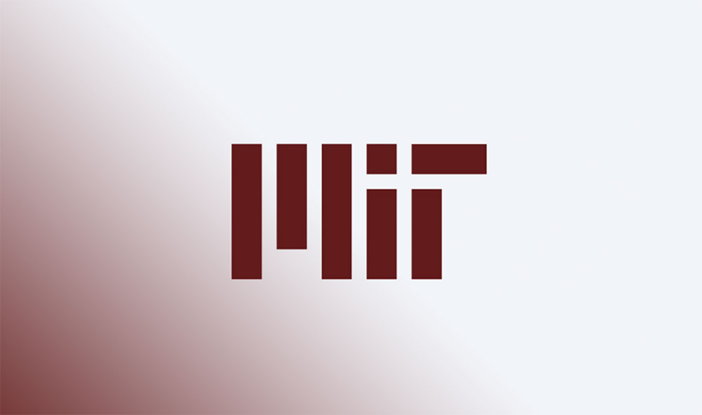
The MIT logo is a custom wordmark made up of seven squared-off geometric shapes that spell out “MIT” in a blocky, abstract style. Designed by type designer Matthew Carter and launched in 2003, it replaced the traditional MIT seal as the primary visual identifier for the Massachusetts Institute of Technology.
The mark sits at the intersection of academic tradition and modern graphic identity. Few university logos manage to feel both technical and approachable. MIT’s does. It reads as something between a circuit board pattern and architectural columns, which is kind of perfect for a school built on engineering and applied science.
The current version was refined during a 2023 brand update. MIT was founded in 1861, the seal dates to 1864, and the wordmark has only gone through one major redesign since its 2003 debut. That’s three visual identity milestones across more than 160 years.
What is the MIT Logo?

The MIT logo is a geometric wordmark consisting of seven rectangular shapes that form the letters M, I, and T. It was created by Matthew Carter and Tim Blackburn in 2003, with Carter doing the final refined drawing. The design uses clean vertical and horizontal bars to spell out the acronym in a style that suggests precision and technical clarity.
Design Type: Wordmark (custom letterform, not a standard font)
Primary Elements: Seven squared-off rectangular shapes arranged to form the letters “MIT.” The M consists of three vertical stripes, one short in the middle and two tall on the edges. The I is a single vertical bar. The T has a horizontal top bar with a vertical stroke beneath it.
Official Introduction Date: 2003, refreshed in 2023
Designer: Matthew Carter (type designer, creator of Verdana and Georgia) with Tim Blackburn and consulting designers Alice Hecht and Kathleen Forsythe
Trademark Status: “MIT” and “Massachusetts Institute of Technology” are registered trademarks. The logo uses the registered trademark symbol for goods like clothing, and the trademark symbol for other categories.
Color Palette: Cardinal Red (#A31F34), Silver Gray (#8A8B8C), Light Gray (#C2C0BF), and Black. The logo itself must appear in black or white only, per 2023 brand guidelines.
Usage Context: Websites, print publications, social media, stationery, signage, merchandise, and academic materials. The logo is treated as a graphic element, not text, and should never be used in place of the typed letters “MIT” in running copy.
How Has the MIT Logo Evolved Over Time?

MIT’s visual identity spans over 160 years, starting with the 1864 seal, moving through a mid-century graphic design revolution, and arriving at the current geometric wordmark introduced in 2003. The 2023 brand refresh simplified the system further, though the core logo structure stayed largely intact.
The MIT Seal (1864-Present, Ceremonial Use)
Years Active: 1864 to present (now reserved for ceremonial use only)
Design Description: Concentric circles containing a central illustration of two figures: a laborer at an anvil and a scholar holding a book. Between them sits a pedestal bearing three volumes labeled “Science and Arts,” topped with a lamp representing knowledge. Below the pedestal, a scroll reads “Mens et Manus” (Latin for “Mind and Hand”). The year 1861 (MIT’s founding) appears at the base.
Color Scheme: Cardinal red, black, or white depending on application
Designer: Committee on the Seal, chaired by founder William Barton Rogers. Engraved by A. Paquet in Philadelphia in 1865 at a cost of $285.
Context: MIT needed a formal institutional mark shortly after its 1861 founding. The seal’s imagery directly reflects Rogers’ educational philosophy: the union of intellectual study with practical, hands-on work.
Cultural Significance: The seal became the face of MIT for well over a century. Its two figures and Latin motto still appear on diplomas, certificates, and academic regalia. But the traditional round seal looked too much like every other university seal, which eventually drove the need for something more distinct.
The Mid-Century Graphic Identity (1950s-1990s)
Years Active: 1950s through the 1990s
Design Description: Not a single logo but a design system built around Helvetica typography and modernist layout principles. Bold poster designs, publication covers, and institutional materials used clean grids, striking photographic treatments, and type-driven compositions.
Color Scheme: Cardinal red and gray remained the institutional colors, but individual designers used broad palettes across posters and publications
Designers: Muriel Cooper, Jacqueline Casey, Dietmar Winkler, and Ralph Coburn, working from MIT’s Office of Publications
Context: An exchange student from Switzerland named Therese Moll introduced the team to Helvetica. They grabbed it and ran. The result was a style that mixed European minimalist design sensibility with American playfulness, earning international recognition.
Key Changes from Previous: This era moved MIT away from relying solely on the formal seal. It established MIT as a place with real graphic sensibility. Muriel Cooper, by the way, also designed the MIT Press colophon (now in MoMA’s permanent collection), which many people still confuse with the main MIT logo.
Cultural Significance: These designers basically created MIT’s visual personality. Their work influenced Swiss design thinking in American institutions and proved that a university could have a graphic identity as sharp as any corporation.
The Matthew Carter Wordmark (2003-Present)
Years Active: 2003 to present
Design Description: Seven geometric rectangular shapes forming the letters M, I, and T. The letterforms are blocky, squared-off, and built from simple bars of varying heights. It reads as an abstract pattern at a distance and resolves into text up close.
Color Scheme: Officially produced in black or white only (as of the 2023 update). Paired with the institutional palette of cardinal red and silver gray in broader brand materials.
Designer: Matthew Carter, with Tim Blackburn and a team of consulting designers
Context: By the late 1990s, the Office of Design Services had closed and MIT lacked a unified graphic identity. The Institute brought in Carter and a team to create something that would work across all media. The result was deliberately provocative. Took me a while to appreciate it, honestly. At first glance it looks like a barcode. But that’s sort of the point.
Key Changes from Previous: For the first time, MIT had a proper logo rather than just a seal or a design system. The wordmark gave the Institute a single, consistent mark for everything from websites to T-shirts.
Cultural Significance: The logo drew pushback initially. Some people thought it was too abstract. But it aged well. The stripped-down geometric approach mirrors the problem-solving ethos of the school itself. Carter, who also designed typefaces for Yale and the Museum of Modern Art, brought the same attention to structural clarity that defines his broader body of work.
The 2023 Brand Refresh
Years Active: 2023 to present
Design Description: The core logo structure remained, but the overall brand system was modernized. The logo now must appear in black or white only. New branding options for departments were introduced, the seal was updated slightly, and Tim the Beaver illustrations were refreshed.
Color Scheme: Expanded palette introduced alongside the legacy cardinal red and gray
Context: After 20 years, MIT wanted to modernize the system to work better across digital channels and to give departments more flexibility in how they connect to the parent brand.
Key Changes from Previous: Simplified color rules for the logo itself. Neue Haas Grotesk became the primary typeface. Retired some legacy branding options (master branding and equal focus branding).
What Do the Design Elements of the MIT Logo Mean?

The MIT logo’s seven rectangular bars encode the Institute’s identity through pure geometry. There’s no illustration, no figurative imagery. Just vertical and horizontal shapes that form letters through negative space and structural arrangement.
It’s a wordmark that works like architecture. Your eye builds the letters from the bars, the same way your brain assembles meaning from parts of a structure.
Why Did MIT Choose These Specific Colors?
MIT’s legacy colors, cardinal red and silver gray, were first adopted in 1876, just fifteen years after the school’s founding.
Cardinal Red – Hex: #A31F34, Pantone: PMS 201 C (updated to PMS 202 C for coated paper in 2023). Red carries energy and urgency. In academic branding, it’s one of the most common choices, but MIT’s specific shade leans darker and warmer than, say, Harvard’s crimson.
Silver Gray – Hex: #8A8B8C, Pantone: PMS 423 C. Gray communicates precision and technical seriousness. It also plays a practical role: it pairs cleanly with red without creating contrast problems.
Black – The logo itself appears in black or white. Black grounds the entire system.
The 2023 refresh added bright red to the core palette and introduced an expanded set of colors for departmental use, making sure color theory principles are respected across all combinations. MIT red pairs best with warm analogous colors like pinks and yellows, or cool blues for complementary effect.
What Typography Style Is Used in the MIT Logo?
The logo itself is not set in any existing font. Matthew Carter drew the letterforms from scratch as a custom graphic element. The shapes resemble something between a blocky sans-serif and a technical diagram.
For broader brand materials, MIT’s primary typeface is Neue Haas Grotesk, a restoration of the original pre-digital Helvetica by Christian Schwartz. MIT had been associated with Helvetica since the 1950s when its Office of Publications designers adopted it. Your mileage may vary on whether Neue Haas Grotesk “feels” different from standard Helvetica, but the difference is there if you look closely.
The logo letterforms have uniform stroke width throughout, which gives them an engineered quality. There’s no kerning in the traditional sense because the letters aren’t type. They’re geometric shapes with deliberate spacing.
What Are the Hidden Meanings in the MIT Logo?
The seven bars can be read as columns or pillars, suggesting institutional strength. Some people see a barcode reference, connecting the mark to technology and data. Carter’s team didn’t explicitly confirm that interpretation, but they didn’t deny it either.
The negative space between the bars matters as much as the bars themselves. If you squint, the M almost looks like a building facade with windows. The whole thing plays with the Gestalt principle of closure, where your brain fills in the missing information to read the letters.
Tim Blackburn described the design process as collaborative and iterative, with Carter refining ideas that emerged from group charrettes. So there’s no single “hidden message.” It’s more like a set of visual associations that accumulate over time.
How Does the MIT Logo Compare to Competitor Logos?

Most elite research universities default to one of two approaches: either a traditional seal (sometimes modernized) or a clean wordmark. MIT’s logo is unusual because it’s a wordmark that doesn’t look like text. It sits in a strange and interesting middle ground.
Stanford University’s logo leans on its iconic tree emblem. The Caltech logo uses a straightforward typographic approach. Columbia University’s logo relies on its crown-topped seal. Princeton’s logo centers on a shield and banner system.
MIT’s geometric approach stands apart from all of these. It doesn’t lean on heritage imagery or classical motifs. Among tech company logos, you might actually find closer visual cousins, which says something about how MIT positions itself. The logo talks to the future more than the past.
Compared to its closest rival in perceived prestige, Cambridge University still uses a coat of arms that dates back centuries. Oxford University does something similar. MIT’s choice to go fully abstract was a deliberate break from that academic tradition.
What Are the Technical Specifications of the MIT Logo?
Official Color Codes
Cardinal Red (MIT Red)
- Hex: #A31F34
- RGB: (163, 31, 52)
- CMYK: (24, 100, 78, 17)
- Pantone: PMS 201 C (legacy), PMS 202 C coated / PMS 7427 U uncoated (2023 update)
Silver Gray
- Hex: #8A8B8C
- RGB: (138, 139, 140)
- CMYK: (48, 39, 39, 4)
- Pantone: PMS 423 C
Light Gray
- Hex: #C2C0BF
- RGB: (194, 192, 191)
- CMYK: (24, 20, 20, 0)
- Pantone: PMS 420 C
Black
- Hex: #000000
- RGB: (0, 0, 0)
Dimensions and Proportions
Aspect Ratio: The logo is wider than it is tall. The exact proportions are defined by MIT’s brand files and cannot be modified.
Minimum Size: MIT specifies minimum reproduction sizes on their downloads page. At sizes too small, the seven-bar structure loses definition and the letters become hard to read.
Clear Space: A defined area of empty space must surround the logo on all sides. No typography, images, or other graphic elements should crowd into this zone.
Usage Guidelines: The logo must appear in black or white only. It must not be reproduced in red and white or black and white two-color combinations where the values differ too much. On merchandise, the logo should be no larger than 10 inches wide on zippered sweatshirts and 8 inches on all other garments.
What Cultural Impact Has the MIT Logo Had?
The MIT logo reshaped how people think about academic brand guidelines. Before 2003, most universities relied on seals, crests, or simple typeset names. MIT proved that a research institution could carry an abstract, geometrically driven identity without losing credibility.
The design influenced other schools to rethink their visual approach. You can see echoes of its stripped-down logic in some of the more recent university rebrands that try to balance tradition with a forward-looking feel.
It also became one of those logos that sparks strong opinions. People either get it right away or need time. But that’s characteristic of strong logo design principles at work. Marks that are too safe get ignored. Marks that provoke a reaction tend to stick around.
How Does the MIT Logo Fit Into the Overall Brand Identity?
The logo sits at the top of a layered system. Below it, there’s the seal (ceremonial), Tim the Beaver mascot (athletics and community), the MIT Press colophon (publishing), and various departmental lock-ups that visually tie back to the main wordmark.
All of these connect through shared color, brand style rules, and typographic hierarchy. The Neue Haas Grotesk typeface runs through everything. Cardinal red and gray tie it all together. The overall structure gives individual labs, centers, and departments room to express their own identity while still looking unmistakably MIT.
MIT offers two main branding options for departments: sub-branding (the MIT logo paired directly with the unit name) and endorsed branding (the unit uses its own visual identity with the MIT logo present somewhere in the communication). That flexibility matters for a place with as many research groups and programs as MIT has.
How Should the MIT Logo Be Used?
Official Do’s:
- Use the logo in black or white only
- Maintain the required clear space around the mark
- Always include the full name “Massachusetts Institute of Technology” somewhere on printed materials when using the logo without a lock-up
- Use only official logo files provided by MIT’s brand resources
- For merchandise, work through MIT’s Technology Licensing Office
Official Don’ts:
- Don’t alter, stretch, rotate, or recolor the logo
- Don’t reproduce it smaller than the specified minimum size
- Don’t build your own logo lock-ups. MIT’s Institute Office of Communications creates all official versions.
- Don’t use the logo in ways that suggest endorsement by MIT without written authorization
- Don’t use periods with the acronym (it’s “MIT” not “M.I.T.”)
Where to Access Official Logos: MIT provides downloadable logo files through its brand guide at brand.mit.edu. Files are available in formats suitable for both print and digital use.
Licensing: “Massachusetts Institute of Technology” and “MIT” are registered trademarks. Commercial use of the logo on merchandise requires a license through MIT’s Technology Licensing Office (TLO). Royalties support MIT’s scholarship programs and athletics department. Prospective licensees must submit an application, provide product samples, and carry insurance with MIT as a named insured.
Trademark Protection: Any use of the MIT name, logo, or seal requires prior written authorization. MIT does not allow its marks to be used in ways that imply endorsement, and the Institute reserves sole control over how its name and visual identity are displayed on any materials.
FAQ on The MIT Logo
Who designed the MIT logo?
Matthew Carter, the type designer behind Verdana and Georgia, created the MIT logo in 2003. Tim Blackburn co-led the project. Carter did the final refined drawing after collaborative design charrettes with a team of Boston-based designers.
What do the shapes in the MIT logo represent?
Seven rectangular bars form the letters M, I, and T through geometric arrangement. The bars suggest architectural columns and technical precision. Some see a barcode reference, connecting the mark to data and technology.
What are the official MIT logo colors?
The logo appears in black or white only. MIT’s institutional color palette uses cardinal red (#A31F34) and silver gray (#8A8B8C). These legacy colors date back to 1876, just fifteen years after the school’s founding in Cambridge, Massachusetts.
Can I use the MIT logo on my website or products?
No, not without written permission. “MIT” and “Massachusetts Institute of Technology” are registered trademarks. Commercial use on merchandise requires a license through MIT’s Technology Licensing Office. Unauthorized use gets flagged quickly.
What font is the MIT logo written in?
It’s not a standard font at all. Carter drew the letterforms as a custom graphic element from scratch. For other brand materials, MIT uses Neue Haas Grotesk as its primary sans-serif typeface, a faithful revival of the original Helvetica.
How is the MIT logo different from the MIT seal?
The seal dates to 1864 and features two figures, a lamp, books, and the Latin motto “Mens et Manus.” It’s reserved for ceremonial use now. The logo is the everyday mark, used across web design, print, social media, and signage.
Has the MIT logo changed since 2003?
The core structure stayed the same. A 2023 brand refresh simplified the color rules, restricted the logo to black or white, and introduced Neue Haas Grotesk as the institutional typeface. The seven-bar wordmark itself wasn’t redrawn.
Where can I download the official MIT logo?
MIT provides official logo files through its brand guide at brand.mit.edu. Files come in formats for both digital and print use. Don’t build your own version. MIT’s Institute Office of Communications creates all approved logo lock-ups.
What is the MIT Press logo, and is it the same as the MIT logo?
They’re different marks entirely. The MIT Press colophon was designed by Muriel Cooper and features vertical lines resembling books on a shelf. It’s now in MoMA’s permanent collection. The main MIT logo is Carter’s 2003 geometric wordmark.
What makes the MIT logo unique compared to other university logos?
Most schools rely on seals, crests, or shield-based emblems. MIT went fully abstract with a geometric wordmark that feels closer to tech company branding than traditional academic identity. That was a deliberate choice, and it still stands out among peer institutions.
Conclusion
The MIT logo proves that a great institutional mark doesn’t need crests, shields, or centuries of heraldic tradition. Seven bars. Three letters. That’s it.
Matthew Carter’s geometric wordmark gave the Massachusetts Institute of Technology something most universities still lack: a visual identity that works at every scale, on every screen, and across every medium without losing clarity.
From the 1864 seal to the 2023 brand refresh, MIT’s approach to visual hierarchy and institutional branding has consistently pushed past convention. The cardinal red and silver gray palette, the custom letterforms, the strict usage rules. All of it serves one goal: making the brand instantly recognizable.
It’s a mark built for an institution that values function as much as form. And it works.

Renowned for his expertise in logo design and visual branding, Bogdan has developed a multitude of logos for various clients.
His skills extend to creating posters, vector illustrations, business cards, and brochures. Additionally, Bogdan's UI kits were featured on marketplaces like Visual Hierarchy and UI8.
He also wrote in the past years on sites like Design Your Way, WebDesignerDepot, WPDean, Designmodo, Speckyboy, Slider Revolution, and more.
- Canva vs PowerPoint: Which Is Better for Presentations? - 22 September 2026
- How to Install Fonts on Mac (Step-by-Step Guide) - 20 September 2026
- From Mockup to Code: How AI-Augmented Development Speeds Up the Design Handoff - 19 September 2026

Bogdan Sandu is a seasoned designer who has been designing websites since 2008. Renowned for his expertise in logo design and visual branding, Bogdan has developed a multitude of logos for various clients. His skills extend to creating posters, vector illustrations, business cards, and brochures. Additionally, Bogdan's UI kits were featured on marketplaces like Visual Hierarchy and UI8. He also wrote in the past years on sites like Design Your Way, WebDesignerDepot, WPDean, Designmodo, Speckyboy, Slider Revolution, and more.
You Might Also Like