The Harvard logo is one of the most recognized academic symbols on the planet. It’s been around, in one form or another, since the 1640s. That alone makes it unusual.
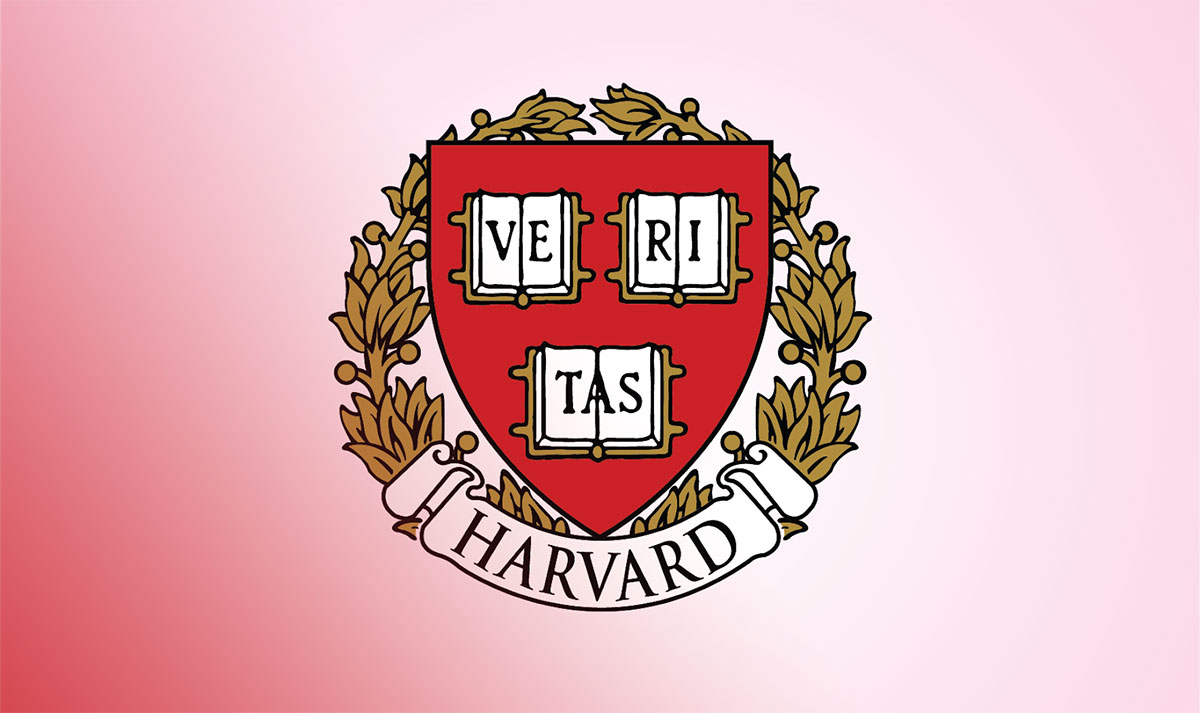
Most university logos go through full redesigns every few decades. Harvard hasn’t. The core of its identity, a crimson shield bearing three open books and the Latin word “VERITAS” (meaning “truth”), has stayed remarkably consistent for nearly four centuries. Founded in 1636, Harvard University is the oldest institution of higher learning in the United States, and its visual mark reflects that deep-rooted history.
The current version of the shield traces back to an 1843 adoption by the Harvard Corporation. But the original sketch? That was drawn during a meeting of “the Governors of Harvard Colledge” in 1643. It sat forgotten in archives until President Josiah Quincy rediscovered it in 1836. The logo has gone through a handful of refinements since then, but nothing that qualifies as a full overhaul.
The shield is classified as a heraldic emblem. It uses the Garamond typeface and a color palette built around crimson red, black, and white.
What Is the Harvard Logo?

The Harvard logo is a crimson heraldic shield featuring three open books inscribed with the Latin motto “VERITAS,” meaning “truth.” The design was first sketched in 1643 and officially adopted as a seal in 1843. It uses the Garamond typeface and symbolizes the university’s commitment to knowledge and scholarly tradition.
Here’s a breakdown of the key attributes:
- Design Type: Heraldic emblem (shield-based). Not a wordmark, not an abstract icon. This is old-school academic heraldry with deep roots in the European coat-of-arms tradition.
- Primary Elements: A shield divided into three sections, each containing an open book. The letters “VE,” “RI,” and “TAS” are distributed across the three books, spelling out VERITAS. Some versions include a laurel wreath surrounding the shield and a banner below with the word “HARVARD.”
- Official Introduction Date: The shield was first publicly displayed on September 8, 1836, during Harvard’s Bicentennial celebration. The Corporation formally adopted it as the official seal in 1843.
- Designer: The original 1643 sketch was created by the Board of Overseers. Pierre de Chaignon la Rose, a Harvard alumnus and heraldry expert, later designed many of the individual school shields in preparation for the Tercentenary celebrations in 1936.
- Trademark Status: The Harvard Trademark Program, established by the President and Fellows of Harvard College, actively registers and protects the university’s marks worldwide. The “Harvard” name and Veritas shield are among the most widely protected academic trademarks globally.
- Color Palette: Harvard Crimson (#A41034), Black (#000000), and White (#FFFFFF). The crimson was officially voted as the university’s color in 1910, though it had been in use since the 1850s.
- Usage Context: The logo appears on campus buildings, official documents, digital platforms, athletic uniforms, licensed merchandise (apparel, stationery, novelty items), and marketing materials across all Harvard schools and departments.
How Has the Harvard Logo Evolved Over Time?

The Harvard logo has remained largely the same since its initial creation in the 1640s. It went through a period of being completely forgotten, then was rediscovered in 1836, formally adopted in 1843, and refined for the 1936 Tercentenary. Unlike most institutional marks, the Harvard shield has never undergone a dramatic redesign.
The Original Harvard Shield (1643-1836)
Years Active: 1643 to 1836 (though effectively “lost” for most of this period)
The Board of Overseers sketched the original coat of arms during meetings in December 1643 and January 1644. It featured a shield with three books and the word “VERITAS.”
But here’s the thing. It was filed away and forgotten almost immediately. For nearly 200 years, nobody at Harvard used this design or even knew it existed.
The original also included the phrase “Christo et Ecclesiae” (meaning “for Christ and the Church”), which reflected Harvard’s Puritan founding purpose. The serif font style lettering was hand-drawn, and the colors weren’t standardized at that point.
Culturally, this version represents Harvard’s earliest identity as a training ground for Christian ministers. The motto itself captures the idea that truth comes from both learning and faith.
The Rediscovered Shield and Official Seal (1836-1936)
Years Active: 1836 to 1936
President Josiah Quincy found the original sketch while researching his “History of Harvard University” in the College Archives. On September 8, 1836, during the Bicentennial celebration, a white banner with the shield was hung in a large tent in Harvard Yard.
This was the first time the public saw the design. The Corporation officially adopted it as Harvard’s seal in 1843.
The 1843 seal added the Latin inscription “Academiae Harvardianae Nov Ang Sigillum” (Seal of Harvard Academy in New England) around the outer frame. The shield kept the pointed lower tip, three books (two on top, one below), and the “VERITAS” motto.
During this period, the phrase “Christo et Ecclesiae” still appeared in some versions. The crimson color started taking hold after 1858, when Harvard crew team members wore crimson scarves at a regatta. By 1910, crimson was voted the official color.
The Tercentenary Refinement and Modern Shield (1936-Present)
Years Active: 1936 to present
For the 300th anniversary, Harvard commissioned Pierre de Chaignon la Rose to design individual shields for each graduate and professional school. La Rose created a standard “chief of Harvard” (the top bar of the shield featuring the three VERITAS books) that would appear on all school-specific arms.
The modern version dropped “Christo et Ecclesiae” from most uses, leaving just “VERITAS.” This change reflected the university’s secularization over the centuries.
Today, the shield exists in two main forms. The plain Veritas shield is used for standard branding. The adorned version, with a wreath and banner, is reserved for commemorative and official University functions.
All three books now appear face-up in the primary version. The color was standardized to the specific crimson shade we see today. And the Garamond typeface became the standard for “HARVARD” text below the shield.
What Do the Design Elements of the Harvard Logo Mean?

Every piece of the Harvard shield carries meaning rooted in both religious history and academic philosophy. The three open books represent accessible knowledge and the pursuit of truth. The word “VERITAS” directly states the university’s founding mission. The shield form itself borrows from European heraldic traditions that signal authority and heritage.
What Does the Shield Shape Represent?
The shield is a heraldic symbol with centuries of tradition behind it. In the psychology of shapes, shields communicate protection, strength, and institutional authority.
Harvard’s shield follows the classic pointed-bottom style common in English and American heraldry. It connects the university to the broader tradition of academic and family crests that European institutions used for identification.
The shape also creates a strong focal point for the entire design. Your eye goes straight to the center where the books and motto sit.
What Do the Three Books Mean?
The two open books at the top historically symbolized the Old and New Testaments, reflecting the Puritan belief that biblical truth is accessible to anyone who reads Scripture.
The third book at the bottom was originally interpreted as representing the unwritten truths of the future. In some early versions, this third book appears face-down, symbolizing the limits of human knowledge and what only divine revelation can provide.
In the modern version, all three books are shown open. This shift mirrors Harvard’s transition from a religious seminary to a secular research university. The message now is simpler: knowledge is open, and truth is something you pursue through learning.
Why Did Harvard Choose These Specific Colors?
Harvard’s official color theory centers on crimson red.
- Harvard Crimson – Hex: #A41034, RGB: (164, 16, 52), CMYK: (8, 100, 65, 24), Pantone: PMS 187 U / 1807 C. Crimson red communicates energy, passion, and tradition. In color psychology, red draws attention and signals authority. The color became associated with Harvard in 1858 when crew team members wore crimson scarves. Students voted it as the official university color in 1910, beating out magenta by a narrow margin.
- Black – Hex: #000000, RGB: (0, 0, 0), CMYK: (0, 0, 0, 100), Pantone: PMS Black 6 C. Black adds weight and formality. It serves as a grounding color for text and outlines in the shield design.
- White – Hex: #FFFFFF, RGB: (255, 255, 255). White provides contrast. The book pages and lettering on the shield are white, which makes the “VERITAS” text legible against the crimson background. It’s a monochrome color scheme at its core, with crimson as the single accent.
What Typography Style Is Used in the Harvard Logo?
Harvard uses the Garamond typeface. It’s a classic serif font originally created by Claude Garamond in the 16th century.
Garamond carries a sense of formality and academic weight. The serifs themselves (those little strokes at the ends of letters) improve readability in print, which is why so many universities and publishing houses use typography from this family.
Different Harvard schools use slight variations in their typography elements. The Graduate School of Education, for instance, also uses Franklin Gothic and Open Sans for digital applications. But Garamond remains the primary brand typeface across the university.
The “VERITAS” text on the shield itself is rendered in capital letters with generous tracking between characters. This gives it a formal, engraved quality that fits the heraldic style.
What Are the Hidden Meanings in the Harvard Logo?
The face-down third book in older versions is the most discussed “hidden” element. Puritans saw it as representing knowledge that only God could reveal, the truths of the future that haven’t been written yet.
When the university moved all three books to face-up position, that choice made a statement. It said Harvard no longer places limits on what can be known through human effort.
The wreath that appears in the adorned version adds another layer. Laurel wreaths trace back to ancient Greece and Rome, where they symbolized victory and achievement. It’s a nod to academic accomplishment without being too on the nose about it.
How Does the Harvard Logo Compare to Competitor Logos?

Among Ivy League and top-tier universities, Harvard’s shield is arguably the most minimalist. It doesn’t try to cram in multiple symbols or complex scenes. Compare it to Princeton’s logo, which features a more ornate shield with a chevron, an open book, and a detailed banner system.
Columbia University’s mark uses a crown atop its shield, adding regal flair. Stanford’s logo includes a redwood tree within its seal. Oxford’s emblem goes even further with an open book, three crowns, and detailed banners.
Harvard’s approach is different. Three books, one word, one color. That’s it. This simplicity makes it incredibly effective at small sizes and across different media. You can put it on a building facade or shrink it down to a favicon and it still reads cleanly.
The MIT logo, by comparison, takes a completely different approach with a modernist wordmark and abstract elements. Yale and Duke also use shield-based emblems, but with more visual complexity.
What sets Harvard apart in the red logo space is the restraint. Among institutions that use crimson or red as their primary brand color, Harvard keeps it cleaner than most.
What Are the Technical Specifications of the Harvard Logo?
Official Color Codes
- Primary Color: Harvard Crimson
- Hex: #A41034
- RGB: (164, 16, 52)
- CMYK: (8, 100, 65, 24)
- Pantone: PMS 187 U / 1807 C
- Secondary Color: Black
- Hex: #000000
- RGB: (0, 0, 0)
- CMYK: (0, 0, 0, 100)
- Pantone: PMS Black 6 C
- Accent Color: White
- Hex: #FFFFFF
- RGB: (255, 255, 255)
- CMYK: (0, 0, 0, 0)
- Supporting Neutral: Cool Gray
- Hex: #808285
- RGB: (128, 130, 133)
- CMYK: (0, 1, 0, 43)
- Pantone: PMS Cool Gray 8
Dimensions and Proportions
Harvard’s identity guidelines require specific clear space around the shield. No other design element can touch or overlap the Veritas shield. The shield and accompanying text (when used as a lockup) must be treated as a single unified graphic and should never be separated or distorted.
The logo exists in two orientations to handle different layout needs: horizontal and stacked. Minimum size requirements exist to keep the “VERITAS” text legible, though Harvard doesn’t publicly publish exact pixel minimums the way some tech company logos do.
For print design work, the crimson color should always be proofed against a printed Pantone chip. Screen-to-print color shifts are a real issue with reds, and Harvard’s identity guidelines note this specifically.
What Cultural Impact Has the Harvard Logo Had?
The Harvard shield is one of the most recognized academic symbols worldwide. It has shaped how other universities approach their own branding, particularly in the use of heraldic shields, Latin mottos, and monochrome color schemes built around a single strong hue.
The logo appears frequently in film, television, and media as shorthand for elite education. Hollywood production companies routinely request permission to use the Harvard name and shield (all such requests go through the Trademark Program).
On merchandise, the Harvard brand generates significant revenue. All royalties, after covering operational costs, go toward student financial aid. This makes the logo not just a cultural symbol but also a practical funding tool for the university.
The Veritas motto has also taken on a life beyond Harvard. It’s become a general symbol for the pursuit of truth in academic and intellectual circles. You’ll see it referenced in contexts that have nothing to do with Harvard itself.
How Does the Harvard Logo Fit Into the Overall Brand Identity?
The Harvard logo doesn’t exist in isolation. It sits at the center of a larger identity system that includes individual school shields, brand guidelines, typographic standards, and strict use-of-name policies.
Every graduate school (Harvard Business School, Harvard Law School, Harvard Medical School, and so on) has its own shield. But they all share the “chief of Harvard,” that top bar featuring the three VERITAS books. This creates unity across a decentralized institution.
The university maintains a brand style guide that specifies everything from color values to font pairings. Harvard Business School, for example, publishes its own detailed identity guidelines that extend the core brand with additional color options and layout rules.
This system creates a visual hierarchy where the main university mark sits at the top, school-specific shields come next, and departmental or organizational logos follow underneath. It’s a tightly controlled structure that keeps the Harvard brand consistent across thousands of applications.
How Should the Harvard Logo Be Used?
Official Usage Guidelines
Do:
- Use the official Veritas shield as provided by the Trademark Program
- Maintain required clear space around the shield
- Keep the shield and wordmark together as a single graphic when using the lockup
- Proof crimson color against Pantone chips for print production
- Use the approved Garamond typeface for official Harvard text
Don’t:
- Modify the shield’s proportions, colors, or layout
- Place other design elements in direct contact with the shield
- Use the Harvard name or shield on alcoholic beverages, even for gifts or Harvard events
- Register any Harvard-related trademark without prior written permission from the Trademark Program
- Create new shields or logos without first obtaining approval from the appropriate Harvard authority
Accessing Official Logos
Licensed manufacturers receive digital files of the university’s primary trademarks directly from the Trademark Program upon license approval. Internal Harvard departments and recognized student organizations can access logo files through their school’s communications or marketing office.
The general public cannot download official logo files. This is deliberate. Harvard controls distribution to prevent misuse and maintain quality.
Licensing Information
Harvard runs both domestic and international licensing programs. Companies that want to produce Harvard-branded merchandise must apply through the Trademark Program and meet strict standards. Licensees must be members of the Fair Labor Association, carry commercial liability insurance, and pay royalties on all products sold.
The university takes a conservative approach. Only “traditional” licensed items like apparel, stationery, bags, and novelty goods are typically approved. Every product and artwork must be reviewed before production begins. And here is the part that matters: after covering operational costs, all royalty revenue goes to student financial aid.
Trademark Protection
The Harvard Trademark Program handles hundreds of unauthorized use cases each year. They monitor internet domain registrations for “Harvard” formative names and take action against infringing websites. Licensing agents and legal counsel operate worldwide.
The family of Harvard trademarks includes word-marks, design-marks, and letter-marks registered across many countries. Faculty, students, staff, alumni, and the general public are all encouraged to report suspected unauthorized use.
FAQ on The Harvard Logo
What does the Harvard logo look like?
The Harvard logo is a crimson shield with three open books displaying the Latin motto “VERITAS,” meaning truth. Some versions include a laurel wreath and a banner with the word “HARVARD” beneath the shield.
When was the Harvard shield first created?
The original sketch dates to 1643, drawn during a meeting of Harvard’s Board of Overseers. It was lost in archives for nearly 200 years.
President Josiah Quincy rediscovered it in 1836 during the university’s Bicentennial celebration in Cambridge, Massachusetts.
What does VERITAS mean on the Harvard crest?
VERITAS is Latin for “truth.” The full original motto was “Veritas Christo et Ecclesiae,” meaning “Truth for Christ and the Church.” Harvard dropped the religious portion as the Ivy League institution became secular. Now only VERITAS remains.
What font does the Harvard logo use?
Harvard uses Garamond, a classic serif typeface created in the 16th century. It gives the brand a traditional, scholarly feel.
Different Harvard schools pair Garamond with sans-serif options like Franklin Gothic for digital use.
What are the official Harvard logo colors?
Harvard Crimson (#A41034) is the primary color. Black (#000000) and white (#FFFFFF) complete the palette.
The crimson shade became official through a student vote in 1910. Crew team members had been wearing crimson scarves since 1858.
Can I use the Harvard logo for my own products?
No. The Harvard Trademark Program strictly controls all usage. You need a formal license to produce any Harvard-branded merchandise. Unauthorized use results in enforcement action. All royalty revenue from licensed products supports student financial aid.
Why does Harvard’s logo have three books?
The two top books originally symbolized the Old and New Testaments. The third represented future truths yet to be revealed.
In the modern Harvard University emblem, all three books face up, signaling that knowledge has no limits.
Does each Harvard school have its own logo?
Yes. Harvard Business School, Harvard Law School, Harvard Medical School, and every other graduate school has a unique shield. They all share the standard “chief of Harvard” top bar with the three VERITAS books.
How does the Harvard logo compare to other university emblems?
Harvard’s shield is simpler than most. Princeton uses a chevron and detailed banners. Columbia features a crown. Stanford includes a redwood tree.
Harvard sticks with three books and one word. That minimalist approach makes it one of the most recognizable academic symbols worldwide.
Where can I find the official Harvard logo files?
You can’t download them publicly. Harvard controls distribution through its Trademark Program and school communications offices. Licensed manufacturers receive digital files only after formal approval. This keeps the Harvard visual identity consistent across all applications.
Conclusion
The Harvard logo has survived nearly four centuries without a major redesign. That says something about the strength of its original concept.
Three books, one Latin word, a crimson shield. The whole thing works because it never tried to do too much. The Veritas seal communicates academic authority and the pursuit of truth through the simplest possible visual language.
Harvard’s strict trademark protection and detailed brand guidelines keep the identity tight across every school and department. From Harvard Yard buildings to licensed apparel, the shield stays consistent.
Few institutional emblems carry this kind of weight. It’s proof that minimalist design, when rooted in real meaning, doesn’t need updating every decade to stay relevant.

Renowned for his expertise in logo design and visual branding, Bogdan has developed a multitude of logos for various clients.
His skills extend to creating posters, vector illustrations, business cards, and brochures. Additionally, Bogdan's UI kits were featured on marketplaces like Visual Hierarchy and UI8.
He also wrote in the past years on sites like Design Your Way, WebDesignerDepot, WPDean, Designmodo, Speckyboy, Slider Revolution, and more.
- Canva vs PowerPoint: Which Is Better for Presentations? - 22 September 2026
- How to Install Fonts on Mac (Step-by-Step Guide) - 20 September 2026
- From Mockup to Code: How AI-Augmented Development Speeds Up the Design Handoff - 19 September 2026

Bogdan Sandu is a seasoned designer who has been designing websites since 2008. Renowned for his expertise in logo design and visual branding, Bogdan has developed a multitude of logos for various clients. His skills extend to creating posters, vector illustrations, business cards, and brochures. Additionally, Bogdan's UI kits were featured on marketplaces like Visual Hierarchy and UI8. He also wrote in the past years on sites like Design Your Way, WebDesignerDepot, WPDean, Designmodo, Speckyboy, Slider Revolution, and more.
You Might Also Like