Three years ago, Banana Republic was bleeding money. Gap Inc. was closing hundreds of stores, and nobody could explain why the brand existed alongside Gap and Old Navy.
Then the Banana Republic rebrand happened. New logo, custom typeface, safari-inspired collections, a full store redesign, and a lifestyle brand expansion into home goods, athletics, and baby products.
The turnaround earned comparisons to Ralph Lauren and The Row.
This article breaks down every piece of that brand identity transformation: who led it, what changed, how the visual identity system was built by Decade and Colophon Type Foundry, and what results it actually produced. Whether you’re studying corporate identity shifts or planning your own rebrand, the Banana Republic playbook is worth understanding.
What Is the Banana Republic Rebrand
The Banana Republic rebrand is a full-scale visual identity overhaul launched in 2021 by Gap Inc. to reposition its underperforming retail chain as a lifestyle brand rooted in travel, adventure, and accessible luxury.
Sandra Stangl, who joined as President and CEO in December 2020, led the charge. She brought in Ana Andjelic as Chief Brand Officer early in 2021 to rebuild the brand from the ground up.
The core positioning shifted from generic office wear to what Stangl called “democratic, approachable and inclusive luxury.”
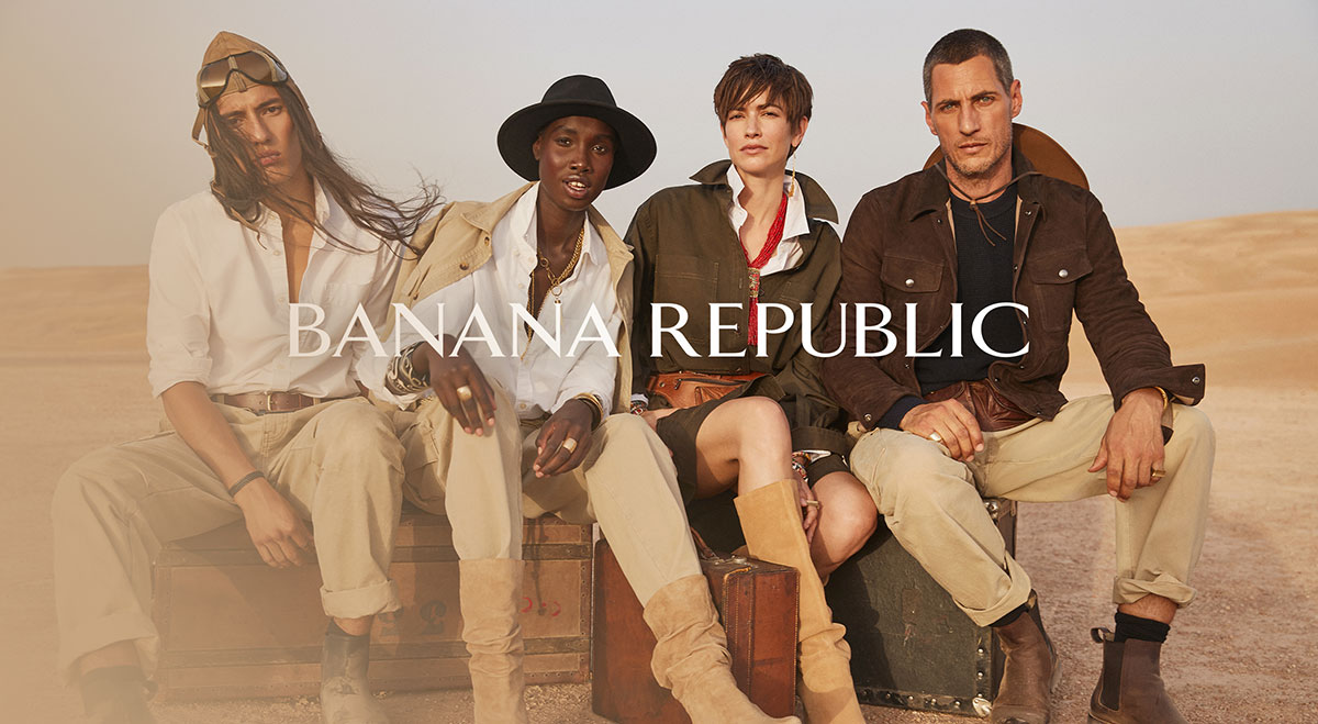
Two campaigns defined the relaunch. “The New Look” debuted in Fall 2021 with safari-inspired clothing, leather pieces, and cargo pants. “Imagined Worlds” followed, framing Banana Republic as a fictional territory meant to be explored.
New York studio Decade handled the brand identity creation, working alongside Colophon Type Foundry to build a custom serif typeface called “Banana.”
The result was not just a logo swap. It was a complete retail brand transformation touching every customer touchpoint, from clothing tags to store interiors to packaging design.
Why Did Banana Republic Rebrand

Money. That’s the short answer.
Gap Inc. reported a $16 million net loss in Q4 2020. Banana Republic’s sales had dropped 2% from 2019 levels, and the company announced plans to close roughly 350 Gap and Banana Republic stores across North America by the end of 2023.
The brand had been a consistent underperformer for years. Nothing about it stood apart from sister brands Gap and Old Navy, and competitors like J.Crew and Abercrombie & Fitch were eating into its market share with similar masstige positioning.
Look, when your own parent company can’t tell your brands apart, customers definitely can’t.
Banana Republic had drifted so far from its original identity that it became interchangeable with dozens of other mid-range clothing retailers. The safari roots, the adventure catalog, the hand-drawn illustrations… all gone. Replaced by safe, forgettable corporate clothing that could have come from anywhere.
The brand positioning was unclear. The product quality didn’t justify the price point. And the in-store experience gave customers zero reason to choose Banana Republic over anyone else.
Something had to break.
What Was Banana Republic’s Original Brand Identity
Mel and Patricia Ziegler founded Banana Republic Travel & Safari Clothing Company in 1978. Both worked at the San Francisco Chronicle. Mel was a reporter, Patricia an illustrator.
They quit their journalism careers and moved to Tamalpais Valley.
The original stores were wild. Elephant tusk door handles. 17-foot fiberglass giraffes. Army jeeps parked inside. Live tropical plants everywhere. Each location felt like stepping into a fictional outpost in some faraway place.
Their product catalogs were just as distinctive. Hand-drawn illustrations paired with fictional explorer stories created a brand narrative that no other clothing company had. The garments themselves were designed for actual adventure, military-inspired pieces with exaggerated proportions.
Gap Inc. acquired the company in 1983.
By 1988, the Zieglers had lost creative control entirely. The safari aesthetic was stripped away piece by piece. The illustrated catalogs disappeared. The eccentric store designs got flattened into sterile retail boxes.
What replaced it was masstige office wear. Safe. Predictable. The kind of clothing that blends into a corporate elevator and never gets a second look.
The original materials gave way to lower-cost fabrics. The storytelling vanished. Banana Republic became a brand defined more by what it lost than what it offered.
How Did Banana Republic Change Its Visual Identity
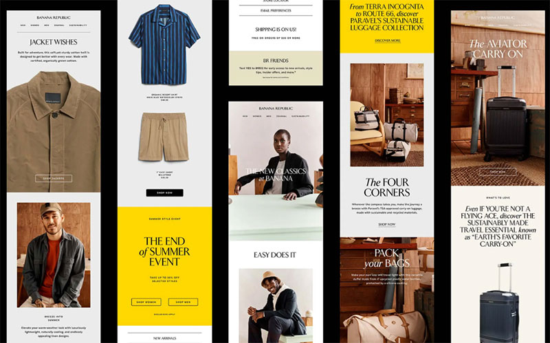
Decade, a New York-based creative studio, led the visual identity redesign starting in 2021. Co-founders Grace Robinson-Leo and Rob Matthews worked directly with Banana Republic’s leadership and in-house design team.
The starting point was the original logo’s letterforms.
Through their research, the Decade team discovered the old logo was based on Arrow, a typeface designed by Walter Diethelm in 1965, stretched slightly wider. They used Arrow as the foundation for sketches, then partnered with Colophon Type Foundry to develop a fully custom serif typeface.
The result is called “Banana.” It comes in four styles: Regular, Italic, Bold, and Bold Italic. The typography carries a lot of weight here. It’s the connective thread across every brand application, from billboards to mobile screens to clothing labels.
Banana yellow became the signature color palette anchor, used across product and brand materials.
Decade also created a system of monograms, accent marks, graphics, and patterns. Athletics collections got sportier varsity-style monograms. BR Baby received playful marks, including a hand-drawn banana. Handwritten touches referenced the original illustrated catalogs from the Ziegler era.
The studio produced extensive brand guidelines and design templates to keep everything consistent across digital, marketing, retail signage, clothing tags, and packaging.
This wasn’t a surface-level refresh. It was a complete rebranding system built for scale.
What Does the New Banana Republic Logo Look Like
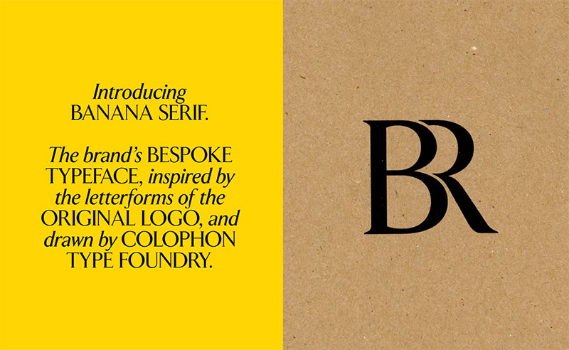
The new logo uses the custom “Banana” font built by Colophon Type Foundry. It’s a bespoke serif with roots in Walter Diethelm’s 1965 Arrow typeface, but refined with sharper details and modern proportions.
Compared to the previous wordmark, the update feels more editorial, more fashion-forward.
The kerning is tighter. The serifs are more pronounced. There’s a confidence in the letterforms that the old version lacked. The whole thing reads less like a mall brand and more like something you’d see on a luxury magazine cover.
Took me a while to notice, but the x-height and stroke contrast give it a very specific personality. Classic but not stiff. Elegant without being precious.
The logo works across a huge range of applications:
- Digital platforms and web design
- Marketing campaigns and social media
- Retail store signage and window displays
- Clothing tags, labels, and hangtags
- Product packaging and shopping bags
What makes this logo design work is how the typographic hierarchy holds up at every size. Shrink it down for a tag, blow it up for a storefront. The proportions stay clean either way.
Decade also created secondary marks, monograms, and graphic accents that extend the identity without competing with the primary wordmark. Each sub-brand (BR Home, BR Athletics, BR Baby) has its own variation that stays connected to the main system through shared typographic elements and contrast ratios.
The evolution of this logo tells a bigger story. From safari outfitter to corporate blur to something with actual character again.
How Did Banana Republic Redesign Its Stores
The store redesign matched the scale of the visual identity overhaul. Every physical location needed to reflect the new brand direction, not just carry updated signage.
Old Banana Republic stores felt like any other mall retailer. Neutral walls, fluorescent lighting, racks of khakis. Nothing memorable.
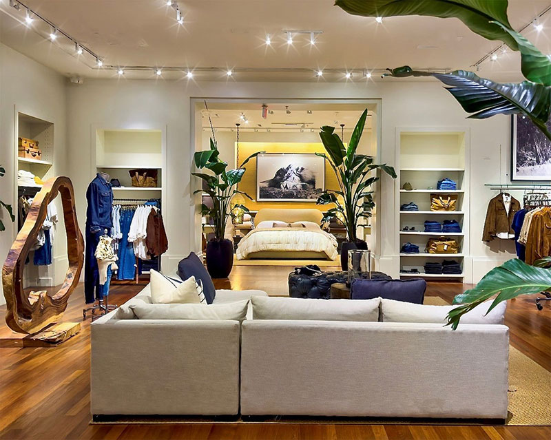
The redesigned spaces lean into editorial-style merchandising. Think curated rooms instead of cluttered sales floors. Product displays that feel more like a mood board than a warehouse.
Staff training changed too. Sales associates now walk customers through styling options, offer coffee, and treat the visit like a personal shopping appointment rather than a transaction.
The alignment between physical retail and digital presence became a priority. Store interiors use the same banana yellow accents, the custom Banana typeface on signage, and the monogram patterns from the brand style guide.
Materials upgraded across the board. Warmer lighting, richer textures, intentional white space in product layouts that lets individual pieces breathe instead of competing for attention.
The flagship locations got the most dramatic treatment, but even smaller stores received enough updates to feel distinct from competitors like J.Crew and Abercrombie & Fitch.
What Collections Did Banana Republic Launch After the Rebrand
The rebrand wasn’t just a logo change. Banana Republic backed it with an aggressive product line diversification that pushed the brand well beyond clothing.
“The New Look” launched in Fall 2021 as the debut collection. Vests, cargo pants, leather jackets, suede pieces. Safari meets tuxedo, formalwear meets casualwear. Ana Andjelic called it “post-genre fashion.”
“Imagined Worlds” came next, positioning Banana Republic as a fictional destination, a place to discover rather than just a store to shop.
Then the brand started expanding fast:
- BR Baby with playful hand-drawn branding
- BR Athletics featuring varsity-style monograms and sportier color palettes
- Art by Banana Republic, a curated collection of wildlife and landscape art pieces
- BR Home, launched September 2023, covering bedroom, living, and dining furniture plus lighting and decorative accents
The product category expansion makes sense when you look at the rebranding strategy as a whole. Banana Republic doesn’t just sell clothes anymore. It sells a lifestyle, and the home collection lets them integrate apparel and interiors across campaigns, catalogs, and store displays.
Nicole Wiesmann, VP of Design, pushed editorial campaigns that feel closer to Ralph Lauren or The Row than anything Banana Republic produced in the 2010s.
How Does the Banana Republic Rebrand Compare to Competitors

Banana Republic sits in a tricky spot. Too expensive to compete with fast fashion, not exclusive enough to sit next to actual luxury brands.
J.Crew occupies nearly the same price range and demographic. The difference now is positioning. J.Crew leans preppy and colorful. Banana Republic leans editorial and safari-inspired. Before the rebrand, that distinction barely existed.
Abercrombie & Fitch pulled off its own successful repositioning in recent years, moving from teen brand to young professional. The two brands now compete more directly than ever for the same customer.
The comparison to Ralph Lauren is the interesting one. Banana Republic’s rebrand clearly borrows from that heritage-adventure-lifestyle playbook, but at a fraction of the price. Nicole Wiesmann’s design direction has drawn direct comparisons to The Row as well, which is about as high-end as fashion comparisons get.
Old Navy stays affordable and family-focused. Gap stays generic. Banana Republic now occupies the premium tier of the Gap Inc. portfolio with actual breathing room between itself and its sister brands.
Among companies that have rebranded in the retail fashion space recently, Banana Republic’s turnaround stands out because it touched everything simultaneously: product, print, digital, retail, and culture.
Who Led the Banana Republic Rebrand
Sandra Stangl started as President and CEO in December 2020. She made the call to rebuild the brand from its heritage rather than chase whatever trend was popular that quarter.
Ana Andjelic came on as Chief Brand Officer in early 2021. Her background in brand strategy shaped the “democratic luxury” positioning and the dual campaign approach with “The New Look” and “Imagined Worlds.”
Nicole Wiesmann, VP of Design, handled the product side. Her editorial campaigns and higher-end garment designs are what earned the Ralph Lauren and The Row comparisons.
On the design agency side:
- Decade (Grace Robinson-Leo and Rob Matthews) created the full brand identity system, guidelines, monograms, and brand codes
- Colophon Type Foundry drew the custom “Banana” serif typeface in four styles based on Walter Diethelm’s 1965 Arrow
The Ziegler founders, Mel and Patricia, had no involvement in the 2021 rebrand. But their original vision became the blueprint. The adventure theme, the illustrated catalog feel, the idea that Banana Republic is a place and not just a store.
Worth noting: this wasn’t a case of one person saving a brand. It took coordinated effort across leadership, creative direction, product design, and agency work to pull it off. Something to keep in mind if you’re reviewing a rebranding checklist for your own project.
What Brand Strategy Did Banana Republic Use
Heritage as foundation. That’s the core of the whole strategy.
Instead of chasing trends or copying competitors, the team went back to the original Ziegler-era identity and asked what parts still worked. The answer: almost all of it. Safari roots, travel inspiration, adventure storytelling in design, hand-drawn catalog aesthetics.
The “democratic luxury” concept gave the brand a clear positioning in a crowded market. Luxury quality and feel, accessible prices. Not discount, not aspirational. Right in the middle, but with a strong point of view.
Inclusivity became a stated value, not just a marketing line. Size ranges expanded. Campaign imagery diversified. The brand explicitly positioned itself as approachable.
The lifestyle brand expansion was deliberate. Clothing first, then athletics, baby, art, and home. Each extension reinforced the same narrative of discovery and self-expression, using consistent design elements across every product category.
Social media shifted from product shots to editorial content. The feeds started looking like fashion magazine spreads rather than e-commerce listings.
Smart move, actually. At least in my experience, brands that treat Instagram as a catalog always lose to the ones that treat it as a publication.
What Results Did the Banana Republic Rebrand Achieve
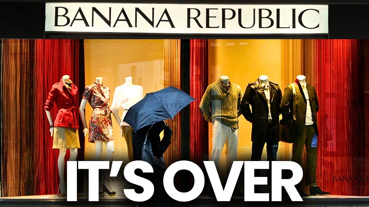
Banana Republic went from consistent underperformer to what industry analysts started calling a “heavy lifter” for Gap Inc.
The brand successfully differentiated itself from Gap and Old Navy for the first time in over a decade. That alone justified the investment.
Product quality improvements matched the price increases. Customers noticed. Social media reception was largely positive, with fashion-focused creators on TikTok and Instagram comparing the new collections favorably against much more expensive labels.
The expansion into BR Home, BR Athletics, and BR Baby created new revenue streams that didn’t exist before the rebrand. Each line launched with its own adapted version of the brand identity system, keeping recognition high across categories.
Nicole Wiesmann’s editorial campaigns earned comparisons to Ralph Lauren and The Row. For a brand that was being called boring three years earlier, that’s a significant shift in consumer perception.
If you’re curious about how to track this kind of turnaround for your own brand, measuring brand performance across multiple touchpoints gives you a clearer picture than sales numbers alone.
What Can Other Brands Learn from the Banana Republic Rebrand
First: heritage works. If your brand has a strong origin story, use it. Banana Republic didn’t invent a new identity. They excavated the one they already had and updated it with modern design tools.
Second: unity across touchpoints matters more than any single design decision. The font psychology behind the custom Banana typeface, the banana yellow hue, the monogram system, the store redesign, the editorial photography… none of these work in isolation. Together they create something undeniable.
Third: price elevation requires experience elevation. You can’t charge more without delivering more. Banana Republic upgraded fabrics, store experiences, and marketing quality simultaneously.
Fourth: lifestyle extension gives you room to grow. Going from clothing to home goods to art feels natural when the brand identity system supports it. Random product launches without a connecting thread just confuse people.
And finally, something most rebranding conversations miss: speed matters. Banana Republic didn’t roll this out over five years. They hit hard and fast across all channels, making the transformation impossible to ignore.
Your mileage may vary. But the pattern here is clear. Know who you were, decide who you are, and commit to it everywhere at once.
FAQ on Banana Republic Rebrand
When did Banana Republic rebrand?
Banana Republic launched its rebrand in September 2021 under CEO Sandra Stangl and Chief Brand Officer Ana Andjelic. The rollout included a new visual identity, updated store designs, and the debut “The New Look” collection that fall.
Who designed the new Banana Republic logo?
New York creative studio Decade, led by Grace Robinson-Leo and Rob Matthews, designed the new brand identity. Colophon Type Foundry created the custom serif typeface called “Banana,” based on Walter Diethelm’s 1965 Arrow typeface.
Why did Banana Republic change its brand identity?
Declining sales, a $16 million net loss at Gap Inc. in Q4 2020, and lack of differentiation from sister brands Gap and Old Navy forced the change. Competitors like J.Crew and Abercrombie & Fitch were taking market share.
What does the new Banana Republic logo look like?
The new logo uses a bespoke serif typeface with tighter letter spacing and pronounced serifs. It feels more editorial than the previous wordmark. Banana yellow serves as the signature brand color across all applications.
What is Banana Republic’s brand positioning after the rebrand?
Banana Republic repositioned as “democratic, approachable and inclusive luxury.” The brand shifted from generic office wear to a safari-inspired lifestyle brand with product lines spanning clothing, home goods, athletics, and baby.
What collections launched after the Banana Republic rebrand?
“The New Look” and “Imagined Worlds” were the flagship campaigns. Product extensions followed: BR Home (furniture and decor), BR Athletics, BR Baby, and Art by Banana Republic featuring curated wildlife and landscape pieces.
Who owns Banana Republic?
Gap Inc. has owned Banana Republic since acquiring it from founders Mel and Patricia Ziegler in 1983. The brand sits alongside Gap, Old Navy, and Athleta in the Gap Inc. portfolio as its premium tier.
Was the Banana Republic rebrand successful?
Yes. Banana Republic went from consistent underperformer to a growth driver for Gap Inc. Fashion critics compared Nicole Wiesmann’s design direction to Ralph Lauren and The Row, a major perception shift from its previous reputation.
How did Banana Republic stores change after the rebrand?
Stores shifted from generic retail layouts to editorial-style merchandising with warmer lighting, richer textures, and curated product displays. The banana yellow accents, custom signage, and upgraded customer service matched the new brand identity.
What was Banana Republic’s original brand concept?
Mel and Patricia Ziegler founded it in 1978 as Banana Republic Travel & Safari Clothing Company in San Francisco. Original stores featured fiberglass giraffes, army jeeps, and hand-drawn catalogs with fictional explorer stories.
Conclusion
The Banana Republic rebrand proved that a struggling retail chain can recover when leadership commits to a coherent brand strategy across every touchpoint. From the custom “Banana” typeface by Colophon Type Foundry to the safari-inspired collections and BR Home expansion, nothing was left untouched.
Sandra Stangl and Ana Andjelic didn’t guess. They went back to the Ziegler-era DNA and rebuilt with purpose.
The color psychology behind banana yellow, the repetition of brand codes across packaging, signage, and digital, the scale and proportion choices in store merchandising. Every detail reinforced the same message.
Gap Inc. needed a win. Banana Republic delivered one by remembering who it was before anyone told it to be something else.

Renowned for his expertise in logo design and visual branding, Bogdan has developed a multitude of logos for various clients.
His skills extend to creating posters, vector illustrations, business cards, and brochures. Additionally, Bogdan's UI kits were featured on marketplaces like Visual Hierarchy and UI8.
He also wrote in the past years on sites like Design Your Way, WebDesignerDepot, WPDean, Designmodo, Speckyboy, Slider Revolution, and more.
- How to Install Fonts on Mac (Step-by-Step Guide) - 20 September 2026
- From Mockup to Code: How AI-Augmented Development Speeds Up the Design Handoff - 19 September 2026
- The Beehiiv Logo History, Colors, Font, And Meaning - 18 September 2026

Bogdan Sandu is a seasoned designer who has been designing websites since 2008. Renowned for his expertise in logo design and visual branding, Bogdan has developed a multitude of logos for various clients. His skills extend to creating posters, vector illustrations, business cards, and brochures. Additionally, Bogdan's UI kits were featured on marketplaces like Visual Hierarchy and UI8. He also wrote in the past years on sites like Design Your Way, WebDesignerDepot, WPDean, Designmodo, Speckyboy, Slider Revolution, and more.
You Might Also Like