


The Ariat logo stands as one of the most recognized symbols in western and equestrian apparel. Founded in 1993 by Beth Cross and Pam Parker, Ariat International brought athletic footwear technology to traditional cowboy boots. The company needed a visual identity that could bridge performance innovation with ranch heritage.
Today’s version represents the brand’s third major iteration. The current wordmark was refined in the early 2010s. It maintains clean lines while projecting durability and authenticity. Understanding logo design principles helps explain why this mark works so well for its target audience.
The brand has become a staple among rodeo athletes, equestrians, and outdoor workers. Its logo appears on everything from boots to hats to performance shirts. Few shoe brand logos communicate rugged reliability quite like this one.
What Is the Ariat Logo?
The Ariat logo is a custom wordmark featuring bold, slightly condensed letterforms with subtle western influences. Officially refined in its current form around 2012, the design uses modified sans-serif typography created in-house. It symbolizes strength, performance, and authentic western heritage.
Core attributes of this brand mark:
- Design Type: Custom wordmark (logotype)
- Primary Elements: Six-letter wordmark with unique “A” letterforms
- Official Introduction: Original 1993, current version circa 2012
- Designer/Agency: Internal design team
- Trademark Status: Registered trademark in multiple countries
- Color Palette: Primary brown (#5C4033), black (#000000), white (#FFFFFF)
- Usage Context: Footwear, apparel tags, retail signage, digital platforms, rodeo sponsorships
How Has the Ariat Logo Evolved Over Time?
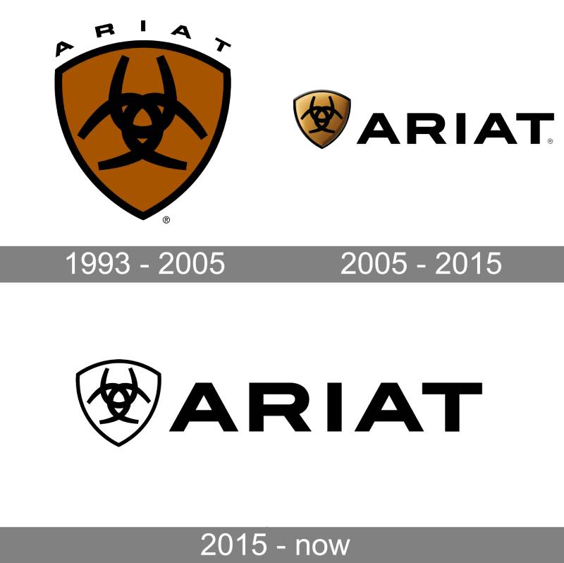
The brand has gone through three distinct visual phases since 1993. Each version reflected the company’s growth from startup to industry leader.
Early designs leaned heavily into western imagery. Later versions streamlined the look for modern retail environments.
Original Ariat Logo (1993-2002)
- Years Active: 1993-2002
- Design Description: Serif-influenced wordmark with more decorative elements
- Color Scheme: Brown and gold tones
- Designer: Founding team with external agency support
- Context: Launched alongside the brand’s first athletic western boots
- Cultural Significance: Established the brand as a serious player in equestrian footwear
Transitional Ariat Logo (2002-2012)
- Years Active: 2002-2012
- Design Description: Cleaner letterforms with reduced ornamentation
- Color Scheme: Darker brown, introduction of black variant
- Key Changes: Removed decorative serifs, modernized proportions
- Context: Company expanded beyond boots into full apparel lines
- Cultural Significance: Signaled shift toward mainstream retail presence
Current Ariat Logo (2012-Present)
- Years Active: 2012-present
- Design Description: Bold, confident wordmark with custom letterforms
- Color Scheme: Rich brown primary, black and white alternates
- Key Changes: Refined letter spacing, strengthened visual weight
- Context: Global expansion and increased sponsorship visibility
- Cultural Significance: Represents the brand’s position as an industry leader
What Do the Design Elements of the Ariat Logo Mean?
The wordmark communicates dependability through its solid, grounded letterforms. Nothing feels fragile or temporary here.
Each letter sits with confidence. The overall shape suggests stability and strength.
Western heritage comes through in subtle ways. The slightly angular terminals hint at ranch aesthetics without being obvious about it.
Why Did Ariat Choose These Specific Colors?
Brown dominates the primary color palette for good reason. It connects directly to leather, earth, and the ranching lifestyle.
This choice aligns with color psychology research. Brown signals reliability and warmth. It feels honest. Companies using brown logos often want to project trustworthiness.
- Primary Brown (#5C4033): Evokes leather, earth, authenticity
- Black (#000000): Adds sophistication for formal applications
- White (#FFFFFF): Provides contrast on dark backgrounds
What Typography Style Is Used in the Ariat Logo?
The typeface is custom-designed specifically for the brand. You won’t find it in any font library.
It borrows from sans-serif font traditions but adds unique character. The letters have subtle variations that prevent them from looking generic.
Readability stays high across all sizes. That matters when your logo appears on tiny boot tags and massive arena banners.
What Are the Hidden Meanings in the Ariat Logo?
The double “A” bookends create visual balance. Start and finish with the same strong letter.
Some see horseshoe shapes in the curved elements. Whether intentional or not, it works for the equestrian audience.
The name itself comes from “Secretariat,” the legendary racehorse. That connection runs deeper than the visual design.
How Does the Ariat Logo Compare to Competitor Logos?

Most western boot brands lean into obvious cowboy imagery. Horseshoes, stars, longhorns. Ariat took a different path.
The wordmark approach sets it apart from competitors like Justin Boots and Tony Lama. Those brands use more traditional emblems.
Compared to athletic footwear brands, Ariat holds its own. The logo wouldn’t look out of place next to Under Armour’s mark or similar performance brands.
This positioning makes sense. The company always wanted to merge western tradition with athletic innovation. The logo reflects that hybrid identity.
What Are the Technical Specifications of the Ariat Logo?
Official Color Codes:
- Primary Brown: Hex #5C4033, RGB (92, 64, 51), CMYK (0, 30, 45, 64)
- Black: Hex #000000, RGB (0, 0, 0), CMYK (0, 0, 0, 100)
- White: Hex #FFFFFF, RGB (255, 255, 255), CMYK (0, 0, 0, 0)
Dimensions and Proportions:
- Aspect Ratio: Approximately 4:1 (width to height)
- Minimum Size: 0.75 inches wide for print, 100 pixels for digital
- Clear Space: Height of the letter “A” on all sides
- File Formats: Available in vector graphics (AI, EPS, SVG) and raster formats
What Cultural Impact Has the Ariat Logo Had?
The mark appears at nearly every major rodeo event in North America. Professional Bull Riders, National Finals Rodeo, countless local competitions.
It represents a shift in how western wear gets marketed. Performance first, tradition second.
Younger consumers recognize it as a premium brand. That perception took decades to build. The consistent visual identity played a big role.
How Does the Ariat Logo Fit Into the Overall Brand Identity?

The wordmark anchors a broader visual system. Secondary graphics, patterns, and imagery all reference its core characteristics.
Product tags use it prominently. Marketing materials position it consistently. Retail displays treat it as the primary identifier.
Following proper brand guidelines keeps everything cohesive. The company maintains strict standards for partner usage.
Every touchpoint reinforces the same message. Authentic performance for real-world riders and workers.
How Should the Ariat Logo Be Used?
Official Usage Guidelines:
- Do: Maintain minimum clear space around the mark
- Do: Use approved color variations only
- Do: Scale proportionally without distortion
- Don’t: Alter colors outside the approved palette
- Don’t: Add effects like shadows or gradients
- Don’t: Place on busy backgrounds that reduce legibility
Access and Licensing:
- Official assets available through Ariat’s retail partner portal
- Trademark registered with the USPTO
- Unauthorized commercial use prohibited
- Media inquiries handled through corporate communications
FAQ on The Ariat Logo
What Does the Ariat Logo Look Like?
The Ariat brand logo is a custom wordmark featuring bold letterforms. No mascot or icon accompanies it.
Six letters. Clean lines. Slightly condensed proportions that suggest strength without feeling heavy.
The design works as a focal point on boots, apparel tags, and retail signage.
What Do the Colors in the Ariat Logo Mean?
Brown serves as the primary hue. It connects to leather, earth, and ranch life.
Black and white versions exist for different applications. The brown carries most of the brand’s emotional weight.
These choices reflect the western lifestyle the company represents.
When Was the Ariat Logo Created?
The original mark launched in 1993 with the company’s founding. Beth Cross and Pam Parker started Ariat International in Union City, California.
The current version dates to around 2012. That’s nearly three decades of brand recognition building.
Who Designed the Ariat Logo?
Internal teams handled most design work. The company never publicly credited a specific designer or agency.
This approach differs from brands that hire famous graphic designers for identity projects.
Sometimes the best branding comes from people who actually know the product.
What Font Is Used in the Ariat Logo?
The typography is completely custom. You won’t find this font available for download anywhere.
It pulls from sans-serif traditions while adding unique characteristics. The letterforms have subtle angles that hint at western aesthetics.
Is the Ariat Logo Trademarked?
Yes. The Ariat trademark holds registration with the USPTO and international bodies.
This protection covers the wordmark across footwear, apparel, and accessories categories. Unauthorized commercial use faces legal consequences.
Where Does the Name Ariat Come From?
The name derives from Secretariat, the legendary racehorse who won the Triple Crown in 1973.
That connection makes sense. The founders wanted to bring athletic performance technology to equestrian footwear.
The storytelling runs deeper than the visual mark itself.
How Has the Ariat Logo Changed Over Time?
Three major versions exist. The 1993 original used more decorative elements.
A 2002 update simplified things. The 2012 refinement created today’s bold, confident wordmark.
Each change reflected the brand’s growth from startup to western boot company leader.
Can I Use the Ariat Logo for My Business?
Not without permission. Retail partners access official assets through a dedicated portal.
Media requests go through corporate communications. The company follows strict brand style guide standards for all partner usage.
What File Formats Is the Ariat Logo Available In?
Authorized partners receive vector files (AI, EPS, SVG) and raster formats. Vector versions scale without quality loss.
For print design applications, high DPI files prevent fuzzy reproduction on packaging and merchandise.
Conclusion
The Ariat logo tells the story of a brand that refused to follow the crowd. No horseshoes. No longhorns. Just a confident wordmark that speaks for itself.
Three decades of consistent visual hierarchy built serious brand recognition in the equestrian apparel market.
The design balances western heritage with athletic performance. That combination mirrors exactly what the boot manufacturer puts into its products.
Whether stamped on cowboy boots or rodeo sponsorship banners, the mark holds its own. Simple choices, executed well, create lasting brand identity.

Renowned for his expertise in logo design and visual branding, Bogdan has developed a multitude of logos for various clients.
His skills extend to creating posters, vector illustrations, business cards, and brochures. Additionally, Bogdan's UI kits were featured on marketplaces like Visual Hierarchy and UI8.
He also wrote in the past years on sites like Design Your Way, WebDesignerDepot, WPDean, Designmodo, Speckyboy, Slider Revolution, and more.
- Jujutsu Kaisen Font Generator - 12 October 2026
- The Windsurf Logo History, Colors, Font, And Meaning - 10 October 2026
- How to Remove Background From Product Photos (No Photoshop) - 10 October 2026

Bogdan Sandu is a seasoned designer who has been designing websites since 2008. Renowned for his expertise in logo design and visual branding, Bogdan has developed a multitude of logos for various clients. His skills extend to creating posters, vector illustrations, business cards, and brochures. Additionally, Bogdan's UI kits were featured on marketplaces like Visual Hierarchy and UI8. He also wrote in the past years on sites like Design Your Way, WebDesignerDepot, WPDean, Designmodo, Speckyboy, Slider Revolution, and more.
You Might Also Like


